Panel-charts, also known as small multiples, provide an effective way to present data in a clear format. This type of chart is particularly suitable for controlling purposes, as it allows for quick comparability of different data sets. In this guide, I will explain what panel charts are and how you can create them in Excel. I will show you step by step how you can visualize your data and gain valuable insights.
Key Insights
- Panel charts visualize multiple data sets side by side for better comparison.
- An average can be used as a reference size.
- Creating panel charts in Excel can be facilitated by copying and pasting the charts for different data sets.
Step-by-Step Guide
1. Prepare the Data
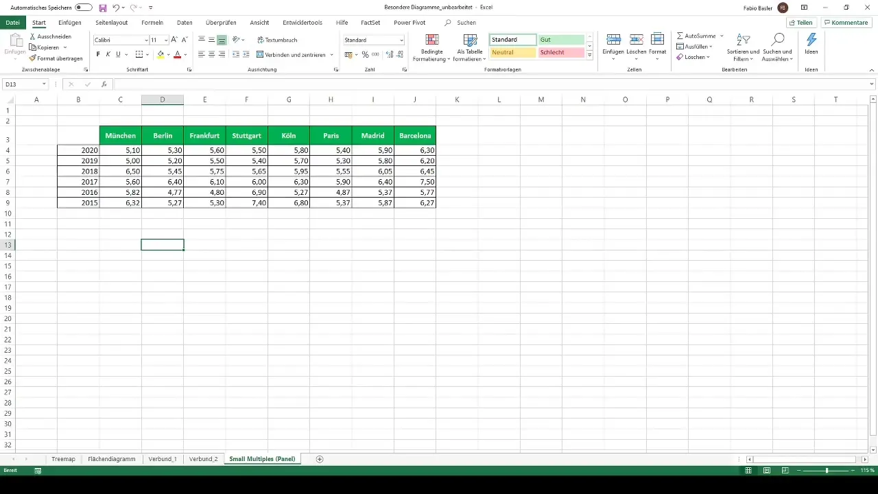
Before you start creating panel charts in Excel, make sure your data is well-structured. In the example, we need an overview of different locations such as Munich, Berlin, Frankfurt, Stuttgart, and others, along with their respective data over a specific period, for example, from 2015 to 2020. Ensure that your data is entered correctly and completely.
2. Select the First Chart Type
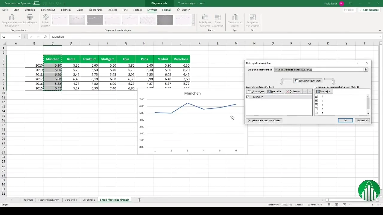
Start by creating your first chart. For this, select the data for the Munich location and use the 2D line chart function. This chart will initially give you an overview of the developments in Munich.
3. Customize the Chart
After creating the first chart, you should customize it accordingly. Set the horizontal axis to time while the vertical axis shows your values. Make sure to adjust the axis labels to make everything clear and understandable.
4. Calculate the Mean Value
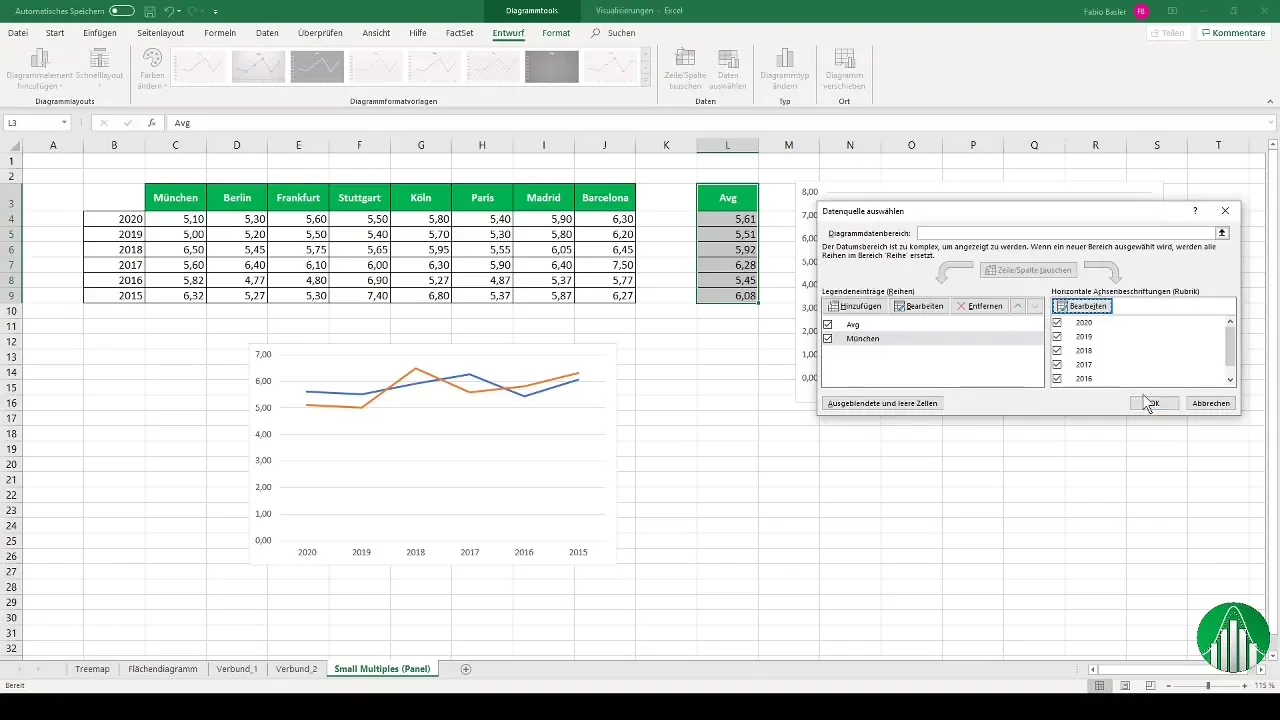
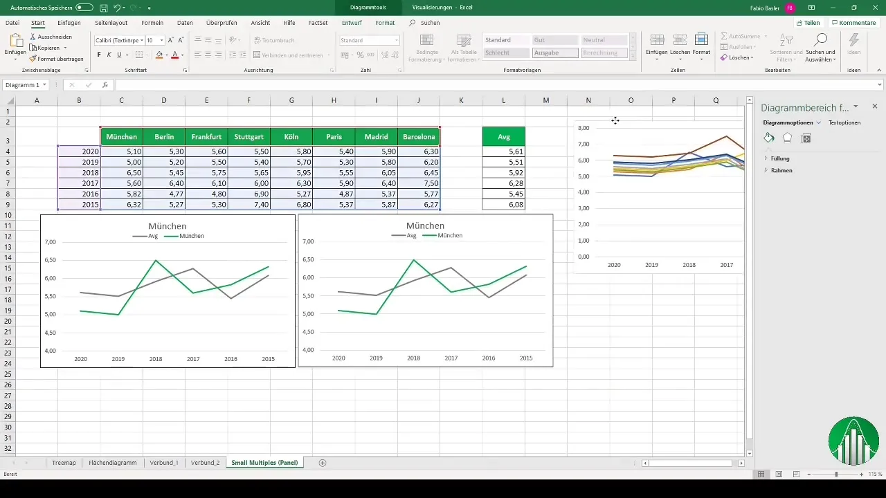
An important aspect of panel charts is the use of a reference size. Calculate the arithmetic mean (average) across all locations. This will help you see how the individual locations behave compared to the average.
5. Add Data Series
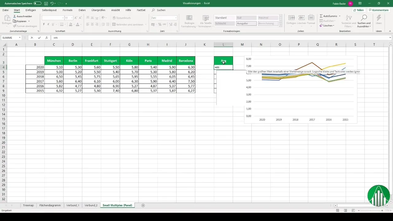
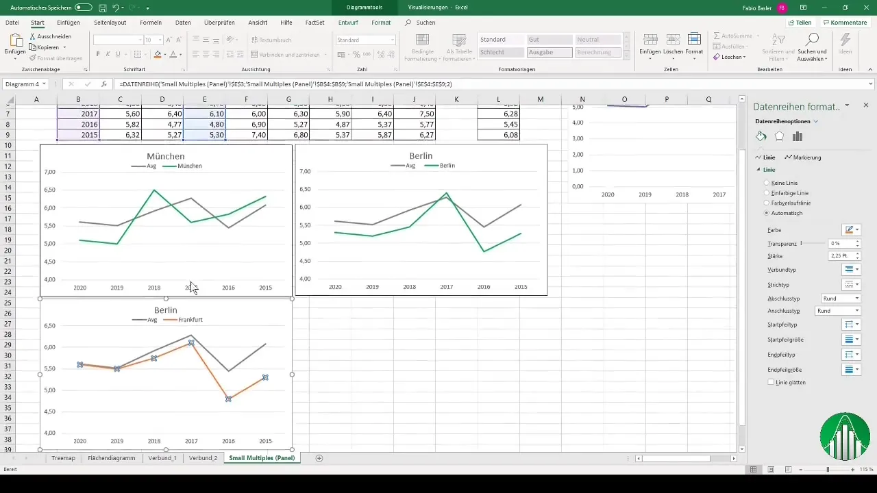
Now you can add additional data series to your chart. Start by creating multiple charts and gradually add the data for the other cities. This ensures better clarity and allows for easier comparisons. Copy the chart for the next city, in this case Berlin, and adjust the data accordingly.
6. Visualize More Cities
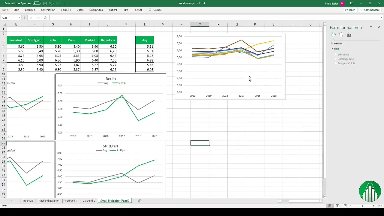
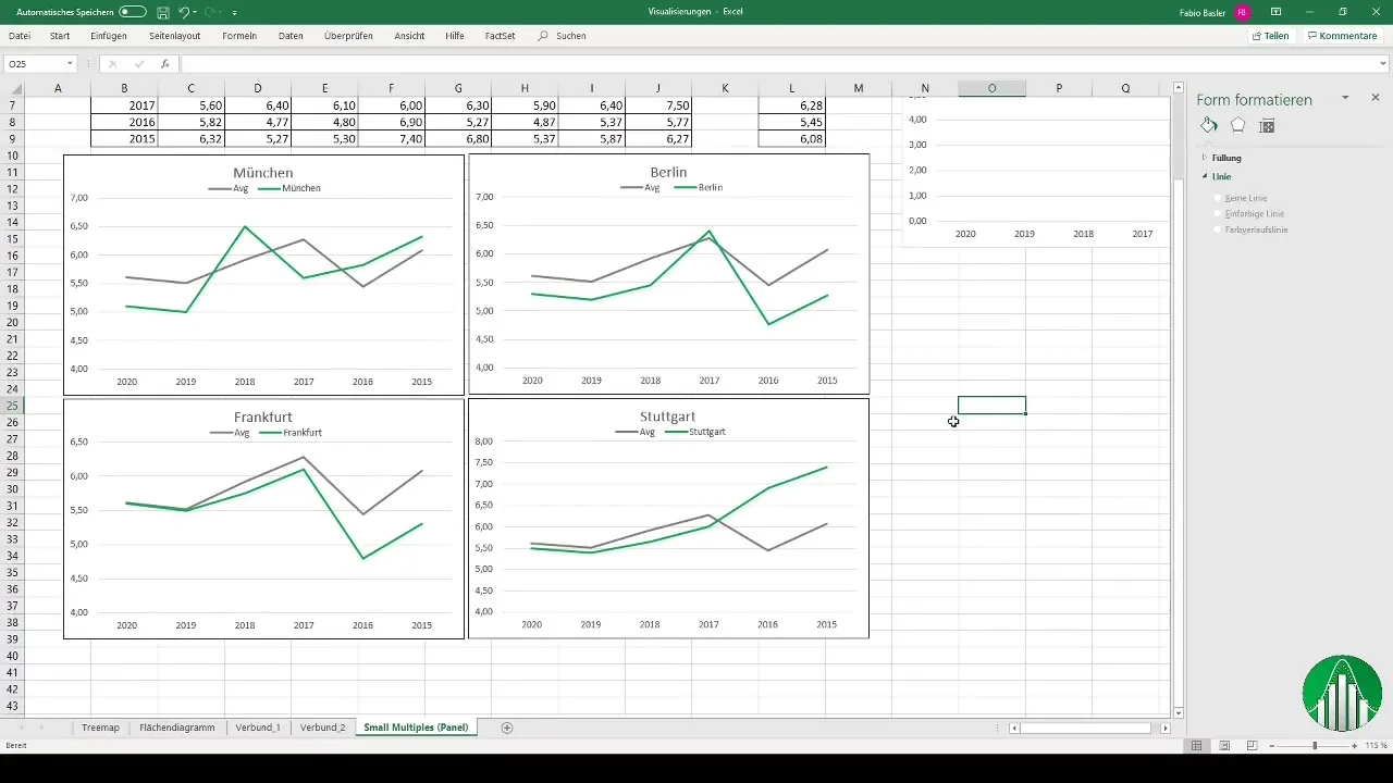
You can continue this process for all other cities you want to visualize in your chart. This way, you will have a clear collection of charts that together provide a comprehensive overview of the different locations.
7. Summarize Charts
Once you have created all panel charts, it can be helpful to summarize them in a presentation, such as in PowerPoint. You can group the charts and present them in one place to clearly convey the information.
8. Optimize the Overall Impression
A well-designed panel chart immediately makes the content more understandable. Be sure to add clear titles, legends, and labels to highlight the key points to your viewers. The use of contrasting colors can also help make differences more visible.
Summary
In this guide, you have learned what panel charts are and how to efficiently create them in Excel. By visualizing multiple datasets in separate charts, you gain valuable insights and comparisons that can be useful in controlling or other areas.
Frequently Asked Questions
What are panel charts?Panel charts are a form of data visualization that allows you to create multiple charts side by side to easily compare different datasets.
How do I calculate the average in Excel?In Excel, you can calculate the average using the function =AVERAGE(range), where you specify the data range for which the average should be calculated.
Can I easily copy panel charts?Yes, you can copy an already created chart in Excel by using Ctrl + C and then paste it with Ctrl + V to adjust the data for other cities or time periods.
Are panel charts good for PowerPoint presentations?Yes, panel charts are very effective for presentations as they represent complex data in a clear form and help the audience quickly grasp the relevant information.


