Treemaps are a useful tool for visually representing hierarchical data. In this guide, you will learn step by step how to create Treemaps in Excel and visually present your data. This type of diagram helps you to quickly identify patterns and proportions within your data.
Main Insights
- Treemaps are ideal for representing hierarchical data and proportions.
- You can customize the colors and formatting of the Treemap to visually represent your data attractively.
- Interactive features allow you to navigate between different levels of hierarchy.
Step-by-Step Guide
Create Treemap Diagram
First, you want to create a Treemap. You have two examples available to help you with this task. In the first example, we work with data from different countries and their index numbers. Simply highlight your data.
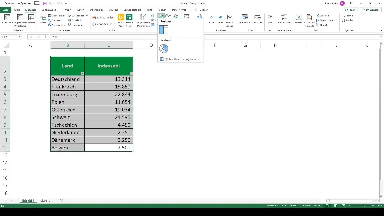
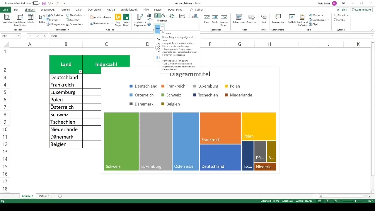
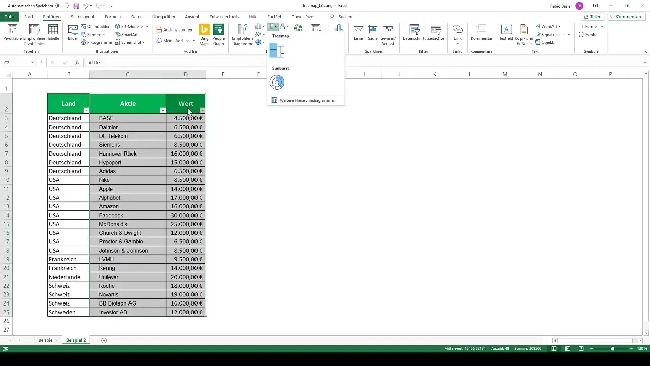
In the Excel ribbon, you will find the option to insert a Treemap diagram. To do this, go to "Insert" and choose the Treemap selection.
Adjust Diagram
Once inserted, you can give the diagram a title or remove it to get a clearer view. You can also customize or remove an automatically displayed legend.
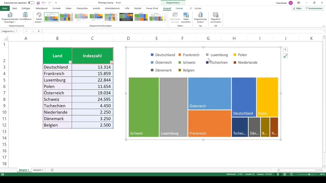
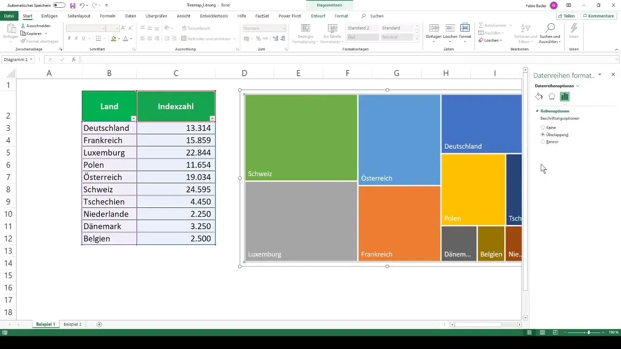
You will now see a beautiful representation of the sizes of countries and their index numbers. A right-click on the diagram allows you to make various formatting adjustments.
Visualize More Complex Data
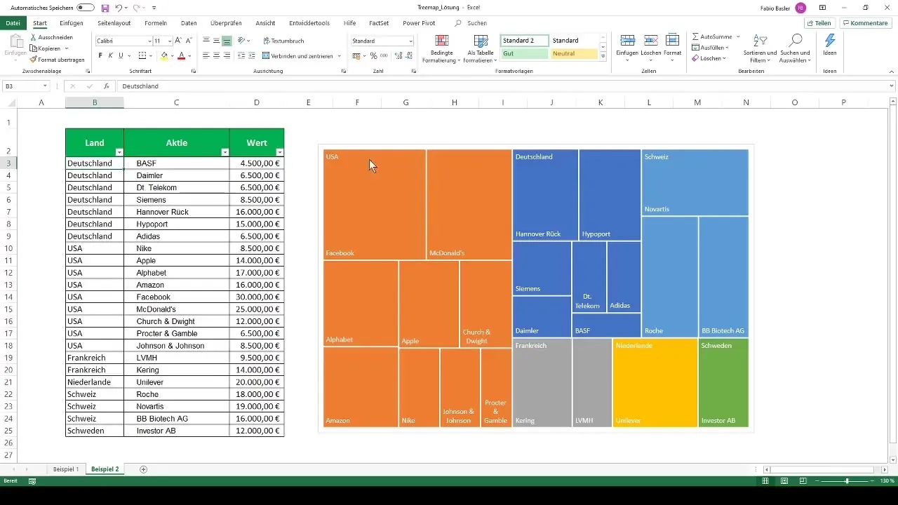
In the second example, we have more complex information available. These represent the data of a private investor investing in the stock market. The relevant data include the respective securities and their location.
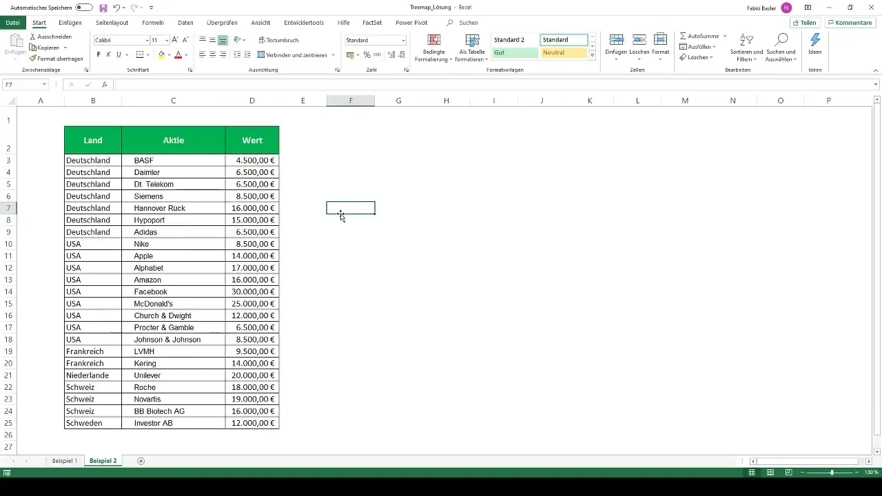
Highlight your data here as well and go to "Insert" in the menu again to insert the Treemap diagram.
Further Customize the Diagram
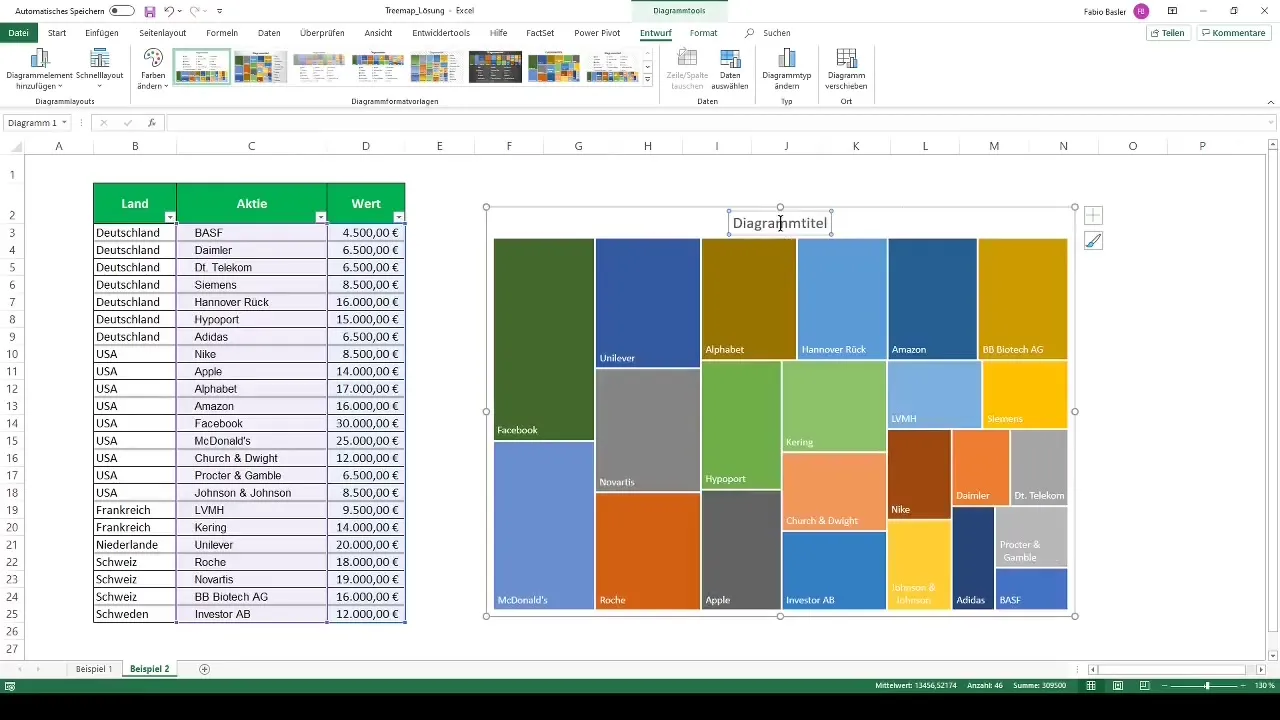
Here, we also want to customize the diagram by removing the legend labels to make more space for the data. Additionally, we want to omit the diagram title.
A useful step is to add horizontal axis labels. To do this, right-click again and select "Select Data." Here you can add country information to the securities.
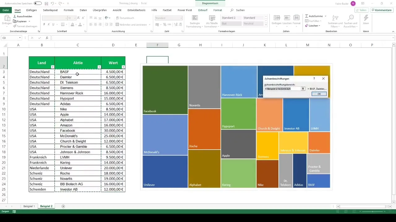
You will notice that Excel colors the fields accordingly, giving you a clear view of the allocation of companies to their countries. Hovering over the fields with the cursor will also display the respective values, making the analysis easier.
Customize and Finalize the Diagram
Just like in the first example, you have the option here to choose different visualization options. Changing the color palette can help make your data clearer and more appealing.
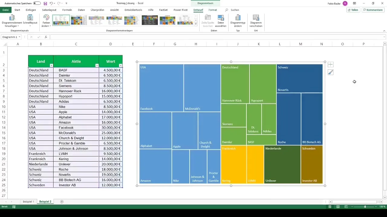
After all adjustments have been made, you will see your Treemap in its final form. This representation offers you an interesting overview of your data, with interactive functions that allow you to navigate within the hierarchy.
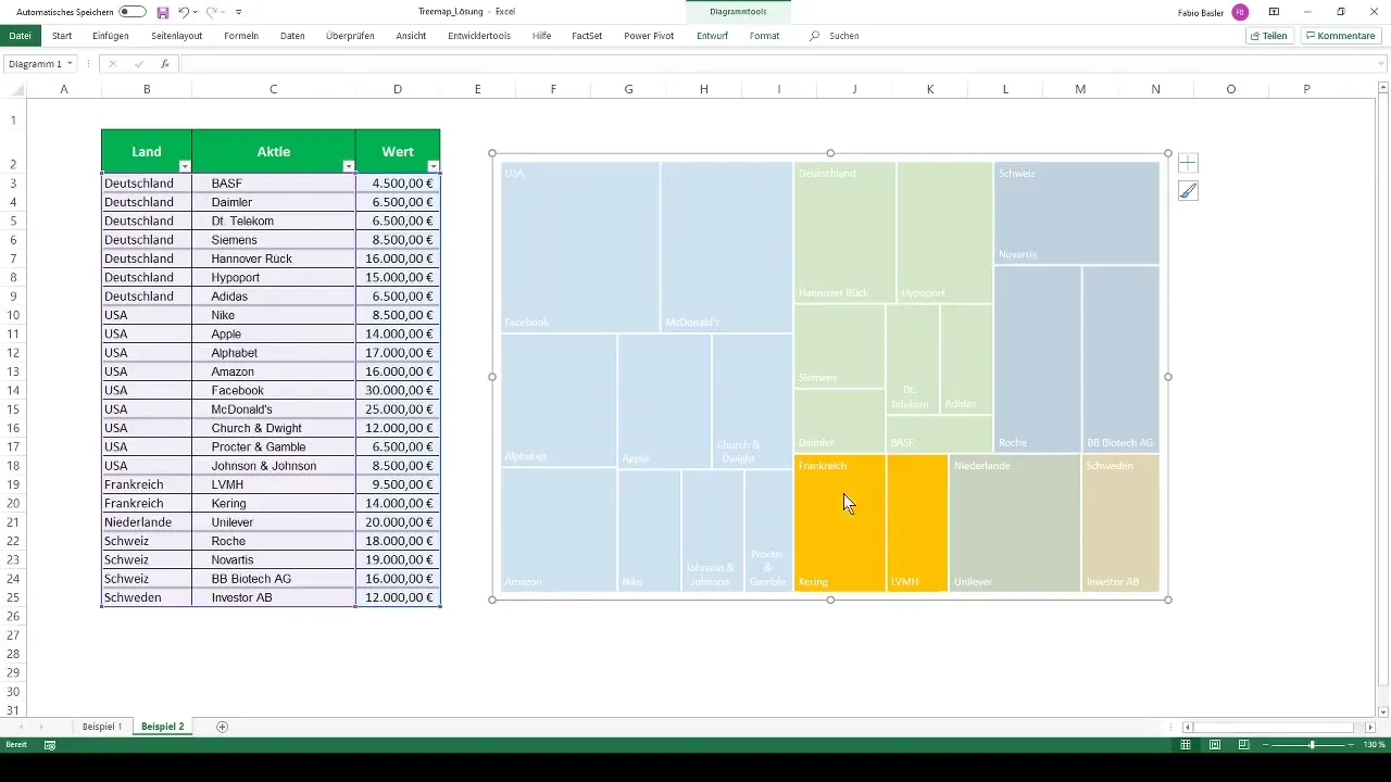
By simply clicking on the higher-level, you can open the next lower-level. A double-click will take you back to the main overview.
Summary
Treemaps provide you with a visual method to represent hierarchical data. In this guide, you have learned how to generate and customize your own Treemaps from your data. From changing colors to interactive navigation between hierarchies, you can now effectively visualize your data.
Frequently Asked Questions
What is a Treemap?A Treemap is a graphical representation of hierarchical data that visualizes sizes and patterns.
How do I create a Treemap chart in Excel?Select your data, go to "Insert" and choose Treemap from the list of chart types.
Can I customize the colors and formatting of the Treemap?Yes, you can change the colors and select various formatting options from the menu.
How can I navigate between different hierarchies in a Treemap?By simply clicking on the individual fields, you can switch to the underlying hierarchy and go back by double-clicking.


