Funnel diagrams are a sophisticated method for representing values across multiple stages of a process. Especially in sales or marketing analyses, you can track how many potential buyers are in the various stages of your sales pipeline. These diagrams are ideal for combining visuals with data, and you will quickly realize how easy it is to create them in Excel.
Key insights
- Funnel diagrams help visualize the reduction of values across multiple stages.
- Excel offers special functions for creating funnel diagrams, including a 3D option.
- You can easily customize the design and formatting of the diagrams to achieve the desired results.
Step-by-step guide to creating funnel diagrams in Excel
Let's start by creating a simple funnel diagram in Excel.
Create funnel diagram
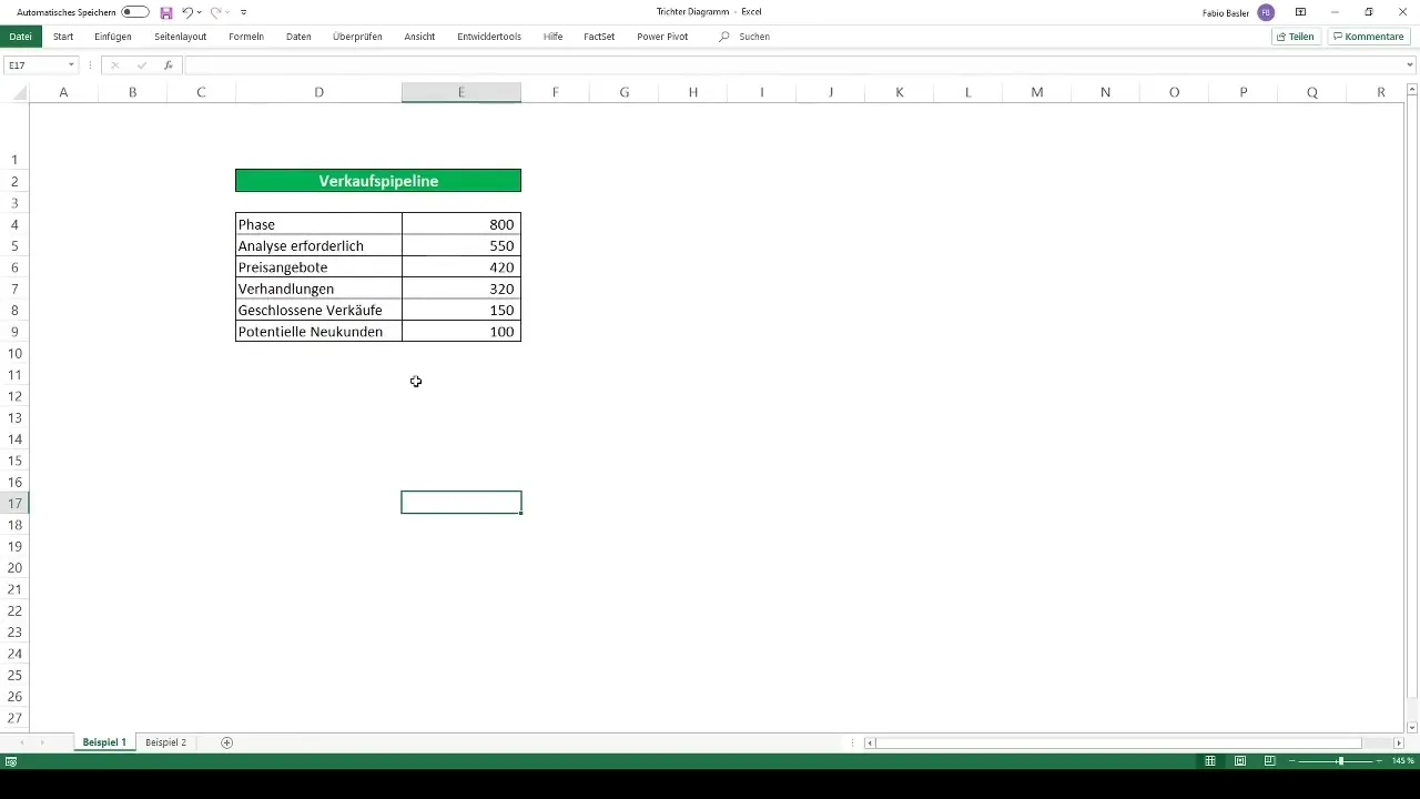
To create your first funnel diagram in Excel, open Excel first and ensure your data is in a tabular format.
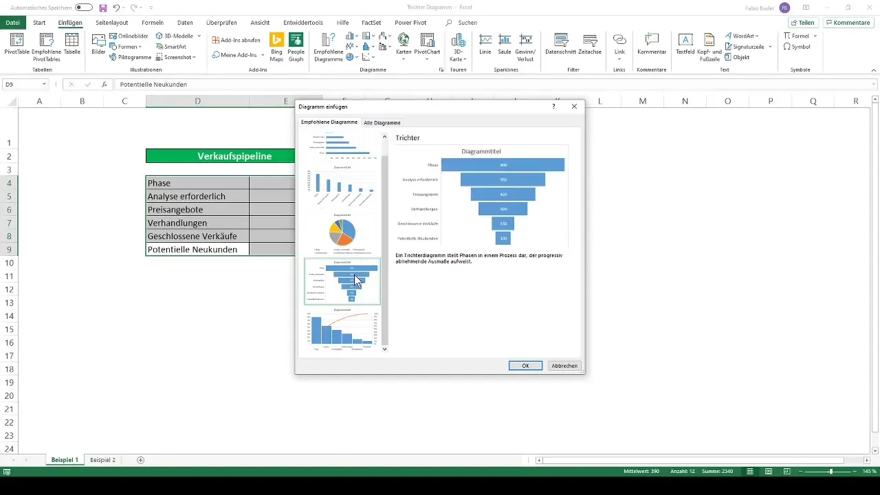
Next, navigate to "Insert" in the menu bar. There you will find the "Funnel Chart" option under the recommended charts.
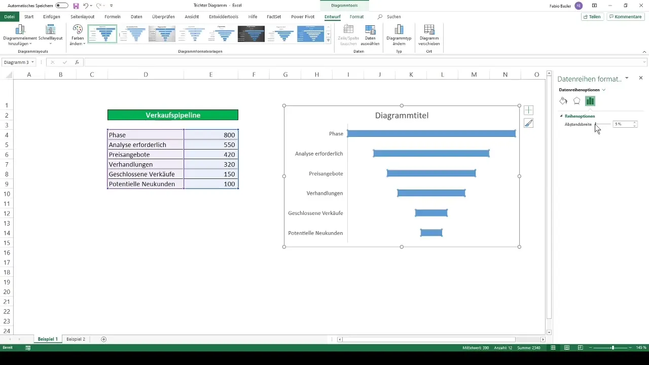
After selecting the data series, the funnel diagram will be automatically generated. Note that the values on the horizontal axis represent the process descriptions.
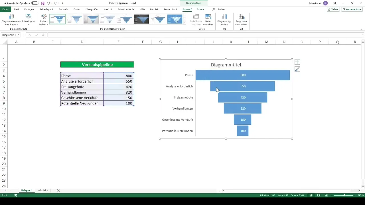
To further optimize the diagram, you can adjust the spacing of the bars. Set the width to nearly 0% to bring the bars closer together and achieve the typical funnel shape.
Create 3D funnel diagram
For a more complex example, let's create a 3D funnel diagram. Again, start by selecting the relevant numbers and use the shortcut "Ctrl + Q" to open the chart selection.
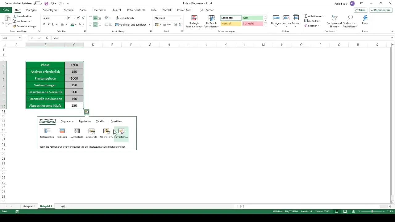
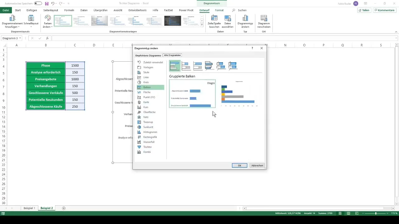
By default, a simple bar chart will be displayed. Right-click on the chart and select "Change Chart Type".
Here you will find many representations; for example, choose the option "Stacked 3D Columns".
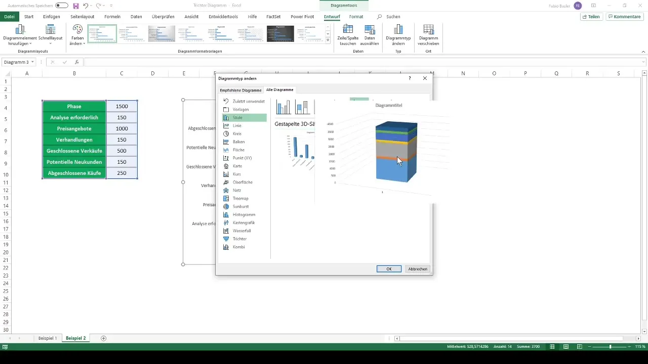
Confirm the selection in the input mask with "OK". Initially, a stacked rectangle will appear, which we will now customize.
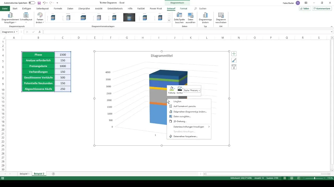
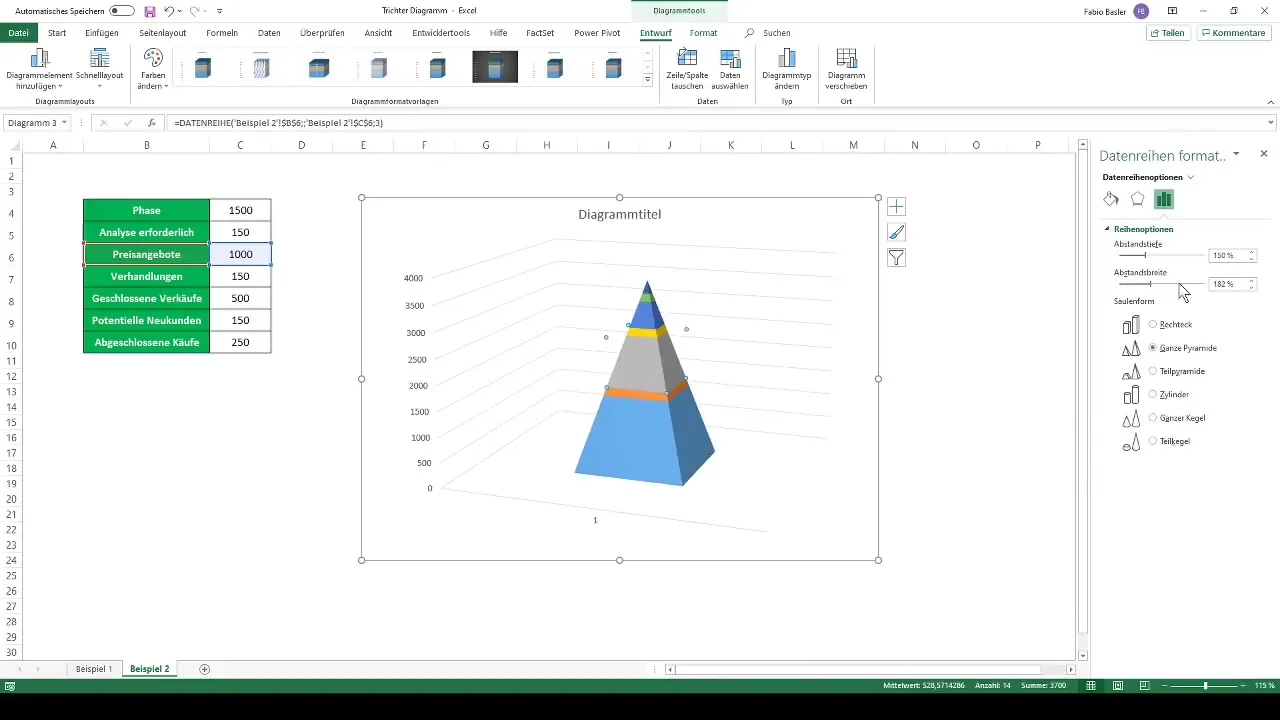
Simply click on the chart and go to "Format Data Series". Here, change the chart from a rectangle to a pyramid style.
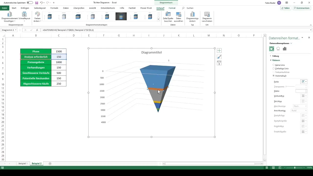
Now let's focus on the vertical axis. Click on it and go to "Axis Format". Check "Values in Reverse Order".
The diagram will re-align to reflect the typical funnel presentation. If you wish, you can hide guidelines or additional elements to clean up the design.
Remove unnecessary graphic elements, such as axes or gridlines, to give the diagram a clean look.
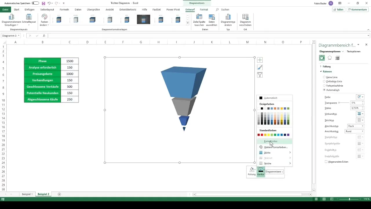
Now you can customize the diagram to your liking. For example, you can change the colors of the individual sections.
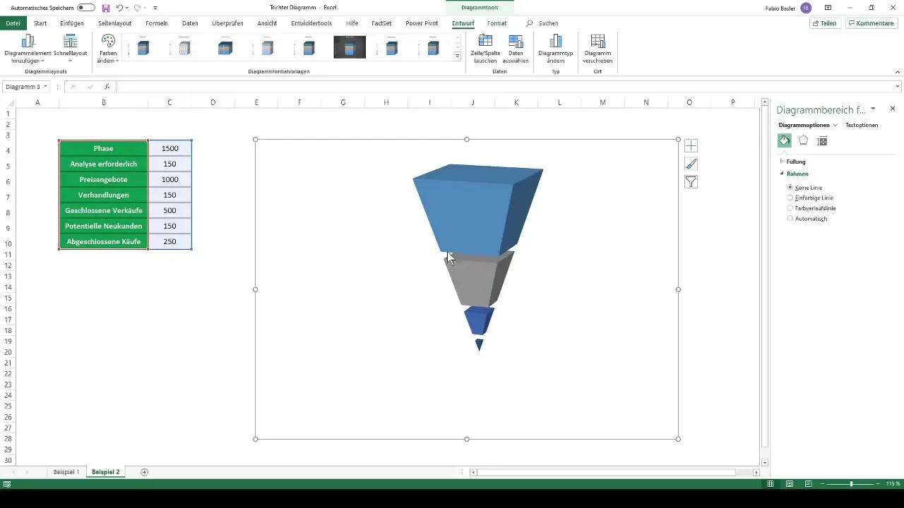
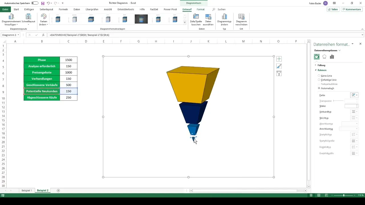
Choose an appealing color scheme, for example, the top area in orange with a black border, the second area in dark blue, and so on.
To display the final values, add data labels and ensure they are legible.
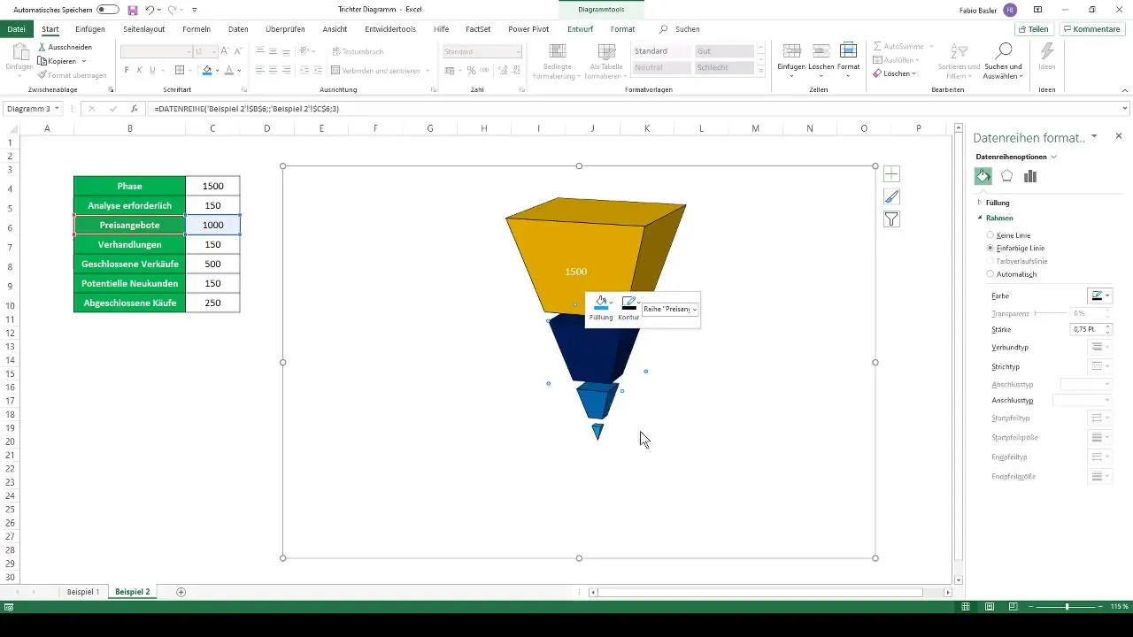
Done! You have successfully created an attractive funnel chart in Excel.
Summary
In this tutorial, you have learned how to create both simple and complex funnel charts in Excel. You have used Excel's ribbon to create charts and learned how to customize the graphic elements and colors. A visual aid for your data analysis is now in your hands!
Frequently Asked Questions
What is a funnel chart?A funnel chart visualizes values across multiple phases of a process to represent reductions.
How do I create a funnel chart in Excel?Go to "Insert", select "Funnel Chart", and follow the displayed instructions.
Can I create a 3D funnel chart in Excel?Yes, you can create a 3D funnel chart by selecting a stacked 3D bar chart and customizing it.
How can I change the colors of my chart?Click on the chart and edit the color selection in the formatting options.
How do I make data labels visible?You can add data labels by selecting the corresponding option in the chart tools.
