You want to present your data in Excel in an appealing and informative way? Sparklines are a perfect solution! These small graphics allow you to recognize trends and developments in your numbers at a glance. In this guide, I will show you how to create and customize Sparklines in Excel so that you can present your data in a visually appealing way.
Main Insights
- Sparklines are miniature charts that represent trends in data.
- They are ideal for visualizing numbers in text format.
- Creating Sparklines in Excel is easy and quick.
- Customization options allow for individual design of Sparklines.
Step-by-Step Guide
Before you start creating Sparklines, it is important to understand what they are. Sparklines are small, simple graphics placed in a cell to show trends in the specified data entries in a space-saving way. You often find these graphics on financial websites, where price movements are displayed in a compact format.
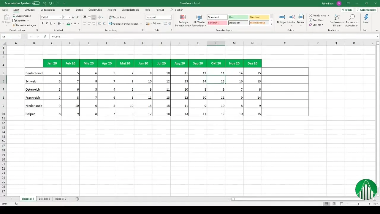
To create Sparklines, you first need a data series. You can enter fictitious numbers in an Excel table or use existing data. For example, in a scenario representing six countries over several months, the process is quite simple. Highlight the cells with the numbers, go to the menu bar, and select "Insert".
Adding Sparklines
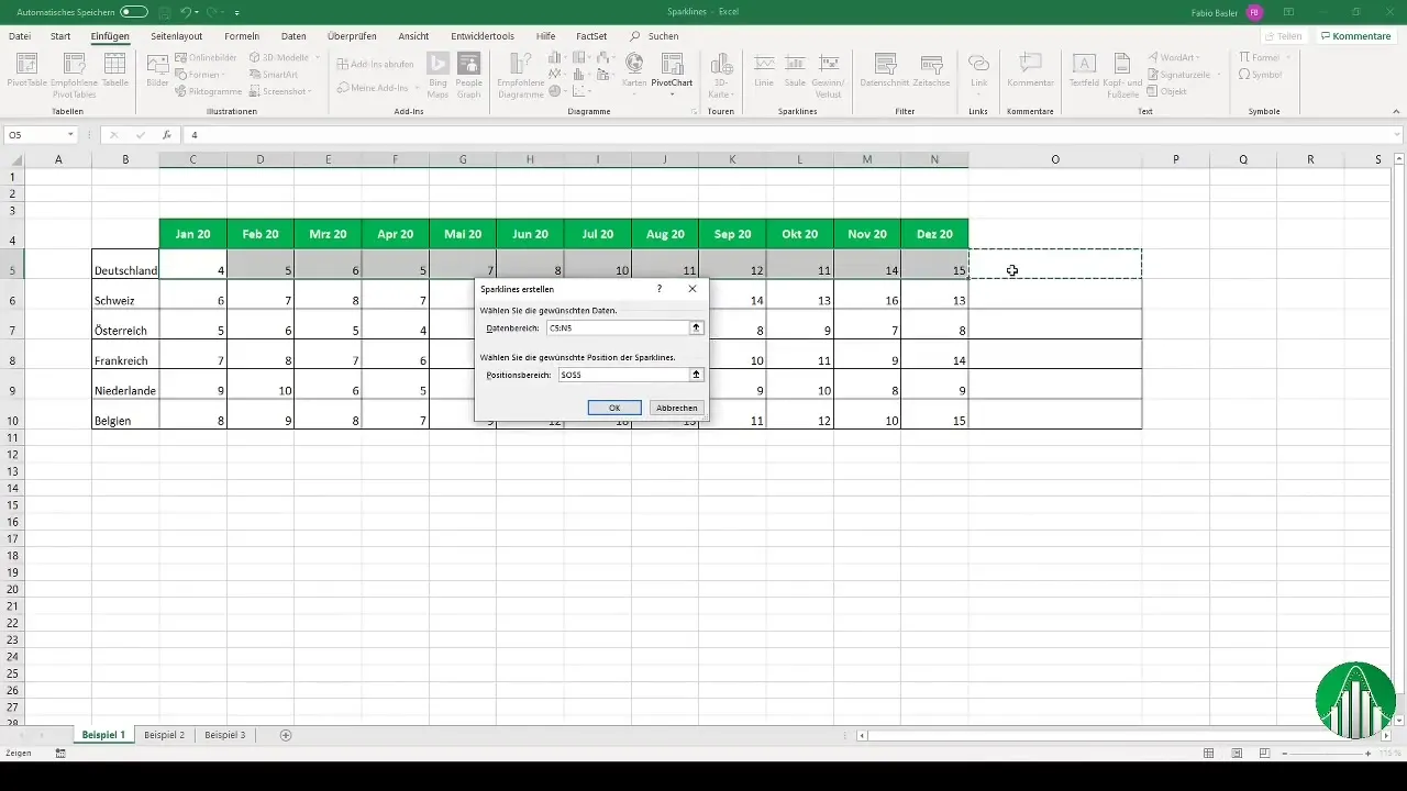
After selecting the numbers, click on "Sparklines". Here you can choose the type of Sparkline you want to create. You have the option of Line, Column, or Win/Loss Sparklines. Choose, for example, "Line Sparkline". Now you need to select the location range where the Sparkline should be displayed, and it will be output.
Once you have created your Sparklines, you can further customize them to make them more informative. Click on the Sparkline to activate the "Sparkline Tools" on the ribbon, where you will find various settings such as displaying the highest and lowest points of the data series.
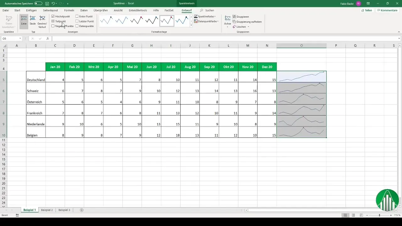
You can customize the color of the Sparklines to highlight them visually or to indicate negative values if present. The axes, such as the maximum and minimum values, can also be easily adjusted. For example, the highest value for Germany is shown as 15 and for Switzerland as 16.
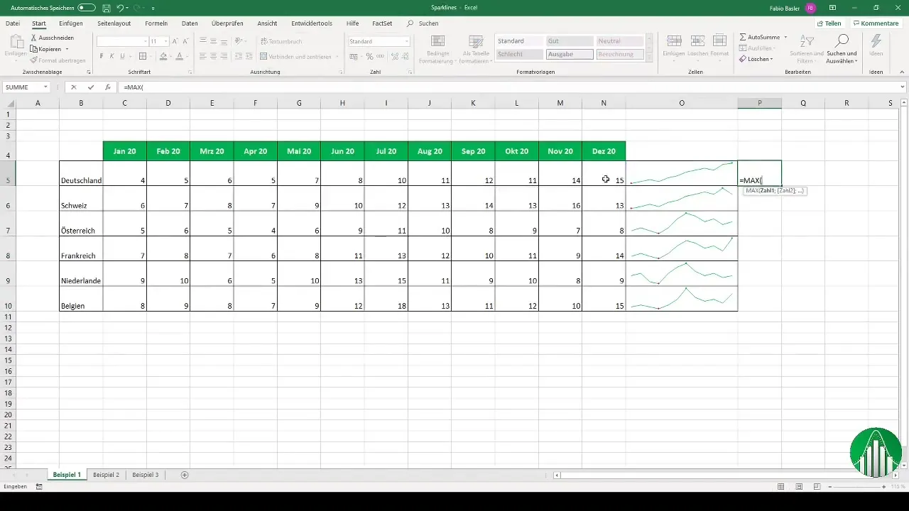
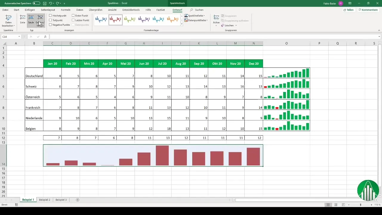
Sparklines are not the only way to visualize data. You can also represent the data as a column chart to highlight different aspects of the data – such as average values for specific periods.
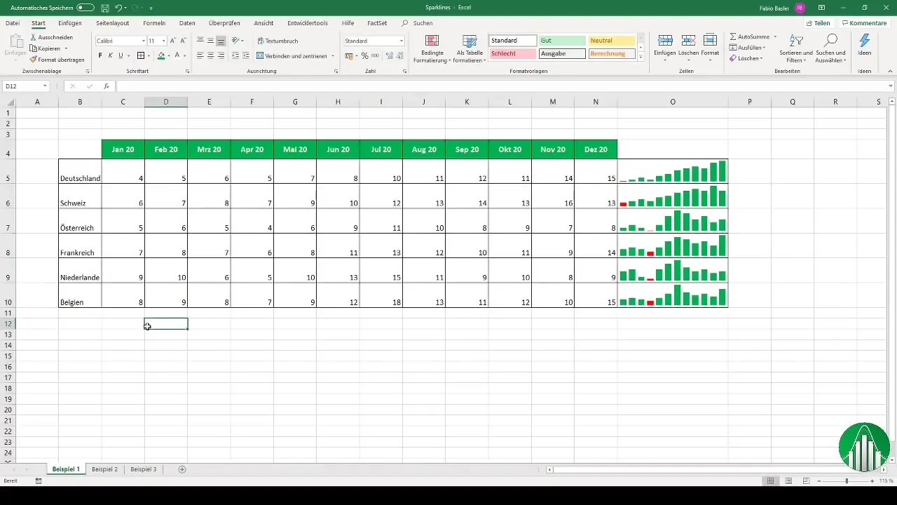
To calculate the average values for the months and visualize them in this format, go one row down, merge the cells, and center them before adding them as a column Sparkline.
In another example, you can create a profit and loss visualization. Once again, select the relevant numbers and position the Sparkline next to the data. At a glance, you can immediately see which regions were profitable and where improvements are needed.
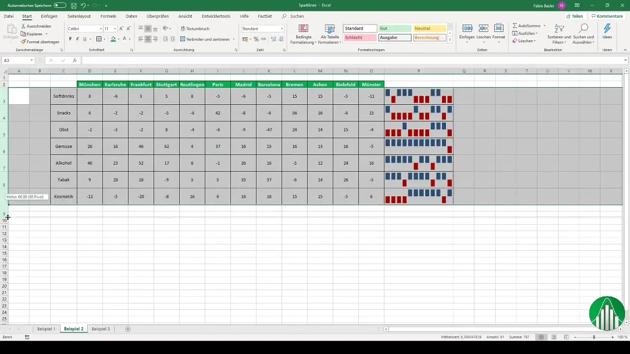
If you no longer need Sparklines, it is easy to delete them. You can either delete a specific Sparkline or the entire Sparkline group. Simply select the desired Sparkline and use the delete option.
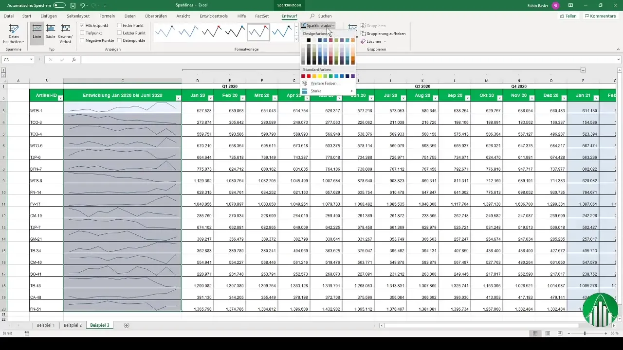
Let's move on to the next example. You can also use Sparklines for the graphical representation of consolidated data. After using sum formulas to consolidate data on a quarterly basis, you can also use Sparklines here to visually represent the values. Look at the numbers and place the Sparkline to the right of the corresponding values.
Summary
Sparklines offer a great way to present data trends in a compact and visual manner in Excel. They are quickly created and can be customized in various ways so you can adjust them to your needs. Use this powerful feature to effectively present your data!
Frequently Asked Questions
What are Sparklines?Sparklines are small charts in a cell that visualize trends in data.
How do I create a Sparkline in Excel?Select your data, go to "Insert," choose "Sparklines," then define the range of cells.
Can I customize Sparklines?Yes, you can change colors, represent the highest and lowest points, and adjust the axes.
How do I delete a Sparkline?Select the Sparkline and use the delete option to remove the graph.
How can I use Sparklines for consolidated data?Use Sparklines to make consolidated data visible by placing them next to the summarized numbers.


