Creating heatmaps in Excel is an effective method to visually represent large amounts of data. With a heatmap, you can quickly and intuitively identify significant values. This type of data visualization utilizes color codes to represent information, similar to a thermal image generated by a thermal imaging camera. In this guide, I will show you how to quickly create a heatmap with conditional formatting in Excel to present your data meaningfully.
Key Insights
- The heatmap is a useful tool for visualizing data and identifying significant values.
- Conditional formatting is the key to creating heatmaps in Excel.
- Color scales allow you to easily highlight positive and negative values.
Step-by-Step Guide to Creating a Heatmap
1. Preparing the Data
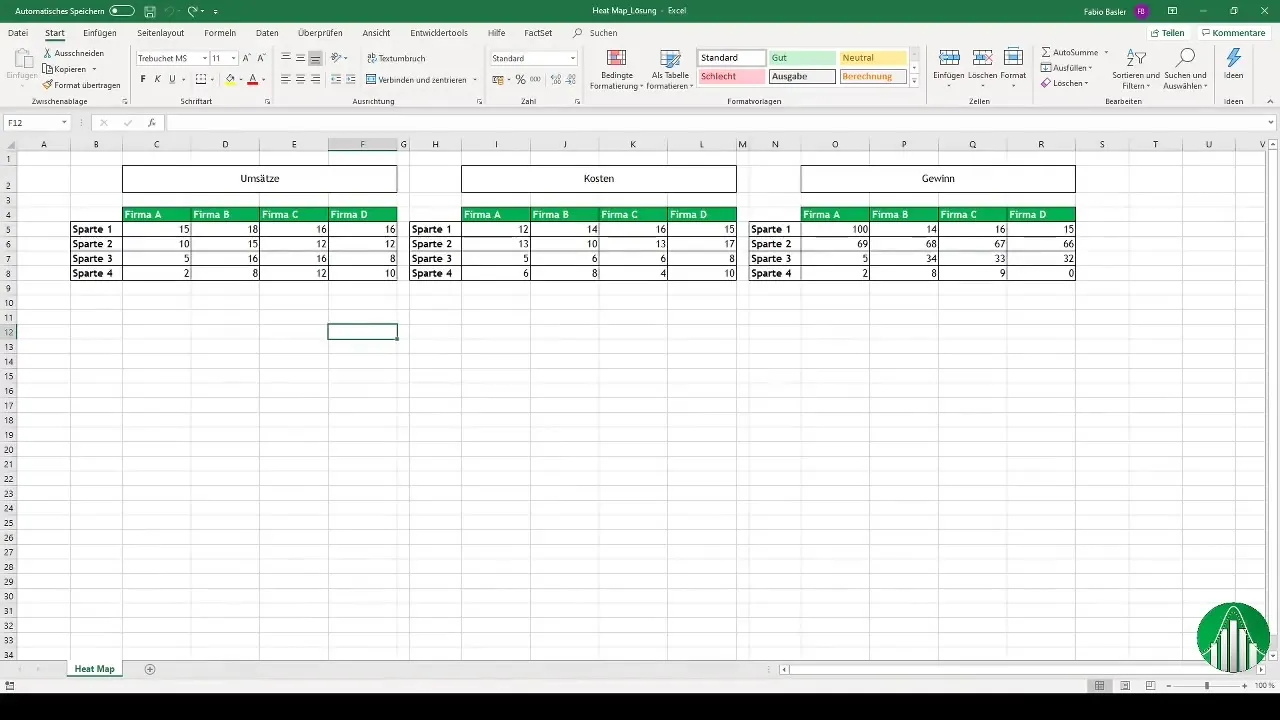
Before you begin creating the heatmap, it is important that the data in Excel is well-structured. You should arrange your data in a clear and tabular format with appropriate headings. In our example, we are working with revenue, costs, and profit numbers from four different companies (A, B, C, and D). It is helpful to organize the numbers in adjacent cells.
2. Selecting the Data
To create the heatmap, select the range of cells that you want to highlight. This typically includes all cells with the respective values for revenue, costs, and profit. Make sure to select the entire range that should be included in the heatmap.
3. Choosing Conditional Formatting
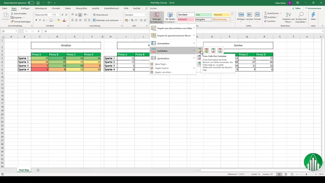
Navigate to the conditional formatting options in Excel. You can find these in the "Home" tab. Click on "Conditional Formatting" and choose the "Color Scales" option. Here, you can select different color gradients to visually represent your data. For revenue values, for example, you can choose the green-yellow-red color scale, where green represents higher values and red represents lower values.
4. Applying the Color Scale
Once you have chosen the desired color scale, click "OK". Excel will now color the selected cells according to the numbers. Higher revenue values will appear in an intense green, while lower values will be shaded in red. This allows for a clear visual distinction between positive and negative values.
5. Creating a Heatmap for Cost View
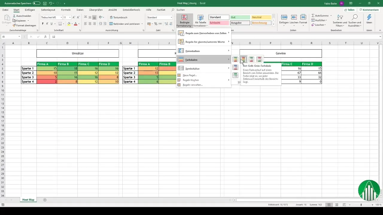
For the cost values, you will follow a similar process, but with reversed colors. Again, select the range of cells with the costs and apply the red-yellow-green color scale. In this case, higher costs should appear in intense red, making critical values quickly recognizable.
6. Calculating and Visualizing Profit
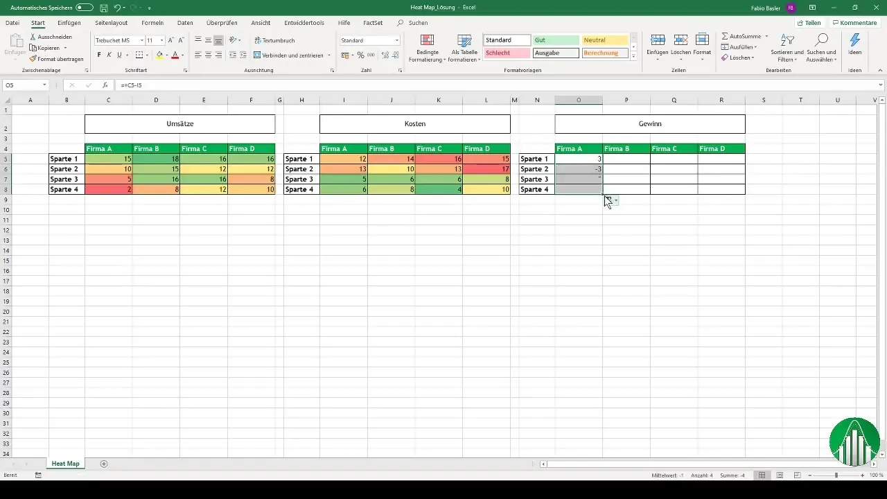
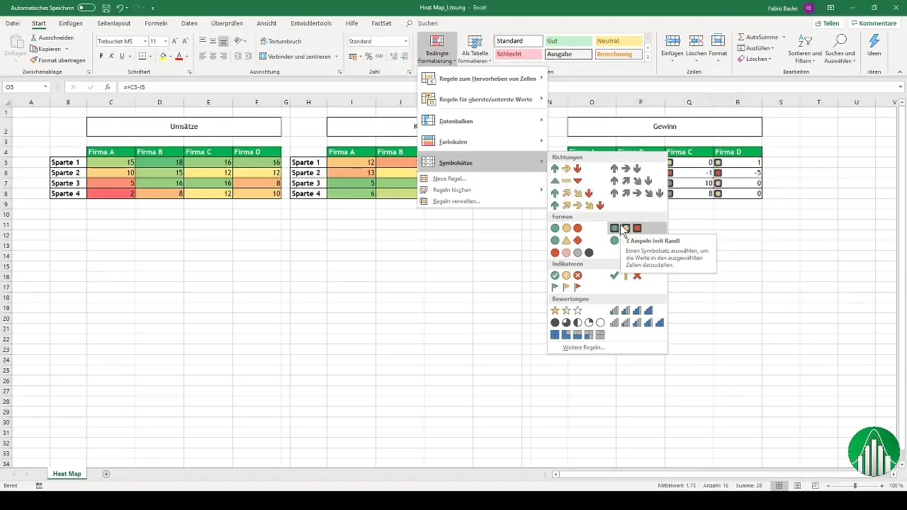
To visualize profit, you can perform a simple calculation: revenue minus costs. Once you have calculated the profit numbers, you should also create a heatmap here. For example, you can use a traffic light formatting to clearly identify positive and negative profits. This enhances the understanding of the financial situation of the companies at a glance.
7. Finalizing and Customizing the Presentation
Additionally, you can further refine your heatmap. Consider whether you want to use specific color choices or traffic light sets to make the data more meaningful. Excel allows you to insert shapes or symbols like arrows or stars to highlight special values. These customizations help you present the information more clearly and use it in presentations or dashboards.
Summary
In this step-by-step guide, you have learned how to create a heatmap in Excel. Using conditional formatting allows you to visually and intuitively represent data. With color coding, you can visually represent both positive and negative values, which is particularly valuable in areas such as controlling and management.
Frequently Asked Questions
How do I create a heatmap in Excel?By selecting conditional formatting and applying a color scale to the desired cells.
What is the advantage of a heatmap?It allows for quick and intuitive visualization of large amounts of data and identification of significant values.
Can I use other forms of visualization as well?Yes, you can use shapes or symbols like stars and arrows to highlight special values.


