In this tutorial, you will learn how to create a dynamic status indicator in Excel. This visualization technique enables you to quickly overview different values and customize them through a simple user interface. You will see how to create an appealing chart with a few steps that can easily adapt to various data. Let's get started!
Key Takeaways
- You can use an XY chart in Excel to create a dynamic status indicator.
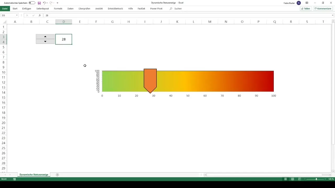
- The indicator is shown by a cursor that can be moved within a defined range.
- Excel allows easy formatting and customization of the chart to visually represent different value ranges.
Step-by-Step Guide
Step 1: Create Worksheet
First, open a new worksheet in Excel. You can do this by using the shortcut Alt + F1 or Shift + F11. This will give you a blank area where you can design your status indicator.

Step 2: Remove Gridlines
To enhance the visualization, remove the gridlines. Click on the "View" tab in the ribbon and uncheck the "Gridlines" option. This will provide a clearer representation of your chart once it's finished.
Step 3: Define Cell for Value
Select an empty cell where you want to set the dynamic value. For example, you can use cell A1. Start by entering a value there, such as 50. To highlight the cell, you can add a nice border.
Step 4: Insert XY Chart
To create the chart, go to the "Insert" tab and select the XY Scatter chart. Choose a simple scatter plot that suits comparing groups of values. This is crucial for visualizing your status indicator later on.
Step 5: Add Data Series
In the next step, add a new data series. Click on "Select Data" and add a new entry for the X values. Set the X value to 50, which you defined in the cell, and confirm your input.
Step 6: Add Cursor
To complete your status indicator, add a cursor. You can do this by clicking on "Shapes" in the "Insert" tab. Choose a shape like an arrow or a triangle, and place it in the right position on the chart. You can customize the color and shape according to your preference.
Step 7: Remove Chart Title and Gridlines
To further improve the display, delete the chart title and gridlines. Right-click on the respective elements and select "Delete". This will give your chart a clean look.
Step 8: Set Gradient for Value Range
Click on the drawing area of your chart. Right-click on it and select "Format Plot Area" to choose fill options. Add a gradient that ranges from green (0) to orange (50) to red (100). This helps differentiate the different values visually.
Step 9: Format Axes
Right-click on the horizontal (x-) axis and select "Format Axis". Set the maximum value to 100 so that the chart covers the entire value range. This will make your dynamic status indicator even clearer.
Step 10: Add Dropdown for Value Input
You can add a dropdown for value input to simplify user inputs. Go to "Data" and then "Data Validation" to create a list of values from 0 to 100. This provides a user-friendly input option.
Step 11: Use Developer Tools for Better Control
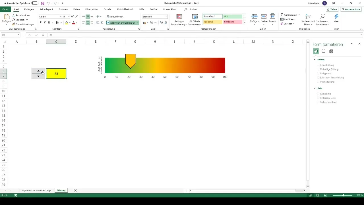
If not already enabled, activate the Developer Tools. Add a spinner that can easily adjust values. Position the control next to the cell with your dynamic value and set it up so you can increase or decrease values by 1%.
Step 12: Finalization and Testing
Now, you can test your chart. Enter different values or use the spinner and observe how the cursor dynamically moves on the chart. This gives you immediate feedback on the set values, allowing you to see how they relate to each other.

Summary - Creating Dynamic Status Indicator in Excel
You now have a complete guide on how to create a dynamic status indicator in Excel. With a few steps and adjustments, you will be able to create an informative and appealing chart that dynamically adjusts to your data. It makes visualizing values particularly user-friendly.

Frequently Asked Questions
How can I customize the chart?You can select different options and customize elements like colors, shapes, and additional information.
What do I do if I don't see the Developer tab?Enable the Developer tab in Excel options under the Customize Ribbon section.
How can I resize the chart?Simply click on the corners of the chart and drag them to resize.
Do I need to reset the chart every time I make a change?No, the chart is dynamic and updates automatically with changes in the linked cells.
Can I insert additional text into the chart?Yes, you can add text boxes via inserting shapes.


