Visualization of data is crucial to make complex information easily understandable. A Sunburst diagram is ideal for representing hierarchical data. It allows you to see the structure and relationships of different levels at a glance. In this tutorial, you will learn how to create a Sunburst diagram in Excel and present your data in a clear way.
Key Takeaways
- Sunburst diagrams are particularly well-suited for hierarchical data.
- They show relationships between different categories in the form of concentric circles.
- Creating them in Excel is fairly straightforward and requires only a few steps.
Step-by-Step Guide
Understanding Hierarchical Data
Before you start creating the diagram, you should develop an understanding of the hierarchical data you want to visualize. Sunburst diagrams show data as concentric circles, with the inner circle representing the top level. All subsequent circles represent subcategories.
Example 1: Visualizing Sales Figures
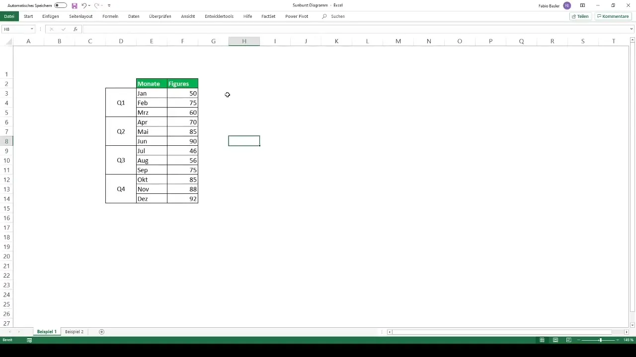
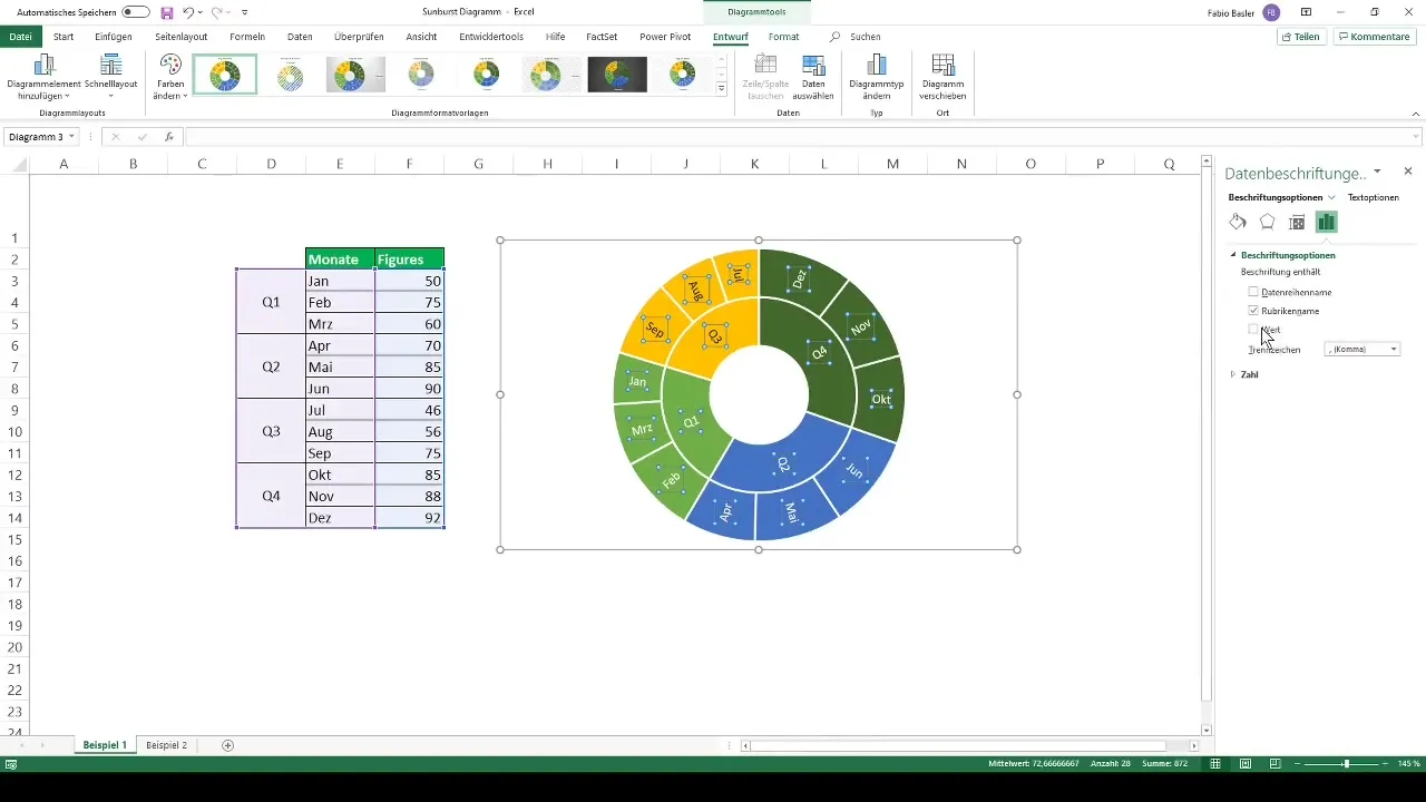
Let's say you have data on a company's sales figures at the monthly and quarterly level. First, you should enter the relevant data into Excel and structure it well. You can do this by creating a table listing the months and quarters.
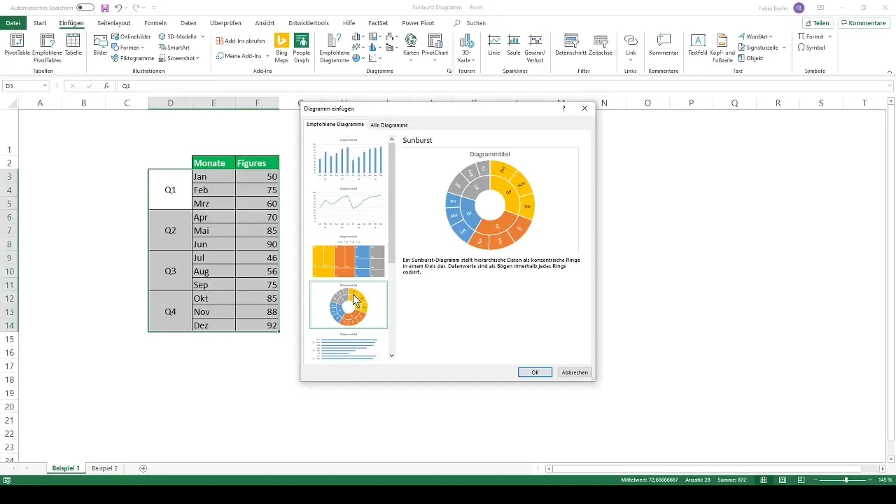
To create the diagram, select all relevant data and press Ctrl + Q. Then go to the chart menu and choose the recommended chart. Click on the Sunburst diagram to create it. Excel will automatically convert the hierarchical data and generate the diagram for you.
Customizing the Diagram
After creating the diagram, you can make various adjustments. For example, you can change the colors by selecting one of the predefined color palettes to make your diagram more visually appealing. You have the option to choose different colors for each ring.
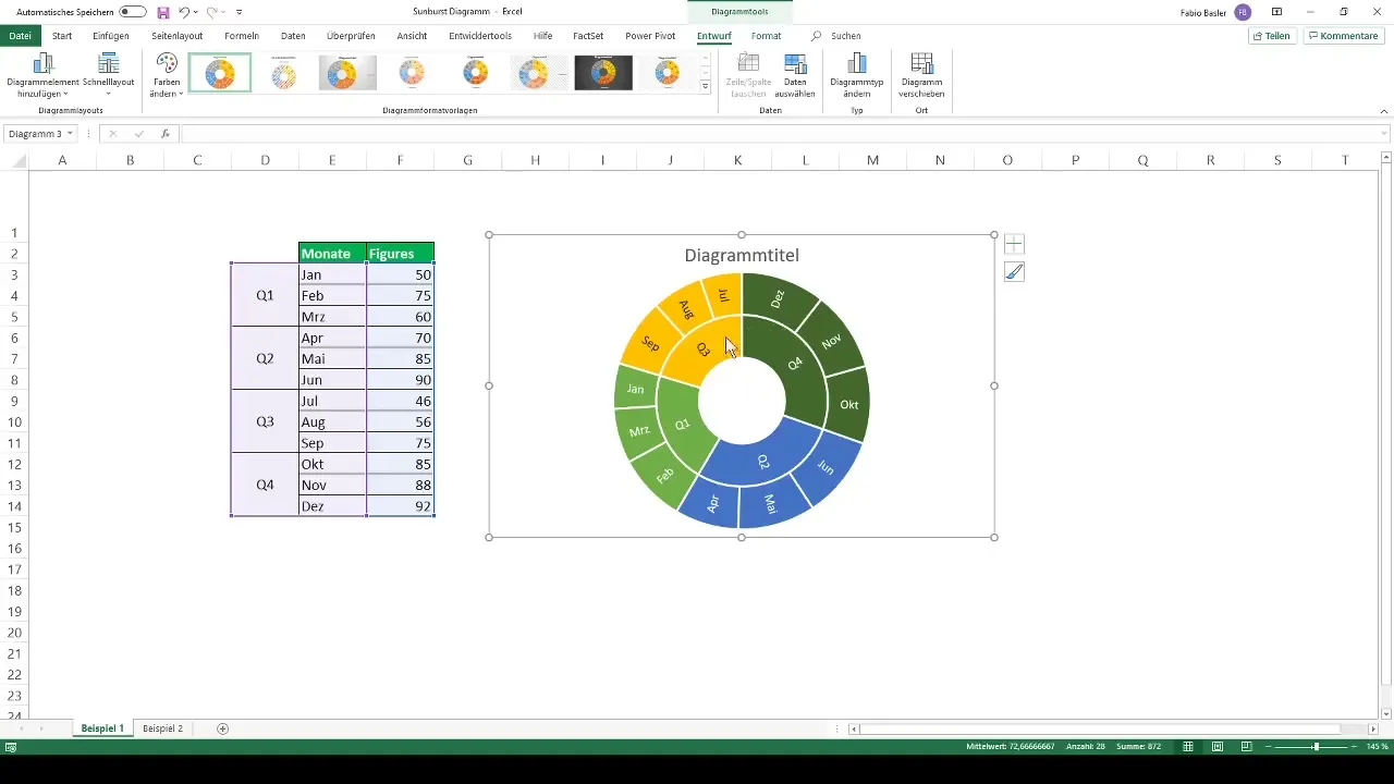
In addition, you can add a title to your diagram or format the data labels to make the information more visible. This helps make your diagram not only informative but also visually appealing.
Example 2: Analyzing Stock Portfolio
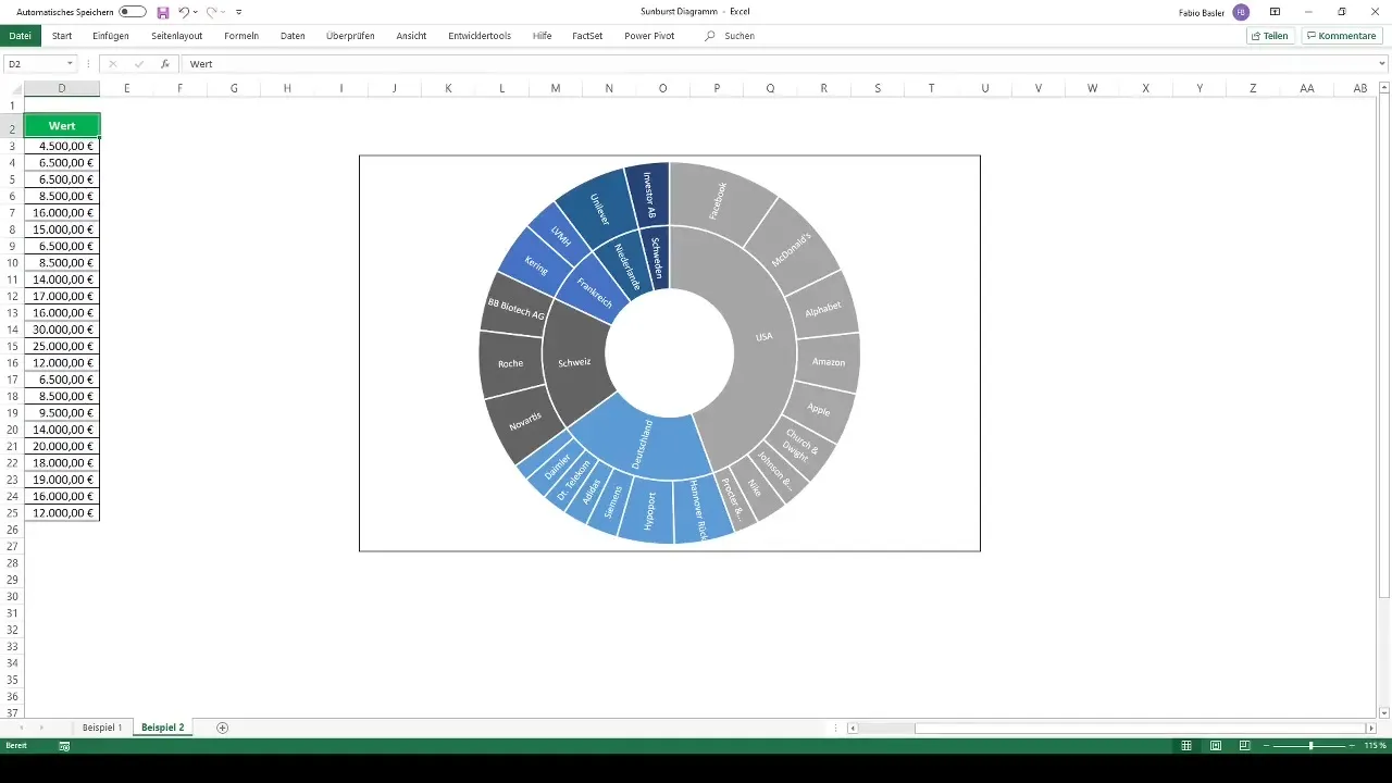
Another example of using the Sunburst diagram is visualizing a stock portfolio. Suppose a private investor holds 23 different stocks from various countries. Again, start by entering the data into Excel and structuring it based on country and portfolio value.
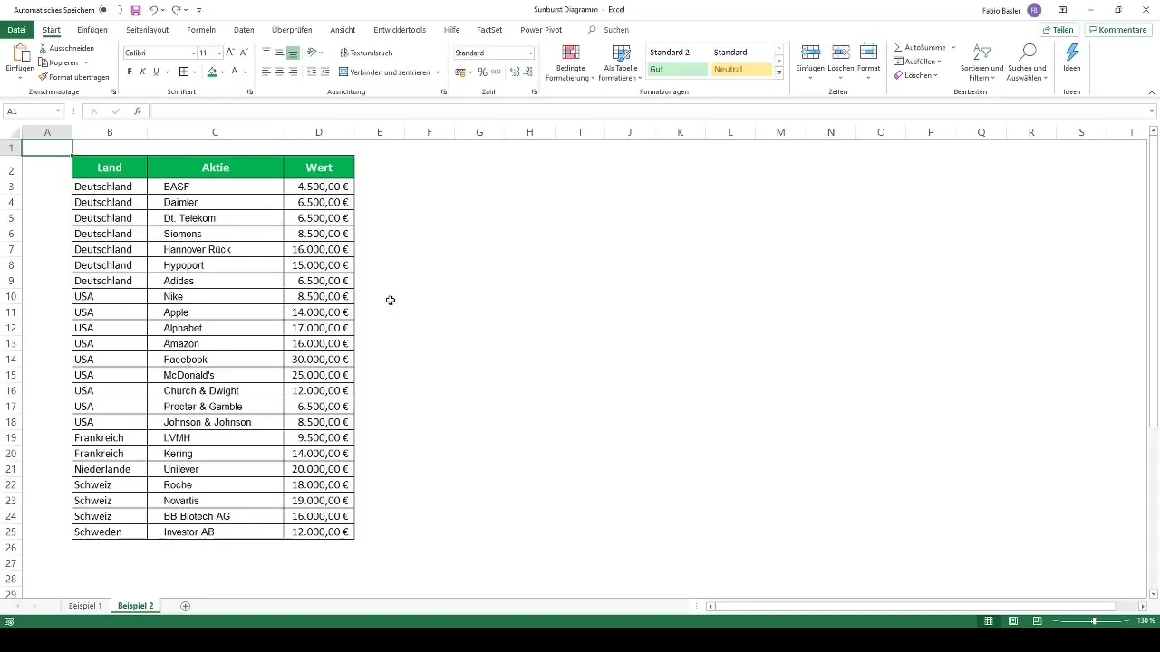
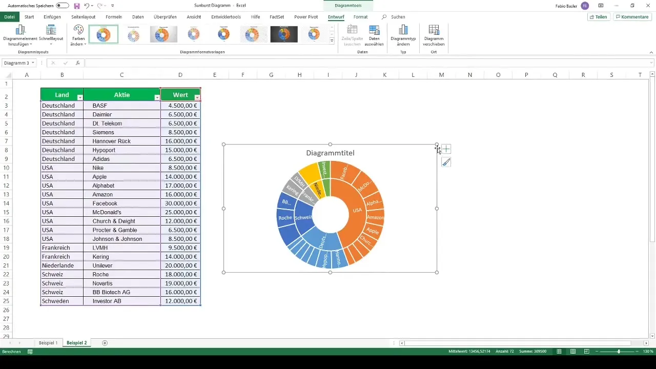
Once again, select the data and go to the recommended charts. You can choose the Sunburst diagram to get a comprehensive view of the portfolio distribution. It's interesting to see how the investments are geographically distributed.
Analysis of the Diagram
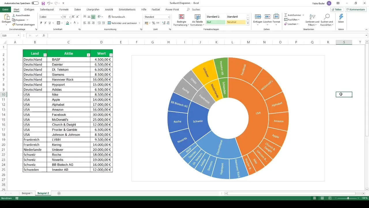
Once the diagram is created, pay attention to the distribution of individual stocks. It becomes visible that a large portion is invested in the USA, while the shares from Germany and Switzerland may appear equally significant. In particular, the number of individual stocks in the diagram can convey different information and is important for analysis.
Summary
Sunburst diagrams are an excellent way to visually represent hierarchical data. This can be easily done with Excel. You have learned how to visualize data, customize the diagram, and gain deeper insights into your data. Use this technique to present your data clearly and understandably.
Frequently Asked Questions
How do I create a Sunburst chart in Excel?Select your data, go to charts, and choose the Sunburst chart.
What kind of data is suitable for a Sunburst chart?Hierarchical data that is divided into multiple levels works great.
Can I change the colors in the Sunburst chart?Yes, you can use predefined color palettes to customize the colors to your liking.
Is a Sunburst chart suitable for every data format?Not every data format is suitable. It works best with hierarchical data.
How can I adjust the detail levels in the chart?You can format the chart and adjust the levels according to the display.
