Visualizing data is an essential element to communicate complex information clearly. Boxplots, also known as box-and-whisker plots, provide an effective method to visually display the distribution and central tendency of your data. In this tutorial, I will show you how to create Boxplots in Excel and what insights you can gather from these plots.
Key Insights
- Boxplots provide a quick overview of data distribution.
- They visualize the median, range, quartiles, and outliers.
- Boxplots are easy to create and customize in Excel.
Creating a Boxplot: Step-by-Step Guide
1. Understanding the Basics
Before we start creating Boxplots in Excel, it's important to understand the basic terms. A Boxplot includes the median, the two quartiles (1st and 3rd quartiles), as well as the data's range (maximum and minimum). These elements provide you with a clear overview of your data distribution.
2. Calculating Metrics
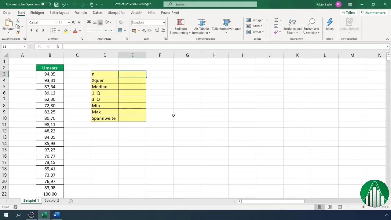
To create these Boxplots, we need some metrics. Let's say you have a series of sales data. First, you should record the number of observations and calculate the mean. In Excel, you can use the formula =COUNT(A1:A170) to count the number and =AVERAGE(A1:A170) to calculate the mean.
3. Determining Range and Median
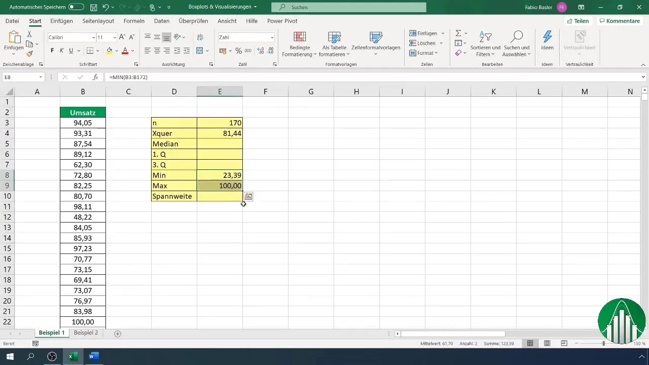
Next, you can determine the range. The maximum and minimum data points help you calculate this range. You can also determine these values using functions like =MAX(A1:A170) and =MIN(A1:A170) in Excel. The median can be calculated using =MEDIAN(A1:A170).
4. Calculating Quartiles
The quartiles are crucial for creating Boxplots. To calculate the first and third quartiles, you can use the quantile functions: =QUARTILE(A1:A170, 0.25) for the first quartile and =QUARTILE(A1:A170, 0.75) for the third quartile. These functions provide important values to understand the structure of your data.

5. Creating the Boxplot
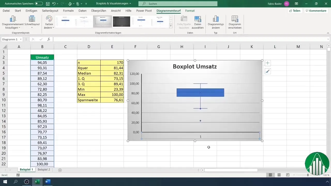
Once you've calculated all the necessary metrics, select the relevant data and go to "Insert Chart" in Excel. There you will find the option for Boxplots. Select it, and your chart will be created.
6. Customizing the Chart
To make the chart more user-friendly, you can delete the x-axis and customize the axis formats. This helps you create more space for the data and enlarge the chart overall. Ensure that the minimum and maximum are correctly set.
7. Adding Data Labels
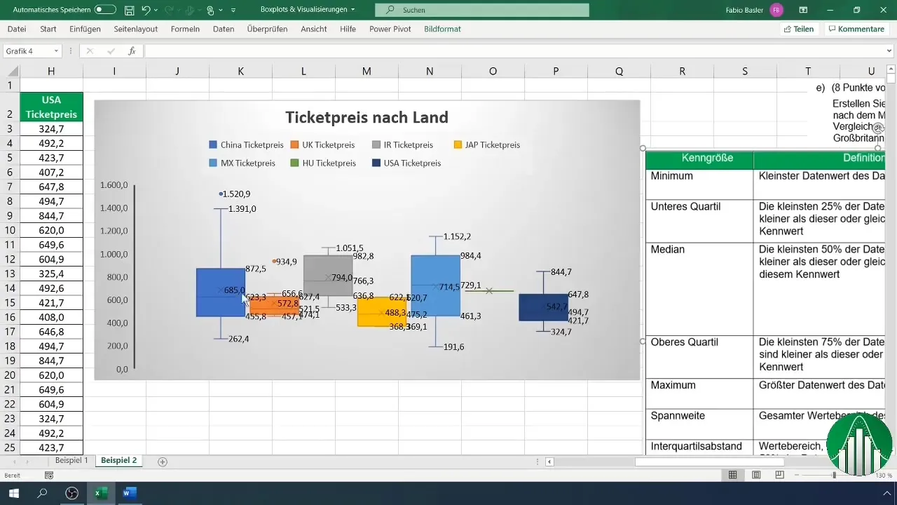
An important addition is data labels. You can add these directly to the chart to highlight key points such as the median, quartiles, and outliers clearly.
8. Interpreting the Results
Now that you have created your Boxplot, it's time to interpret the visualization. Pay attention to the different quartiles, mean, and range. Also, analyze the outliers, which may indicate interesting patterns or errors in the data.
9. Comparing Multiple Boxplots
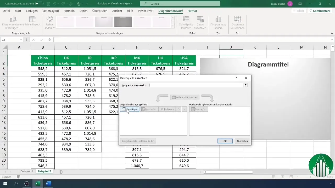
You can also create multiple Boxplots in one chart to compare different datasets. Add the data for various groups and generate a comprehensive comparison. This way, you can analyze the data distribution for different categories, such as ticket prices for different countries.
10. Drawing Conclusions
The final analysis covers all visualized data. Create a table listing all relevant metrics and use it to interpret your box plots. This structured approach will help you maximize the full potential of the box plots.
Summary
Box plots are a powerful tool for visualizing data distributions in Excel. By considering medians, quartiles, and ranges, you gain valuable insights into your data. You have learned how to calculate the necessary metrics, create box plots, and customize them to conduct meaningful analyses.
Frequently Asked Questions
What is a box plot?A box plot is a diagram that represents the distribution of data through its quartiles and the median.
How do I create a box plot in Excel?Select your data and go to "Insert Chart" to choose the option for box plots.
What does a box plot show?A box plot shows the median, range, quartiles, and possible outliers in your data.
How do I interpret the values in a box plot?The box plot represents the median, first and third quartile, as well as the range, helping you understand the distribution and variability of your data.
Why are box plots useful?Box plots allow for a quick and clear visualization of data distribution and aid in identifying outliers.


