Tacho diagrams are practical visualization tools commonly used in controlling. They allow you to grasp important key figures at a glance, especially in the form of dashboards or visualization cockpits. In this tutorial, I'll show you how to create a Tacho diagram in Excel, step by step. You'll learn what data you need, how to format the diagram, and how to make it dynamic.
Main Insights
- You can create a Tacho diagram in Excel by combining a ring diagram and a pie chart.
- A drop-down list enables the dynamic selection of percentages.
- You'll learn how to customize the design and correctly display the tachometer needle.
Step-by-Step Guide
Prepare the Basic Data
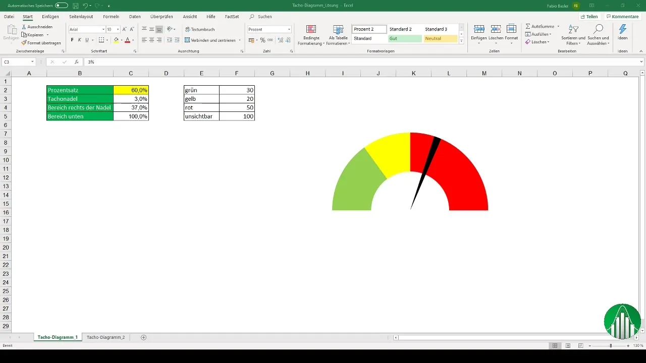
To create a Tacho diagram, you first need appropriate data. Start by creating an Excel document where you list various percentages for visualization. For example, you can list 10%, 20%, ..., up to 100% in one column. Consider entering these values in steps of 10%.
Set Up a Dropdown List for Value Selection
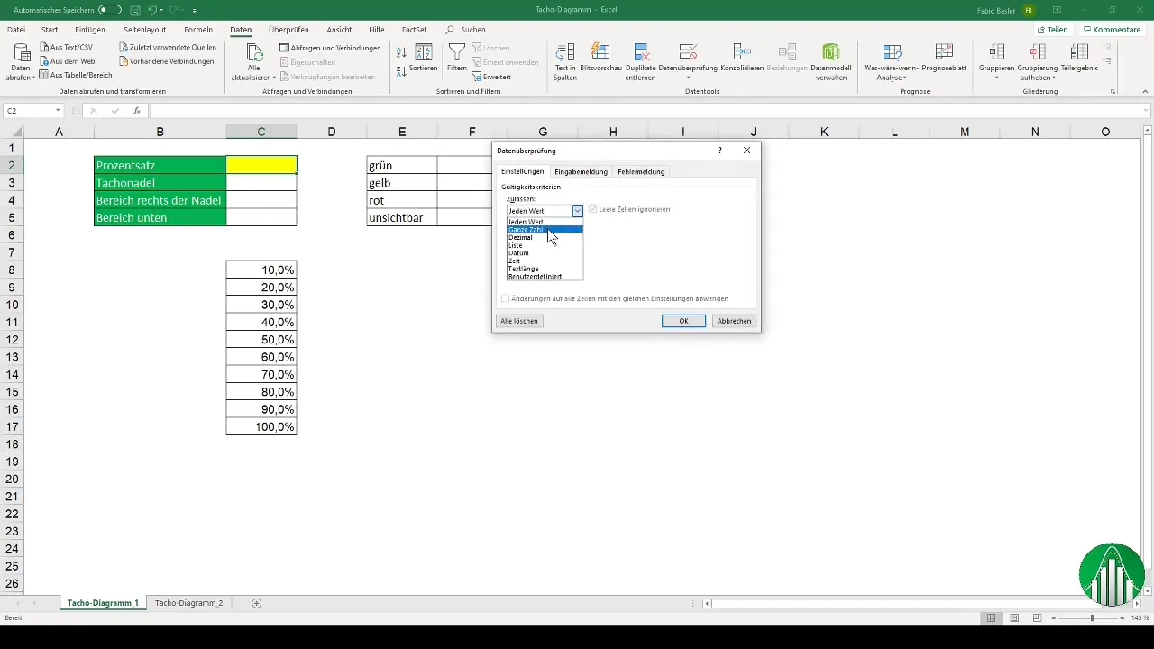
Once you have your base values, you need to set up a dropdown field. Go to "Data" and select "Data Validation." Click on "List" and enter the range where your percentages are listed as the source. This allows you to select different values with a click.
Create Auxiliary Data for the Diagram
For the Tacho diagram, you also need auxiliary data to support the base values. It is important to note that the tachometer needle moves within a specific range. Define the stationary part of your diagram, in this case, 100%. Next, specify the specific percentage that the needle should display.

Create a Ring Diagram
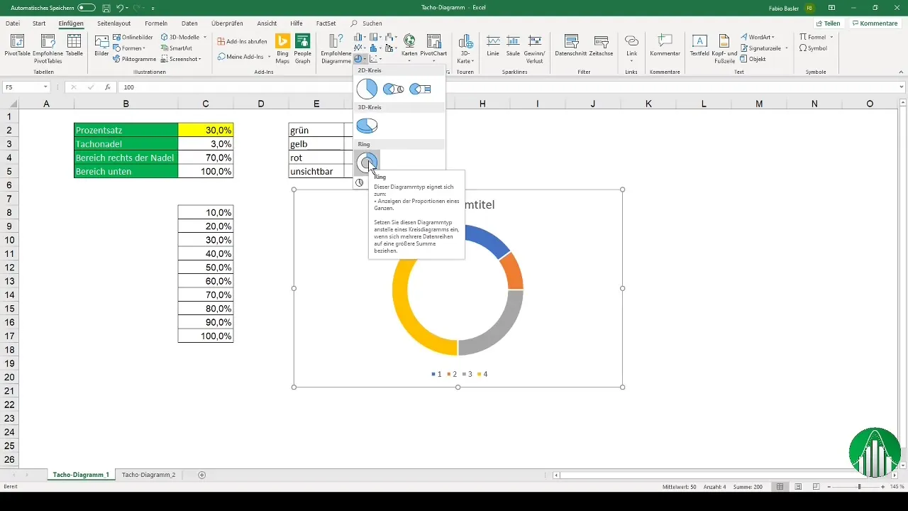
To build the actual Tacho diagram, you now need to create a ring diagram. Select the corresponding auxiliary data and go to "Insert" -> "Charts" -> "Ring Chart." This ensures that you represent the data proportionally.
Customize the Diagram and Display the Needle
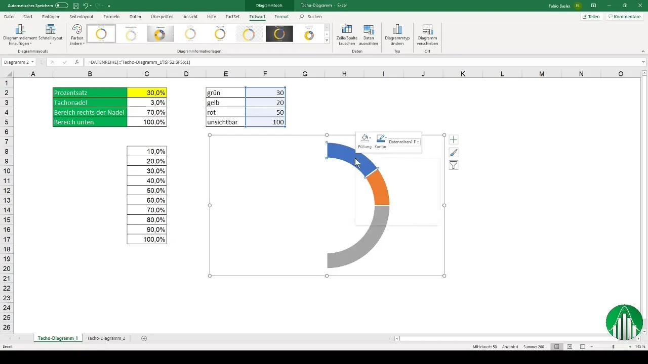
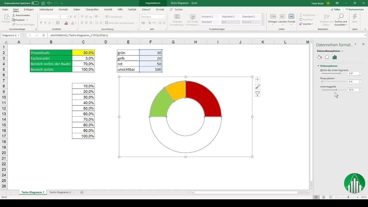
Now it's time to customize your ring diagram. Remove the legend and the fill color of the region representing 100% to optimize the visualization. Set the fill colors for different areas (e.g., green, orange, and red) to suit the needs of your diagram.
Rotate the Diagram and Add the Tachometer Needle
To display the diagram as desired, you need to adjust the angle of the segments. Set the angle to 270 degrees to show the tachometer needle in the correct position. You can derive the tachometer needle from the auxiliary data by creating a second data series that visually represents the values.
Design the Needle as a Dynamic Element
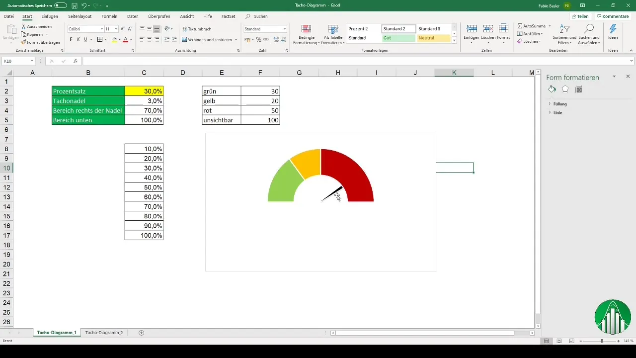
To design the needle dynamically, create a combined chart: Choose the ring chart for the inner representation of values and a pie chart for the needle. Place the needle on the secondary axis so that it is displayed above the ring chart.
Functionality Check
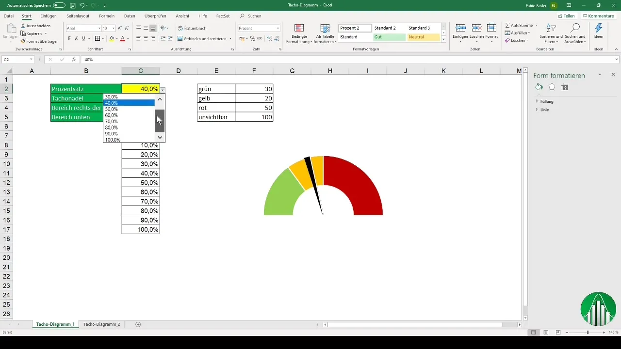
With these steps, you should now be able to create a functional tachometer in Excel. Check if you can select and see different percentages in your dropdown, and observe how the needle adjusts accordingly.
Alternatives to visualizing the speedometer chart
There are alternative methods for visualizing a speedometer chart in Excel that you can also try out. One option is to use a scatter plot with interpolated lines. Here, you can calculate base values using the radian formula in Excel to obtain the XY coordinates for the needle.

Summary
Speedometer charts are effective tools for visualizing key performance indicators. By combining pie and doughnut charts, you can create attractive dashboards in Excel that dynamically respond to different inputs. The steps include preparing the data, creating dropdown lists, drawing the charts, and adding the needle. With these instructions, you are well-equipped to design your own speedometer charts.
Frequently Asked Questions
How do I create a speedometer chart in Excel?You need to prepare the necessary data, set up a dropdown field, create a doughnut chart, and customize it to add a speedometer needle.
Can I make the speedometer chart dynamic?Yes, by creating a dropdown list for the values, the speedometer needle can dynamically adjust.
How can I change the colors in the chart?You can adjust the fill colors of the different areas in the chart by using the corresponding chart formatting options in Excel.


