Waterfall charts are among the most effective tools when it comes to presenting financial developments and increases in a clear way. These special charts not only help in analyzing revenue and cost structures but also in budget planning and controlling. In the following, I will show you how to create waterfall charts in Excel from scratch.
Key Insights
- Waterfall charts visualize changes to an initial value.
- It becomes clear how various factors, both positive and negative, contribute to the final value.
- Creating a waterfall chart in Excel requires specific steps for data preparation and chart design.
Step-by-Step Guide
Understanding Waterfall Charts
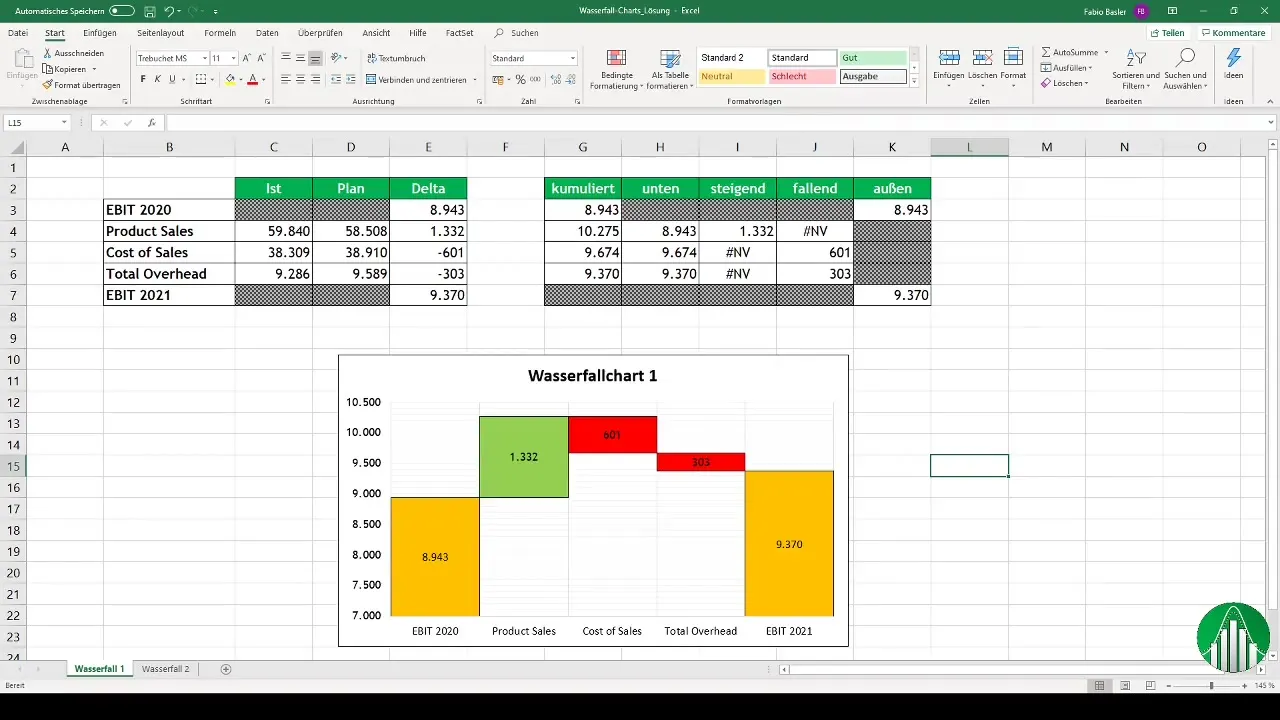
Waterfall charts are a special type of column chart that show how an initial value is influenced by a series of positive and negative values. Start by understanding the structure of waterfall charts and consider the data you want to represent.
Collecting Data and Calculating Delta Values
Before you can create a waterfall chart, you need to have the relevant numbers. Initially, you need the EBIT of your company for the current year as well as all influencing factors that change this value (revenues, costs, etc.). Then calculate the delta values, which are the differences between actual values and planned values.
Setting Up the Excel Table
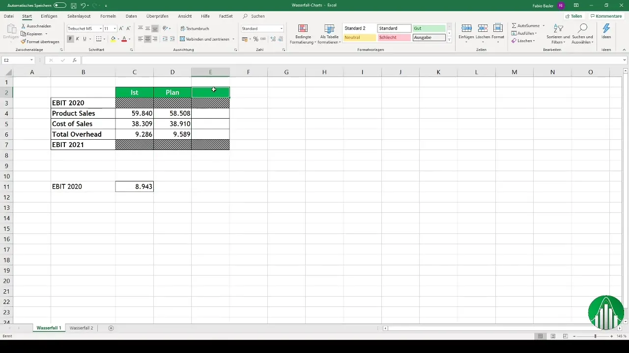
Open Excel and set up your table. You need at least five columns: one for the EBIT 2020, one for the delta values, and others for cumulative values. Enter the EBIT 2020 in the first cell and start calculating the delta values in the respective column.
Creating Cumulative Values
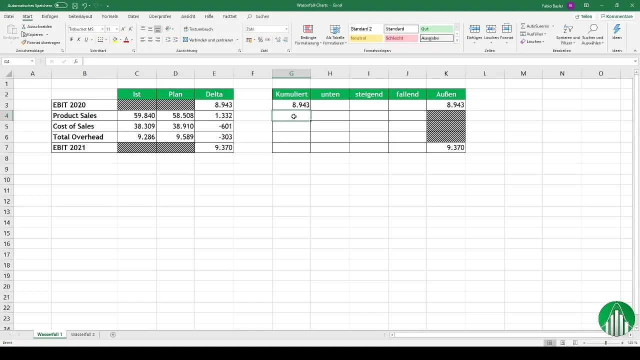
Cumulative values allow you to show the development of EBIT across the different steps. Start with the EBIT of the current year and then add the delta values into the next cells to gradually accumulate the values. This helps you better represent the different influencing factors in the chart.
Creating Metrics for Rising and Falling Values
Now create separate cells for the metrics "rising" and "falling." Here, if the delta value is positive, the corresponding value should be accepted; otherwise, enter an error value (NA - not available). This information is crucial for correctly representing the different increases and decreases in the chart.
Creating the Chart
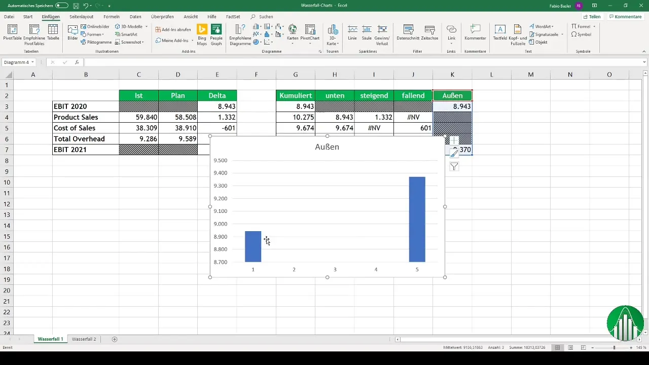
You can now start with the graphical visualization. Select the cells of your data and go to the "Insert" menu. Then choose a stacked column chart. This gives you the basic structure of the waterfall chart.
Adjusting the Data Series
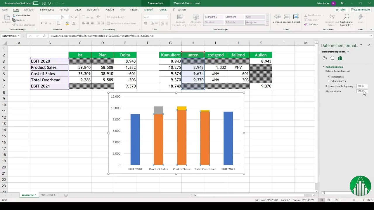
After creating the basic chart, add all necessary data series, especially the delta values and cumulative values. Make sure to adjust the spacing of the data series to suit your needs and make the chart more understandable.
Formatting the Chart
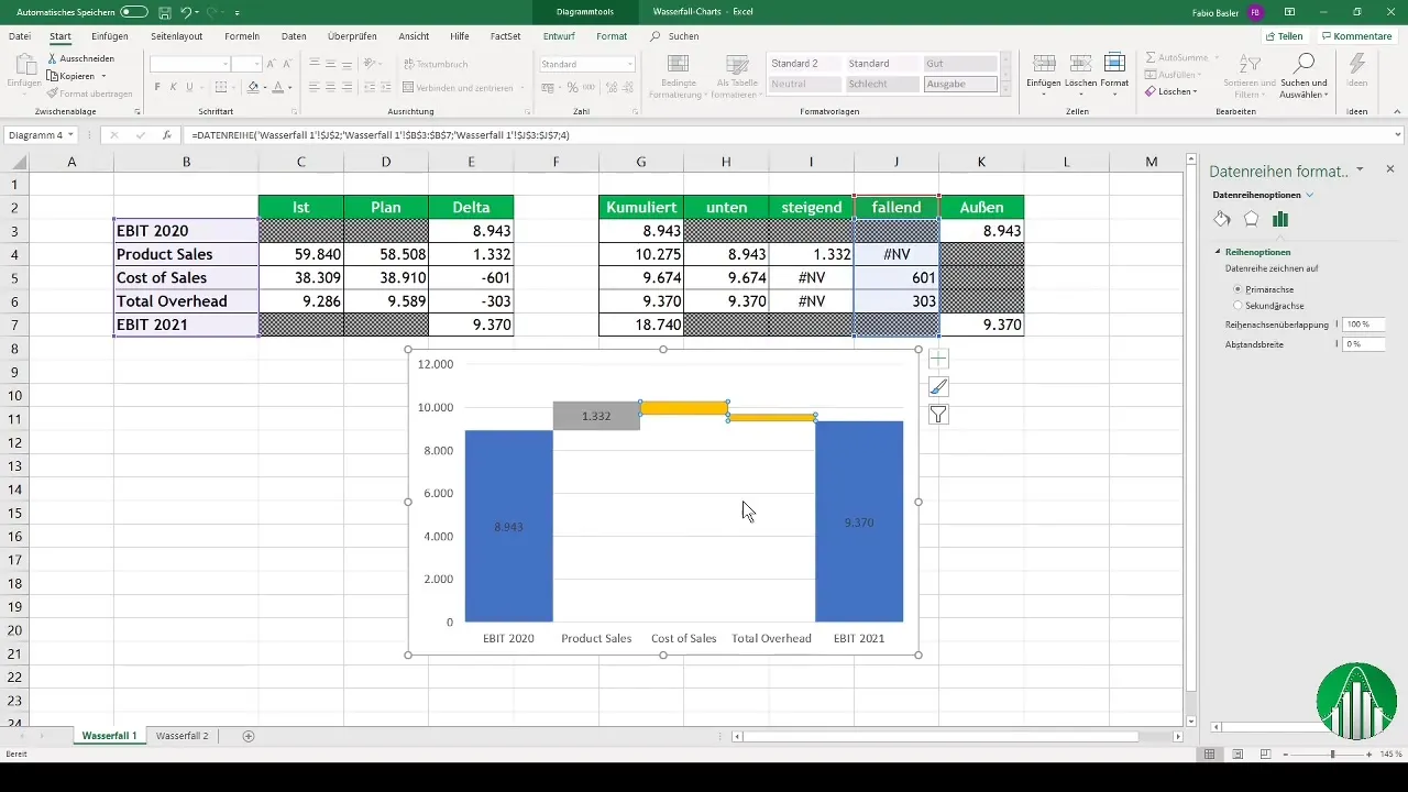
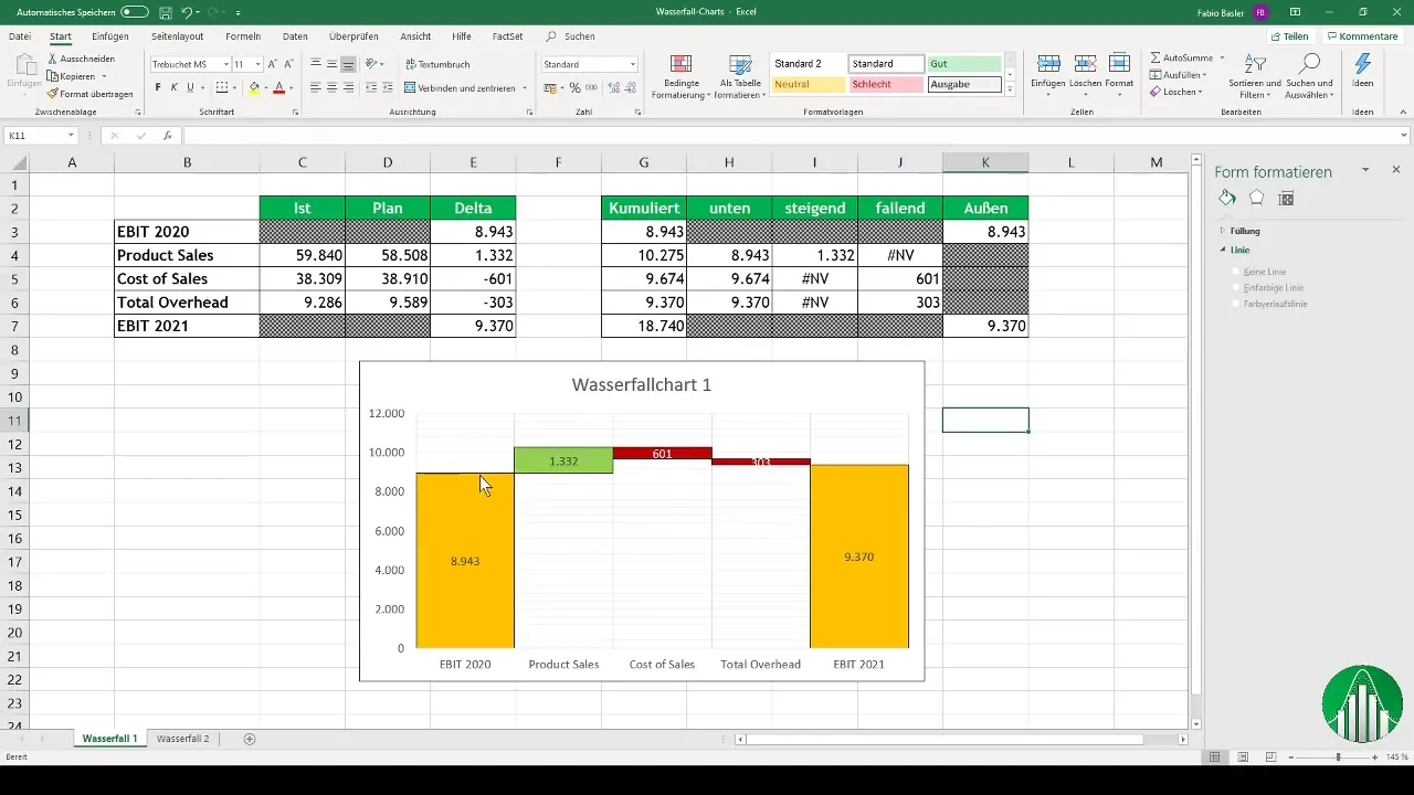
To perfect the chart, go to the formatting options of the data series. Change the colors so that rising values are shown in green and falling values in red. Data labels can also be added to visually enhance the numbers.
Final Adjustments
To make the chart look professional, make some final adjustments. Check the gridlines and the vertical as well as horizontal axes to ensure everything looks clear and appealing. It is also important to revise the size of the charts and the proportions of the individual values to make the steps clearly recognizable.
Summary
Waterfall diagrams are an extremely effective way to visually represent changes in key figures. By carefully preparing the corresponding data and considering the right steps for creating and formatting in Excel, you can create meaningful diagrams that help you and your colleagues in controlling to optimize decision-making processes.
Frequently Asked Questions
How do I calculate the delta values in Excel?The delta values are determined by the difference between actual and planned values.
What are cumulative values?Cumulative values show the ongoing sum that reflects various positive and negative impacts on an initial value.
Why are waterfall diagrams useful?They visualize the different factors that lead to an end value, facilitating the analysis and understanding of financial developments.
How can I change the colors in my chart?Right-click on the data series in the chart and select "Change color" from the formatting options.


