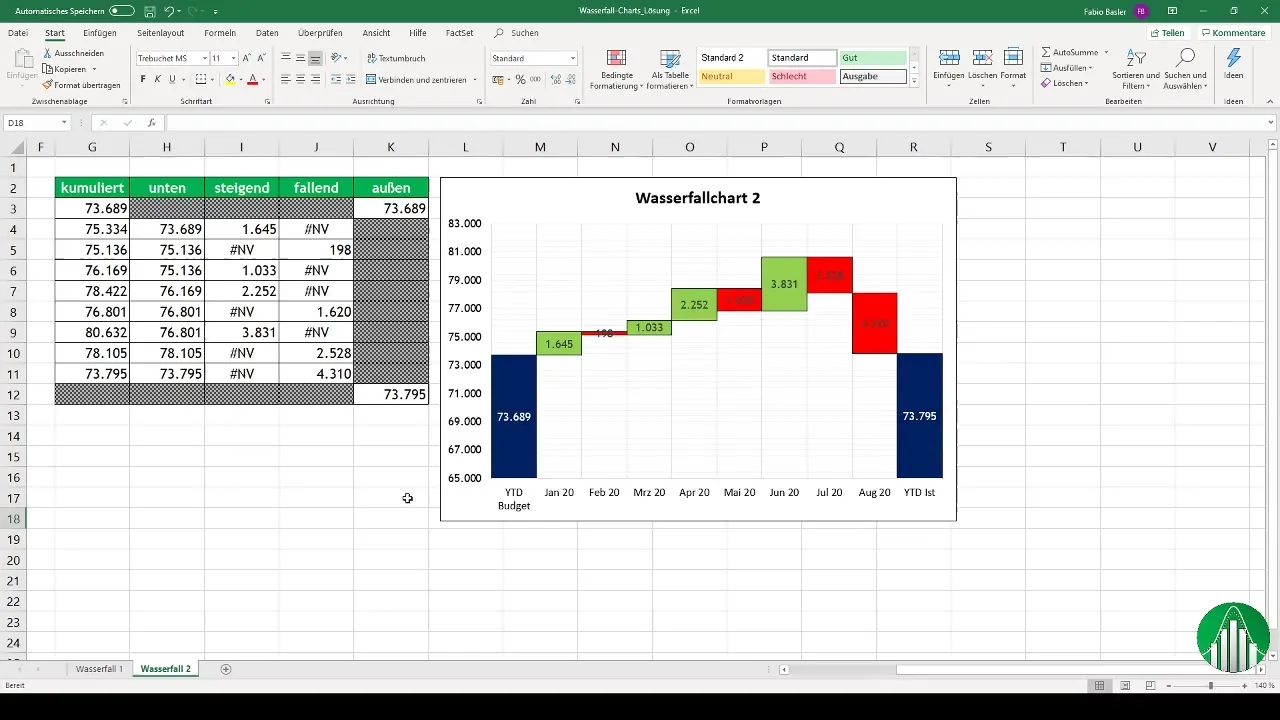
Waterfall diagrams are a powerful tool for visualizing financial changes over a period of time. They provide a clear visual representation of budgets, actual values, and variances, significantly enhancing the understanding of complex data. In this guide, we will show you how to create a waterfall diagram in Excel, using a practical example to make the steps easy to follow.
Key Insights
- Waterfall diagrams allow for a concise analysis of business changes over periods of time.
- The creation is based on calculating difference values between budget and actual values.
- Special formulas in Excel help reduce data ambiguity and optimize the display of resulting diagrams.
Prepare Data and Perform Calculations
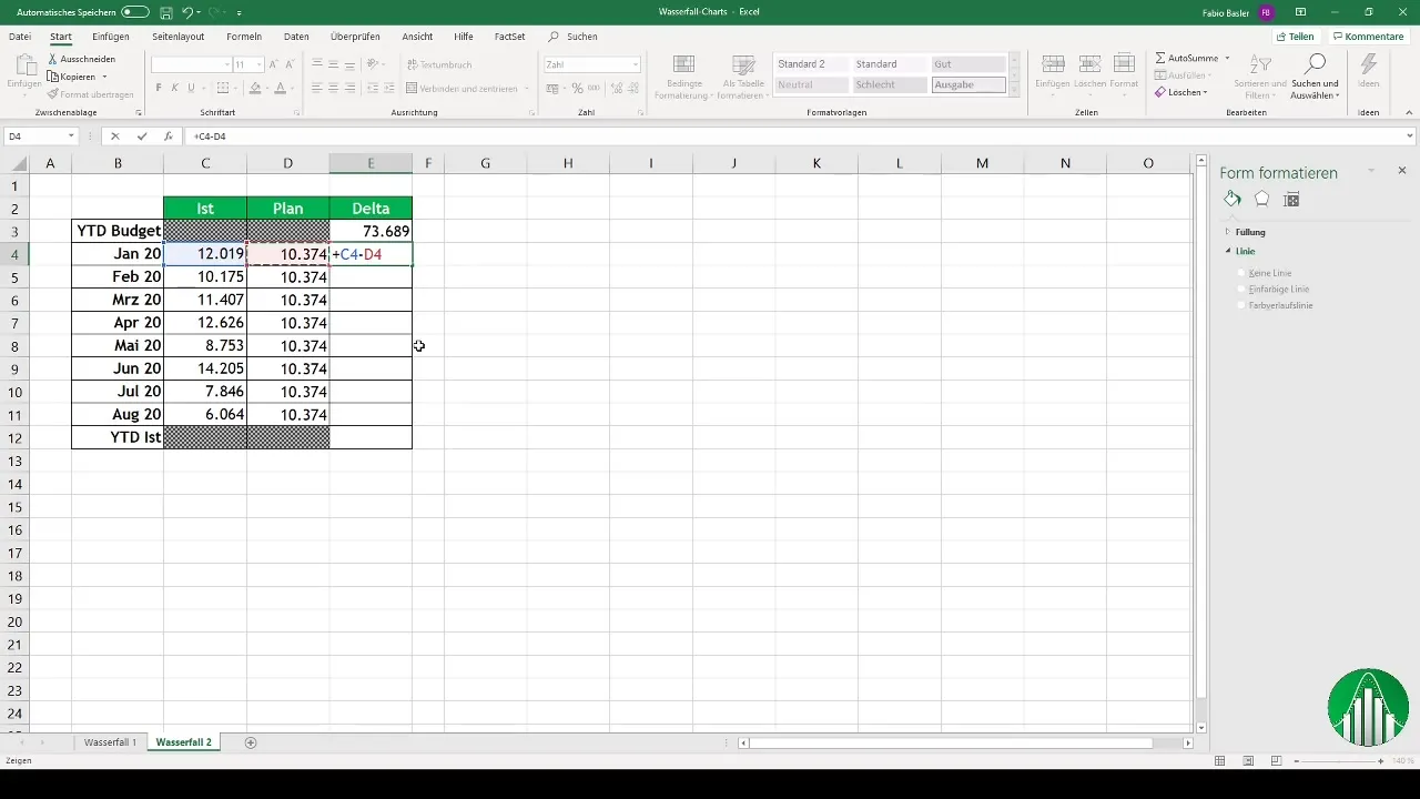
To create a waterfall diagram, start by entering the data into Excel. You need the relevant budget and actual values, as well as the difference values for the months.
Here, you calculate the difference values by subtracting the actual values from the planned figures. These steps are crucial to precisely visualize the changes.
Prepare Data Structure for the Diagram
Once the calculations are completed, you input the values into Excel. It is important to correctly attribute the difference values to positive and negative values. The diagram will represent both increasing and decreasing key figures.
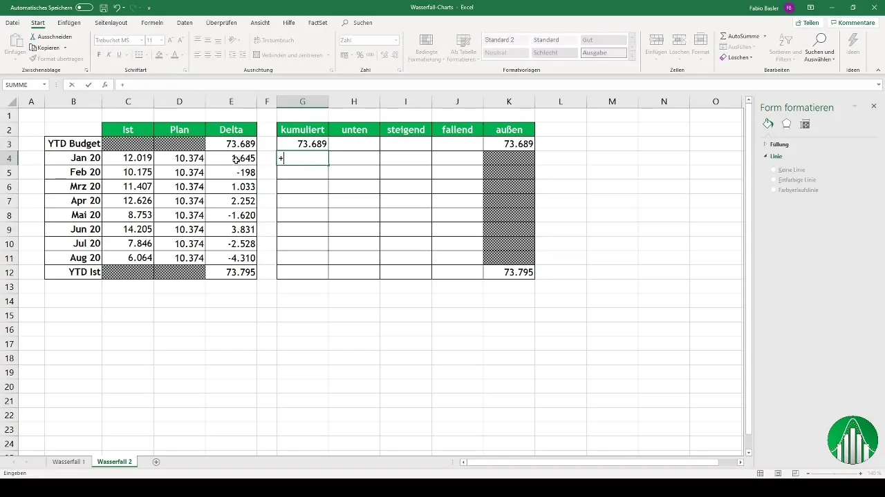
The cumulative representation is achieved by adding the budget values and difference values in Excel. This forms the basis for the diagram.
Create the Diagram
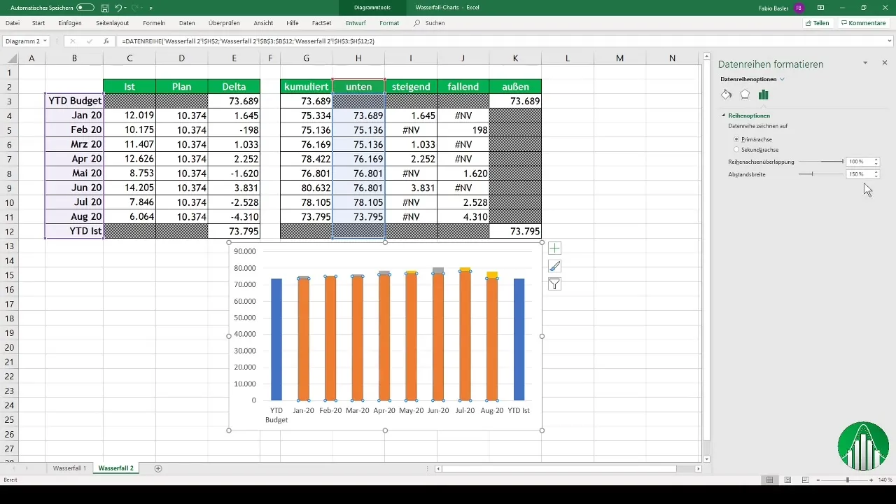
To create the waterfall diagram, select the relevant values and add the diagram. In this step, the horizontal axis for time periods, such as "Year to Date Budget," is configured.
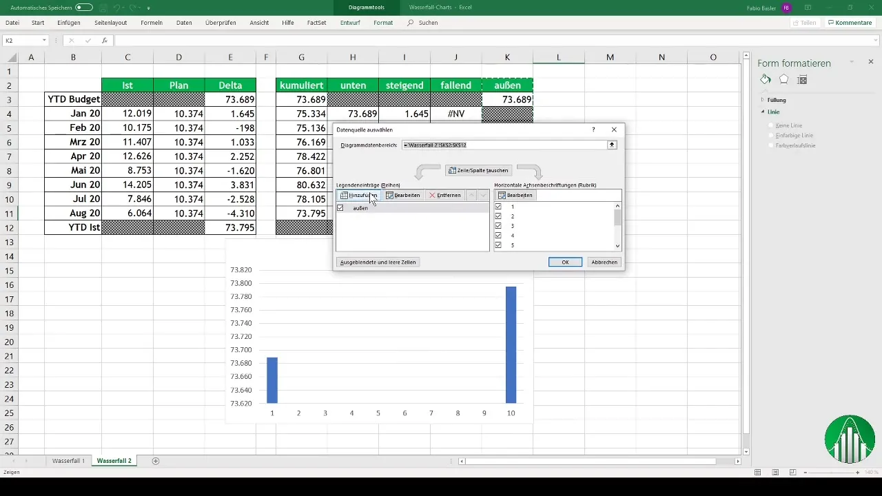
For the diagram, format the data series so that the gap width is set to 0%, achieving a clear and concise layout.
Adjustment and Formatting
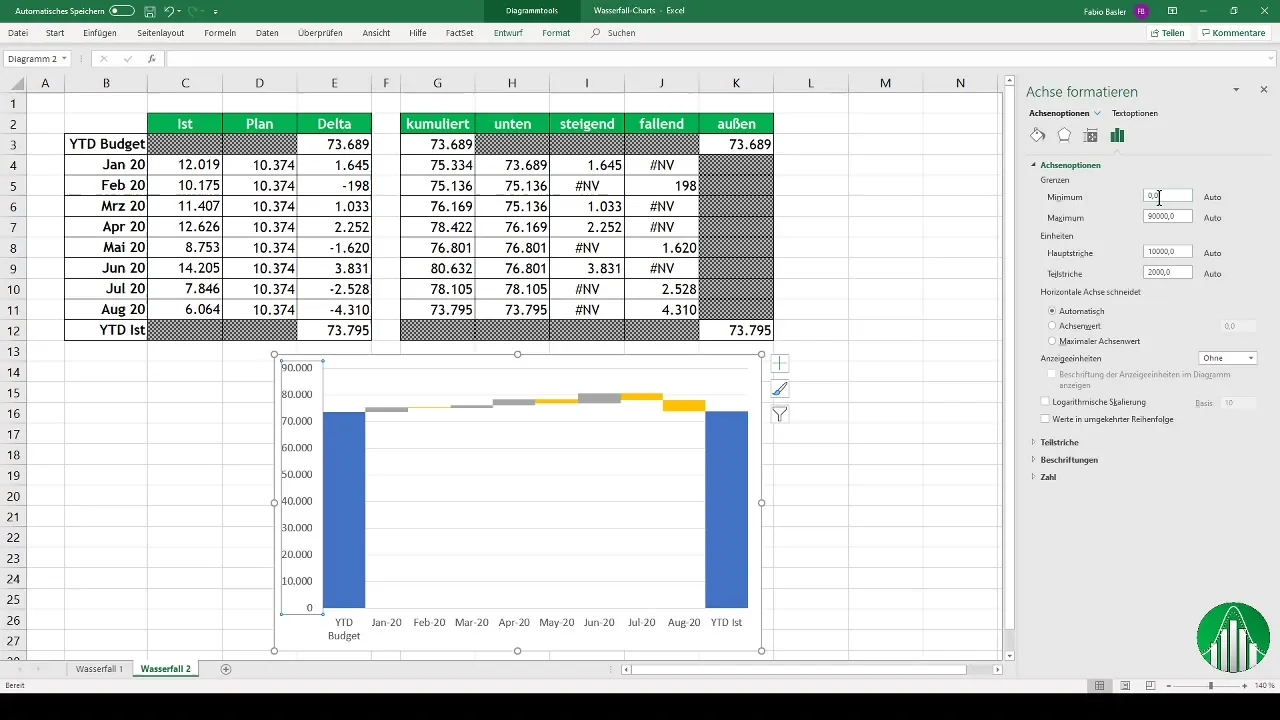
Following that, you can start adjusting the vertical axis. Here, you increase the minimum value to enhance visibility of the difference values.
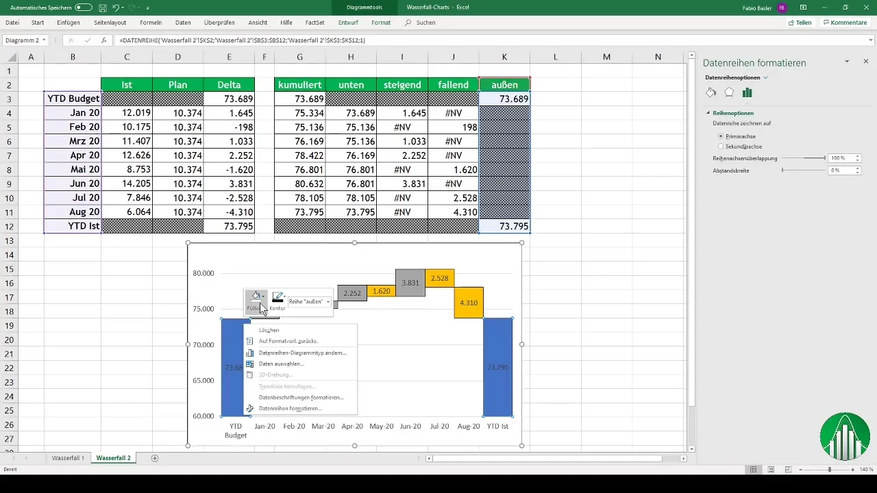
Data labels are added to ensure clear visibility of the numbers. You can also add outlines or colors to make the diagram appear more professional.
Conclusion and Tips
After these steps, you should have created a functional waterfall diagram in Excel. It is clear and allows for better responsiveness to key figures.
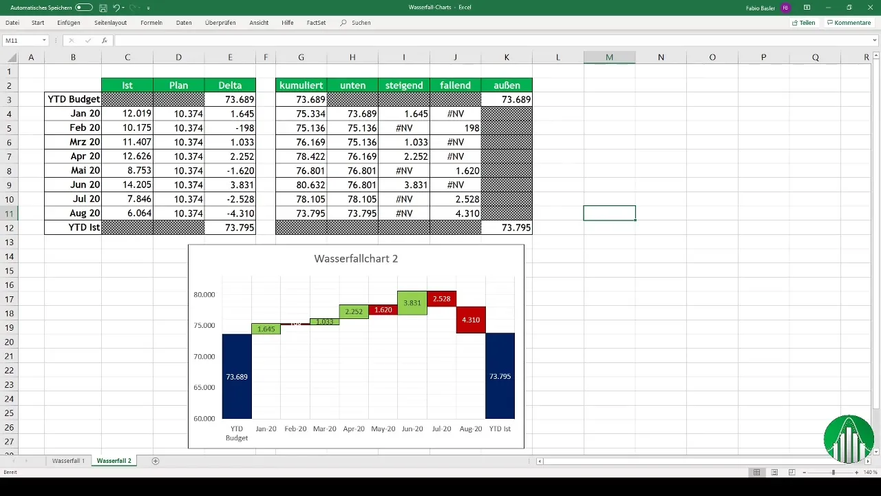
If you still have uncertainties, you can work on it in the provided Excel file. Both the solution and raw data are available for you to deepen your learning.
Summary
In this guide, you have learned how to create a waterfall diagram in Excel. We have detailed the necessary steps, from data entry to calculation to diagram adjustment, for you to follow.
Frequently Asked Questions
How do I calculate the difference values for the waterfall diagram?You subtract the actual values from the planned figures to obtain the difference values.
Why is the cumulative representation important?It allows for visualizing total changes over time, which is crucial for decision-making.
Can I customize the colors in the diagram?Yes, colors can be changed as needed to enhance clarity and contrast.
How can I change the diagram outlines?In the formatting options, you can adjust the outlines to make the diagram appear more professional.
Are there any ready-made Excel files for practice?Yes, the relevant Excel sheets are attached in the video and available for you to use.


