Creating 2D map charts in Excel is a challenging yet incredibly useful skill when you want to visually represent geographic data. With the right tools and techniques, you can create clear and concise visualizations that help you immediately identify trends and patterns. In this guide, you will learn how to create a 2D map chart for Germany that displays population or other interesting metrics.
Main Insights:
- Map charts allow the representation of geographic and demographic data.
- Excel offers various ways to create map charts, including the use of the area cartogram.
- By adjusting the data series representation and color scheme, you can optimize your charts.
Step-by-Step Guide to Creating a 2D Map Chart
Step 1: Prepare Data
Before you start drawing the map chart, it's essential to create a suitable table with the data relevant to you. You should ensure that the data is clearly structured, for example, by listing the federal states with their corresponding metrics.
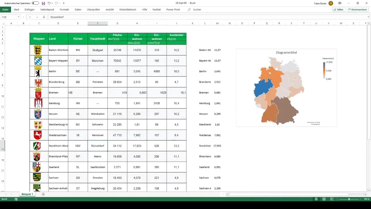
Step 2: Choose Chart Type
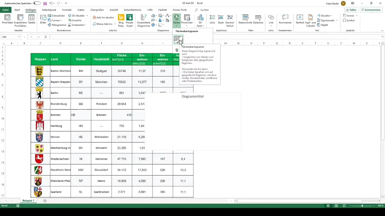
To create a map chart, navigate in Excel to the "Insert" tab and select the function for the area cartogram. Here, you have the choice between manually selecting the data or using an auxiliary table to align the data side by side.
Step 3: Data Structuring
If you choose the first approach, right-click on the chart and select "Select Data." Here, you name the series as "Population" and choose the numerical values for each federal state.
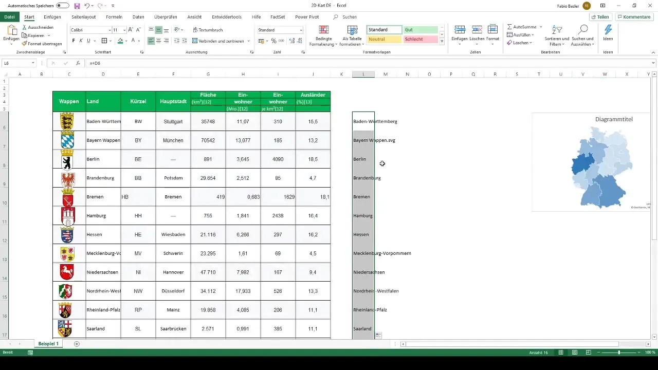
Step 4: Use Auxiliary Table
In the alternative approach, you create an auxiliary table. You select the federal states in one column and enter the corresponding population in the adjacent column. These two columns are then selected for the map chart.
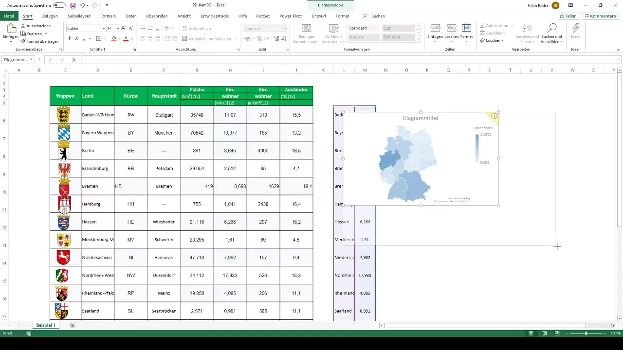
Step 5: Create the Map Chart
With the corresponding data selected, you can now click on "Map Chart." Excel will then generate the area cartogram that visualizes the federal states of Germany according to the chosen metric.
Step 6: Adjust Chart
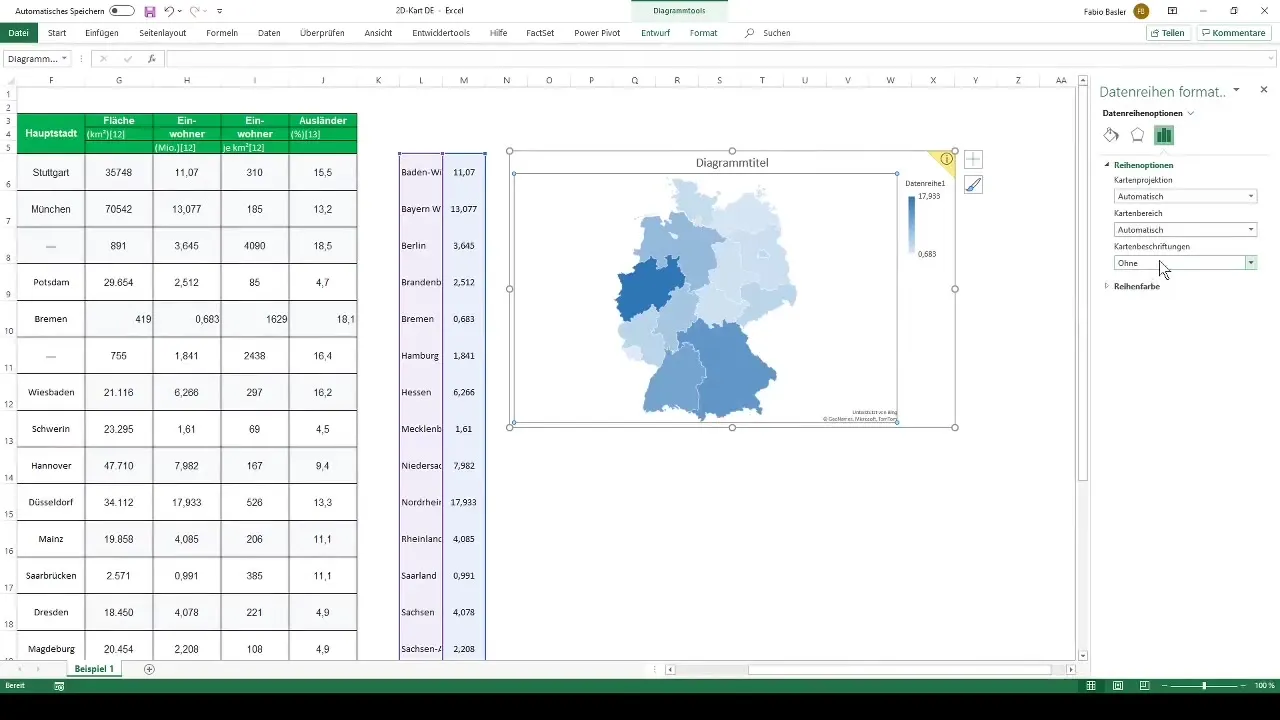
To further optimize the chart, go to "Format Data Series" by right-clicking on the chart. Here, you can customize the map labels and ensure that the names of the federal states are clear and readable.
Step 7: Optimize Labels
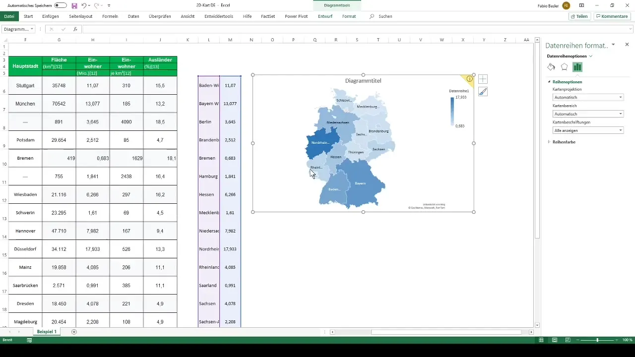
A common issue is that longer federal state names or smaller areas may not be fully visible. You can adjust the size of the display to improve readability, even though there is no automatic solution in Excel.
Step 8: Customize Color Scheme
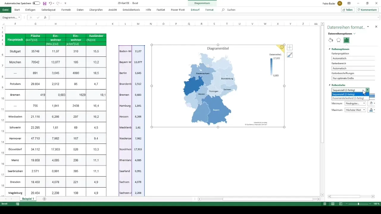
When depicting the data, you can choose different color designs. Excel offers a sequential two-color design as well as a diverging three-color design. Depending on the purpose of your presentation, you can choose the color scheme that suits you best.
Summary
To create a 2D map chart in Excel for Germany, you first need to carefully structure your data and then select the appropriate chart type. You have various options for customizing the chart so that your data is not only informative but also visually appealing. By adding labels and choosing the right colors, you can enhance the clarity and visual impact of your presentation.
Frequently Asked Questions
How do I create a map chart in Excel?To create a map chart in Excel, go to the "Insert" tab and select the filled map. Make sure your data is prepared correctly beforehand.
What data do I need for a map chart?You will need a table with geographic categories (e.g., states) and corresponding numerical values (e.g., population numbers).
How can I customize the layout of my map chart?You can adjust the chart by right-clicking, formatting the data series, and customizing the labels and colors to your liking.
Why are some state names truncated?This can happen when the areas are too small or the names are too long. Try changing the size of the chart or opting for a different visualization method.
What color scheme is suitable for map charts?You can choose between sequential two-color or diverging three-color designs, depending on the type of data you wish to visualize.


