Numbers and data often gain significance through visual representation. A 2D map chart can visually represent data on the population figures of the countries of the world, thereby illustrating relationships and trends. In this guide, I'll show you how to create a 2D map chart for the entire world in Excel. You will not only learn the basic necessary steps, but also how to adjust the coloring to highlight important information clearly.
Key Insights
- Creating a 2D map chart enables visual data analysis.
- The corresponding coloring of countries is based on population figures.
- Excel offers the possibility to use different color schemes to optimize data representation.
Step-by-Step Guide
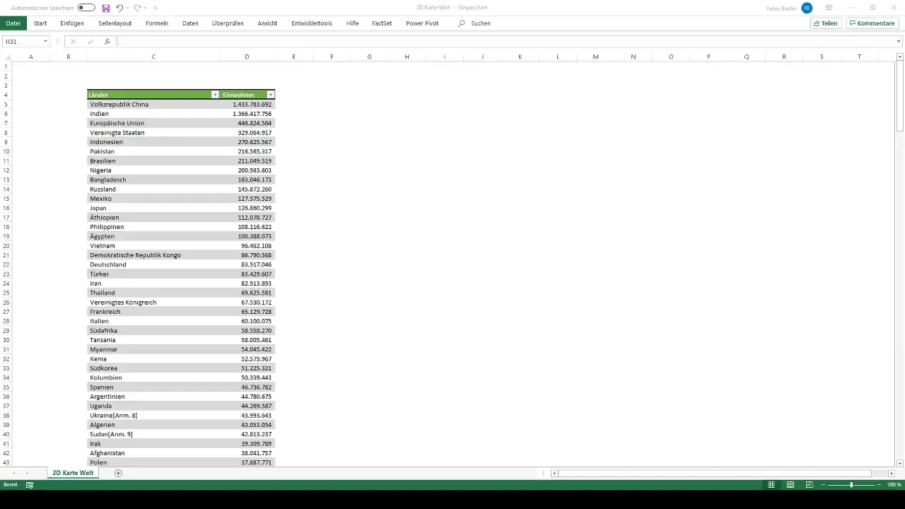
First, you need an overview of the countries and their population figures. For this tutorial, I have already prepared an Excel document listing 236 countries with their respective population figures.
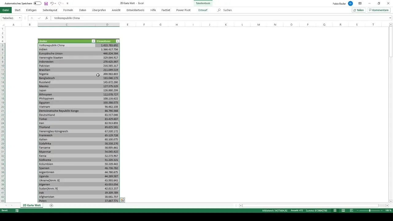
To select the required data in Excel, you highlight both columns: the countries and their respective population figures. This can be done simply by holding the Shift and Control keys while dragging the data down.
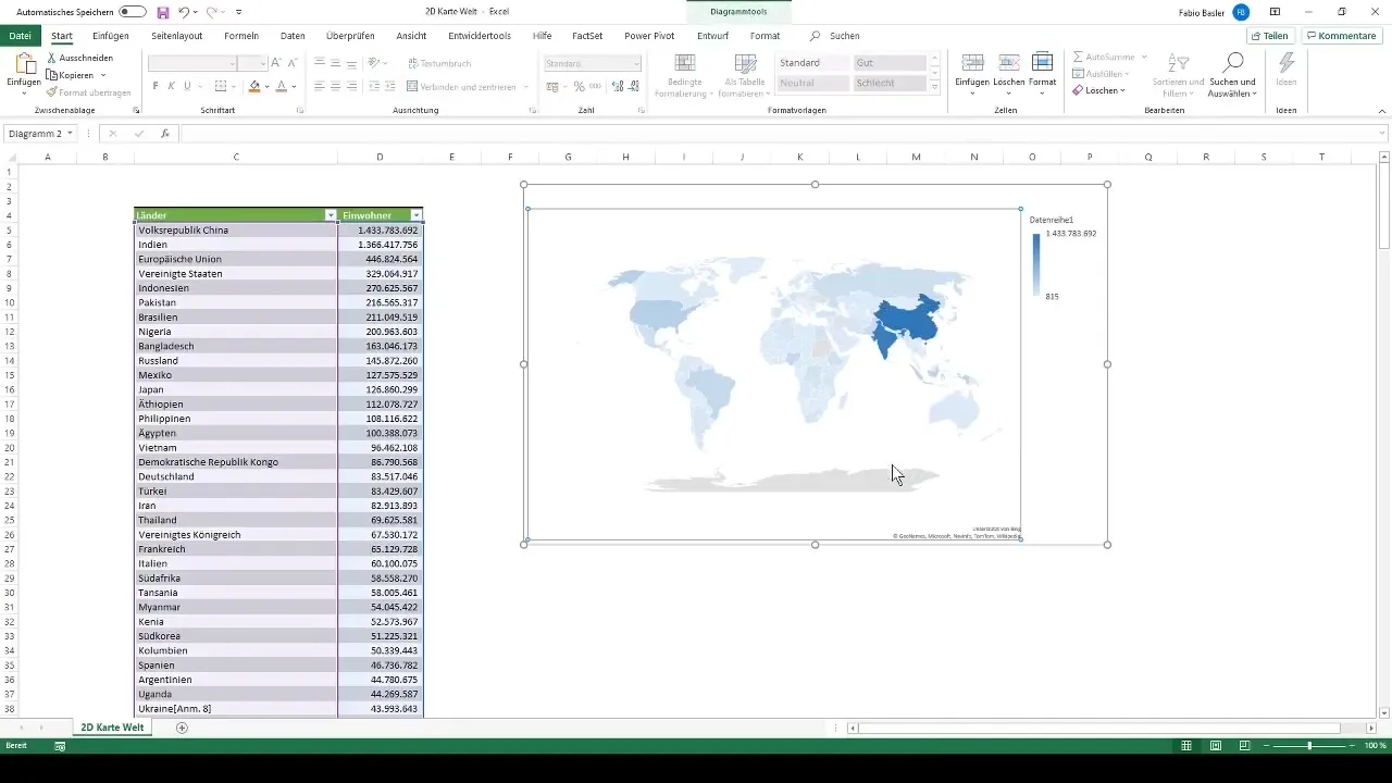
After selecting the data, navigate to the chart insertion section in the ribbon and choose the appropriate option for the map chart. Upon correct selection, a representation of all countries considering the provided population figures should appear.
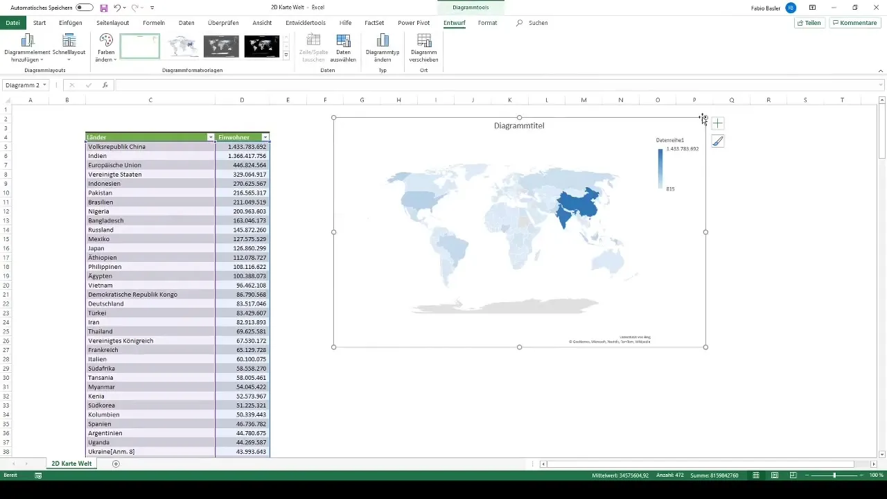
In the chart, each country is colored according to its population figures. Particularly noticeable are China and India. China has over 1.4 billion inhabitants, and India has around 1.36 billion. These large numbers are highlighted in the map chart through distinctive coloring.
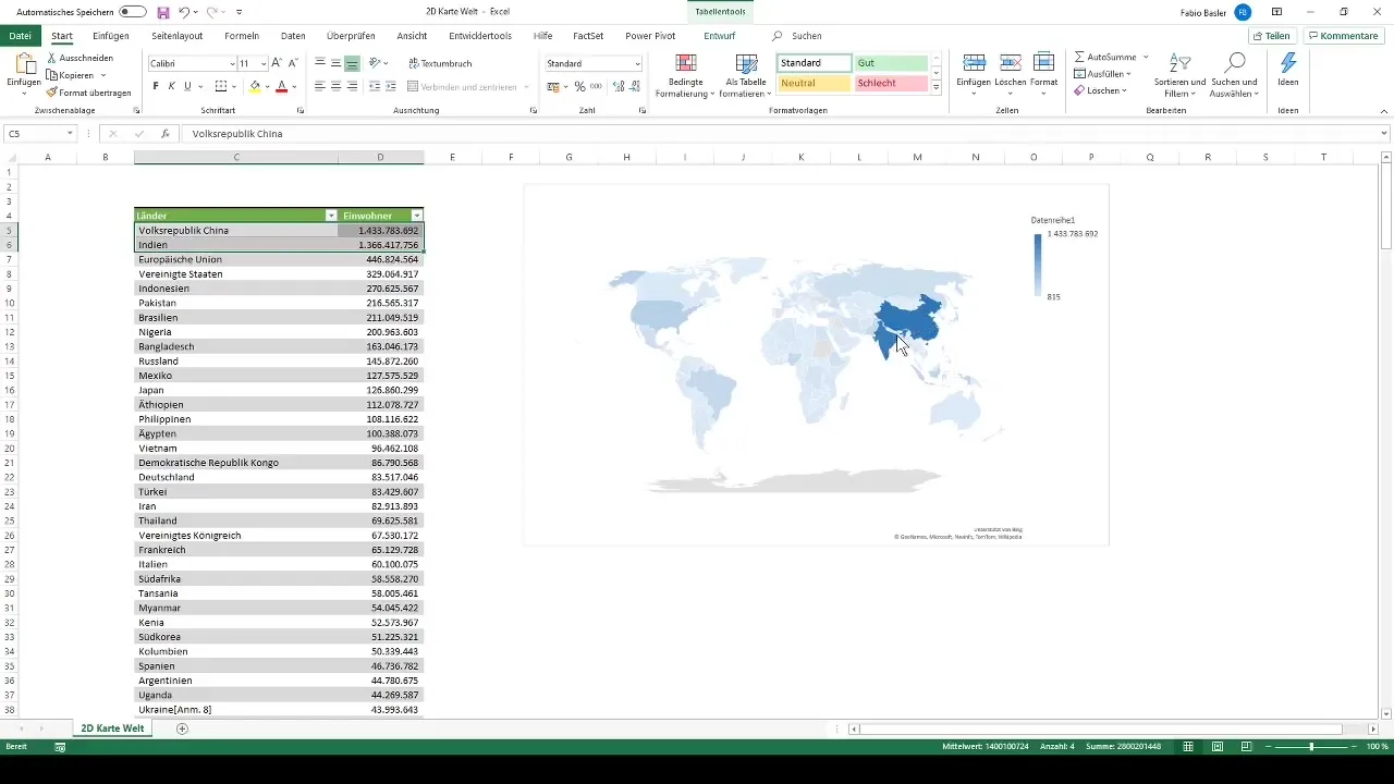
If you can omit the coloring of certain countries like India and China, the remaining coloration of other countries changes. For example, the European Union member states or the United States are displayed more distinctly as their population figures grow in comparison.
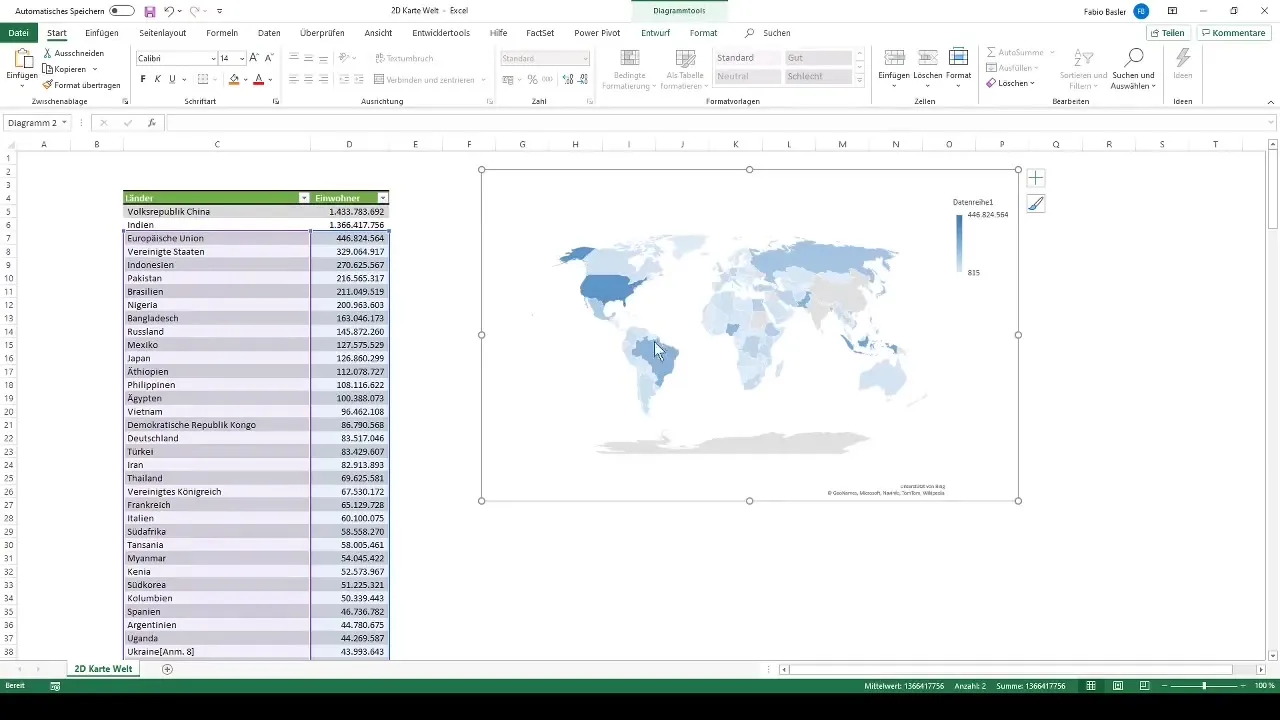
By adjusting this coloring, you can customize the 2D map chart to your preferences. Use different colors to highlight specific data or represent trends. This way, your representation can be even more effective in conveying the information you want to impart.
After adjusting the representation, you now have a complete 2D map chart that clearly displays the population figures of all countries in the world. This visual approach allows you to draw valuable insights from your data.
Summary
In this guide, you have learned how to create a 2D map chart in Excel to visualize the population figures of countries in the world. You have learned the steps of data selection, chart selection and adjustment, as well as the possibilities for customizing the coloring.
Frequently Asked Questions
How many countries are included in the chart?A total of 236 countries are included in the chart.
How can I adjust the data in Excel?The coloring can be changed in Excel through the Chart Tools menu.
What are the largest population countries in the chart?The largest countries in terms of population are China and India.
Can I add more data?Yes, you can add additional columns with data to expand the chart.


