Visualization plays a crucial role in data analysis. A well-designed world map can potentially be more informative than tables or charts. In this guide, you will learn how to create a dynamic world map using Excel that can be interactively adjusted. You will utilize the benefits of data slicers to selectively filter and control the displayed information.
Key Takeaways
- You can create a dynamic world map in Excel that visualizes various regions.
- The creation requires the use of data slicers to filter the view.
- With the right steps, you can efficiently design an appealing and informative map.
Step-by-Step Guide
To create a dynamic world map in Excel, follow these steps:
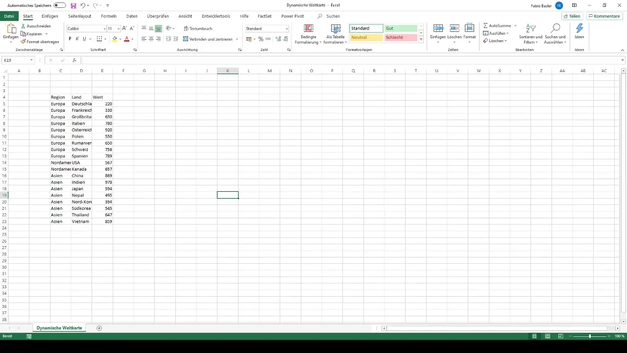
First, you need to prepare the necessary data in Excel. This data should include the region, country, and the corresponding values. Ensure that you have at least 19 data sets for the map to be meaningful. Organize the data in a clear manner, with each column having a concise header.
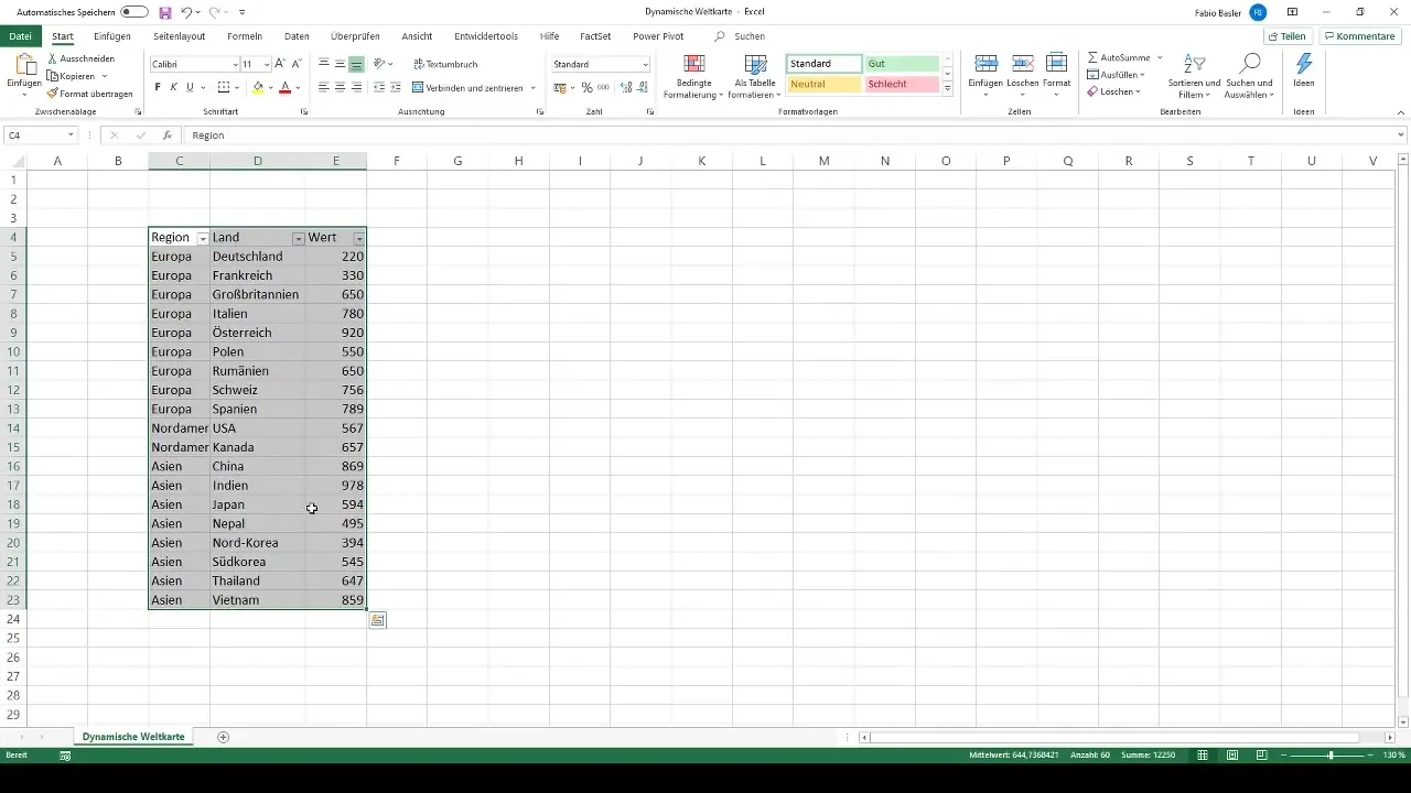
Once you have prepared your data, you need a table. Highlight the entire data range you just entered. You can simply use the Ctrl + T shortcut to instruct Excel to recognize the top row as a header row and format your data into a table.
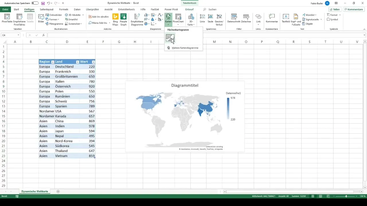
Now, with your data in table form, go to the "Insert" option in the ribbon toolbar and select "Map". Excel will show you a map based on your data range. You now have the option to customize the map by giving it a name, such as "Dynamic World Map".
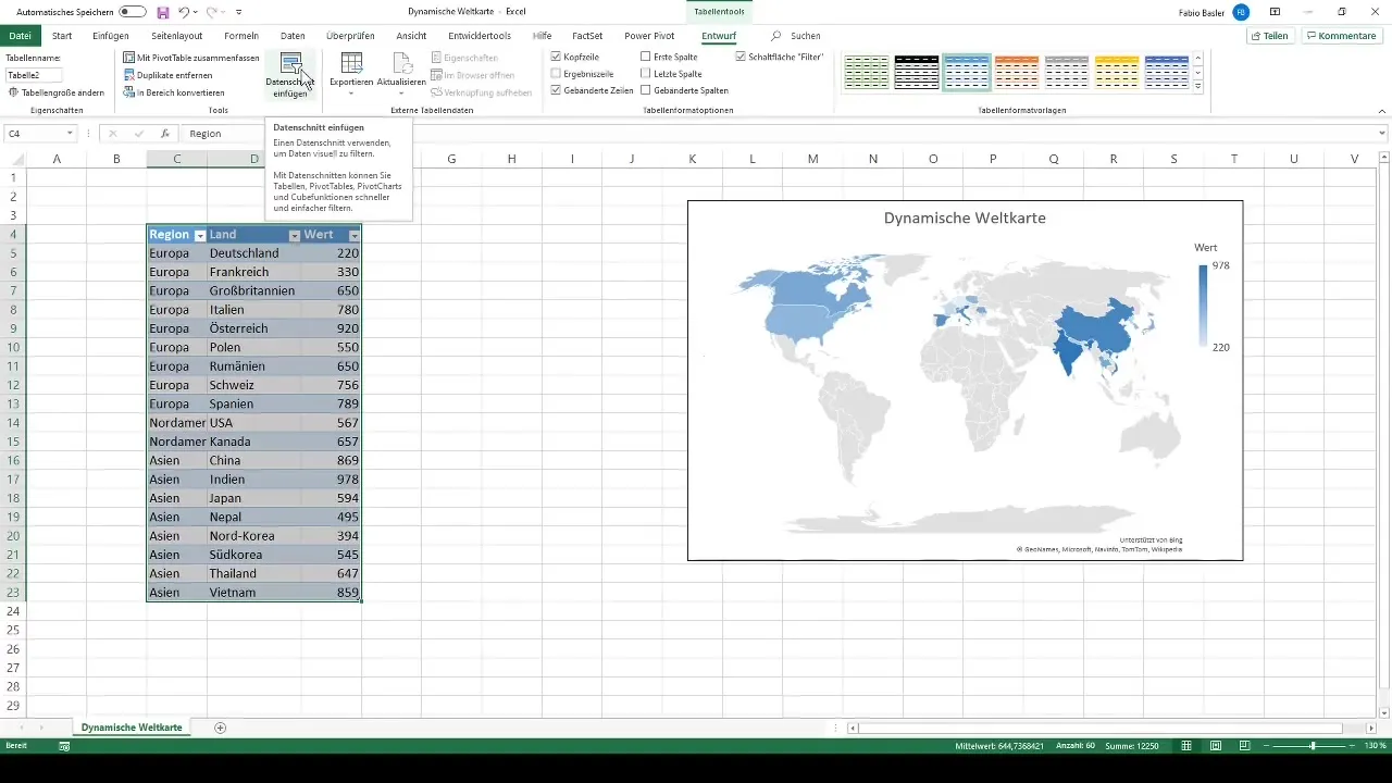
However, you now have a static map. To make it dynamic, you need to add data slicers. Go to the "Design" tab in the table tools and find the "Insert Slicers" option. Here, you can choose which areas to filter. For our dynamic world map, we should select the regions and countries.
After selecting the slicers, rename them accordingly, providing two different filters. These are now directly connected to your world map. The region slicer will allow you to choose a variety of countries. For example, if you click on Asia, only the associated countries like China, India, and Japan will be displayed.
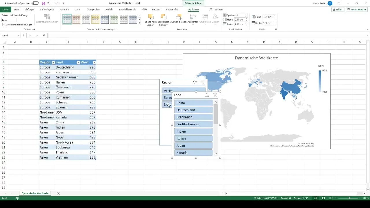
Another useful tip: By holding the Ctrl key and selecting multiple regions, you can selectively filter different continents or regions simultaneously. This allows for extensive data management and a detailed analysis of your data.
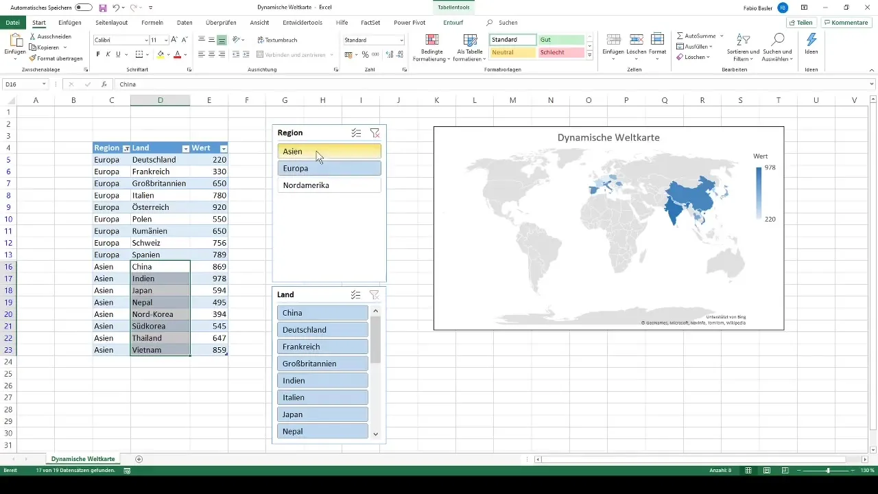
Through these steps, you have successfully created a dynamic world map in Excel. You can now adjust the displayed data playfully and give your analysis various perspectives.
Summary
In this guide, you have learned how to create a dynamic world map in Excel. You have understood the importance of data preparation, table formatting, and the functionality of data slicers. With these tools, you can present your data visually and interactively manipulate it.
Frequently Asked Questions
What are data slicers?Data slicers are visual filters that help you filter and display data in Excel.
How many data sets do I need for the world map?At least 19 data sets are recommended to display meaningful data.
How can I select a different region?Simply click on the respective data slicer for the region you want to see.
Can I display multiple regions simultaneously?Yes, by holding the Ctrl key, you can select and display multiple regions simultaneously.
Does this work with other chart types?Yes, data slicers can also be used for pivot tables and other chart types.


