Excel is not just a tool for tables and simple charts. With Bing Maps, you can take your data to a new dimension by visualizing it spatially. This guide shows you how to create interactive 3D graphics with Bing Maps in Excel.
Key Takeaways:
- Bing Maps enables the visualization of spatial data directly in Excel.
- You can link different metrics to locations and display them graphically.
- The application offers numerous customization options for personalized visualization.
Step 1: Access Bing Maps in Excel
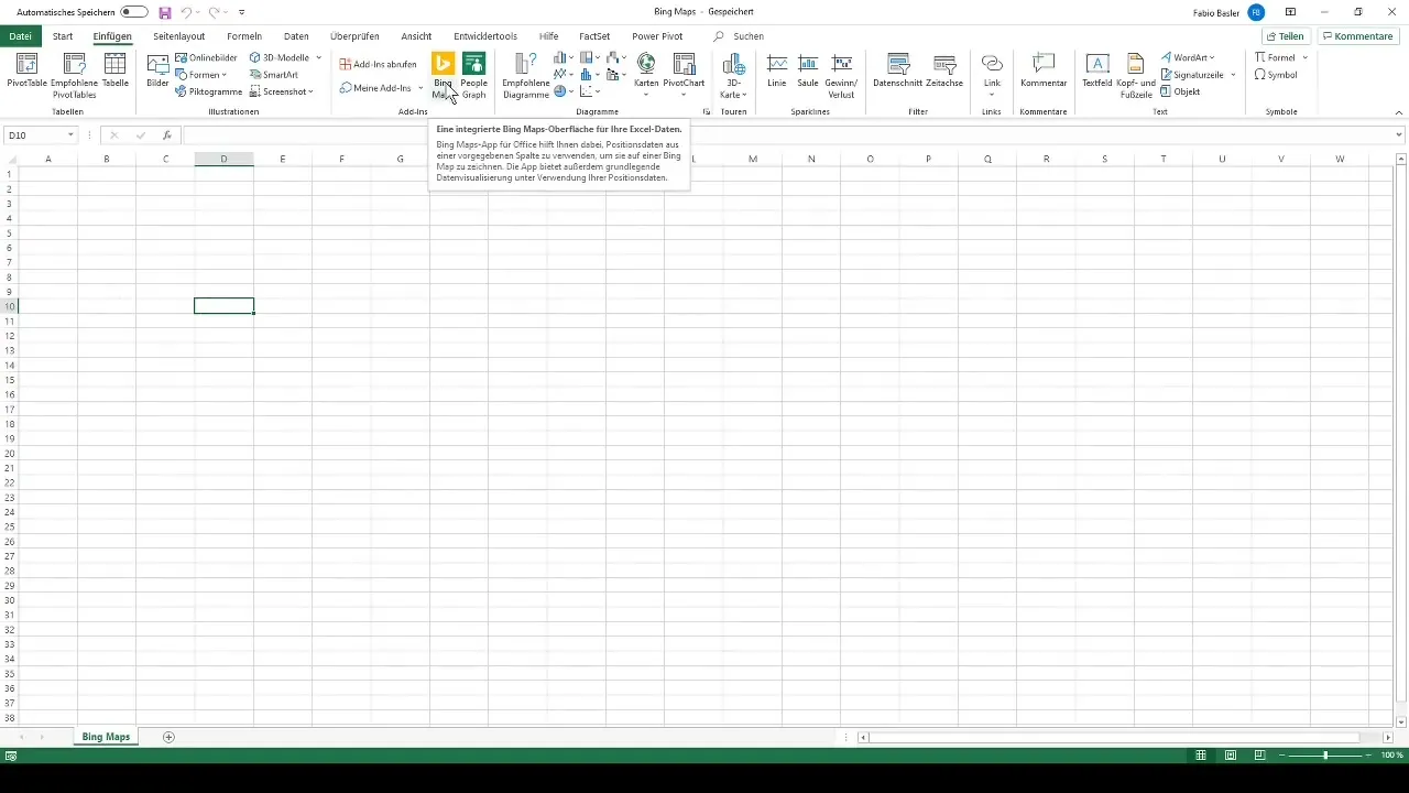
First, open your Excel application. Go to the menu bar and look for the Bing Maps option. This feature is integrated into Microsoft Excel, allowing you to effectively organize geospatial data.
Step 2: Enter Example Data
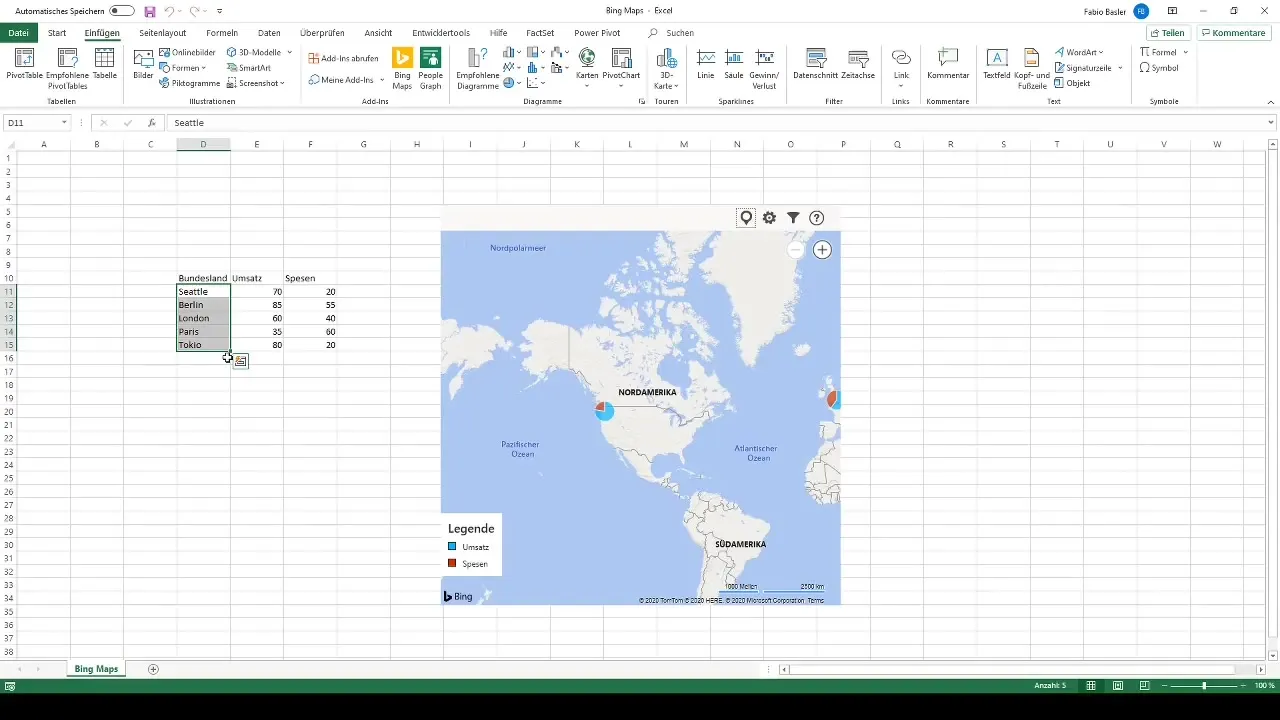
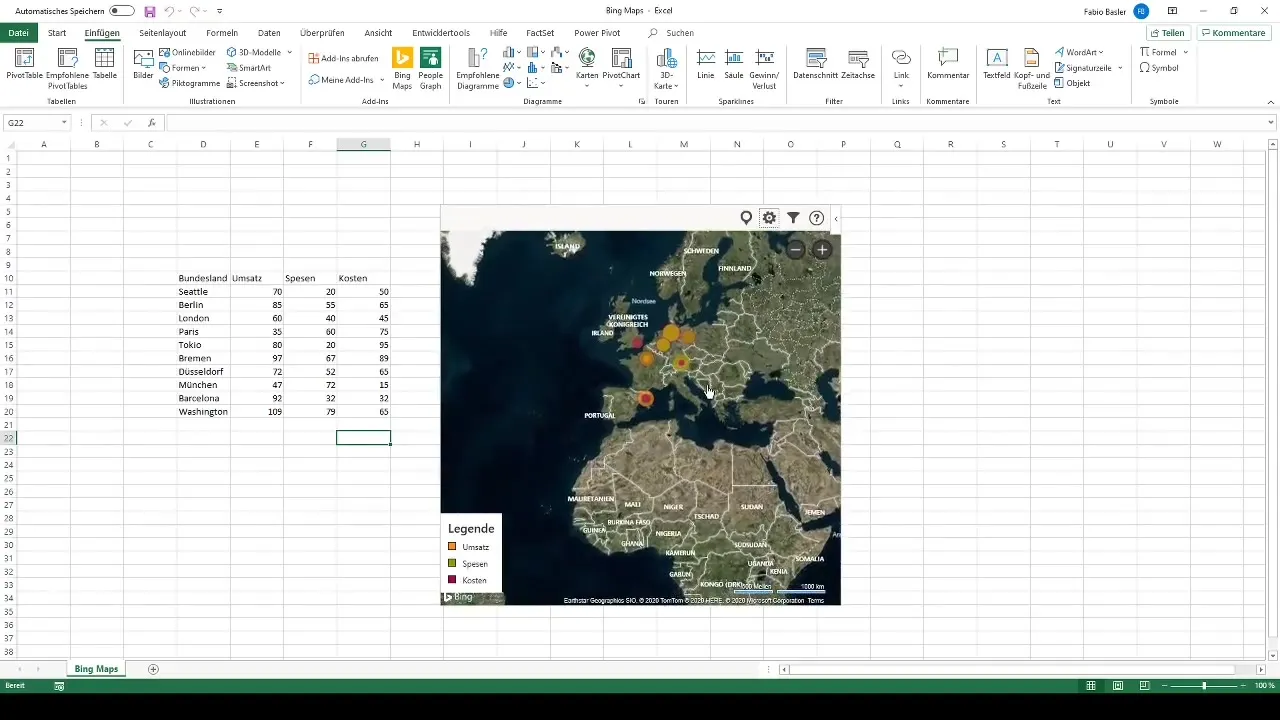
To make the most of Bing Maps' features, example data must first be entered. You can choose five cities by default, such as Seattle, Berlin, London, Paris, and Tokyo. This includes metrics like revenue and expenses. These data will then be displayed on the Bing Map.
Step 3: Explore Interactive Map
Once the data is entered, you can explore the interactive map. Hover over the map to see the distribution of metrics for the selected cities. This provides a visual and intuitive way to identify regional differences in the data.
Step 4: Add Your Own Data
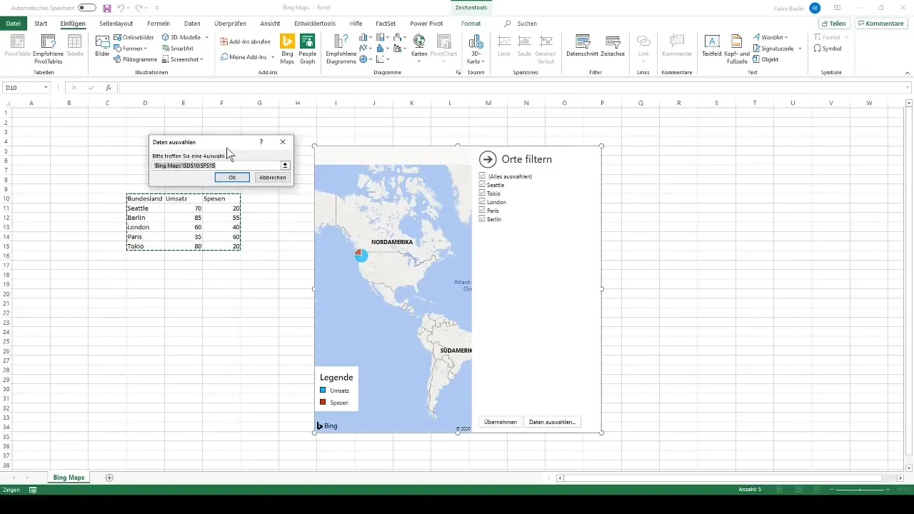
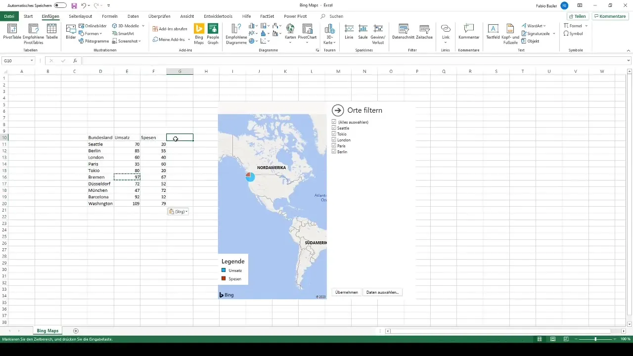
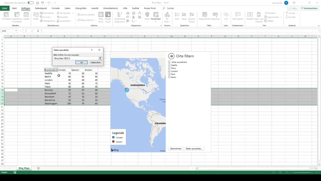
If you want to analyze your own numbers, you can add more cities and metrics. Click on the filter icon and select "Select data." Expand the selection to include new cities like Bremen, Düsseldorf, Munich, Barcelona, and Washington.
Step 5: Define New Metrics
Enhance the table with new metrics, such as entering revenue, expenses, and costs. Use simple Excel formulas to calculate the new values. This gives you the flexibility to personalize your analysis.
Step 6: Update Data
After adding new cities and metrics, go back to Bing Maps to update the data. Select the entire range of your data and confirm the selection. This ensures that the updated information will be displayed on the map.
Step 7: Customize Visualization
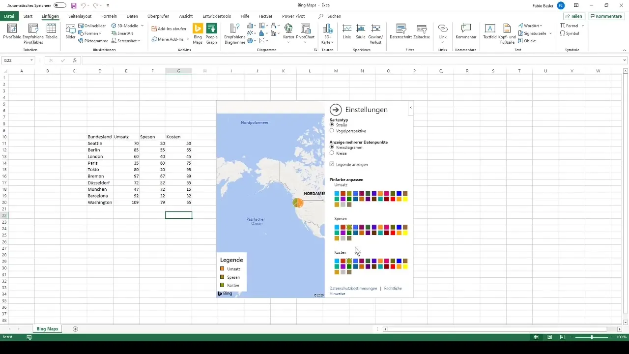
Once the data has been updated, you can customize the visualization. Change the colors for revenue, expenses, and costs to highlight the differences. Bing Maps offers a variety of customization options to optimize the presentation of your data.
Step 8: Utilize Additional Visualization Options
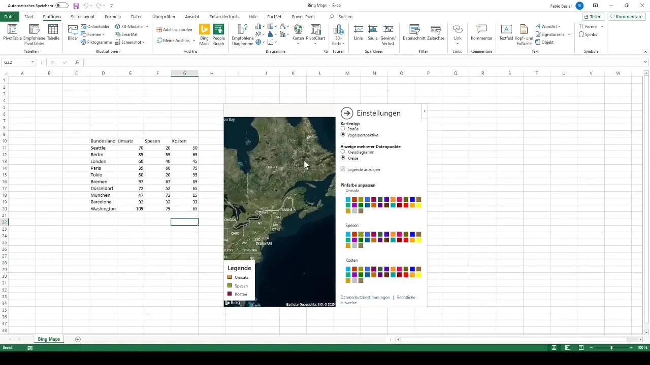
Utilize the various visualization options provided by Bing Maps. You can choose a bird's eye view or switch between different types of charts, such as pie charts and volumetric circles. These options help you present the data in an attractive and informative way.
Step 9: Show or Hide Legend and Notes
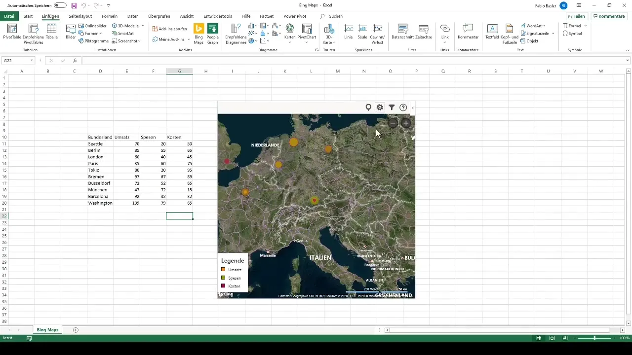
To make your analysis clearer and more concise, you can show or hide the legend. This helps focus on the key data without being distracted by unnecessary information.
Step 10: Manage Map
When you are satisfied with your visualization, you can save, delete, or reload the Bing Map. This flexibility allows you to test and analyze different views and data structures.
Summary
With Bing Maps in Excel, you get a powerful tool for visualizing and analyzing spatial data. Through the step-by-step guide, you can enter, analyze, and customize your own data. This not only brings more clarity to your data but also provides new insights.
Frequently Asked Questions
How do I integrate Bing Maps into Excel?You can use Bing Maps in Excel through the menubar.
What kind of data can I visualize with Bing Maps?You can use various spatial data such as cities and their metrics (e.g. revenue, expenses).
Can I use my own data in Bing Maps?Yes, you can add your own data and customize the visualization accordingly.
Does Bing Maps offer customization options for display?Yes, Bing Maps allows you to change colors and chart types to effectively represent data.
Can I save or delete the map?Yes, you can save, delete, or reload the Bing Map as needed.


