3D maps in Excel offer you exciting opportunities for visualizing complex data. Through the three-dimensional representation, you can gain insights that are often hidden in conventional charts. In this guide, you will learn how to present and analyze information in an innovative way using Power Map in Excel.
Main insights
- 3D maps enable visual analysis of data on a regional level.
- You can utilize various metrics such as population and revenue figures.
- The visualization offers deeper insights that are not possible with 2D visualizations.
Step-by-step guide
Prepare and format data
To start with 3D maps, you need to structure your raw data well in Excel. One simple way to do this is by converting the data into a formatted table.
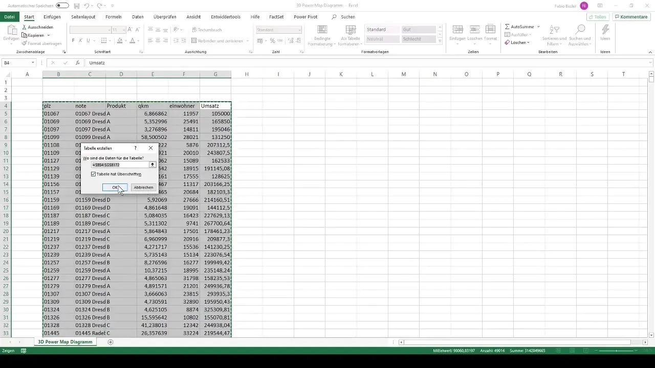
Select the entire dataset and press "Ctrl + T" to open the table formatting menu. Make sure to select the option to use the first row as headers. This significantly facilitates working with the data.
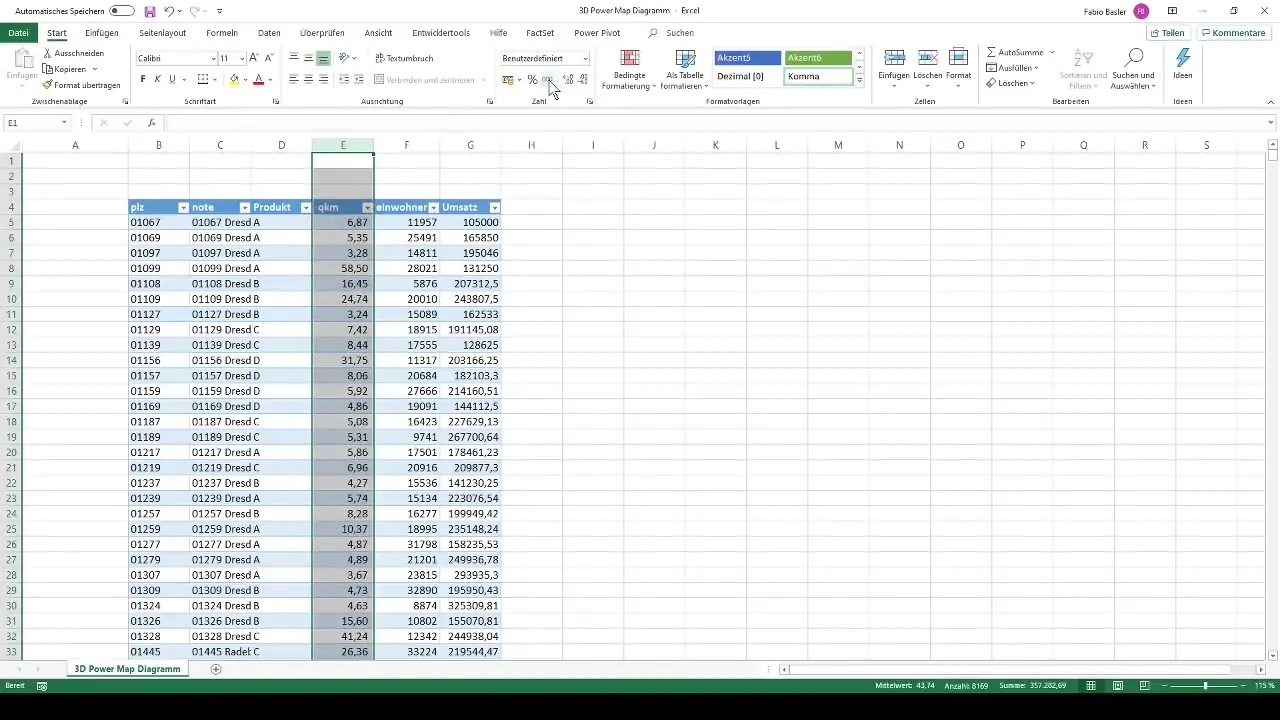
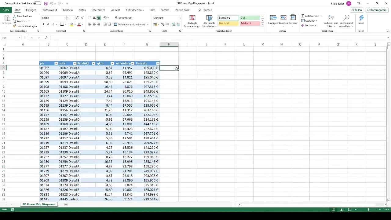
After that, format the individual columns for better readability. For example, add a thousand separator to the numbers and remove unnecessary decimal places. Especially for the revenue column, you should use monetary formatting.
Activate 3D map
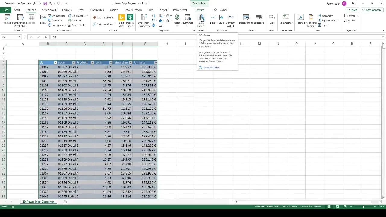
Now you are ready to integrate your data into a 3D map. Click on "Insert" in the ribbon and select "3D Map." This action allows you to visually represent geodata and analyze temporal developments.
Create a new tour
Next, create a new tour in the 3D map. Select "New Tour" from the menu, and you will see an editor area where you can visually represent your data.
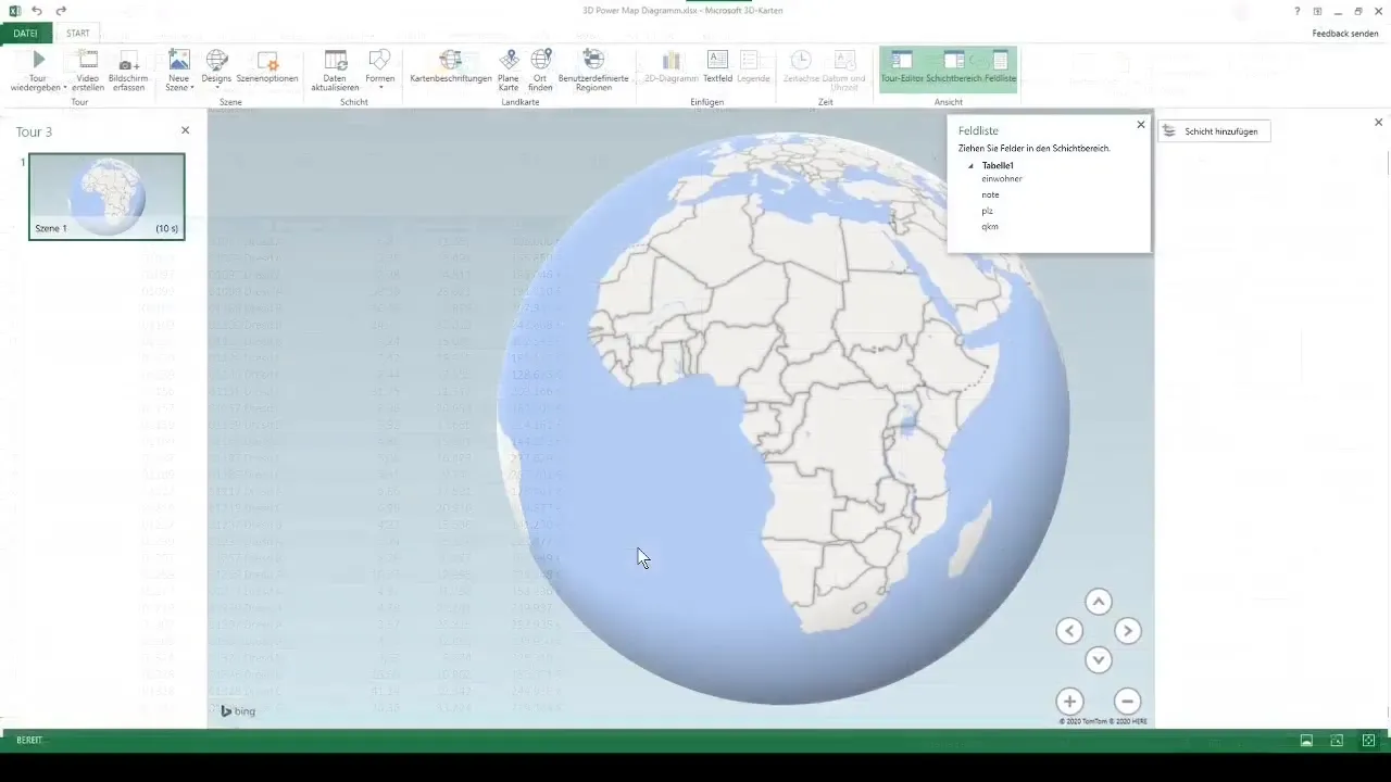
Now you can take a closer look. This area displays a globe representing different regions. Using the scroll wheel on your mouse, you can zoom in deeply into the map view and examine the data more closely.
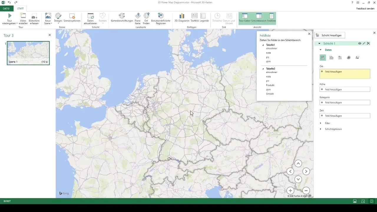
Adjust visualizations
To visualize your data, drag the relevant metrics into the height or categories field. Add zip codes to clarify the geographic distribution of your data.
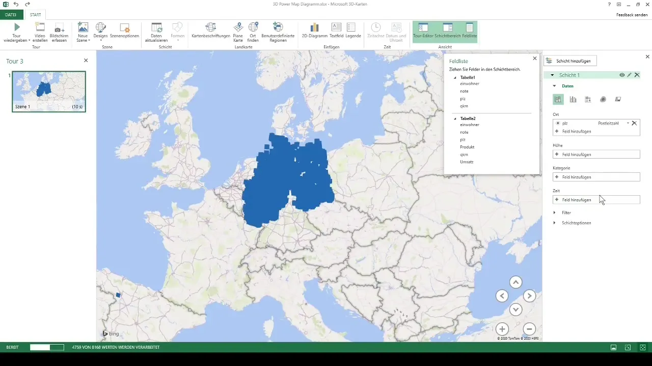
Processing your data will take some time, especially if you have over 8000 values. Excel will automatically populate the map with the relevant information.
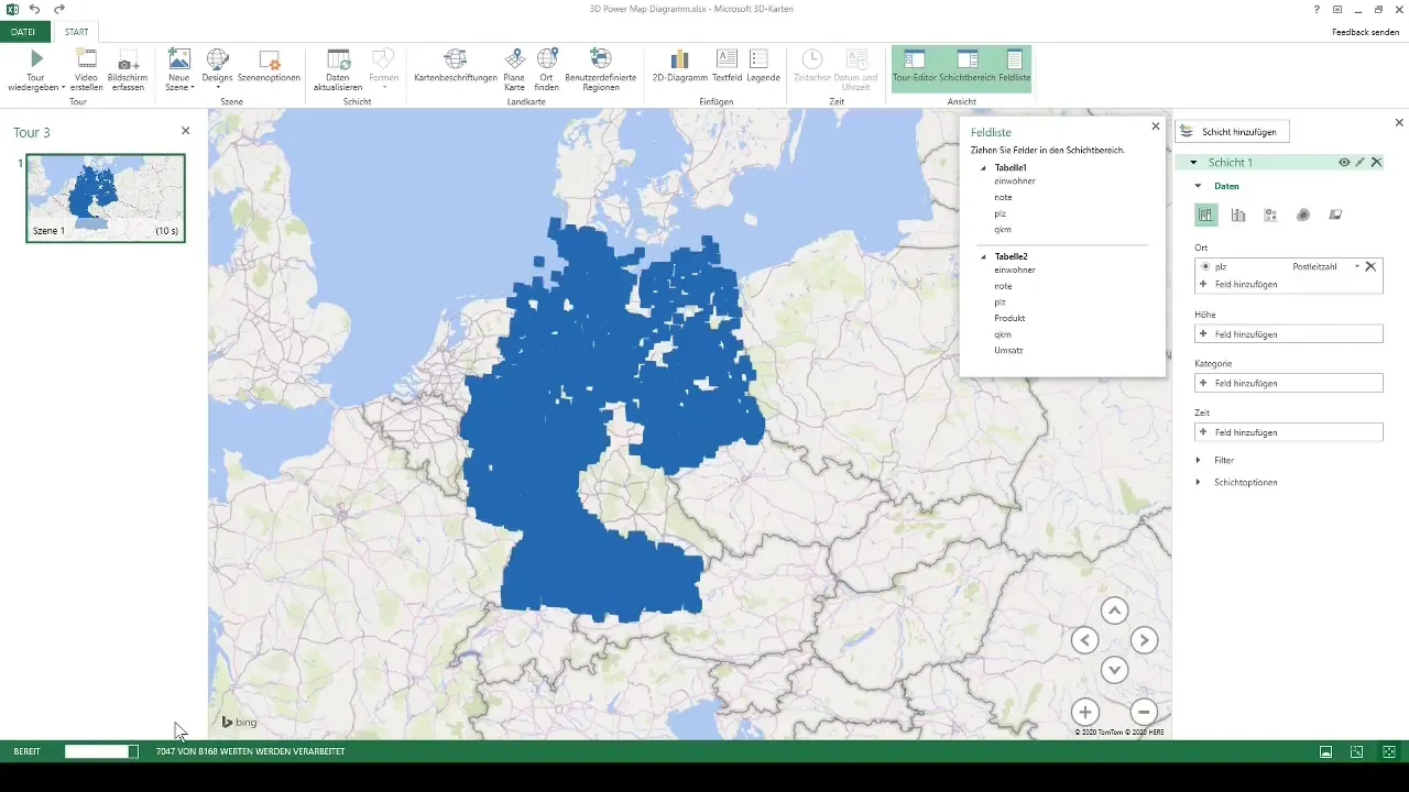
Visualize revenue and population figures
Now you can visualize revenue in the 3D map. Drag the revenue value into the height field, and you will see how the data are visualized in three dimensions on the zip code level.
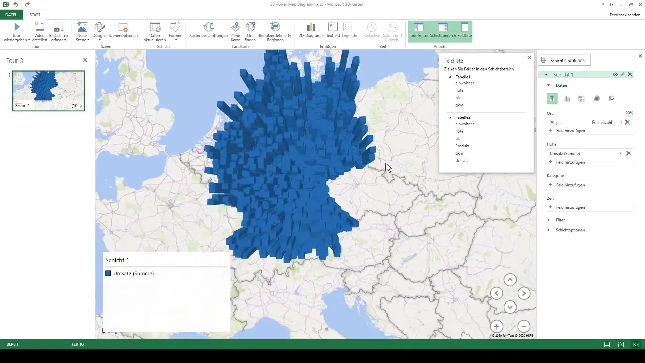
Particularly exciting is the ability to zoom into the regions and immediately identify the zip codes with the highest revenues. This interactivity makes the analysis particularly illustrative and engaging.
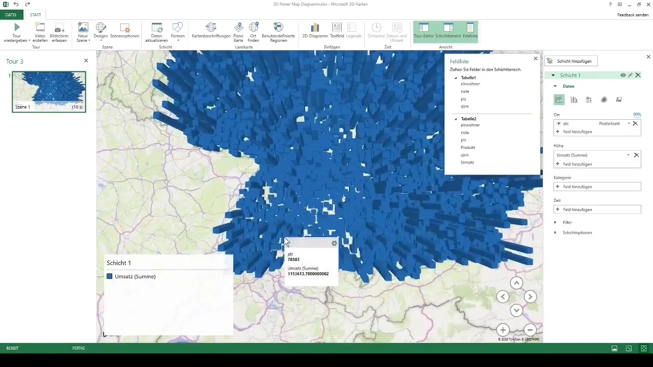
Add more metrics
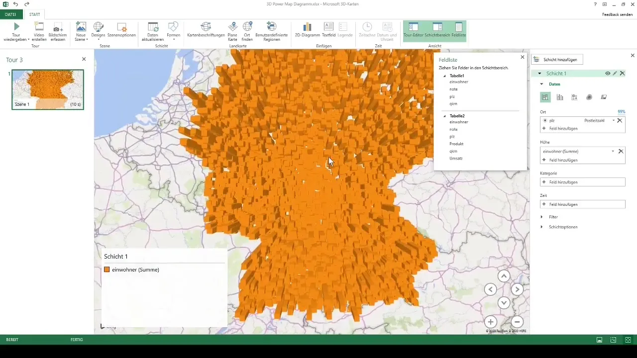
In addition to revenue visualization, you can also include population figures and other categories in your 3D map. This can be quickly done through drag-and-drop. Switching between different metrics is equally easy, allowing you to stay flexible.
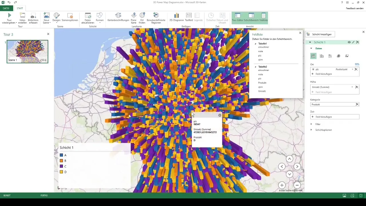
You can also create a subdivision by product categories to represent your sales in an even more differentiated way. By selecting the corresponding product elements, the map will be color-adjusted, allowing you to identify the different product categories.
Utilize Conditional Formatting
Another interesting feature in the 3D map is conditional formatting. With this, you can color-sort your data sets to clarify the distribution of sales. High sales will be displayed in warm colors (e.g. orange or yellow), while lower sales will be presented in cooler colors (e.g. blue).
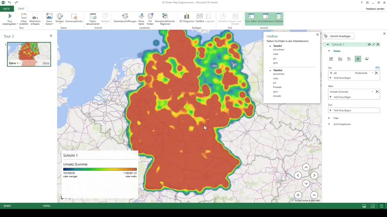
This way, you not only get a visual representation of your sales figures, but you can also easily identify where your strongest and weakest regions are.
Summary
In this matter, you were able to discover the powerful capabilities of 3D maps in Excel. You learned how to effectively format your raw data and then convert it into impressive, interactive visualizations that provide deeper insights into your metrics.
Frequently Asked Questions
What Excel version do I need for 3D maps?You need at least Excel 2013 or a newer version.
Can I use 3D maps for data outside of Germany?Yes, 3D maps can be used for geographical data worldwide.
How many data points can I visualize in 3D maps?You can visualize up to 1 million data points, but performance may vary with the number of points.
Can I add animations to my 3D maps?Yes, you have the option to create videos or animations to illustrate temporal changes.
Can I export the maps in other formats?The maps cannot be directly exported, but screenshots can be taken for external use.


