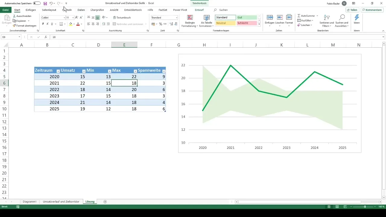
The revenue trend of a company is an essential key figure that is often visually represented to quickly identify trends. In this tutorial, I will show you how to create a target corridor chart in Excel that efficiently visualizes the revenue trend. Using a combined chart, you can represent both the actual value and the target corridor in an appealing graphic that helps you make important decisions.
Key Takeaways
- You will learn how to create a stacked area chart in Excel.
- You will find out how to convert this chart into a combined chart.
- You will see how the axes can be formatted to present the data more effectively.
Step-by-Step Guide
Step 1: Create a New Worksheet
To begin creating your chart, you first need to create a new worksheet. This can be quickly achieved by using the shortcut Shift + F11 or by clicking on the plus sign for a new worksheet.
Step 2: Enter and Format Data
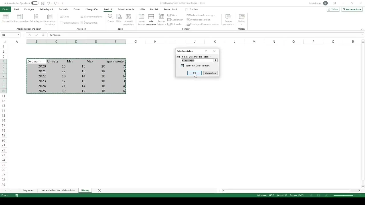
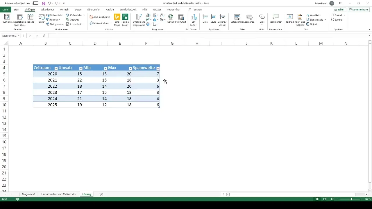
After opening the new worksheet, enter the necessary data for your chart. To make your table more organized, you can use the shortcut Ctrl + T to format the data as a table. This will make it easier to work with the data later on.
Step 3: Create a Chart
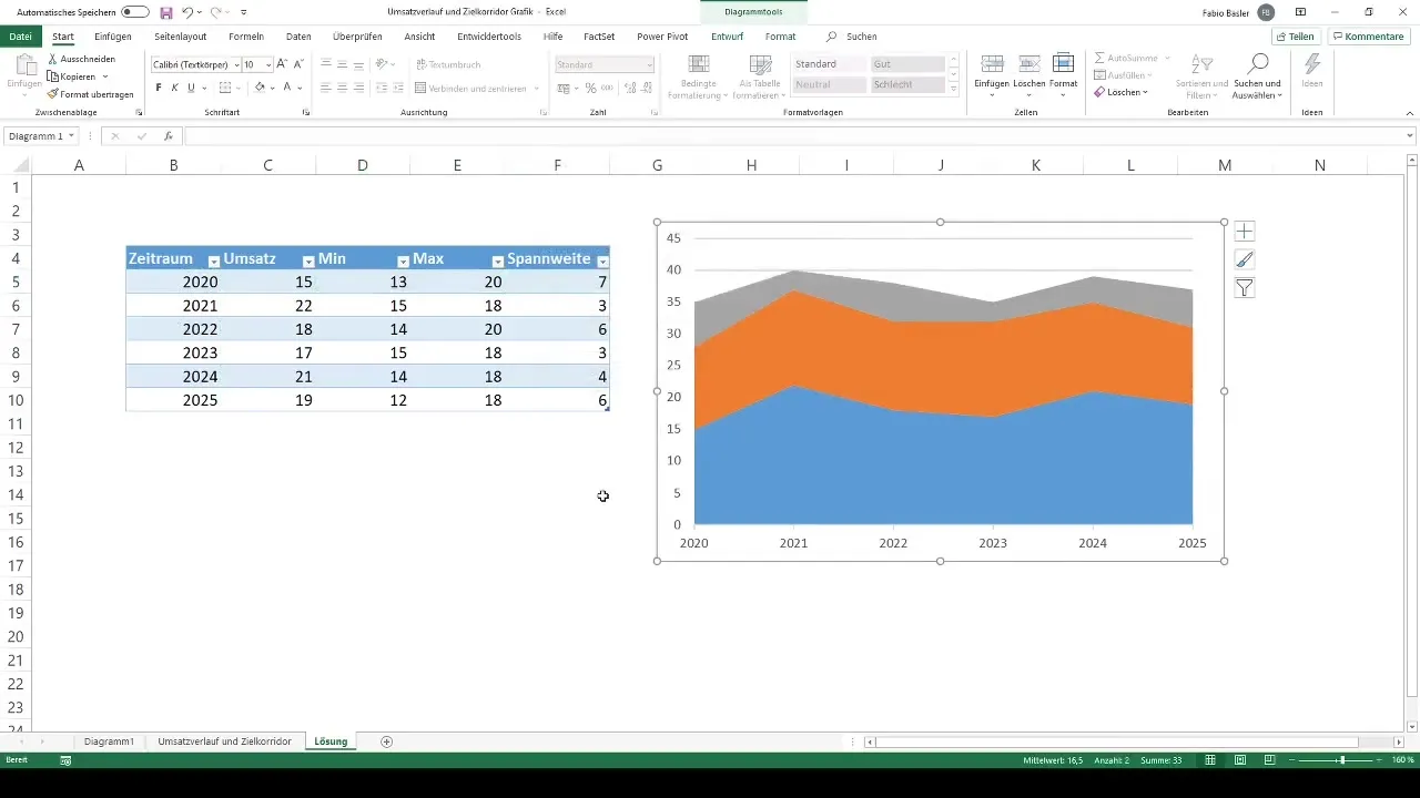
Now that your data is organized in a table, it's time to create the chart. Choose a stacked area chart to display your revenue data. Move the chart aside to have enough space when editing the data.
Step 4: Select Data for the Chart
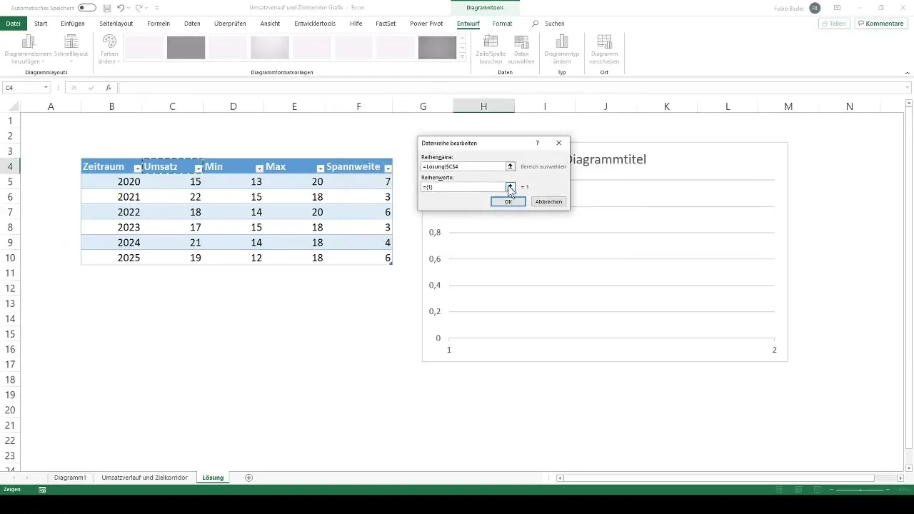
Now it's time to select the data for your chart. Right-click on the chart and select "Select Data". Successively choose the revenue values, the minimum values, and the ranges. The range is the difference between the maximum and minimum revenue values.
Step 5: Add Axis Labels
To enhance the understanding of your chart, add a label to the horizontal axis. This is the timeframe over which your revenue trend is depicted.
Step 6: Create a Combined Chart
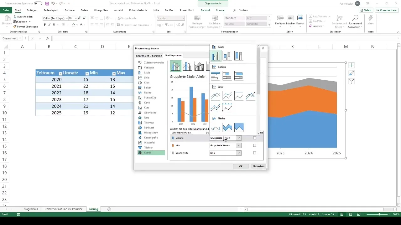
To bring more clarity to your chart, go to "Change Chart Type" again. Choose a combined chart that allows you to combine different chart types. You can represent revenue as a line while displaying the other values as areas.
Step 7: Adjust the Chart
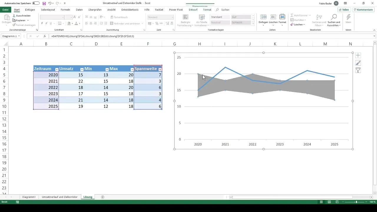
Now you can make further adjustments to your chart. For example, you can hide the lower trend by selecting "No Fill". This increases visual clarity and makes the important data more visible.
Step 8: Adjust Colors and Lines
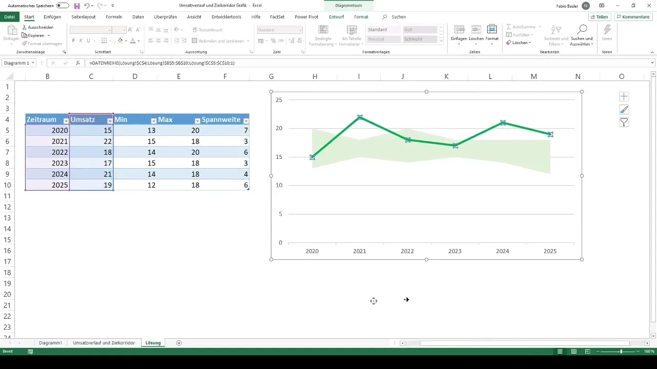
To enhance the artistic design of the chart, choose the color for the range area. A light color like light green may be appropriate here. Similarly, you can color the outline of the revenue line in green and increase its thickness to highlight it.
Step 9: Format Axes
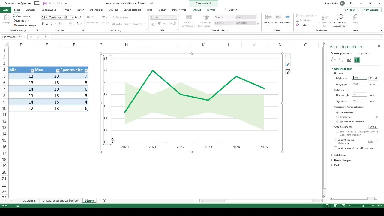
The vertical axis can also be formatted to ensure that the data is clearly understood. Consider increasing the minimum to 10 and adjusting the maximum to a value between 22 and 23. These adjustments ensure better readability of the chart.
Step 10: Adjust Data Dynamically
One of the strengths of this visualization method is the ability to modify the underlying data. For example, if you enter a new range or set a different maximum value, the chart will update automatically. This ensures clarity, regardless of the magnitude of the values.
Summary
In this tutorial, you have learned how to create a revenue history as a target corridor graph in Excel. By combining a stacked area chart with a revenue line, you get a clear and informative visualization. With the adjustments described, you can customize the chart to your needs and gain valuable insights from your revenue data.
Frequently Asked Questions
What is a target corridor in the graph?The target corridor shows the maximum and minimum revenue values between which the actual values are visualized.
How can I customize the chart in Excel?You can easily customize axis labels, colors, and chart types through the chart tools in Excel.
Can I update the chart later?Yes, if you enter new data or modify existing data, the chart will update automatically.
