You are here to find out how you can analyze variances in number series in Excel? In this guide, you will learn the different steps to create and customize charts that will help you visually represent these variations. Additionally, whether you are using the latest or an older version of Excel, you will find useful tips here to effectively visualize your data.
Main Insights
- You can graphically represent negative and positive deviations in Excel.
- The latest versions of Excel have a simpler set of tools for creating charts.
- Even older versions of Excel offer the ability to represent deviations, but require some adjustments in the menu.
- Visualizations help you better understand and analyze changes in data series.
Step-by-Step Guide to Analyzing Variances
Step 1: Prepare Excel Data
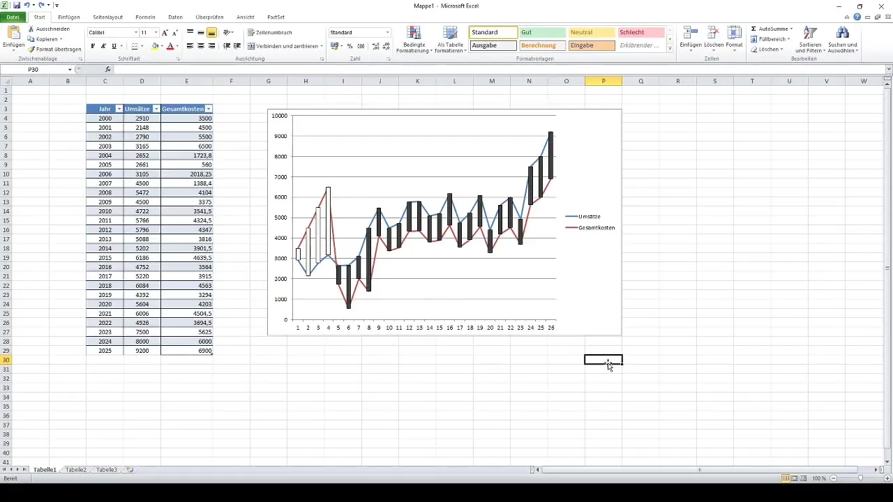
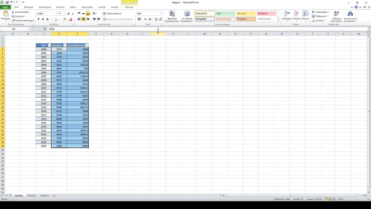
Before you start visualizing, make sure your data is properly formatted. You should have a table that contains the relevant information. In this case, years, revenues, and total costs are used. Open your Excel document and check if the data is entered correctly.
Step 2: Choose Chart Type
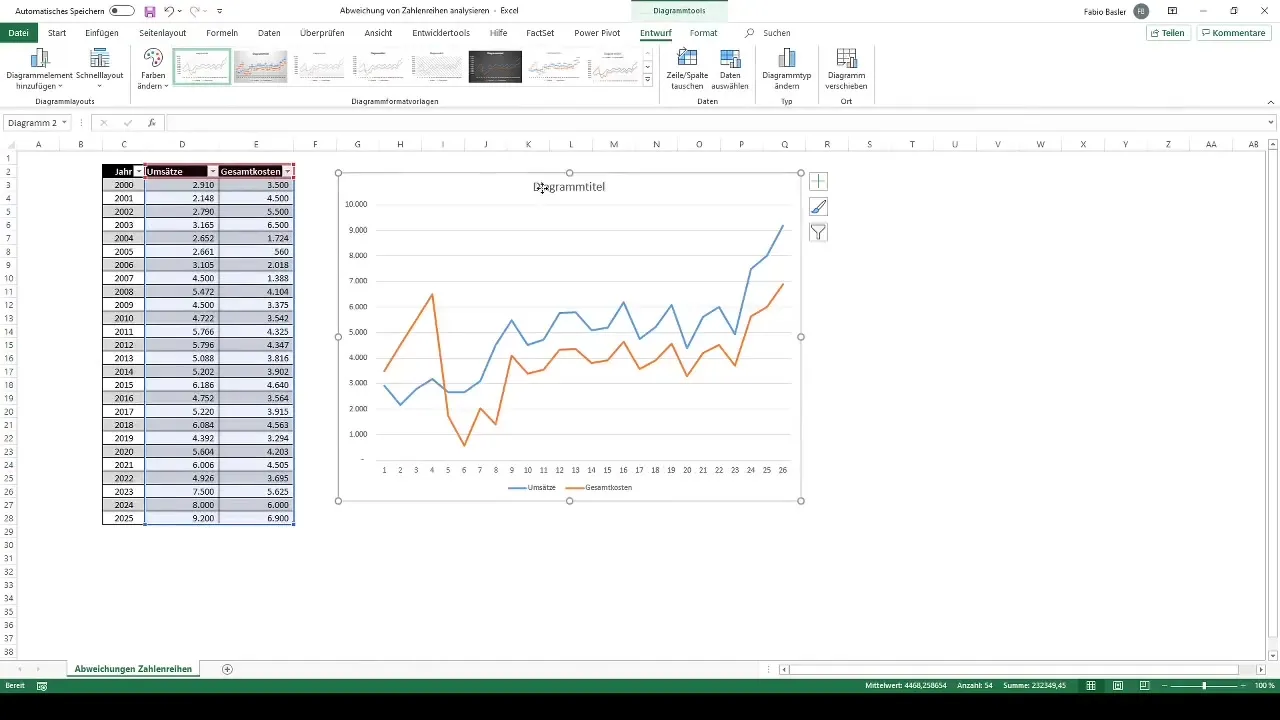
Select the data you want to analyze. Often, a 2D line chart is ideal as it can visually represent both positive and negative variations. Go to the "Insert" tab and click on the option for line charts.
Step 3: Customize Chart
After creating the line chart, you should make some adjustments. For example, you can customize the chart title to focus on your variance analysis. You can do this by simply clicking on the title in the chart area.
Step 4: Add Bars for Variances
To visualize the differences between the two values (revenues and total costs), you need to add bars to the chart. Right-click on the chart and select "Select Data". Now you can make data label and axis edits.
Step 5: Add Axis Labels
Add the horizontal axis label to clearly represent the years. This significantly improves the readability of your chart. Edit the axis options by right-clicking on it.
Step 6: Utilize Chart Tools
In the new Excel version, you will see two main categories for chart tools on the ribbon: Design and Format. Through these tools, you can customize the layout and design of your chart to make it more appealing.
Step 7: Customize Layout (old Version)
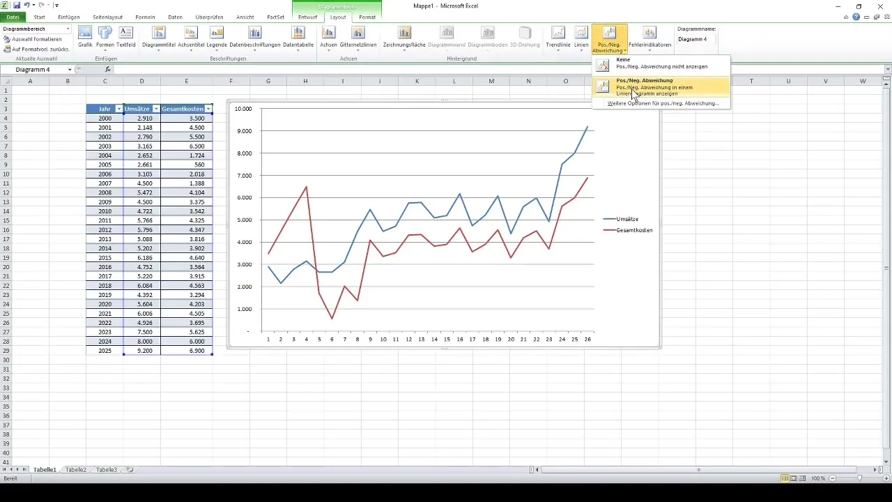
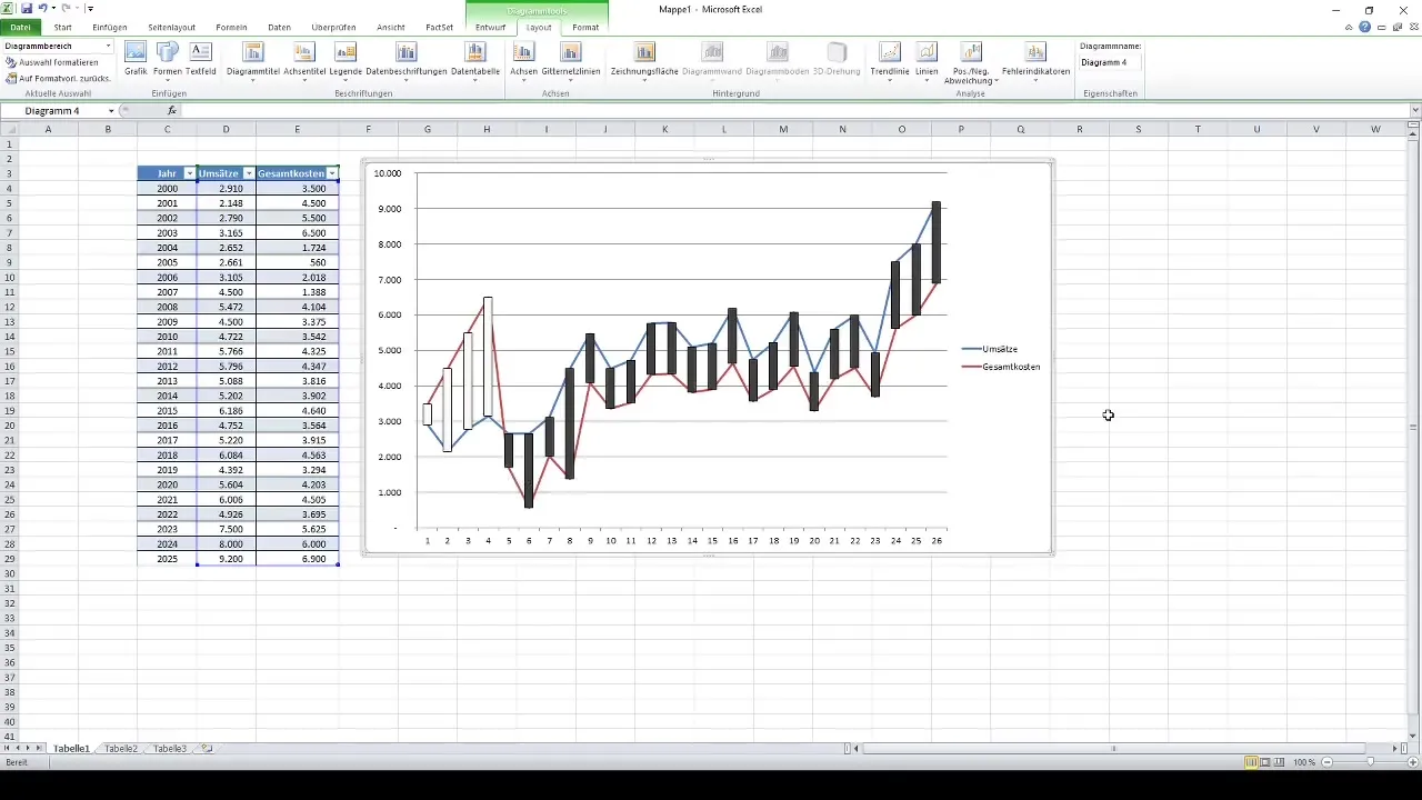
If you are using Excel 2010, you will find the "Layout" category under the chart tools. You need to enable this if it is not automatically displayed. You can adjust the options on the ribbon to make the correct layout tab visible.
Step 8: Highlight Variances
One of the key features is the ability to display positive and negative variations in a chart. Go into the chart structure and select the option to represent these discrepancies.
Step 9: Adjust Colors and Transparency
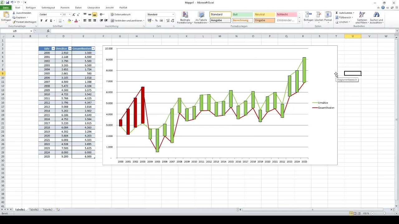
To make your data more easily interpretable, you can adjust the colors of positive values (e.g., black) and negative values (e.g., white). You can also increase transparency to enhance the visualization.
Step 10: Further Adjustments and Options
The chart offers many additional options for customization. Go to the layout options and explore different ways to further refine your chart and optimize the expression.
Summary
In this tutorial, you have learned how to effectively analyze and visualize deviations in number series in Excel. By creating and customizing charts, you can understand your data more clearly and interpret the changes between the values more easily.
Frequently Asked Questions
What are positive and negative deviations?Positive deviations indicate that revenue is higher than costs, while negative deviations indicate that costs exceed revenues.
How do I add axis labels to my chart?Right-click on the chart and select "Add Axis Titles" from the menu.
Can I change the colors of data points in a chart?Yes, by double-clicking on the specific data points, you can adjust and modify the colors.
How can I create charts in the older version of Excel?The steps are similar, but you need to activate the Layout tab to access the corresponding options.
Can I adjust the transparency of data points?Yes, you can effectively adjust the transparency in the chart formatting options.


