You want to learn more about the creation of bubble charts in Excel? This type of chart is particularly useful when conducting a portfolio analysis. In this tutorial, you will learn how to effectively present the BCG matrix using a bubble chart in Excel. This tool is commonly used in practice to strategically analyze a company's products and services.
Key Insights
The BCG matrix allows for the graphical representation of market share and market growth, aiding in deriving strategic decisions. By effectively using bubble charts in Excel, you can analyze market segments and develop targeted strategies.
Step-by-Step Guide
First, it is important to understand what you want to achieve with your chart. The BCG matrix represents products or services based on their market share and market growth. To create a bubble chart in Excel, follow these steps.
Prepare Data
Before starting with the chart in Excel, you should prepare your data. You will need the relative market share (X-axis), market growth (Y-axis), and the size of the bubbles representing revenue.
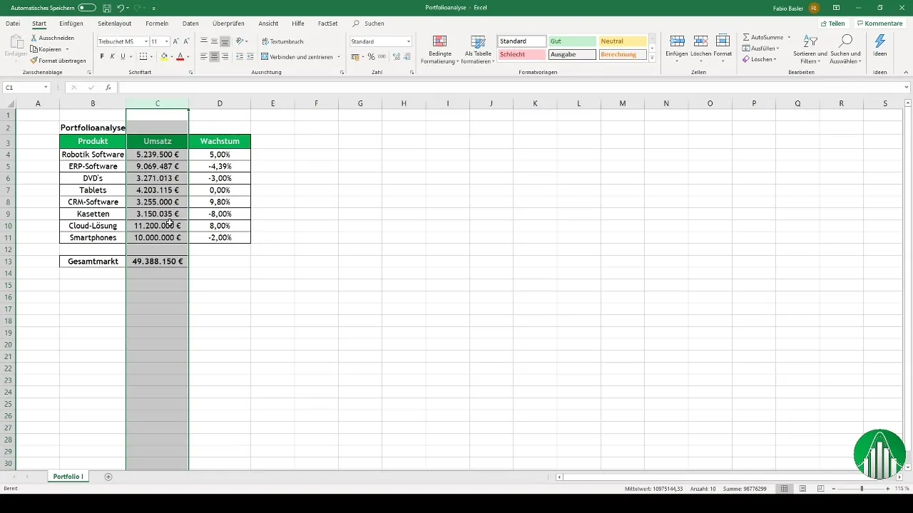
Here, the individual values for products or services should be prepared. Make sure all necessary data is available to perform a correct analysis.
Create Chart
Open a blank Excel document and select the data you want to use for your bubble chart. Then look for the option for a scatter plot and choose it.
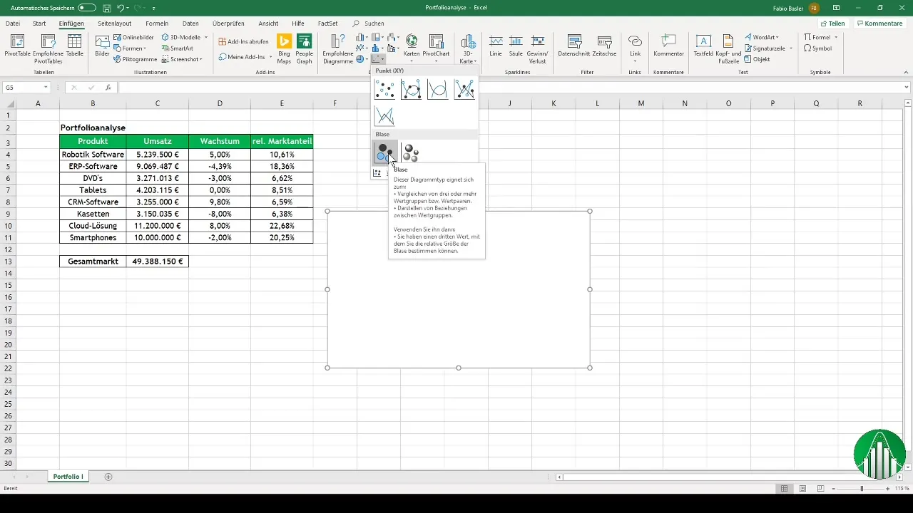
In this step, you will define the X and Y coordinates for the chart. The relative market share will be placed on the X-axis, while market growth will be represented on the Y-axis.
Define Bubble Size
For the bubble size representing revenue, ensure that the data is appropriately assigned. Go into the chart and adjust the bubble widths according to the revenue data.
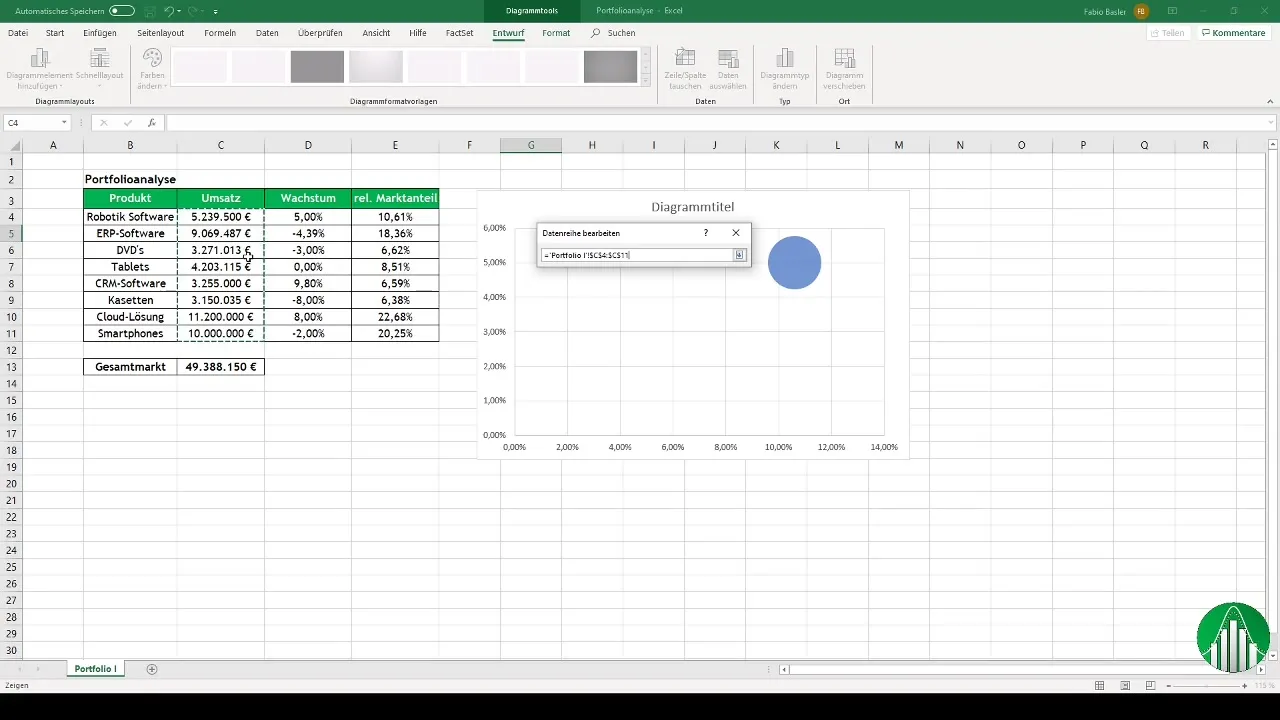
To make the chart more visually appealing, add axis titles. The titles for the X and Y axes are crucial for viewers to easily understand the prepared data.
Add Data Labels
Now, it's time to adjust the data labels to clearly identify the products. Select the appropriate cells and add the products as labels.
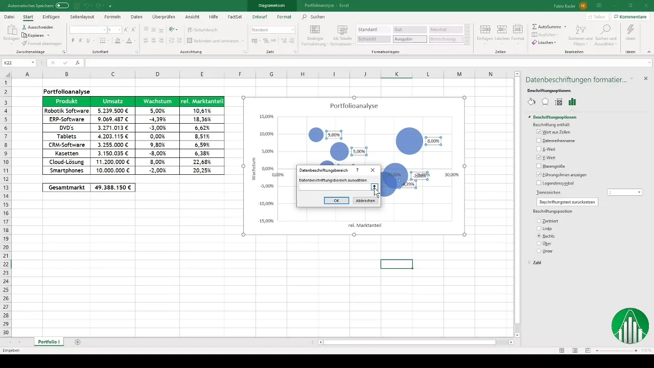
Remove the percentage values as they are not necessary and could clutter the chart. Ensure the labels are centrally positioned to enhance readability.
Customize Chart Appearance
An appealing design is important for presenting your bubble chart. You can customize colors and fonts to your liking. Ensure the bubble color is pleasing to the eye and the font remains legible.
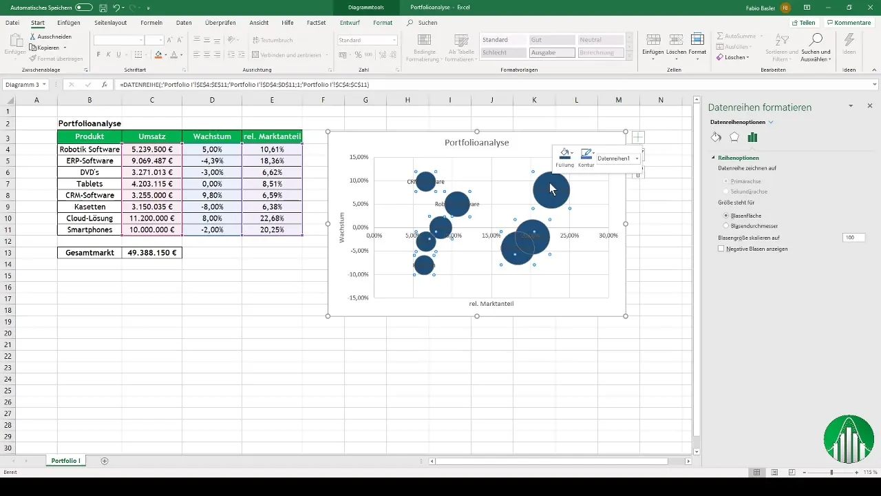
A commonly used color scheme is a light blue background with a dark font color. This makes the chart look professional and clear.
Determine Axis Intersections
To ensure better analysis, you should calculate the axis intersections. The value on the X-axis should represent the relative market share, and the value on the Y-axis should represent market growth.
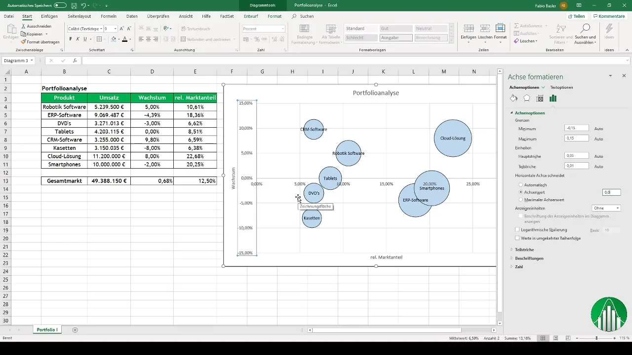
Use axis formatting to input the values for the intersection. These values are important for defining the different categories (Stars, Cash Cows, Question Marks, and Dogs) in the BCG matrix.
Add Icons
To make your chart more meaningful, you can use icons. Go to "Insert" and select the icon option. Add icons representing the different categories resulting from your analysis.
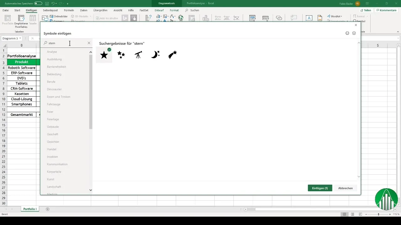
Once you have inserted the symbols, place them accordingly in the matrix. These visual elements help to clearly present the strategies for the individual products or services.
Conduct a final analysis
With the finished diagram, you can now discuss the results of your portfolio analysis. Take a look at the distribution of products in the BCG matrix and identify Stars, Cash Cows, Question Marks, and Dogs.
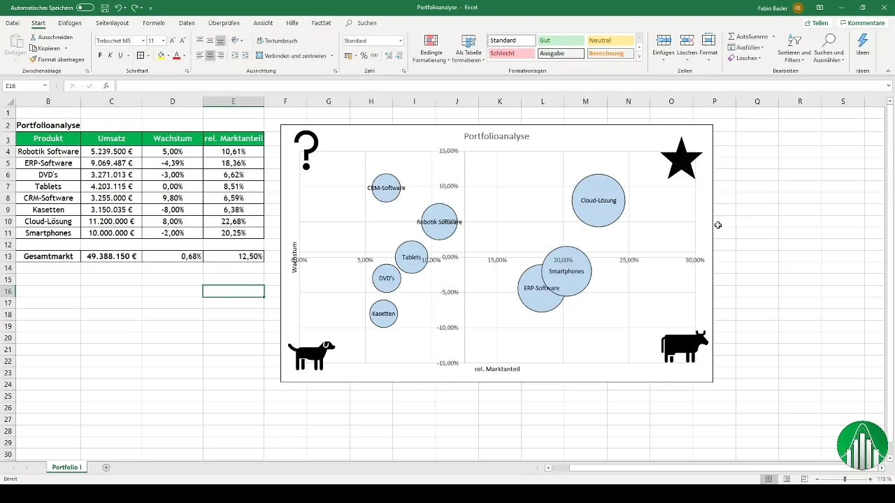
Your analysis will help you make strategic decisions for your company. Consider which products should be further promoted and which may need to be phased out.
Summary
Creating bubble charts in Excel is an effective way to perform a portfolio analysis. The BCG matrix helps you make strategic decisions based on market growth and market share. By carefully preparing your data and designing your diagrams visually, the presentation will be clear and memorable.
Frequently Asked Questions
How do I create a bubble chart in Excel?Select the data, open a scatter plot chart, and define the X and Y coordinates as well as the bubble size.
What is the BCG matrix?The BCG matrix helps companies analyze their products or services based on market share and market growth.
How can I present my results?Design your chart appealingly and add icons to visually support the analysis.


