Note: The tutorial "Photoshop Composing - Fire and Ice - Part 12: The Final Steps" is a text version of the accompanying video training by Marco Kolditz. The texts may therefore have a colloquial style.
Here we go: Steps 1-10
Step 1
Well, and here you are at the last tutorial in this series. It's amazing, you've actually turned this original image ...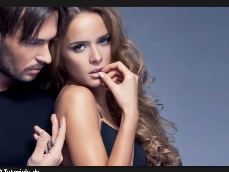
... into this one.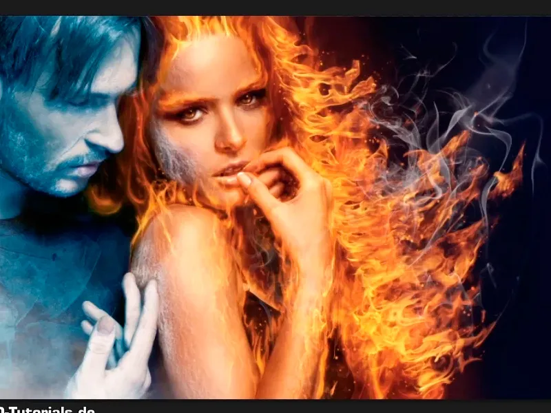
Step 2
And in this tutorial, Marco shows you the final steps, namely sharpening and adding noise. You'll see why in a moment. You can ignore the "Info" group for now, it will come later.
In the meantime, Marco has added a mask to the gradation curve layer, which looks like this: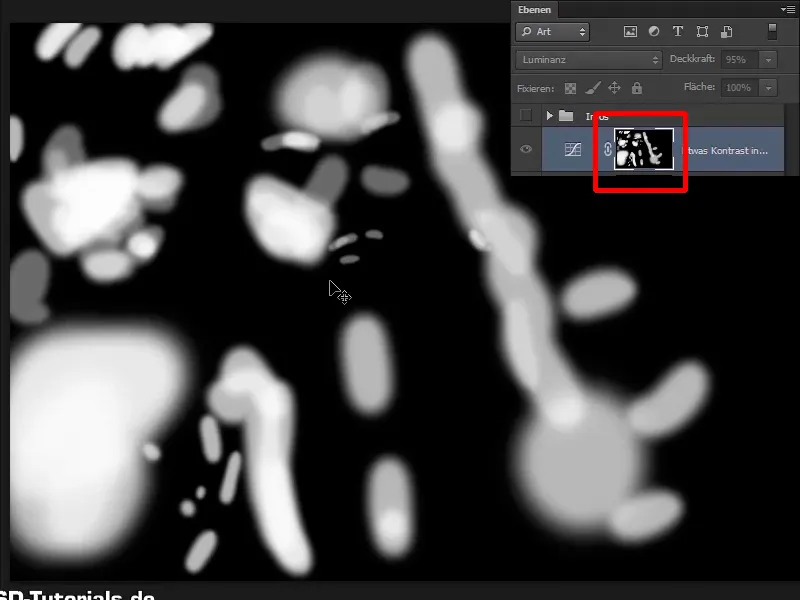
Step 3
This means that the brightness you have added will only have an effect where white is visible. Especially in the area of the nose, forehead, etc. and not on the entire image.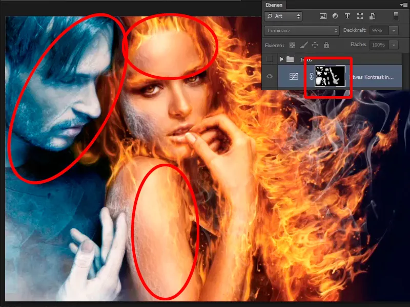
Step 4
Now you want to sharpen the image. To do this, zoom into the image a little and click on the top layer. As I said, you can ignore the "Info" layer. Press Ctrl+Shift+Alt+E to combine all existing layers into one layer and rename it "Sharpen".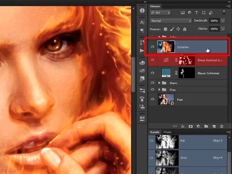
Step 5
Of course, you turn this into a smart object again ,...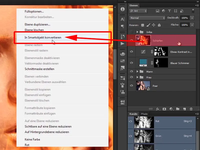
... because you want to be able to change it at any time, and select Hard Light as the layer mode.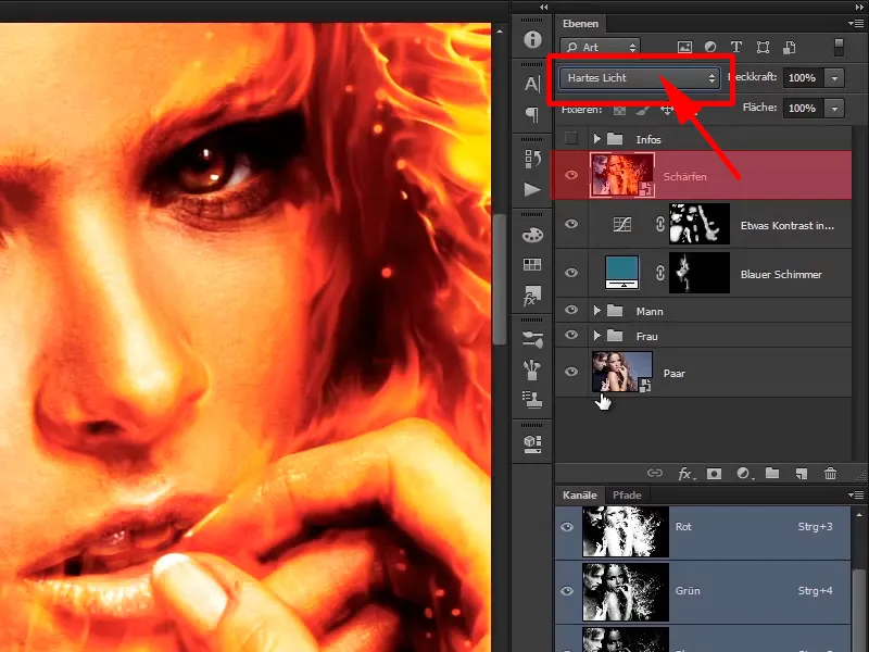
Step 6
So, now you've messed up the whole picture and it was a lot of fun showing you all this, until next time. No, of course not. With Hard Light you have created an incredible amount of contrast in the picture, which of course makes no sense.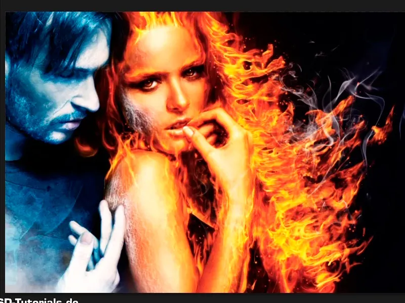
Step 7
But this was necessary because it is part of the sharpening process. Now select the High Pass filter from Filter>Other Filters>High Pass...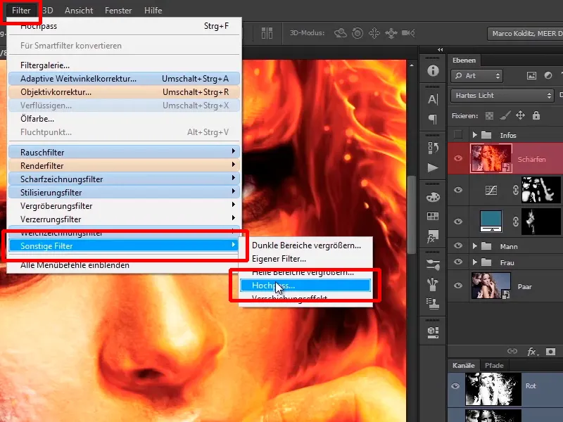
... and set a radius of 4 pixels for this image.
Radius: 4.0 pixels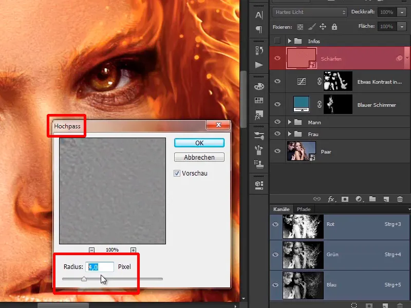
Step 8
If you move the slider further to the right, you will create an extremely strong contrast, which makes no sense in this image.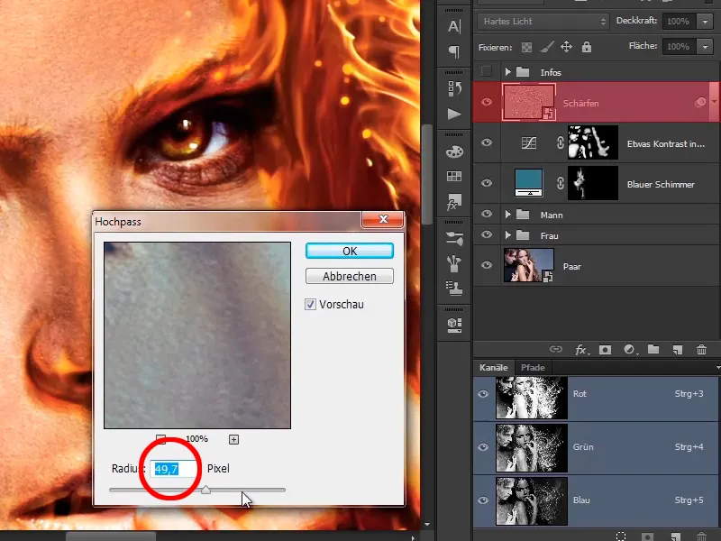
If you move it all the way to the left, you won't see any sharpening at all.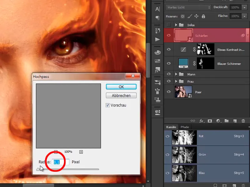
Step 9
The more you go into this area, at 3 or 4 pixels, the more sharpness appears in the image. It looks quite good like this.
Radius: 4.0 pixels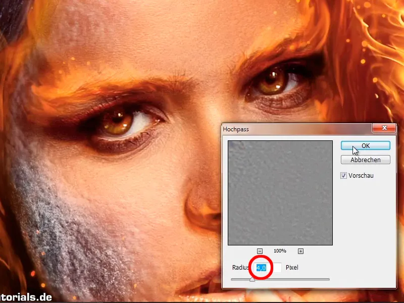
Step 10
What is noticeable is that, for example, such contours can create very slight light fringes.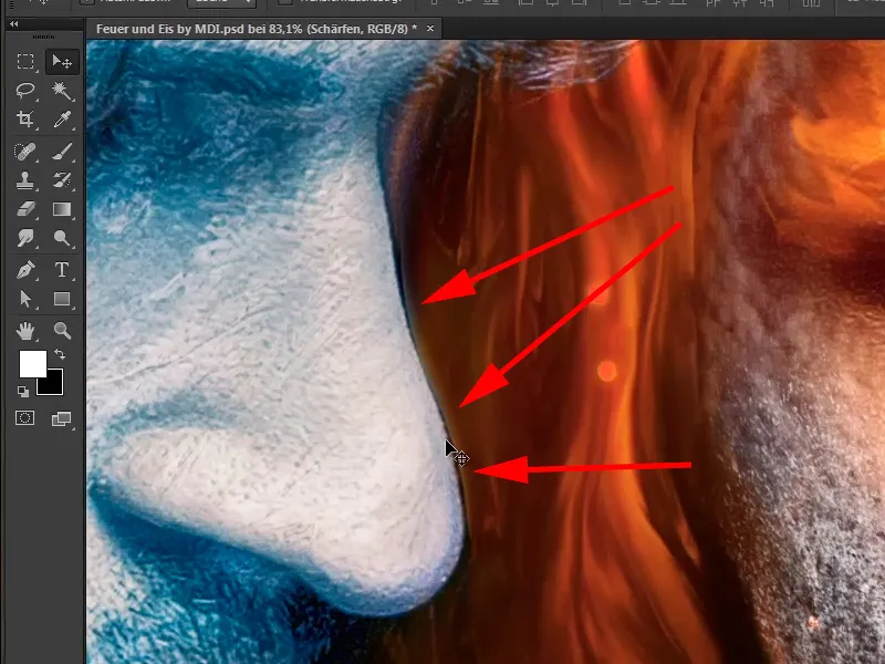
Where else might this be visible? On the shoulder, for example.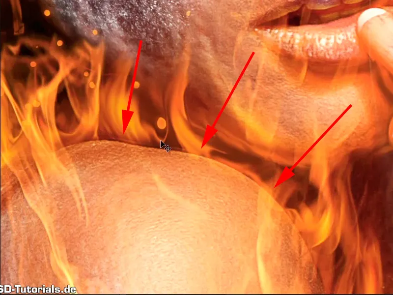
Simply continue: Steps 11-20
Step 11
And of course you don't want that to happen, so you'll create a mask. Take a brush with a black foreground color, full opacity of 100%, and simply paint it out a little in those areas.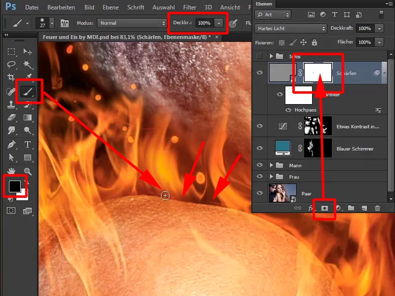
Step 12
This means that you at least go along the contours where it is particularly noticeable. Here too, for example, if you take a look. There's a very slight light line here, if you go over it, it disappears and you should do that.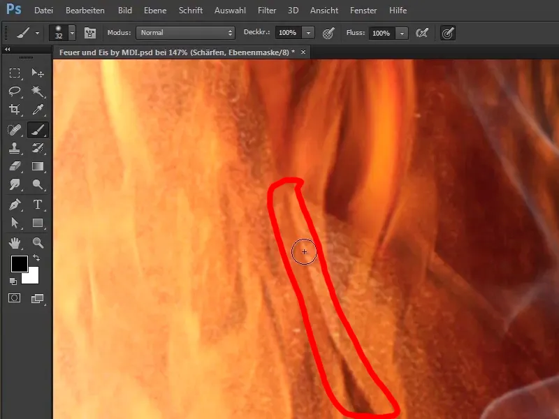
Step 13
You can do this again manually in the same way and take a look at where you can do this throughout the picture. For example, on the nose, and in this way you can avoid these typical sharpening errors, which you often see on the Internet, where someone sharpens like crazy and then you have these unsightly contours everywhere in the picture, which simply create these light fringes. If you don't remove this immediately, you simply won't enjoy the picture any more, because it's very difficult to remove later, especially if you continue to work with the picture. So here's a tip: always sharpen the image last.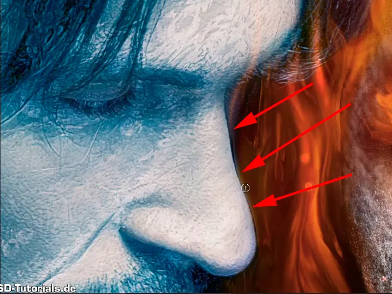
Step 14
Unless it is really necessary to sharpen an image for an editing step. But here, for example, you can also see it very clearly. It has become really bright here ...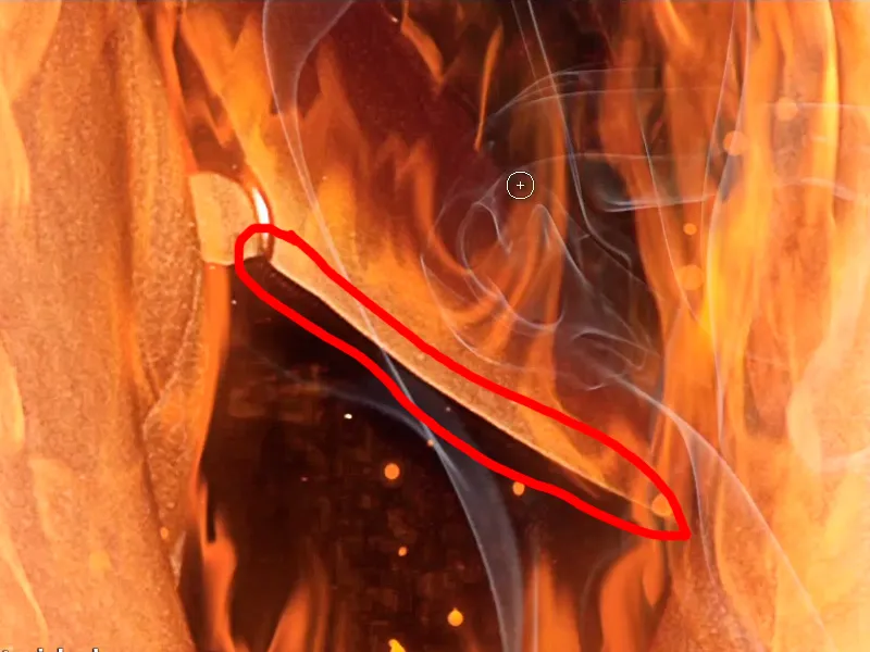
... and if you paint over it, it goes away, and that's how it should be.
Step 15
Marco has now worked on this for you; he has adjusted the mask, and he'll show you how in the overview. You will hide the mask and you can see, especially in the fire, where it is really bright, that it is now just too bright, ...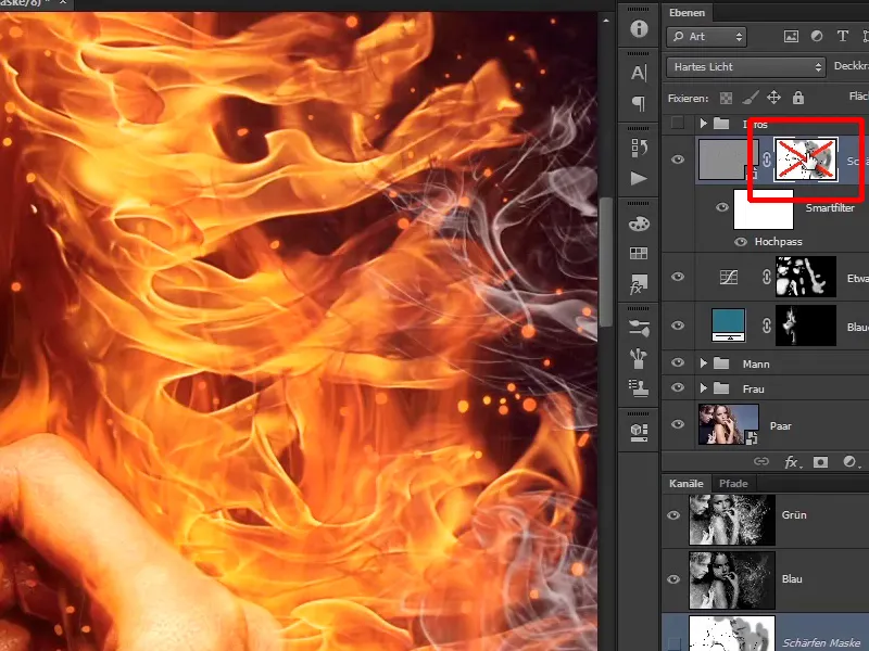
... and when you show it again, the light fringes will disappear a little.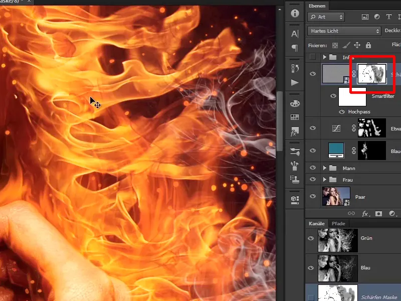
Step 16
If you zoom out of the picture, the mask looks like this. Interesting drawing, ...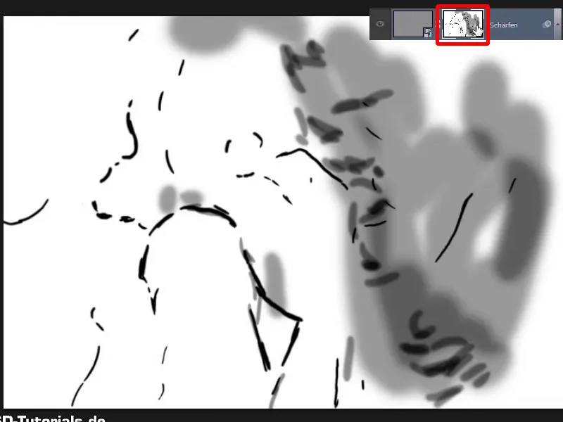
... and now you've sharpened the image nicely.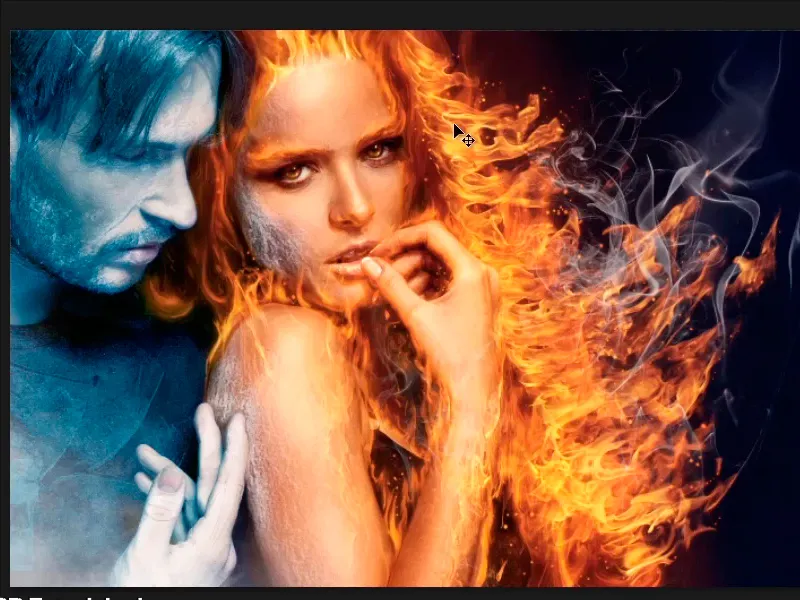
Step 17
In the next step, the final step, you now want to adjust the color look of the image a little, and to do this you select a new Color Balance adjustment layer.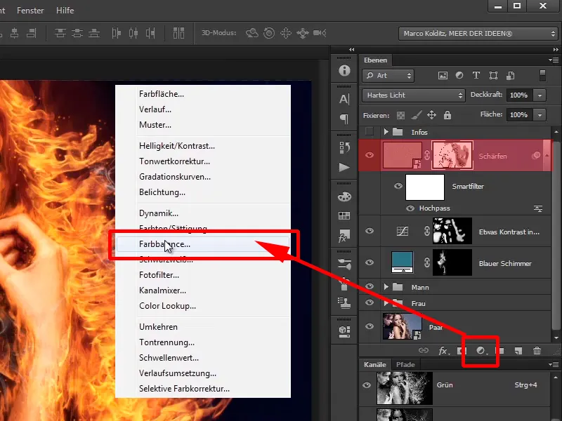
Step 18
Here you go to the depths and add a little bit of blue to the image; +1.
In the mid tones, add a little red to the image, +4 approximately. For the contrast, add a little blue, around +8, and leave the highlights as they are.
Depths: Blue +1
Mid tones: red +4, blue +8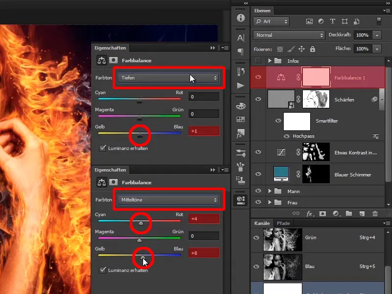
Step 19
If you look at the before and after comparison, ...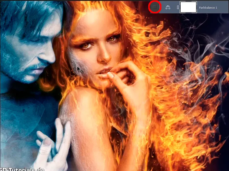
... you can see that the image has lost a little of its green cast.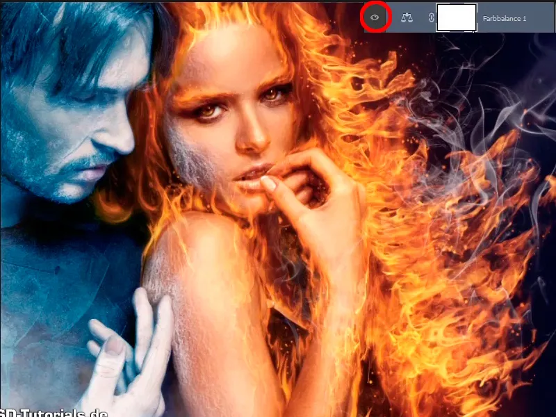
Step 20
This is another nice improvement of the color look and you rename this layer to "Color look". Place a new layer above it to add noise to the image. Hold down the Alt key and select the icon for a new layer to open the dialog box that you already know and name the layer "Noise" Set to soft light mode and fill with grey.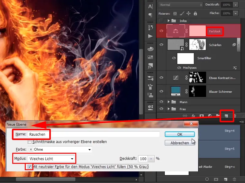
The last steps
Step 21
Now you can't see anything at first. You zoom into the image and what you notice is that when you edit images, it can happen that there are areas of sharpness like the skin or the frost on the woman's cheek. And then there are also these areas where you've painted the fire with the wiping finger. The wiping finger generally creates soft areas, and Marco always likes to add some noise to create a harmonious effect.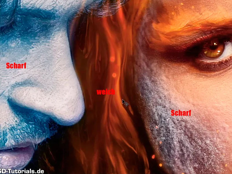
Step 22
This means that you convert the "Noise" layer back into a Smart Object.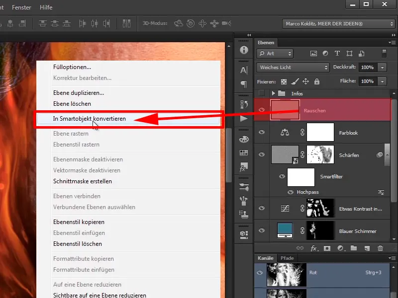
Photoshop now has to do a bit of work. With the "Noise" layer active, select Filter>Noise Filter>Add Noise.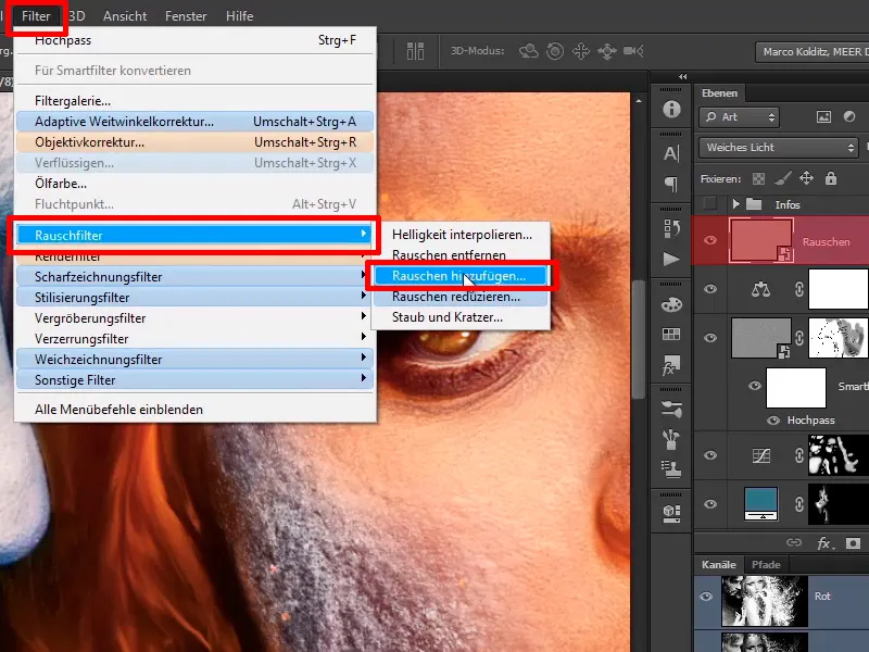
Step 23
Most people prefer to remove noise. Marco adds it in Monochromatic mode, very important, otherwise it will still be relatively colorful. With a strength of 15%, this is fine.
Strength: 15%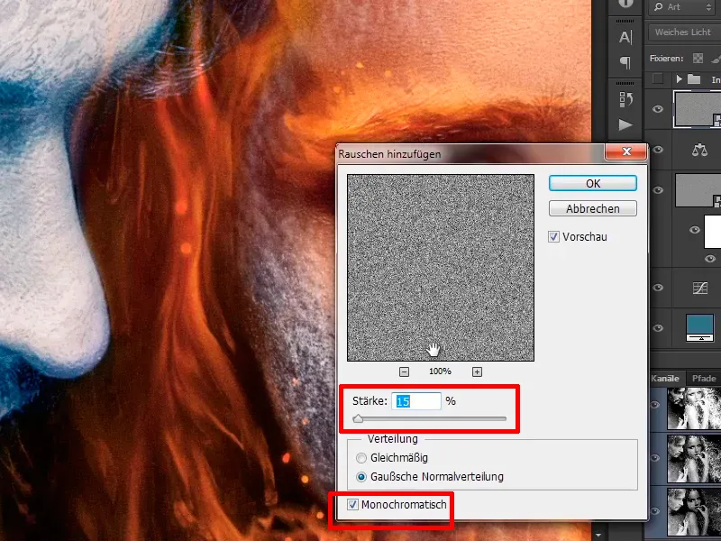
Step 24
If you drag it further to the right, it becomes very noisy, as you can see here, ...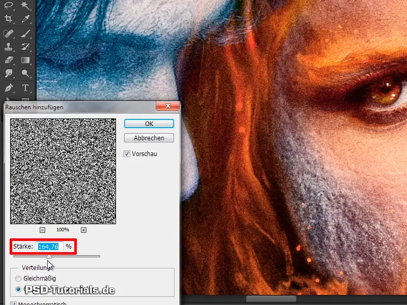
... but with the value of 15% you can be very satisfied and confirm with OK.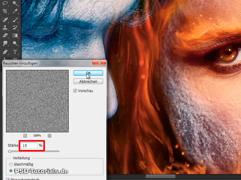
Step 25
If you look at the transitions in the picture, you have the man's skin, the soft areas on the hair, and then the woman's skin again.
If you hide this, you will see skin, the hair has been edited, wiped and skin again.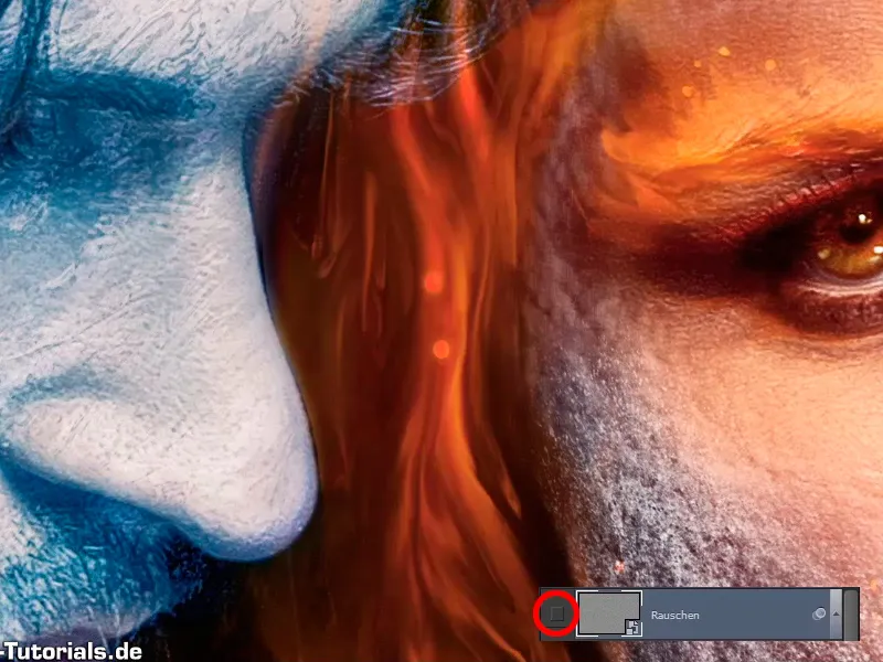
If you Blender the layer back in, you can see how it blends together so nicely.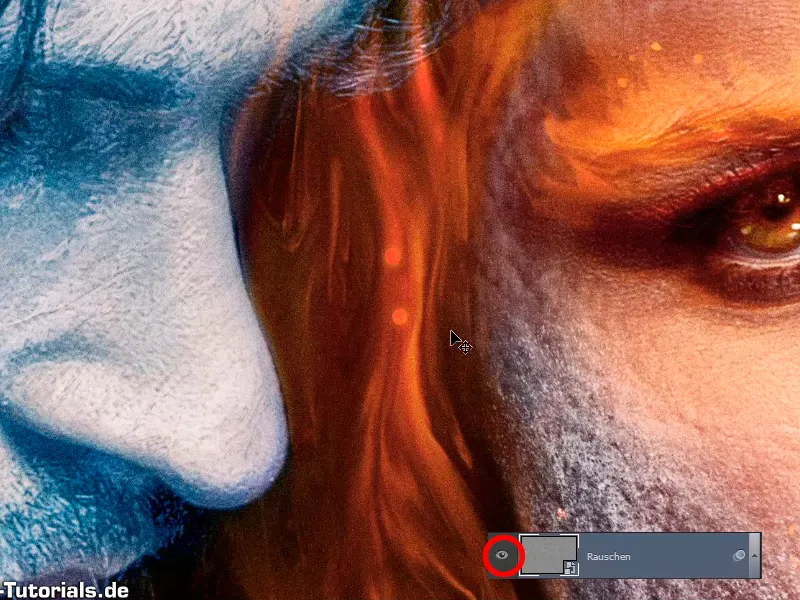
Step 26
This means that the edited areas, although this is very clear in this image, as the fire didn't really exist, are blended much better into the rest of the image, and that looks quite good.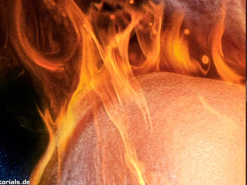
Step 27
This also has a bit of a movie poster look. Because many, especially old movie posters, always had this noise in them.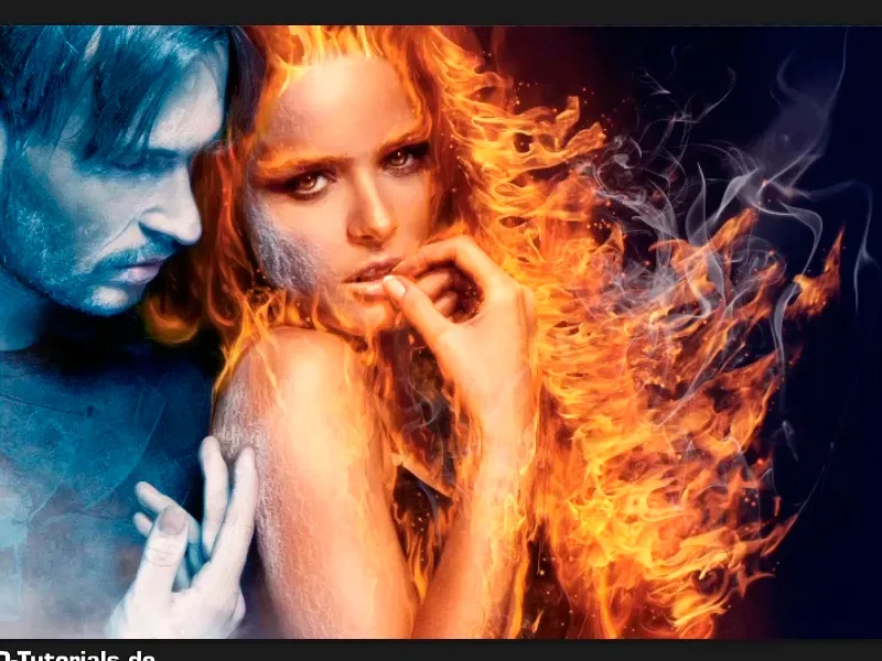
Step 28
Marco would like to thank you very much for watching. Finally, we'll fade in the "Info" layer and would like to invite you to write him your feedback at any time.
On Facebook, for example, where you can also follow him at www.facebook.com/meerderideen.
On Twitter at www.twitter.com/meerderideen.
He also has his own channel on YouTube, which you can access at www.youtube.com/meerderideen.
You can also write to him or visit him on his brand new blog at www.meer-der-ideen.de.
Step 29
Marco hopes you really enjoyed it and learned a lot. He would be delighted if you would join him again for the next tutorial.