During this training session, I'm on a very special assignment, namely Christmas. When the nights outside are getting longer and the days shorter, it's getting bitterly cold and you'd rather visit the Christmas market than work overtime, then it's time for Christmas, people get a little closer together, warmth is on the rise again and you think of all the people you've loved over the past year.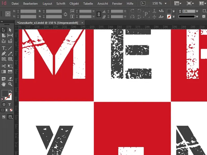
And because of this, I did a bit of searching myself and came across a very interesting infographic that I naturally don't want to keep from you. What this infographic says is this: Over 80 percent say they are sending Christmas greetings this year.
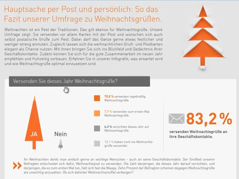
Overview of the Christmas card layout
Of course, this can be done digitally, but it can also be done in analog-postal form. How do you do it? Do you prefer the modern computerized way, do you write via WhatsApp or do you really still send out cards? Personally, I don't think any of this does justice to the charm of a real Christmas greetings card. And that's why we're going to create a very special Christmas post together in this workshop. It's a business greetings card in the DIN long landscape format. Wow, sounds tricky, but when I show you what it's all about, you'll say: "Oh, that's what he means." Because it's pretty simple.
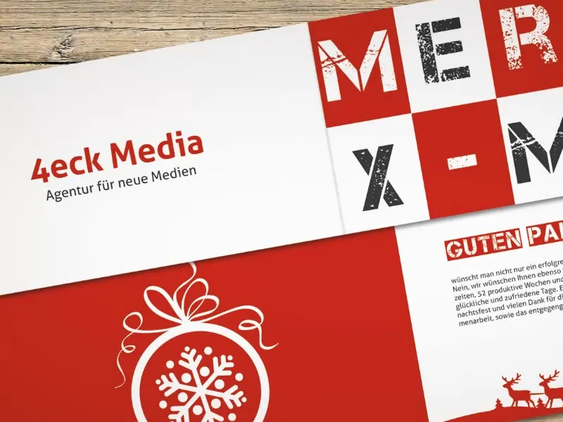
The finished greetings card looks like this. We have the DIN-long format, which is actually like a normal envelope. We have a front, a back and ...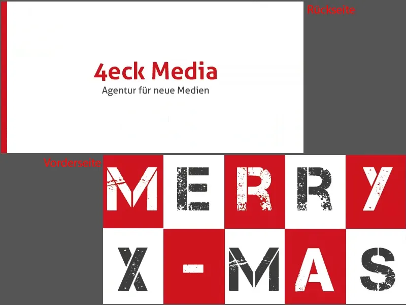
... two inside pages. This is what our greetings card will look like.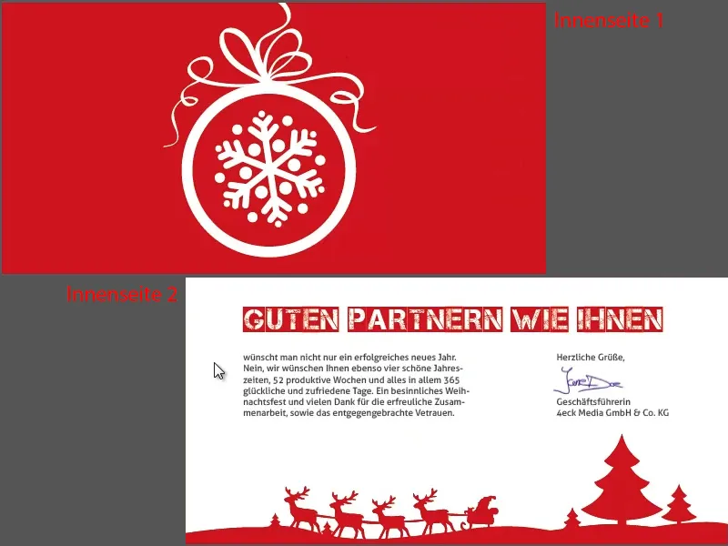
As a small visualization aid, the whole thing as a print preview in our online presentation. This is the front, the inside ...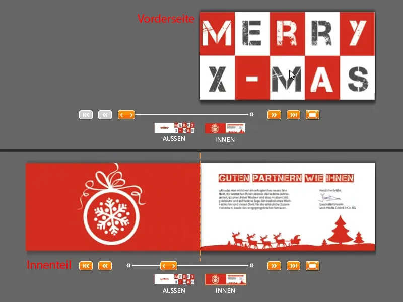
... and the back, once again with the front. Now the whole thing closes again.
This is what the card looks like - and we will now build it together. And to use the famous words of Jack Sparrow: "All right so far?" - I think so. Let's get started ...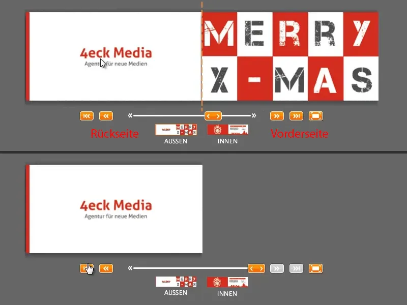
Download layout template
As in other of my training courses, we'll look for a template on the web. Once again, I go to viaprinto.de, our online print shop, and there I find the greeting card (1) in this large list on the right.
Then I select the format: DIN long landscape (2). There are also others, such as DIN long portrait, which I think would be interesting to see what a greeting card looks like.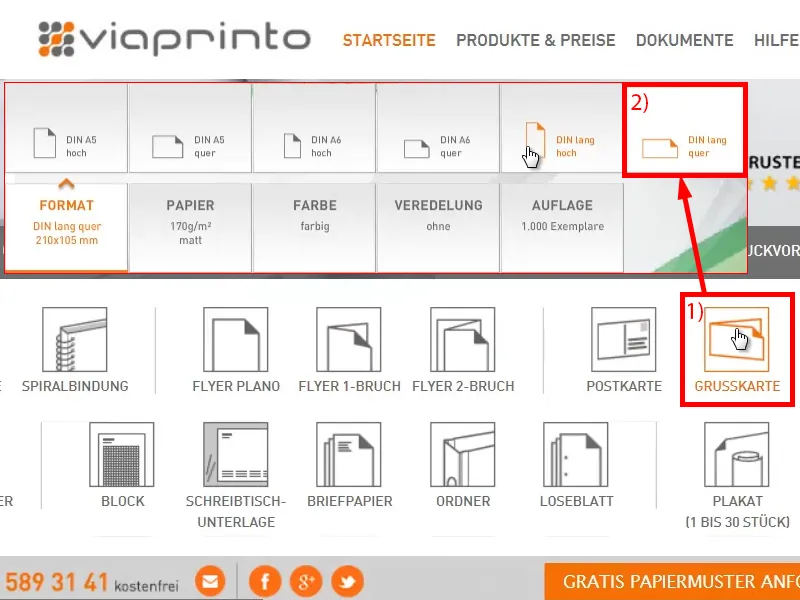
Here below under Details and templates (1) we select the template. You can then see all the information (2), for example that there is a fold, there are finishing instructions and the number of pages. You can also define the bleed here (3) if you want to do it yourself.
But we won't do that, we'll just go to the bottom, find the InDesign template(4) and save it to open it in InDesign. By the way, I'm working with InDesign CC 2014, but the template is available from CS 5.5 onwards.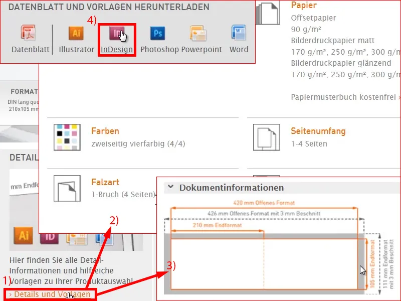
This is what the document looks like. Let's get an overview: What is actually always the case when working with templates: different layers are arranged here (1), an information layer "for data creation", which is where everything we can see here is, and a "design layer", which is what we are working on here at the end.
I'm going to take the liberty of simply hiding this information layer (2), because I know what I have to do next. I don't need that. This could be useful for you, so just take a closer look at the hints. I'll remove them for now.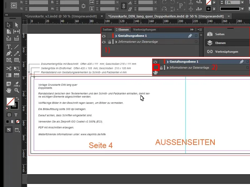
Designing the front
The first thing I need is definitely the place where the fold will be. That's why I simply draw a line from my ruler on the side (1) and set it to 210 mm by entering it up there (2). So that's where the kink will be.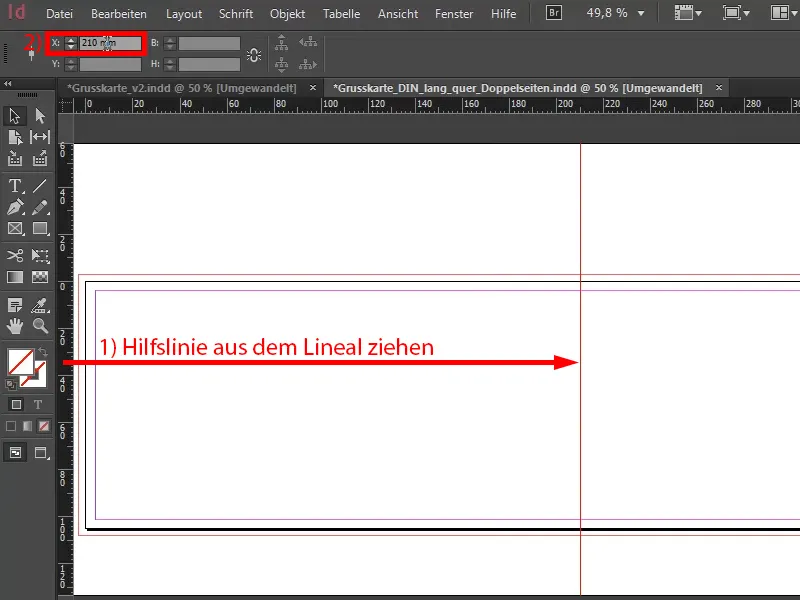
Now I'll turn my attention to the right-hand side, because I'd like to have this tile design here. You remember, it looks like this page here.
Yes, what's behind it? It should simply be a flat look. Less is more and I just want this lead page to stand out a little from the crowd.
I want this page to simply stand out from the huge jumble of Christmas greetings cards that you've always received, from the 81 that you've seen before and from the 320 that you received last year. So that's exactly why we came up with this design. We have a warm, Christmassy shade of red. And that's my lead color for Christmas, but of course there are other colors, green or blue, I'll come back to that later, but for now we need the tiles.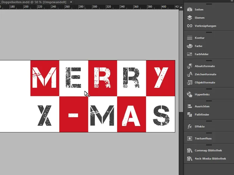
We can easily add this by going to Layout>Create Guides. Then this great dialog opens. I'll activate the preview function(1) so you can see directly what will change there. I would like to have two lines. I don't need the column spacing, I'll set it to 0 mm. And I want 10 columns, again with 0 mm column spac ing (settings under 2). Here below the checkbox at Page is OK (3). Confirm with OK.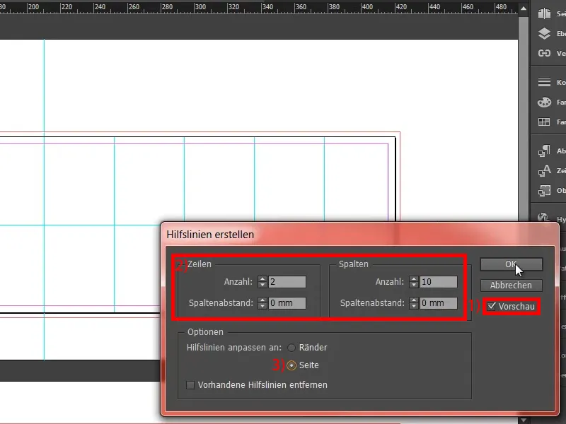
Now we actually already have our grid, that was pretty easy. And then, of course, we need the right color. I create my color manually (1), because I have exact color values that I want to take into account. It's quite simple for me (2): cyan 17 %, magenta 100 %, yellow 95 % and black 7 %. That gives this red tone, fiery as love, which I add (3 and 4).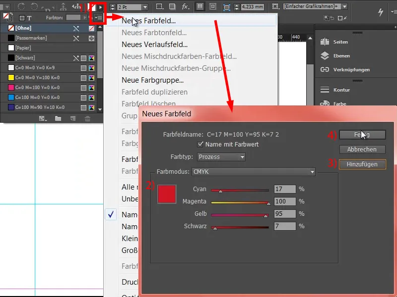
If you are looking for such colors that match a certain mood, then I can also recommend you: Try the Adobe Color themes under Windows and then on Color. I think this is the former Kuler, which they have obviously renamed. There you can easily search for certain color harmonies. You go to Discover (1) and enter, for example, "christmas" (2). It will then spit out various color harmonies on the theme of Christmas. You can also do it this way, then you can easily add them to your color palette if you are still looking for a suitable color.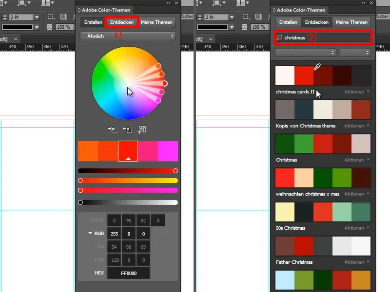
I now use the rectangle tool (1), remove the outline (2) and draw a rectangle (3). This is the first stroke, but you have to make sure that you are on the guide line (4).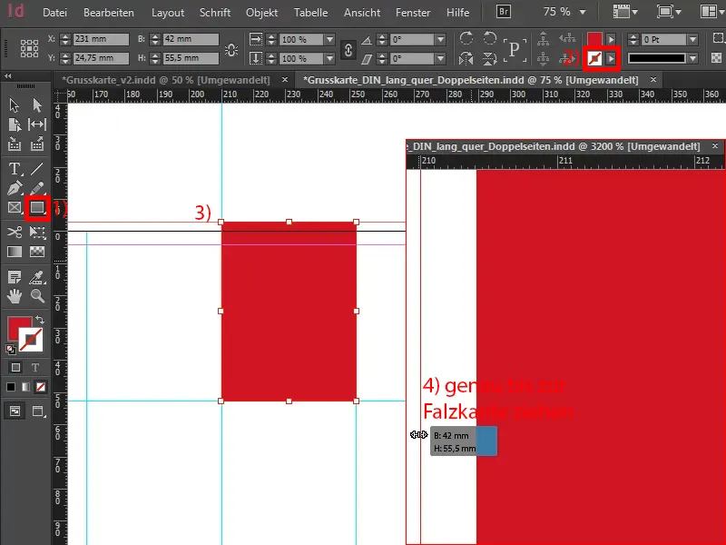
For a cover page that is not necessarily off the peg, you naturally also need a font that stands out a little from the rest. You kind of expect these "handwritten" beautiful fonts for Christmas because they just look so great and are so calligraphically curved, such as Zapfino or Vladimir Script and whatever they are all called. They are such beautiful, sweeping, homogeneous fonts. Great, no doubt, but not for us - we do something else.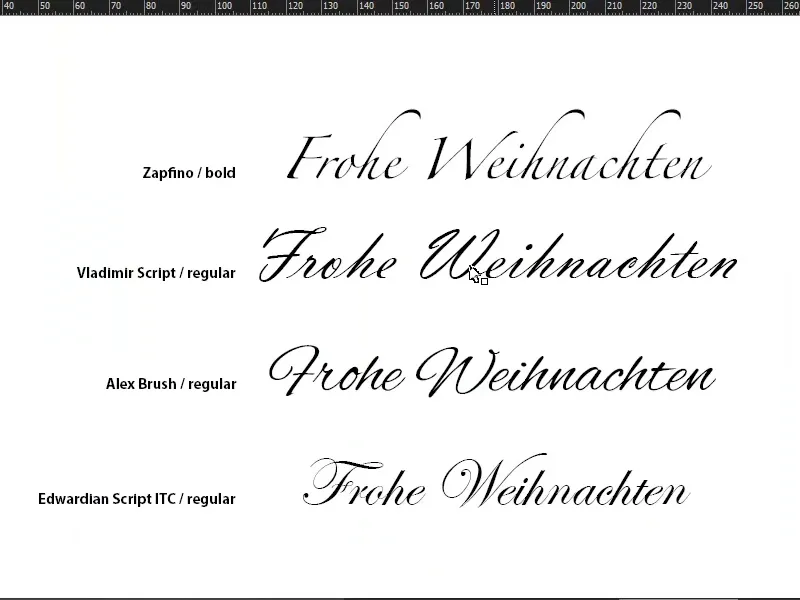
I take the text tool (1), click once in the frame, which creates a text frame from the object frame (2). Here I look for a font, namely Capture it. It remains in Regular, but much larger, namely 120 pt (3). I use it to write the "M". Color in white (4).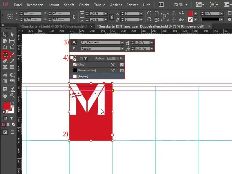
In the next step, I open the text frame options with Alt and a double left-click (1). Here I want to make sure that the "M" is centered on the horizontal axis (2).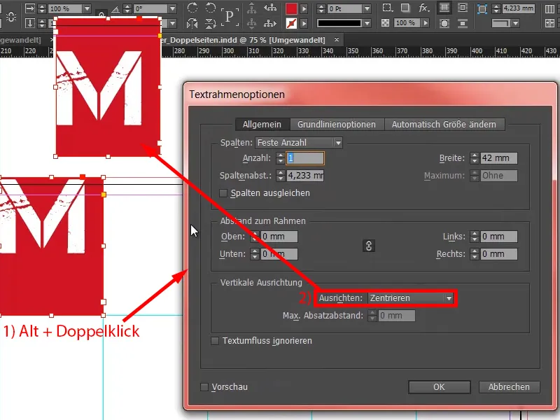
I also center it in this direction (1), then it looks like this (2).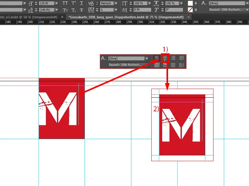
Now I copy the whole thing, turn the "M" into an "E" (1), change the background to white (2) and the font to a color I'm still working on: a ninety percent black (3). It's not as hard as the usual black (4), it's a little softer. "A little" is relative of course, it's still just as noticeable as King Kong's footprint, but it's also about contrasts.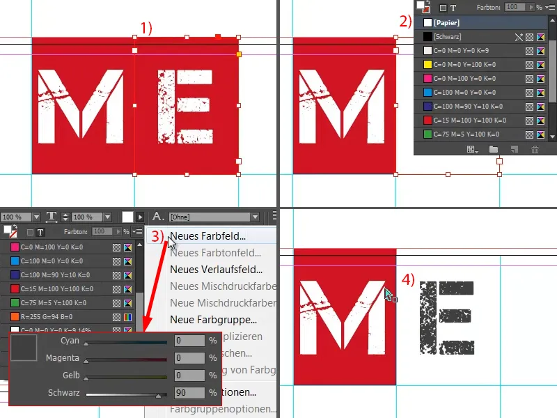
Now I take the two objects, copy them to the right, and then I continue copying until it looks like this. Here (see arrow) you have to make sure that you go right up to the bleed.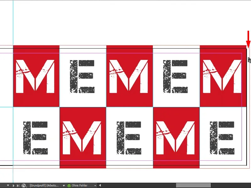
You could, for example, simply take this field and drag it out, but then the "M" will move with it (see right). You can either tolerate this or not. I would recommend people who are a little more fussy about details: Put a red area behind it. For my part, I simply drag the field over (as in the picture on the right).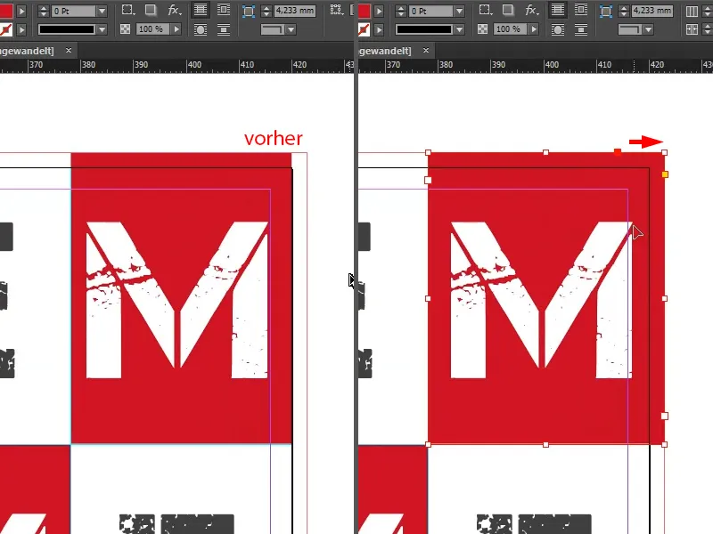
We probably haven't seen this Christmas slogan "MEMEM ..." anywhere else either, so let's rename it ... And that's it for the front.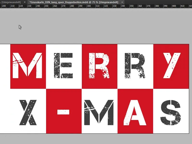
Designing the back
Let's move on to the second outer side, the back. We'll simply draw a rectangular frame from the bleed at the top left to the bottom line in red (1). And in the next step, I simply take our logo and claim from my library (2). I align it in the center ...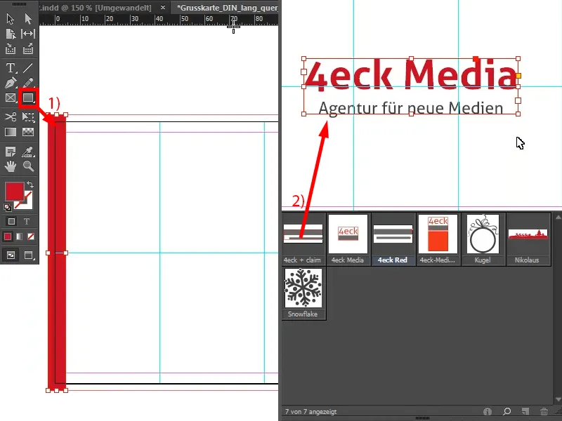
The page is now actually finished.
What's behind it now? - Because it really wasn't witchcraft at all. There's an idea behind this page: it's simply about reducing the information to the essentials and not distracting the viewer so that their eyes can simply rest on the company branding. You could incorporate your company branding there - and nothing else, please, because anything else would really just be distracting. It's simply about having a very graceful, elegant, stylish appearance like on the red carpet, even if it's snow-white here. The stage on this side belongs only to the company.
What you should also bear in mind here, for example, is that the visual language of the card should also match the corporate identity of the company. As an agency for new media, we actually keep it rather plain and simple, true to the motto: "Keep it short and simple" - and that's nothing more than "short and simple". Voila.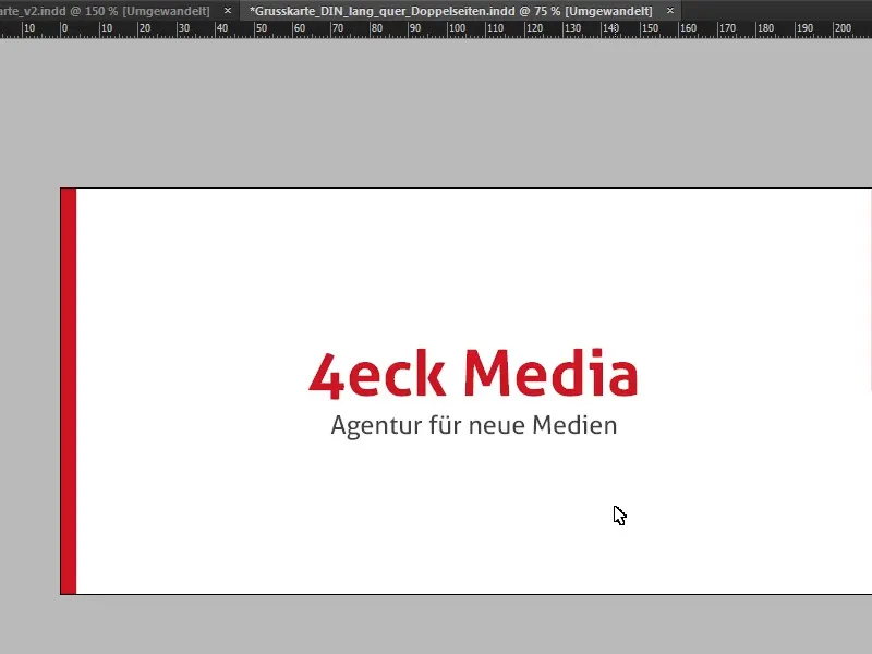
Designing the inside
Now it's time to move on to the inner section. Here, too, I set an auxiliary line at 210 mm (1 and 2), i.e. exactly in the middle. Let's take another look at the template ...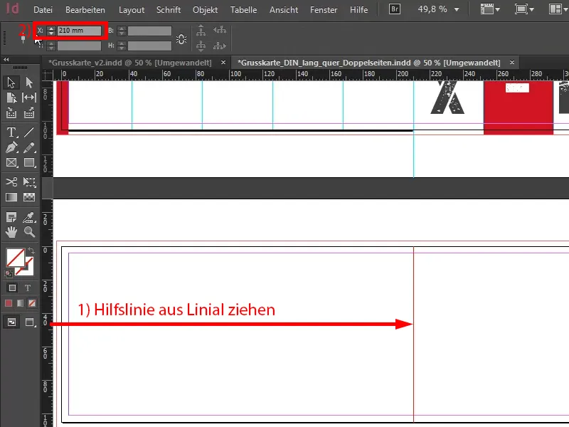
As you can clearly see here, we want to continue the design of the cover pages from the outside in the inner image. That's why we have our leading color again on the left, peppered with a flat illustration and a snowflake.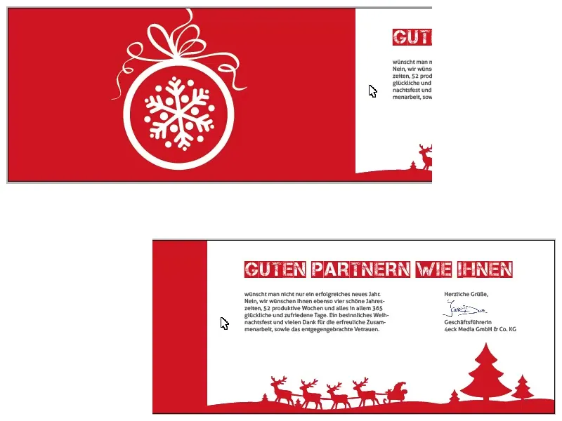
We simply draw a rectangular frame (1). Again, make sure that we really draw the color field up to the folded edge (2).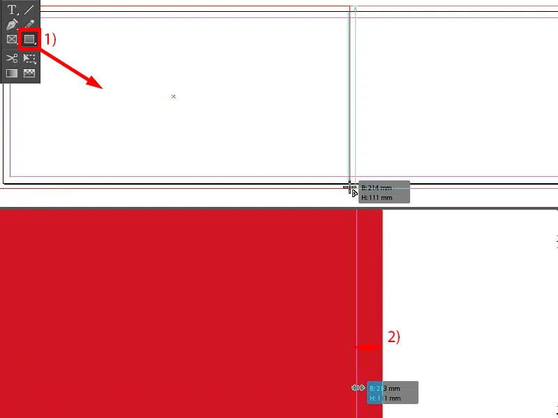
The next step is to add our illustration. I take them from my library (1), but you can buy them from various photo stock providers, for example. Of course, there are also free websites on the Internet where you can look around to see if you can get really free licenses, although in most cases these are not commercially usable.
I have recolored this beautifully flat-looking Christmas bauble in white (2).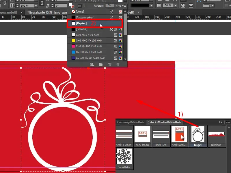
I select the background by holding down the Shift keyso that I have selected both objects (1). Now I can use the Align panelto align the center of each object (2 and 3), although I have to note here: At the top we are clearly away from the bleed, so I just let it bounce a little higher (4), because I like it better this way anyway, when we still have a little free space at the bottom.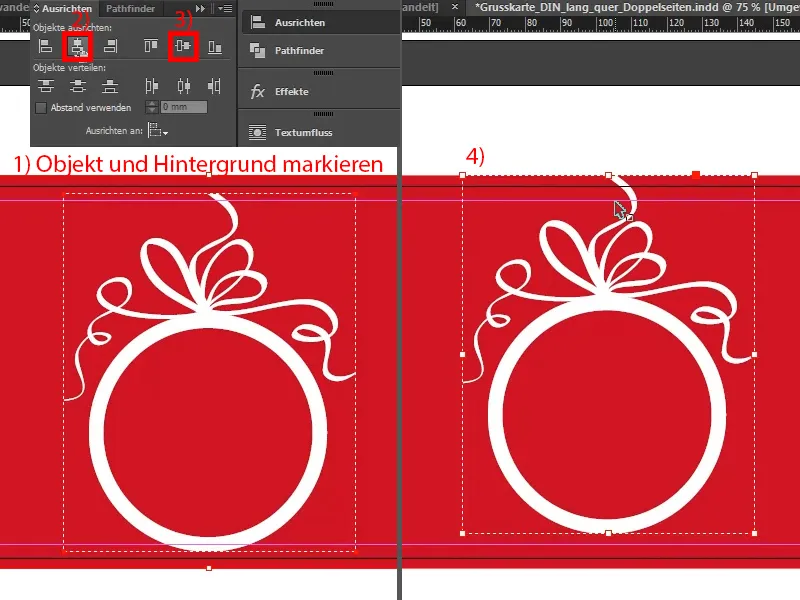
I'm going to do the same with the snowflake. I'll also draw it in once (1) and recolor it in white (2). And with the centered alignment of the snowflake, you have to be a bit careful that it's really nicely aligned. I don't have the time for this in this training session, but you - before you print it - please take a critical look at it beforehand.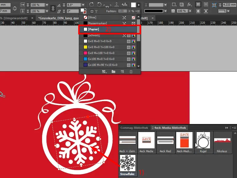
I'm now also using the left-hand side to bring a bit of Christmas spirit to this card. I would also strongly advise against using a product reference here, because Christmas greetings are really about the human touch and we don't want to write: "Do you already know about our revamped online store? And do you already have a vacuum cleaner? If not, do you want one? If yes, do you perhaps want a better one?", and so on - no, please don't do that. So we'd rather stick to the charming route.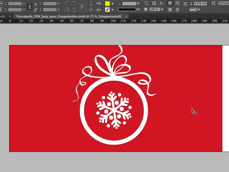
Last page: This is where the greeting formula comes in, ideally with a personal address of course, but this is often not so easy to implement due to mass printing. Nevertheless, 40 percent claim to want to personalize their greeting cards with an individual salutation. In our salutation, however, we concentrate on the design concept, which is already in place, and then also use the font that we have already used on the front, Capture it, but this time in a different variant.
I show the baseline grid via View>Grid and Guides. Then I simply draw a text field (1), select the Capture it, but this time not the normal one, but the one with the 2, in font size 32 pt, I set the color to my red (2).
The headline: "Good partners like you". Double-click on the handle (3) to crop the text field to the optimum size. You can also choose an auxiliary line here to make it flush with the next line (4).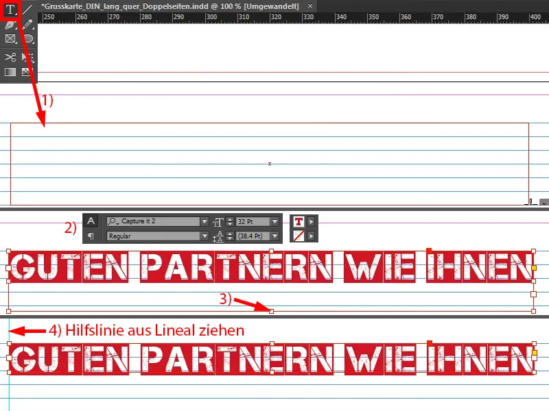
Now it's time for the warm words (pull up the text field as in 1) that we want to address to our partner. I choose Aller Regular as the font. The text from my clipboard goes in there (2), ...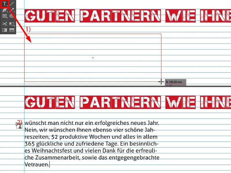
... then I widen it so that the lines are exactly flush (1).
There are certainly different opinions about this font, but I chose Aller for a specific reason: On the one hand, I didn't want to mix too many fonts in this design concept, because that would quickly create a restless effect, and the typographic part in the inner section should also build up again somewhere on the outer pages. And we already have the Aller (2) in the logo ... And companies can handle this individually. Sometimes you hear things like: "Yes, I'd rather have this with serifs, or no, I'd rather have it without serifs because it looks like this or that". To be honest, I rely entirely on the motto: "Form follows function", which simply means that form follows function.
What is the function of this card? We have to keep that in mind from time to time: The point of this card is to convey a recognizable image, a recognizable corporate identity, and that's the bottom line here. Of course - enriched with nice greetings - but it's also about the customer remembering us, and that's why I won't deviate here with the font. I simply see the corporate font as the overriding goal here and attach far more importance to it.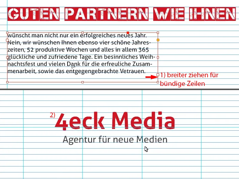
What I still want, however, is for the lines to lie on the baseline grid. This means that I select everything (1) and activate this dialog box (2) via Font>Paragraph, where I can align the lines at the bottom to the baseline grid (3).
12 pt is too big for this, so I reduce it to 10 pt (4). This means I can also make it six lines (5) ...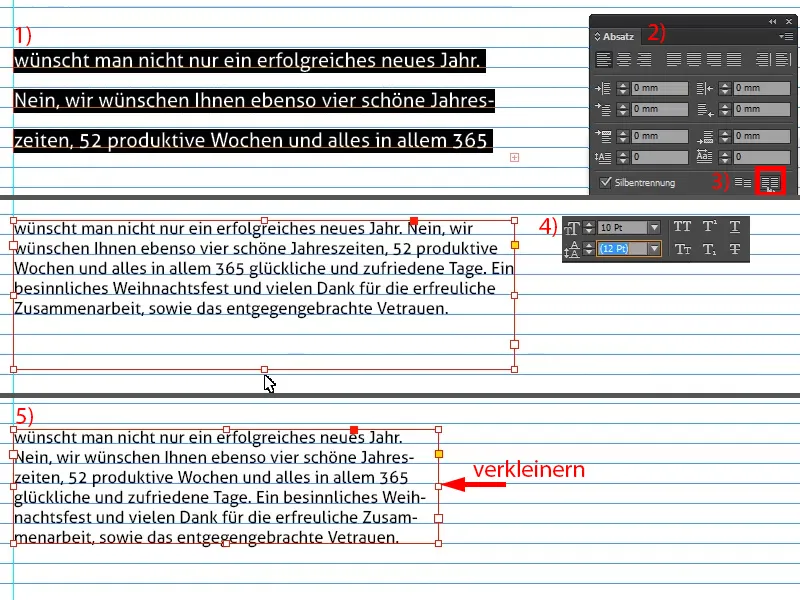
Pull out another guideline (1), create a copy (2), make the text field smaller (3), throw out the text and write the farewell greeting (4).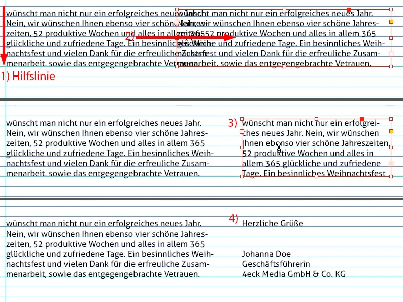
At this point, of course, it's always cool to leave space for a signature. I simply have a PNG graphic that I include here (1). It always looks nice because it creates a personal reference.
Now align the whole thing flush right with an auxiliary line (2).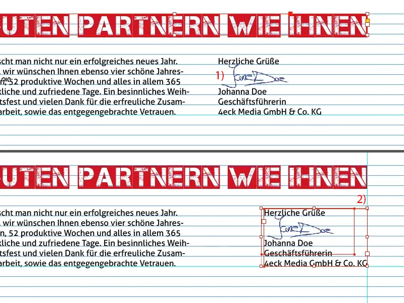
Finally, we'll add Santa Claus at the bottom, just a vector graphic (1). Again, we have to be careful to include the bleed (2).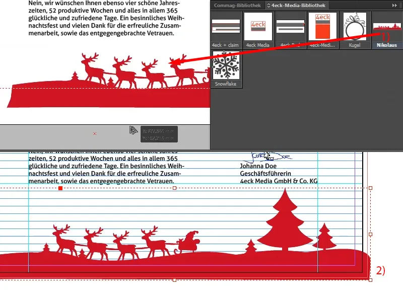
Preparing the PDF for printing
We're done with that now. Now it's just a matter of exporting. Ctrl + E for the export dialog. But I don't want JPG, I want Adobe PDF (print). Rename, save.
Here I can already select the appropriate parameters for the correct export from my PDF preset. I have already saved them.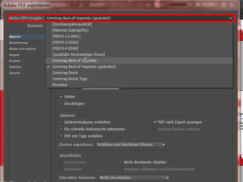
In your case, you simply have to check with your print shop how they want the data to be prepared. I did this here under Help (1) and then Instructions (2), Create source documents (3), I work with a PC (4), Adobe InDesign (5). And in this entire dialog (6) you will find everything you need to set.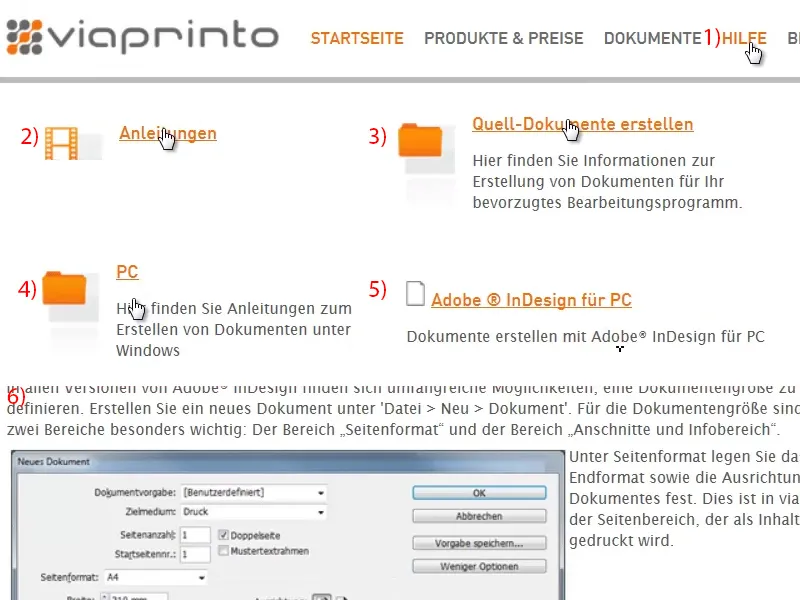
The 3 mm bleed (1) is very important. However, I have already saved all of this as a default, so I simply go to Export (2).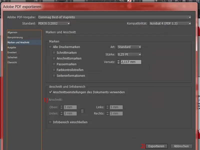
This is now our print-ready PDF, which we will use to submit the order.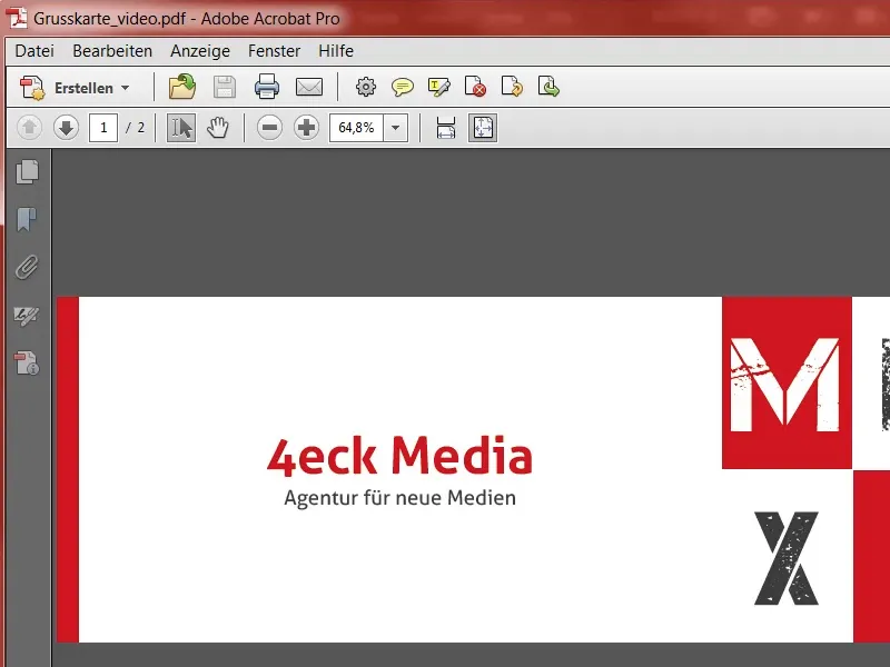
Order printing
In the product selection, click on the appropriate parameters (1) and then on Upload document (2) on the right.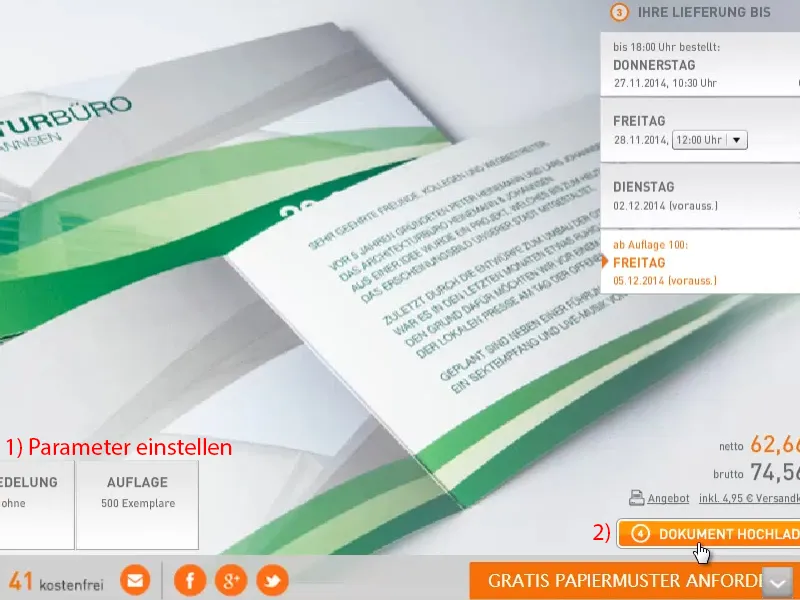
This opens a dialog. It's already uploaded here, I can use it straight away.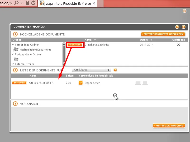
Here's that super handy preview functionthat you saw at the beginning. Very practical if you want to look at the whole thing again. Add it to the shopping cart.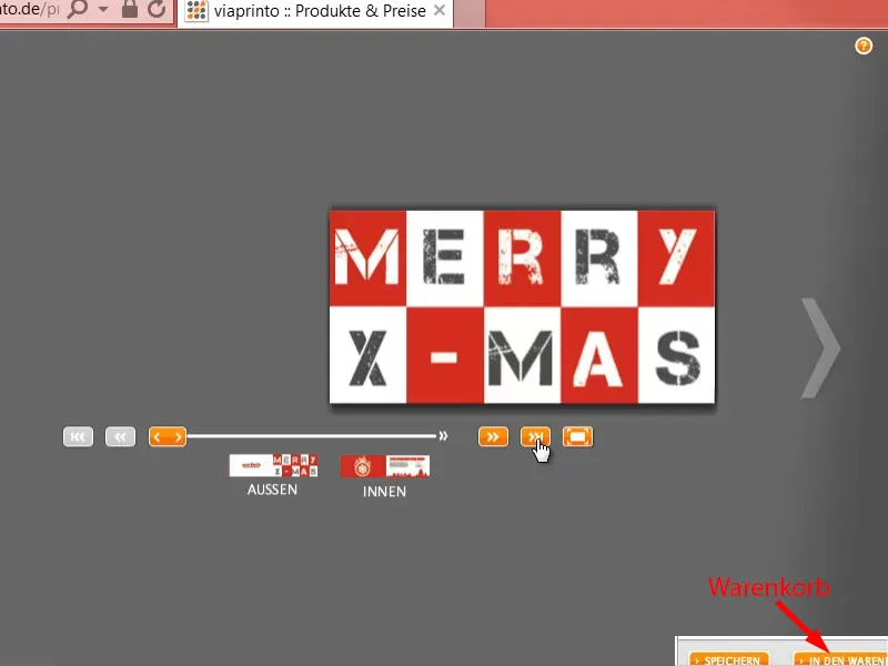
And if you then go through this ordering process, paper and color will soon form a symbiosis, so that you can get a good load of beautifully designed greeting cards sent to your company and send them on to your partners.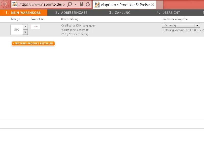
I hope you had fun and I look forward to your suggestions. Write to me in the comments. Until then, your Stefan.