You want to analyze the relationship between different products to make business decisions? In this guide, you will learn how to conduct a correlation analysis in Excel, specifically between notebooks and tablets. This will deepen your understanding of the relationships between your sales figures and help you take strategic actions.
Key Insights
- You will learn how to calculate the Pearson correlation coefficient in Excel.
- You will understand how to create a graphical representation of the correlation between notebooks and tablets.
- The analysis will help you identify any potential cannibalization effects.
Step-by-Step Guide to Correlation Analysis in Excel
Step 1: Prepare Data
To perform the correlation analysis, you first need the relevant data. Copy the sales figures of notebooks and tablets into your Excel worksheet. Make sure the data is arranged in two separate columns. Are you done?
Step 2: Calculate Correlation
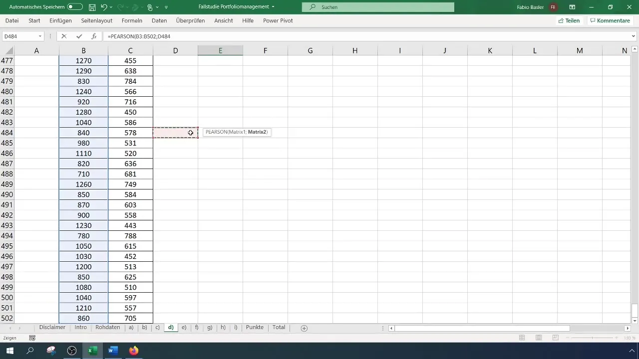
After preparing the data, the next step is to calculate the Pearson correlation coefficient. In Excel, use the function =CORREL(). Enter the values for notebooks as the first set and the values for tablets as the second set in the parentheses. Press Enter to get the result.
Step 3: Interpret Results
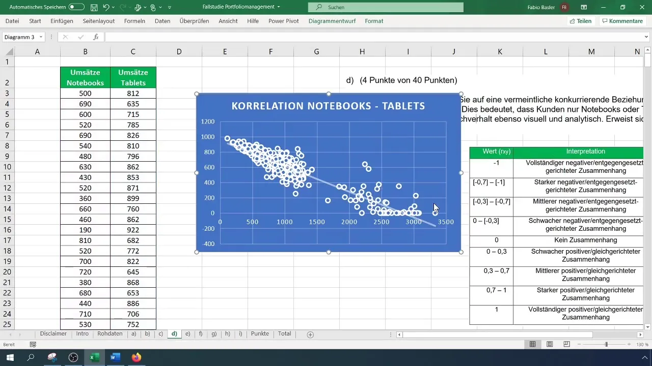
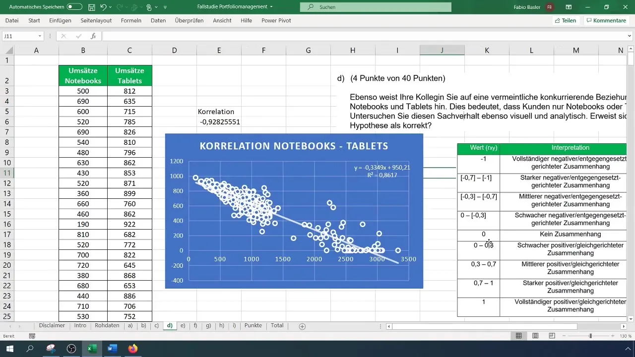
Once you have obtained the correlation coefficient value, you can interpret it. A value of -1 indicates a perfect negative relationship. For example, if you get a correlation value of -0.92, it means there is a strong negative correlation between the sales of notebooks and tablets. Customers typically buy one or the other, indicating a cannibalization effect.
Step 4: Create Graphical Visualization
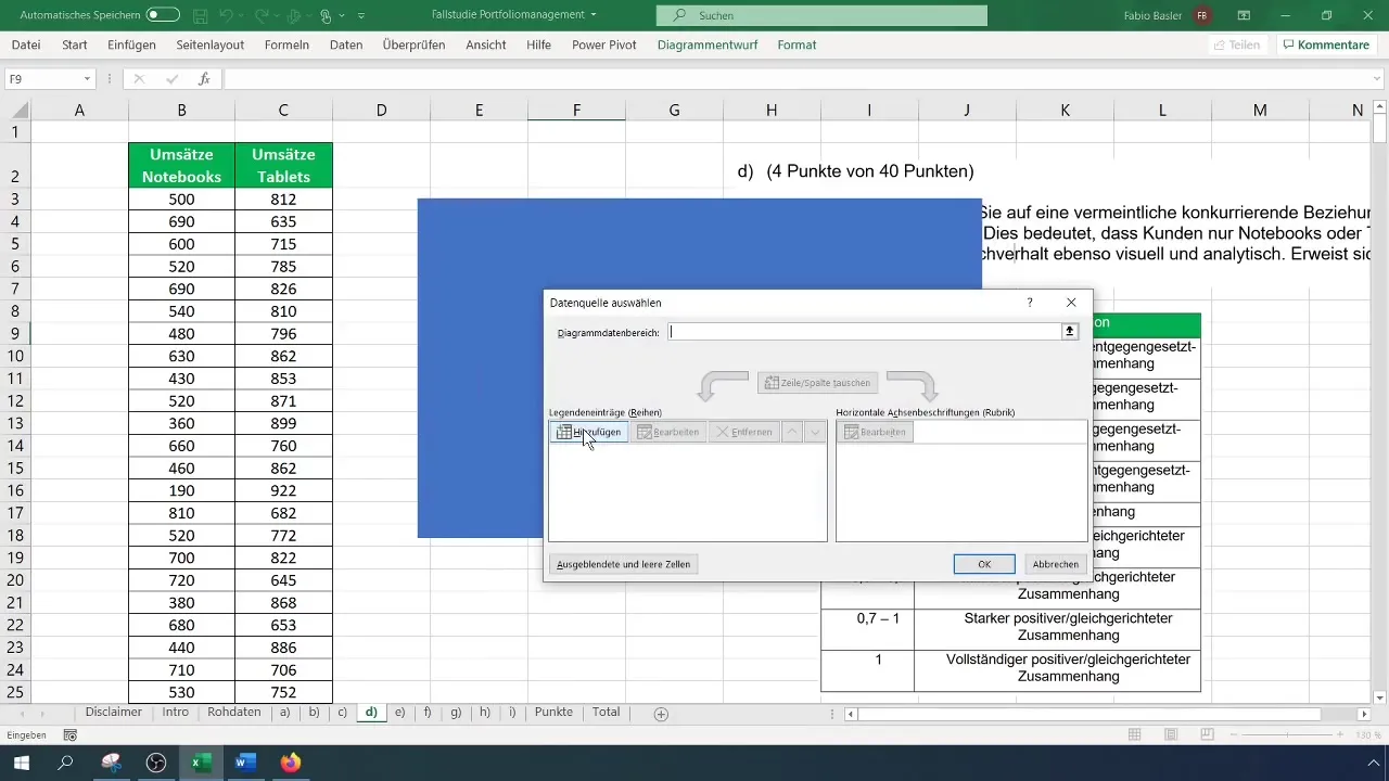
To better illustrate the relationship, you can represent the data in a scatter plot. First select the data and click "Insert" to create the scatter plot. Be sure to choose the correct chart type to visualize the data accurately.
Step 5: Add Trendline
To further highlight the negative relationship, you can add a trendline to your chart. Right-click on a data point, choose "Add Trendline," and select the option for a linear trendline. This will help you visualize the trend of the correlation.
Step 6: Check Additional Options
You can also display additional options for the trendline, such as the coefficient of determination or the corresponding formula. This information is useful to see how well the trendline fits your data.
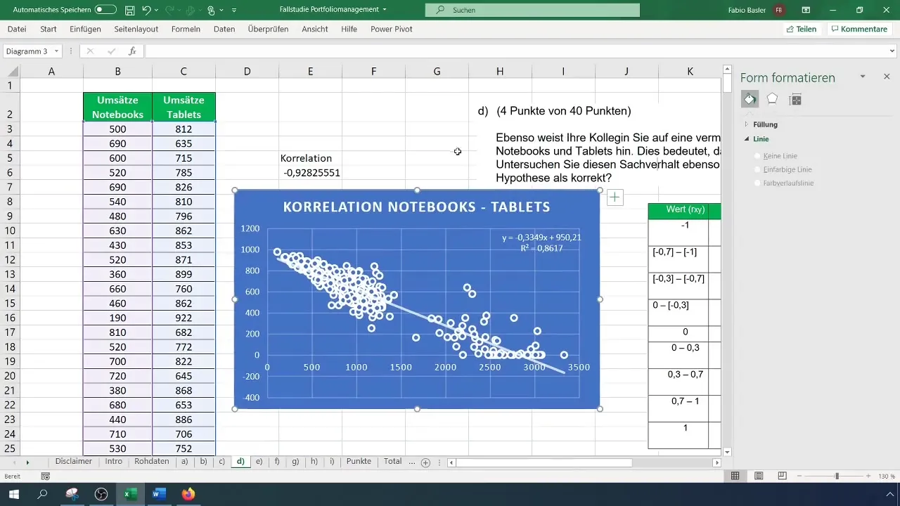
Step 7: Confirm Hypothesis
After conducting the analysis, validate your initial hypothesis about the cannibalization effect. If your calculations and the graphical representation support this effect, you can document and present your results accordingly. This will not only support your analysis but also convince your team of the accuracy of your findings.
Summary
By conducting a correlation analysis in Excel between notebooks and tablets, you were able to determine that a negative correlation exists. These insights provide valuable insights into customer purchasing behavior and its impact on sales figures. Use this information for future business decisions.
Frequently Asked Questions
How do I calculate the Pearson correlation coefficient in Excel?Use the function =CORREL() and enter the data ranges for the two variables in the parentheses.
What value indicates a strong negative relationship?A value of -0.70 or less indicates a strong negative relationship.
How can I add a trendline to my chart?Right-click on a data point in the chart and select "Add Trendline".
What does a correlation value of -0.92 mean?A value of -0.92 indicates a very strong negative relationship, indicating a cannibalization effect between product sales.
How can I add additional information about the trendline?You can choose additional options to display the coefficient of determination or the formula of the trendline.


