The Boxplot analysis is an excellent tool for graphically displaying data distributions. It allows you to instantly recognize the spread and central tendencies of the data. In this tutorial, I will show you how to create a Boxplot for the attribute "Customer Satisfaction" in Excel. By following these steps, you will be able to create your own Boxplot and interpret it correctly.
Key Insights
- The Boxplot visualizes the distribution of a data series, especially the median, quartiles, and potential outliers.
- The most common statistics like minimum, maximum, median, and quartiles can be easily calculated.
- Excel offers specific functions for efficient Boxplot creation.
Step-by-Step Guide to Boxplot Analysis in Excel
Step 1: Collect and Prepare Data
First, you need to have the relevant data for the Boxplot analysis. In our case, we are looking at the attribute "Customer Satisfaction." Start by copying the data, which is on an ordinal scale, into an Excel table. A quick way is to copy the data from your source using key commands (Ctrl + C) and then paste it into a new worksheet (Ctrl + V).
Step 2: Calculate Basic Statistics
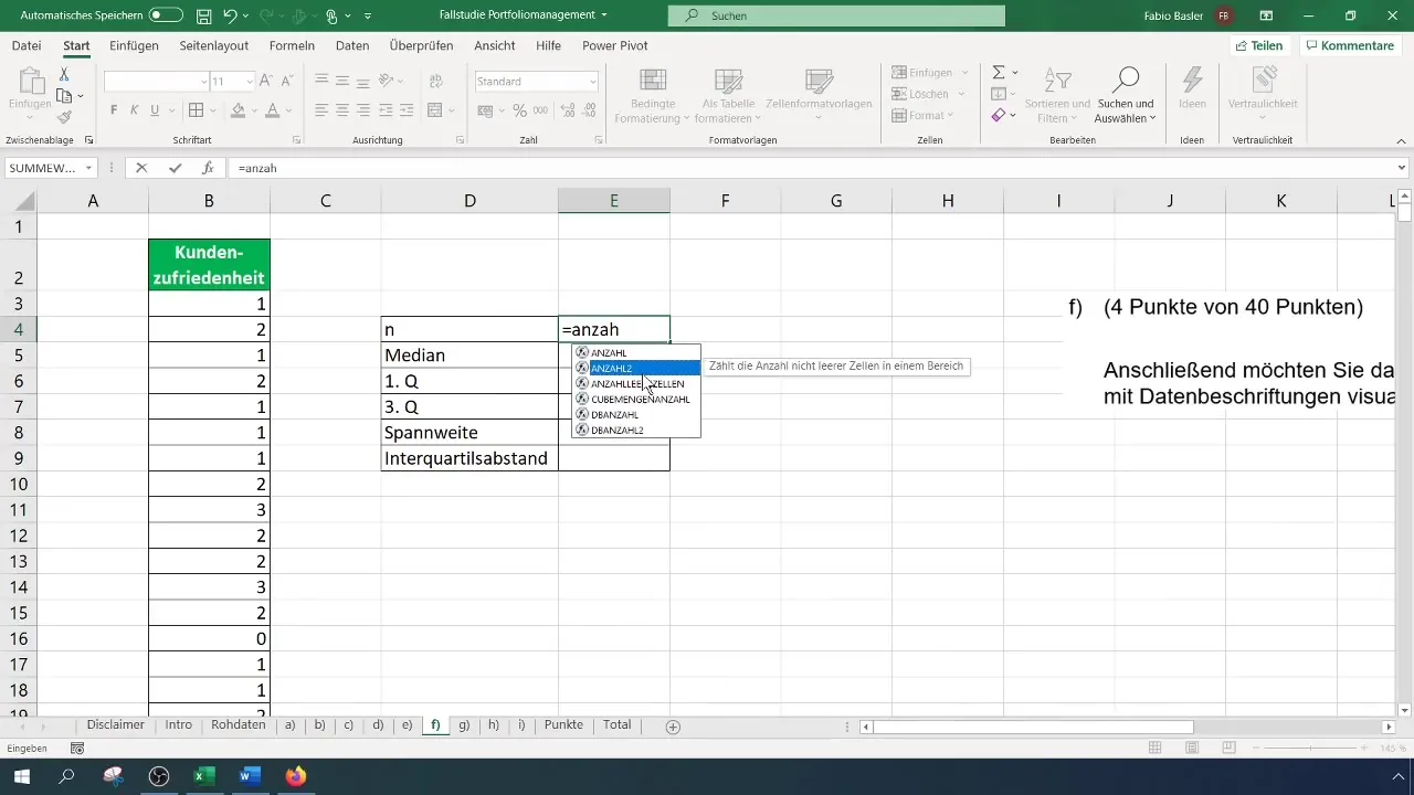
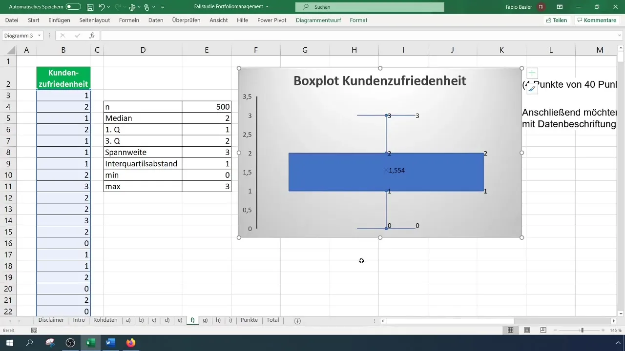
Now, it is important to calculate some basic statistics that you can later use in the Boxplot. These include sample size, median, quartiles, range, and interquartile range. Start with the sample size (n), which you can determine by the number of data points in your selected column.
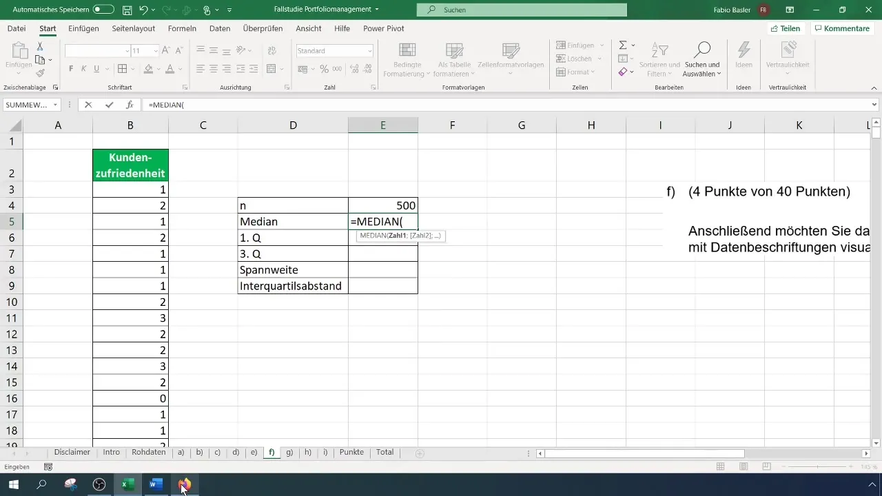
Next, you can calculate the median using the function =MEDIAN(range). Here, "range" represents the range of your data. The result is the value that lies in the middle of the ordered data series.
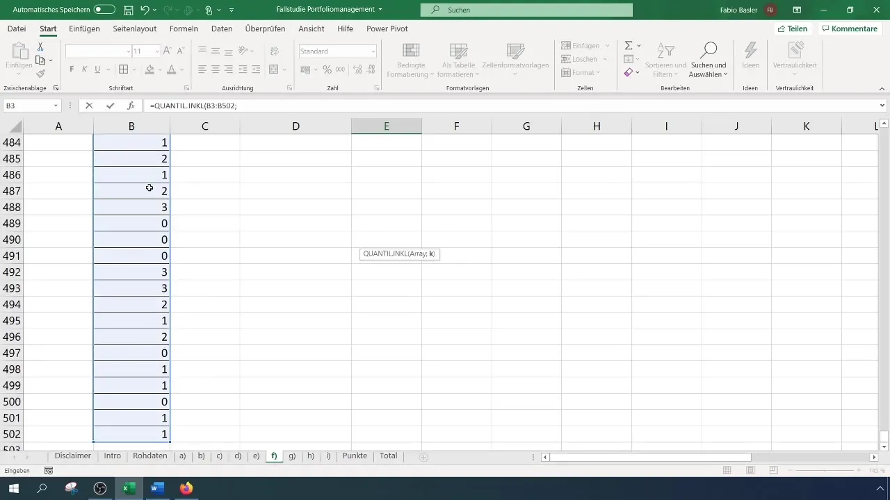
For the quartiles, you can use the function =QUARTILE(range, quart). Here, you input the value 1 for the first quartile and 3 for the third quartile.
Step 3: Calculate Range and Additional Statistics
To calculate the range, you need the maximum and minimum of your data, which you can determine using the functions =MAX(range) and =MIN(range). The range is then the difference between these two values.
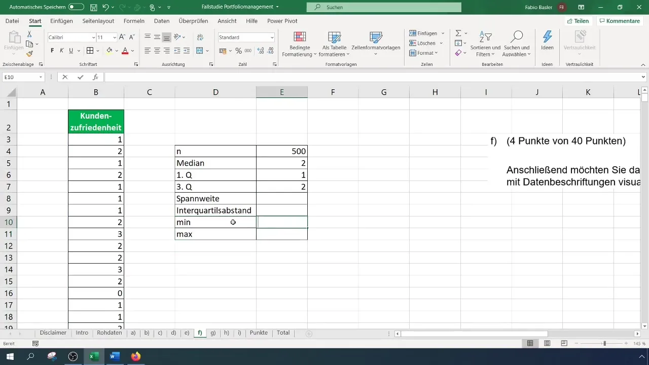
In addition, the interquartile range (IQR) (distance between the 1st and 3rd quartiles) is of interest to determine the dispersion of the middle 50% of data. You can manually calculate this by subtracting the values of the quartiles from each other.
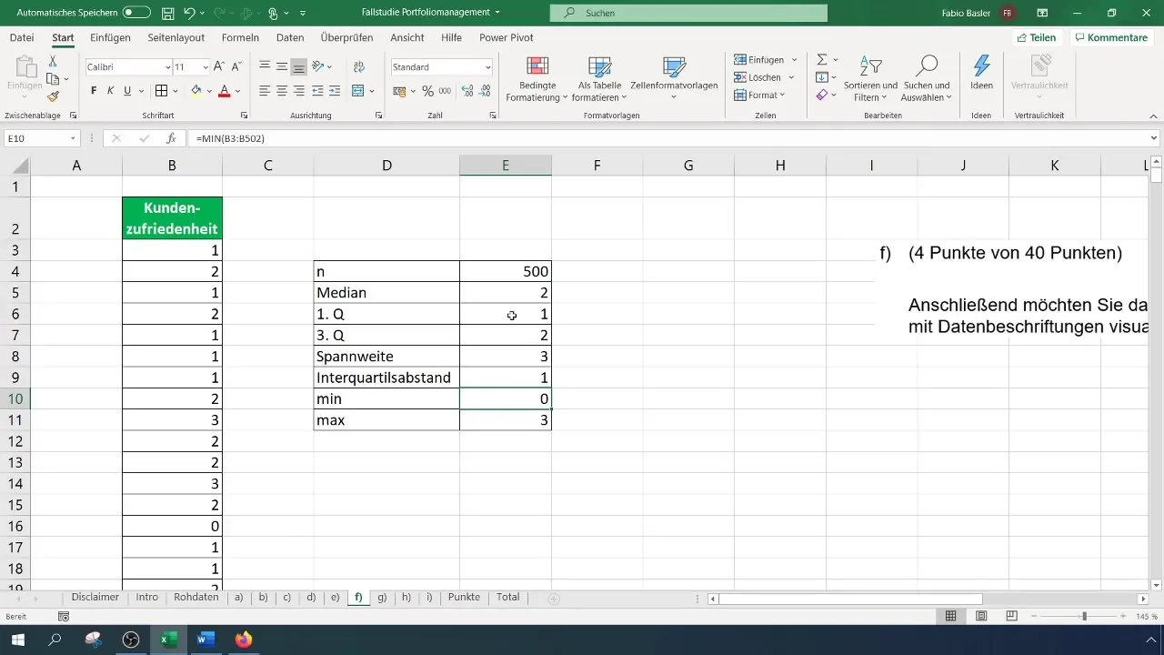
Step 4: Create Boxplot
Now we come to the crucial step: creating the Boxplot. Go to the "Insert" menu in the Excel toolbar and choose the option for Boxplots. Here, you can select from the types of charts and create the Boxplot directly.
Once you have created the chart, you can customize its appearance. It is recommended to change the colors to enhance the Boxplot's visibility. For example, dark gray against a light background could be very visually appealing.
Step 5: Add Data Labels
To complete the analysis, it is helpful to mark the important data points on the Boxplot. You can simply right-click on the chart and choose "Add Data Labels." This will make the values for the median, quartiles, and other relevant points visible directly on the Boxplot.
Step 6: Interpret the result
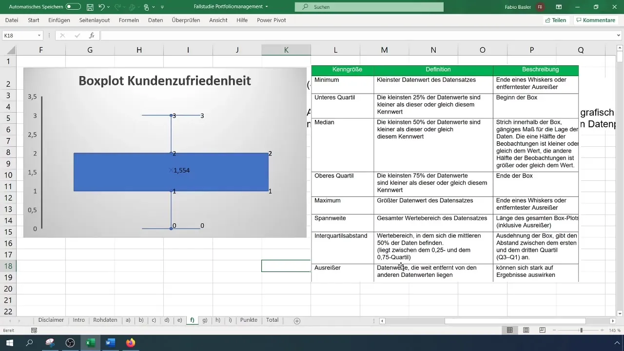
Now that you have created the boxplot, it is important to interpret the individual characteristics. The median, represented by the line in the box, indicates the central value of the data. The first and third quartiles help you understand where 25% and 75% of the data are located.
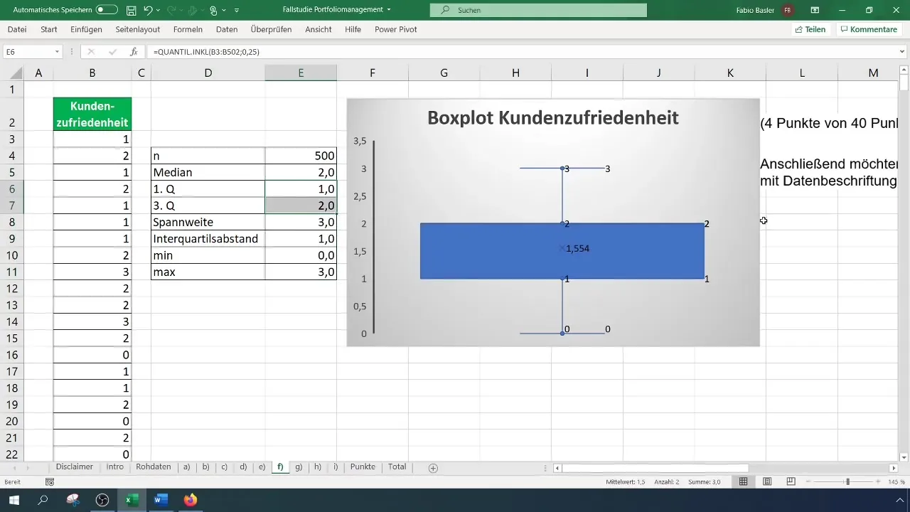
In addition, it is crucial to identify possible outliers! These will usually appear in the graph as points that lie outside the so-called "Whiskers". Make sure that outliers are not always negative, as they can provide valuable information about the distribution of your data.
Summary
Conducting a boxplot analysis in Excel allows you to clearly represent the distribution of your data. By calculating essential measures such as median, quartiles, and range, you can gain valuable insights into the data. With a few steps in Excel, you can efficiently create and correctly interpret this visual representation.
Frequently Asked Questions
What data is needed for a boxplot?You need ordinal scale data to create a boxplot. These can be, for example, survey results on customer satisfaction.
Which functions are helpful in Excel?Important functions include MEDIAN(), QUARTILE(), MAX(), MIN(), and some chart options in the "Insert" menu.
What does the boxplot show?The boxplot illustrates the distribution of the data, the median, quartiles, and potential outliers.
Can I manually identify outliers?Yes, you can visually identify outliers in the boxplot, as they are depicted outside the Whiskers.## ##


