Statistical analyses are part of many business and production processes. The visualization of time series is particularly important for identifying trends and making decisions on a solid basis. In this tutorial, I'll show you how to graphically visualize a time series, specifically production numbers, using Microsoft Excel. This way, you will gain valuable insights into your data and be able to make informed decisions.
Key Insights
- Graphical representation of time series helps identify trends and patterns.
- Excel offers numerous options for customizing charts.
- Using trendlines can help you identify significant deviations.
Step-by-Step Guide
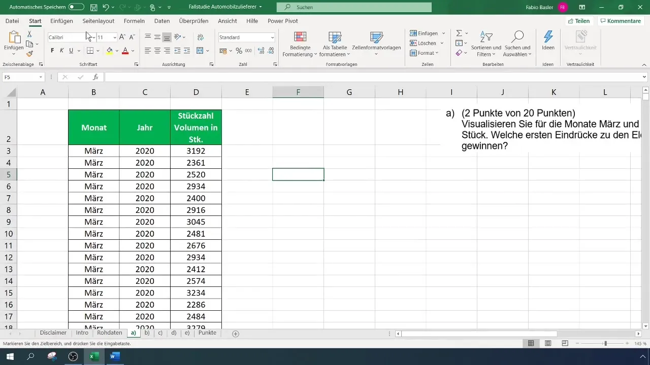
Start by filtering the data to isolate the relevant information from the year 2020 for the months of March and April. You should ensure that you mark the correct columns with the production numbers. To work efficiently, select columns D and E and hold down the control key to also select column I. You can copy these by right-clicking.
Paste the copied data into a new workspace. Make sure the new workspace has enough space to create the chart.
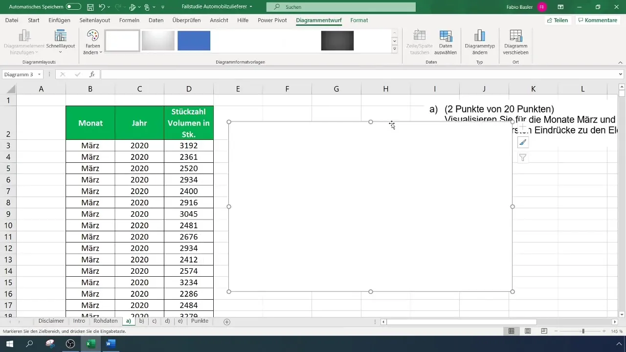
Now it's time to start with the graphical representation. Go to the menu bar and select "Insert". Here, choose a simple 2D Line Chart. Initially, you will see a blank chart which we will then customize.
To make the chart more appealing, you can change the chart type settings so that the chart visually stands out from the background. For example, you can choose a darker color scheme.
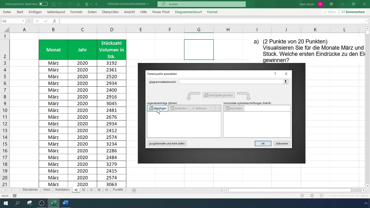
Now it's time to integrate your data into the chart. Right-click on the chart and select "Select Data". Add a new data series and enter the first name and values. Click on the symbol to select the production numbers and transfer them to the chart.
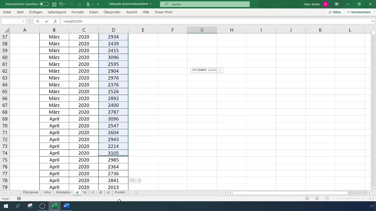
To optimize the chart axes, it is important to display the values for the maximum and minimum. Use the Excel function "=MINIMUM.VALUE()" to determine the minimum production value. This will give you an initial indication of the lowest production numbers in 2020.
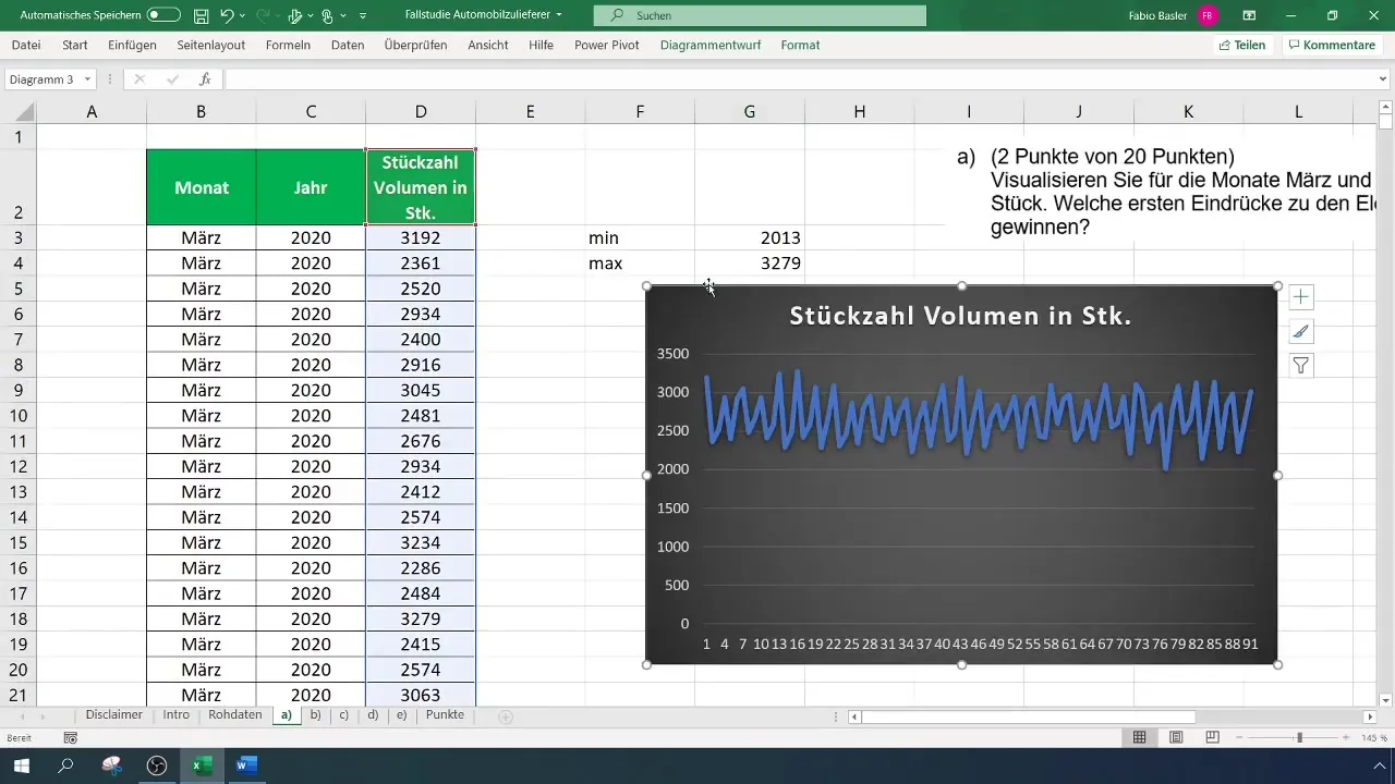
To display the maximum production value, use the function "=MAXIMUM.VALUE()". This will help you capture the highest production numbers, allowing you to adjust the axes accordingly.
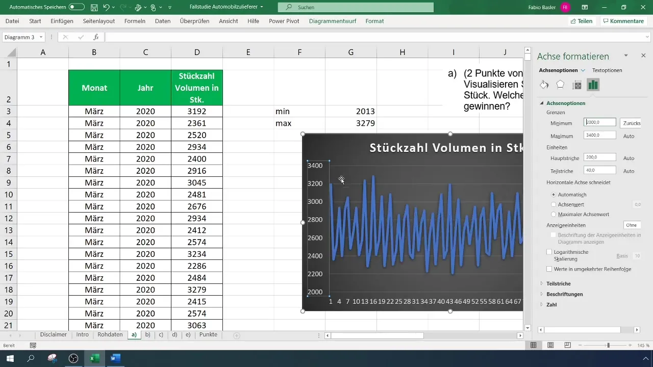
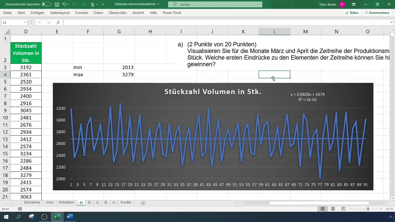
Go to the left axis of your chart, right-click and select "Format Axis". Here, you can set the minimum to 2000 and reduce the maximum to 3300, for example.
Next, you can customize the x-axis, the abscissa, to clearly label the data. You can display data from multiple time points to better understand the trend.
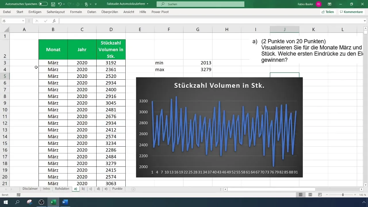
To correctly display the duration and progression, move the chart to the right to provide enough space for the 91 data points. This will help you get a clearer overview of the data.
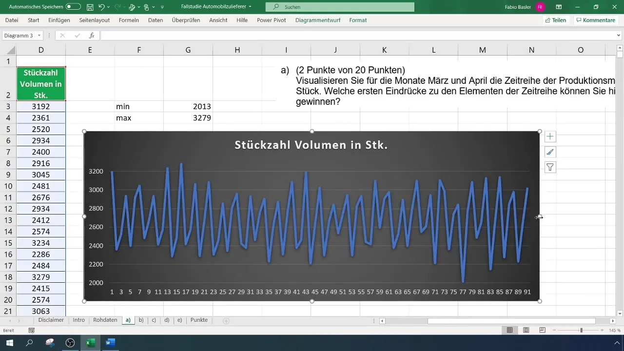
One of the key insights from your visualization could be trend analysis. Add a trendline to identify a stable trend and see how the production numbers are distributed over time.
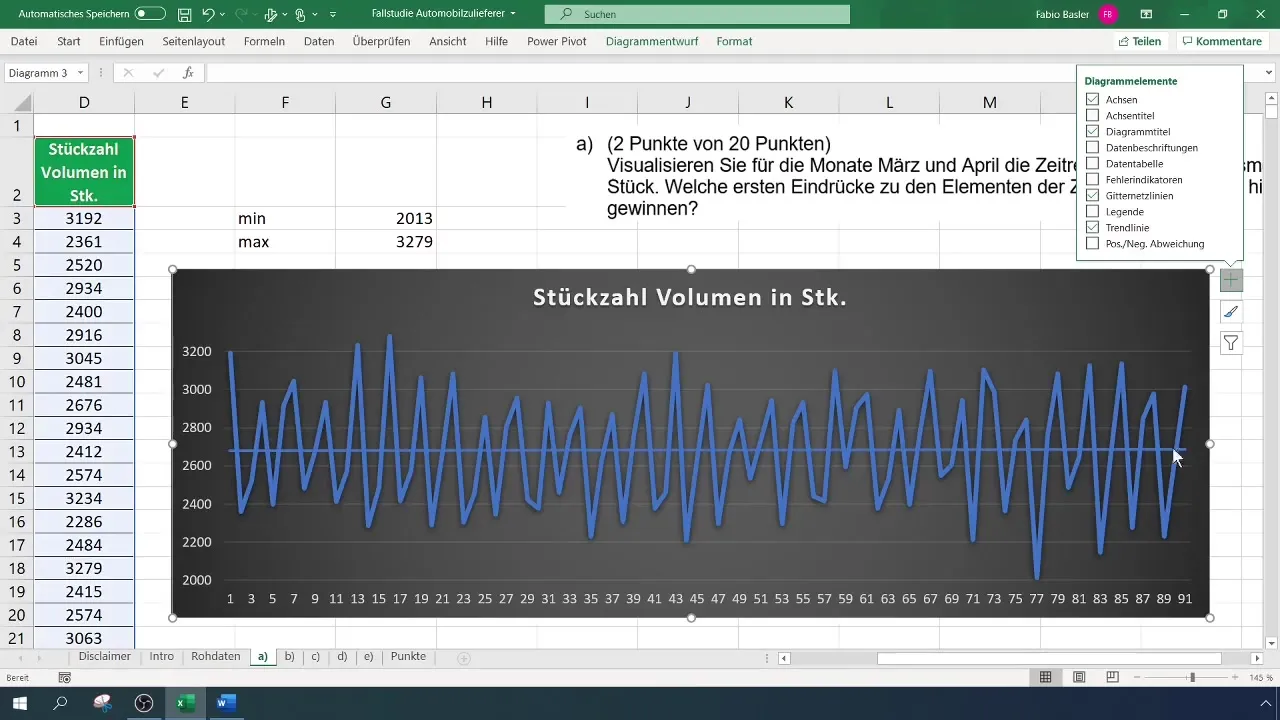
In addition, you can expand the options of the trendline to display the formula and the coefficient of determination. These pieces of information will help you gain a deeper insight into your data.
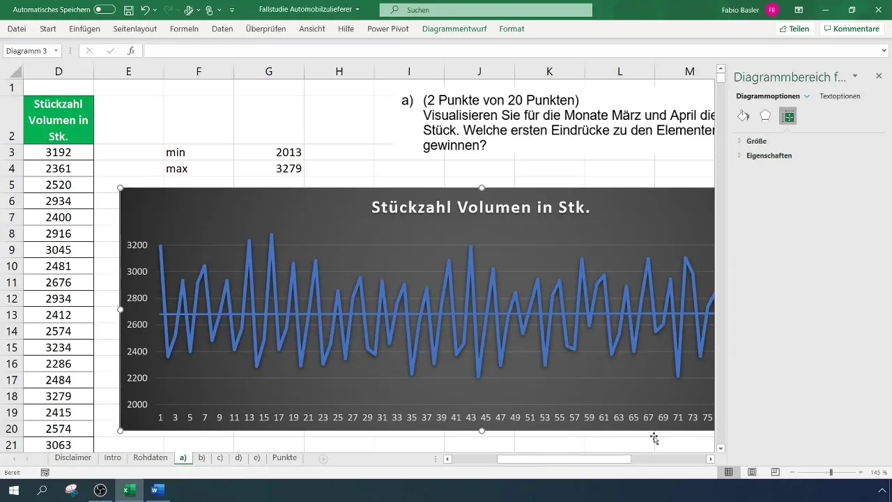
Visualizing your production numbers in Excel not only provides an overview of your current data, but also enables you to forecast potential changes and developments.
Summary
In this guide, you have learned how to effectively visualize production numbers from Excel for a specific period of time. We have gone through the steps together to filter your data, create a chart, and make it visually appealing. By using trendlines and adjustments in formatting, you will not only obtain a clear representation but also valuable insights into future developments.
Frequently Asked Questions
What is a time series?A time series is a series of data collected over continuous time intervals to illustrate trends and patterns.
How can I add a trendline in Excel?Right-click on the data series in the chart and choose "Add Trendline" to display various options for visualizing the trends.
Why should I adjust the axes in my chart?By adjusting the axes, you create a clearer overview of the data and optimize the visualization.
How many data points can I use in an Excel chart?Excel supports a large volume of data points, but typically you can display up to 32,000 data points in a chart.
How can I save or export my chart in Excel?You can export your Excel chart into various formats by simply clicking on "File" and then on "Save As" and selecting the desired format.


