When dealing with the analysis of data, you will quickly come across the need to recognize relationships between different variables. In this tutorial, I will show you how to conduct a contingency analysis in Excel to quantify the relationship between two nominal variables. We will use a practical example from the automotive supply industry to understand how valuable insights can be obtained from the data.
Key Insights
- Contingency analysis allows for examining relationships between two nominal variables.
- The contingency coefficient quantifies the strength of the relationship.
- A pivot table in Excel is an essential tool for analysis.
Step-by-Step Guide to Contingency Analysis
Step 1: Prepare Data
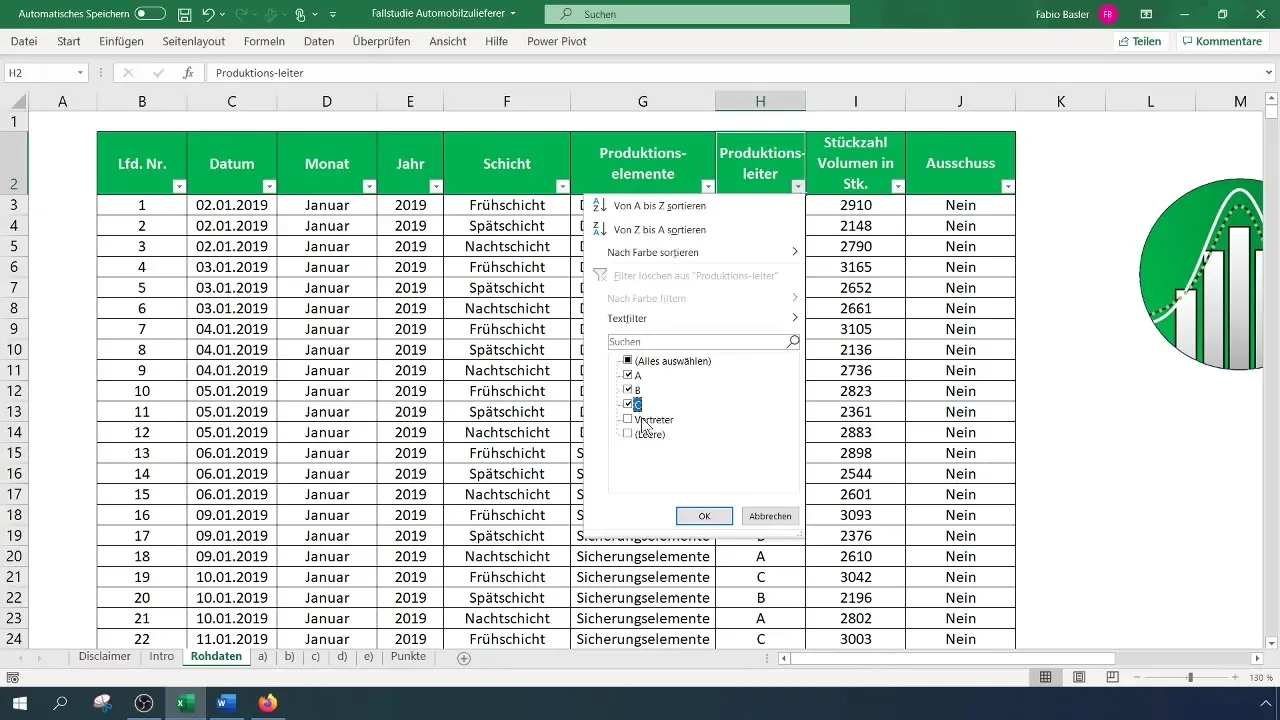
Before starting the contingency analysis in Excel, ensure that the data you are working with is properly formatted. Remove all filter settings to ensure a complete view of the data.

Create a summary containing the production manager and scrap information as nominal data. In our case, we focus on supervisors A, B, and C and exclude all other representatives.
Step 2: Create Pivot Table
To perform the contingency analysis, you need to create a two-dimensional frequency distribution that shows how often each combination of production manager and scrap occurs. Go to the menu bar, click "Insert," and select "Pivot table."
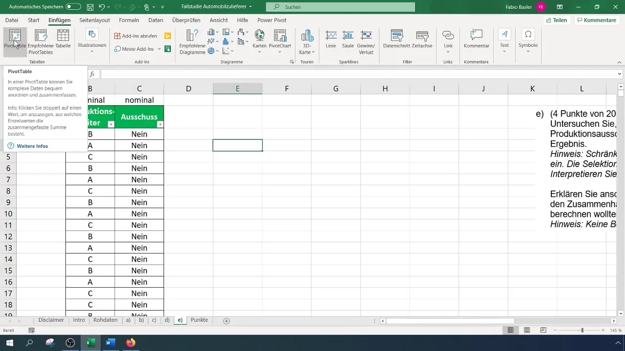
Select the relevant data range and confirm that the headers are correctly identified. Your pivot table will now be created, allowing you to compare the fields for production manager and scrap.

Step 3: Analyze Frequencies
Once you have created your pivot table, you can determine the absolute frequencies. Place the characteristics in the rows and columns of the pivot table. This will show you how many scraps came per supervisor.
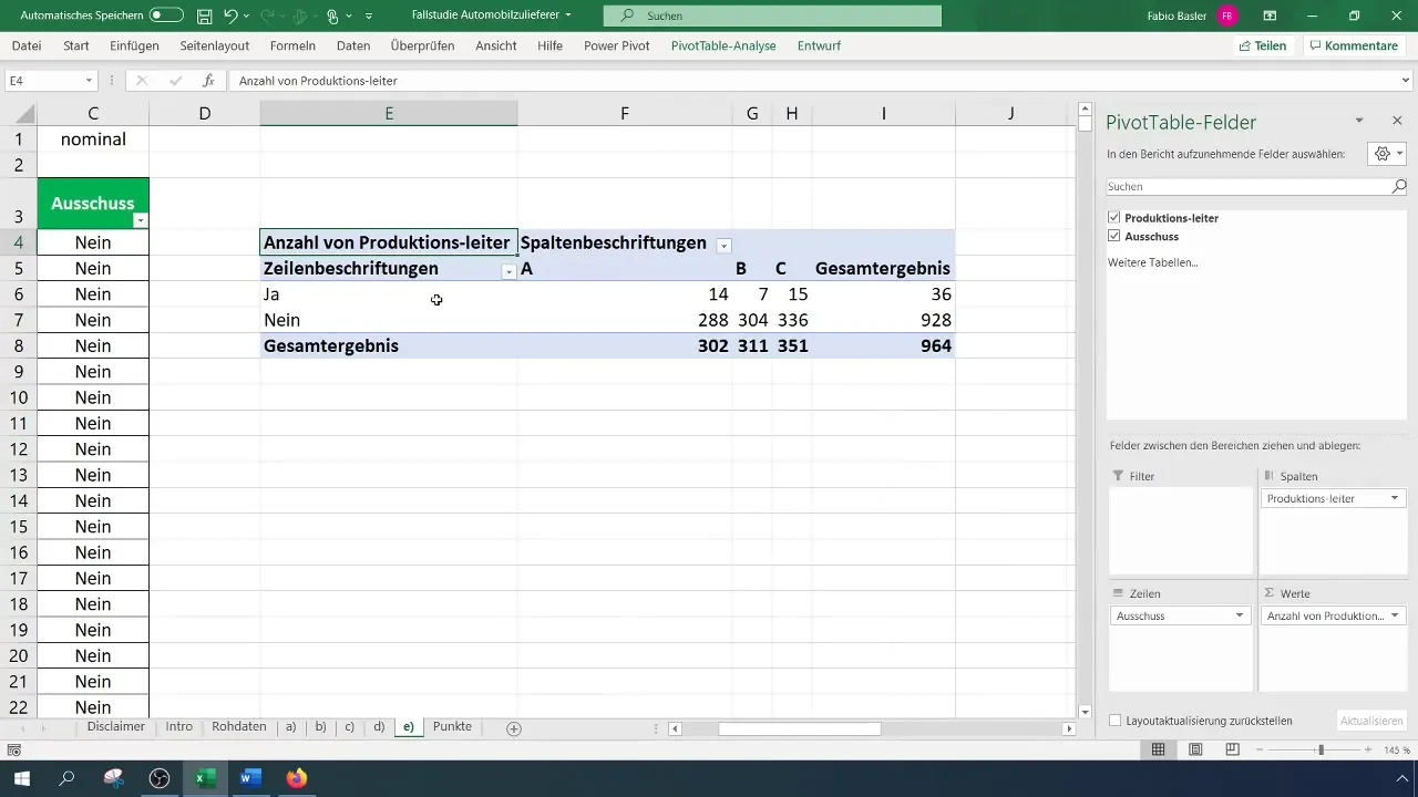
Examine the pivot table and analyze the results. Pay particular attention to the distribution of the variables to determine which supervisor has the most or least scrap occurrences.
Step 4: Calculate Expected Frequencies
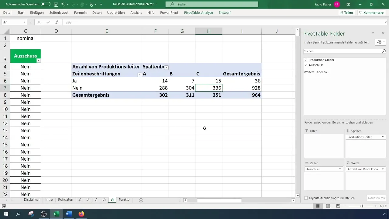
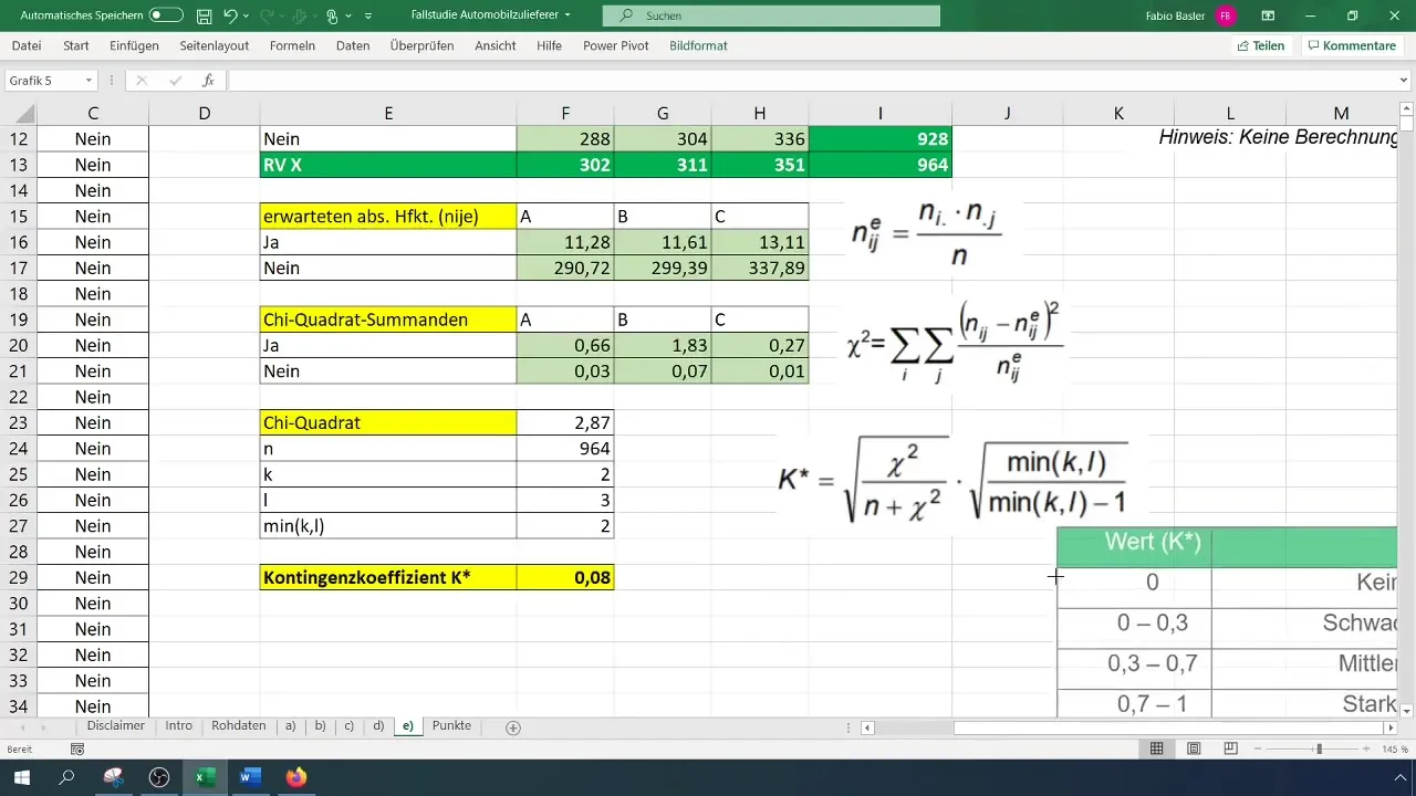
To calculate the contingency coefficient, you need to determine the expected absolute frequencies. The general formula is: (N_{ij} = \frac{(R_i \times C_j)}{N}), where (R) represents the row marginal frequency and (C) the column marginal frequency.
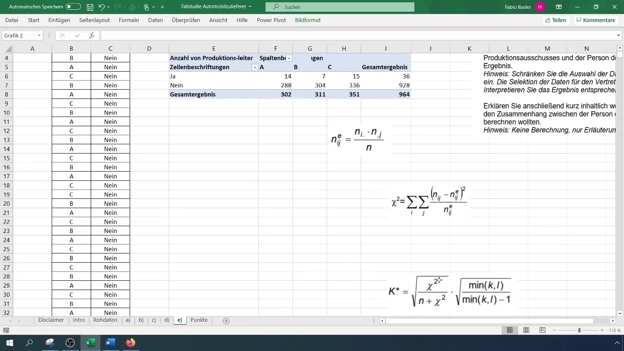
Apply this calculation to the values in your pivot table. Make sure to create a separate table for the expected frequencies to keep the analyses organized.
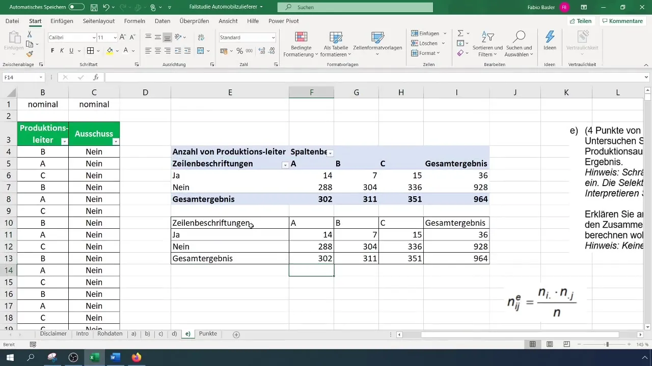
Step 5: Calculate Chi-Square Value
Now calculate the chi-square value to quantitatively capture the relationship between the variables. The formula is:
[ \chi^2 = \sum \frac{(O{ij} - E{ij})^2}{E_{ij}} ]
Here, (O) is the observed frequency and (E) is the expected frequency.
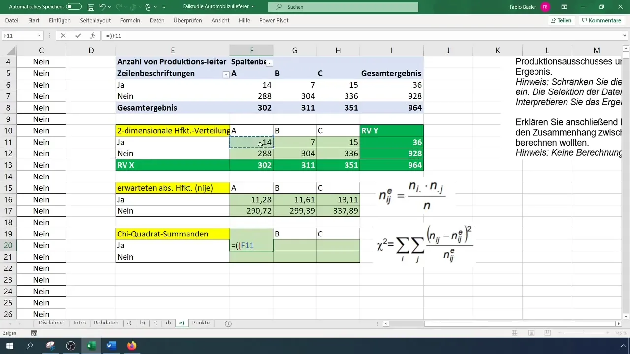
Calculate the differences between the observed and expected frequencies and square them.
Step 6: Calculate Contingency Coefficients
The final step is to calculate the contingency coefficient. The formula for calculation is:
[ K = \sqrt{\frac{\chi^2}{N}} ]
Use the previously calculated chi-square value and the total number of observations (N).
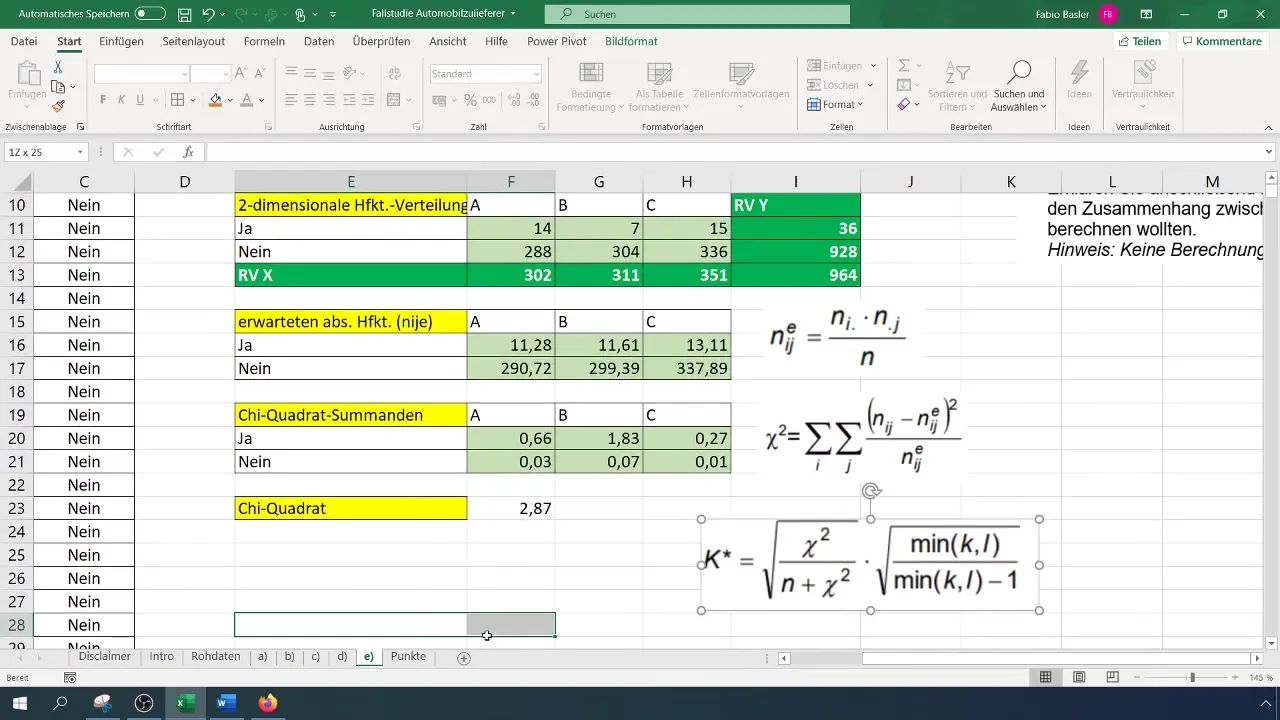
Once you have calculated the contingency coefficient, you can interpret the result. Our analysis has shown that the contingency coefficient of 0.077 indicates a weak relationship between the variables.
Step 7: Interpretation of the Results
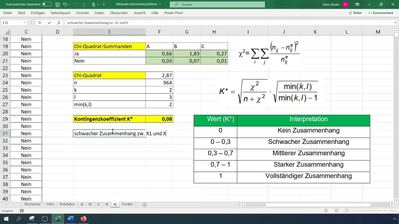
The final steps of your analysis involve interpreting the results. A contingency coefficient close to 0 indicates that there is hardly any relationship between the variables. A value of 0.08 suggests that the production manager has no significant influence on the occurrence of defects.
Summary
In this tutorial, you have learned how to perform contingency analysis in Excel to identify relationships between nominal variables. You have learned how to prepare your data, create a pivot table, and perform the necessary calculations for the contingency coefficient.
Frequently Asked Questions
How do I deal with a large amount of data?If you are working with many different values, classify the data into groups to simplify the analysis.
Can I perform contingency analysis in other software tools?Yes, the basic principles of contingency analysis are applicable in many statistical software and programming languages, even though the steps may vary.
Which variables are suitable for contingency analysis?Nominal-scale variables are ideal for this type of analysis as they do not have a ranking.
How do I interpret the contingency coefficient?A value between 0 and 0.3 indicates a weak, between 0.3 and 0.6 a moderate, and above 0.6 a strong relationship.


