Here we go: Steps 01-10
Step 01
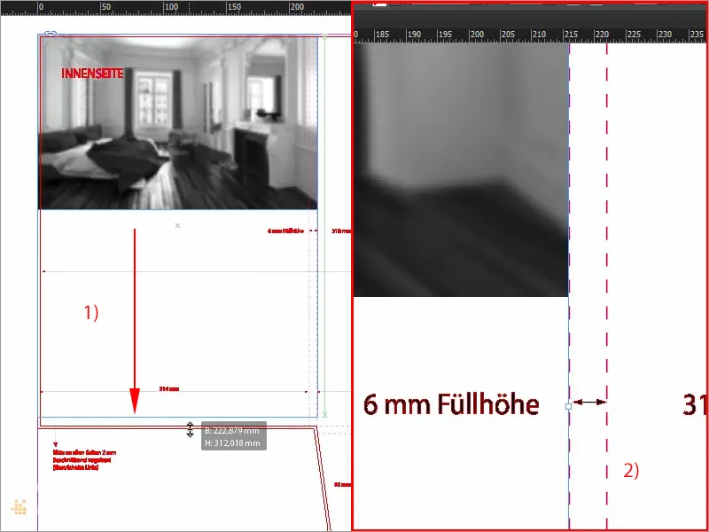
Off to the inside, because it's usually nice and warm and cozy inside, and that's exactly what we're going to take advantage of, because we're going to place the first image here, and I'll select Ctrl+D, choose the right image once, I can now drag it here as desired, down to the bleed (1) and on the right side there up to this line (2). Ok. Adjust>Fill frame proportionally.
Step 02
And now there's a little tip to bear in mind, here in the middle of the inside of the spine of our folder (1), we might need to create a little space there, because the folder will be folded up and it could be that the image will then be cut off. This might not look very good, so we will simply counteract this effect. Place the reference point of the image in the center (2) and do not reduce it proportionally, but manually reduce the width by -10 mm and the height by -10 mm (3).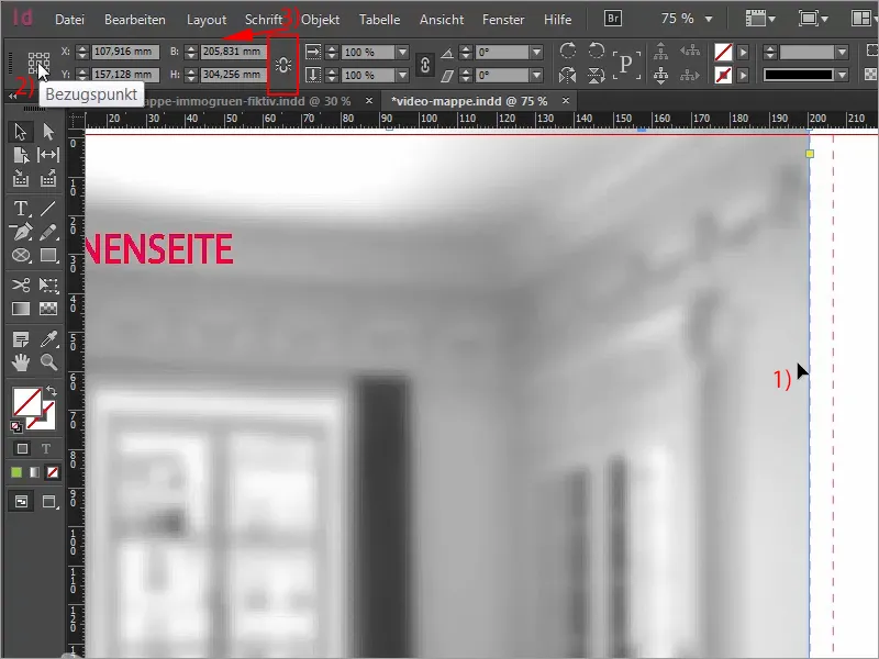
Step 03
Now we have a symmetrical distance (1), once againAdjust>Fill frameproportionally. (2 ) And now take a look at this, I have zoomed in: We now have the 2 mm bleed that we have gained here (3), and here (4) we also have the necessary safety margin. That doesn't mean that you can't pull these images out to the bleed. You can do that. I'm only doing it this way in this example because I would like to have a proportional image with a white border around it, which you should see on all four edges here.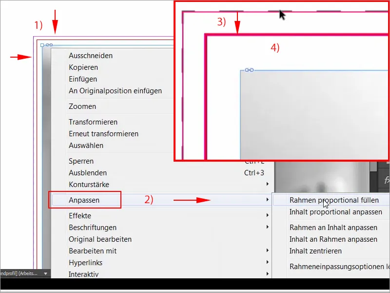
Step 04
By the way, it's not really rocket science to get a blurred image like this in black and white. All you need is a suitable image and Photoshop. I'll show you briefly for those who don't know. Simply open the image in Photoshop and then select the Gaussian blur filter under Filter>Blur filter. And at the moment it comes with 20 pixels, that's fine, I'm okay with that, ...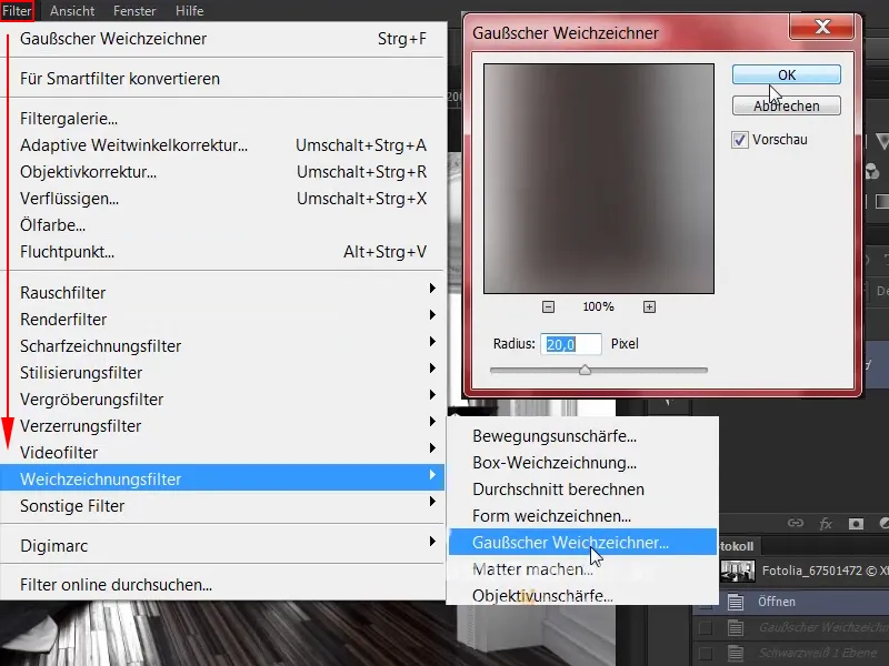
Step 05
... and now we have a nice blurred image. What we still need, however, is our black and white adjustment layer. One click on this (1) and it is already there. We have only used black and white images in our design.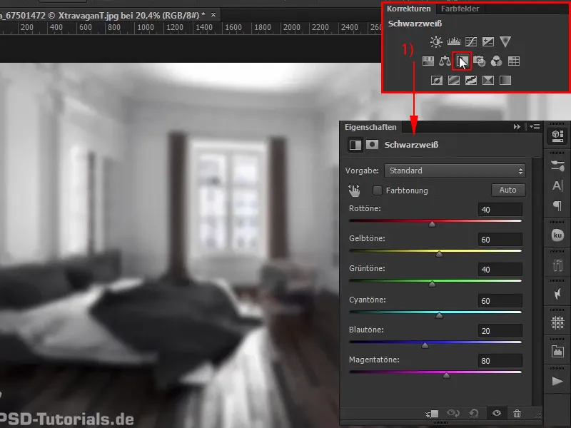
Step 06
Back in InDesign: We see exactly this image there, I could perhaps align it a little more beautifully so that you can see the bed, the stucco at the top and the beautiful window, and then we'll get to work on the caption. To do this, I simply draw a large frame with the rectangle tool, really lush at first (1), I use the text tool to click in once, now the graphic frame becomes a text frame, of course we choose our Exo, font style Bold, in size 60 pt (2). Capital letters activated (3), please in white (4), ...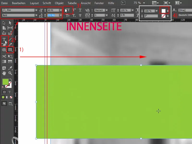
Step 07
... and then comes the first word: "Responsibility". Now we need to add a little spacing, so Ctrl+B, add 6 mm to the frame everywhere (1). Fits. Confirm, reduce to the required size and now drag once up to the bleed (2), ok, and then we can reduce exactly this text field on the right (3) and duplicate it with Alt and Shift. The next word is "sustainability". Here, too, we reduce this (4). Do you see how practical the spacing is? That's only because we've made exactly the right provisions in the text frame options. One more time and then the last core term is "lifestyle".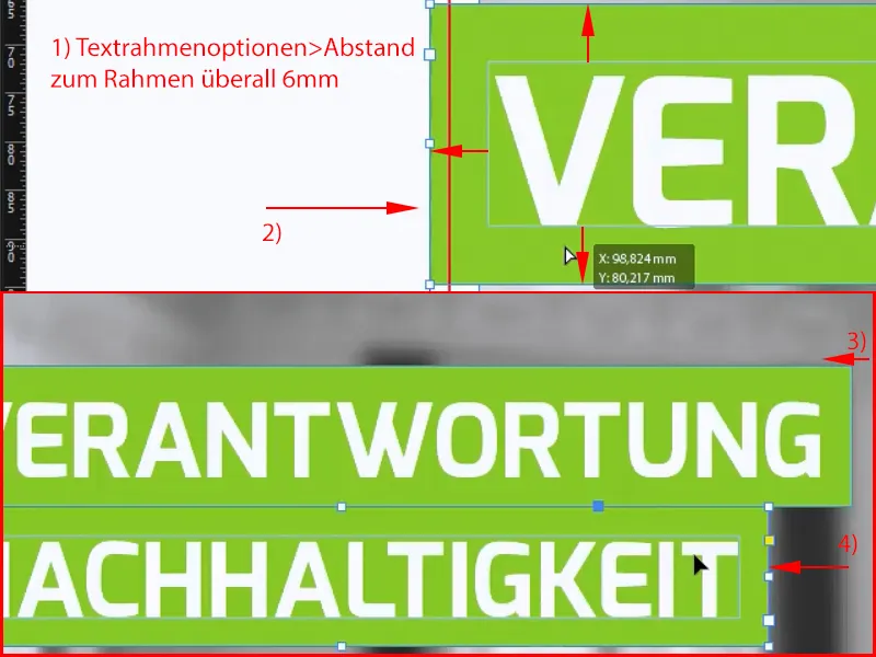
Step 08
Now let's move the whole thing to the top third, I'll lock the background image by right-clicking>Lock (Ctrl+L), then nothing can happen. Now I'll select everything and move it a little higher. In the lower third we draw a rectangle again, just completely arbitrarily, look for the height as we have already used it above, so click once on it, height 28.933, exactly, we also grab it (1), now we adjust it to the same height and then I can take a look at the whole thing. Then I'll use the circle tool or the ellipse frame, as the thing is officially called, to draw a circle of 55 mm approximately (2), fill it with the color white (3), then I'll align it with the center axis (4), ...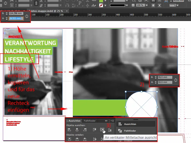
Step 09
... and now I pull out the matching logo from my library (1). Also Align>Center, (2) it could perhaps be almost a touch larger, the logo, so mark it once and drag it larger.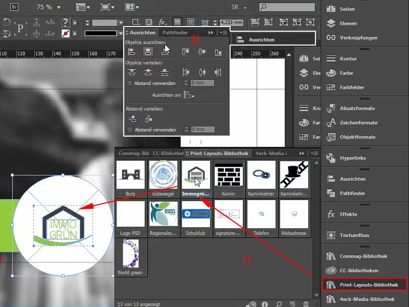
Step 10
And then the only thing missing here is a text field, (1) I also drag it manually, select the Exo, in Bold, 2) font size 40 pt. (3), color white (4), and then I write in here: "Welcome". Oh, I love this font! Look at these wonderfully beautiful letters, gorgeous. Then let's fade in the hidden characters: font>fade in hidden characters, a paragraph in, reduce font size to 13 pt, font style to medium, (6) there I have to change the view, like this, right. "In the world of", medium, 13 pt, reduce once here, like this, and right-align "In the world of" (7), and then we can also put this once in the right home position. Of course, we don't need a flight indicator for this, we can just do it manually with the center line, but I would like it to be left-aligned (8).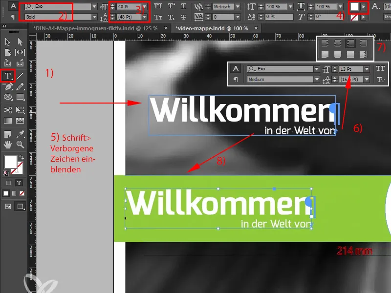
Steps 11-20
Step 11
Now let's take a look at this. But what you can still do here in any case is work with the spacing. That's why I'm throwing everything into a group (1) and the upper area into a group and now I'll just use the rectangle tool (2) to find a help here. Let's dock it right at the top, which is now 38 (3). Let's quickly change the color so that we don't mix anything up (4), and I'll insert exactly the same distance down here with Ctrl+X (5), move the group up and delete the auxiliary rectangle.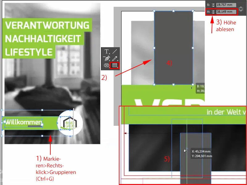
Step 12
Now we also have the same spacing and can continue with the inner part, which actually only contains this watermark. So just take this logo again, press the Alt key for a copy (1), now I'll throw out the slogan from this logo, because I only want the house with the green arch, and now I'll make this thing bigger (2). That's roughly how I could imagine it provisionally. And I just have to center it, so you can see here on the right is the wing (3), which means we only have this area.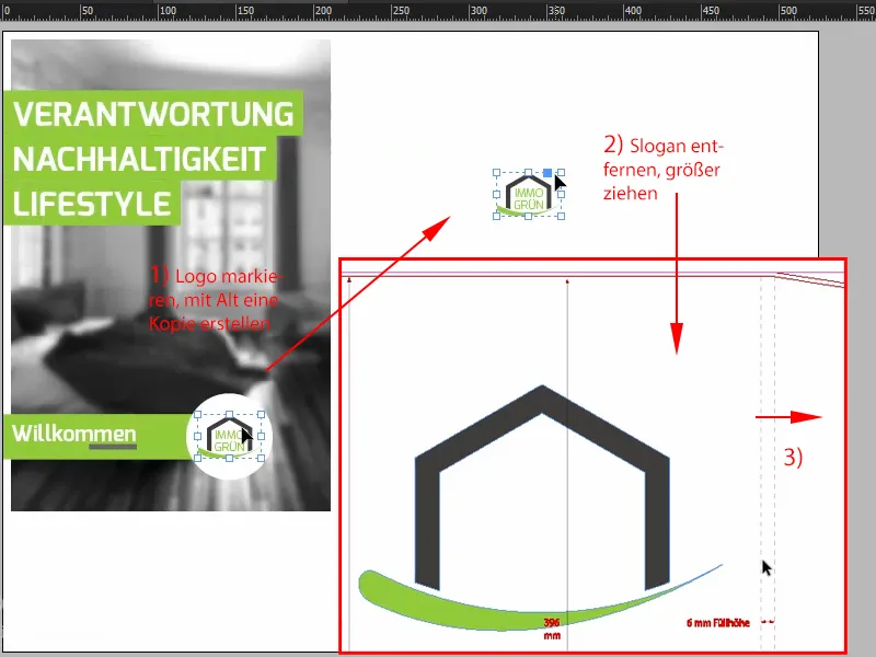
Step 13
And the same game at the bottom. The wing starts here, so I'll just do it like this: We've already defined the spacing here once, so I select the image, unlock it at the beginning, make a copy of it, move it over here, now InDesign has just shown me the help, a green line, and now I can center this house once using the background (1). I don't want it to be centered in height, because when you close the lower wings of the folder, this logo sticks too close to it. I would like it to swing freely. So I move it up to the top third (2) and reduce the opacity to 30 % (3).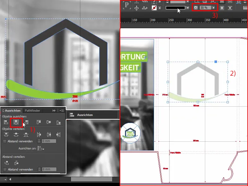
Step 14
So that's it for the inner part, it's not that tricky, press Ctrl+S once to save and now it's time for the part you've probably all been waiting for, namely the finishing. To do this, we'll first clean up the layers and create a new layer using this little symbol below (1). Double-click on it and rename it (2), we'll leave out the champagne for the christening. Ok.
Step 15
Next, let's go to the front pages, because I've already mentioned that this relief varnish is only possible on the outer pages. It's not possible on the inside, but that's not a problem. We now want to apply this relief varnish partially on this side, i.e. on all white surfaces. Okay. What is necessary for this? First of all, of course, a so-called solid color. So you open the control panel for the colors, click on it here: New color field, (1) then this wonderfully magnificent dialog opens and there you can select the solid color(2) instead of the process colorfor the color type. I will now deliberately set this to 100% magenta (3) so that we can clearly see that this is the solid color, and it also has a very specific name, namely "Varnish" (4). Add (5), confirm (6).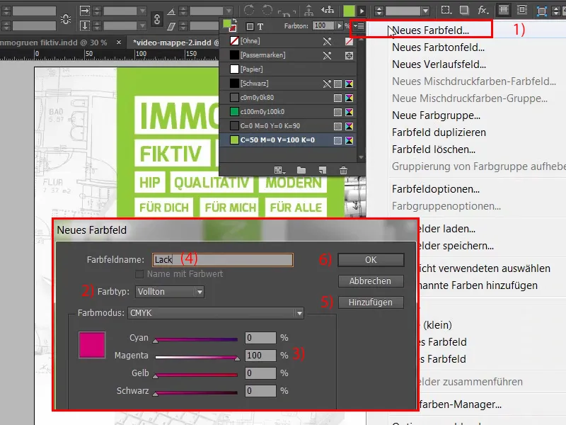
Step 16
A few important notes at this point: If you are working with such a solid color"Varnish", then this object must have 100% opacity. Lines must be at least three pt, which is a little over 1 mm, and fonts must also be at least 14 pt. Serifs in particular can be a bit tricky, so be sure to check with your print shop what the individual parameters of your printing partner are. How does finishing work? It's quite simple, the principle is actually quite easy to explain. We have this layout printed in the usual way, using the 4C process, and then this varnish is applied on top, which means you don't have to change anything at first, you can't leave anything out either. The solid coloris therefore added on top. Meaning: If, for example, we don't want the font to be refined here with "immogrün", but the background, i.e. this white area, then it doesn't mean that we simply add the varnish color to this white area (1), that would be wrong, because what would happen? When printing, we would no longer have a white area, but only a relief varnish without the white area.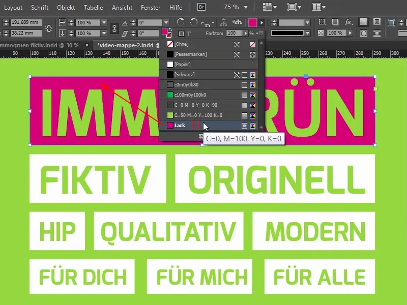
Step 17
So the right thing is: You leave this white area and put the relief varnish on top. So let's quickly undo this: Ctrl+Z, and we will now move the elements we need onto the new layer. To do this, I will first select all the text boxes and convert this heading into paths.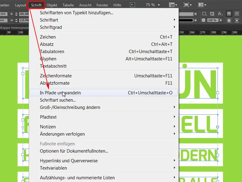
Step 18
Now we have paths and I can simply subtract this path from the white area using the pathfinder (1). It is now subtracted, which means that we now actually only have this single white box and inside it is actually a cut-out from the font (2). I'll do exactly the same thing here, I'll repeat it a few times, so this will now be done very quickly. Let's go. Like this.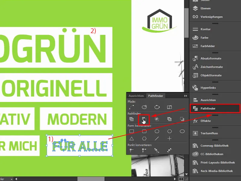
Step 19
Now we only have individual shapes and I'm going to mark them all once: Ctrl+C. Now I change the layer to the relief varnish layer (1) and go to Edit>Paste to original position. (2)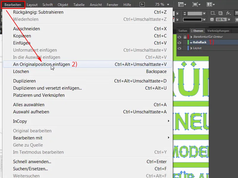
Step 20
So now we've made a copy of it and now I can set the color of it to Varnish (1). This is now directly above it, I can show you this once, if I move this box (2), then we can see the original object in the background.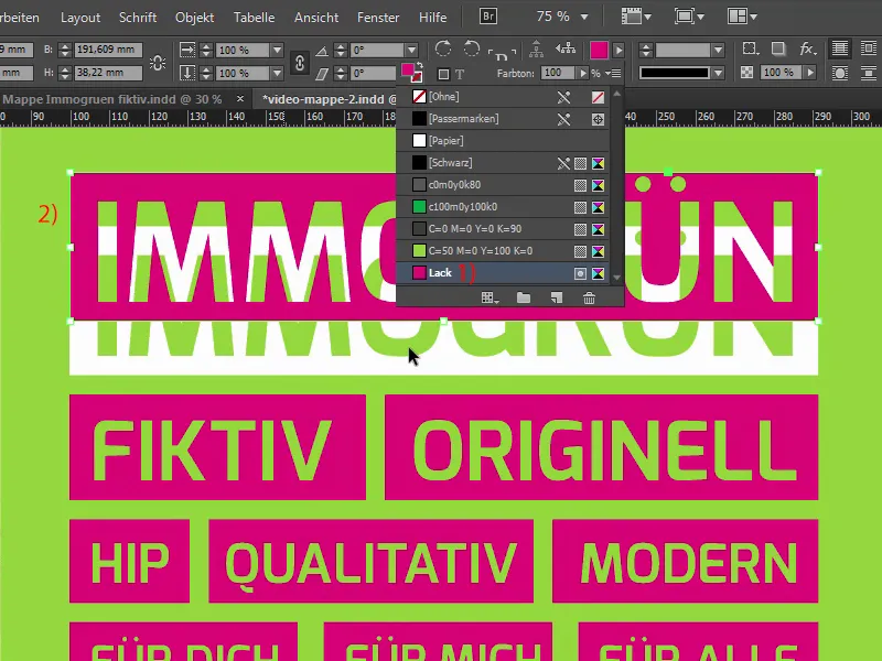
Let's continue: Steps 21-30
Step 21
So, Ctrl+Z, undo again. What else do we want to have white? This one at the bottom is too small to add relief painting, but we still have a few elements here. Again, I'll convert both text boxes to paths first. And then I can use Ctrl+C to move the text fields and the white circle to the relief varnish layer, insert them in their original position and apply the varnish color. It's as simple as that.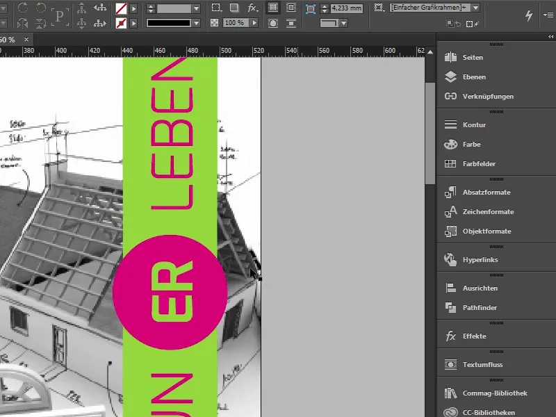
Step 22
You wouldn't have thought that would be the end of it, would you? Yes, and how the heck are we supposed to know now whether we've done everything right? Fortunately, InDesign tells us via Window>Output, specifically via the separation preview (1). I'll slide it in here. You already know the separation preview (2) from other videos in this training. If I go to it once, we have a fifth color in addition to our basic colors, namely the solid color. If I hide everything here and we only show the paint color (3), then we can see which of all these elements should really be refined. It's a pretty cool thing, because everything that is shown here in black (4) will be spit out of the machine with a refined finish afterwards. I think that's actually pretty fantastic and you can definitely check it there.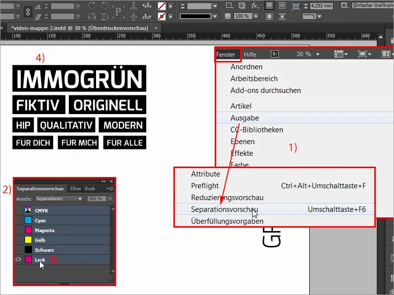
Step 23
Now I turn off the separation preview again. Next, however, it is important that these fields or everything on this layer is set to overprint. Where can I do that? That's actually quite simple, I'll move it over here. Via Window and also Output>Attributes. (1) There I have this attributes window(2). And if you have worked with layers, you can simply select all the elements on this relief varnish layer (3) and select Overprint area (4) here.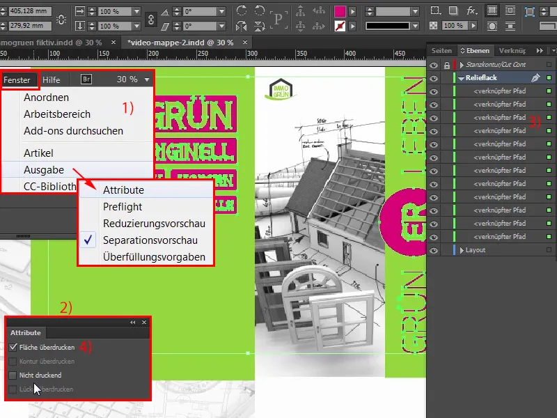
Step 24
So, that was the whole secret. It is important to note that if you use a varnish like this, the color tones may change slightly. I would definitely recommend that you talk to your print shop again, they know exactly what to do, so close the window once and now it's time to export. Ctrl+E, we want to export once, ISO Coated (1), there is something wrong with the color space, so, now, all clear. Marks and bleed (2): Here you could actually activate the checkbox (3), but the bleed is already included, i.e. we now simply go to Export (4). The process bar at the top tells us that the thing is in progress.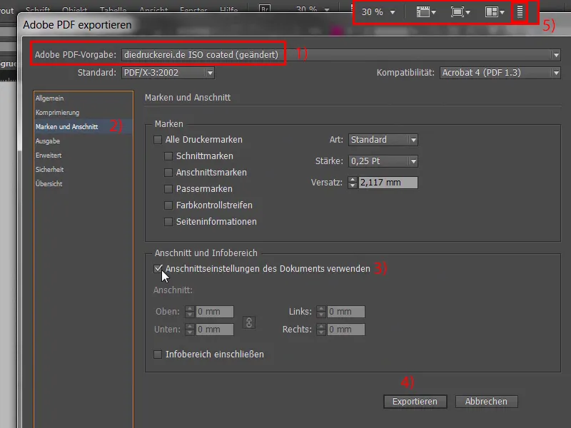
Step 25
So, there's our print-ready PDF template, page 1, page 2. However, you support the print shop if you upload a so-called view file in addition to this print-ready template, and that's what we're going to do now. So we'll show the die-cut outline once in the layers, deactivate the lock (1) and then I'll simply draw a text box here or a rectangular frame (2), fill it with the color varnish (3) and simply write the text from my clipboard in white (4). "Note: There are objects for relief varnish on the outer sides." You can still center the whole thing.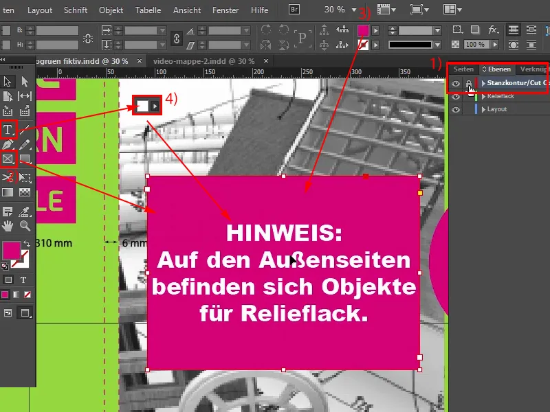
Step 26
So, all right. So this is now a view file, because we have all the markings in the boat, and then we go to Export again and then call the file "View file print real estate fictitious", save, export once, done. So, here is the view file.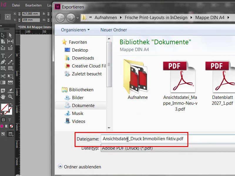
Step 27
Ok. On to the last steps.
We have arrived, then we go to the search for folders and folder folders (1), whereby search is of course an exaggeration, because here you can find everything quite quickly, folder (2) DIN A 4,4/4-color (3+4), let's go to it again.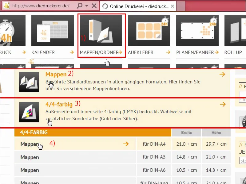
Step 28
Now it's on to the settings. 300 g picture printing paper (1), that's what we decide on, so we have a brilliant paper on all sides for great color reproduction. Of course, there are other options here, but we will use the art paper. For the number of pages, we choose four-sided (2), which we agree with. Now we come to the finishing. This is where it gets interesting: one-sided with relief varnish (3). We had the number 14 for the die-cutting contour (4). Ok, die-cut contour number 14, quick-stapling mechanism No, we don't need triangular pockets either, nor business card pockets, nor CD pockets, but we will include the data check (5).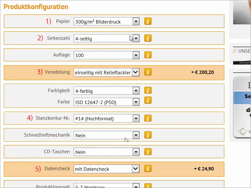
Step 29
So, on to the order (1). By the way: Here you can also print the offer once, if you are acting on behalf of a third party and you would like to send the offer once or you need to consult with your customer, simply go to PDF / print offer (2) or add it to the watch list (3). No problem if you have a customer account.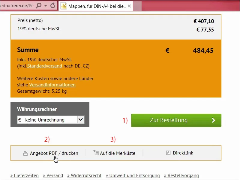
Step 30
So, here we have the summary again (1). That's right, unfortunately we don't have a voucher (2), but that's no problem. We go to Next. (3)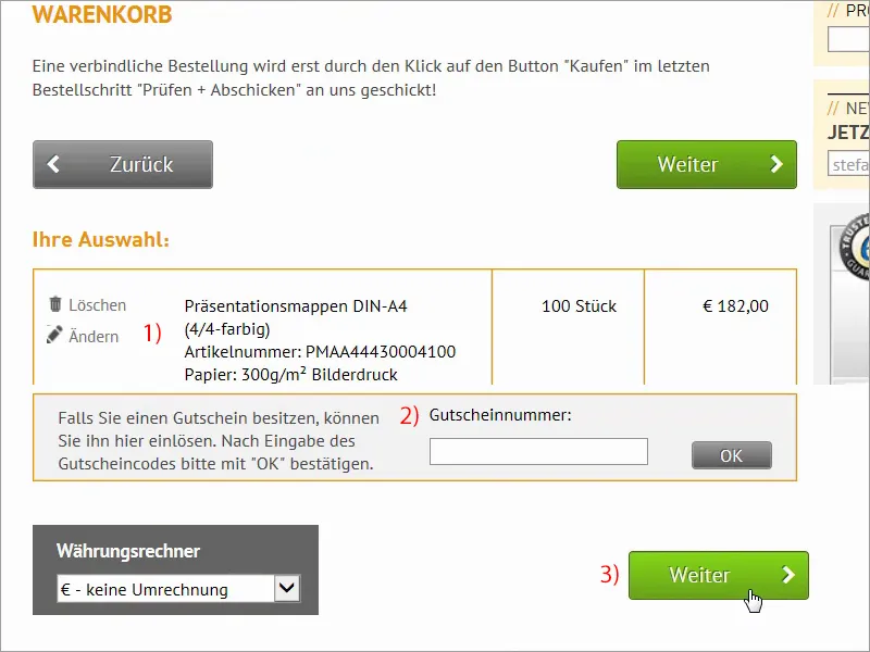
The last steps
Step 31
Billing address. Here you also have the option of entering a different delivery address. "Would you like to stay up to date?", we can also subscribe to the newsletter, but now we simply go to Next, select Prepayment and have numerous other options here or, this is very practical, a reference text. This is an internal transaction number that you can assign, which is then displayed accordingly on the invoice or on the e-mail confirmation and in the order history.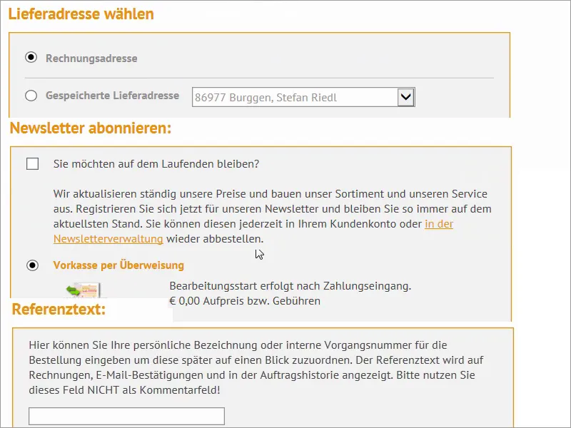
Step 32
So, we accept the terms and conditions (1), go all the way down, click on Buy (2). Yes, that's what we want. And then on to upload (3).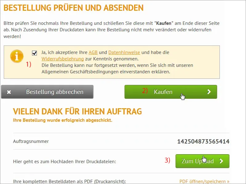
Step 33
Yes, we're at our well-known Upload Manager, and we're going to use it a bit now; so, I've just pushed the two files into the Upload Manager, which will take a moment, I think we'll make a short time jump and be right back.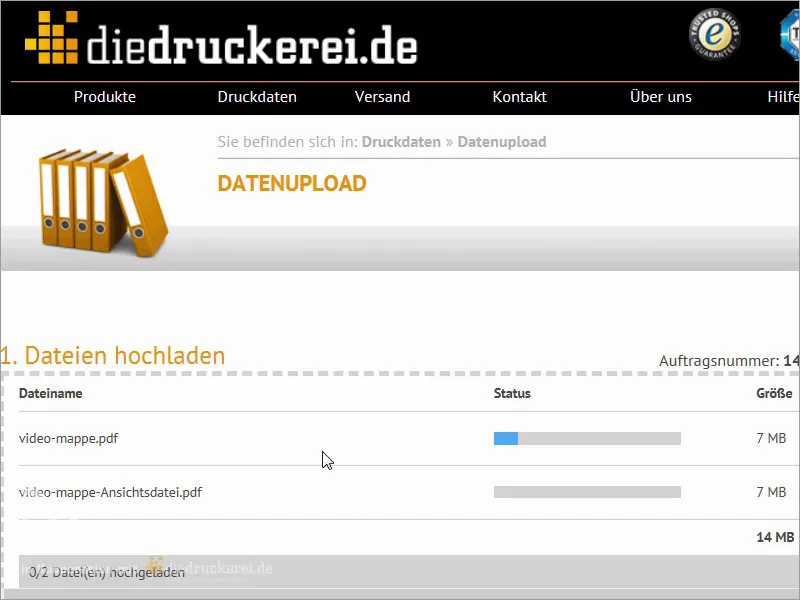
Step 34
Here we are again, everything is uploaded and I select "All in one document" (1) for the first PDF, then it says here: "The file contains non-critical errors" (2), which says: "Resolution below 300 dpi", I also now already know which image this is about, which is the one we've blurred, which is 270 dpi, but that's not really noticeable in an image that's been treated with Gaussian blur, so I can definitely nod it off and finalize it that way.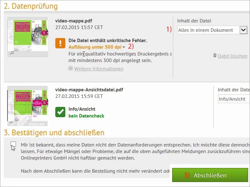
Step 35
Our care package has arrived and we'll now see what's inside this tightly lashed box.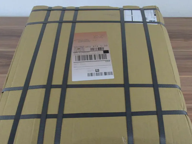
Step 36
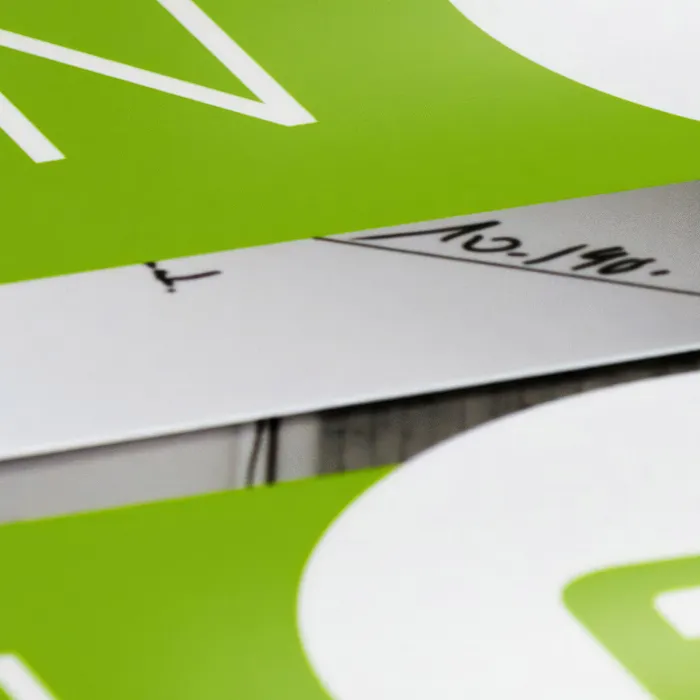
And there you have it: Look. Here's the good stuff. I'll take out a stack of them and put the box to one side. Like this. Yes, so: 300 g picture printing paper with relief varnish was used, and it looks really great, I especially like this poison green very, very much. We have the contours here, the filling height of 6 mm, it's all pre-punched, so you can easily fold it and fold it again, we'll do that now, then there's also a wing here, so we'll do that here too at this point. Then we continue. What else do we have? Yes, here's another wing, we also have to fold it over once and then we'll put them together. There we go. Okay, guys, now let's take a look at this thing. Wow! The front and the relief coating feels really great, so everything that's white here has this relief coating. It looks really good, but feels even better. The relief coating has a really great glossy character, which I really like. Let's take a look at the back. Here we can see it again: relief coating here at the top. The feel is okay, the address is at the bottom, we've entered it like this, and now we open it once and it looks like this. Wow.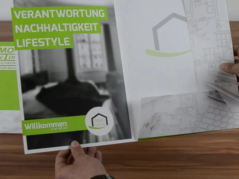
Doesn't that look great, guys? It looks good, doesn't it? Then the wings: Did we do it right? "Hallway" - you can read it correctly. "Hallway" - you can read that correctly too. Not too dominant, but nice and delicate in appearance. I really, really like the soft-focus image. I'm satisfied, I've still got a few more ahead of me, which means I can still fold a bit, but I think overall you can work very well with it and it's definitely worth a recommendation. It's great fun to recreate, and it's really, really cool when you see a print product like this in front of you.
