Have you ever wondered how to present and analyze large amounts of data in Excel clearly? In this guide, you will learn how to effectively classify data and create a frequency distribution. We will go through the entire process, from data collection to graphical representation. The goal is to provide you with the necessary tools to evaluate your data optimally.
Main Insights
- You create a classified frequency distribution.
- You learn how to calculate absolute and relative frequencies.
- A graphical representation of the results is highlighted.
Step-by-Step Guide
1. Prepare the Data
First, you need the raw data that you want to analyze. In this case, we are using the sales figures of notebooks. Copy the data into a new Excel document or use an existing one. Make sure the data is arranged in a single column.

2. Determine the Range
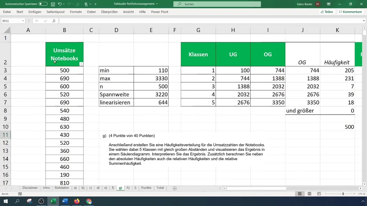
Before you can create classes, you need to determine the range of the provided sales numbers. This is done by subtracting the maximum from the minimum. Check the sales figures to determine the minimum and maximum.
3. Create Classes
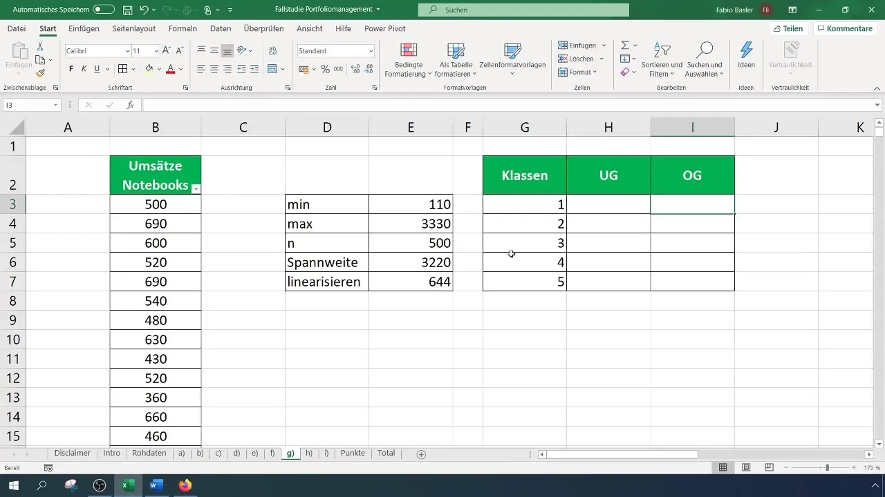
Once you have determined the range, you can start classifying the data. The goal is to create five equally sized classes. Divide the range by the number of classes to determine the width of each class. In this example, this results in a spacing of 644.
4. Define Lower and Upper Limits
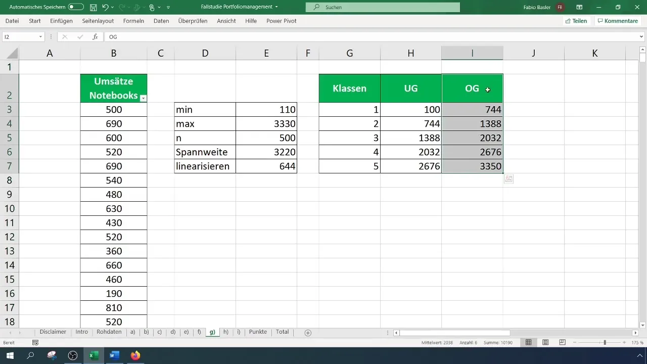
Set the lower limit of the first class so that it is below the minimum value, then calculate the upper limits of the classes. Start with the first class (e.g. from 100 to 744) and add the width to the respective lower limits. Make sure the upper limit of the last class includes the maximum of the sales numbers.
5. Determine Frequencies
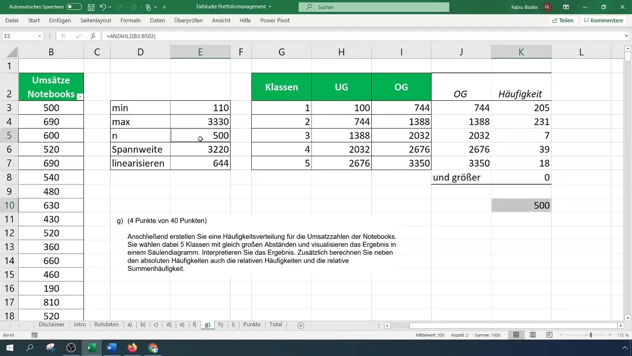
To determine the absolute frequencies for each class, go to "Data" and select "Data Analysis". If this function is not enabled, you need to activate it in the Excel options. Then choose "Histogram" and enter the input ranges for raw data as well as the class upper limits.
6. Verify Results
Once you have calculated the frequencies, check if the sum of the absolute frequencies matches your sample size. In this case, you should get 500 observations. If not, check the upper and lower limits of the classes.
7. Graphical Representation of Frequencies
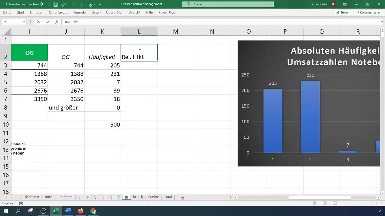
To visualize the data, go to "Insert" and select a 2D column chart. This will give you a clear insight into the distribution of frequencies in the different classes.
8. Calculation of Relative Frequencies
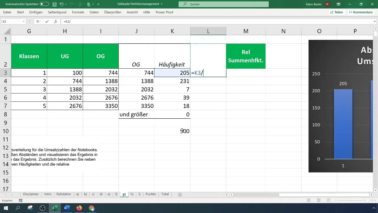
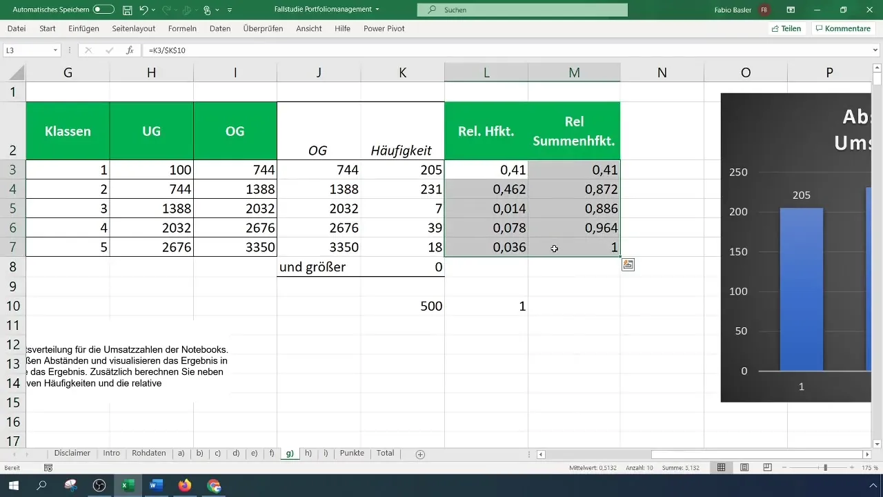
The relative frequencies are determined by dividing the absolute frequencies by the total sample size. Use a reference for the total sample to automate the calculation. Make sure that the sums of the relative frequencies add up to 1.
9. Cumulative Relative Frequency
To determine the cumulative relative frequency, add the relative frequencies step by step from the first to the last class. The end result should be 1.
10. Further Analysis and Visualizations
Alternatively, you can also visualize the results in an empirical distribution function. This method complements your analysis with additional information about the distribution of the data.
Summary
You have now learned how to classify data, determine frequencies, and graphically represent them in Excel. This technique is helpful in analyzing large amounts of data in a clear and understandable way.
Frequently Asked Questions
How can I avoid an error message in data analysis?Make sure that data analysis is enabled in the Excel options.
Can I create more or fewer than five classes?Yes, you can adjust the number of classes as needed, as long as the range is correctly divided.
How do I know if the classes are meaningful?If the class results in the histogram representation appear meaningful and significant, the classes are meaningful.


