Excel is a powerful tool used in many companies for data analysis and decision-making. In this course, you will learn how to effectively use Excel for your financial sales team to gain valuable insights from data and make informed decisions. The case study we will examine provides you with the opportunity to apply your knowledge practically and familiarize yourself with the various functions.
Main Insights
The following are the main aspects summarizing the case study:
- Analysis of 100 sample data with seven different characteristics.
- Conducting descriptive and inductive statistics.
- Creating a classified frequency distribution.
- Calculation of association measures and regression analyses.
- Visualization of time series and derivation of trend forecasts.
- Conducting parametric tests, including confidence intervals and variance tests.
Step-by-Step Guide
1. Classify Data and Create an Overview
Before you start with data analysis, you should get a sense of the available data. This includes classifying the data and determining a classified frequency distribution. This provides a clear overview of your data distribution. Go to the corresponding table in Excel and begin to review the data and classify them according to the relevant characteristics.

2. Graphical Visualization of Data
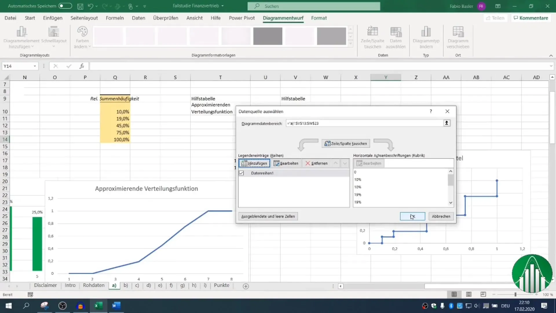
After classifying the data, it is useful to visualize them graphically. Excel offers various types of charts to help you identify patterns and trends in the data. Choose a suitable chart and represent the classified data to clearly display the frequency distribution.

3. Calculate Measures of Association
To analyze the association between nominally scaled characteristics, you can calculate the contingency coefficient and the association measure G squared. Go to the appropriate functions in Excel and perform the necessary calculations to understand the statistical relationship between your characteristics.
4. Perform Regression Analysis
An important part of data analysis is regression analysis. Here, you quantify the linear functional relationship between dependent and independent variables. In Excel, you can accomplish this using special functions. Interpret the results to better understand the relationship between the data points.
5. Time Series Analysis and Trend Forecast
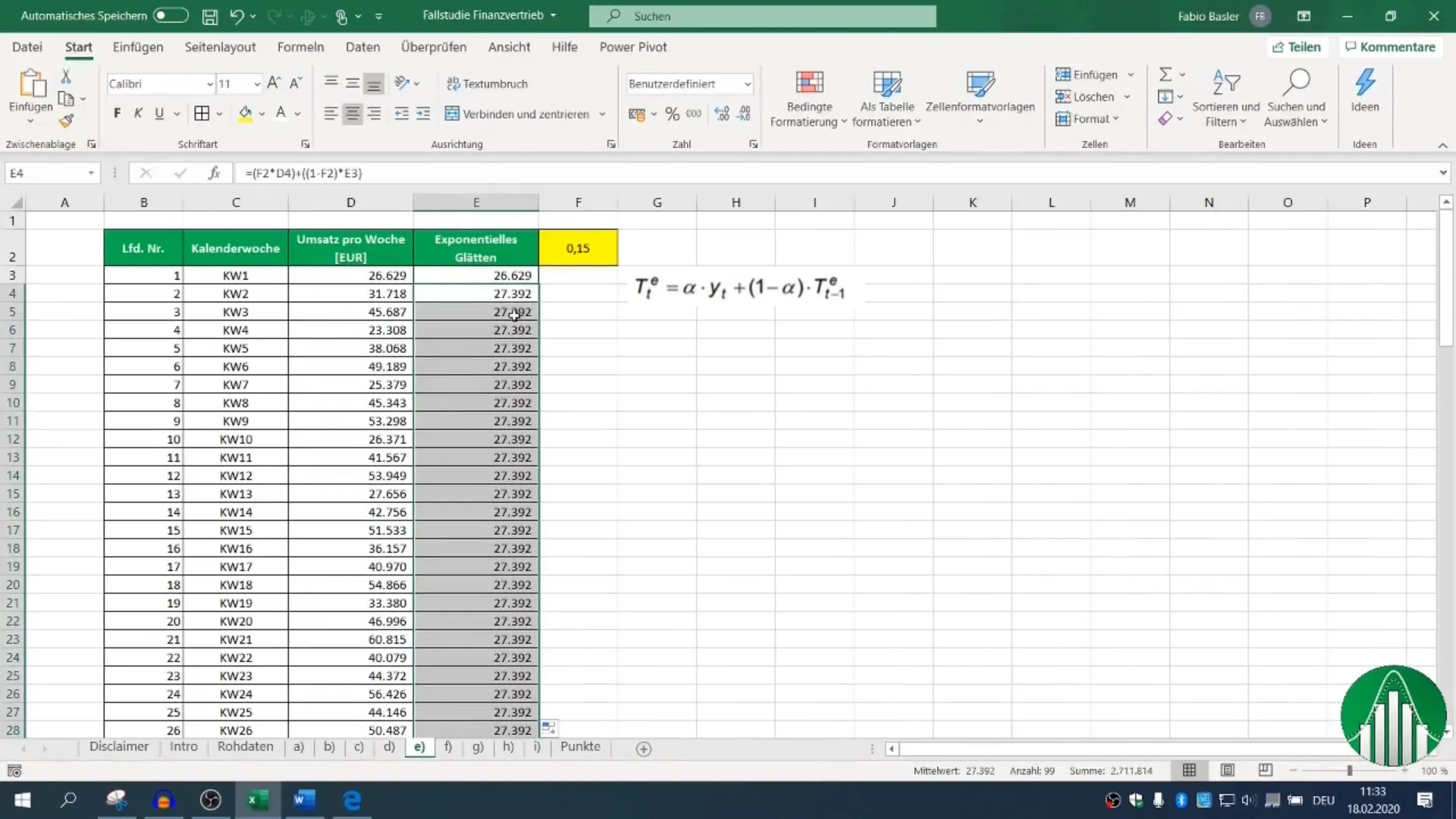
It is now time to perform time series analysis. Visualize your sales figures graphically to see how they have changed over time. Based on this visualization, you can also derive a trend forecast. Remember to experiment with different methods and choose the most suitable one for your data.

6. Inductive Statistics and Hypothesis Testing
In the final part of data analysis, you will deal with inductive statistics. This includes conducting a single-sample test for the expected value. Also, perform a two-sided confidence interval in Excel to calculate an interval where the true parameter could lie.
7. Conduct Variance Test
Finally, you will conduct a two-sample variance test. This test checks if the variances of two groups are significantly different. Use the appropriate Excel functions for this and document the results for your analysis.

Summary
With the guide described above, you have a comprehensive overview of data analysis in Excel. You have learned how to classify data, visualize them graphically, and conduct comprehensive analyses. These methods are essential for anyone working in financial sales to make data-driven decisions and enhance the company's performance.
Frequently Asked Questions
What type of data is analyzed in the case study?100 sample data with seven different characteristics are analyzed.
How many steps are involved in data analysis in this course?The data analysis consists of a total of seven steps, from classifying data to conducting variance tests.
Which functions are used in Excel?Functions for descriptive and inductive statistics, regression analysis, and time series analysis are used.
What is the goal of the analysis?The goal is to gain valuable insights to make informed decisions in financial sales.

