Effective handling of data is essential for success in financial distribution. Visualizing information can help you identify crucial trends and patterns. In this guide, I show you how to convert sales figures in Excel into a concise line chart. This way, you can not only analyze your data but also present it in an illuminating way. The steps are simple and do not require deep Excel expertise, just a little attention to detail.
Main Insights
- Using a line chart facilitates the visualization of time series data.
- It is important to differentiate between series name and series values.
- Trendlines help you recognize and understand patterns in your data.
Step-by-Step Guide
To visualize your sales data in Excel, follow these steps:
Copy and Paste Data
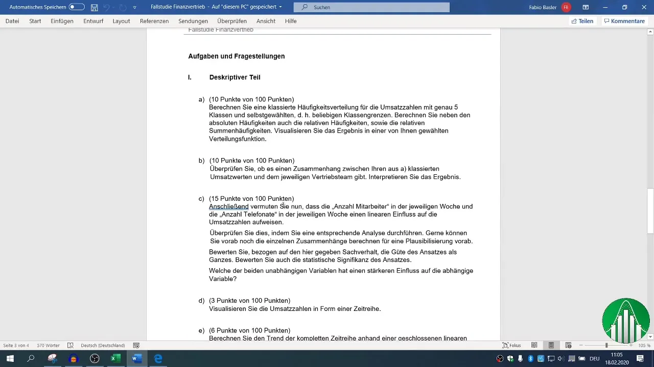
First, you need to have the relevant data available in Excel. Start by selecting the corresponding columns like "Calendar weeks" and "Sales" in your dataset. Highlight columns B to D, which contain this information. Copy the data using Ctrl + C and paste it into the task area D. Ensure that your data is pasted correctly.
Create Chart
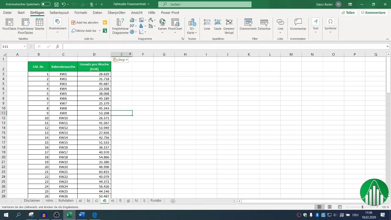
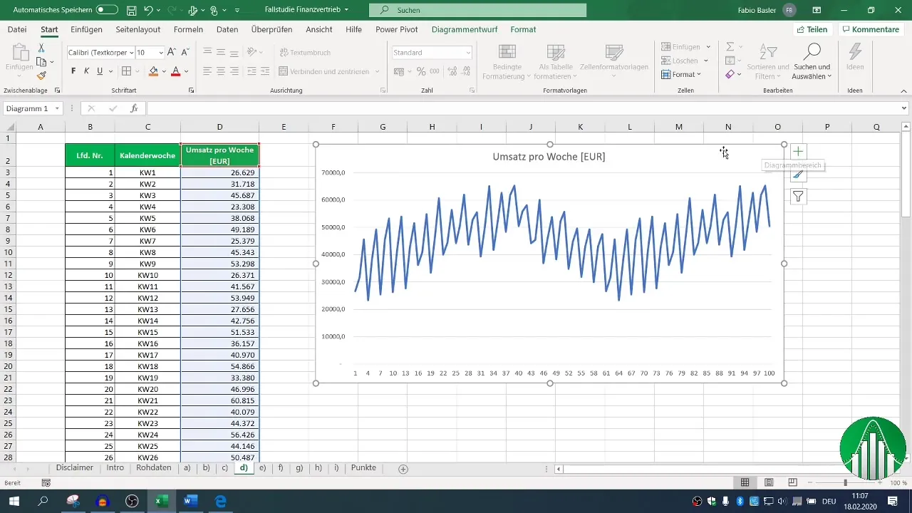
Now you are ready to create the chart. Navigate to the "Insert" tab on the toolbar. There you will find various chart options. It is recommended to start with a blank chart. Choose a line chart that provides a clear representation of your time series.
Add Data Series
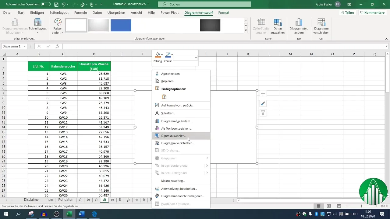
To add the data to your chart, right-click on the chart and select Select Data. Here you can define the data series. Differentiate the series name and values. The series name should be "Sales per week" here, while the series values reflect the actual sales data.
Mark Series Values
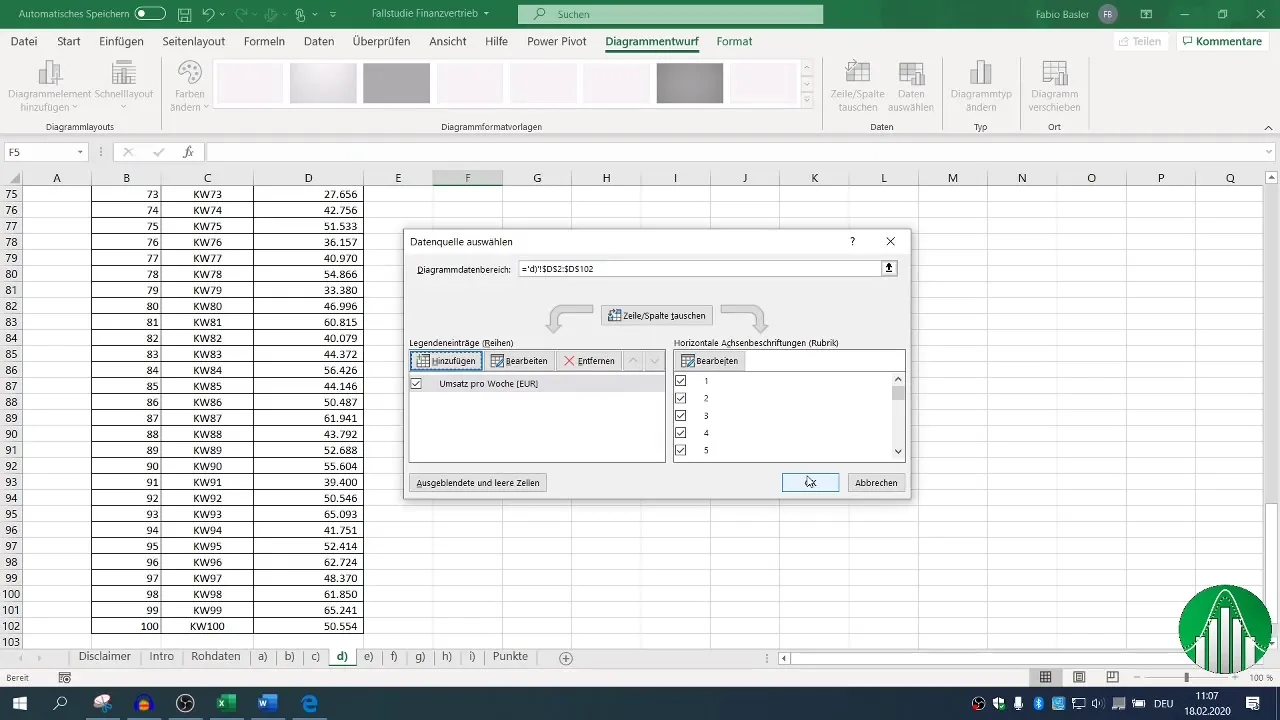
To set the series values, mark the cells for the sales numbers. You can quickly do this by using Shift + Ctrl and the down arrow to select cells D3 to D12. Confirm the selection with OK.
Adjust and Confirm Chart
You can leave the horizontal axis label as default, as it already extends between 1 and 100 and is suitable for your analysis. This way, the chart is created directly and visualizes the time series of your sales.
Additional Visualization Options
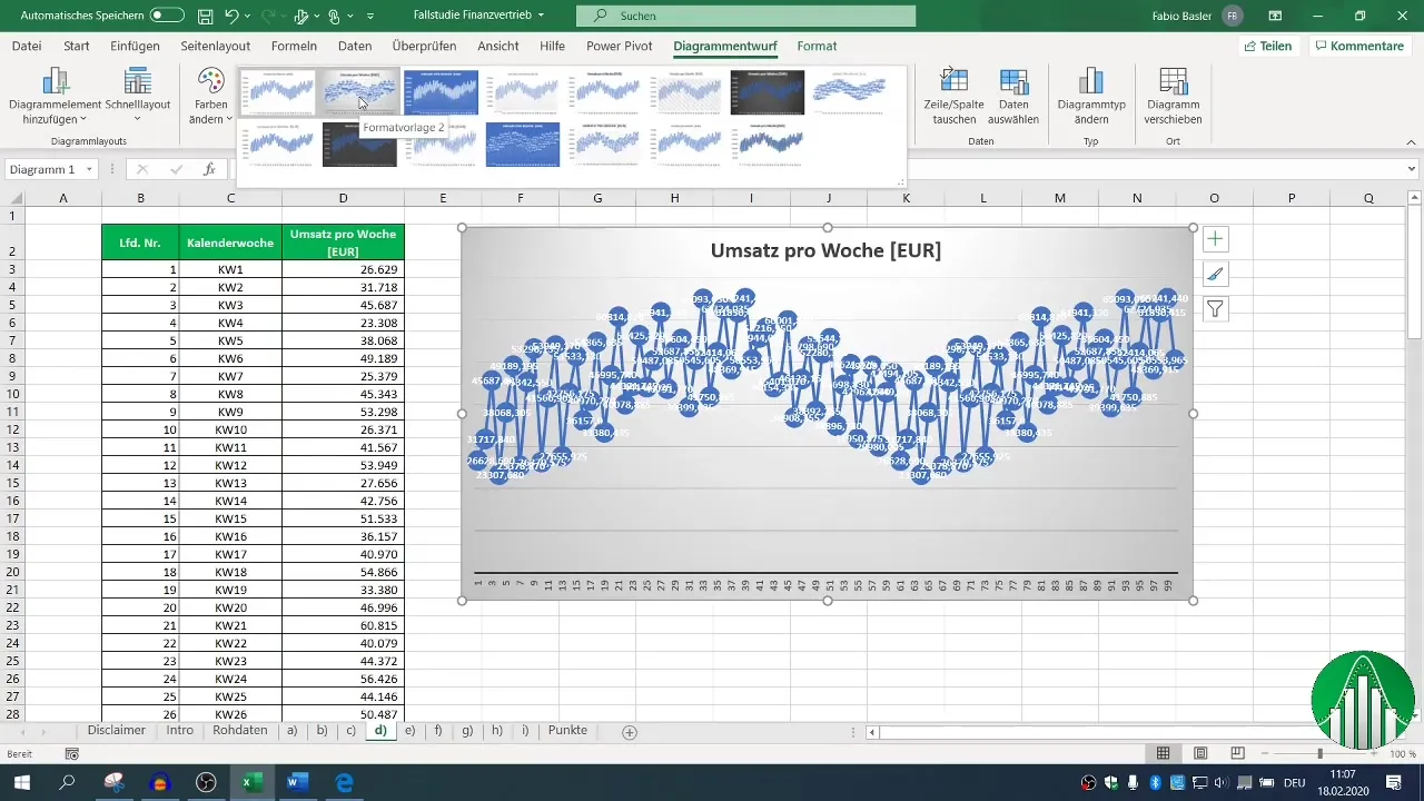
You have the option to further customize the chart. For example, you can try different visualization options to gain various insights. A darker background color can improve interpretability. You can adjust this through the "plus" symbol on the right side of the chart.
Insert Trendline
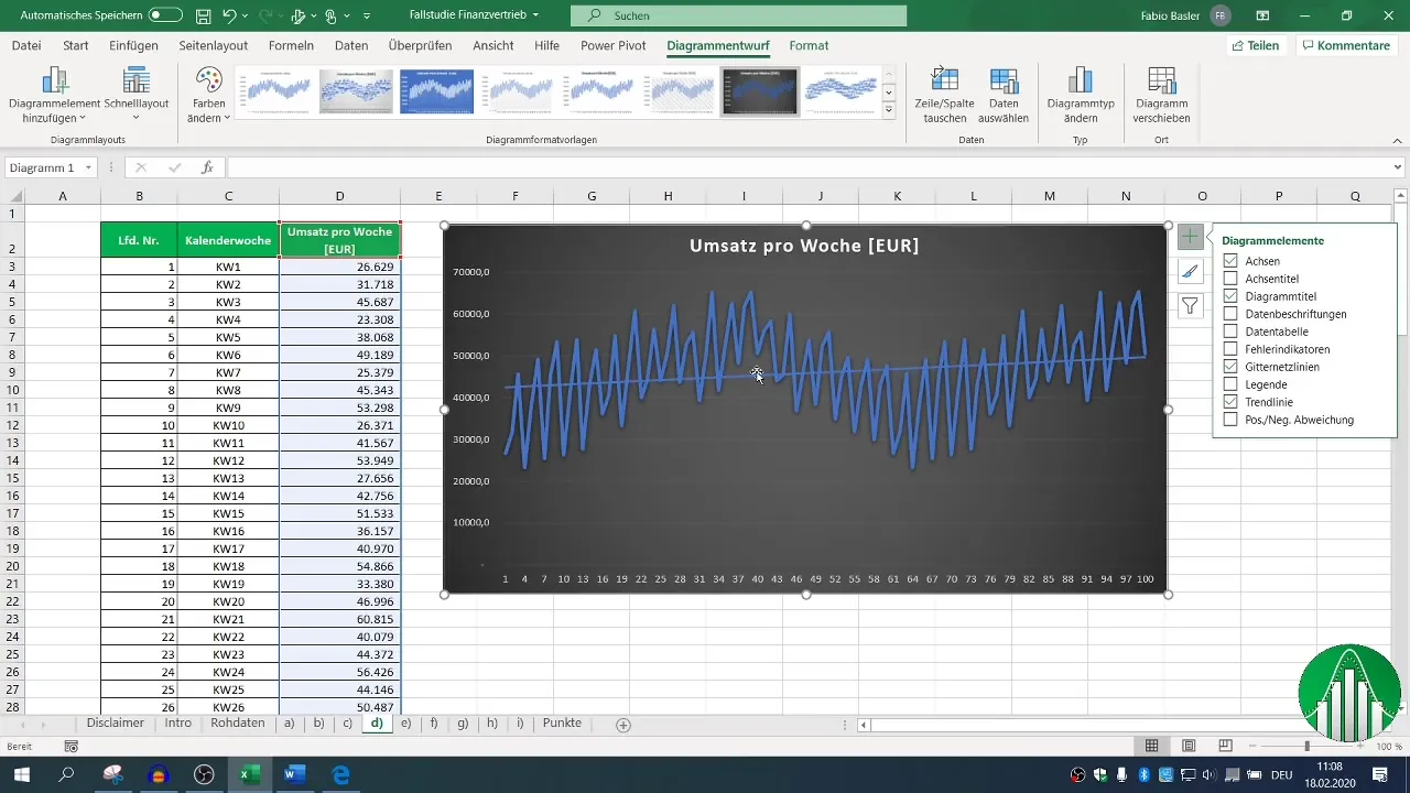
A particularly useful tool is the trendline. You can activate this option to better understand where the trends are heading. With the trendline, you have additional options available to insert quantitative results and formulas into your chart.
Interpreting Regression Functions
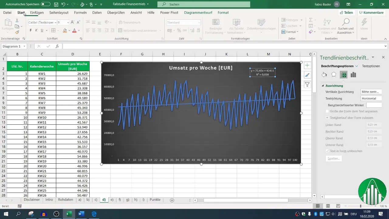
When using the trendline, you can visualize information such as the coefficient of determination (R²) and the regression function. This illustrates the regression of sales over the recorded 100 weeks. It helps you better understand the influence of certain variables on sales.
Summary
Creating line charts to visualize time series data in Excel is a straightforward process. By following the necessary steps, you can gain data-driven insights that will help you make strategic decisions in financial sales. The combination of correctly selected data and the addition of trendlines ensures that you can anticipate not only the current results but also future developments.
Frequently Asked Questions
How do I create a line chart in Excel?You can create a line chart by selecting the relevant data, then clicking on "Insert" and choosing the chart.
What is the difference between series name and series values?The series name refers to the category of the data (e.g., sales per week), while the series values represent the actual numerical data.
How do I add a trendline to my chart?Right-click on the chart, select "Add Trendline," and activate the corresponding options in the settings.


