Whether you work in business or sales, the ability to analyze and visualize data effectively is crucial. Excel provides powerful tools to evaluate business data and gain valuable insights. This guide shows you how to create a classified frequency distribution in Excel and visually represent the results.
Main Insights
- You will learn how to create a frequency distribution for revenue numbers.
- The guide includes calculating absolute and relative frequencies as well as visualizing this data.
- It explains how the data analysis feature LinkedIn Histogram can be used.
Step-by-Step Guide
Step 1: Prepare the Initial Data
First, you should have your revenue numbers in Excel. You can copy the revenue numbers from a separate datasheet or table. Go to the column with the revenue numbers, right-click, and choose "Copy." Then paste the data into a new datasheet.
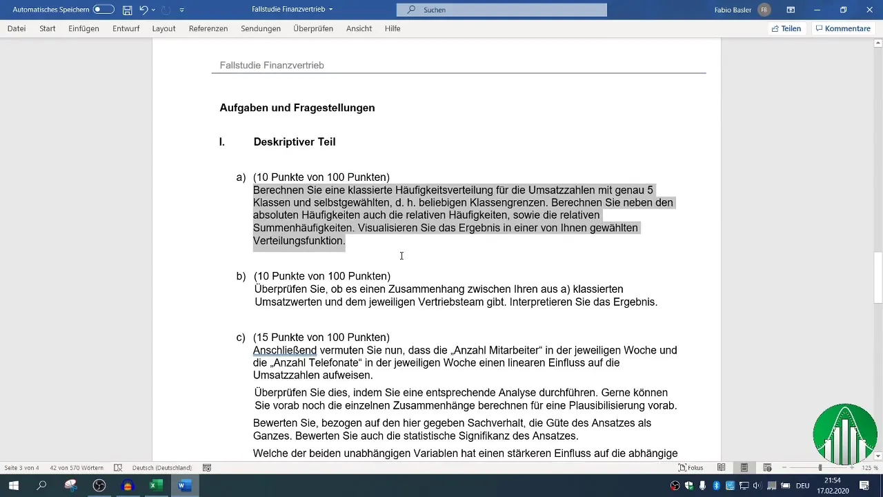
Step 2: Calculate Minimum and Maximum
To classify the frequency distribution correctly, you need the minimum and maximum of the revenue numbers. You can use the functions =MIN() and =MAX() to determine these values. Select all the revenue numbers, press the Shift key and the down arrow key to select all relevant data, and calculate the values.
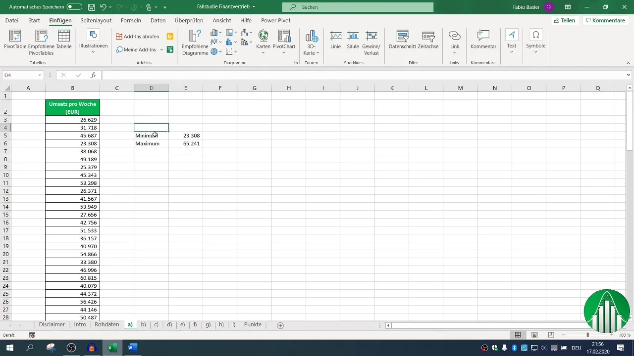
Step 3: Define Classes
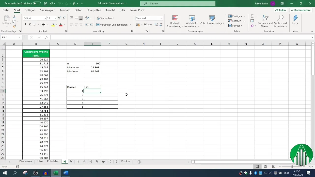
Now you should determine the number of classes. In this case, we will choose five classes. Define upper and lower limits for each class and make sure the minimum is included in the first lower limit and the maximum in the last upper limit. Calculate the range of the data by subtracting the maximum from the minimum, and divide the result by five to determine the width of each class.
Step 4: Calculate Frequencies
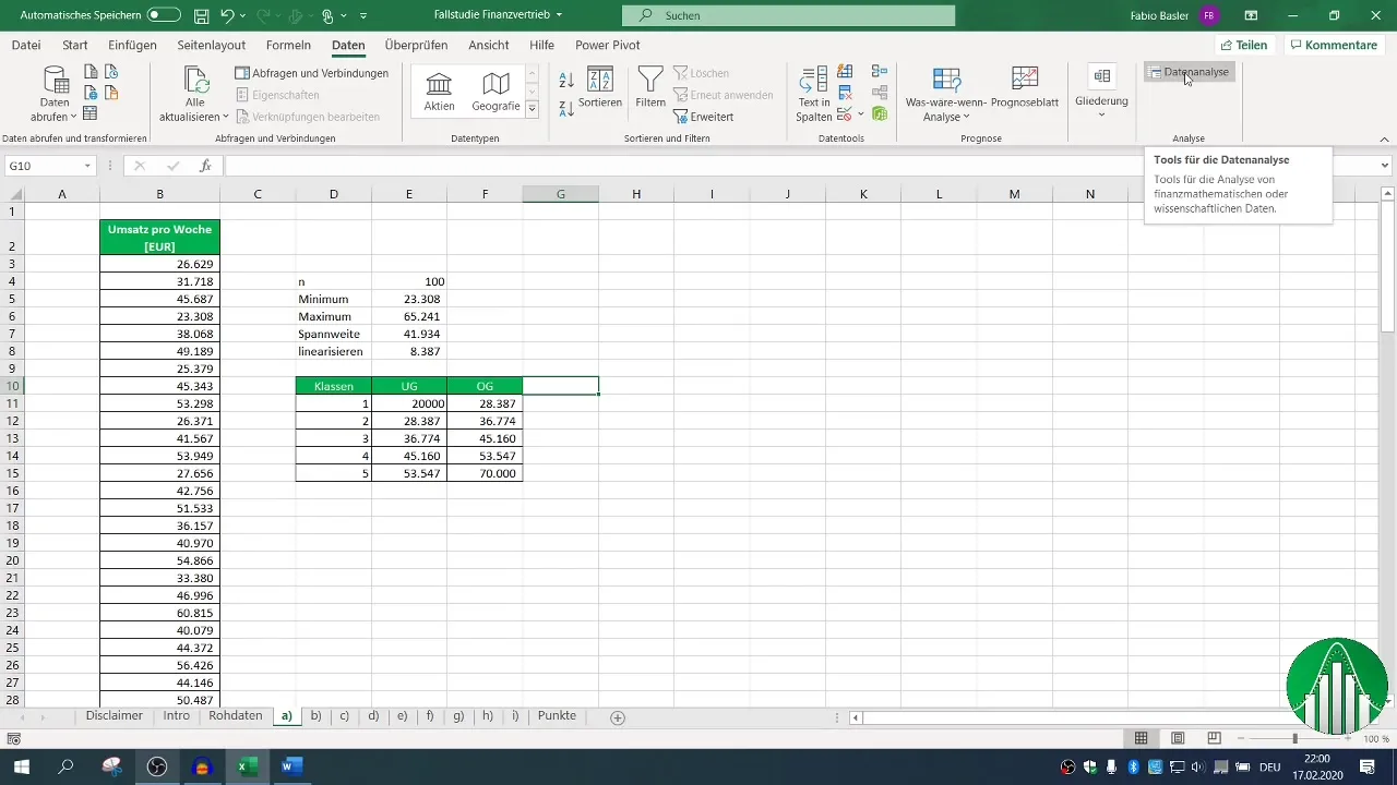
Now you can start counting the frequencies for each class. You can use the Excel data analysis function, which allows you to quickly and efficiently create a histogram. If this function is not available in your Excel, activate it in the Excel options.
Step 5: Create Histogram
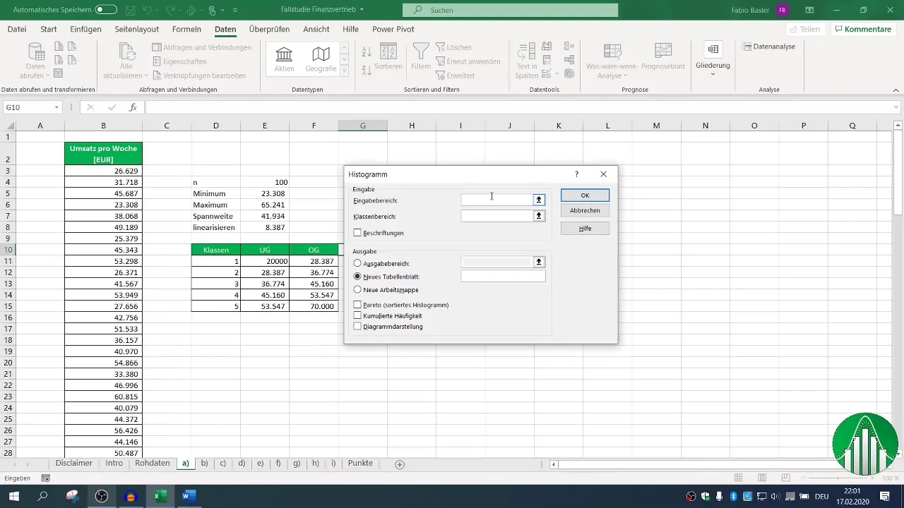
Select the data analysis function and click on "Histogram." Now you need to specify the input range for the revenue numbers and the class range for the defined upper limits. Make sure to include the headings as well. Then define the output range for the results.
Step 6: Check Frequency Distribution
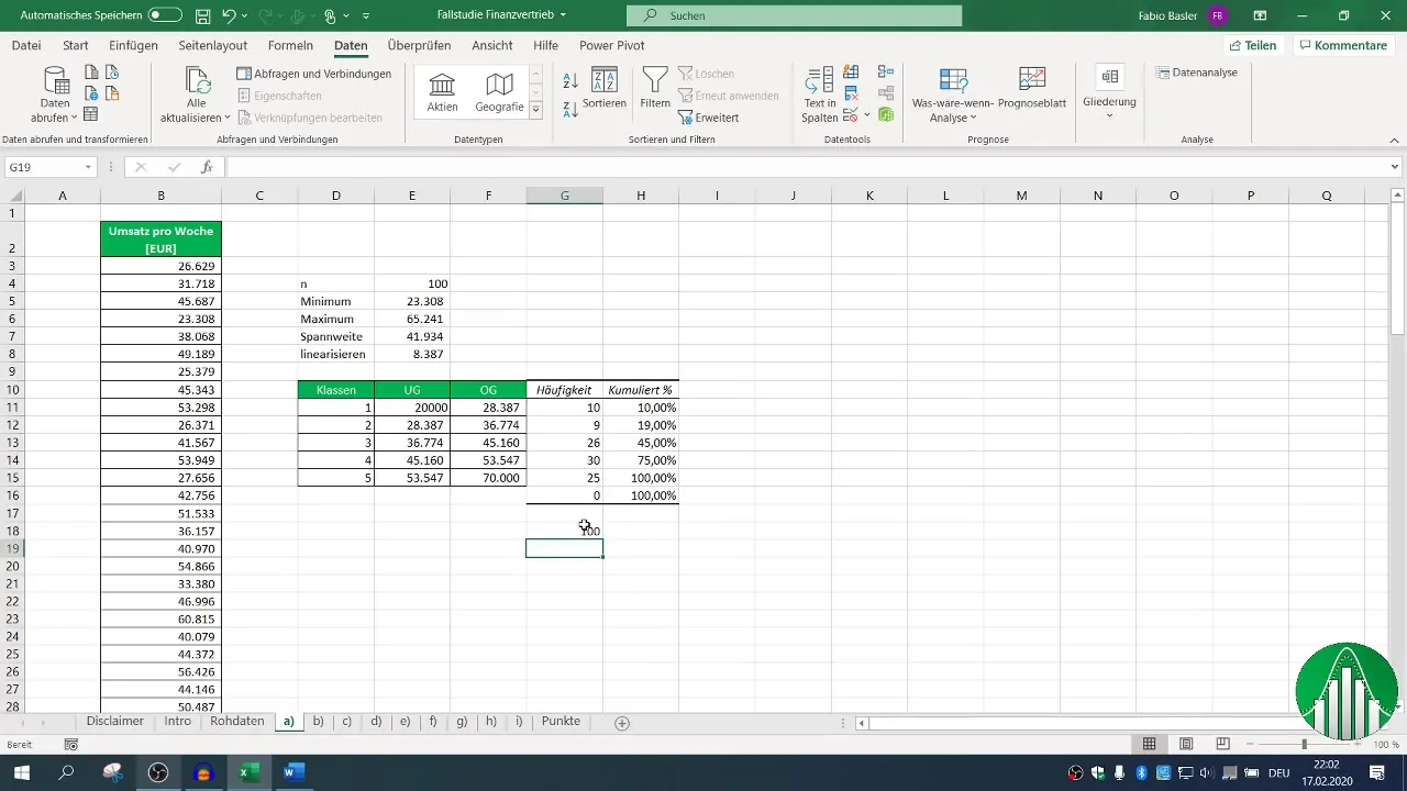
Now you should see the absolute frequencies in your table. Check with the function =SUM(), if the total number of observations is correct. This gives you a good overview of the frequency distribution that you want to further process.
Step 7: Calculate Relative Frequencies
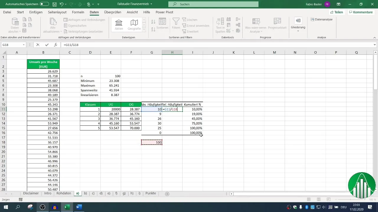
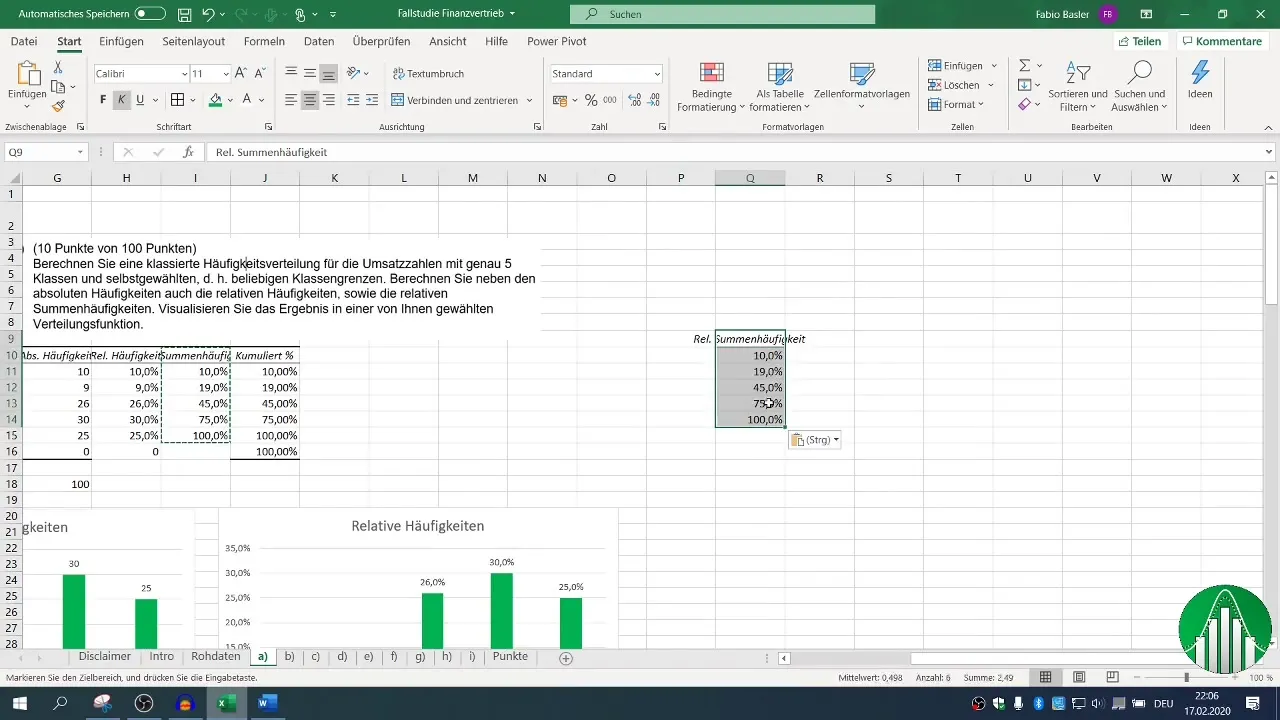
To calculate relative frequencies, divide each absolute frequency by the total number of observations. Make sure to appropriately fix the cells so that the values remain correct when you drag the formulas down.
Step 8: Graphical Representation in a Chart
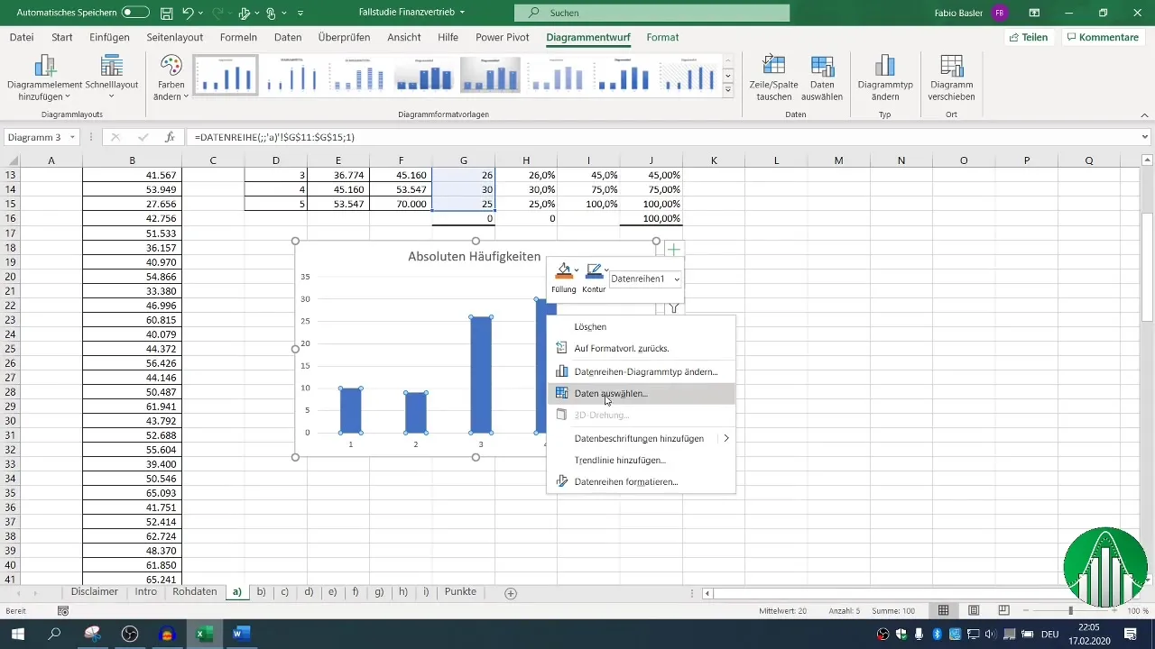
Now you can represent the absolute frequencies in a bar chart. Select the relevant data, go to "Insert," and choose the bar chart. The visual result gives you a clear overview of the most common revenue classes.
Step 9: Creating approximate and empirical distribution functions
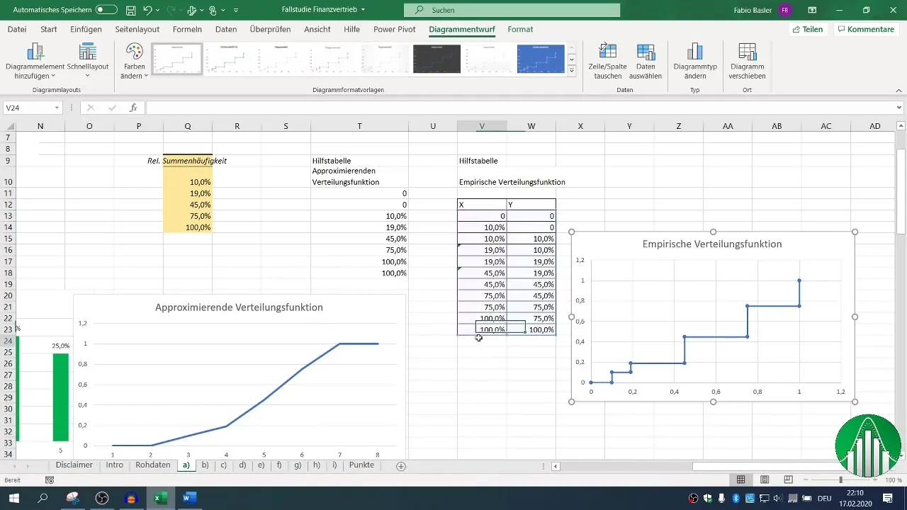
To illustrate the relative cumulative frequencies, you can use line charts. Start with an auxiliary table from 0 to 100% and then enter the relative cumulative frequencies. This will show you how the frequencies are distributed across the classes.
Step 10: Empirical distribution function
The empirical distribution function works similar to the approximate one but shows the steps for frequencies. You should prepare the data points accordingly and adjust the chart to make it clearer.
Summary
In this guide, you have learned how to create and graphically represent a frequency distribution using Excel. You have learned how to classify the data, calculate absolute and relative frequencies, and visually present them. This knowledge will help you make data-driven decisions and improve your presentations.
Frequently Asked Questions
How do I calculate the minimum and maximum in Excel?Use the functions =MIN() and =MAX() on the respective data range.
How do I activate the data analysis tool in Excel?Go to options and check the box for "Data Analysis Tool" under Excel Add-Ins.
How do I create a histogram in Excel?Use the data analysis tool and select "Histogram." Specify the input range and bin range.
Which charts are suitable for frequency representation?Bar charts for absolute frequencies, and line charts for relative frequencies and distribution functions.
How can I display my data in percentages?Format the cells with relative frequencies as percentages.


