The detection of trends in data is crucial for many companies. Excel offers numerous possibilities for data analysis and visualization, especially when it comes to applying trend detection methods. In this guide, you will learn step by step how to use exponential smoothing in Excel to detect trends in your sales data and visualize them.
Main Insights
- Exponential smoothing allows you to identify trends in time series data by giving more weight to recent data.
- When calculating trends in Excel, fixed cell references are important to handle the calculations correctly.
- Visual representation of trends makes interpreting the results easier.
Step-by-Step Guide
Step 1: Prepare Data
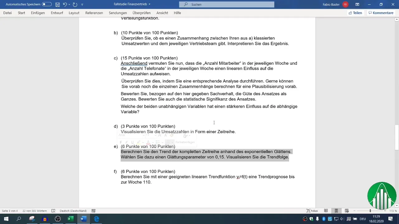
Start by transferring the relevant data into your Excel worksheet. You should copy the serial number, calendar weeks, and sales values per week. This helps you create a clear structure necessary for trend detection.
Step 2: Insert Additional Column for Exponential Smoothing
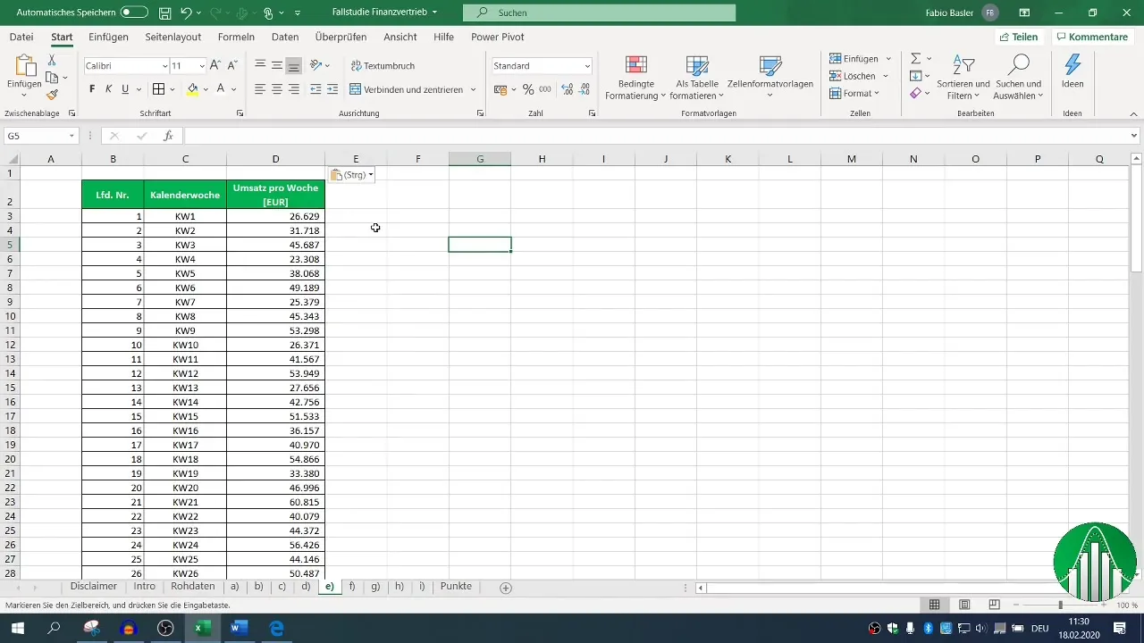
Add an additional column in your worksheet where you will record the results of the exponential smoothing process. Ensure that this new column is formatted in the same structure as the previous columns. You can use Excel's format painter tool to copy the format.
Step 3: Formula for Exponential Smoothing
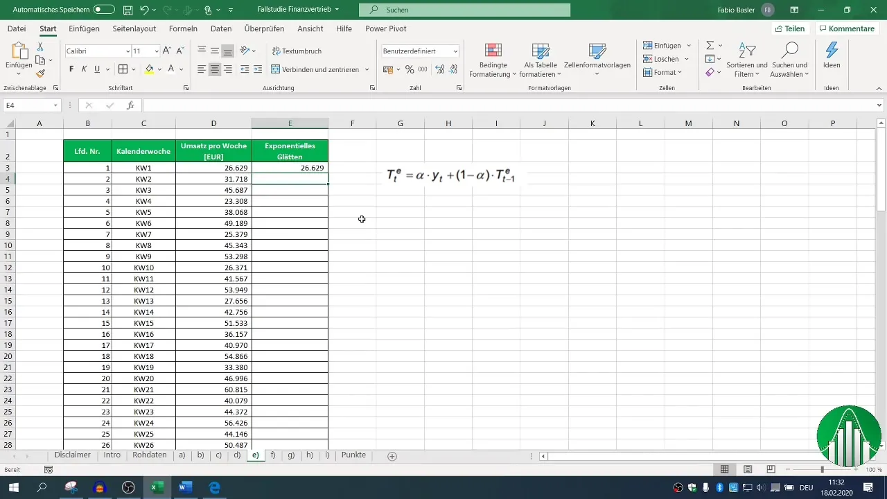
You will use the formula for exponential smoothing that considers Alpha (the smoothing parameter) with a value of 0.15. Start your formula from the second observation, as the method is meaningful from this point on. Begin by taking over the sales from the first week.
Step 4: Calculating the Trend
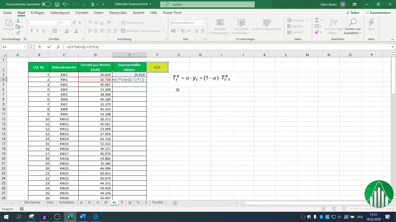
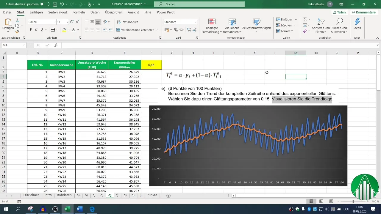
To calculate the trend, multiply the smoothing parameter Alpha (0.15) by the current sales and then add the product of (1-Alpha) value with the previous trend value. Write this formula in the respective cell and drag it down to apply it to the following sales values. Make sure to firmly reference the cell with Alpha.
Step 5: Visual Representation of Data
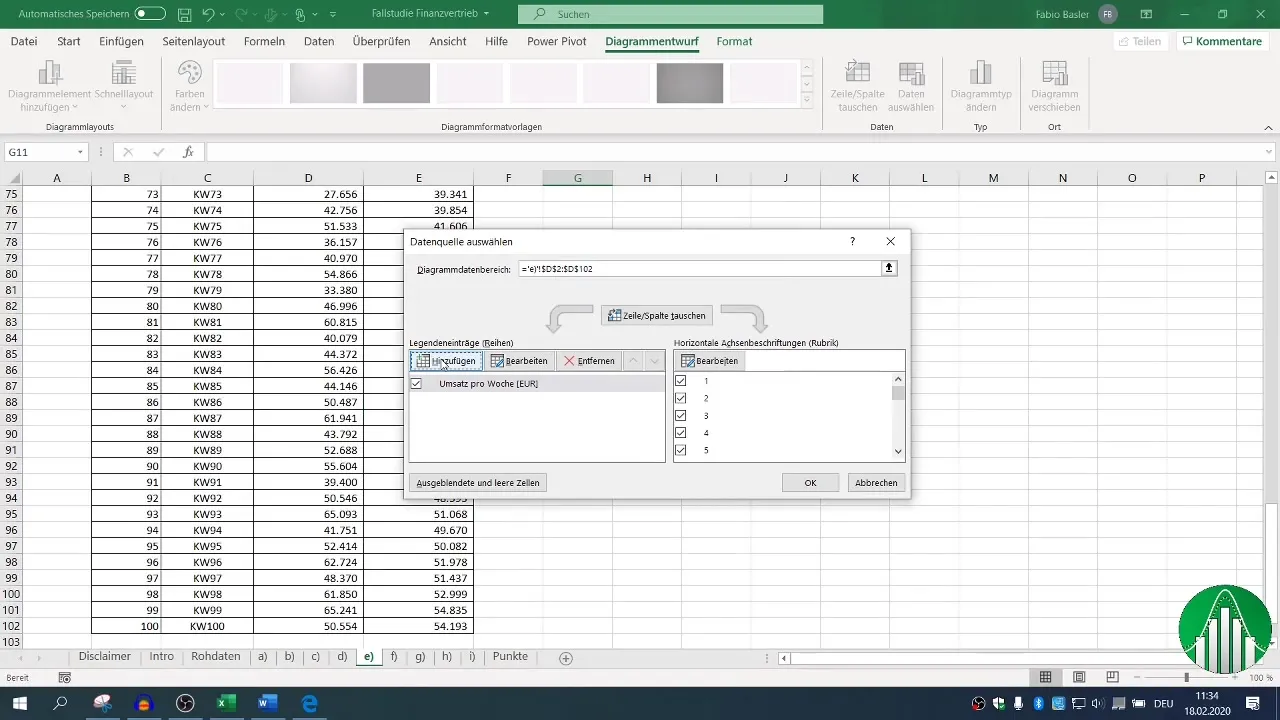
To display the calculated trends, create a 2D line chart. Select the data series of your original sales values and add them to the chart. Then, you can add the exponentially smoothed values as a separate data series in the chart.
Step 6: Interpreting the Results
Once your chart is created, you should be able to visually compare both the original sales and the smoothed values. Notice how exponential smoothing reduces the individual observation values, giving you a clearer view of the actual sales trend.
Summary
By using exponential smoothing in Excel, you can effectively identify and visualize trends in sales data. This method ensures that you have a solid foundation for your business analysis and forecasts.
Frequently Asked Questions
How is the smoothing parameter Alpha chosen?The smoothing parameter Alpha is typically chosen in the range between 0 and 1. A value of 0.15 is often a sensible choice as it gives more weight to the most recent data.
How can I customize the visualization of the data?In Excel, you can select different chart types and edit the data selection to customize the graphical representation according to your needs.
Is it possible to apply the method to other datasets?Yes, exponential smoothing can be applied to various time series data, not just sales data, to identify trends in different contexts.


