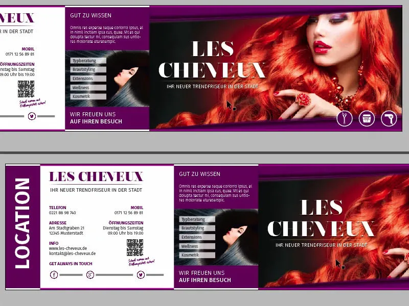
Hello dear men, hello dear ladies, here again is your Stefan Riedl from PSD-Tutorials.de. We've reached the last big step of our big design project. In the next few minutes you will hopefully be spending some time with me, because we are going to design this wonderful folding card. This is undoubtedly a trend hairdresser, more precisely the new trend hairdresser "Les Cheveux". So things are getting hairy.
The format we are working with today is DIN-long, in landscape format, as you can see here. This is page one, the lead page, beautifully and colorfully designed with this elegant lady and of course this incredibly fantastic, even devilishly red mane.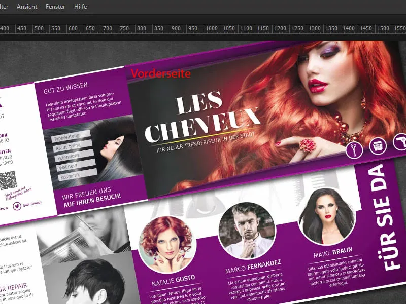
We continue on the back of our folding card with the opening hours and additional services. We include a QR code. We will include the contact details in the social media section.
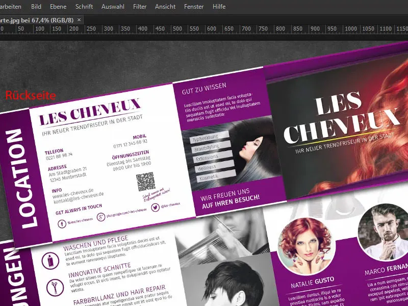
Here we come to the inner section, i.e. the right and left inner sections. On the right we introduce the team, ...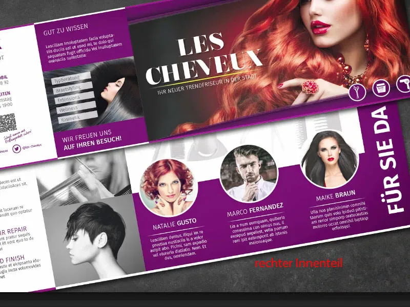
... on the left we present all the services once again. The whole thing is peppered with great pictures, a clean layout, nice symmetries and a tidy character. I'm looking forward to our journey together ...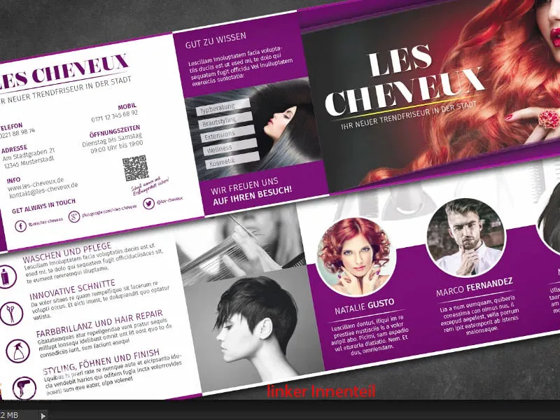
Printing specifications for the folding card
Of course, we first need to find out what the printing parameters are. So let's take a look at our print shop, diedruckerei.de. There we can already find postcards and folded cards (1). We take the folding cards (2). Be careful with the format, there are portrait and landscape formats. We take the landscape format (3). The dimensions are already shown here: 21 cm and 10.5 cm.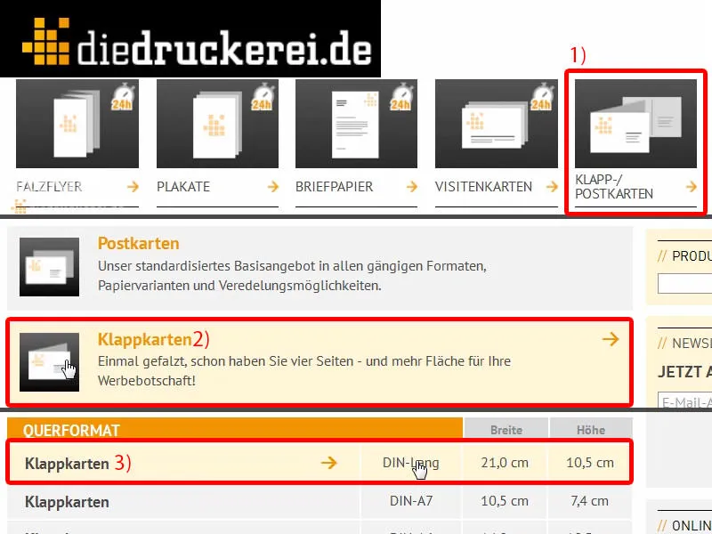
However, we have to take something into account, because you can already see under the details that the final format is different, namely 42 cm by 10.5 cm. Logical, because we have a 1-break fold, which means we have to double the 21 cm.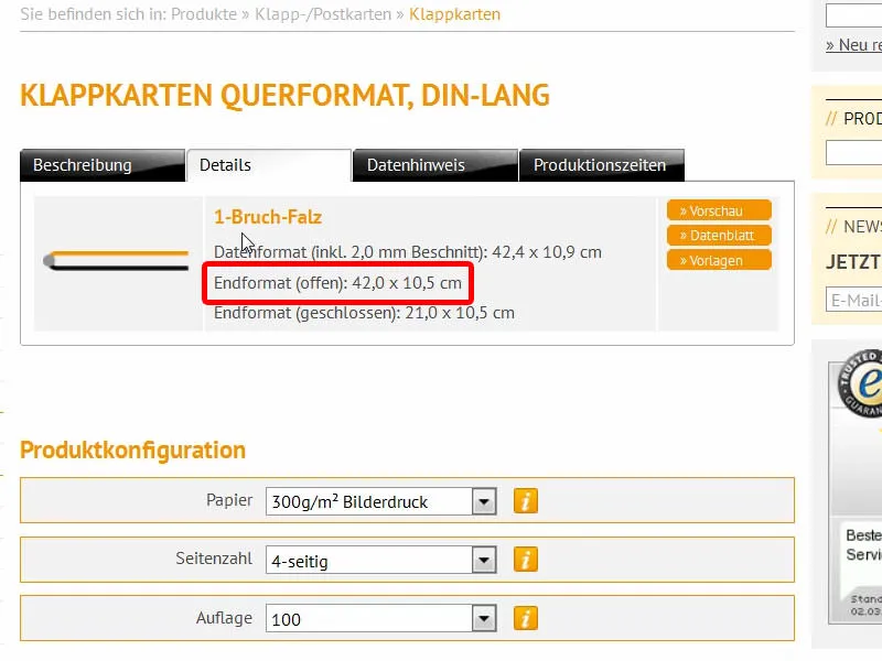
There are also lots of other tips on finishing and other things to bear in mind.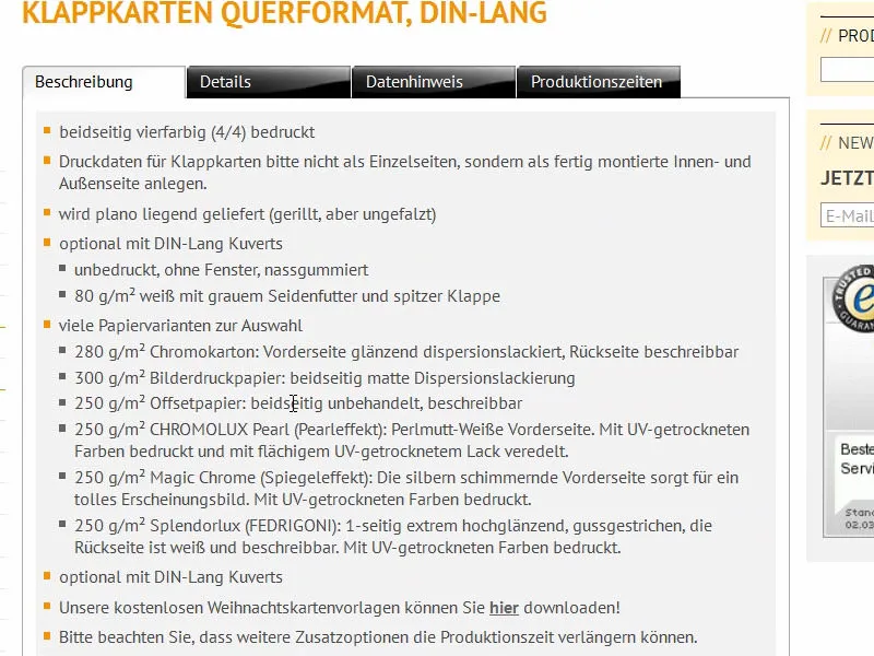
Here too, for example, under data information, you can find out which color mode you need to work in, the color application and you can see that we need to create a 2 mm bleed. And under the details you can also download the data sheet and the templates if required. We don't need any of that, because we create it manually. We have the right hands-on mentality. So let's soar to lofty heights with InDesign CC ... Here we go.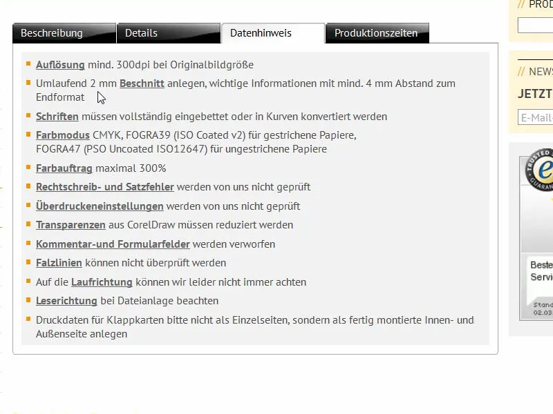
Prepare InDesign document
First we create a new document via File>New>Document.... We can save the double page (1) in this case, because we create the format manually directly with the appropriate width. The width is 420 mm and the height is 105 mm (2). We can leave the columns as they are, as we will draw a grid of guide lines later. For the margins (3), I choose 4 mm in all directions. This is simply a safety margin for the texts that we will use or other critical lines. At the bottom we still have the bleed and info area. If this is missing, simply click on this little arrow (4). We set everything to 2 mm (5) and confirm the document (6).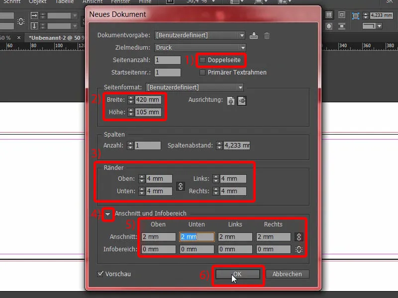
Define color fields
For a better overview and to make it easier for you, I will mark (2) all color fields (1) that we do not need and delete them using the barrel symbol (3).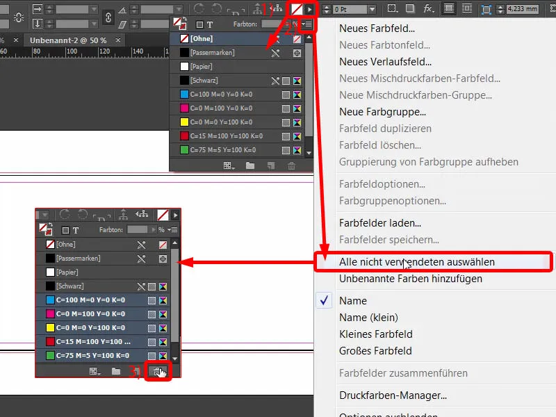
At the same time, I define new color fields (1), which I need for our layout. The first is the color for the font: C=0, M=0, Y=0 and K=90 (2). Click Add after each color definition (3). Continue with C=68, M=100, Y=27 and K=24, then we have this blackberry-like purple color (4). Add this once too. Continue with C=43, M=88, Y=0 and K=0 (5). This is the lighter version. And last but not least, something completely different is added: C=22, M=0, Y=100 and K=0 (6). Now we have a bright yellow. This already looks like a nuclear reactor yellow, but we also need this, as it is the complementary color to our violet tones. Confirm with OK (7).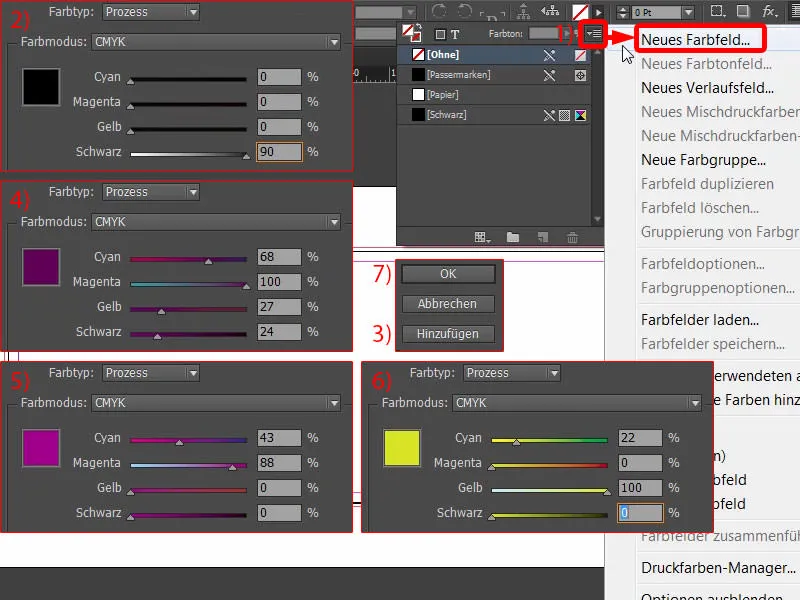
Inserting guide lines on the pattern page
Now it's time to go to the pattern page. I create the appropriate grid from guidelines so that I don't have to do it manually on all pages. To do this, select the master page in the page control panel...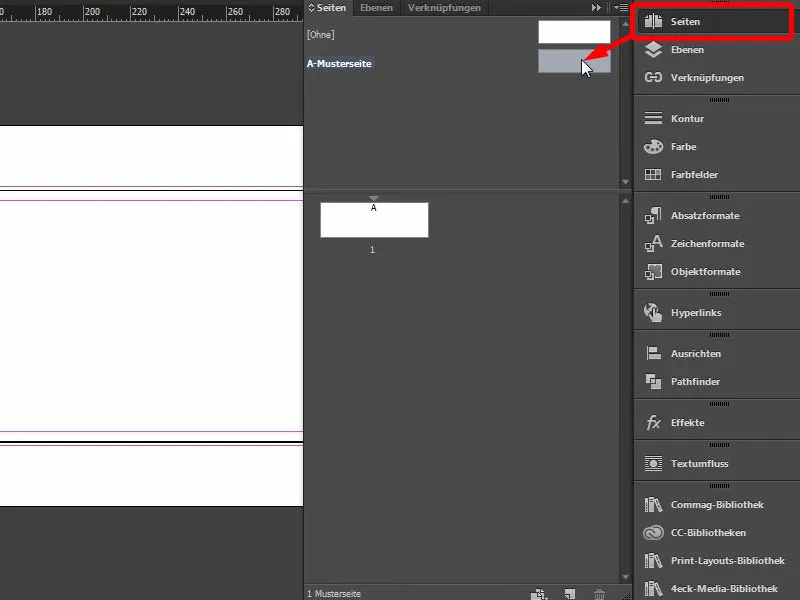
... and draw the appropriate lines via Layout>Create Guides.... I want everything to be divided into groups of three, i.e. 3 rows with 0 mm column spac ing and 6 columns, also with 0 mm column spacing (1). Then it looks like this, as you can already see in the background (2).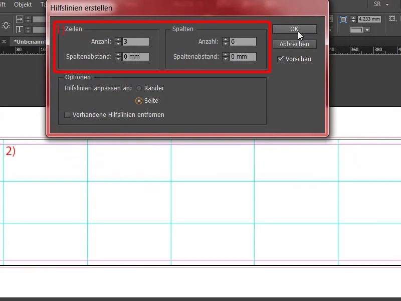
Let's continue: I pull out an auxiliary line on the left (1) and set it manually to 28.8 mm (2). And another one (3), which I drag to 391.2 mm (4). So that's now here on the left and here on the right.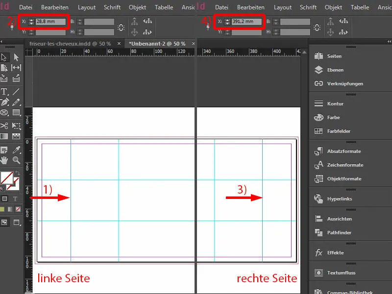
Let's go back to our normal, ordinary page. There we have this grid and we can't move anything by mistake, because what's on the pattern page is locked.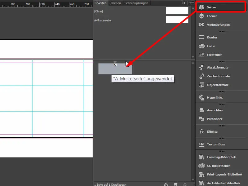
Create a rounded bar with single-color shading
We start on the lead page on the right by drawing a small border at the top and bottom. To do this, I can simply place a rectangular frame (1), then select the appropriate color (2) and reduce the height of the element to 3.5 mm (3).
Now it's time to position the element nicely in the bleed in the top right-hand corner (4). You can also zoom in with Alt and the mouse wheel ... move it nicely to the bleed (5). This is 2 mm wide and the element is 3.5 mm wide, which means we have 1.5 mm that will actually still be visible in the final format.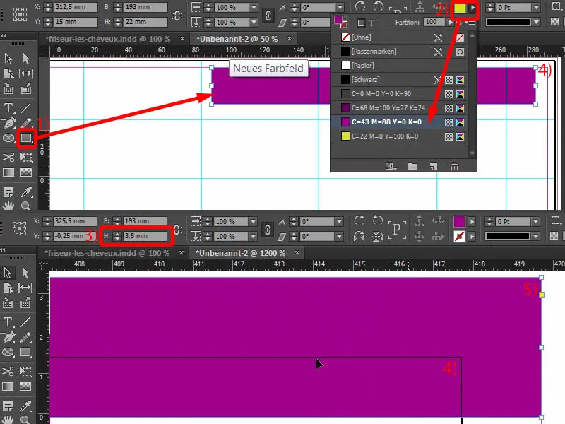
Now we have to draw it to the right width (1), here up to the center line, it's best to zoom in again to work precisely (2).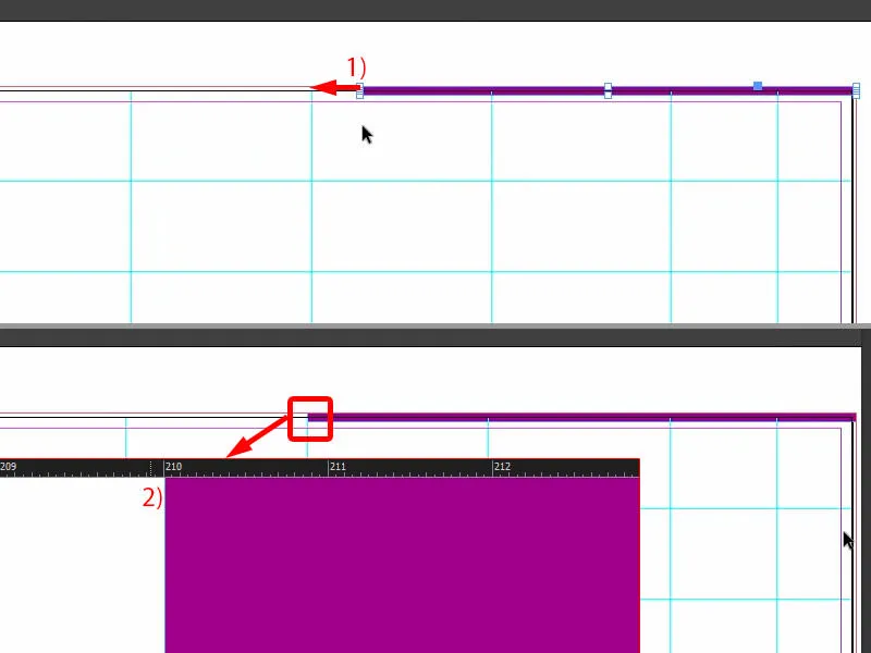
Now draw another rectangle (1). The height should be 10 mm (2), I set the color to the dark violet (3). I move this to the top (4).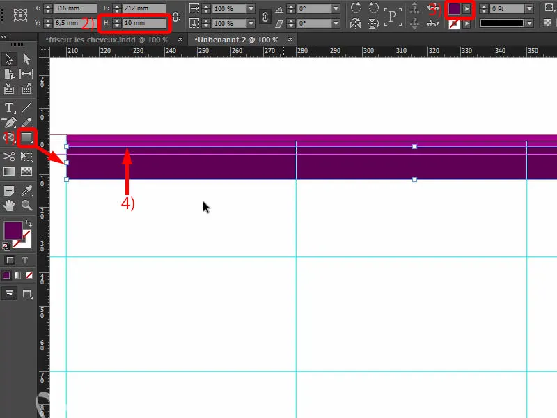
Now we need the Convert direction point tool(1). I use it to select this point (2). Holding down the mouse button, I deform it so that we get a nice, elegant, round curve here (3). That's how I could imagine it. Let's take a look at this without the guidelines (4): This has now been given a new shape.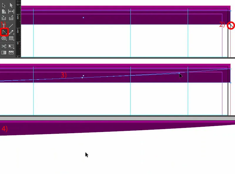
What do we do with it? Clearly - we apply an effect to it. You can use the effects panel(1) to set the corresponding properties or click on the fx (2) at the top here. Here you select Shadow inwards (3), coming from below, i.e. with an angle of -90° (4). The opacity remains at 75 % (4). Confirm with OK (5). Now we have exactly this effect here (6), from dark black to violet (arrow at 6).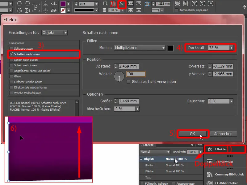
Next, I duplicate this path (1) by simply dragging it onto this symbol (2). There are countless ways to duplicate things in InDesign, this is just one. I activate the upper path (3).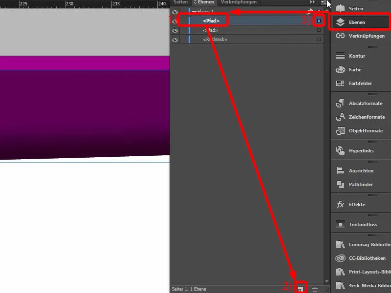
Now I remove the effect by deactivating the checkbox here (1). Then I'll make it a little bigger. We have a height of 10 mm here. I can move the reference point upwards (2) and enlarge it to 11.8 mm (3) - the result is as shown in the picture. Now you have to move it back one level (4).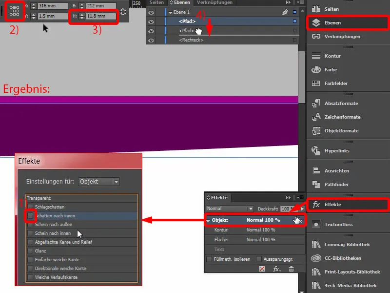
It will look like this (1).
We make a few more adjustments in the effects panel: We select the shadow to the inside (2). We can leave the -90° (3). However, we reduce the opacity to 50% (4), the distance to 1 mm (5) and the size to 1 mm (6). This means that the shadow runs very close to the edge (7).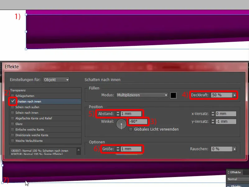
It's still a bit too strong for my taste, so just enter 75% here at the top (1). You could also do it here (2) ... Enter ... and so we build up plasticity bit by bit.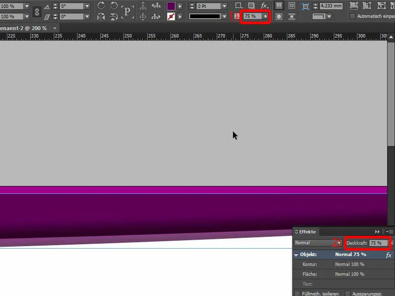
Last but not least, we also make a copy of it. This means that I will also drag this path once onto the new layer (1). I'm going to widen it a little in height again, from 11.8 mm to 13.4 mm (2). Be careful not to make it too wide, but that's perfectly fine. Now we can keep the effects, but I'll reduce the opacity to 50% (3).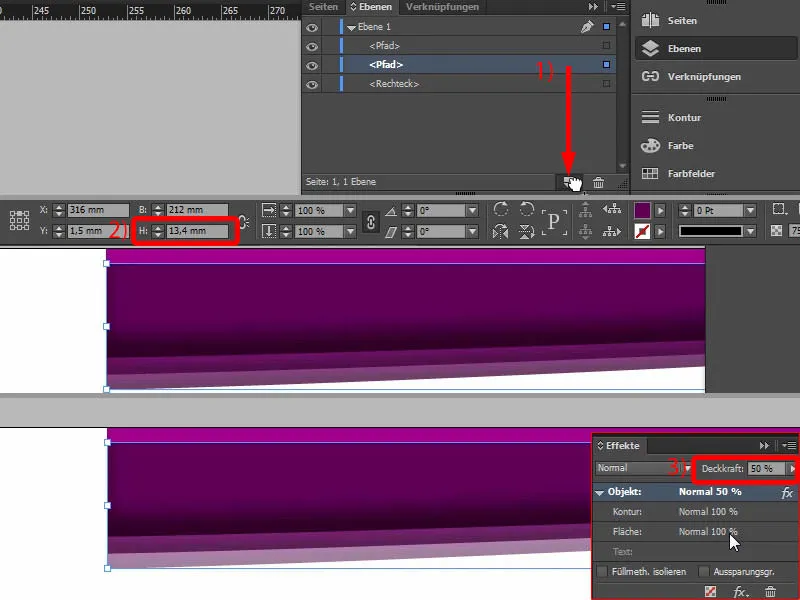
This is what the play of colors looks like now (1). A little monochrome rainbow, you might think. And I select all of this and create a duplicate of it by holding down the Alt and Shift keys(2). Using the handle (3) on the outside, I can rotate everything once (4), ...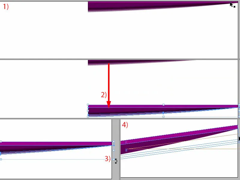
... by 180° (1). Then I can position it carefully at the bottom of the gate (2 and 3).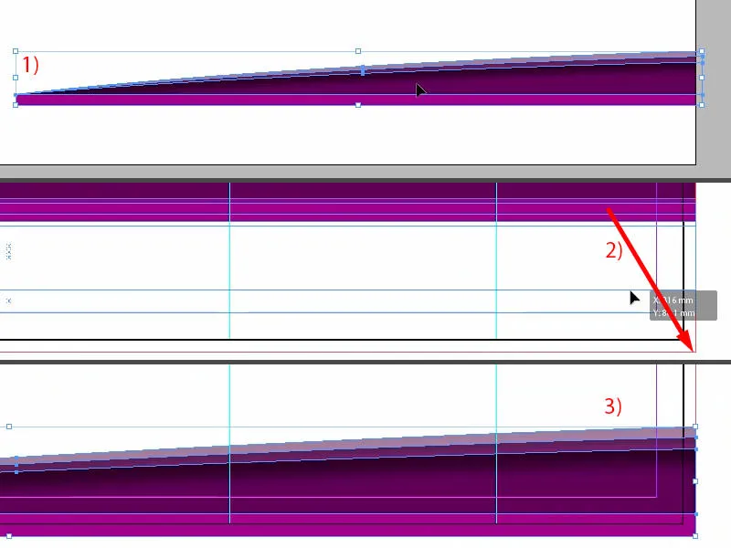
We now have a completely symmetrical, identical image on the top edge and on the bottom edge. That's an exact clone. This makes your work easier - you don't have to create everything twice. Copying works wonders.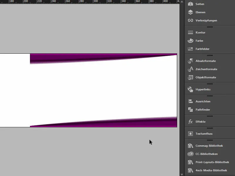
Place image
You can then use the Place commandwith Ctrl+D to select the appropriate image. Take a look at this lady. Wow! If that's not an eye-catcher. Then let's drag it once.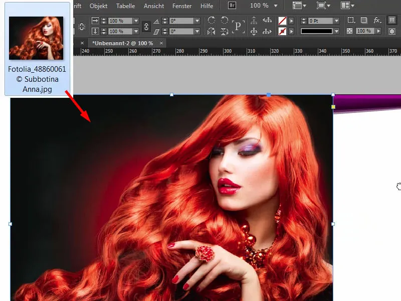
It's now in the middle, but it doesn't matter, because it will immediately slide one level to the back (note the information in the image).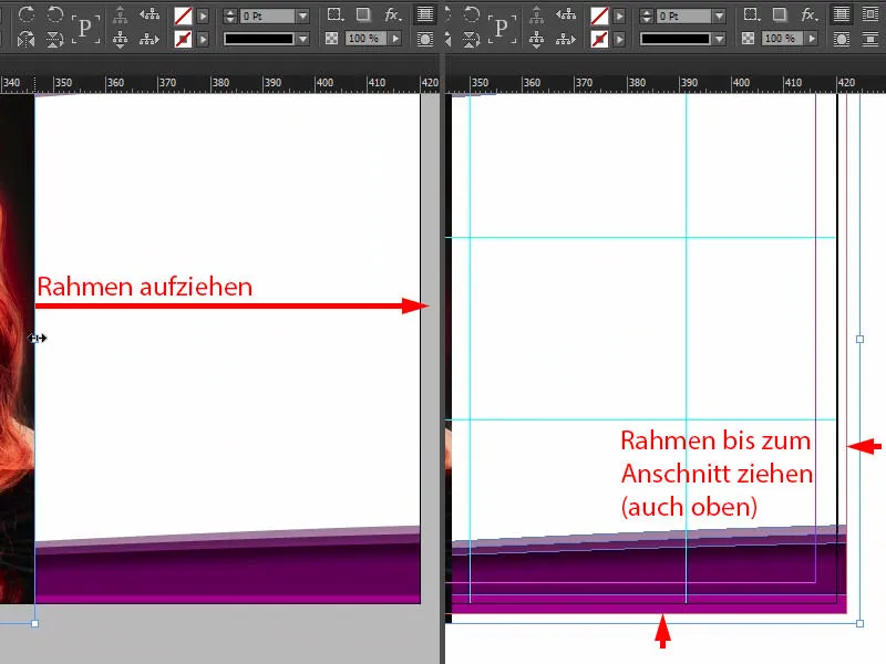
Then right-click, select Customize>Fill frame proportionally (1). And now we move this image to the bottom of the layers panel(2).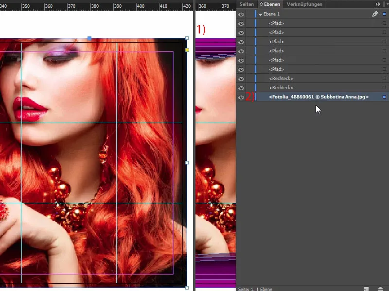
Now we have cut off the pretty lady's eyes (1). We don't want that. And so that we can visualize this better, I'll right-click again and set the display performance to high quality. Now I can double-click to select the image content and use the Shift keyand the down arrow key to add enough to the image to make sure that her eyes are included and that her fingernails are at least partially in the image (2). This is how it could look for you.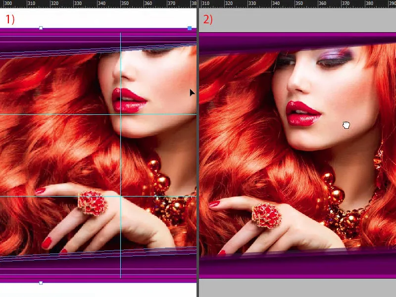
Insert text and add effect
The next step, of course, is to give the hairdresser a name. We do this in the next step by drawing a text field. The font is called Nouvelle Vague, which is only available in one style (1). Set the font size to 50 pt, activate the capitals (2), set the color to white (3), and then we can start typing after centering (4) ... And reduce the size of the text field once (double-click at 5).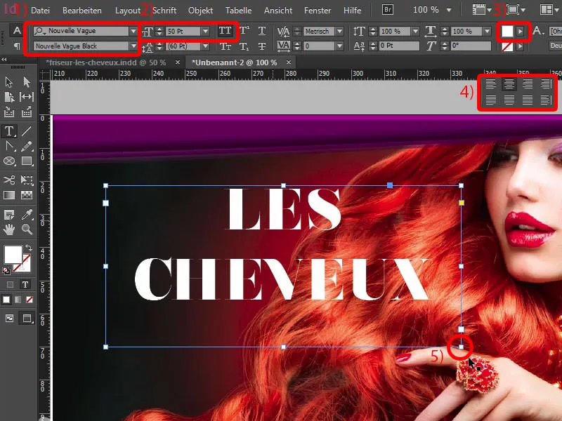
Next, I want to add more depth, which we can also achieve using the effects panel(1). There you can select the drop shadow (2). The distance of three and a half millimetres is almost always too much. I reduce this to 1 mm (3), which is enough, also in the size 1 mm (4) and from the angle somewhere around 104° (5). The opacity remains at 75 % (6).
If you take a look at this (7): We definitely gain more depth here, and that's what I want, to improve the legibility of the letters.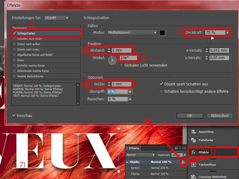
Nouvelle Vague is of course a great font, but it's really not at all suitable for texts that are longer than headlines. That's why I draw up a second text field. And then we need another font. In my example, I've opted for Fira Sans in the Light style. Here we see a special symbol, the Typekit symbol (1). This means that if you don't have the font, you have the option of downloading the corresponding fonts via Adobe's Typekit service. I'll show you how it works in a moment.
I'll just finish formatting it quickly: center (2), set color to white (3), activate capitals (4). Then we write in: "Your new trendy hairdresser in town" (5).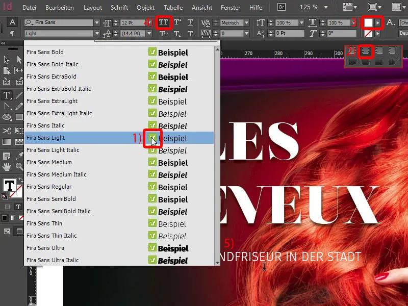
I simply copy the drop shadow effect via the effects panel(select headline, 1) by clicking on the fx symbol(2) and dragging it onto the second element (3). But we probably have a little too much here, so go back in (double-click at 4) and reduce the spacing and size to 0.5 mm each (5, result at 6).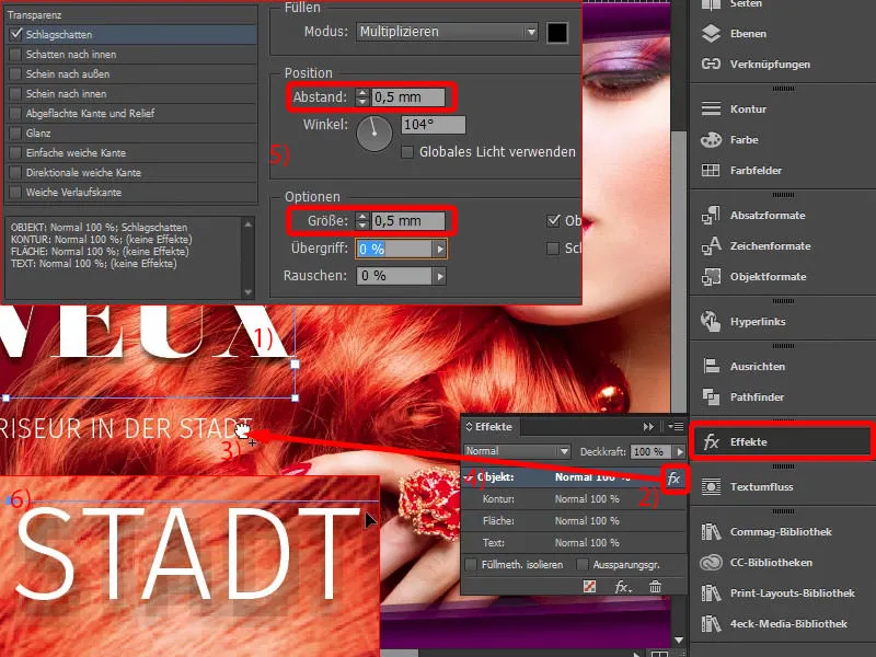
Excursus: Fonts from Typekit
Back to Fira Sans: Where does it come from? How do we get it? I want it now, what do I have to do? If you have a Creative Cloud subscription from Adobe, you can start your CC application once. You can click on the home buttonat the top here. There are of course the apps, i.e. all applications. And then you can load various assets, i.e. files, via Elements (1). You also have cloud storage. You can pull out the corresponding elements from the Market and use them. So it's like a huge marketplace that you can use. And there are fonts (2).
If you need a specific font, like Fira Sans, which I have already downloaded here with 14 other fonts, you can simply synchronize it via fonts from Typekit. Let's click on it (3).
If I now open my browser, then we are on Adobe Typekit (4), and there you can enter Fira Sans, for example (5). Then it spits out the font with the different weights. You can easily select these via Use fonts (6), then select the font styles you want (7). In my case, they are all already synchronized. I could remove them (8), but that's not what we want.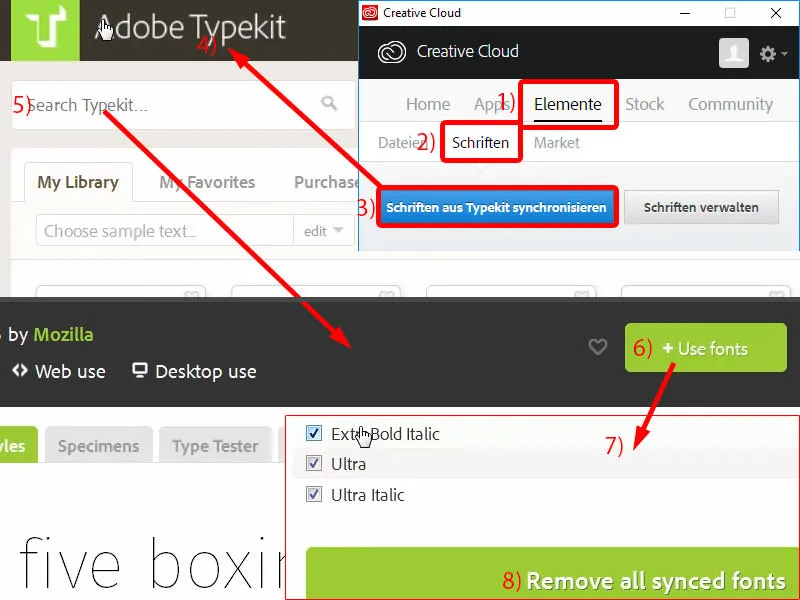
If you need a different font, just go to the start page. You have a lot of great options here (see image) ... Do you want serifs or perhaps a grotesque font without serifs, for the desktop area, for the web area or maybe just make a few other adjustments at the bottom? How do you want the font to look? Then you can load them with one click, they will be automatically synchronized with your InDesign as long as you are connected to the Internet, and then you can use them in your document. However, there is one disadvantage: you can only use the font if you are online. So if you are no longer online at some point, you will have the problem that the font is not available because it simply cannot be synchronized. I'll end this again, but you now know where this font comes from.
And we use it again throughout the entire layout, because it's nice and bold, it's easy to read, it expresses exactly what we want to convey - it really is a wonderful font.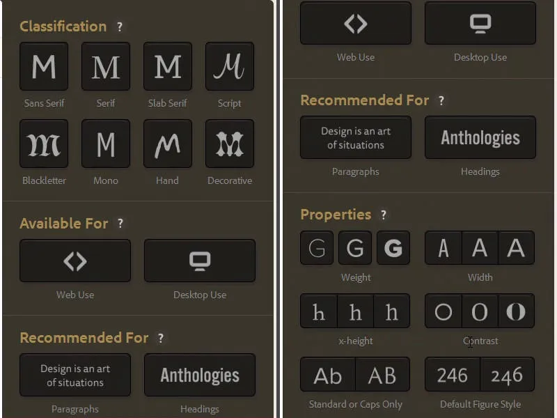
Adjust line spacing
I would like to adjust the line spacing in the headline. It is currently set to 60 pt. I reduce it manually to 50 pt.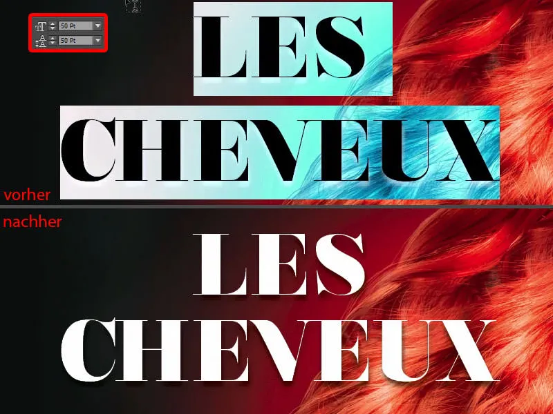
Create a line with a color gradient
Now comes the line. You can draw it using the line drawing tool (1), from the far left of the headline to the far right of the headline (2). Then we use our complementary color core reactor yellow (3). It looks pretty hard at the moment (4).
So let's add a gradient. We can easily adjust this using the effects panel(double-click at 5) by selecting the soft gradient edge here (6). In the options, select the radial gradient (7). Now something has changed: the line fades very slowly here (8).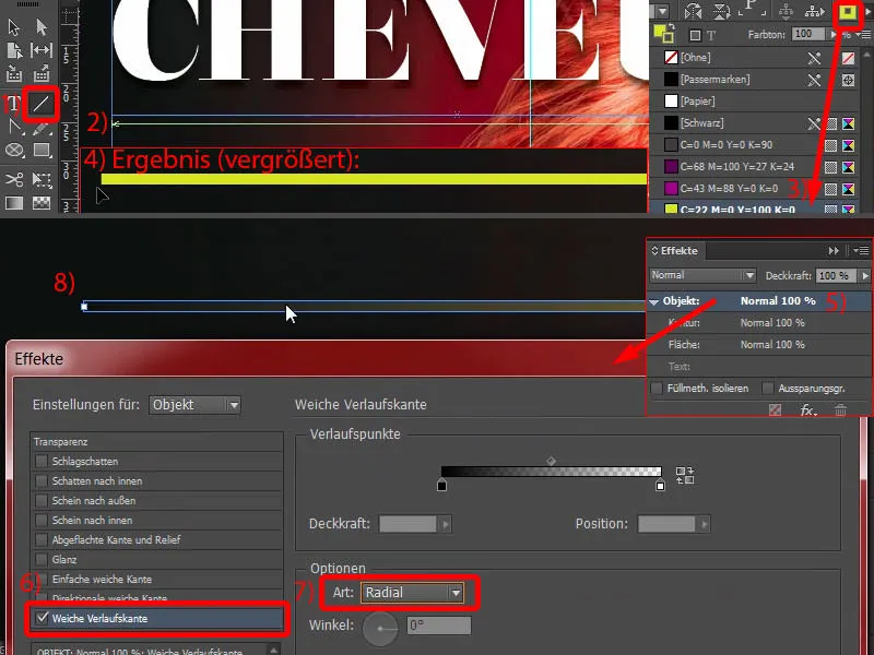
That's almost a bit too much for me (1), so I make a small adjustment and simply move this diamond here at the top and the black paint bucket a little to the right, about halfway (2, in the effects for soft gradient edge). If I confirm this now, the gradient will be much smaller (3), and I'm completely happy with that.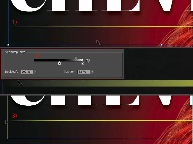
Arrange text and line in the layout
Now we need to move everything a little closer together: I dock the line to the bottom of the headline (1), then I go down once with Shift and the down arrow key (2). I dock the text to the yellow line (3), and then I also go down once (4).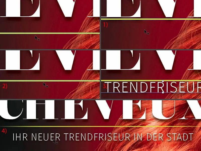
Now I select all three elements by holding down the Shift keyto align them better. I'll move it all down so that we're using the model's eye line somewhere as a guide. I want her to look at the name, and her finger can also point there a little.
Now I'll move it all the way to the edge again (1) and then I'll go to the right three times with Shift and the arrow key (2). So, I think we're on the safe side. Now we've almost finished the front.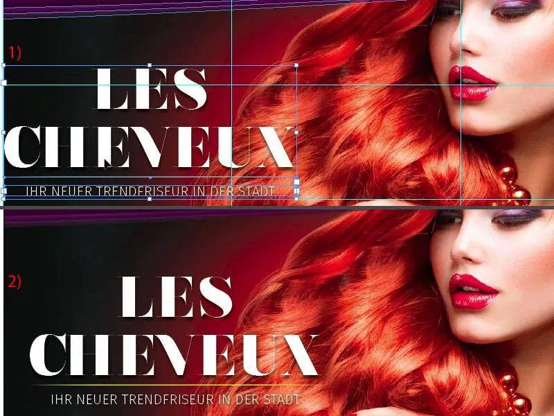
Placing the icons
The only thing missing are these little icons at the bottom here. I'll take them from my library. So I zoom in a little, open the library (1) and first of all select the hairdryer (2) - every hairdressing salon has one. I place it on the far right, on our 4 mm spacing line (3). How are all the elements put together? - We have a circle with a 2 pt thick, white outline, which contains an icon from Fotolia. Next to it is the corresponding hair treatment. It goes right next to it (4). Then press Shift and the left arrow key once to the left (5). Then comes the last element, the scissors, and the same game again for positioning. As you can see from all the paths, this is a vector file, i.e. an AI file from Adobe Illustrator, which I have downloaded here.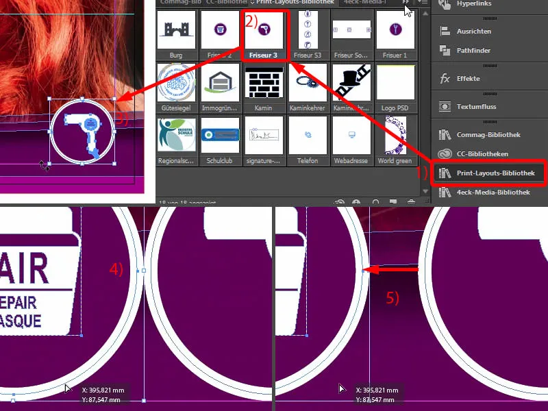
A bird's eye view of the whole thing (1): For my taste, there could even be a bit more distance. It looks very squat now. You also need to take this into account in your layout: Is it right? Does it fit the way I want it or not? And that's why I select the background and lock it with Ctrl+L (2).
Now I can take these two elements (3), Shift again and to the left. And move the last element with the scissors to the left again with Shift. Now we've gained a bit of space, which simply looks better (4). You really need to take a critical look with your creative eye: Does it fit? Is it right? Are the harmonies and proportions right? Does the whole thing look like a complete package? I think we're now on the safe side.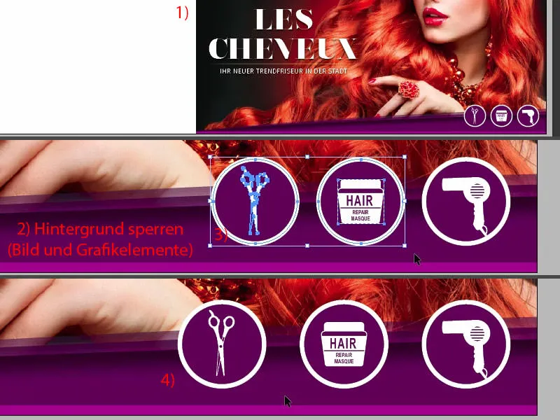
How do you like the front? I think it's actually quite good.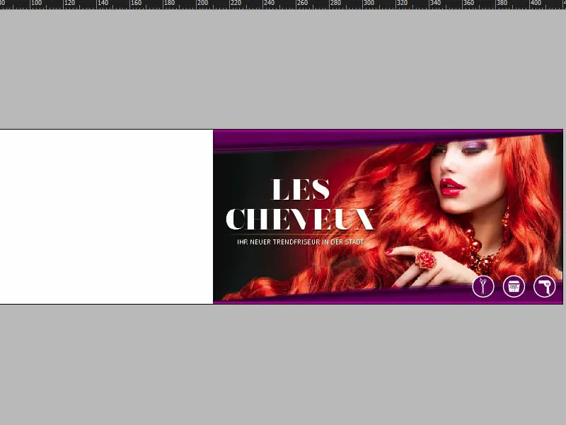
Back: graphic elements for the basic layout
Let's switch to the back of our folded card for the hairdresser. We start by duplicating these delicate lines here at the top (1), which we have given a whopping 3.5 mm. You select the object, select the Alt keyfor a copy and the Shift keyso that you stay on the axis. Move it once to the left (2) and position it right at the bleed (3). Then reduce it in size (4). Then I copy it again, move it to the right and drag it to this guide (5). And copy again and drag the object to the guide (6).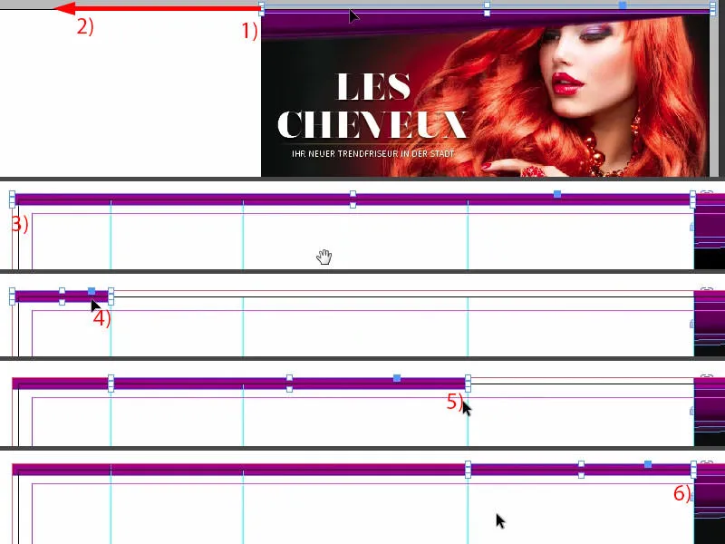
Now we have to swap the colors: The one on the left and the one on the right each get the color white (1). Now I can select all three elements and also move them down to the bleed using Alt and Shift (2).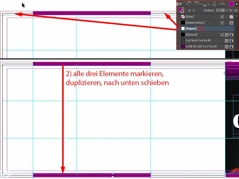
After they have all been moved to the basement, we continue by drawing a large color area on the left and far right. We use a different color there - the deep purple (1). Here I draw a rectangle (2). Take care up here (3) that we get to the same height.
I'll make a copy of this again and draw it from here (4) to the fold (5).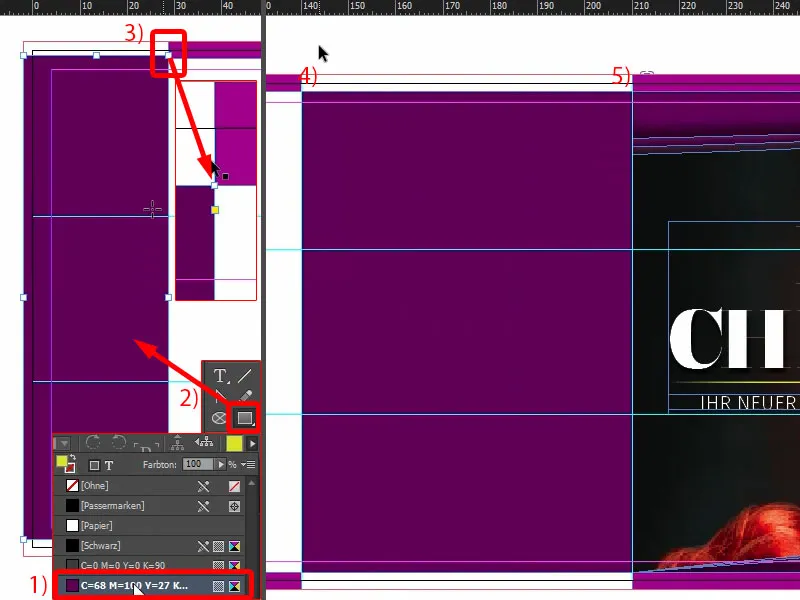
In this way, we can create a basic layout on which we can work within a few seconds. On the left-hand side of the image, we will place a keyword that describes what is available on this page, i.e. the location. In the middle, we will then include the contact details. We will insert the address, a QR code and so on and so forth. And in this field, we will finally add the supplement for the service portfolio.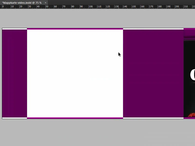
Placing text
Let's start by giving the child a name: Draw up the text field (1), select the Fira Sans in Bold, the capitals on and 48 Pt for the font size, still center. The color is white (all settings in the upper part of the image at 2). Here we write in: "Location" (3).
Double-click on the handle to adjust the text field (4). Rotate it by 90° and move it into place, aligning it in the middle (use the guidelines at 5). We have now successfully placed the first element (6).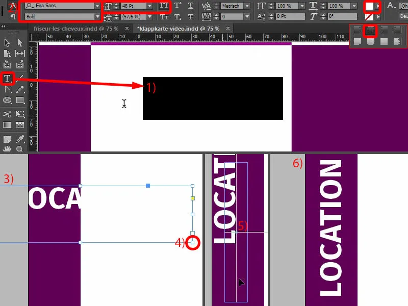
The page now looks like this.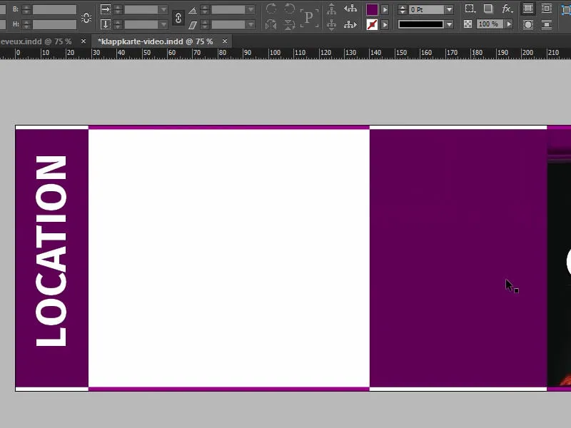
Insert image and additional services
We continue on the right-hand side of the page. There we work with a mixture of text, an image and certain transparencies to create a nice visual effect: Pull up text box (1), change font to Fira Sans Light. The font size is 14 pt, the capitals are activated, the color is white (settings at 2). "Good to know", then add a blank line.
Reduce the font size further to 9 pt, remove the capitals and then Font>Fill with placeholder text (settings at 3). We currently have five lines, I'll reduce this to four and reduce the size of the text field (double-click on the bottom handle of the text field). Let's just leave it to the left, because we'll take care of the alignment once we have the right image.
Call up the Place dialogvia Ctrl+D, select the appropriate image (4), drag once (5). Of course, this is far too large, so I'll reduce the height. I think 47 mm should be about enough (6). Then I place the image content so that we can also get the lady with her pretty face in the picture (7). When placing images, it is also important that the face always looks into the layout. So here she is looking diagonally upwards. It would be bad if it looked out of the layout, because there is nothing to find there.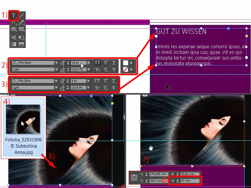
I'll now move it up to the guide line (1) and press Shift and down once. Likewise this field (2), Shift and down.
I'll make a copy of this and move it down (3). With Ctrl+Y you select this dialog (4), and there you will also see the unformatted text (5), throw it out once. And then we stay with "Good to know", this is the line we are going to work with.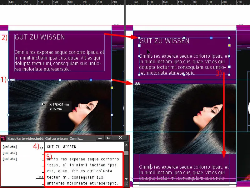
It's behind the image, so move it down a little (1). And then we rewrite it: "We look forward to your visit" - we set "to your visit" in the font style to Medium (2). It's a very popular effect to work with different weights, bold and light, for example, when you simply have thick and thin next to each other. However, you naturally set the passages that are essential and important to Bold.
Move this all the way down to the guideline (3) and move it up once with Shift (4). Then it fits.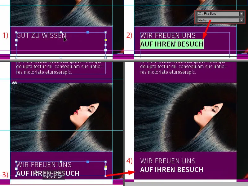
Next, we continue with the supplementary services, which we draw here. Select the rectangular frame once (1), click in the workspace and set the width to 30 mm and the height to 5 mm (2). Color in white (3). Reduce the opacity to 80 % (4), then we have a slight transparency here. Now I take the text tool (5), click once and format it accordingly: Fira Sans, this time with Light, 10 pt (6). For the color, don't use the hard black, but the slightly softer one (7).
And now use Ctrl+B to define the distance to the frame: 2 mm on the left (8), so that the cursor jumps away from the edge. And then we can select Center (9). Now we can start typing, for example: "Type advice" (10).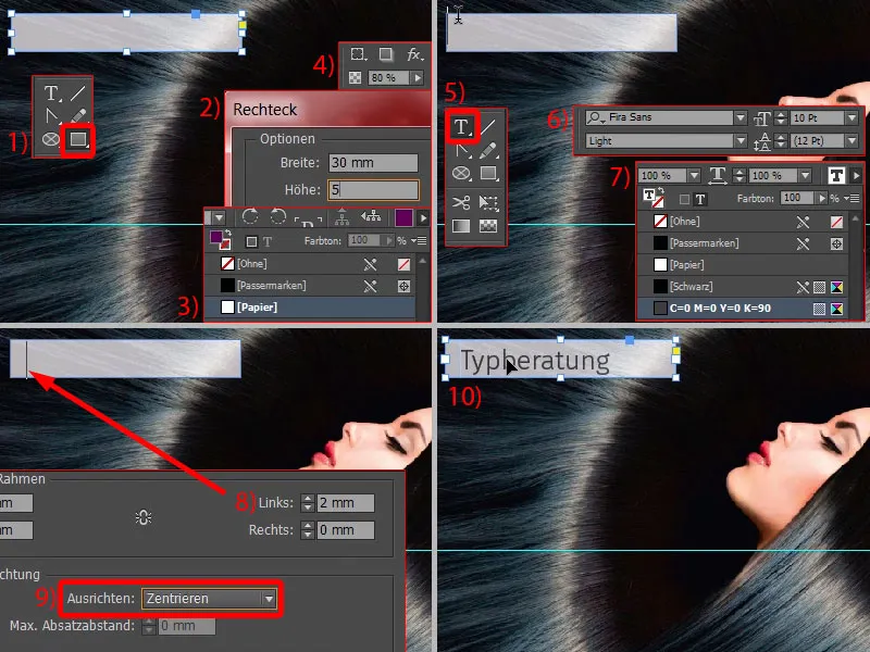
Then you can copy this field with Shift and Alt, place it directly at the bottom (1) and define the spacing once with Shift and the down arrow key (2). "Bridal styling". And for the next element, the guides should appear automatically (3). We can copy this several times and fill it with the corresponding texts (4).
Now select them all and, holding down the Shift key, align them in the middle of the image so that they don't slip on the axis. Here you can see the auxiliary line (5). Done (6).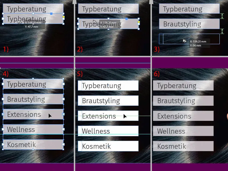
Add text for address, align and format elements
What's missing, of course? Of course - the address, because what is a hairdresser if you don't know where he has his salon? So let's get started.
The name should definitely also be visible on the back. I simply grab it from the front by selecting these three elements and moving them to the left while holding down the Alt key(1).
Now we need to change the color, i.e. Ctrl+A, in a different color (2) and with a font size of 30 pt (3). You can ignore the line spacing, as it will be single-spaced. And I would also like to dispense with the drop shadow at this point. It is not necessary, because the two colors form a good contrast to each other. So click on the drop shadow symbol at the top here (4) and it will disappear.
Next, move this element to the top, dock it once (5) and adjust the position with Shift and the down arrow key. Then we have the same proportions as on the front (6).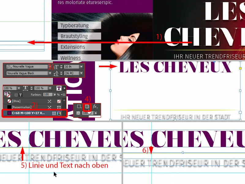
Here (1) we also remove the shadow (2) and change the color to 90 percent black (3). We will also change the color of this line from nuclear reactor yellow to blackberry violet (4).
Then select all three elements (5), move them up to the guide (6), and then Shift and press the down arrow key once (7). Now we have exactly the same axis as in the field next to it (red line at 7).
As you can see, graphic design is always about creating symmetries and harmonies. These may not even be consciously perceived, but it is important for the subconscious perception that it has a tidy character.
One correction we still need to make concerns the width of the text boxes, which is too large, resulting in this image (8). We have also stretched the line to the size of the text boxes and this simply breaks the line exactly as I want it. So I reduce the whole thing. And this is also important because I need the reference lines of the text boxes for the lower part. So: double-click once on the handles (at 9).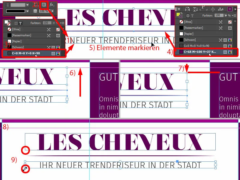
Now we have to make sure that it is centered. I move it a little to the left, and now you can already see: top left and top right, these green arrows (1) - so again guide lines, wonderful. If you don't have them, please activate the intelligent guides under View>Grid and Guides.
The same game here, also align in the middle (2).
We will now reduce the line. If I were now to attack only once (3) and then change the length, we would only draw on the right side of the line. If we want to pull from both sides at the same time, simply press the Alt keyand this line will also be shortened on the left (green lines at 3, overall result at 4).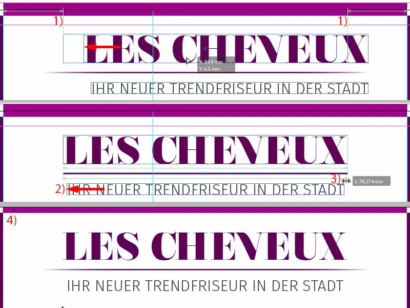
Let's move on: Now we draw a large text field, at the same width as the heading above (1). I'm going to draw it very large, again using Fira Sans, Medium font. The font size is 10 pt, which is perfectly adequate. You have to imagine how big 10 pt actually is in the printed version, it's amazing how lavishly these letters still come into their own. So you can work a little smaller. Activate the capital letters, select the color (see settings at 2) and off you go with "Telefon Mobil".
Now I want "Mobile" to be right-aligned. You can easily do this by selecting the space between the words (3) and pressing the Shift and Tab keys. Zack - "Mobil" jumps to the right (4).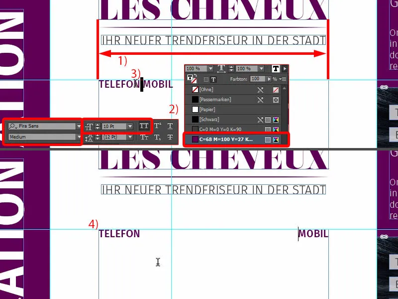
Now we can go to the end of the line, make a paragraph and type in a phone number, which also varies in font style - we use the light styleagain and the color 90 percent black (see settings at 1). I enter the phone number, press Shift and Tab again and enter the mobile number (2).
Because we need this a little more often, I'll define these individual formatting options as a paragraph format (3) and call the whole thing "Subline". I'll also create the format underneath as a new paragraph format. I call this "info text". (To do this, format the corresponding text, open paragraph formats via 3, enter the name and confirm).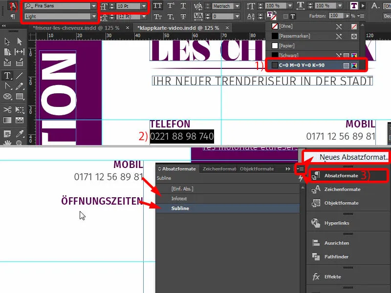
Now I can jump to the next line, two paragraphs. I type in "address" and define this as a subline. Shift+Tab again, that's where the "opening hours" go. Then, of course, we have the wrong format, so I change it. Oh, something's happened here ... the info text is also in capitals. Why is that? Let's take a look at this - in the paragraph formats. Under Basic character formats (1) we have the character type. Once set to Normal (2), this will not happen. And so I can now quickly fill the whole thing using the formats and Shift+Tab and assign the corresponding formats (3).
Cool, isn't it? So if a certain format is always repeated, for example this "Location" could also be defined as a paragraph format, then with the one-click solution you have the corresponding formatting in no time at all and don't always have to set everything up there. However, it is only worth using formats if these formats are recurring. We've had less and less of this up to now, but this is the first time we've used it.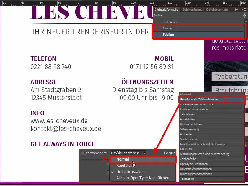
Placing icons for social media
Since the world is connected via social media channels and platforms, we will also include this element below. I've already prepared the right thing here in my library (1), namely three icons for the most popular platforms. I place them flush left (2).
Then I start with new text fields, just draw them on randomly. We use Fira Sans Light in a font size of 6.5 pt and our beautiful purple color again (settings at 4). Then we start with the first text. I align it in the center of the icons (5), ...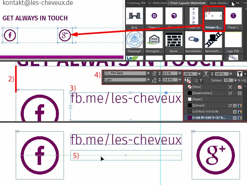
... dock it to the left (1) and move to the right twice with the arrow key and Shift (2). Copy the text field, Alt and Shift, dock to the next icon (3), two steps to the right again (4). Last but not least, the chirping bird. However, we are running out of space here (5).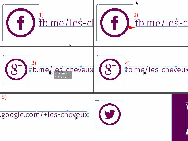
We should probably not align the whole element in the middle, but move it to the far left (1). Then three times with Shift and arrow key to the right (2). I think this works better. And now let's put the chirping bird in there (3).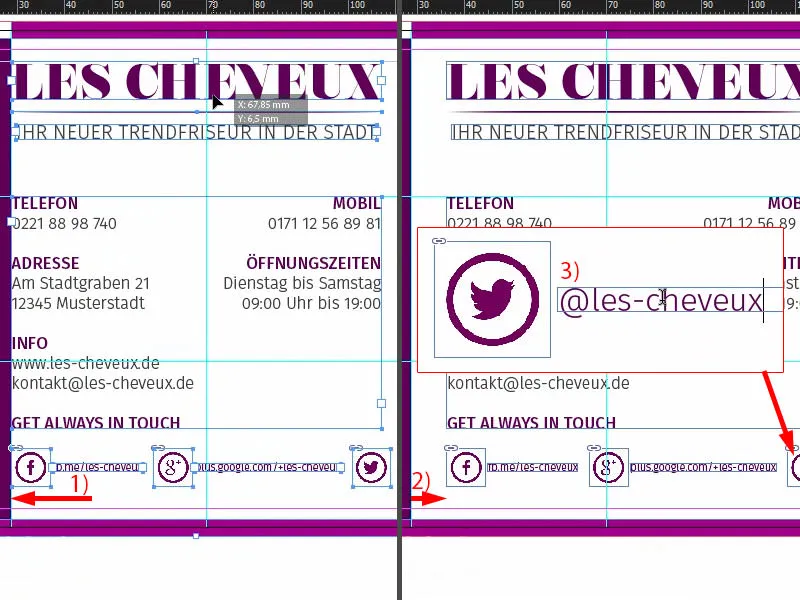
The intermediate result: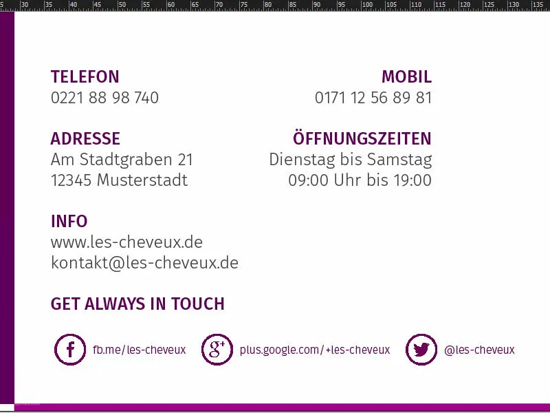
Creating a QR code with InDesign
Since InDesign has also fallen to the dark side like its brothers Illustrator and Photoshop, i.e. since the InDesign CC version, you also have the option of creating QR codes from the user interface. You can do this easily via Object>Generate QR code.
The problem with this is that QR codes are viewed a little skeptically. Some think it's quite good, because - why? Sure - QR codes build a bridge between printed products and the digital world. And they're right about that.
For example, if you have a responsive website - like our hairdresser's website or one of these accounts below - you can simply enter the address. Set the type to hyperlink and enter the URL (see next image), and it spits out a QR code that you can easily scan from your smartphone.
Other people say: "Oh God, QR codes? I don't want something so hideous on my design. I don't want that at all. I don't even have a QR code reader on my cell phone." Of course, these opinions also exist - you just have to decide for yourself.
But I want to show you: The function is available here. So you can choose the type here at the top, hyperlink, text message, you can even select e-mail, whereupon a predefined e-mail is automatically loaded into the draft folder, for example, when the QR code is scanned, which you then only have to send. So you can use all kinds of tricks here. I actually think it's quite cool. You just have to decide for yourself whether you want this gimmick or not. I will definitely add it once (1 and confirm).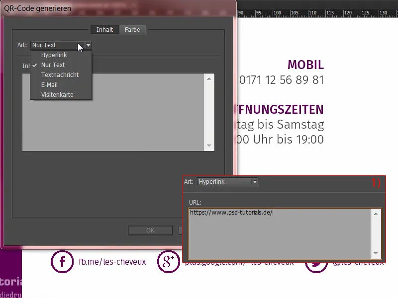
Now we have a QR code that I can easily pull up (1). What do we notice? The color contrast is very dramatic, but you can change it again by right-clicking at the bottom, where it says: Edit QR code... Just click on it, then you get back to the dialog, and there we select the 90 percent black (2). Now it's a little softer. Then we move the content where we want it to be, exactly so that we form a line here (3).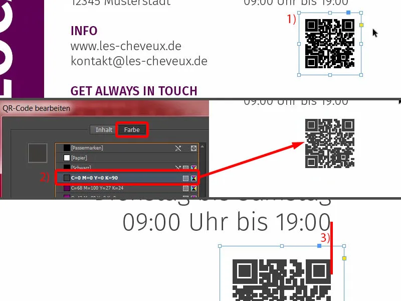
Then, of course, there's a motivating text field underneath, because now you also have to get the user to scan this QR code, so pure curiosity is no longer enough. And such a strange pile of pixels doesn't necessarily pull the herring off the plate. I insert the text and format it: 10.5 pt, purple color, Journal font, which is handwritten. I reduce the line spacing (see settings at 1), then add a slight slant (2) and position the whole thing (3). Now we have also created a motivation to scan this QR code, because otherwise perhaps nobody would do it at all. But as soon as you hear "discount, there's a discount, there's a winter sale, there's a free teddy bear, there's an apple tree in France ..." - Yes, that makes people prick up their ears. So we need exactly the same tool where the QR code is.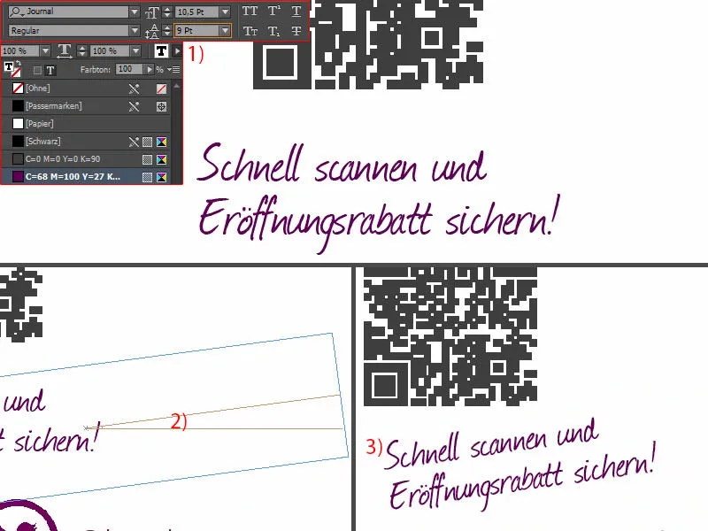
Overview of the layout so far
So that's our team of two, front and back. We're done so far. In the next part, you'll see how we designed the inside pages.