In this Excel tutorial, you will gain valuable insights into the versatile functions of Excel, especially into the world of pivot tables, charts, and the appealing design of tables. Excel is an extremely powerful tool that helps you analyze data and present it in a visually appealing way. It not only explains how to use these functions, but also how to efficiently improve your Excel skills. Let's dive into this topic together!
Key Learnings
- You will learn how to create pivot tables and charts to derive helpful analyses from datasets.
- You will receive tips and tricks for efficient use of Excel.
- Basics of Excel macros, Sparkline, and conditional formatting are covered.
- You will learn how to create interesting visual representations of your data, such as traffic light functions.
Step-by-Step Guide
Introduction to Pivot Tables
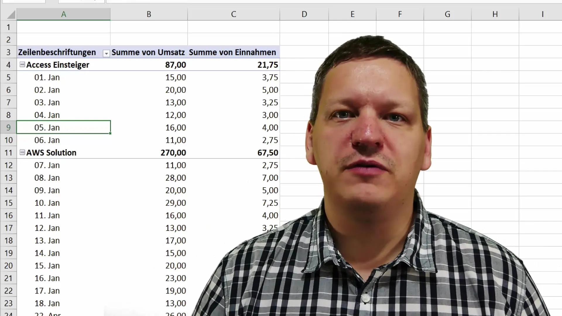
In the first step, we will focus on creating pivot tables. The basic idea behind pivot tables is the ability to structure large amounts of data and present them in easily understandable information. You can effortlessly conduct data cross-analysis.
Creation of Timelines
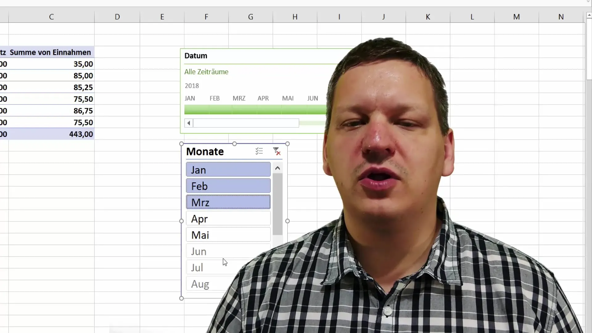
After learning how to create pivot tables, we will explore how to insert timelines into these tables. Timelines enable a chronological visualization of data and help you identify trends and patterns over a specific period of time.
Data Slicers
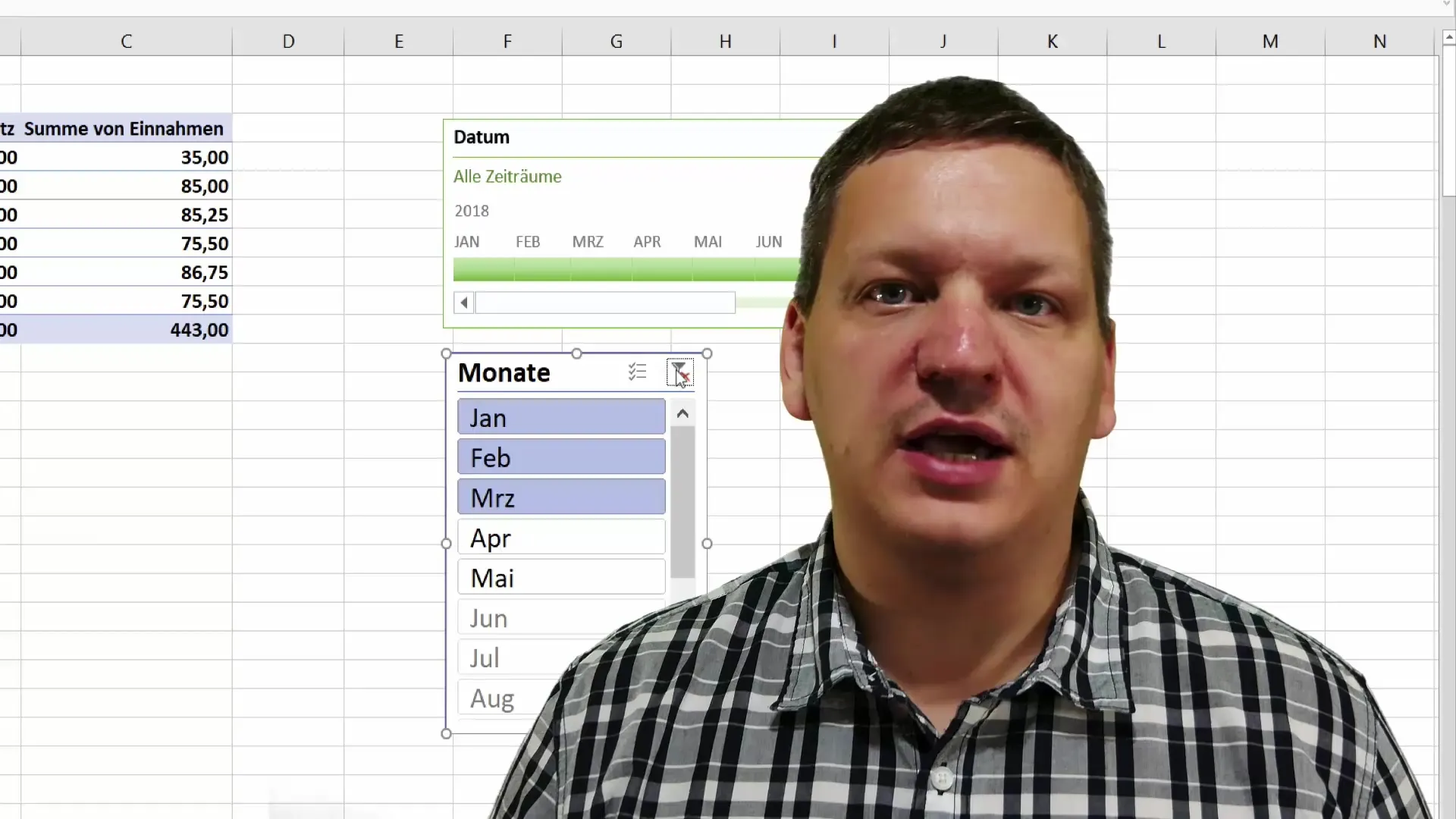
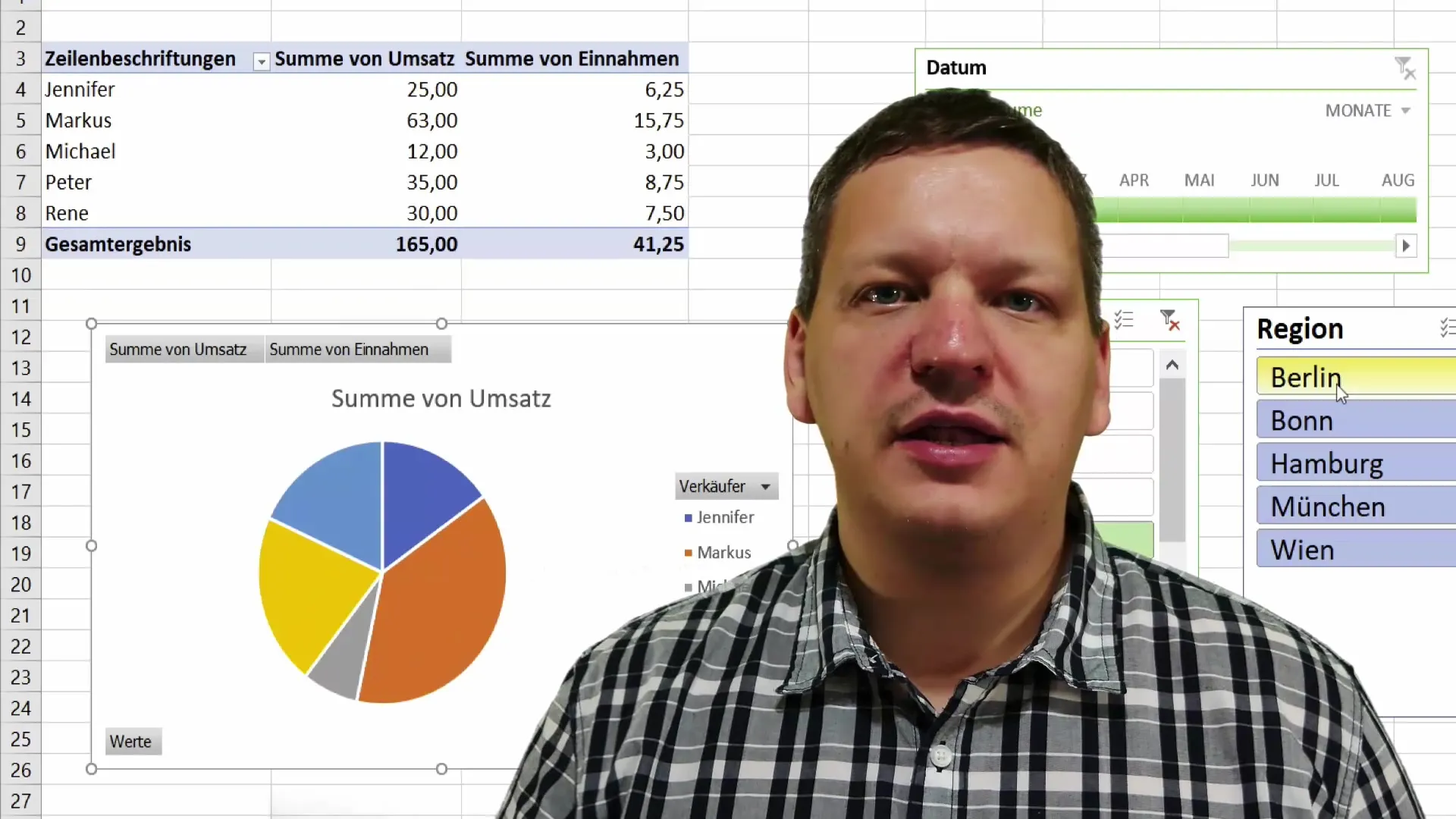
An important aspect of working with pivot tables is creating data slicers. You will learn how to filter your data and analyze it based on specific criteria. This ensures that the presented data is relevant to your specific needs.
Creating Pivot Charts
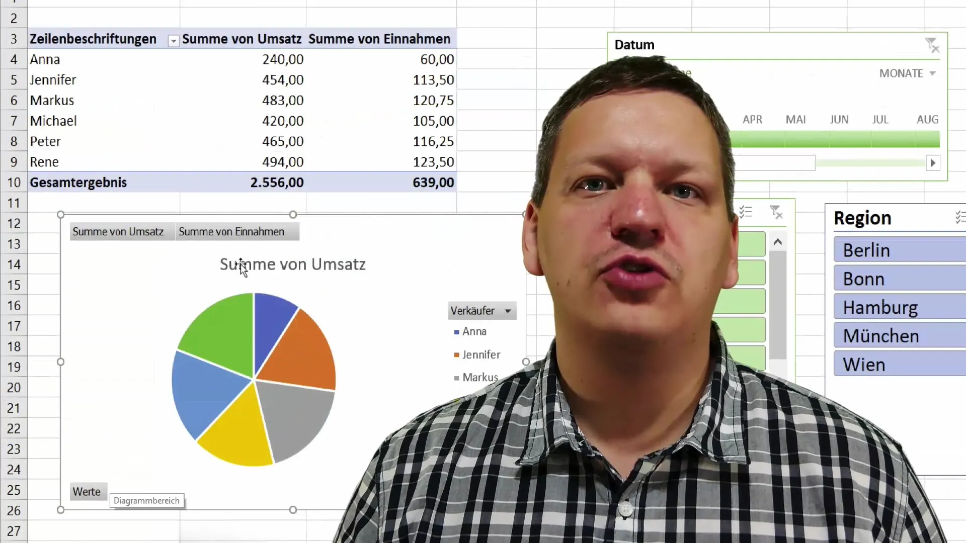
Now it's about creating pivot charts. With these charts, you can visually represent the results of your pivot tables. Visual representations are often the key to capturing your audience's attention and promoting understanding.
Appealing Table Design
A well-structured and appealing design is essential for presenting data. You will learn how to design your tables to appear both personal and professional. Aspects like colors, fonts, and layouts are crucial.
Efficient Work with Excel
Efficiency is key when working with Excel. In the tutorial, you will learn practical tips and tricks to help you work faster and more effectively. These tips can also help you avoid errors and make the most out of your data.
Basics of Excel Macros
Another exciting point is the introduction to Excel macros. Macros are automation tools that can save you a lot of time. You will learn how to create simple macros to automate repetitive tasks and thus increase your productivity.
Sparkline and Gauge Charts
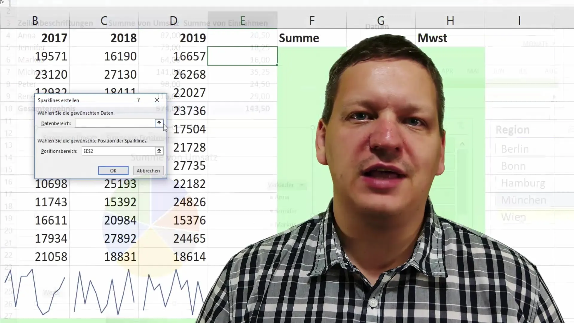
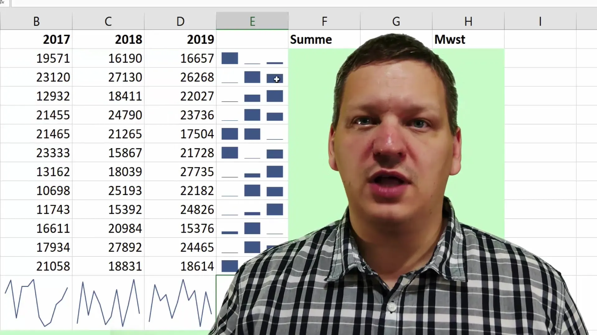
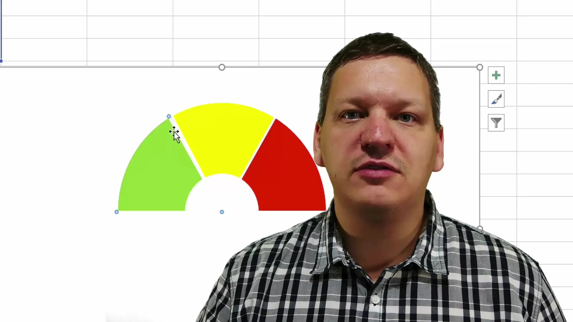
Visualizing data is not limited to large charts. Sparklines and gauge charts are excellent ways to quickly and succinctly show an overview of data trends. You will learn how to integrate these formats in Excel.
Creating Traffic Light Functions
A practical example of using Excel is creating a traffic light function to represent inventory levels. This function helps you quickly identify whether an inventory is too low, sufficient, or high.

Fractions and Database Masks
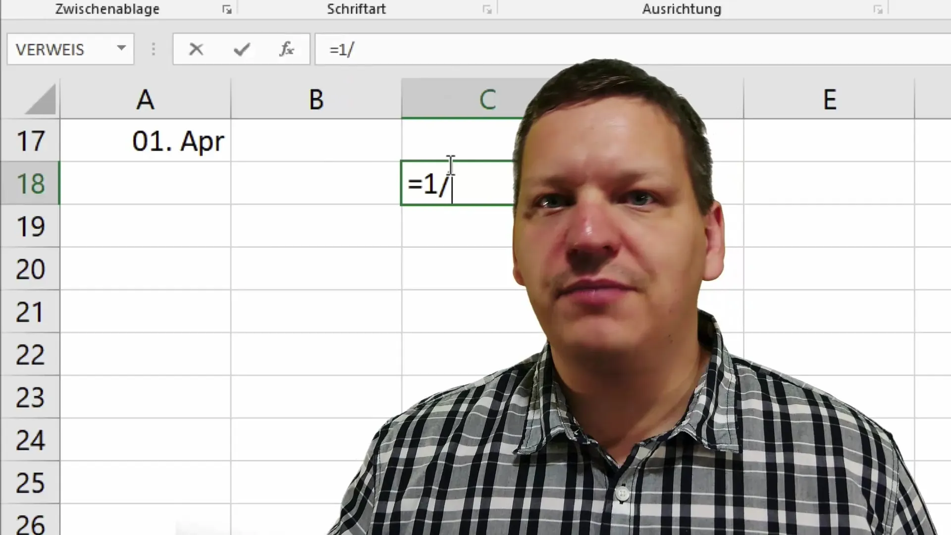
An interesting feature in Excel is working with fractions and database masks. You will see how to handle fraction data and how effective database masks can be for data input and representation.
Conditional Formatting
Conditional formatting is a well-known standard tool in Excel. This feature allows you to change the appearance of cells based on certain criteria. This way, you can easily see where action is needed.

Summary
In this tutorial, you have learned the basics and many helpful tips for effectively using Excel. You now know how to create pivot tables and charts, analyze data, and present it attractively. In addition to expanding your knowledge of Excel macros and conditional formatting, you have also gained insights into advanced visualizations. This equips you well to professionally design and present your data.
Frequently Asked Questions
What are Pivot Tables?Pivot tables allow you to analyze and visualize data quickly.
How do I create a pivot table in Excel?You select your data, go to "Insert," and click on "Pivot Table."
What are Sparklines in Excel?Sparklines are small charts that represent trends in data directly in cells.
What is a traffic light function and how is it used?A traffic light function visually displays the status of values, e.g., inventory levels, in colors (red, yellow, green).
How can I make my tables in Excel visually appealing?Use colors, fonts, and layouts strategically to improve readability.
