You want to sharpen your data visualization and present statistics in a compelling way? Sparklines offer you an excellent way to visualize complex data simply and efficiently. These small diagrams in Excel give you a quick overview of trends, fluctuations, and important information from your datasets at a glance. In this tutorial, I will show you how to insert and effectively use Sparklines in Excel.
Main Insights
- Sparklines are small diagrams presented in a single cell.
- There are different types of Sparklines, including line and column charts.
- Sparklines help you visually grasp data without having to create extensive charts for it.
- Using Sparklines makes it easier to identify trends and outliers in your data.
Step-by-Step Guide
To use Sparklines in Excel, follow this step-by-step guide.
1. Prepare Data
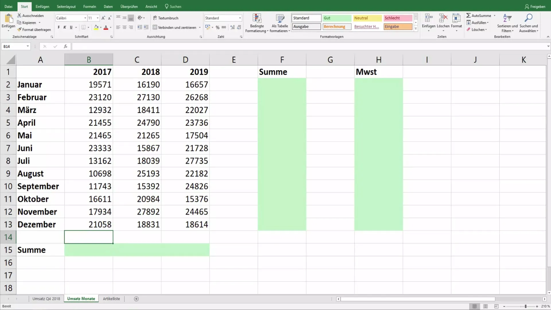
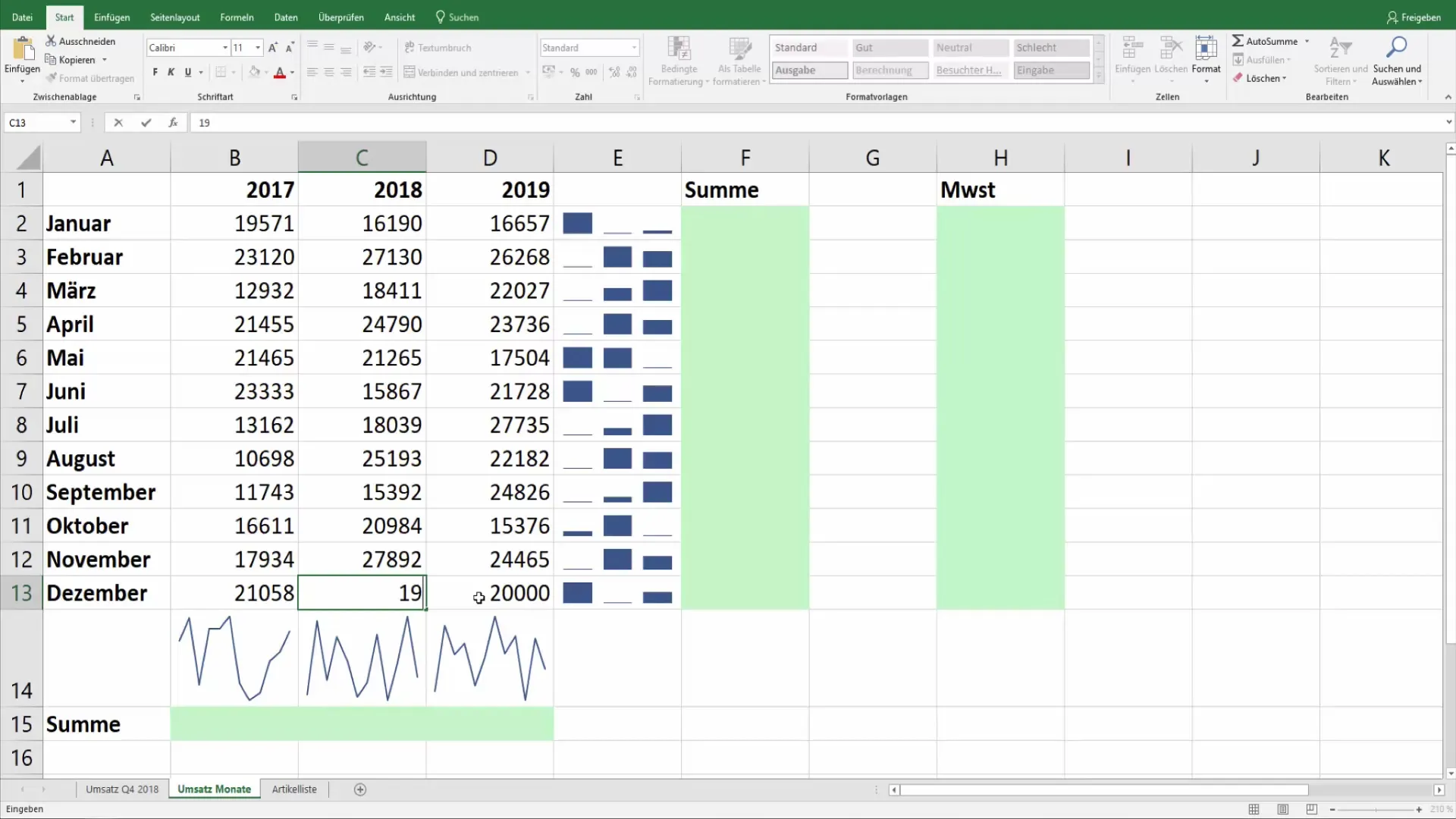
Before you can create Sparklines, you need a structured data source. In our example, we are working with a revenue list that contains revenues for the years 2017, 2018, and 2019. Make sure your data is organized in a clear table so that you can add Sparklines later.
2. Insert Sparklines
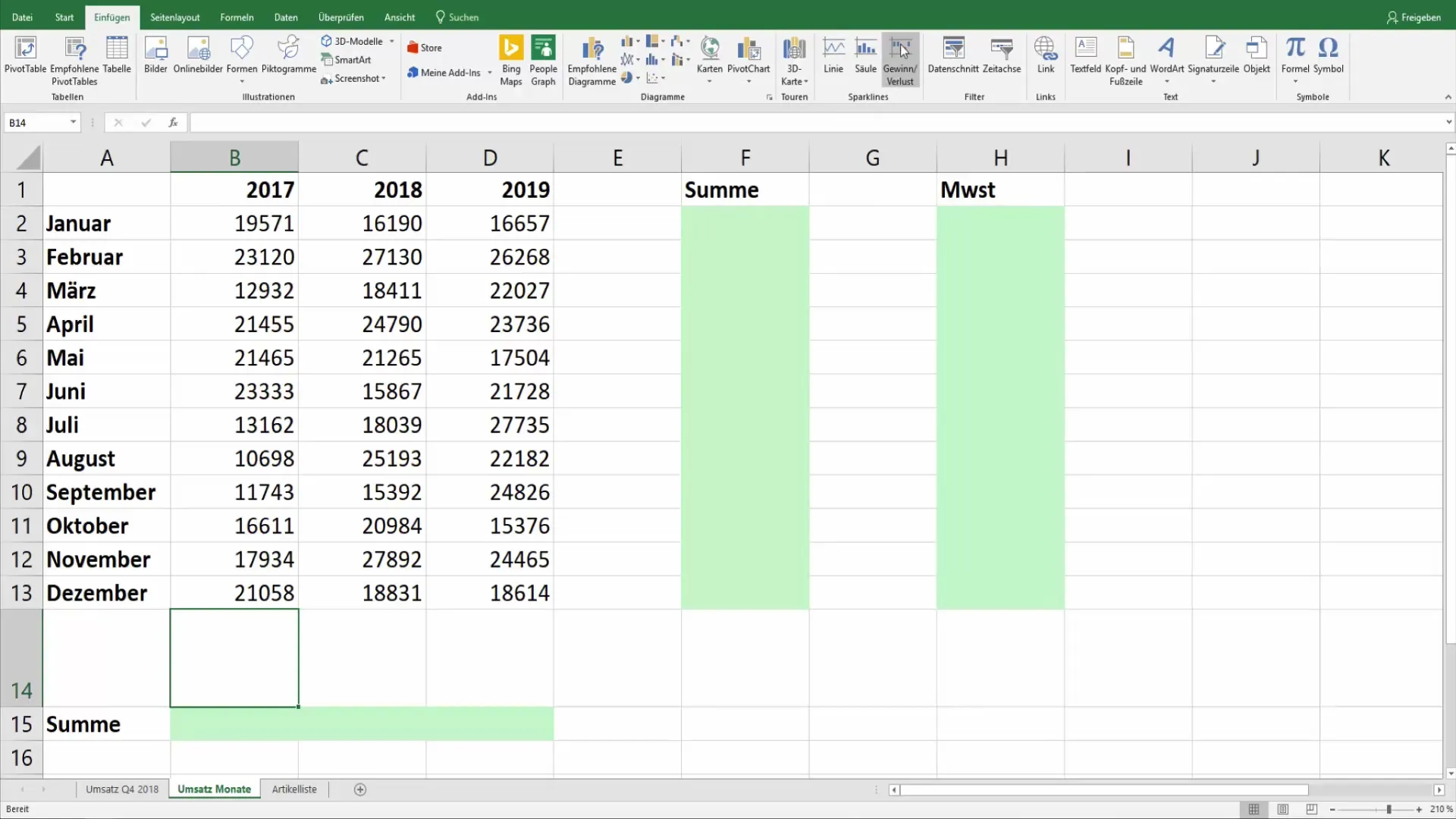
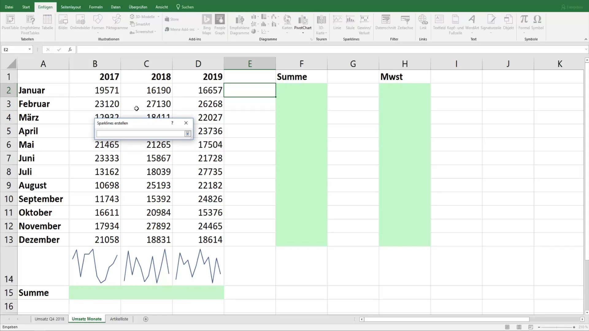
Go to the “Insert” tab in Excel. Here you will find the “Sparklines” section. Choose the type of Sparkline you want to create, such as line or column charts.
3. Select Data Range
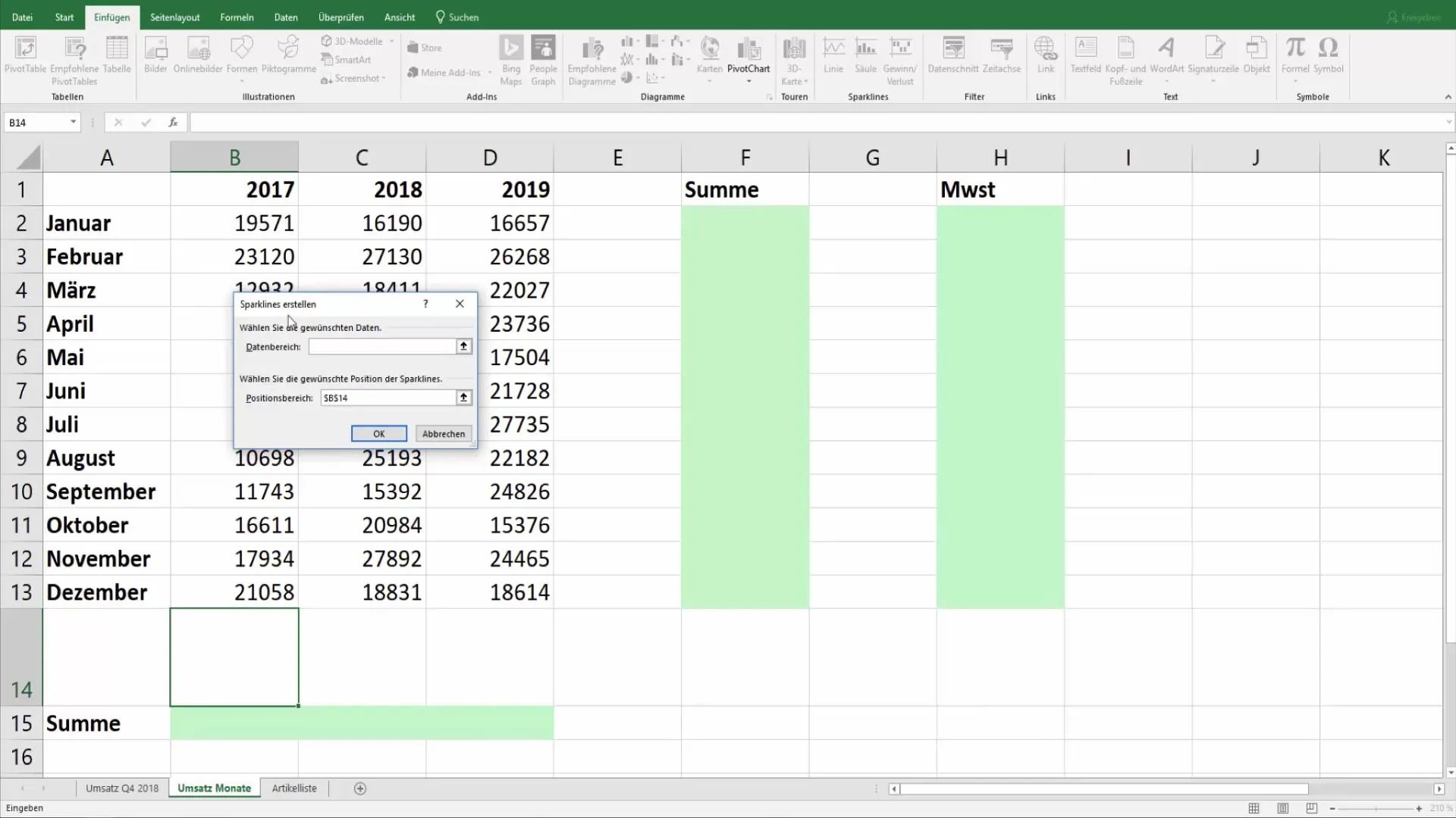
After selecting the type of Sparkline, a dialog box will appear asking you which data range you want to use for creating your Sparkline. Choose the appropriate cells containing the data for the Sparkline.
4. Define Sparkline Position
Now you need to define the position where the Sparkline will be displayed. Click on the cell where your Sparkline should appear and confirm your selection. In this example, we use cell B14 for the Sparkline.
5. Create First Sparkline
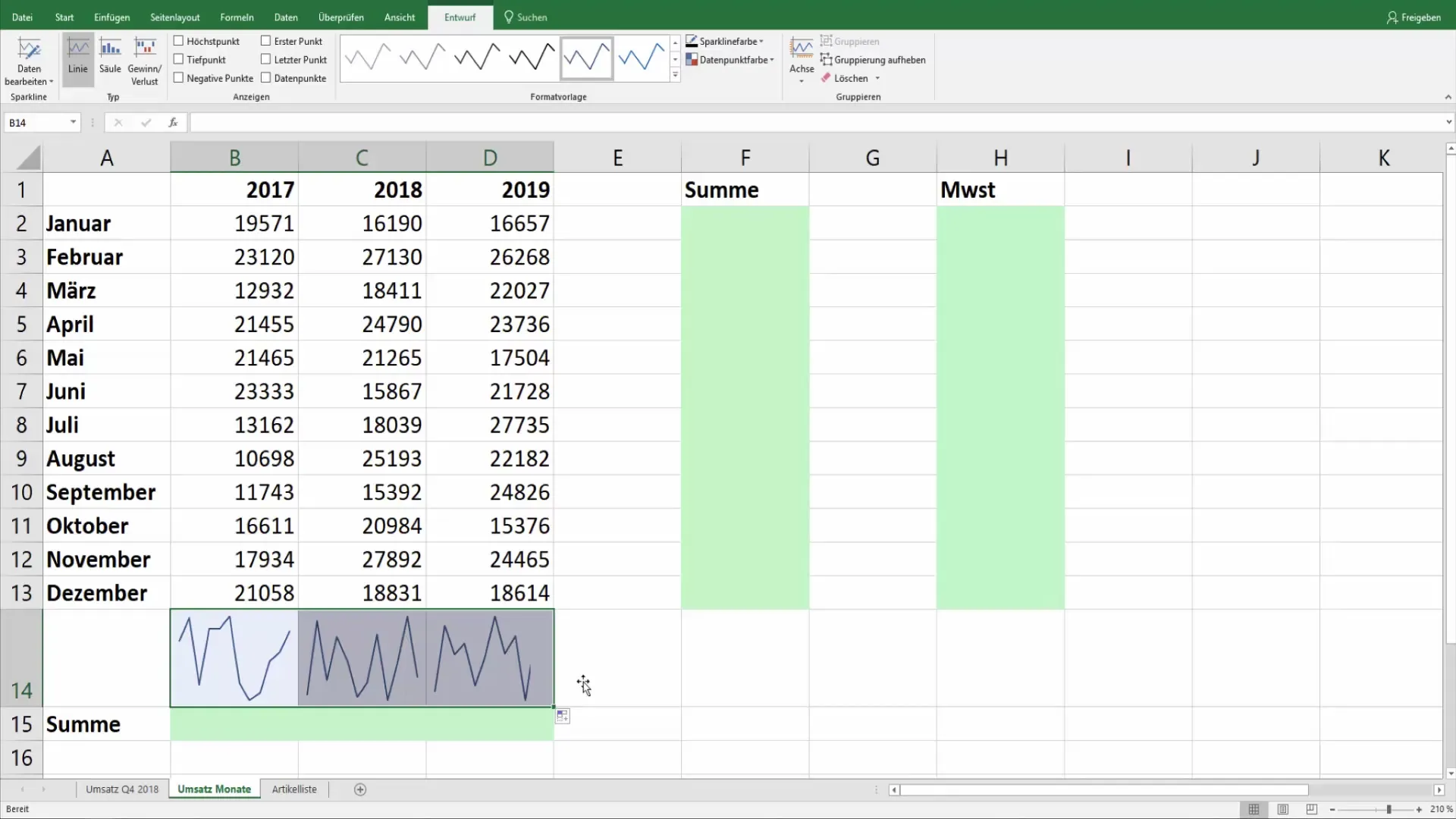
After selecting the data source and position, click “OK”. Your first Sparkline will now be displayed within the designated cell.
6. Customize Sparkline
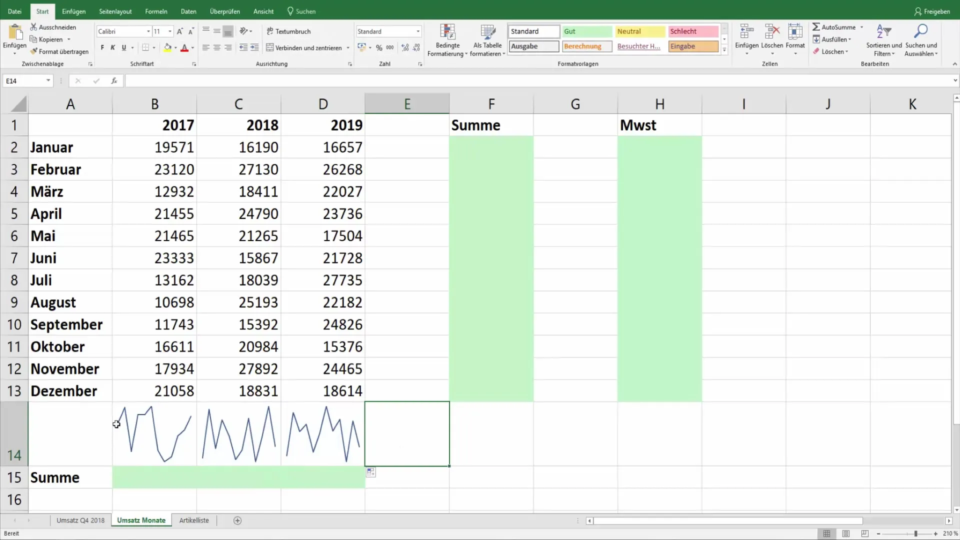
Now it's time to customize your Sparkline to visualize the essence of your data. You can drag or copy Sparklines as needed to show them for additional time periods or datasets.
7. Try Alternatives
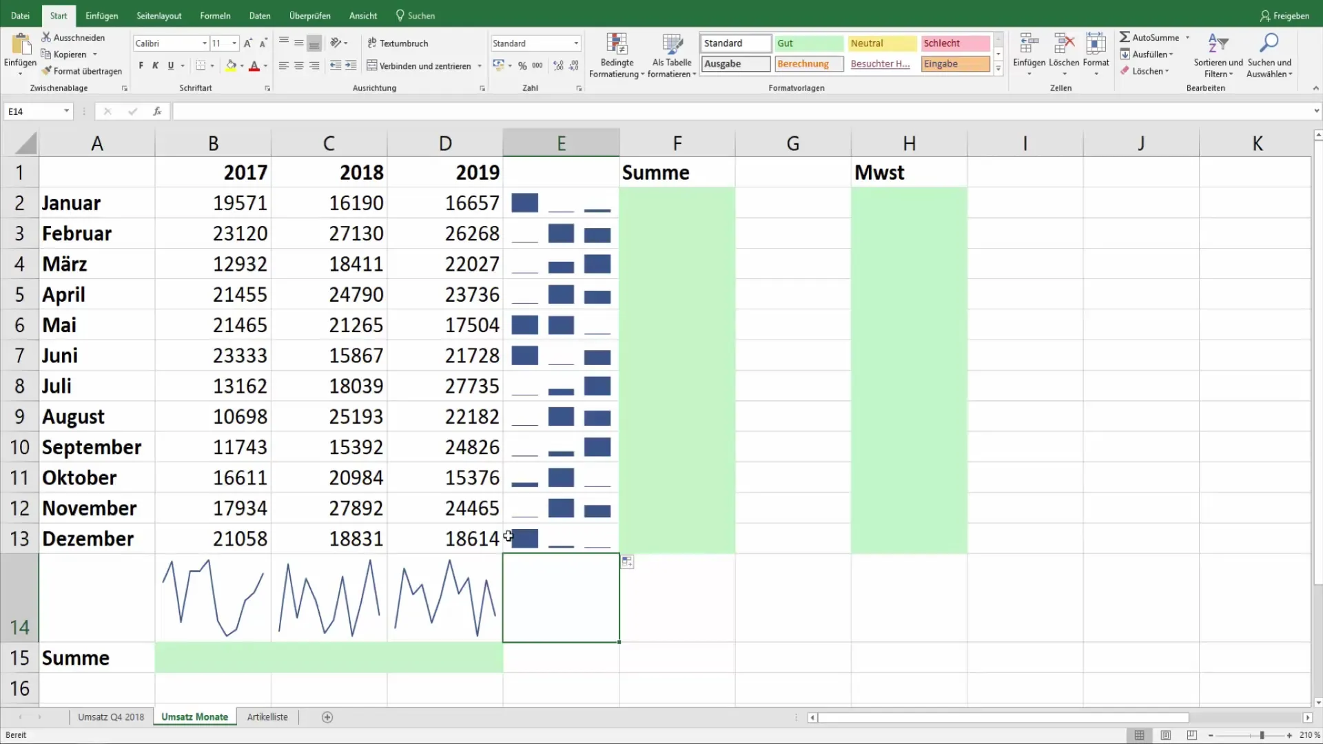
In addition to line charts, you can also use column Sparklines to represent your data. These provide a clear visual overview where you can quickly see in which periods revenues were highest or lowest.
8. Utilize Analysis Opportunities
Analyze the displayed data. With Sparklines, you can track the development over the years and also point out noticeable patterns or deviations in your numbers.
9. Adjust Charts
If your data shows fluctuations, revise your Sparkline. This allows you to look at your data from different perspectives and present it more vividly.
Summary
Using Sparklines in Excel is an effective method to present complex data simply and visually. Whether showcasing revenues or other statistics, Sparklines make trends and changes easily recognizable and significantly enhance your data communication. By following the steps described, you can implement Sparklines in your Excel documents and enhance your data proficiency.
Frequently Asked Questions
What are Sparklines?Sparklines are small charts displayed within a cell in Excel to visually represent trends and developments in data.
What types of Sparklines are there?There are various types of Sparklines, including line and column charts.
How do I insert a Sparkline in Excel?Go to the "Insert" tab, select "Sparklines," determine the data range and position.
Could I use Sparklines for data other than revenues?Yes, Sparklines are versatile and can be used for different datasets to represent trends and comparisons.
Can I customize the design of my Sparklines?Yes, you can customize the color and design of your Sparklines in the Excel options to make them more appealing.
