The Gauge Chart is an effective tool for visually representing values. It resembles the display of a speedometer in a vehicle, with values displayed in different color ranges – often in red, yellow, and green. With Excel, you can create such a chart quickly, even if it is not predefined. Here, I will show you step-by-step how to create a Gauge Chart in Excel.
Main Insights
- Understanding the values for the Gauge Chart.
- Using ring and pie charts to create the Gauge Chart.
- Adjusting the chart for clear visualization.
Step-by-Step Guide
First, create a new worksheet to start creating your Gauge Chart.
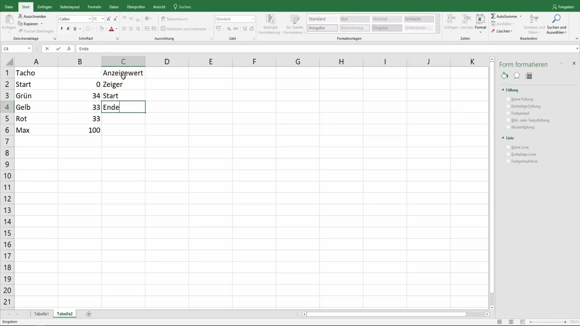
Initially, you should define the values for your Gauge Chart. These values are crucial for representing the different color ranges. The starting value is often zero, and you define three ranges: green, yellow, and red. Assuming the total range is 100, the distribution could look like this: Green 34, Yellow 33, and Red 33. You can adjust these values as needed.
Next, you need a display value. This indicates where the pointer on your Gauge Chart is positioned. For example, you could set a display value of 40%. The starting value remains at 1, and the end value is 100. This provides a baseline for displaying your value.
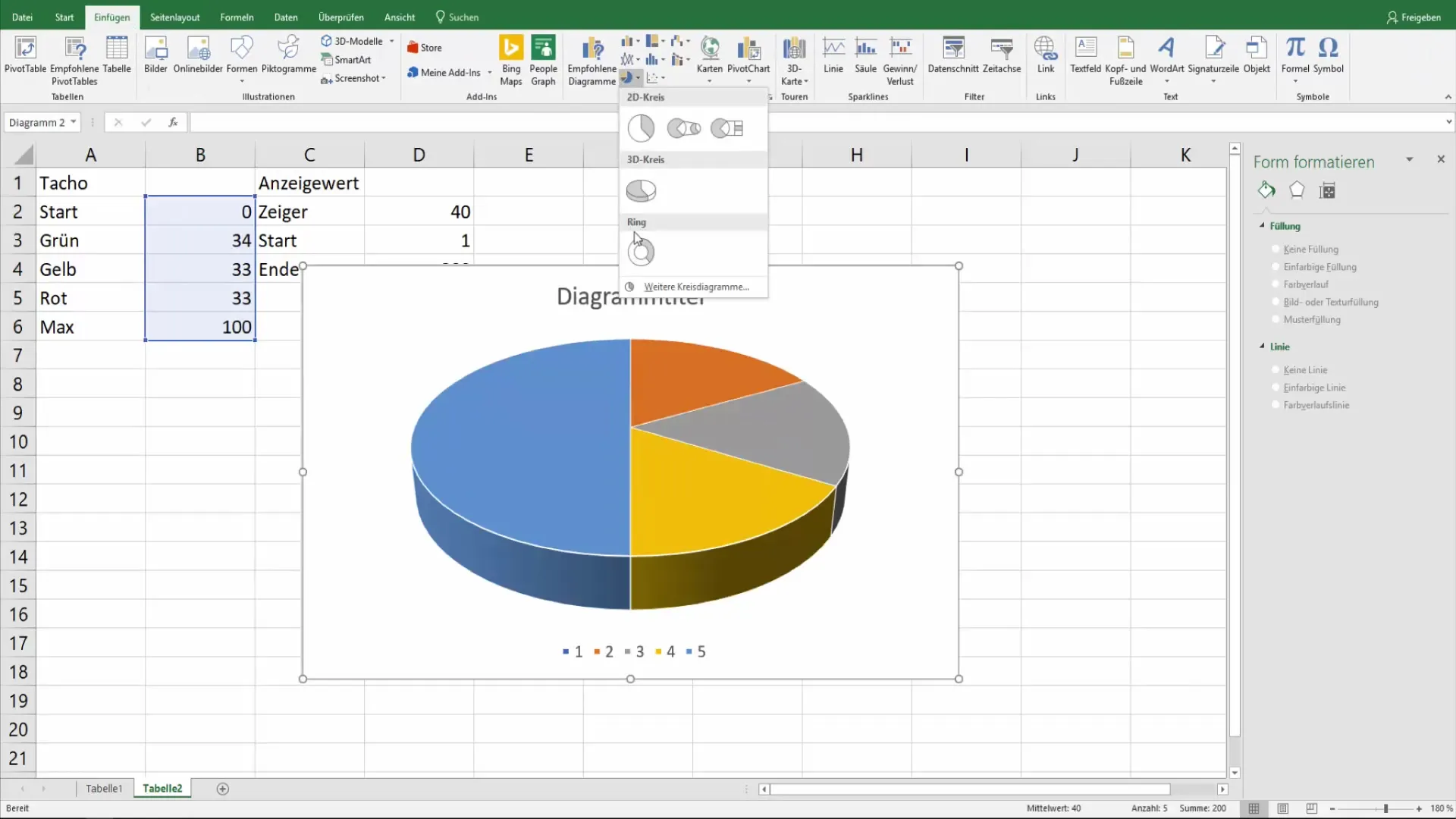
The next step is to insert your first chart. Navigate to "Insert" and choose the doughnut chart. It is important to select the defined values beforehand so that Excel can correctly create the chart.
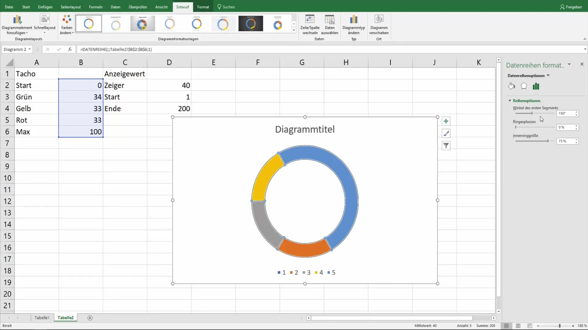
Once the doughnut chart is created, you will already see an approximate representation of your Gauge Chart. The larger sections represent the totality, while the smaller color ranges illustrate the subdivision into green, yellow, and red. Now you can adjust the angle of the segments to further optimize the chart.
To achieve better visibility, you can adjust the fill color of the corresponding areas. Select the segments and choose not to fill the largest area to achieve a clear distinction.
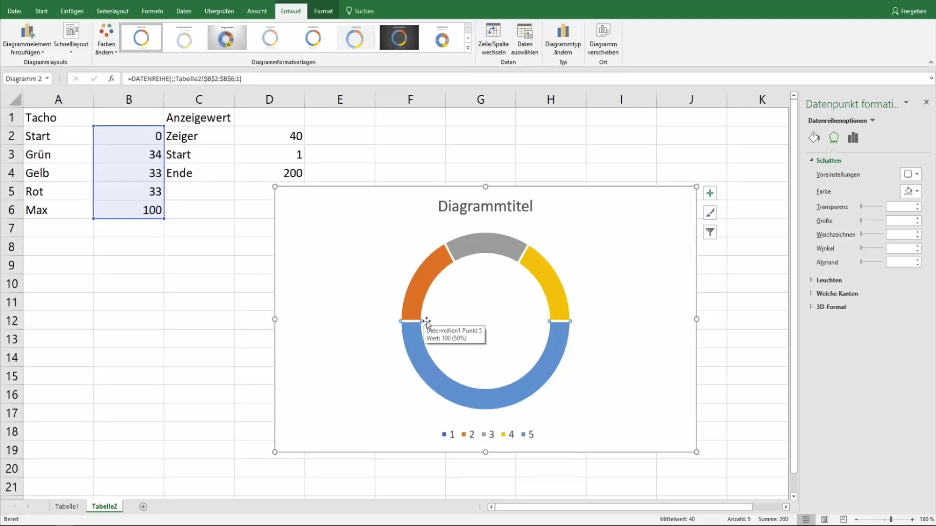
Continue to adjust the thickness and width of the ring until the chart meets your expectations. You can adjust the inner and outer sizes to better harmonize with each other.
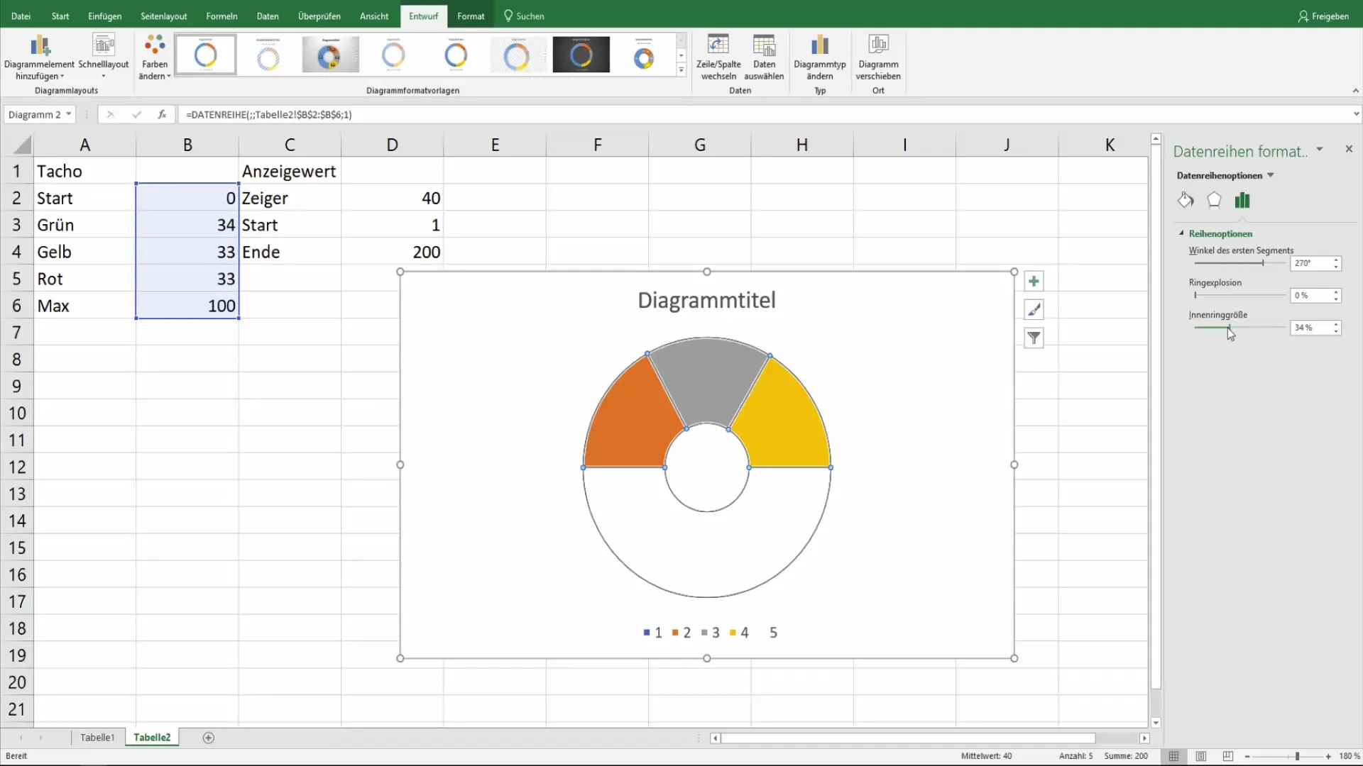
Now comes the crucial step: coloring the individual areas in green, yellow, and red. Select the segments one by one and assign them the corresponding colors. This creates a clear view of the different skill areas.

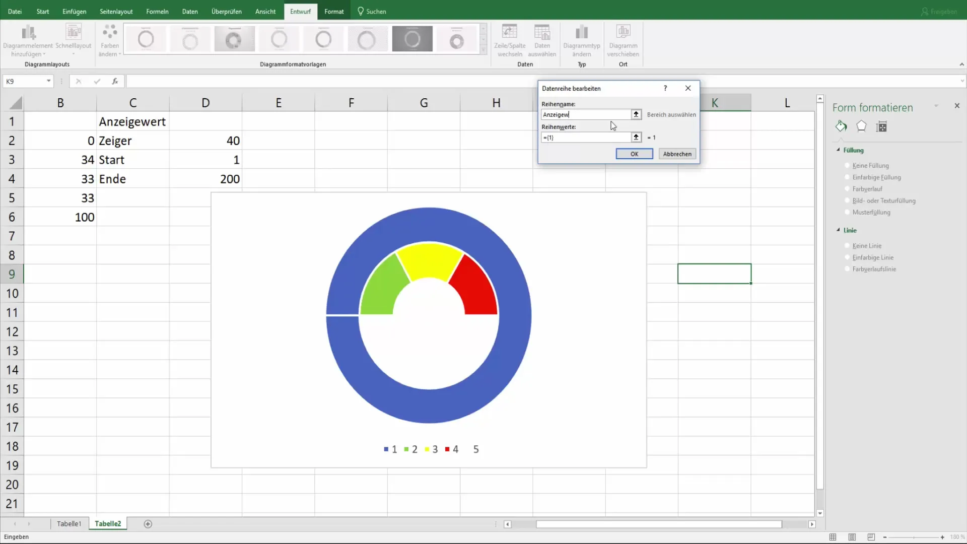
To integrate the display value into your chart, you need to create another chart: a pie chart. Right-click on the existing chart again, go to "Select Data", and add a new data series. This is the display value, which you then overlay visually on the doughnut chart.
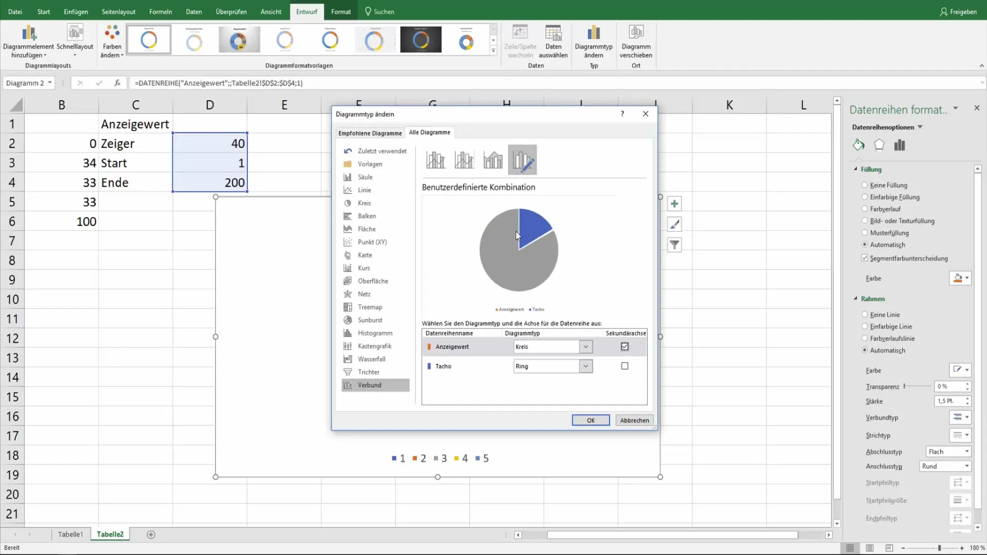
Change the chart type of the new data series to a pie chart. Ensure that this representation is on the secondary axis so that the display value is shown above the doughnut chart.
To further refine the chart, ensure that the display value is positioned correctly to be visible in the right area. You can make such adjustments, for example, by omitting the fill color for unnecessary chart areas.
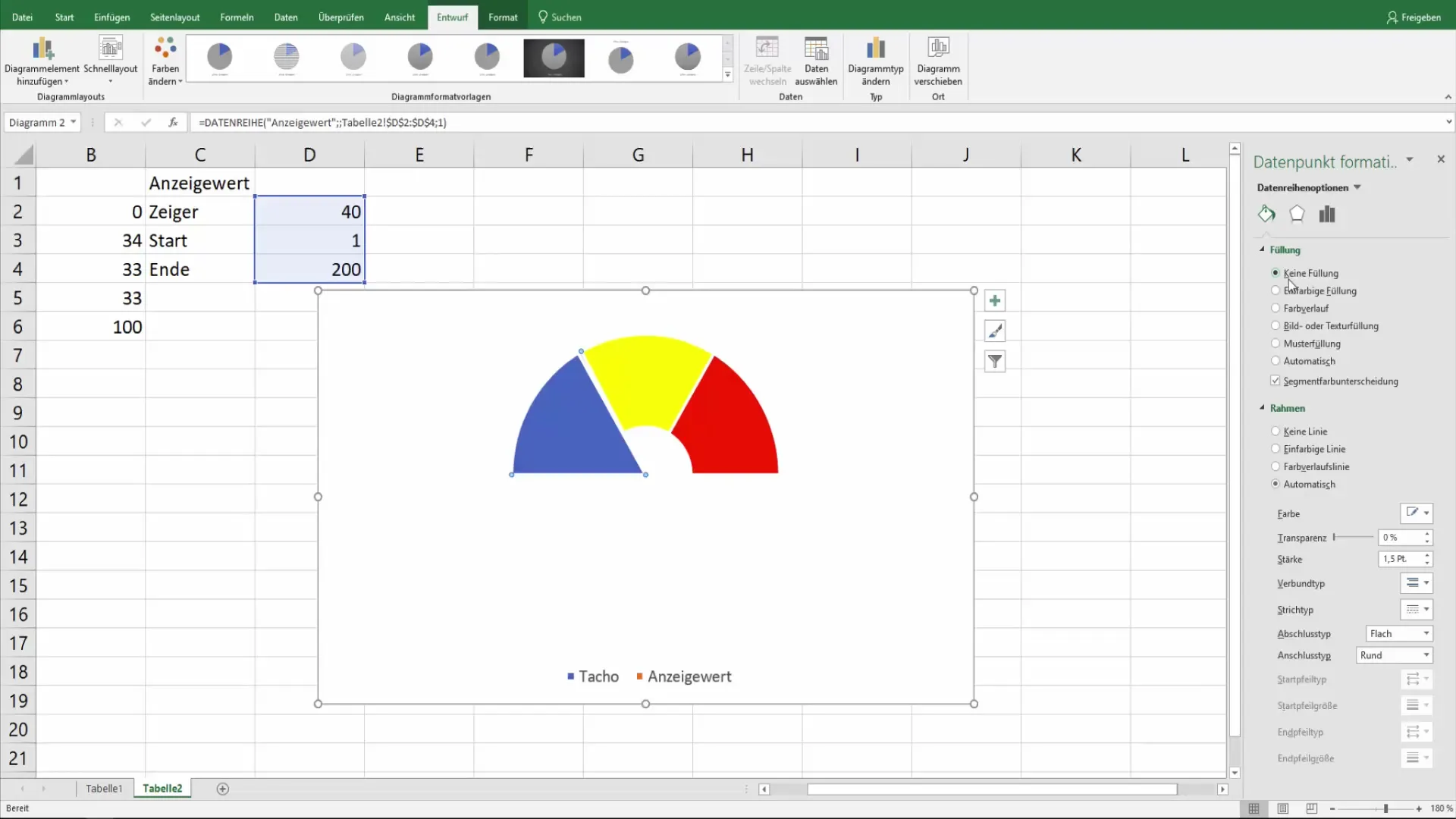
Now that the dial diagram is almost finished, you can adjust the formatting of the pointer. Choose the color and style settings for the pointer to optimize the display.
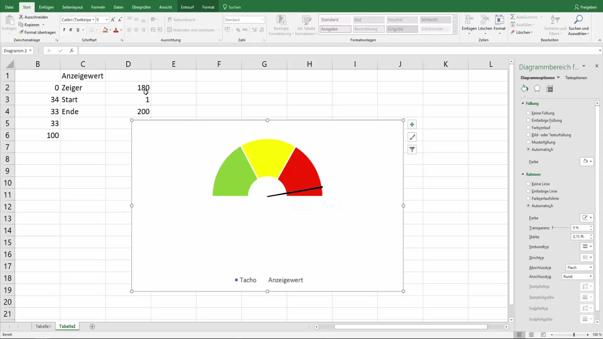
Now you have a visual dial diagram that shows both the current and maximum values. Of course, you can also make personal adjustments to customize the diagram to your preferences. This includes the background color, the frame of the diagram, and any labels.
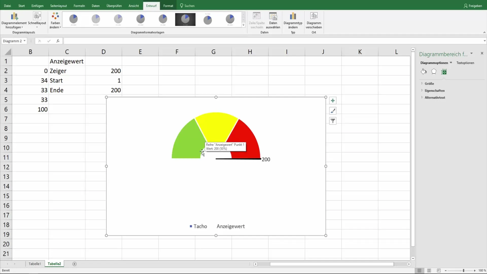
By changing the values, you can test the flexibility of your dial diagram. Be sure to adjust the display values to the new conditions.
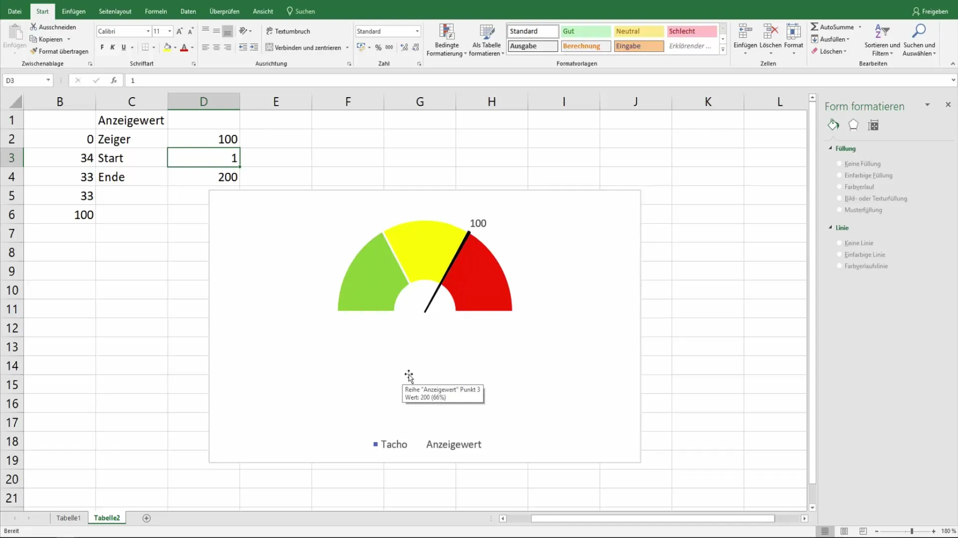
With a little practice, you will quickly be able to create dial diagrams for various use cases, whether it be for displaying performance data or other relevant information.
Summary
Creating a dial chart in Excel is a creative process that is not limited to just entering data. You have learned how to define the values, combine different types of charts, and give the chart a clear visual structure. With the tools that Excel provides, you can now design and customize your own dial charts.
Frequently Asked Questions
How do I add a ring chart in Excel?Go to "Insert" and choose the ring chart option under the charts section.
Can I change the colors of the chart segments?Yes, click on the respective segments and choose the desired color.
How can I represent the display value in the dial chart?Create an additional pie chart and overlay it on the ring chart.
Is there a template function for dial charts in Excel?Yes, you can save your chart as a template and reuse it later.
Can I dynamically change the values in the chart?Yes, by entering new values, the charts will adjust automatically.


