You want to optimize your Excel tables for presentations? Learning how to visually enhance tables is a crucial step. In this tutorial, I will show you how to enhance your sales lists with appealing designs and use them in PowerPoint. We will learn how to create quicksilver graphics and impressively stage your data. Come along and discover how easy it can be to design an Excel table in an appealing way!
Key Takeaways
- Tables can be presented without gridlines for a more polished look.
- Graphics provide strong visual support and are easily customizable.
- Simple shapes can be used to highlight important information.
- Inserting graphics into PowerPoint is straightforward and practical for the presentation.
Step-by-Step Guide
Create and Format the Table
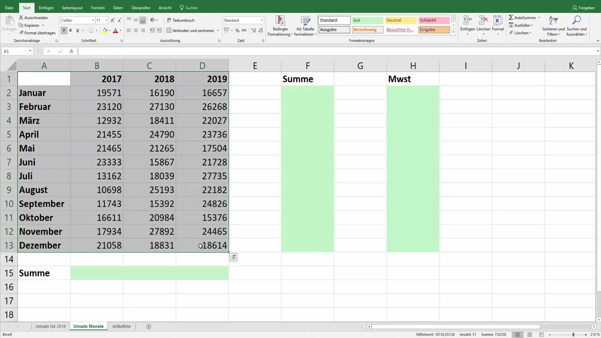
The first step is to set up your sales lists. You select the entire table, copy it, and paste it into a new worksheet. To enhance the table, adjust the cells to make the data more readable.
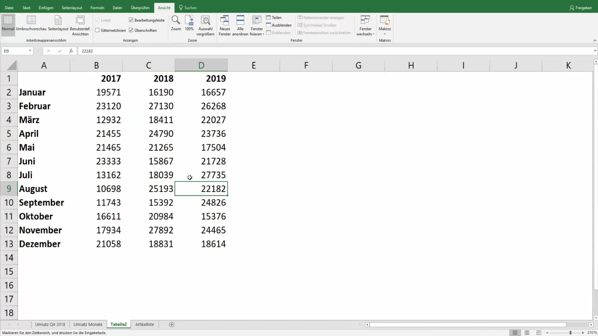
Now it's essential to hide the gridlines to make your table more inviting. You can find this setting under "View" and uncheck the gridlines.
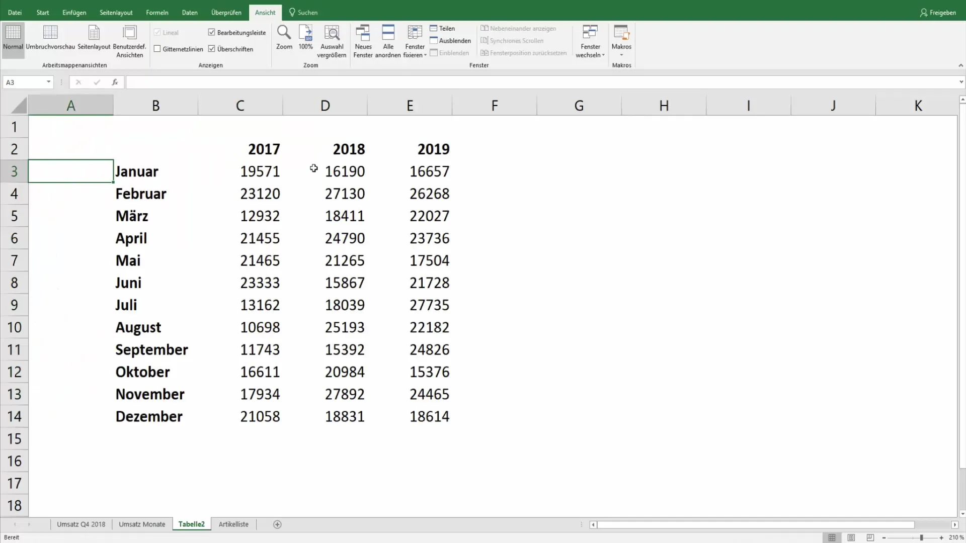
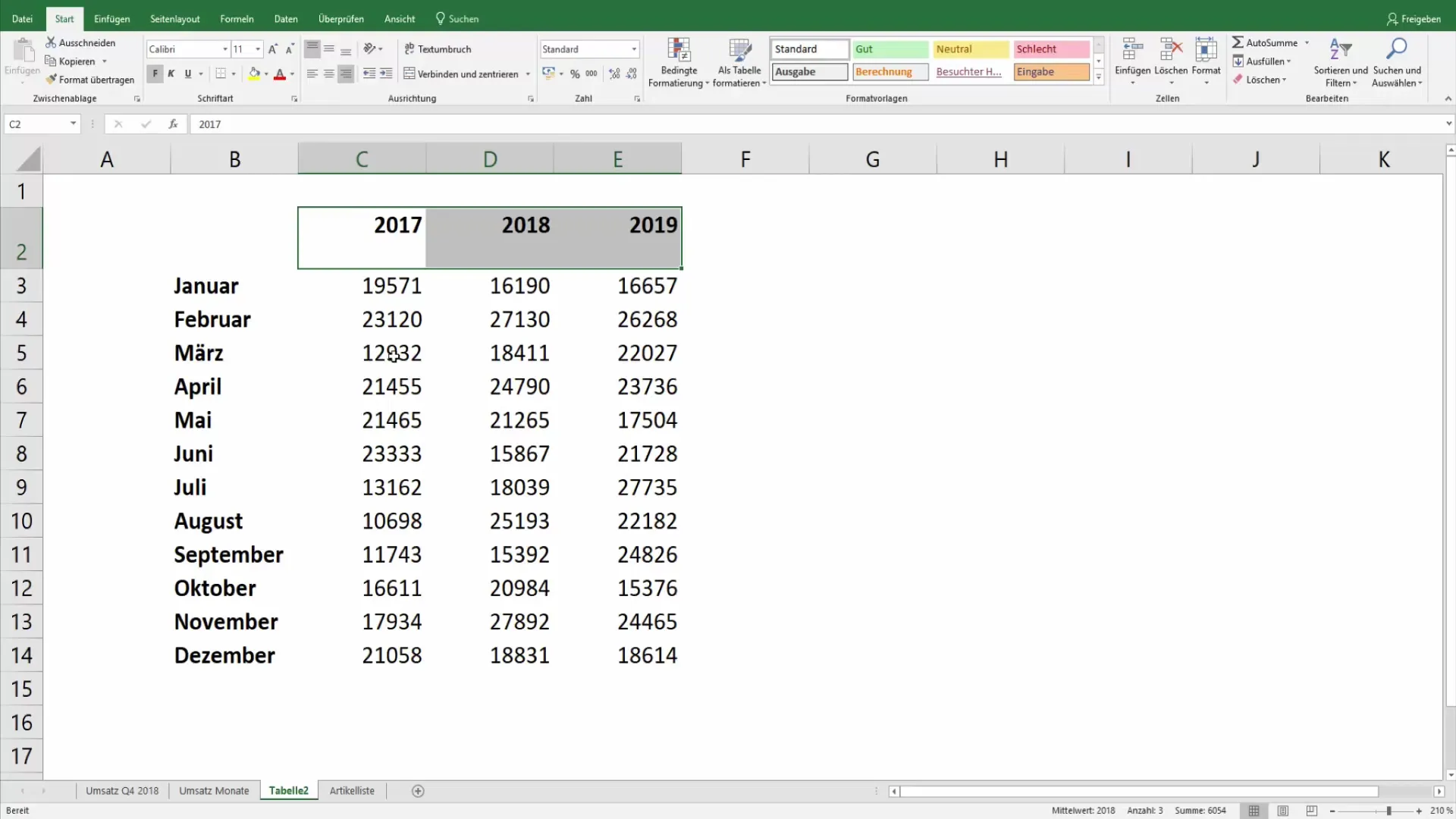
To continue working on the presentation, you could shift or expand the table downwards to make more space for future graphics and data.
Customize Background and Design
Now we will add a graphical background to refresh the table significantly. Choose a suitable template or experiment with the "Fill Area" and select an appropriate color. Alternatively, you can also choose a unique gradient design.
To achieve this, copy the table again and choose the option "Paste as Picture." This transforms your table into a non-editable but flexible graphic element.
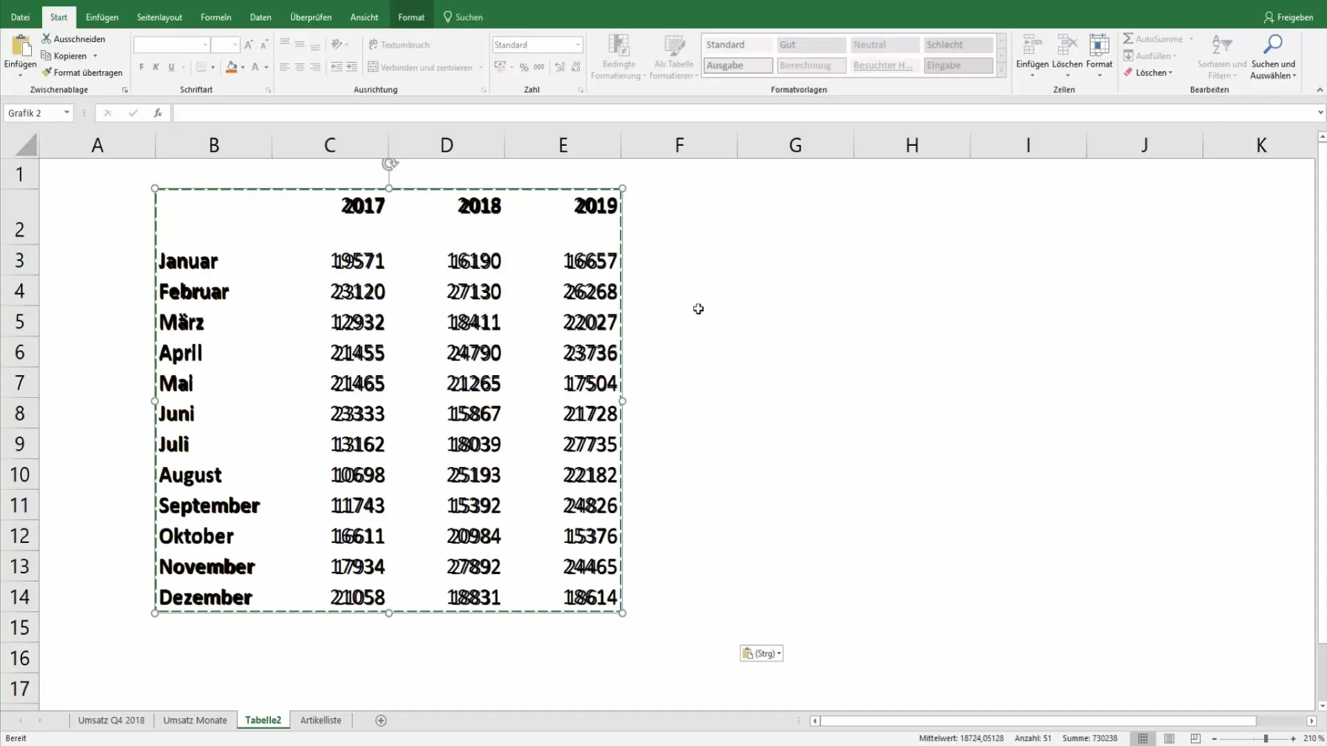
Highlighting Important Data
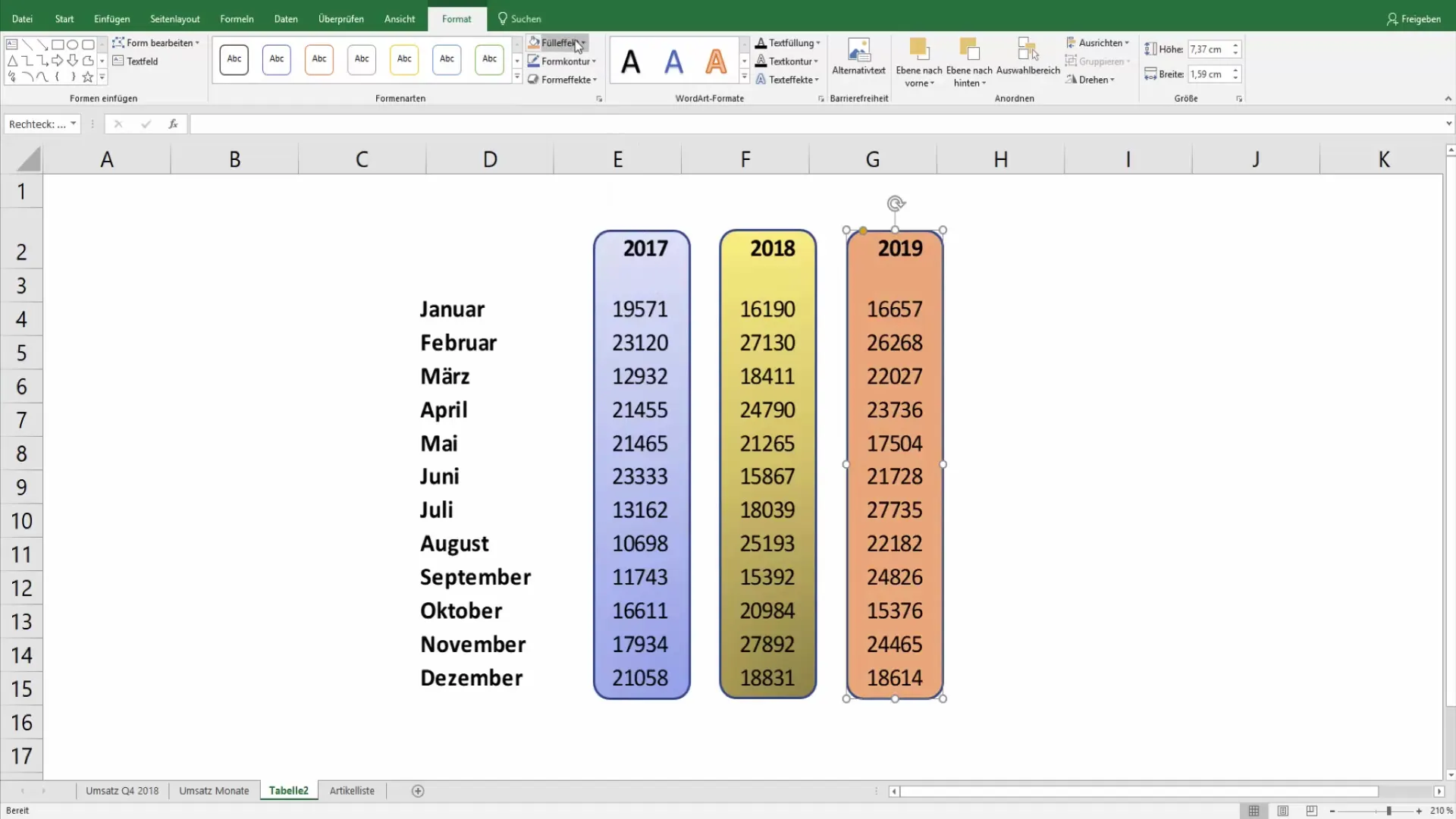
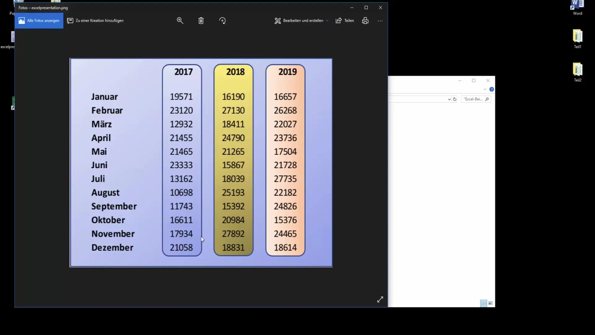
Now comes the fun part: We want to highlight specific data. Add a shape, for example, to highlight the year 2017. Choose the rectangle from the shapes and place it over the year.
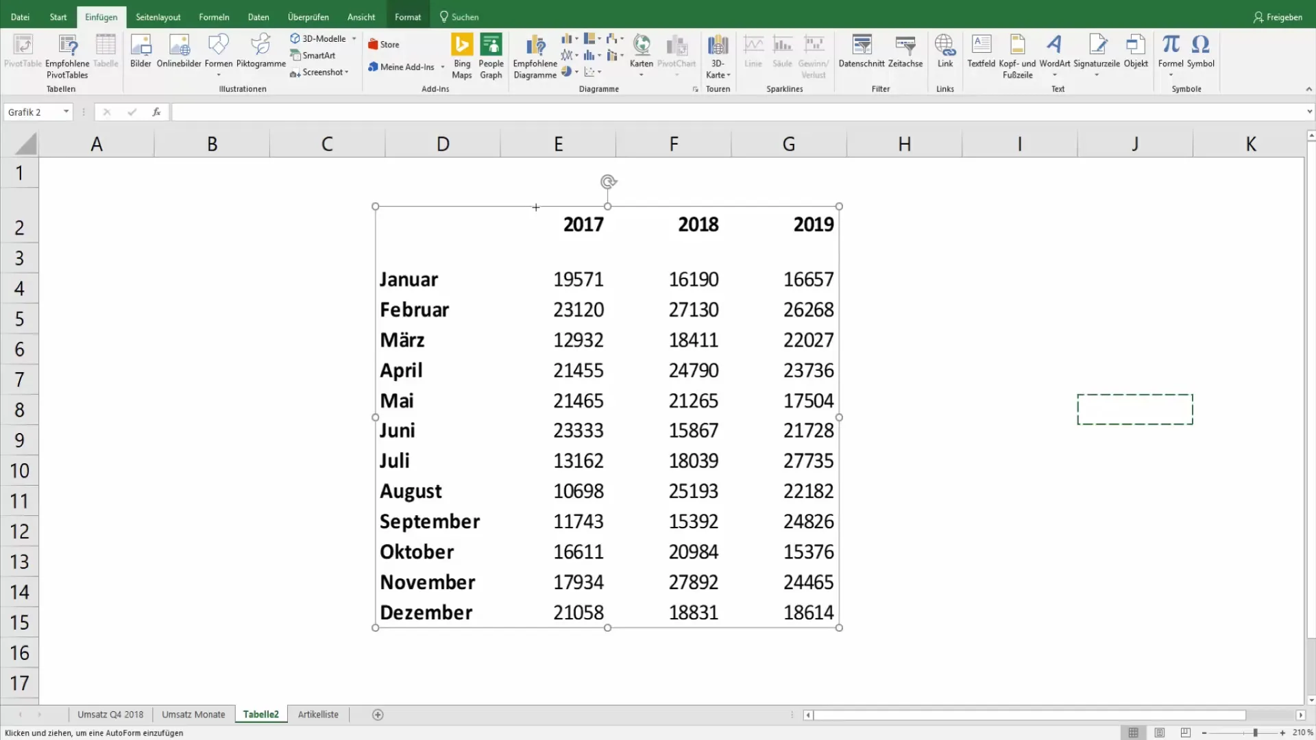
Go to formatting and change the fill effect of the shape. This allows you to try out different color gradients to breathe life into the graphic and make it more appealing.
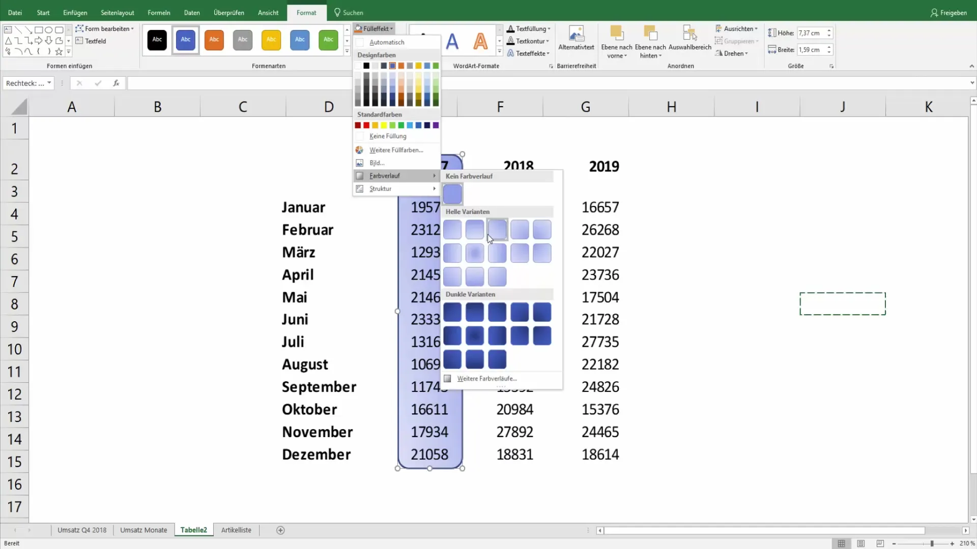
Copying and pasting the shape is easy: Use the shortcuts Ctrl + C and Ctrl + V to highlight multiple time periods or relevant information.
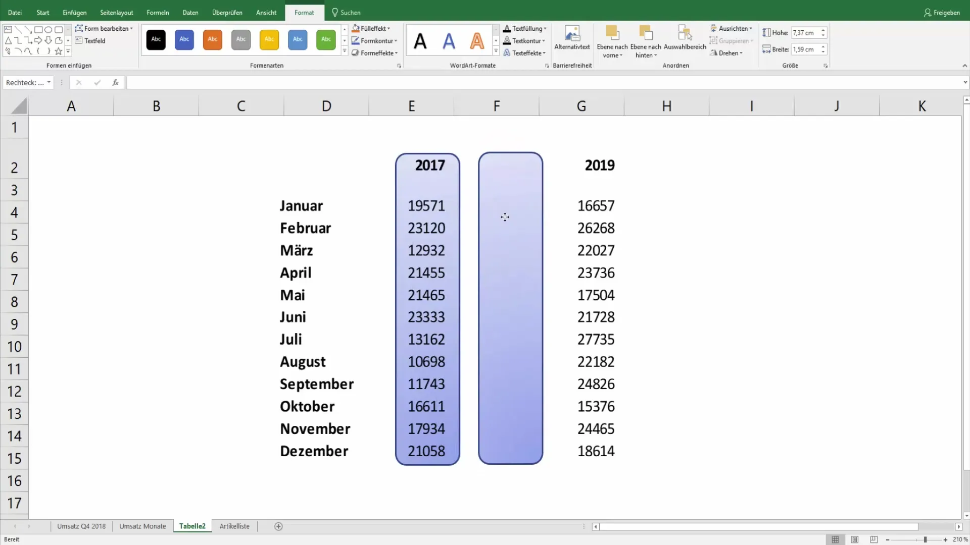
Now customize the color gradient for the following years. Trying out different shades helps create a visually consistent and appealing design.
Adjust and Export Graphics
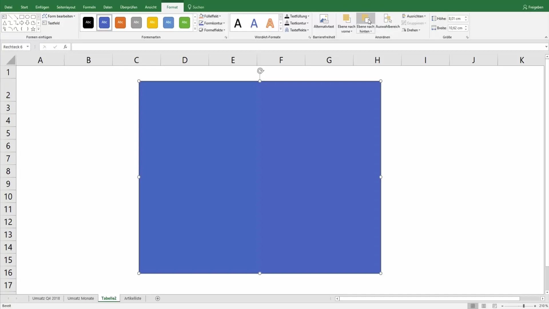
Many designers also use rectangles to cover the entire graphic and design the background. Make sure to bring the desired elements to the correct z-order so that the most important information remains visible.
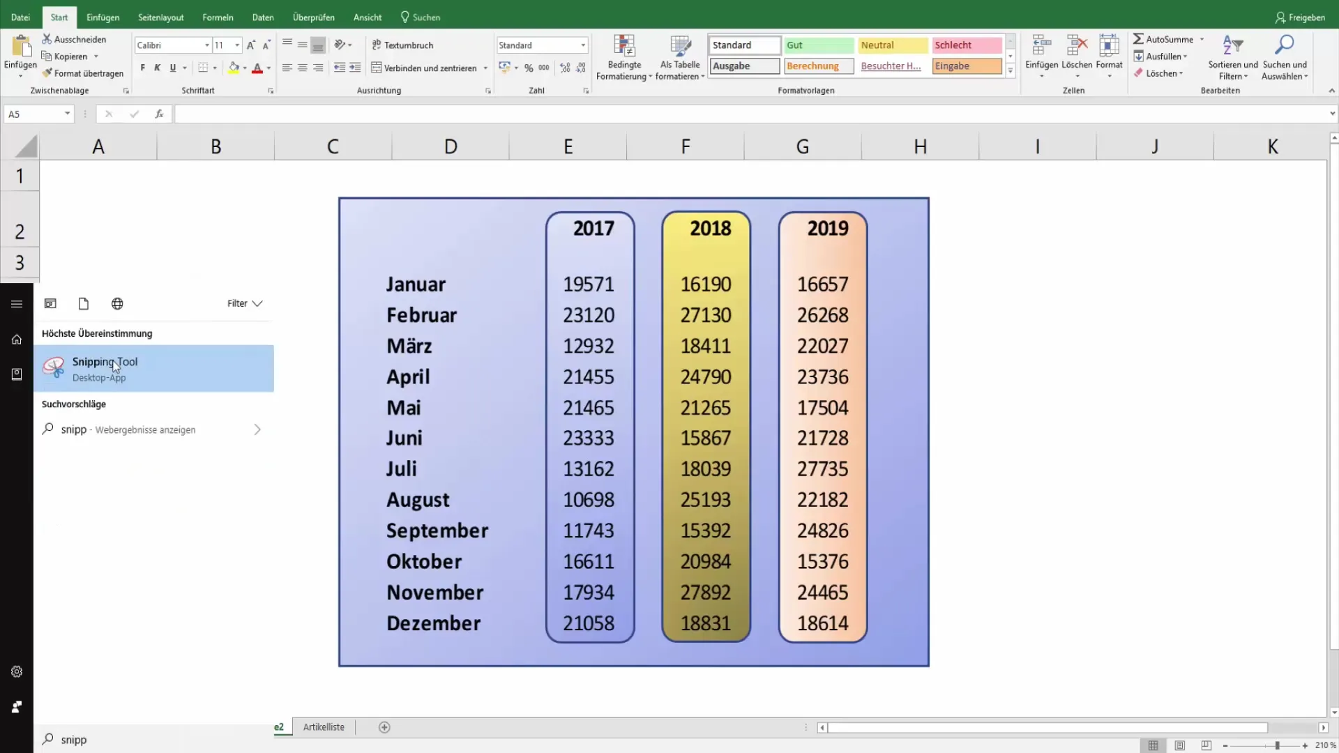
Now you have created an appealing graphic. To use it for PowerPoint, you want to take a screenshot. The best way to do this is with the Windows Snipping Tool. Start the tool, choose "New" and select the area you want.
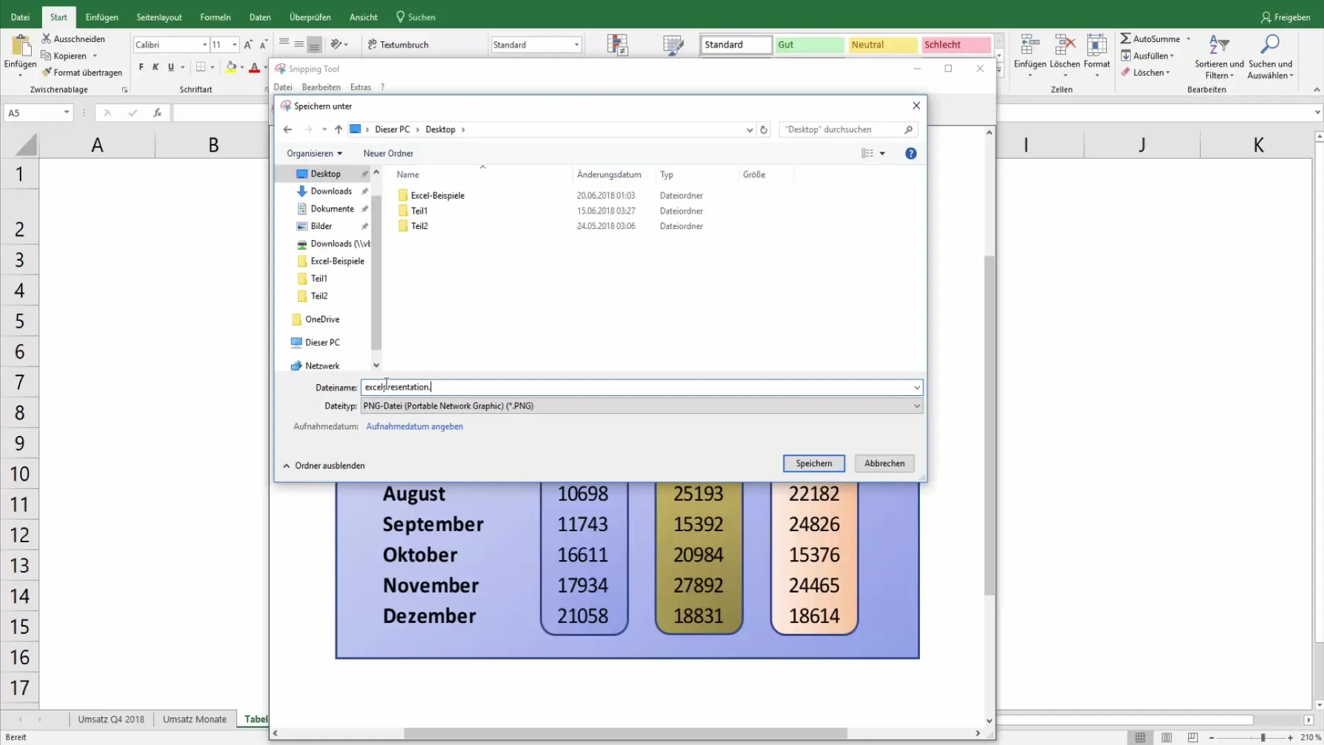
After taking the screenshot, you can save the file with a memorable name, for example, "Excel_Presentation.png".
Now close Excel without saving the changes. Then, review your PNG file. You are now ready to use the graphic in PowerPoint or other graphic programs.
Conclusion and Uses
This is how you use your graphics in presentations to make a strong impression. You can also further edit them in Photoshop to customize them and create transitions.
Summary
With these steps, you can prepare your Excel tables and present them in a creative way. Use the different design options to showcase your data in a new light.
Frequently Asked Questions
How do I hide gridlines in Excel?You can deactivate the gridlines under "View".
Can I insert my table as a graphic in PowerPoint?Yes, copy the table and select "Paste as Picture".
How can I highlight important data?Use shapes like rectangles and adjust the fill colors.
Can I edit graphics in other programs?Yes, you can use the PNG file in graphic programs like Photoshop.
What should I do with the graphic after creating it?Save it and import it into PowerPoint or other documents.


