Pivot tables in Excel are an extremely versatile tool for analyzing and visualizing data. They not only enable a simple summary of information but also provide deeper insights through various calculation methods. In this guide, you will focus on the important settings and calculation options that will help you effectively present your data.
Main Insights
- Pivot tables allow for a flexible arrangement of data.
- Calculations enable insights into different categories and their contributions.
- Field settings offer numerous customization options to optimize data display.
Step-by-Step Guide
1. Create Pivot Table and Adjust Data
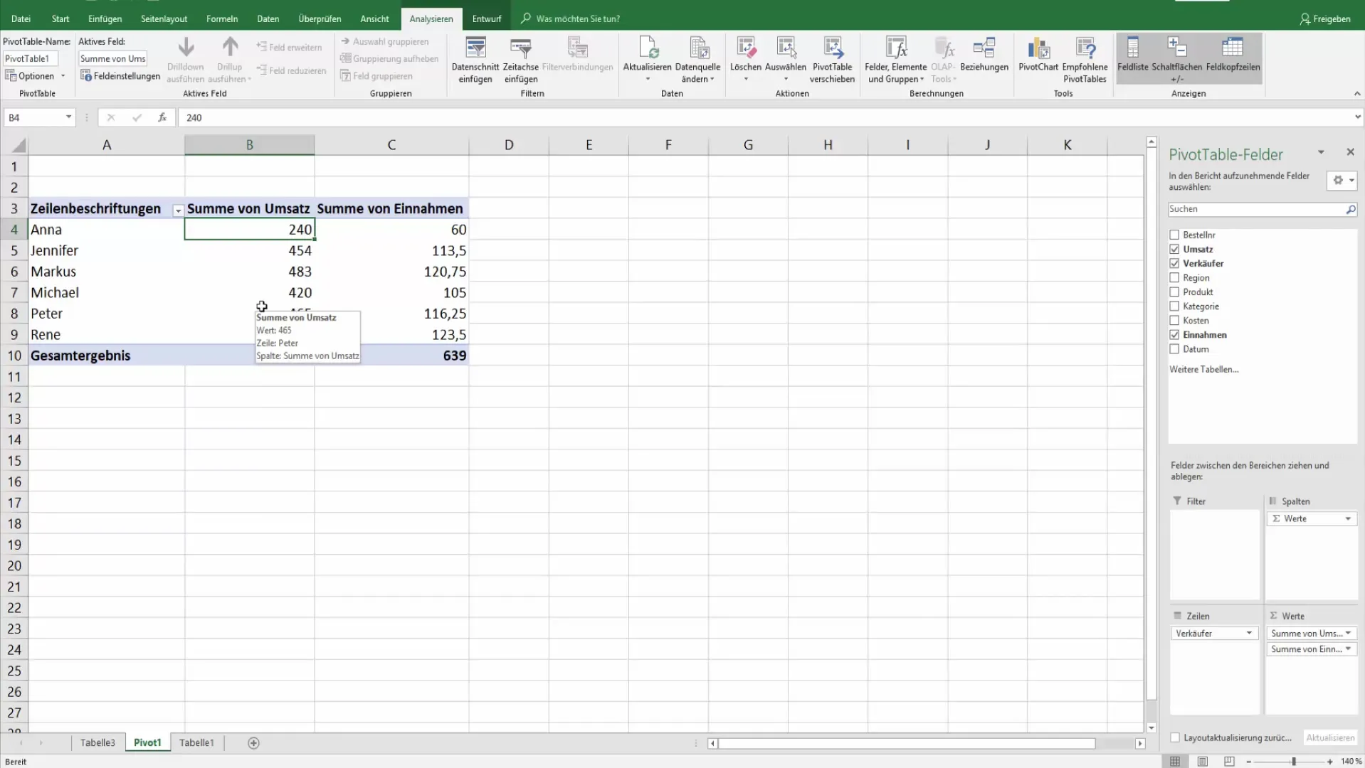
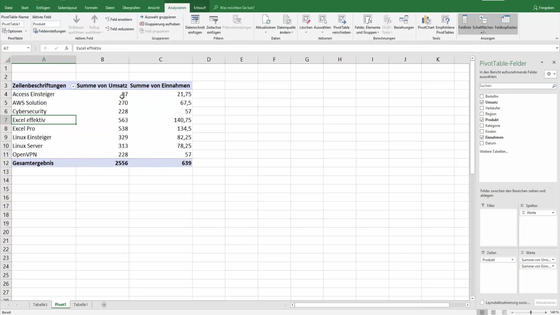
To start your analysis efficiently, first drag the desired product into the rows of the pivot table. At this point, instead of the sellers, you will see the product categories.
This change gives you a new perspective on your data. Now you can easily see how much revenue was generated in the different product categories.
2. Grouping by Super Categories
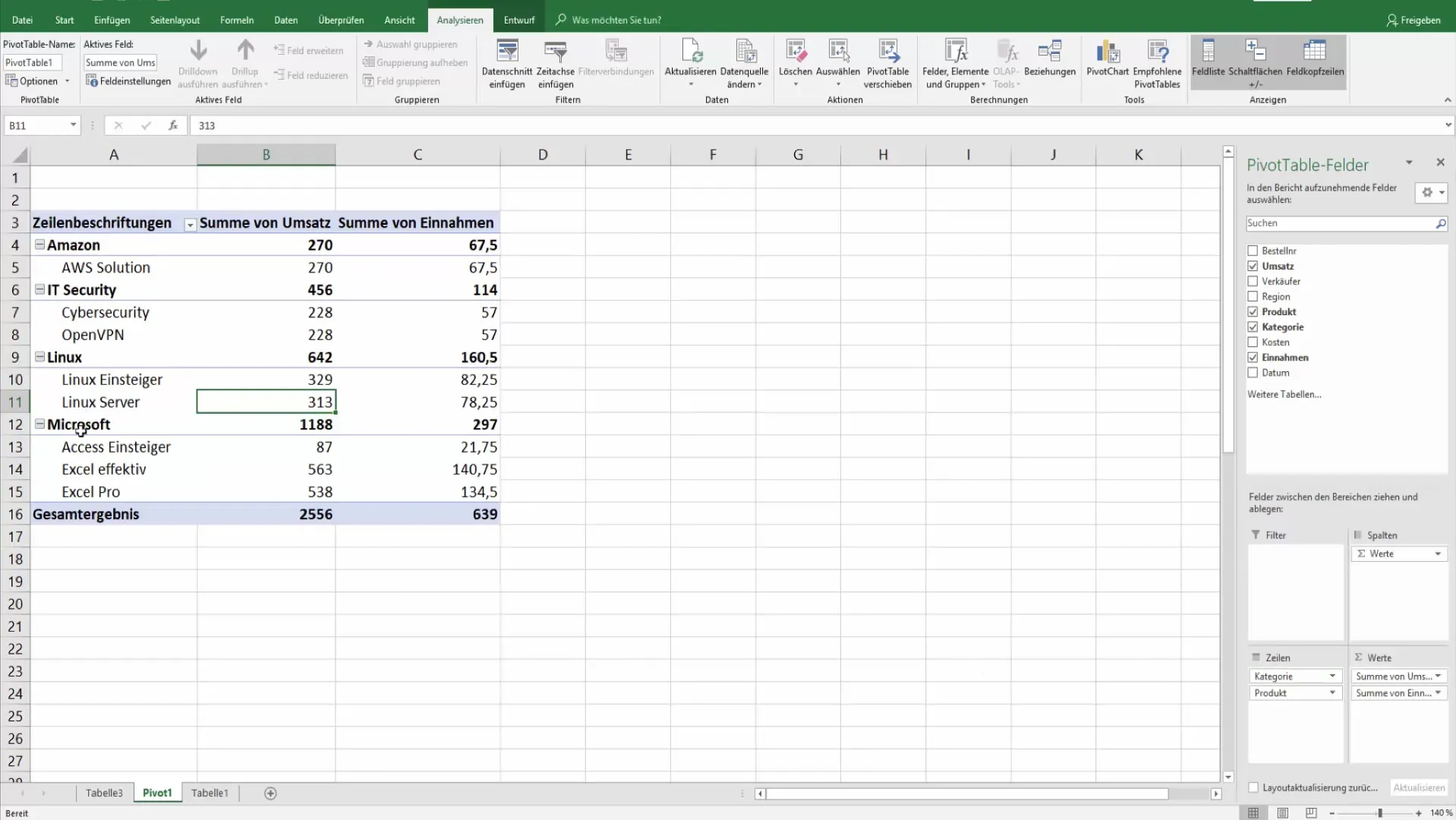
To get an even better overview, additionally add the super category as extra rows. This way, for example, you will see the total revenue per main category.
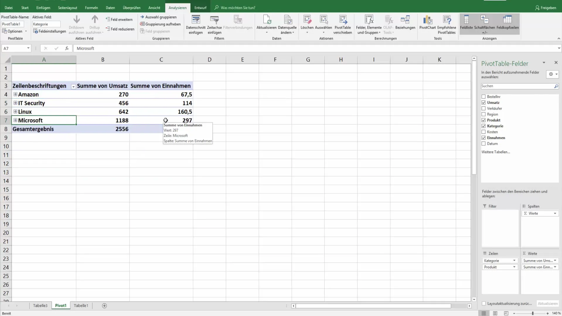
If you want to collapse or expand the categories, you can do so either by a single click or a double click on the respective headers.
3. Formatting Values in the Pivot Table
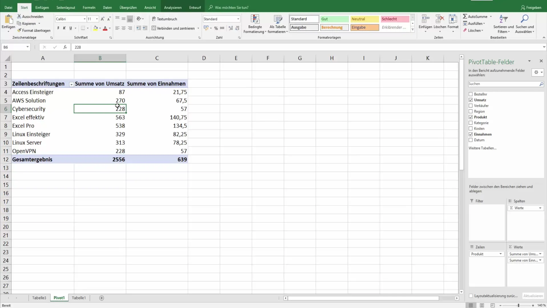
Standard formatting may often not be sufficient to enable precise analyses. Right-click on the pivot table and select the formatting option.
Ensure that these formats apply only to the selected field. To ensure that the formatting is protected from changes, use the Pivot Tools.
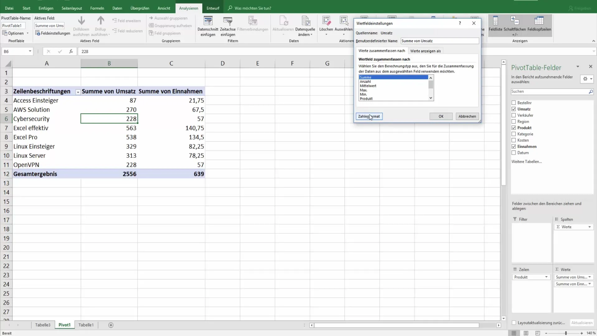
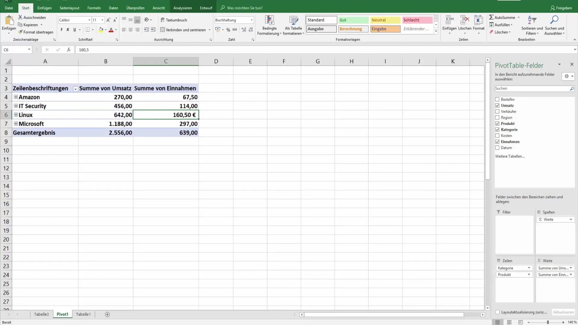
Here, under the "Analyze" tab, you can access field settings to adjust the number format, for example, to two decimal places or with thousand separators.
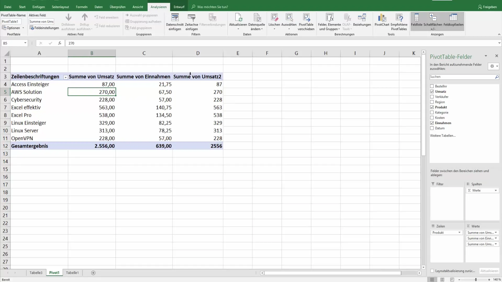
4. Calculating Percentage Shares
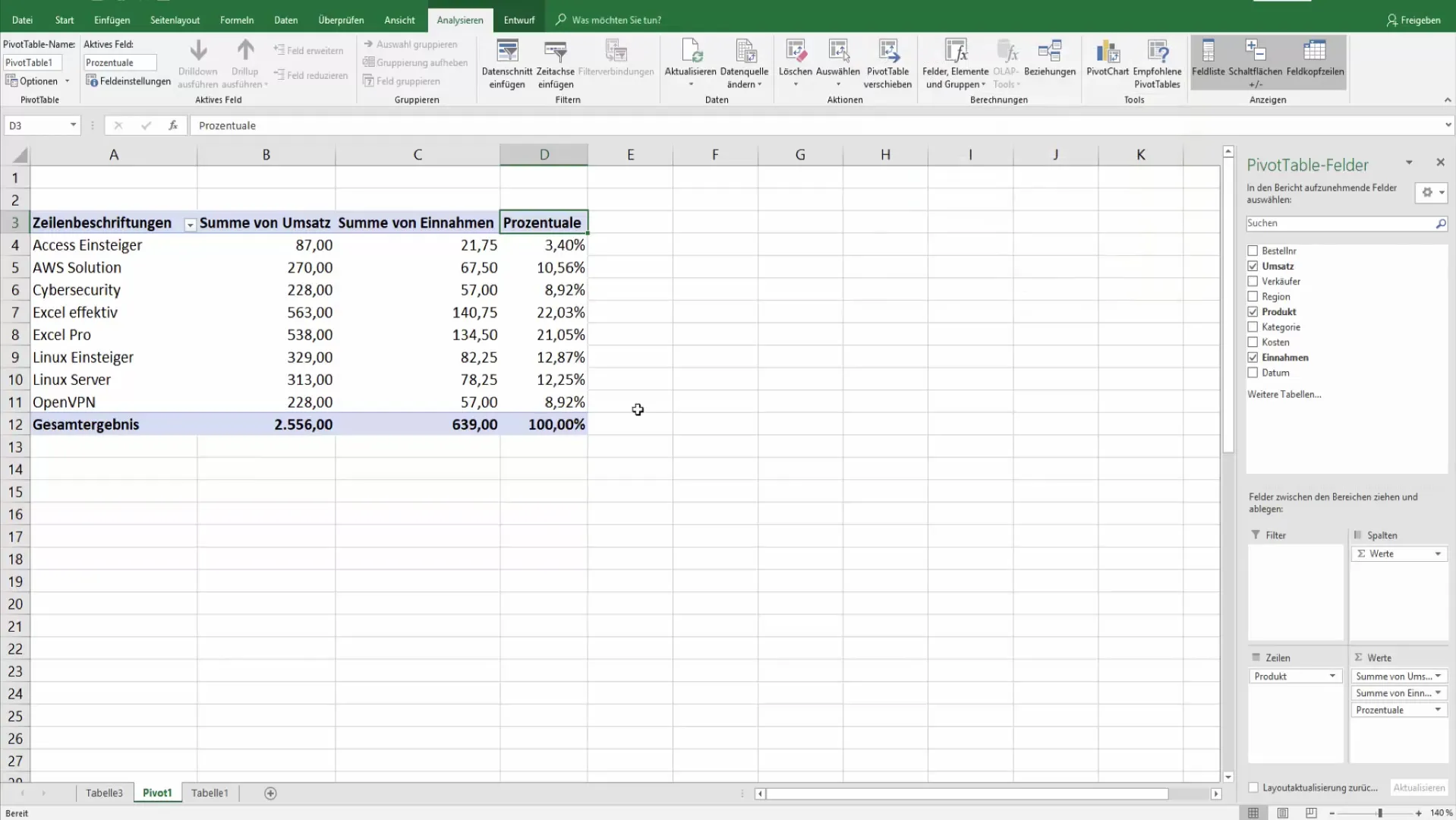
In addition to the sum of revenue, you can also calculate the percentage share. Again, drag revenue into the values table and change the field settings to display the percentage of the total results.
This provides you with a direct view of the weights of individual product categories in comparison to the total revenue.
5. Creating Comparisons Between Categories
Another useful feature is the ability to show differences between categories. By setting it up so that the revenue from one category is used as the base value for calculation, you can easily see how other categories compare.
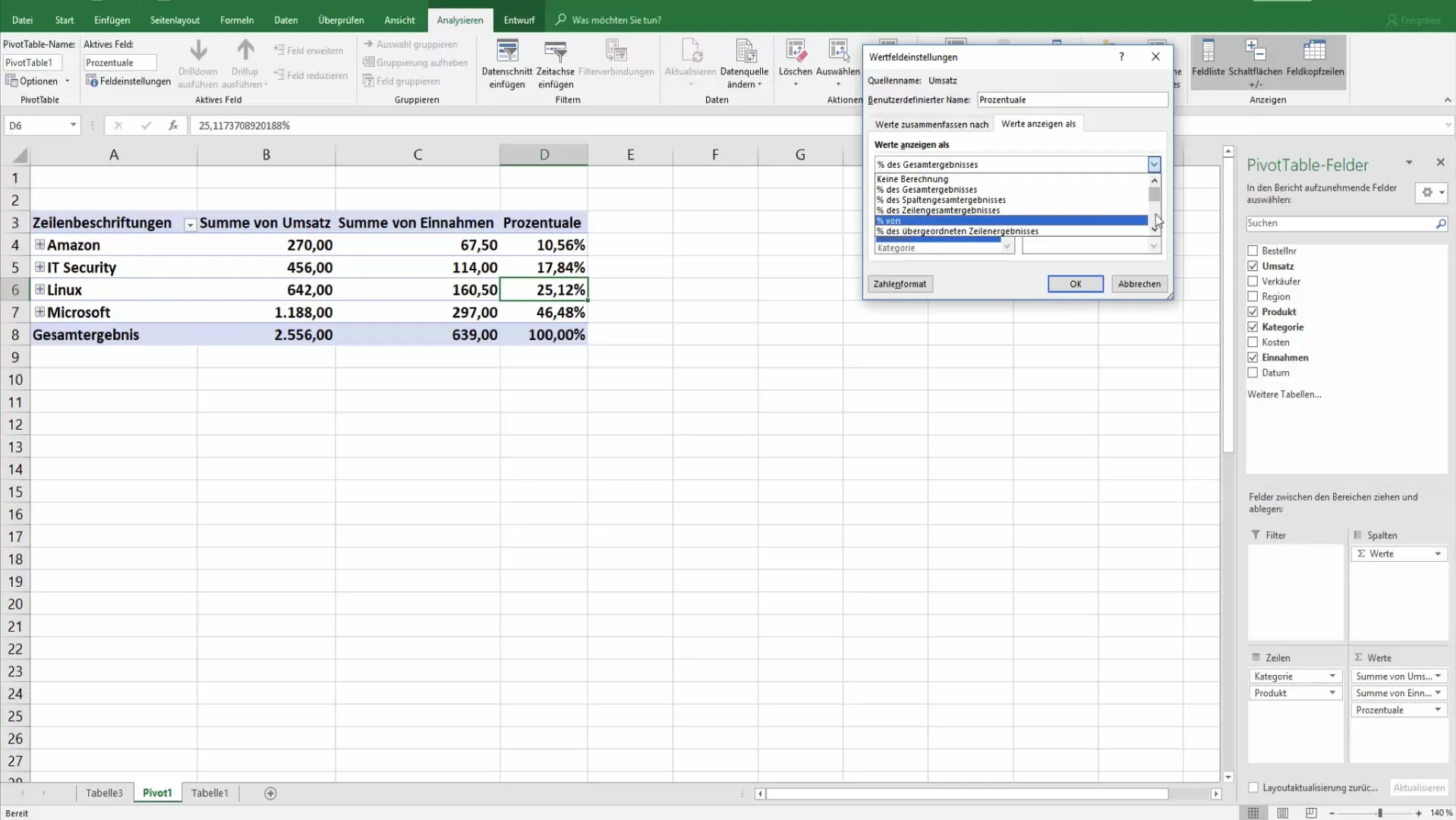
Here, the revenue data is displayed in percentages, significantly simplifying the analysis.
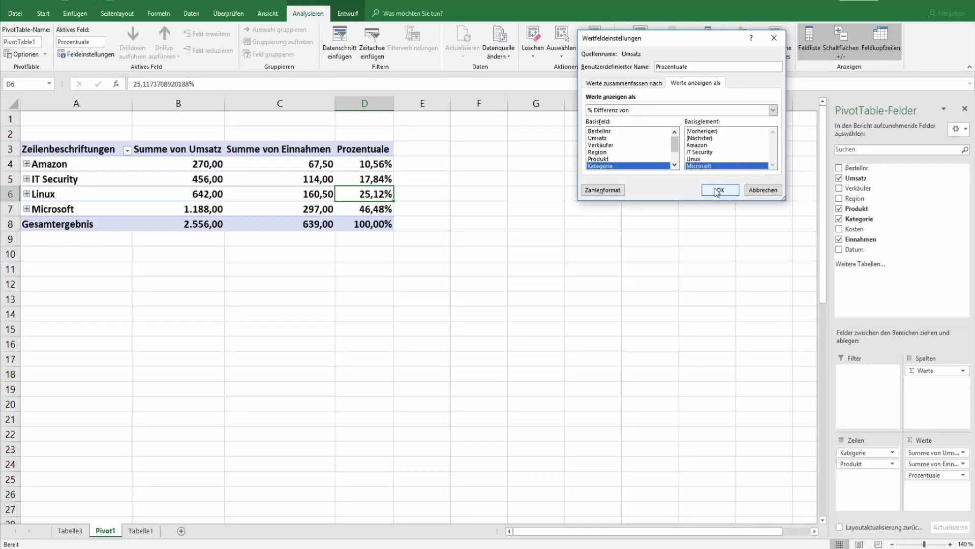
6. Finalizing the Pivot Table
Before using the pivot table definitively, make sure that all value formats and calculations meet your requirements. Check if you still want to make further design adjustments to enhance clarity.

Use the options under the field settings for more detailed adjustments. Here it is crucial that the formatting is consistent to avoid misunderstandings.
Summary
Using pivot tables in Excel offers you countless possibilities to customize your data and conduct in-depth analyses. With targeted preparation and thoughtful calculation methods, you can gain effective insights into your data.
Frequently Asked Questions
What is a pivot table?A pivot table is an interactive Excel tool that allows you to summarize and analyze data.
How can I group data in a pivot table?Drag the desired categories or product groups into the rows or columns fields of your pivot table.
How do I change the number format in a pivot table?Select the cell, right-click and go to "Field Settings" where you can adjust the number format.
Can I insert percentages in a pivot table?Yes, drag the field you want to calculate the percentage for into the values and select the field settings to change the display to percentage.
How do I make comparisons between different categories?Add the categories as data fields in your pivot table and choose the appropriate field settings to calculate the differences.


