You want to present your data in Excel in an appealing way while keeping track of them? Pivot Charts are an excellent tool for visually representing complex data structures. In this guide, you will learn step-by-step how to create effective charts from a pivot table, so that your presentations not only contain informative but also visually appealing elements.
Main Insights
- Pivot Charts allow for a clear presentation of data.
- There are different chart types for various data visualizations.
- The data in the charts dynamically adjust to filter changes.
- You can customize the chart design individually.
Step-by-Step Guide
1. Preparing the Pivot Table
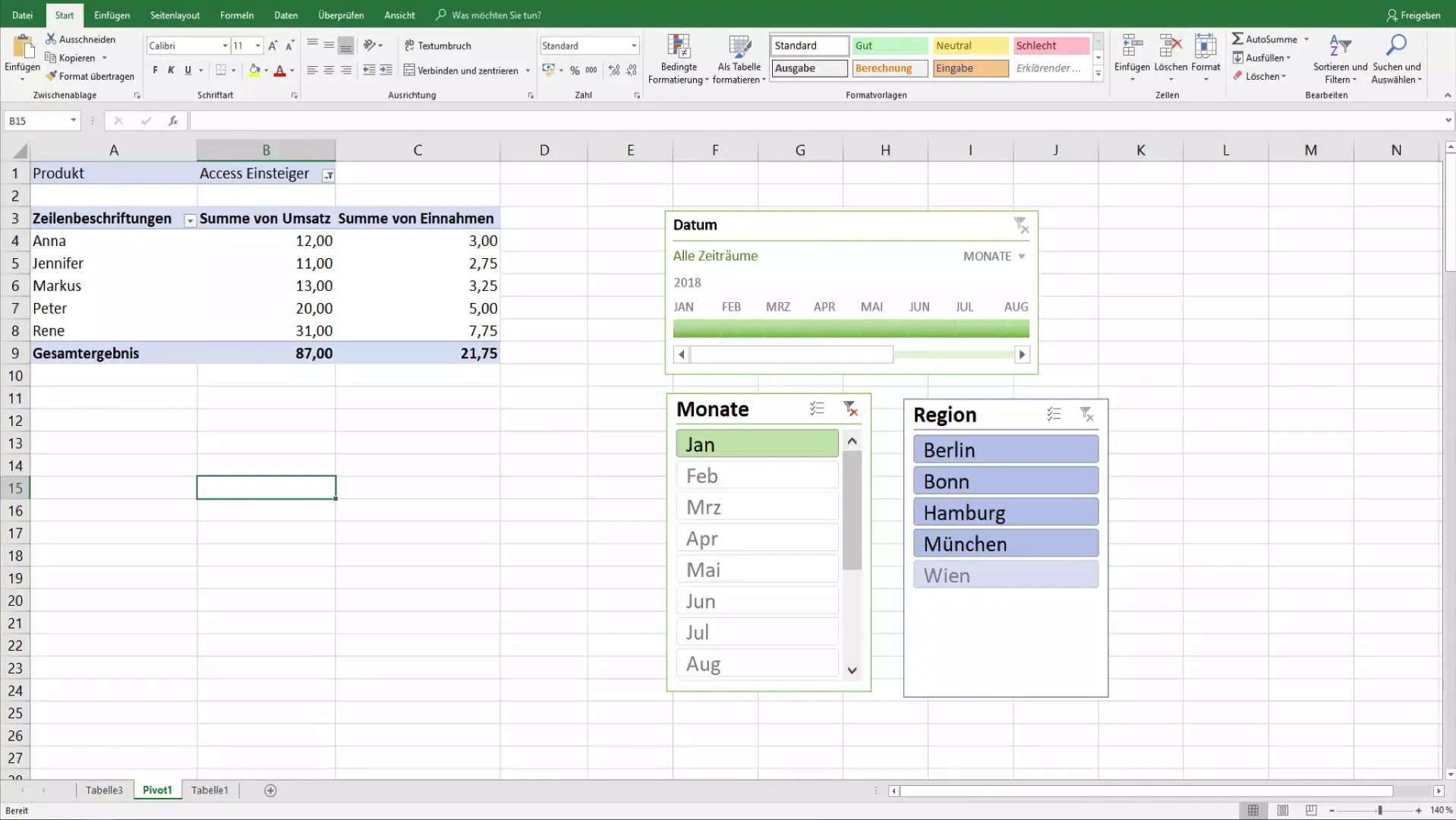
Before you start creating pivot charts, you first ensure the cleanliness of your data. I have cleared the filter rules in the pivot table and also removed the top filter to start with a clear overview.
2. Accessing the Pivot Chart Function
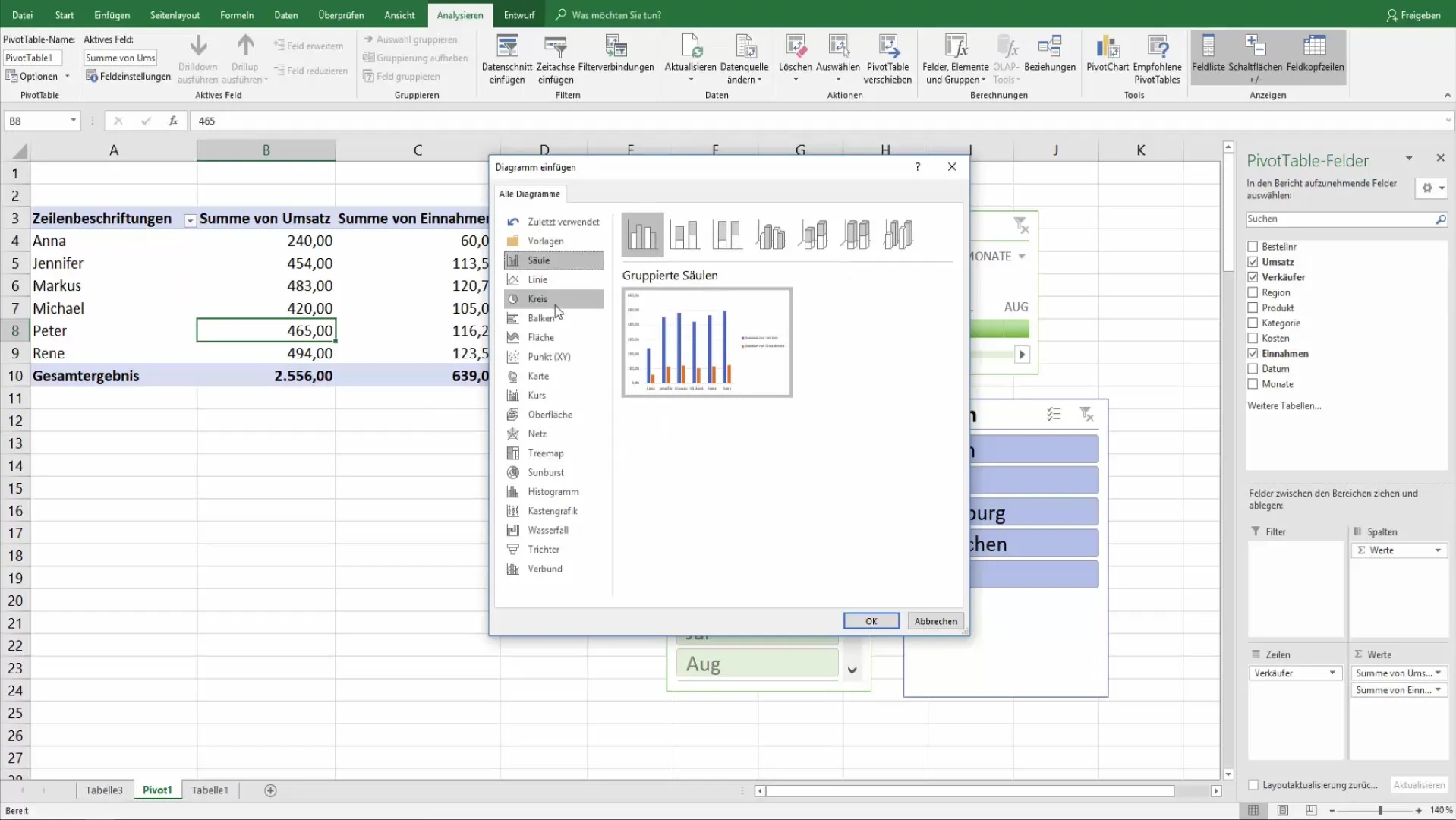
Navigate to the analyzed pivot table and click on the "Analyze" tab under the Pivot Table Tools. Here you will find the option to insert a pivot chart.
3. Selecting the Chart Type
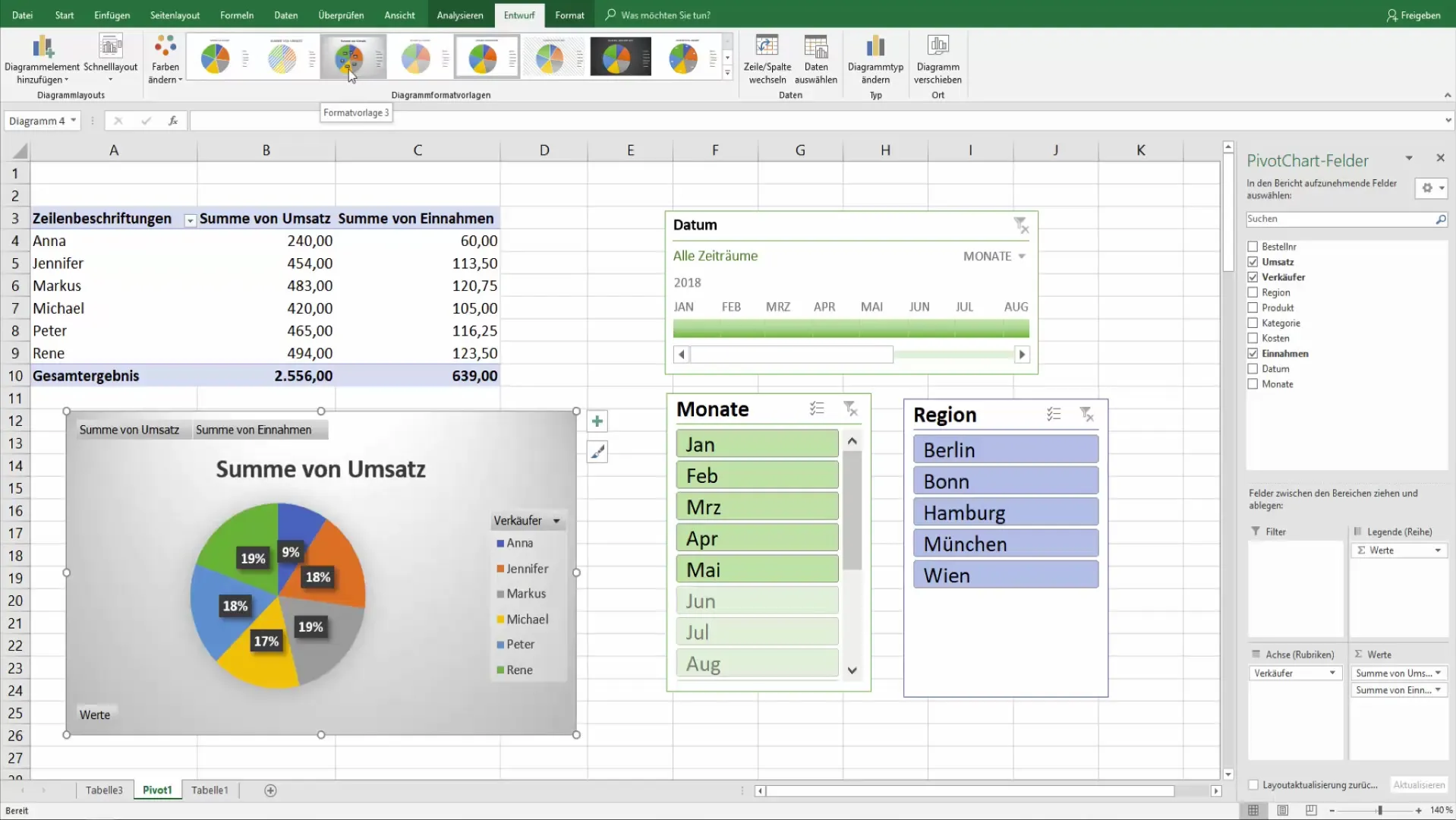
Among the available chart types, you have the choice between different styles such as column charts or pie charts. I recommend using pie charts or 2D charts as they often provide a better visual representation.
4. Customizing the Chart
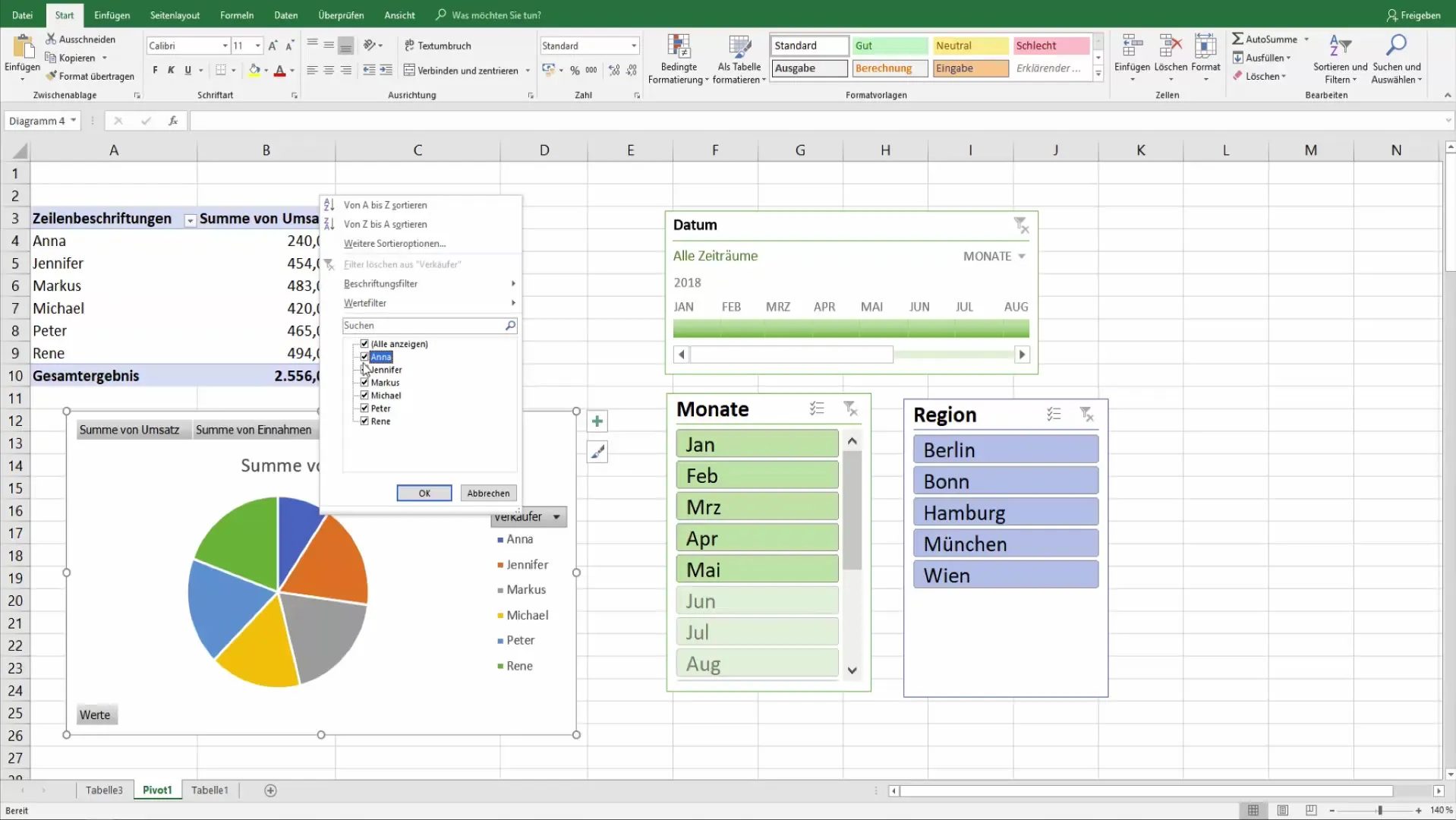
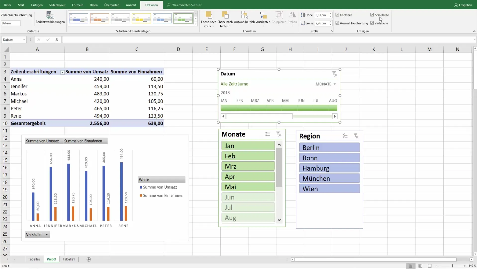
Your pivot chart will now be automatically created. In the right corner, you can select the sellers and remove some if necessary. These changes immediately affect the graphical representation, allowing you to visualize the data clearly.
5. Specifying Filter Settings
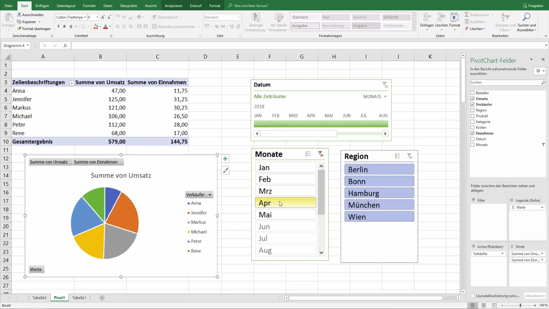
By clicking on the "Filter" option, you can display specific areas of the data. For example, if you want to focus on sales figures for only a specific month, the charts will update immediately, allowing you to make a direct visual evaluation.
6. Changing Chart Templates
The Pivot Chart Tools provide you with various templates that you can use to improve the visual representation of your data. There is also an option to display labels to clearly communicate valuable information.
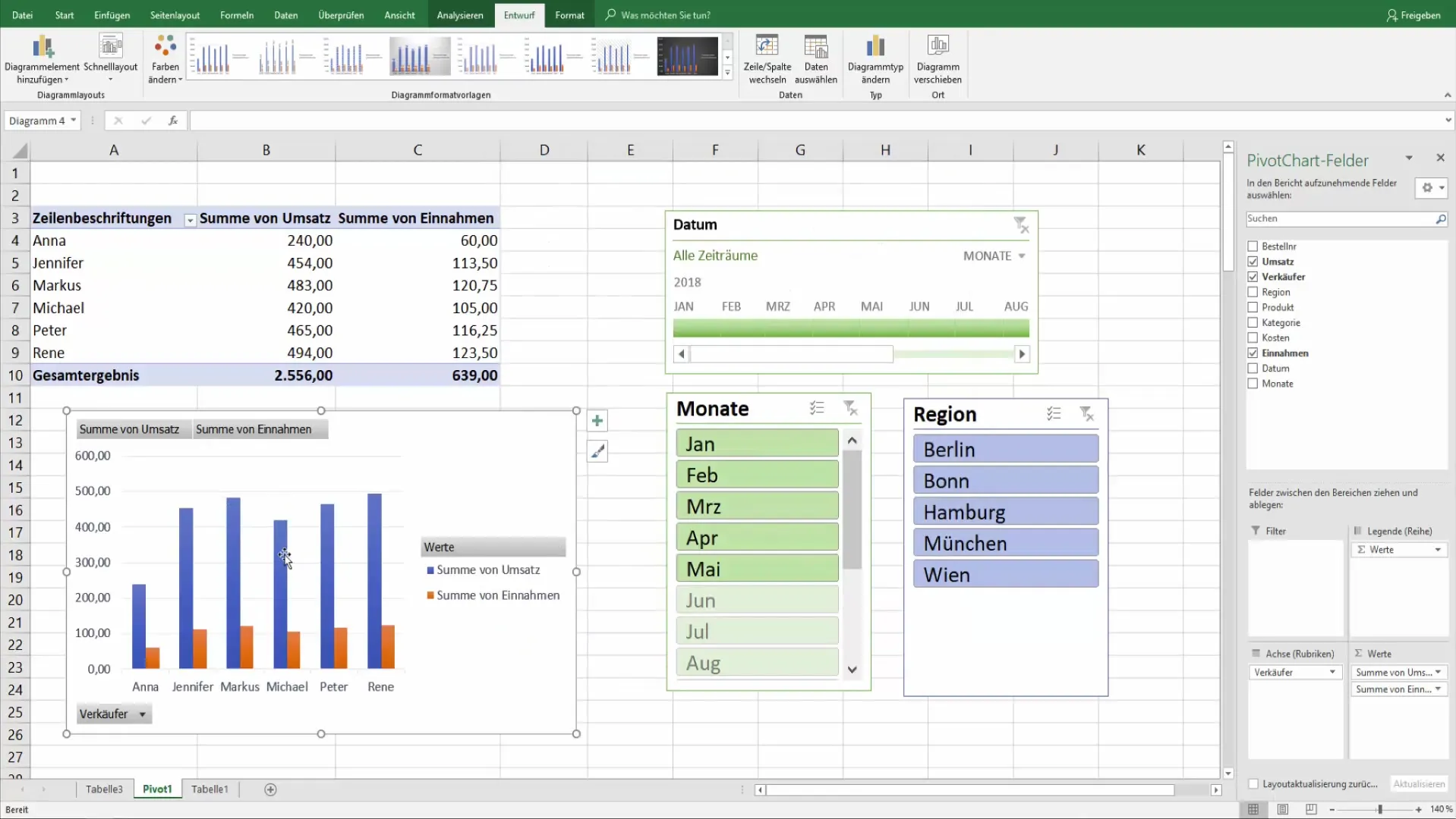
7. Changing Chart Type
To customize the chart, you can change the type at any time, for example, to a column chart. This flexibility is particularly useful when you want to visualize the same data from different perspectives.
8. Adjusting Titles and Formatting
Click on "Chart 4" in the Analysis tab to adjust the title or the chart settings, such as colors and legends. Here you have the opportunity to customize your chart according to your preferences.
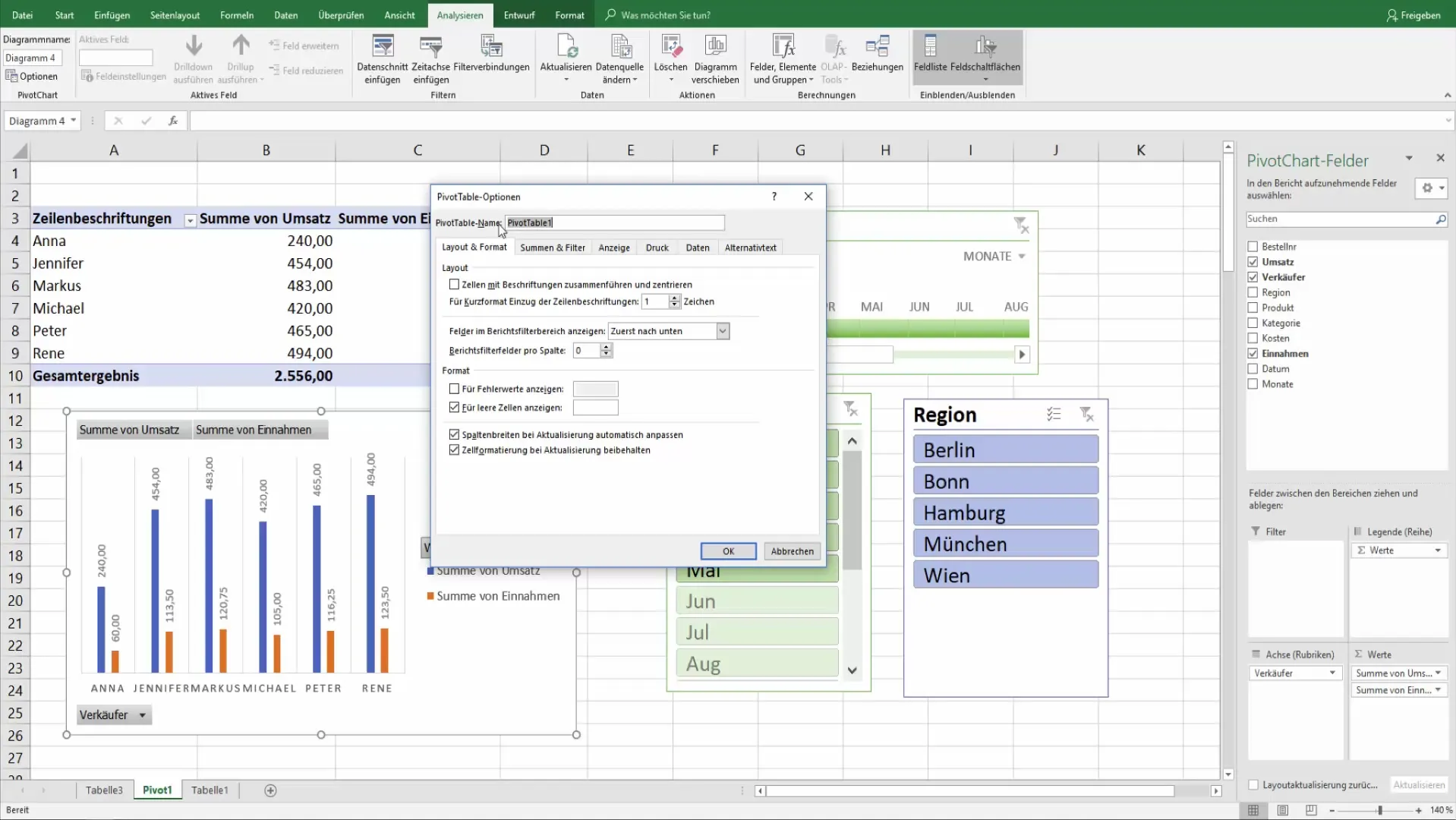
9. Managing Field Buttons
If you want to prepare your pivot chart for printing or presentations, it may be useful to hide the field buttons. This contributes to clarity and a more professional appearance.
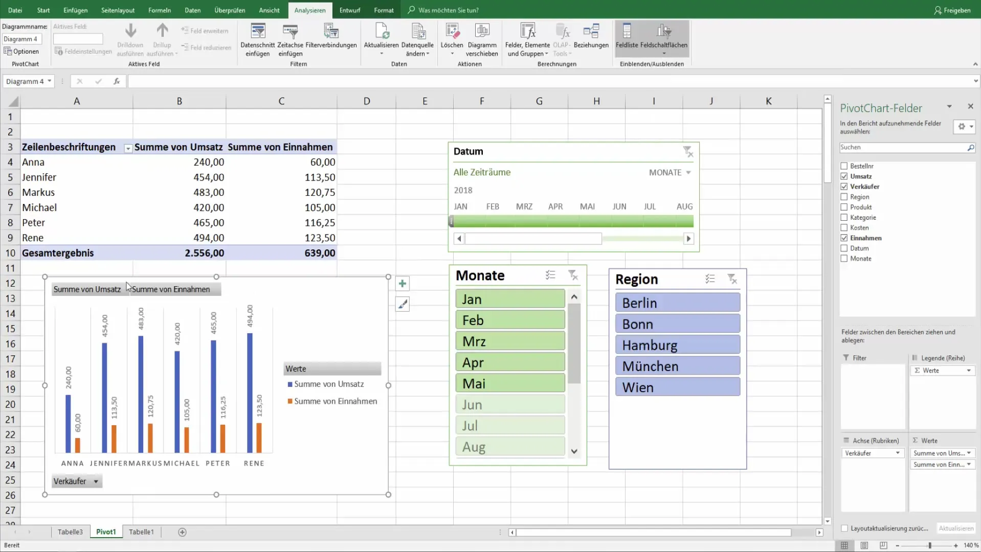
10. Final Adjustments
Make sure all desired information is included in the chart and make any final adjustments if necessary. Click on "Analyze" to change the buttons or add information that fits your dataset.
Summary
With these steps, you can create effective and visually appealing pivot diagrams that enhance your data in Excel. This visual representation allows you to quickly grasp the essential information at a glance, which is beneficial not only for yourself but also for your superiors and colleagues.
Frequently Asked Questions
How do I add a pivot diagram?Go to your pivot table, click on "Analyze," and select "Insert Pivot Chart."
Can I change the diagram type after creating it?Yes, you can always adjust the diagram type through the "Analyze" tab.
How can I optimize the display for printing?Hide the field buttons through the Analysis options and customize the diagram format.
What are the best types of diagrams for pivot charts?Pie charts and bar charts are often the most effective for data visualization.
How can I apply filters to my diagram?Use the filter options in the pivot table, and the diagrams will adjust automatically.


