Statistics and their applications are of central importance for many professional fields. In this text guide, you will learn how to perform basic statistical analyses using Excel, based on a specific case study from an E-commerce webshop. An exciting journey through the world of descriptive and inductive statistics awaits you.
Main Insights
- Using Pivot Tables for multidimensional data analysis.
- Calculating correlation analyses and rank correlations.
- Performing regression and outlier detection.
- Analysis of time series and their visualization.
- Statistical hypothesis tests and confidence intervals.
Step-by-Step Guide
1. Introduction to the Case Study
Before you start the analysis, it is important to understand the context. In this case, we are using a dataset of over 500 surveys from an E-commerce webshop. 13 features were recorded in various scales - nominal, ordinal, and metric. This diversity allows for a comprehensive analysis.
2. Data Preparation in Excel
Open Excel and load the provided dataset. Make sure that the data is correctly formatted. Identify and address any missing values to not compromise the quality of your analyses.
3. Creating a Pivot Table
Start by using a Pivot Table to get an overview of your data. Pivot Tables are a powerful tool to aggregate and analyze large data sets. Go to "Insert" and select "Pivot Table". Arrange the features accordingly to identify relevant relationships.
4. Performing the Correlation Analysis
In the next step, calculate the correlation coefficients to examine the relationships between different features. Use the "=CORREL()" function in Excel to create a correlation matrix showing you which features correlate with each other.
5. Spearman's Rank Correlation
To calculate the rank correlation, you can use the "=RANK.EQ()" function. This method is particularly useful when you want to investigate non-linear relationships between variables. It is important to get a clear overview here as well.
6. Analyzing Regression
To make predictions, you could perform a regression analysis. This is offered in Excel under "Data Analysis". Here you can set up a linear regression and select the relevant data.
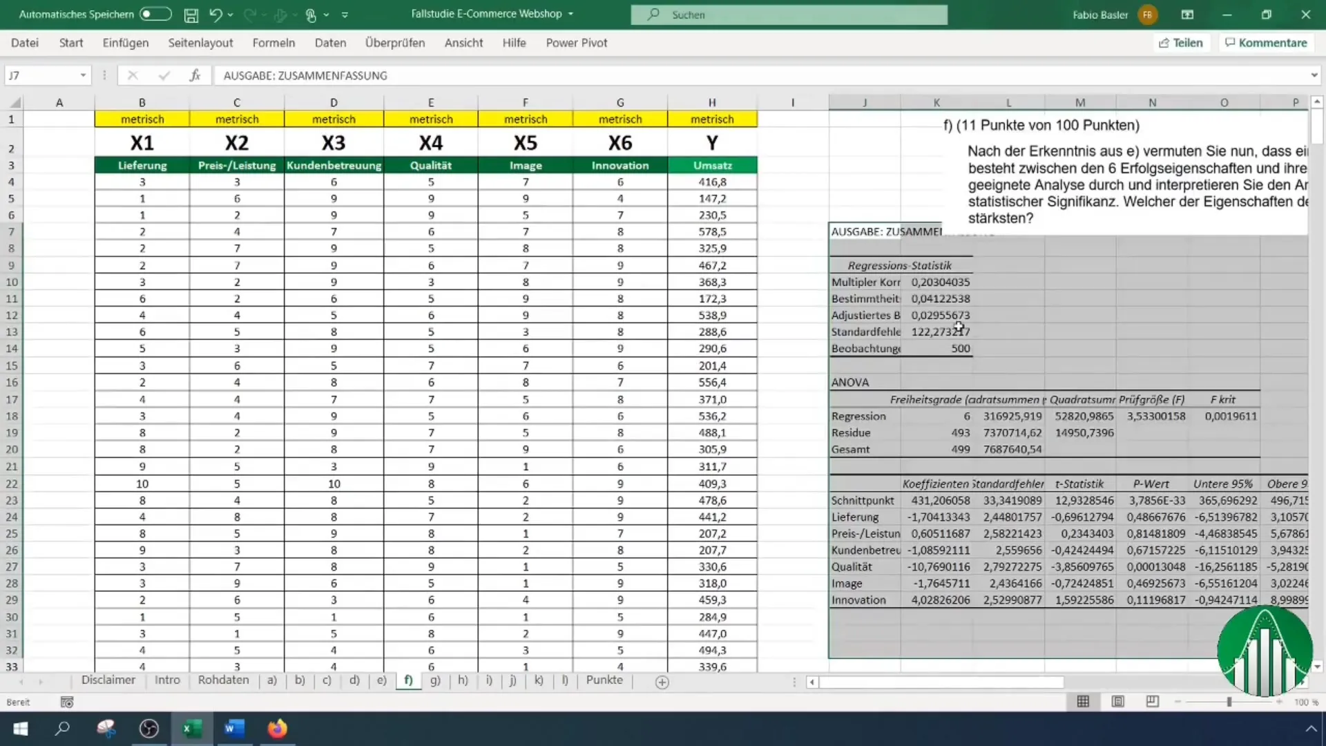
7. Visualizing Boxplot
The Boxplot is an excellent method for visualizing data distributions. You can create it in Excel to quickly identify outliers and develop a better understanding of your data distribution.
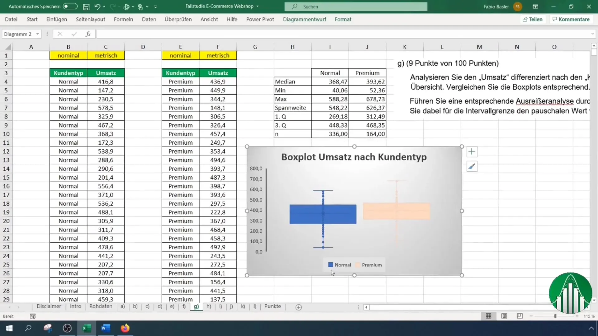
8. Performing Outlier Detection
Outlier Detection helps you identify anomalies in your dataset. Analyze your data again after removing potential outliers to increase the accuracy of your analyses. Excel provides various functions to identify outliers.
9. Time Series Analysis and Trend Forecast
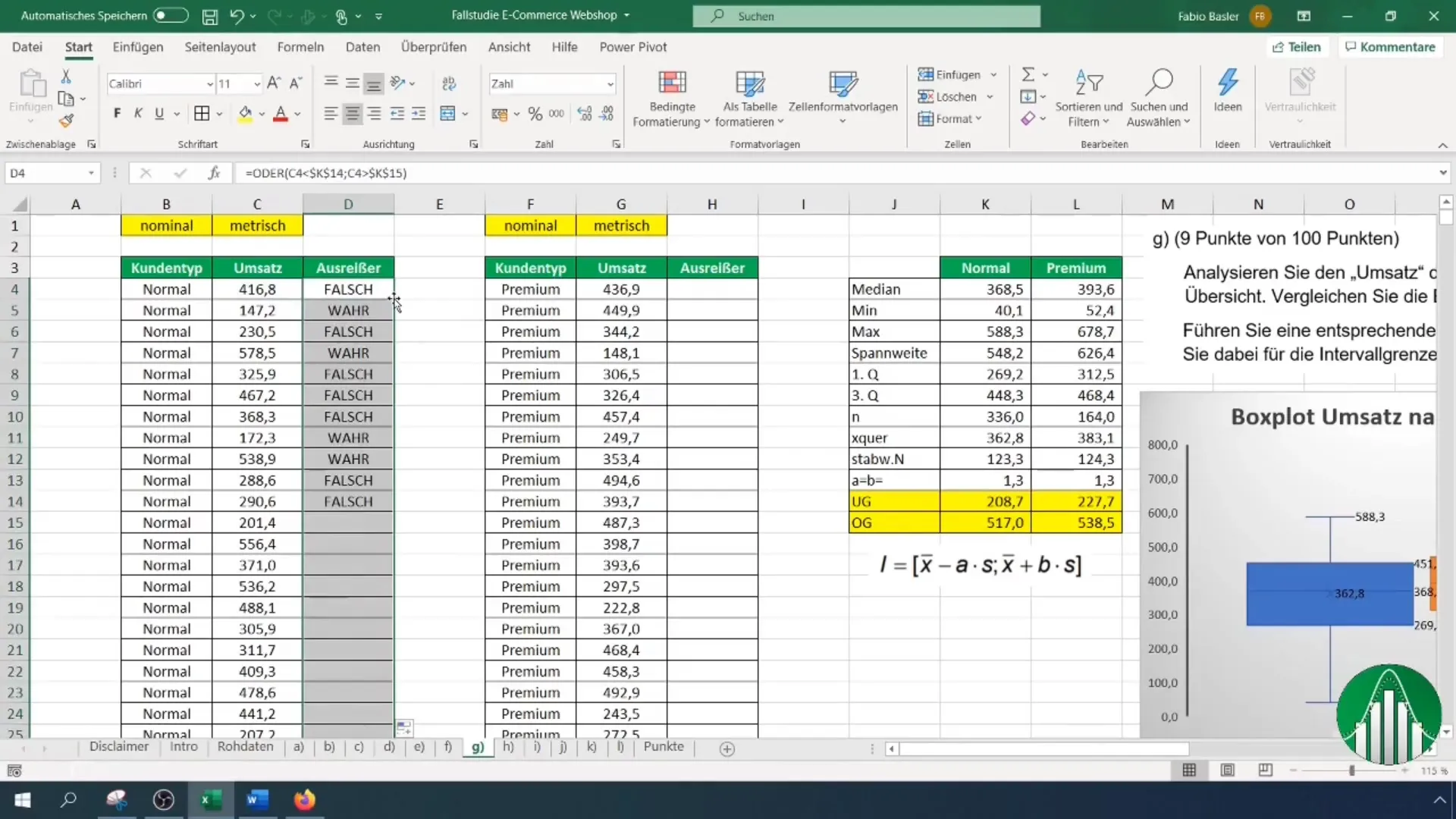
Time series analysis is used to identify trends over a specific period. Visualize the time series in Excel and add a trendline to predict future developments.
10. Calculating Stochastics and Probabilities
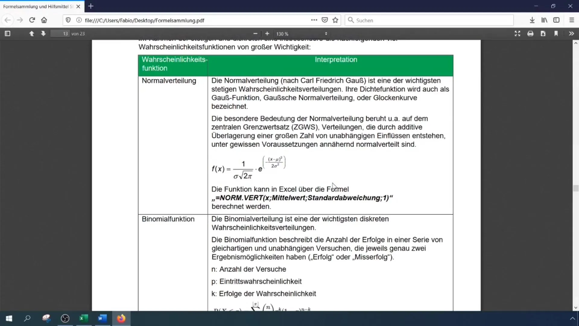
In the next step, you should look into probability theory. In Excel, you can easily calculate probabilities of the normal distribution. Use functions like "=NORM.DIST()" and "=POISSON()" to determine relevant probabilities.
11. Statistical Hypothesis Tests
Perform statistical hypothesis tests, especially to check the proportion value. Excel provides suitable tools to help you confirm or reject the hypotheses.
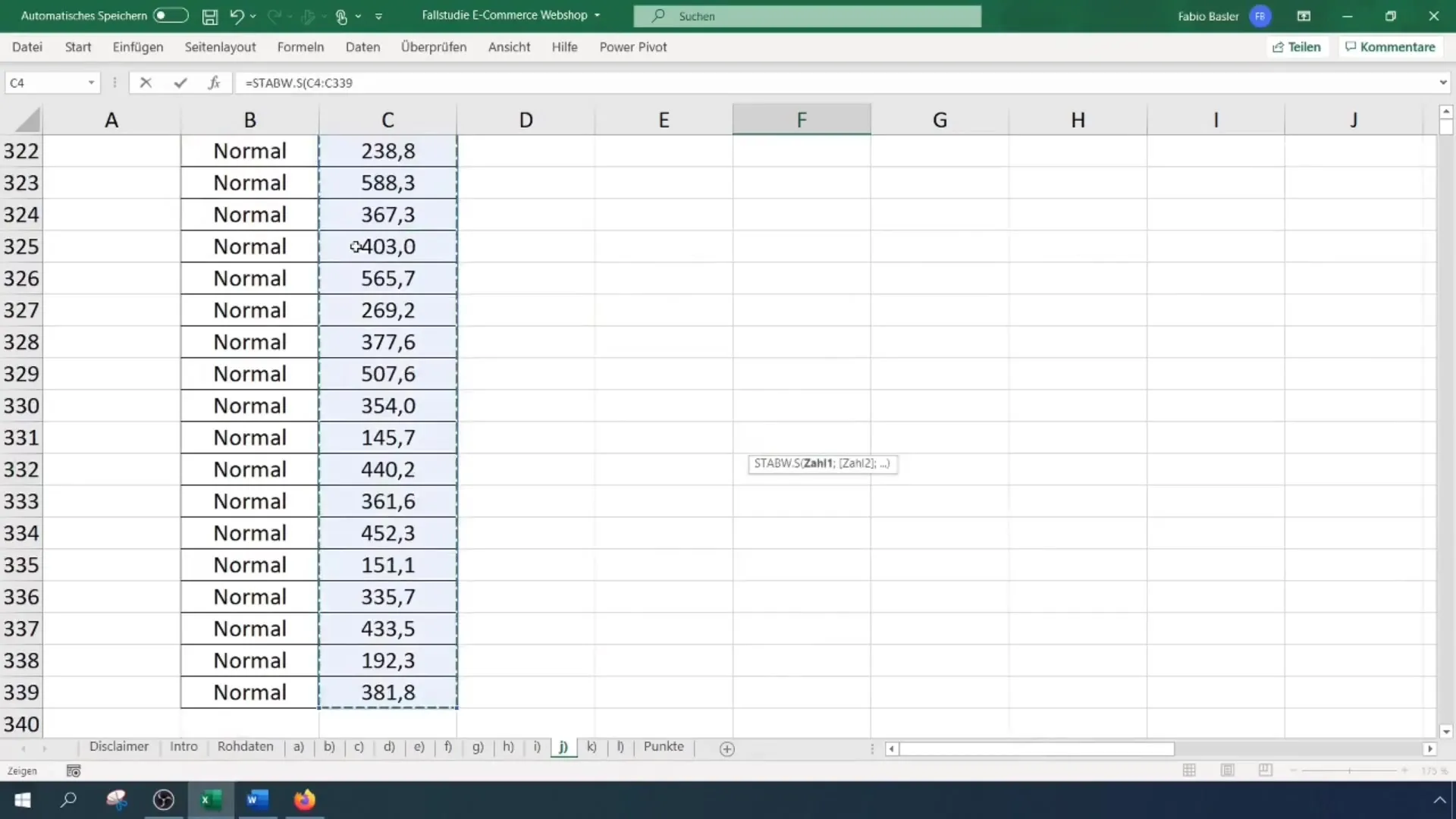
12. Creating a two-sided confidence interval
Finally, you calculate a two-sided confidence interval to quantify the uncertainty of the estimates. Excel allows you to calculate the confidence interval using functions.

Summary
In this tutorial, you have learned how to perform a comprehensive statistical analysis based on survey data using Excel. From creating pivot tables to conducting regressions to calculating probabilities and confidence intervals – you have learned the basics to help you effectively analyze data.
Frequently Asked Questions
How do I create a pivot table in Excel?Go to "Insert" and select "PivotTable". Choose the data you want to aggregate and arrange it accordingly.
What is the difference between descriptive and inductive statistics?Descriptive statistics describe and summarize data, while inductive statistics draws conclusions from a sample to a population.
How can I perform a regression using Excel?Use the "Data Analysis" function and select the option for linear regression. Choose the appropriate data sets for analysis.

