The analysis of survey data is one of the most important tasks in the field of data analysis. Especially through the use of pivot tables in Excel, you can make this analysis clear and organized. In this guide, we will show you how to create multidimensional pivot tables and what calculations you can perform to extract valuable metrics from your survey data.
Key Insights
- Calculating the average of survey responses by customer type and country.
- Determining the relative fluctuation of responses, especially regarding innovation ratings.
- Efficient use of pivot tables for displaying and analyzing survey data.
Step-by-Step Guide
Step 1: Create Pivot Table
First, you need to create the pivot table in Excel. Go to the menu bar and select "Insert". Then click on the option for pivot tables. A dialog box will open where you can choose the data source. In this case, select the relevant range of your survey data.

Insert the pivot table into an existing worksheet and select the specific range where you want to store your data.

Step 2: Calculate Average Values
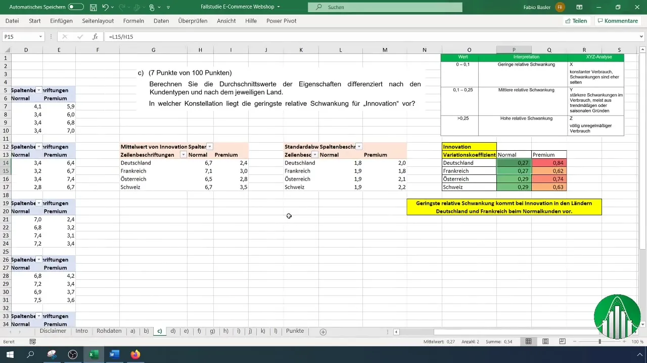
Next, we begin calculating the average values. Drag the first metric, for example, "Delivery," into the value field of the pivot table. Make sure to change the calculation from "Sum" to "Average."
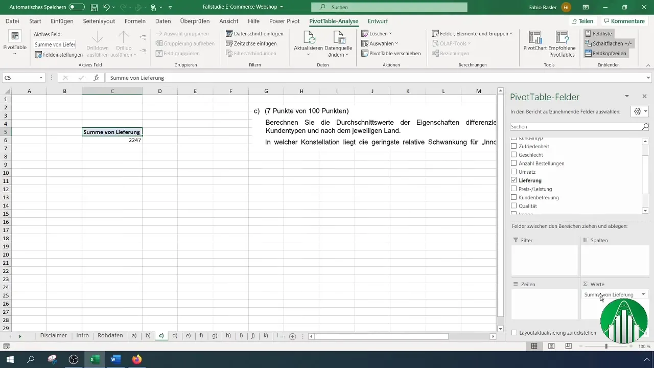
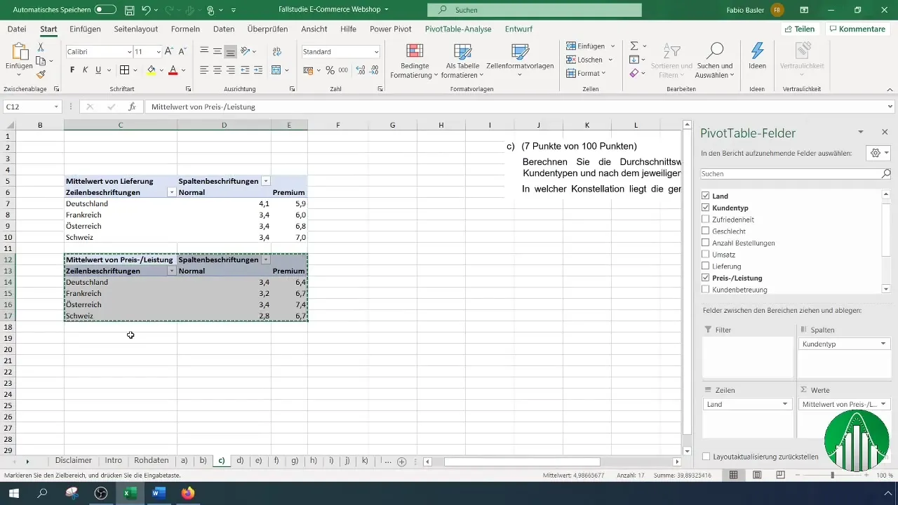
Now you have calculated the average values for Delivery by customer types and countries. Repeat this process for all six features of your survey.
Step 3: Add More Metrics
To calculate more metrics, copy the pivot table you have already created and paste it below. Then sequentially change the metrics from "Delivery" to "Value for Money," "Customer Service," and so on. With each change, make sure to switch back from Sum to Average.
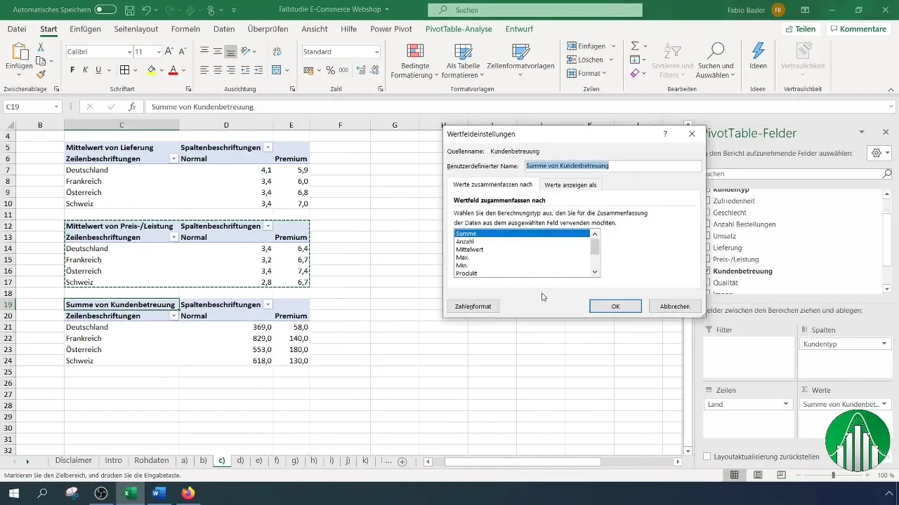
As you add the next metrics, copy the tables accordingly and adjust the settings. This reduces effort and increases the consistency of your calculations.

Step 4: Calculate Relative Fluctuation
To calculate the relative fluctuation, particularly for "Innovation," we will expand the existing table. Click on the pivot table settings and change the value from "Average" to "Standard Deviation." This will give you an idea of how the ratings vary.
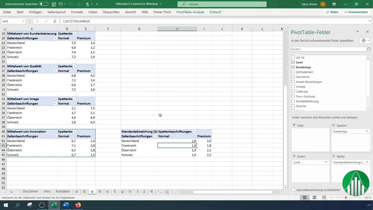
Now you will calculate the relative fluctuation by inserting the coefficient of variation formulaically in a new column. Use the standard deviation and the mean for your calculation.
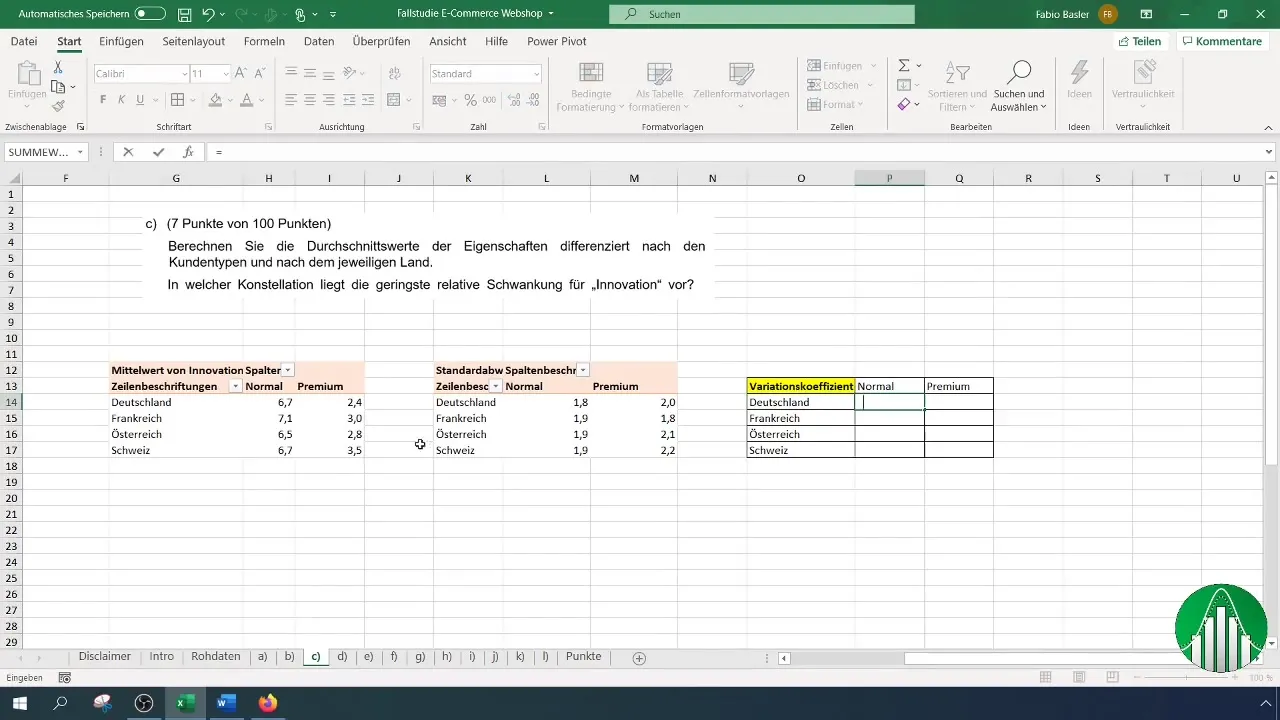
It is important to correctly specify cell references so that Excel can calculate the values accordingly.

Step 5: Helper Table and Interpretation
Create a helper table for the relative fluctuation. Define, for example, three classes: low, medium, and high relative fluctuation. Enter your calculated values here to facilitate interpretation.
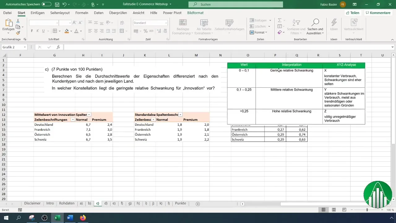
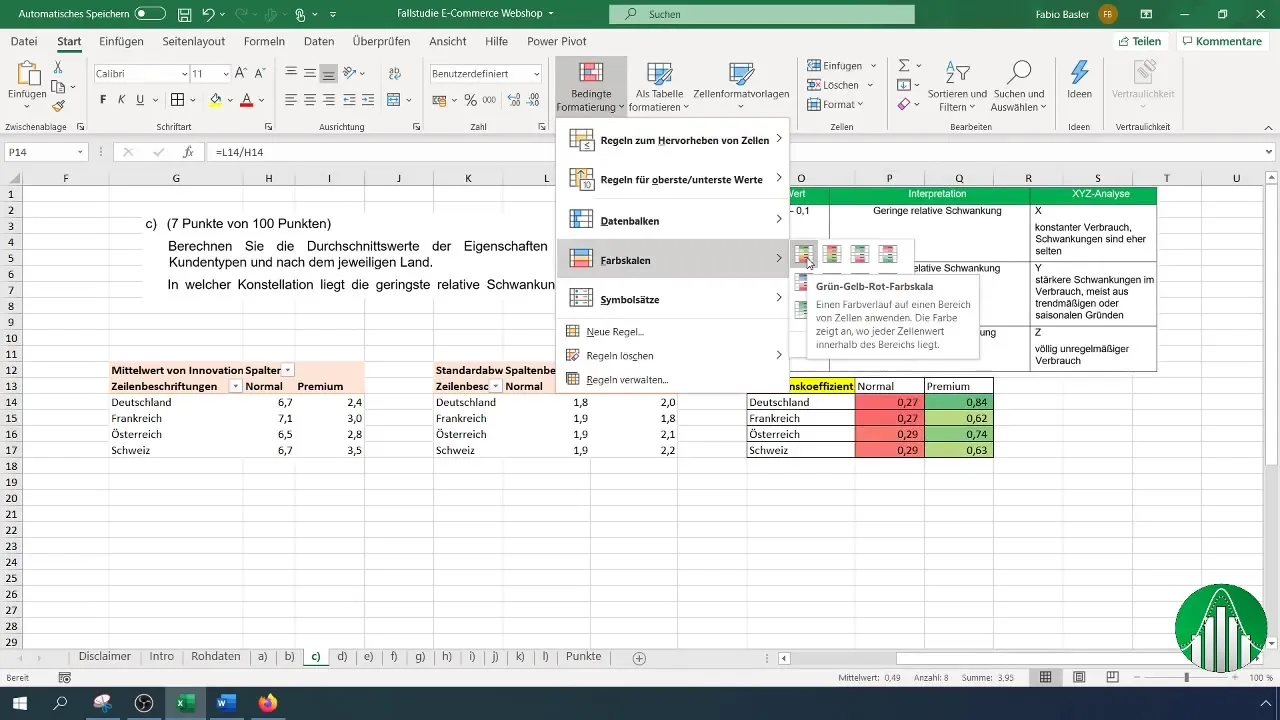
Use conditional formatting to visually highlight values. A color scale can help you quickly identify which responses have a high variability.
Step 6: Summarize results
After you have created all key figures, summarize your results. Formulate clear answers to the most important findings in the context of your analysis.
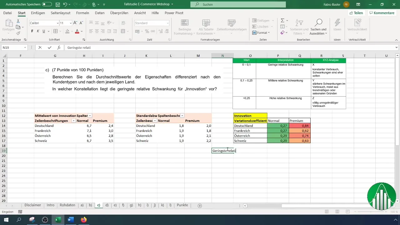
Make sure to list all key points, such as the smallest and largest relative fluctuation, as well as the average values. This will give you a clear overview of your data and its interpretation.
Summary
In this tutorial, you have learned how to efficiently create multidimensional pivot tables in Excel to analyze survey data. You have calculated average values and determined the relative fluctuation of the results.
Frequently Asked Questions
How do I create a pivot table in Excel?Go to "Insert", select "Pivot Table" and choose the data source.
How do I calculate the mean in a pivot table?Drag the desired key figure into the value field and change the settings from "Sum" to "Mean".
What is the coefficient of variation?The coefficient of variation describes the ratio of standard deviation to mean and thus indicates the relative dispersion of the data.


