Statistical analyses are essential to identify patterns and trends in data. In this guide, I will show you how to perform a time series analysis using Excel, illustrated with a practical example from the e-commerce sector. The focus is on the graphical representation of revenue values, calculating trend lines, and creating forecasts.
Main Findings
- Performing a time series analysis with Excel
- Graphical representation of 100 revenue datasets
- Inserting and calculating a trend line
- Using the trend function for forecasts
Step-by-Step Guide
Step 1: Prepare Data
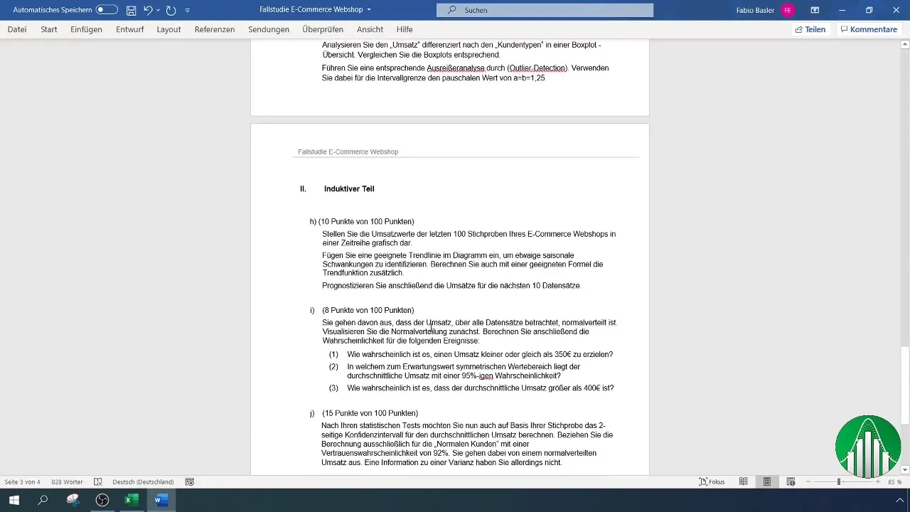
First, you need to prepare the data for the time series. Make sure you have the revenue values for the last 100 samples of your e-commerce website. It is important that all data is presented correctly and without filters. You can remove the filter for premium customers to get a consolidated view.
Step 2: Fix the Header
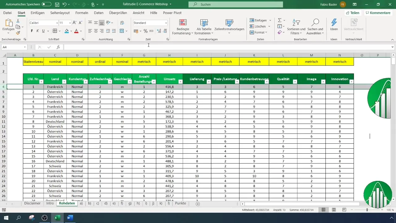
To maintain an overview while scrolling, you should fix the header. Select the fourth row, then go to "View" on the menu bar and choose "Freeze Panes". This will keep the header visible at all times as you navigate through the data.
Step 3: Copy Data
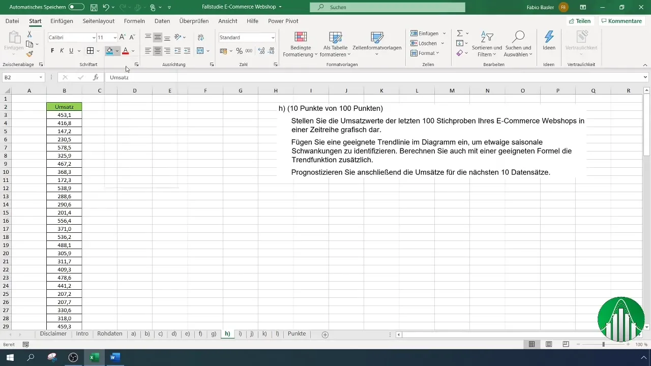
To graphically represent the last 100 revenue values, you need to copy them first. Go to the last 400 revenues, select rows from 400 to 500, and copy them to a new working area.
Step 4: Create Chart
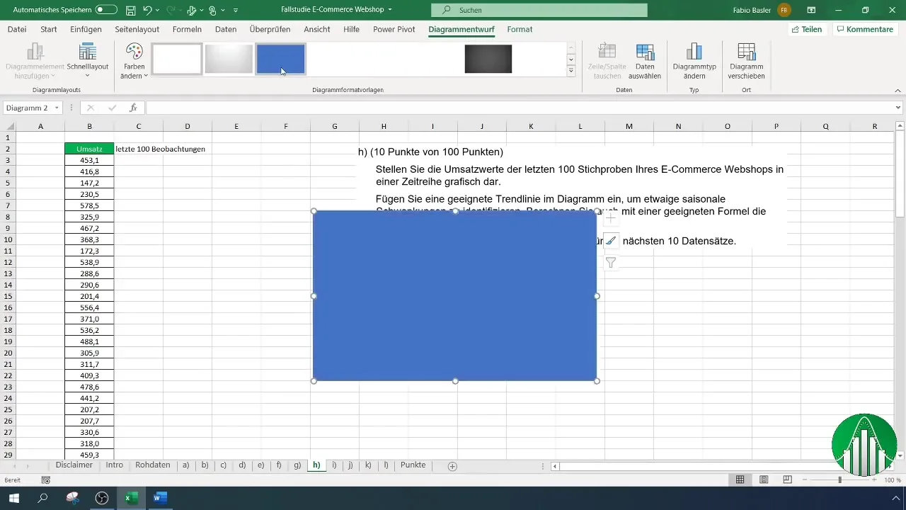
To graphically represent the data sets, go to the "Insert" tab and choose a 2D Line Chart. You can format the representation as you wish, for example, changing the line color. To visualize revenue in the chart, right-click and choose "Select Data".
Step 5: Name Time Series
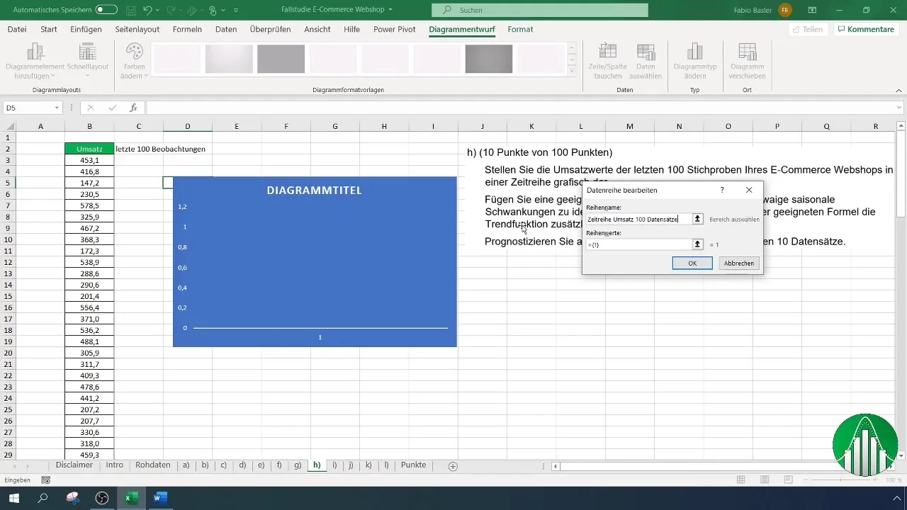
To make the data in the chart more manageable, name the data series. Select the chart editor and add "Revenue - 100 datasets" as the name designation.
Step 6: Add Trend Line
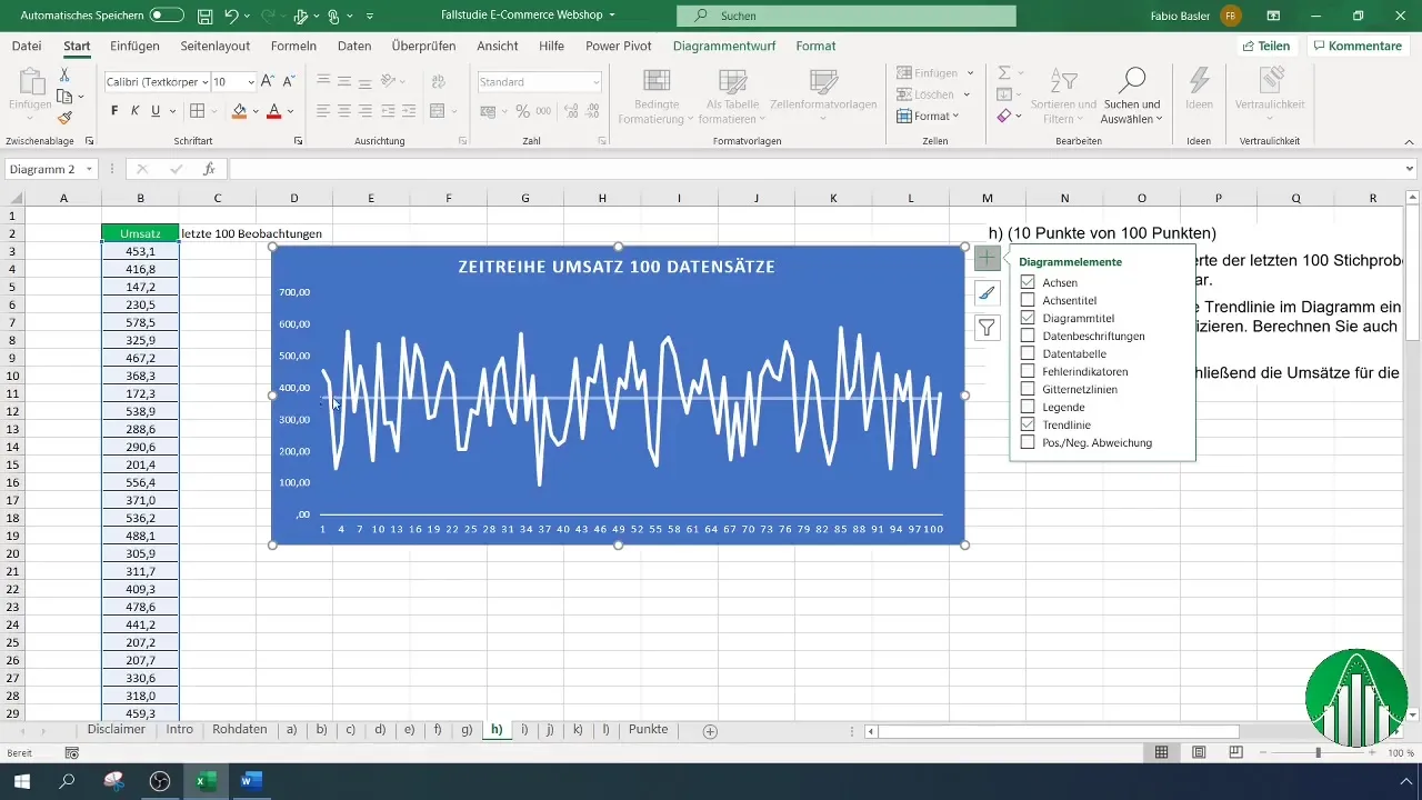
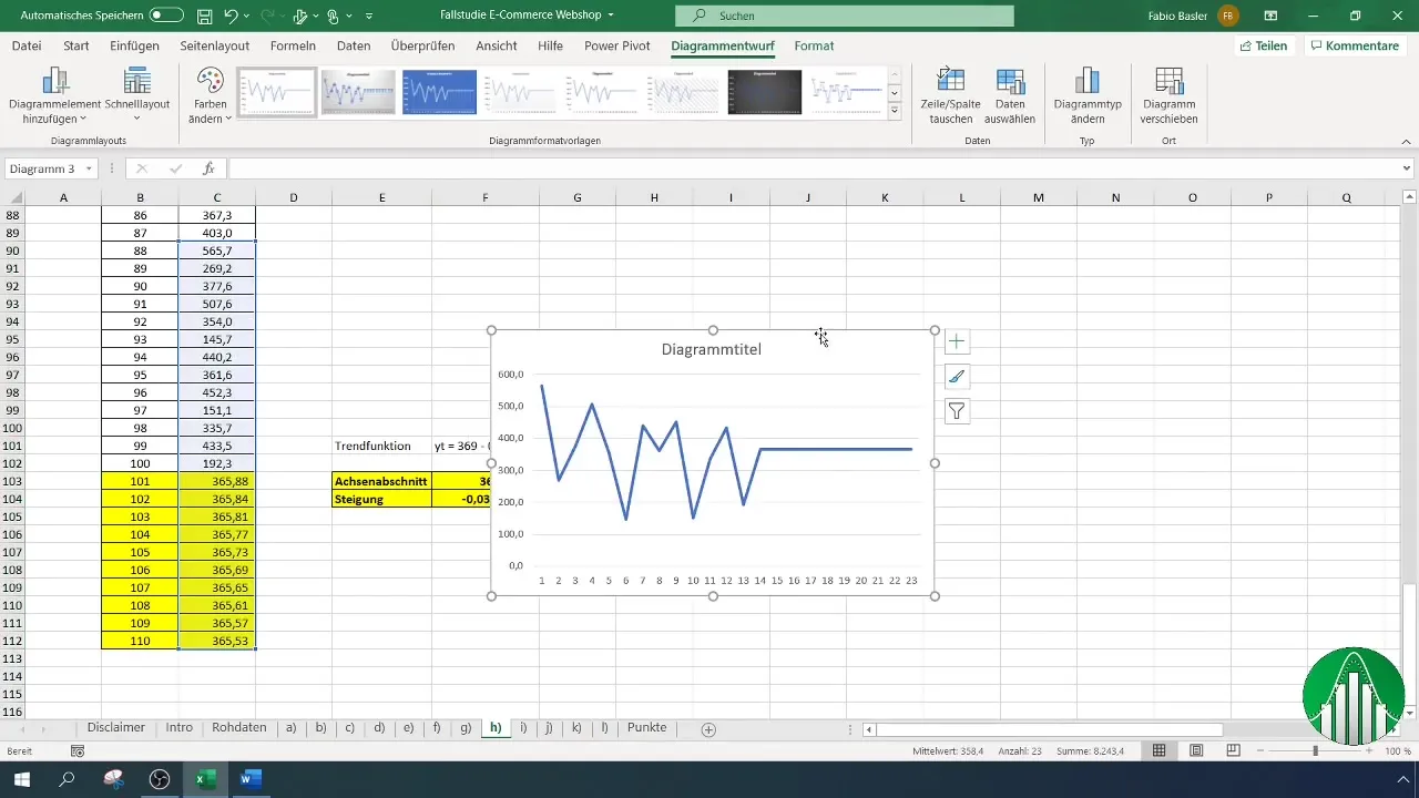
To better assess the development of revenue values, add a trend line to the chart. Select the data series in the chart, click on "Add Trendline," and choose the option to show the formula in the chart.
Step 7: Calculate Trend Function
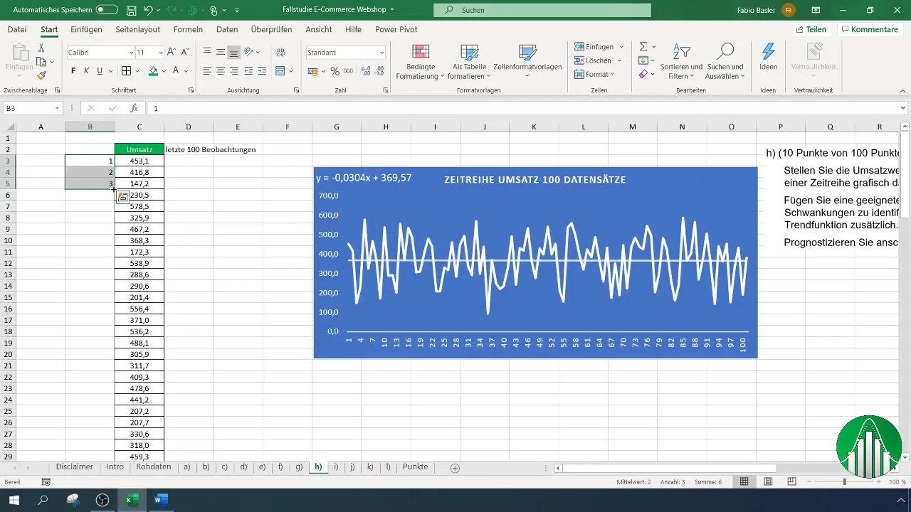
Now you can manually calculate the trend function. First, insert a new column in your worksheet to create running numbers up to the 100th observation. You should adjust the values of the revenue data and running numbers accordingly to calculate the trend function correctly.
Step 8: Intercept and Slope
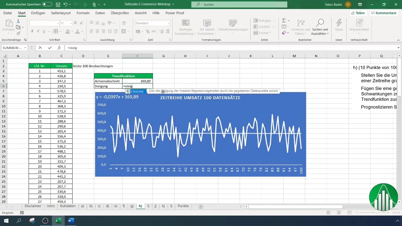
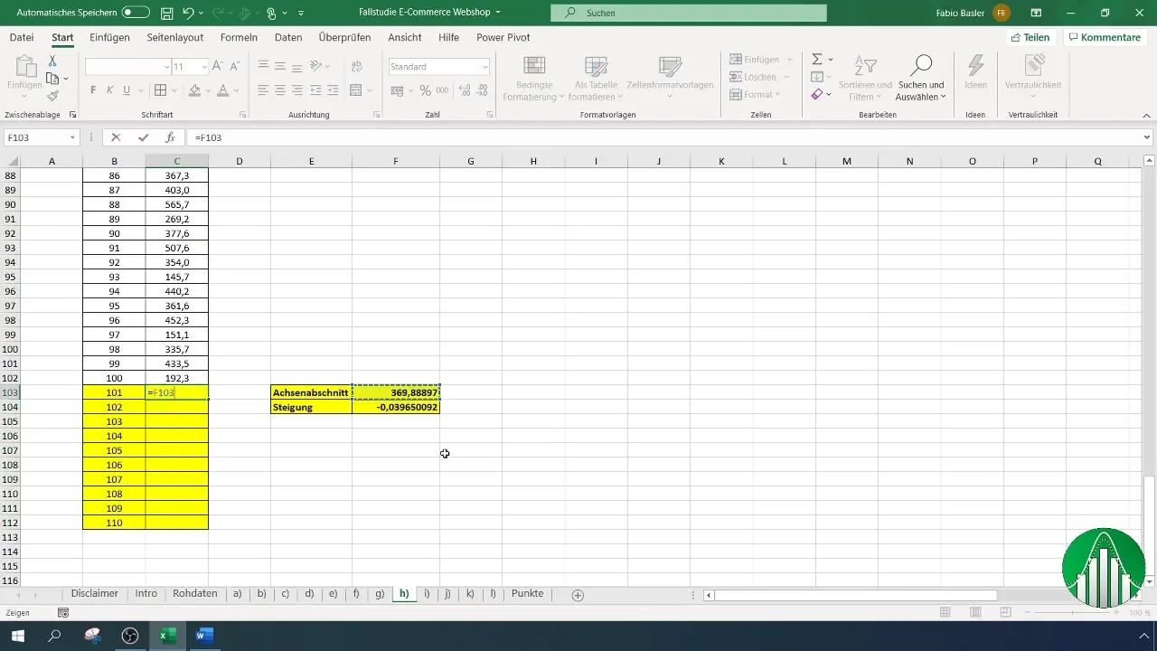
The trend function consists of an intercept and a slope. You can find out what the intercept (369.89) and slope (-0.0397) are. You can calculate these values again in Excel using the appropriate formula.
Step 9: Make Forecast
To create a forecast for the next Z data sets, copy the last values into the cells below. Use the trend function to make predictions for future revenues. The formula relates the intercept and the slope to the running number. Make sure to correctly fix the cell references.
Step 10: Visualizing the Forecast
After you have created the forecasts, visualize the entire chart again to get a clear representation. This way, you can quickly identify how the values could develop and what volatility exists.
Summary
In this tutorial, you have learned how to create a time series for sales values in Excel, insert a trendline, and make predictions for future revenues. These steps are fundamental for analyzing sales figures and help you make informed decisions based on real data.
Frequently Asked Questions
How to reset my data after filtering?Highlight the filtered column and select "Clear Filter" from the Data menu.
How to add another data series to my chart?Click on the chart, go to "Select Data" and add a new data series.
How to view the slope of the trendline?Right-click on the trendline in the chart and choose "Trendline Options". Enable the option to display the formula in the chart.
How to change the chart color?Click on the data series, go to the Chart Tools, and select the desired color under "Format".
What should I do if my data is not displayed correctly?Check if the data is entered in the correct cells and without empty rows.


