The visual representation of data can be crucial when it comes to effectively communicating information. Column and bar charts are the foundations of these visualizations in Excel and help you present your data clearly and comprehensively. In this tutorial, I will show you how to create data-driven charts in Excel to visually compare multiple datasets, such as revenues and expenses.
Key Takeaways
- Understanding the benefits of column and bar charts.
- Step-by-step guide to creating these charts in Excel.
- Tips for formatting and customizing the charts for better readability.
Step-by-Step Guide
1. Enter Data
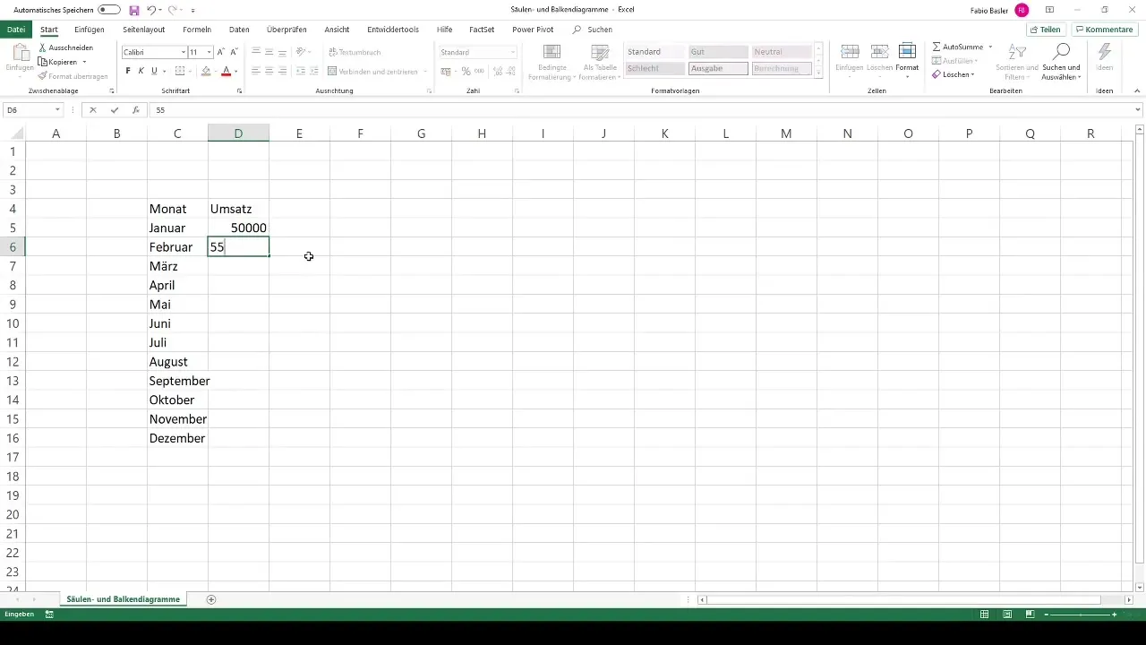
Start your project in Excel. You are on a blank worksheet where you can quickly enter the data. Begin by entering the months, entering January in cell A1, February in cell A2, and so on up to December (A12). For a good overview, simply drag the months down to complete them.
2. Add Metric Values
Now, next to the month names in column B, you can enter the corresponding metric values. Start in cell B1 with the revenue, for example, entering €50,000. You can enter this number in increments of five and drag it down to have values for all months.
3. Enter Cost Values
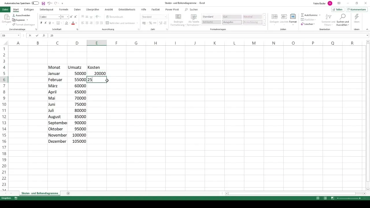
In column C, enter the costs. For example, start in cell C1 with €25,000 and also drag this number down to get similar values for the other months.
4. Format Table
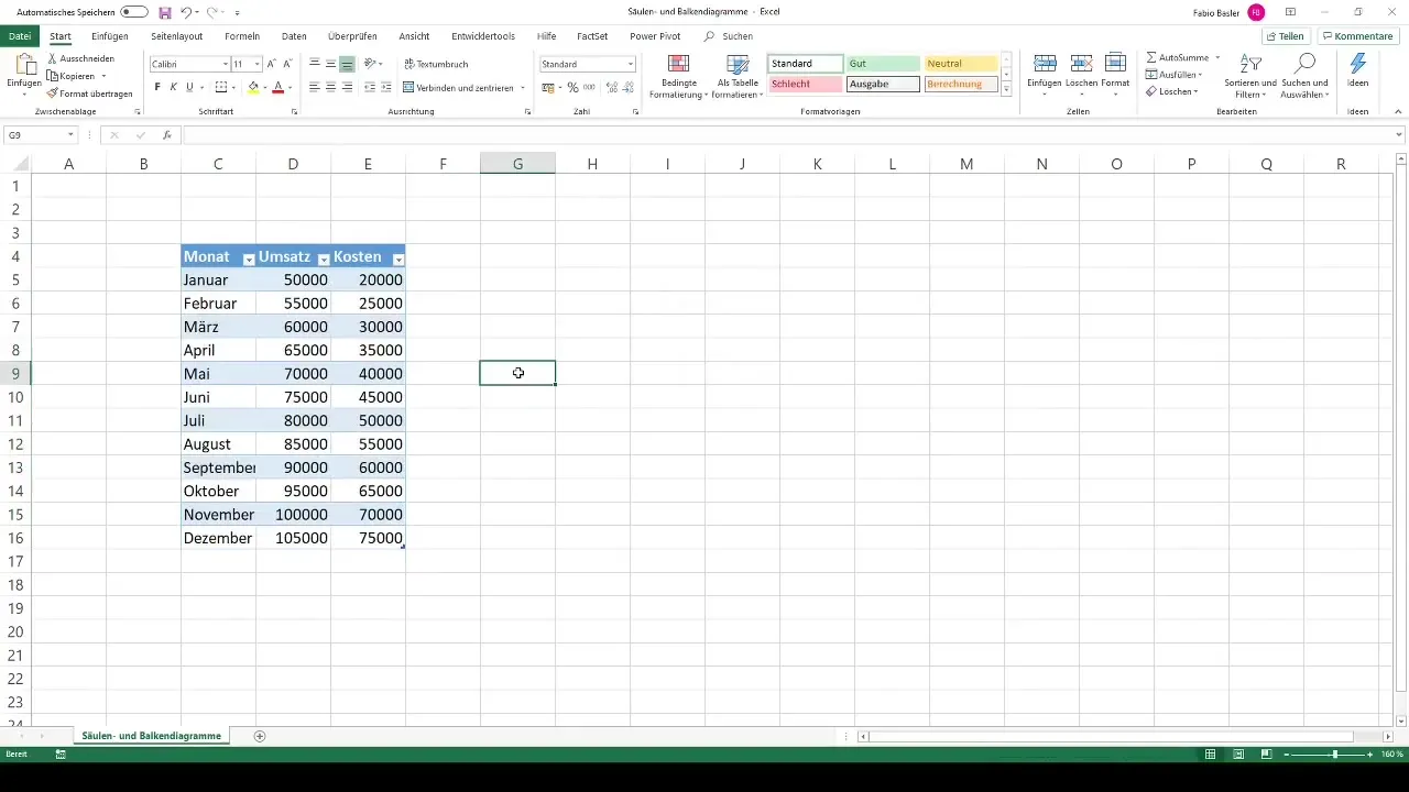
To visually present your data attractively, select all the data and press Ctrl + T to apply the table data format. This will make editing easier and make the data visually appealing.
5. Create First Chart
To create your first chart, go to the ribbon and click on the "Insert" tab. There you will find various chart options. Choose the category of 2D column charts. Click on the chart to create it, and the chart will be displayed on the worksheet.
6. Select Data for Chart
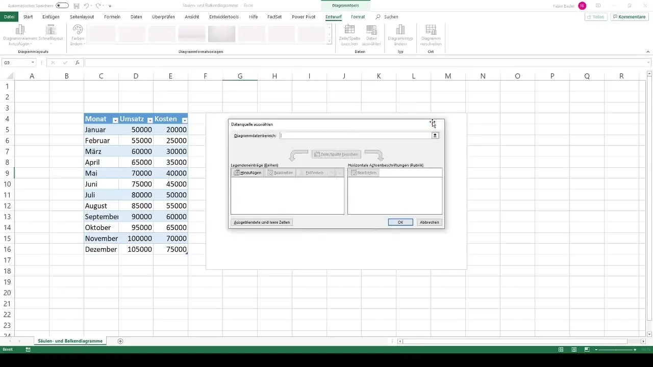
After inserting the chart, right-click on the chart and select "Select Data." In this menu, you can add the appropriate data series to fill the chart with the revenue and cost values.
7. Change Chart Type (Optional)
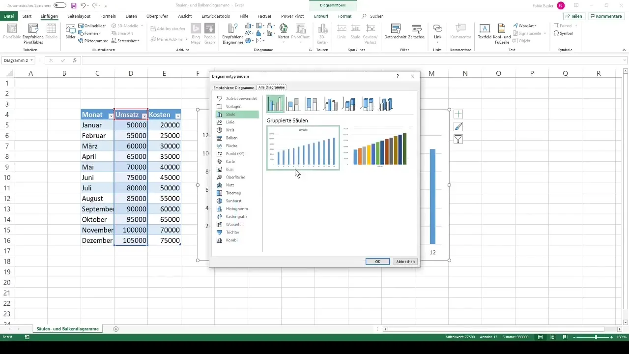
If desired, you can change the chart type by right-clicking on the chart and selecting "Change Chart Type." Here, you have the option to choose between different display options to customize the appearance.
8. Adjust Axes
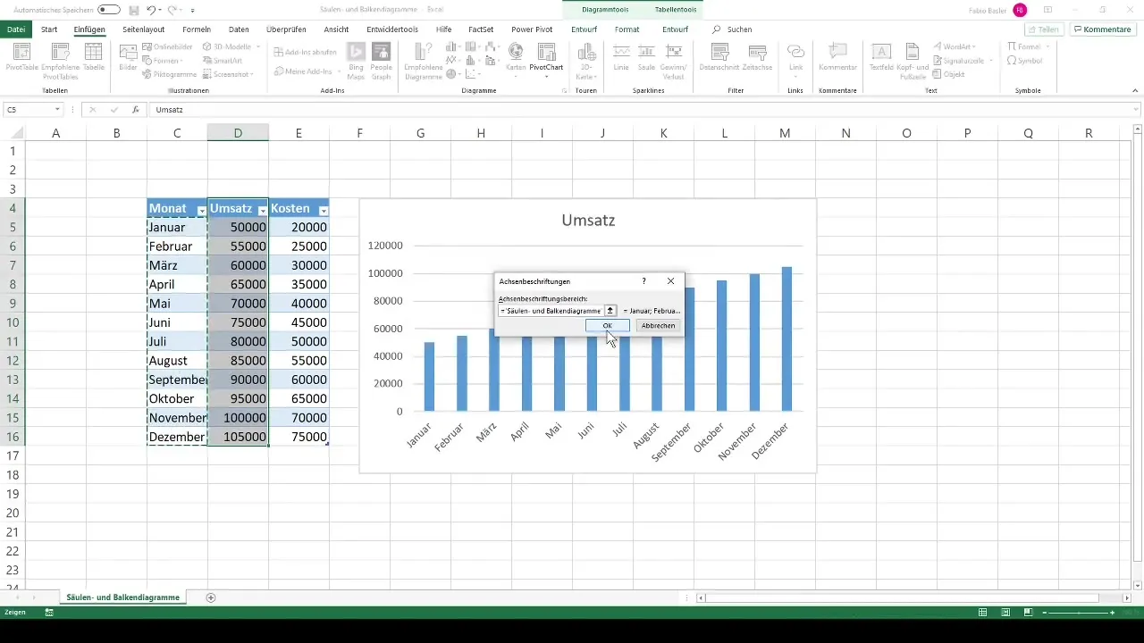
To optimize the representation on the horizontal axis, you may want to display the month names instead of numerical values. Right-click on the horizontal axis label and choose the label selection option.
9. Add Data Labels
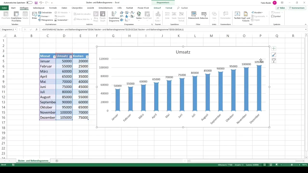
To make the revenue and cost values visible directly on the chart, you can add data labels. To do this, right-click on the chart again and select "Add Data Labels." This way, you will directly see the values in your chart.
10. Added cost values
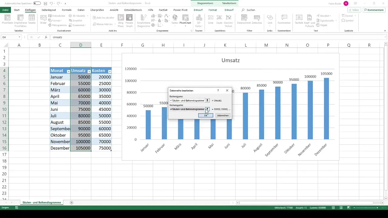
To include the cost values in the chart, go to "Select Data" again. Add a new data series for the costs, select the quantities, and confirm the selection. You should now see a clear comparison between revenues and costs in your chart.
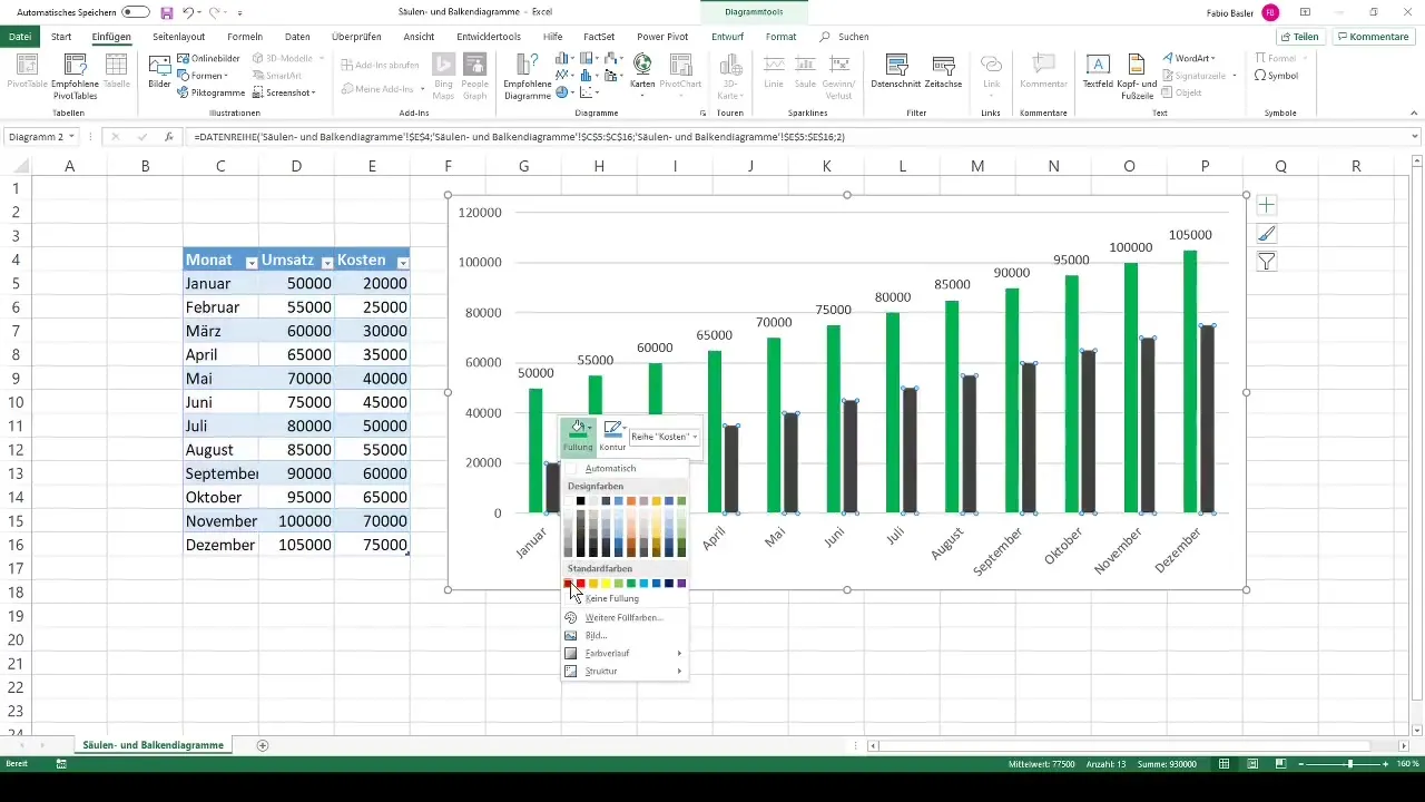
11. Adjusting coloring
To improve clarity, you should adjust the colors of the bars. Set the revenue to green and the costs to red. Right-click on the individual bars and choose the fill color option for the respective color.
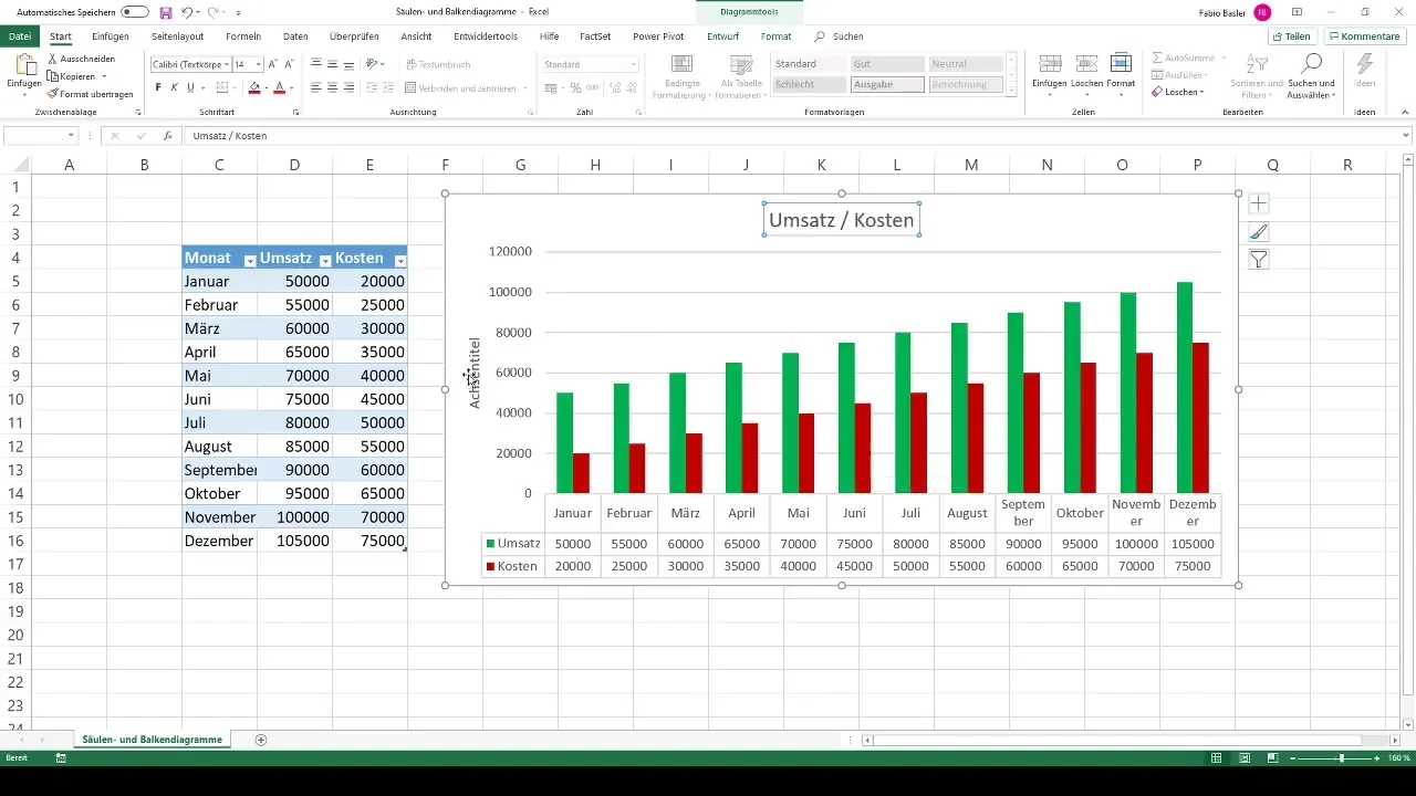
12. Labeling title and axes
To provide more context to your chart, you have the option to change the chart title and axis titles. Click on the chart, go to the chart tools, and adjust the titles to explain the content of your data.
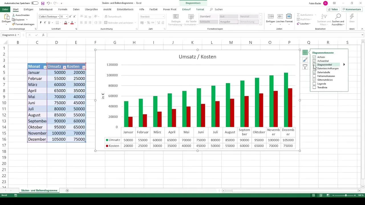
13. Refine chart formatting
You can further customize chart elements, such as adding gridlines or including a legend, to improve clarity. Click on the green plus sign next to the chart to see additional options for this purpose.
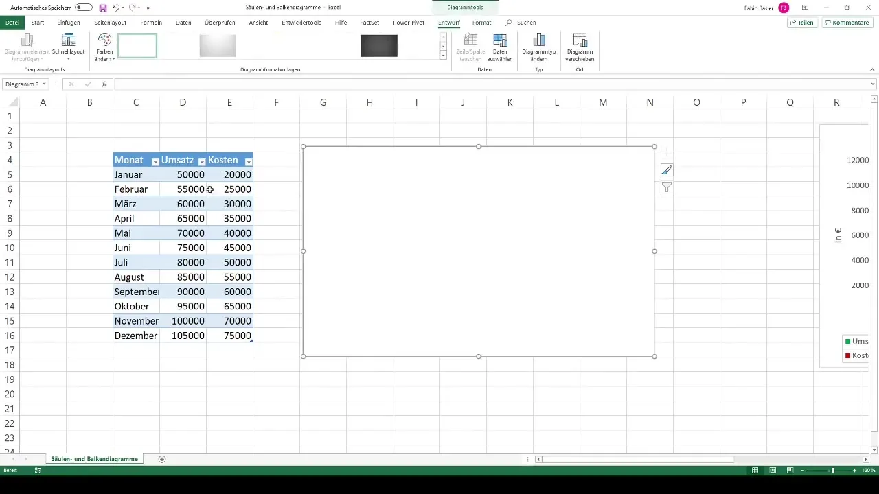
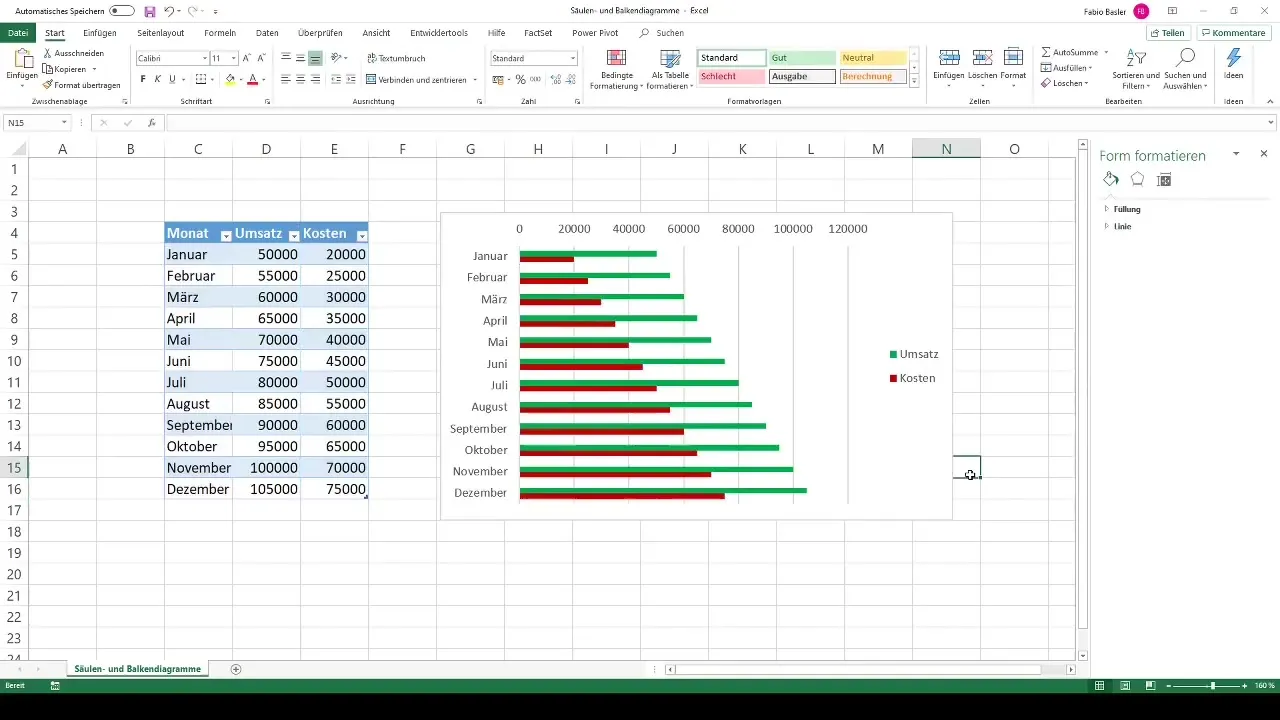
14. Create bar chart
Set aside your column chart and repeat the process for a new chart by selecting a bar chart this time. Start again with a blank chart and follow the same steps as before to select and display the data.
15. Adjust chart
Add the relevant data for revenue and costs, and adjust the fill colors accordingly. Another bar chart is great for presenting the same information in a different form and visualizing the comparison.
Summary
In this step-by-step guide, you have learned how to create both column and bar charts in Excel. You can now present your data in a more structured way and optimize the visual representation for your audience or colleagues.
Frequently Asked Questions
What are the differences between column and bar charts?Column charts represent data vertically, while bar charts depict them horizontally.
How can I format my charts in Excel?By right-clicking on the chart, you can select options such as color settings or data labels.
Are there different types of charts in Excel?Yes, Excel offers many types such as line charts or pie charts that can represent different data visualizations.
How do I add a legend to my chart?Click on the chart and activate the legend through the chart tools to label colors and values.


