Excel offers numerous possibilities to analyze and visualize data effectively. Pivot tables in particular have established themselves as powerful tools for structuring and evaluating large amounts of data. Pivot-Charts extend this functionality with a dynamic graphical representation. In this tutorial, you will learn step by step how to create and use Pivot Charts in Excel to present your data in a clear and visual way.
Main Insights
- Pivot Charts are based on Pivot Tables and allow dynamic data visualization.
- Changes in the raw data automatically affect the Pivot Charts.
- You can apply interactive filters through Slicers to refine the analysis.
Step-by-Step Guide
Step 1: Prepare the Raw Data
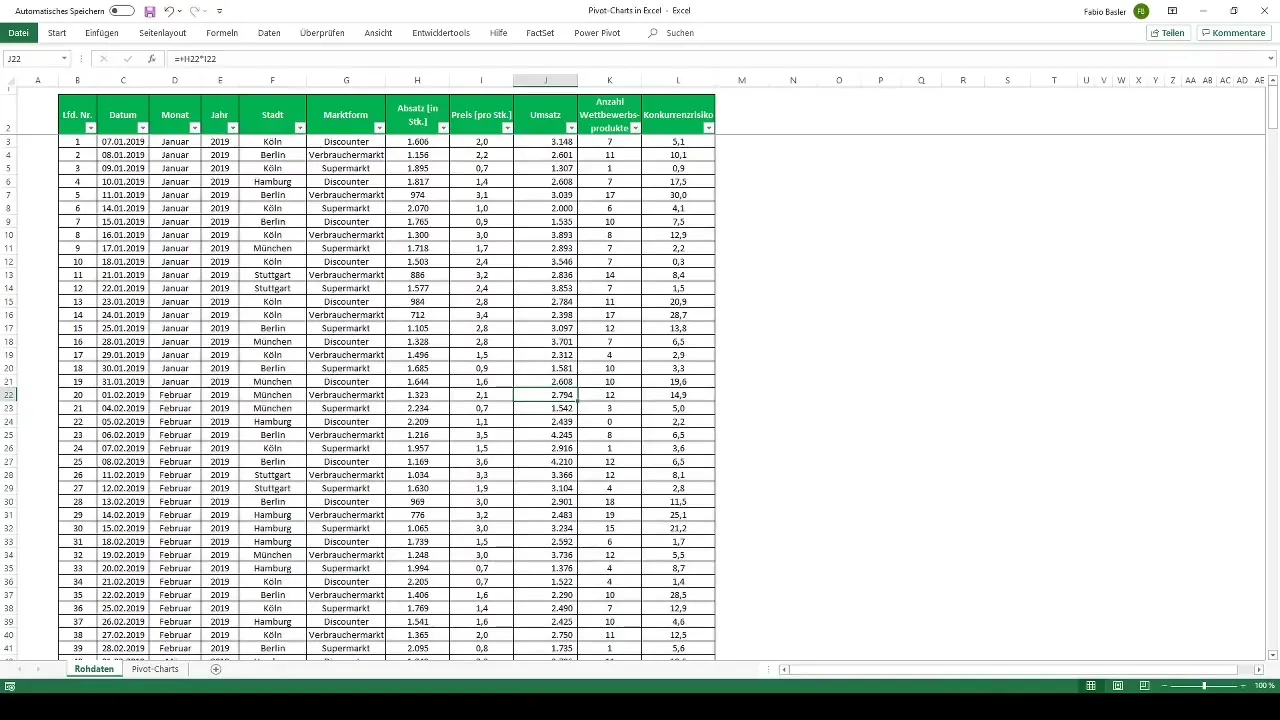
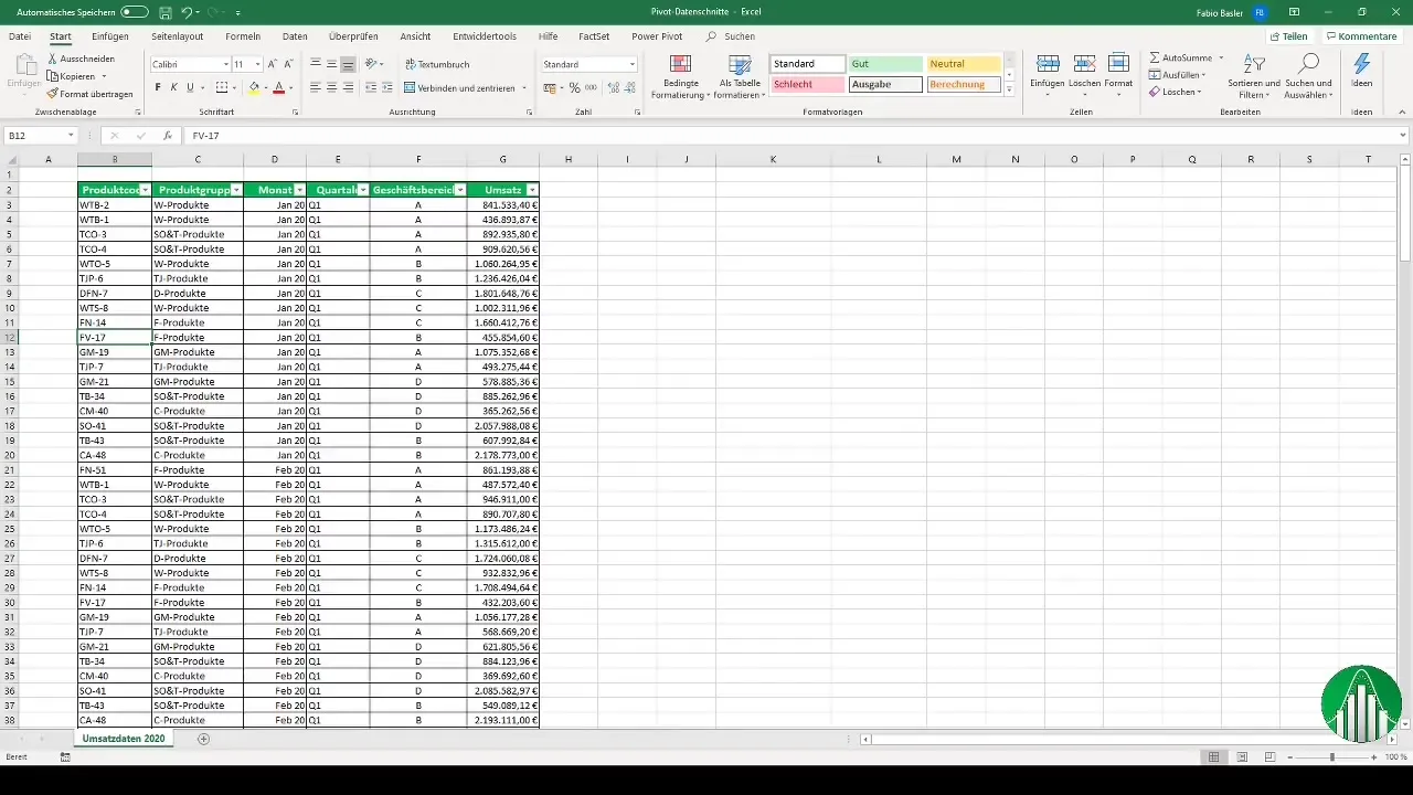
Start by preparing your raw data in Excel. Ensure that your data is complete and well structured. You can use the existing table to create the Pivot Table. Press Ctrl + A to select all data.
Step 2: Create a Pivot Table
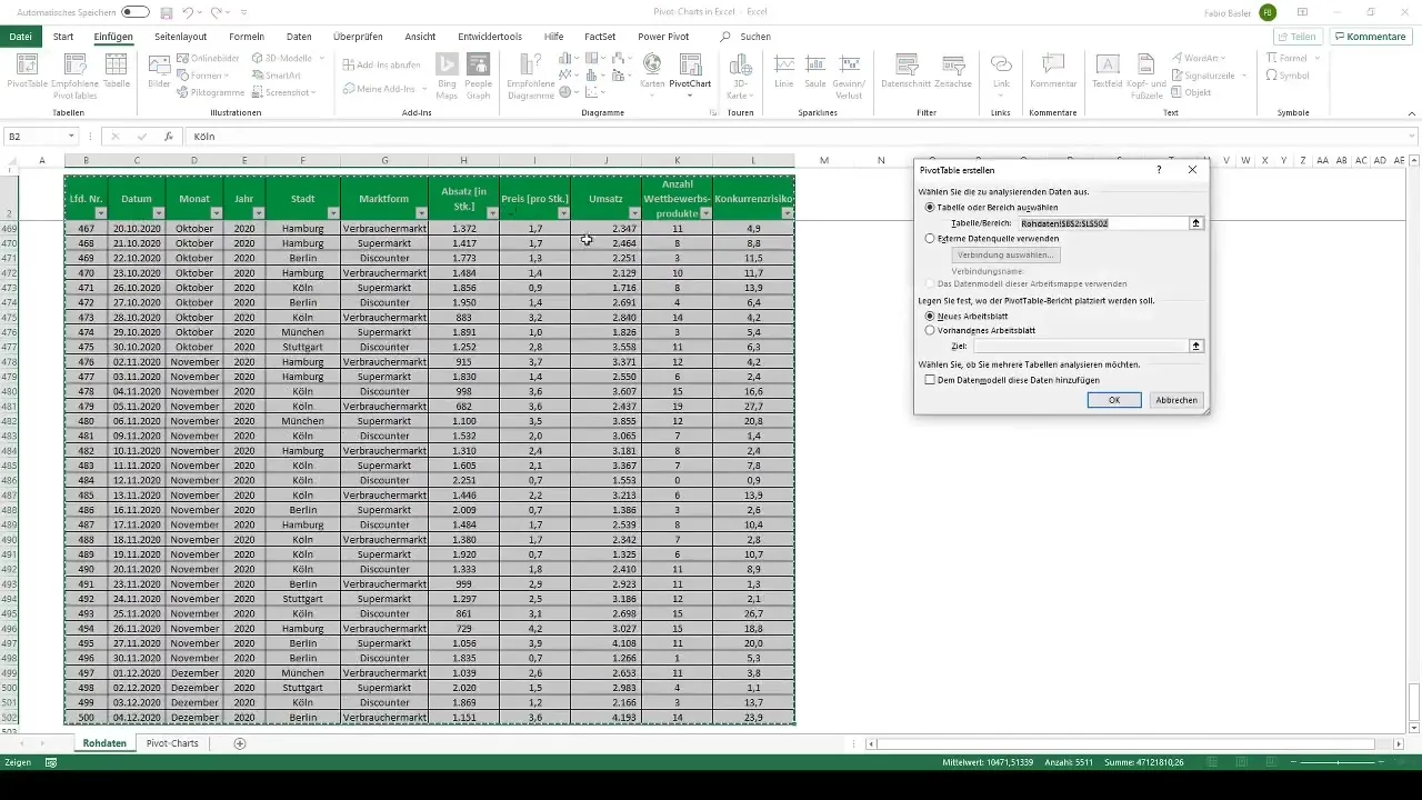
Go to the ribbon and click on "Insert". Choose the "PivotTable" option. Set the output range to a new or existing worksheet – in this example, "Pivot Charts". Click "OK" to create your first Pivot Table.
Step 3: Dynamic Work with the Pivot Table
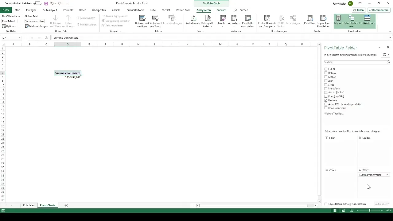
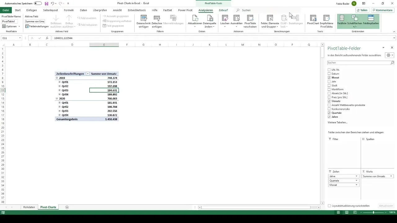
Now the PivotTable Field opens, where you will find the individual features. For example, drag the revenue into the values field. Excel consolidates the data and shows you the total revenue. If you value temporal breaks in the analysis, you can add months as rows or columns.
Step 4: Create a Pivot Chart
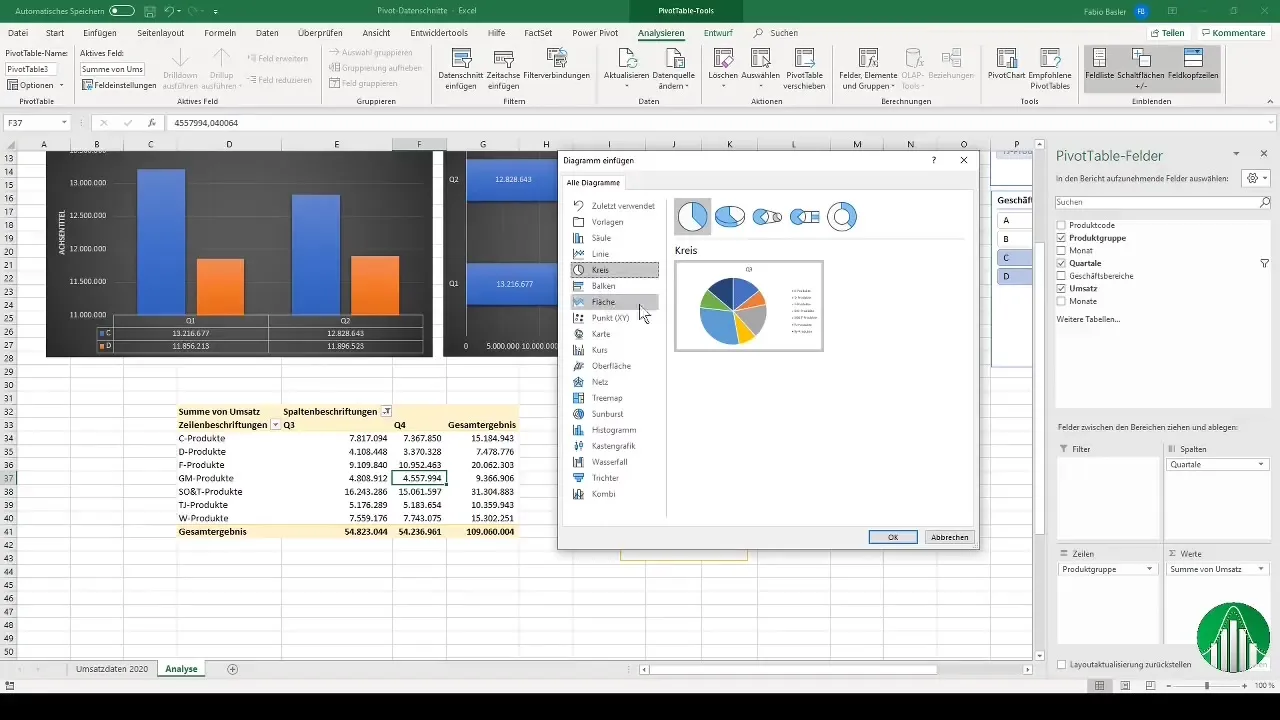
After creating the Pivot Table, switch to the "Analyze" tab and click on the "PivotChart" icon. Here, you can choose different chart types. Select the desired chart type and click "OK".
Step 5: Update After Raw Data Changes
When you make changes to the raw data, the Pivot Table is automatically updated. To apply the changes, right-click on the Pivot Table and select "Refresh". This will also dynamically adjust your Pivot Chart.
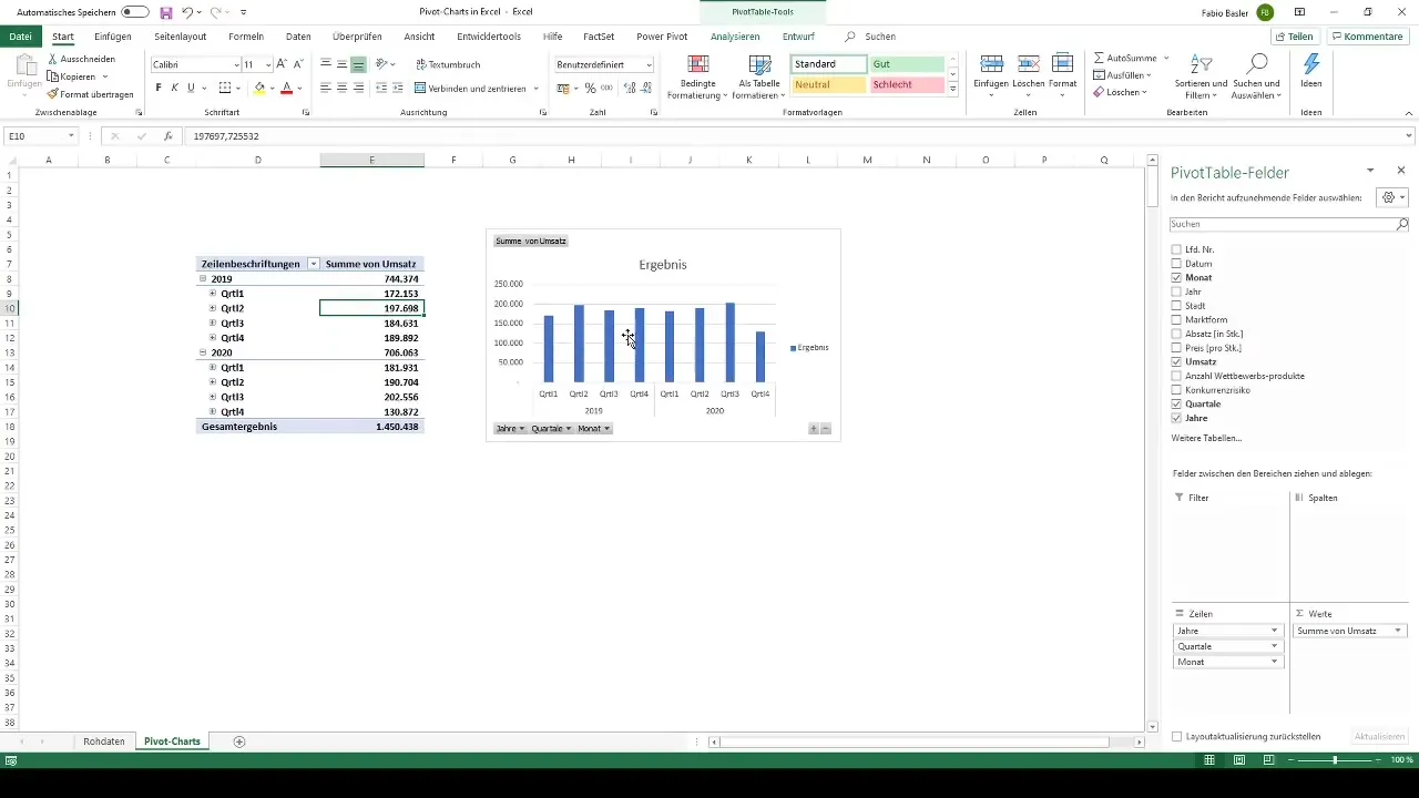
Step 6: Customizing the Chart
Click on the chart to make various customizations. For example, you can hide the field buttons to create more space for display. You can also remove the legend if it is not needed. To change the chart type, right-click on the chart and select "Change Chart Type".
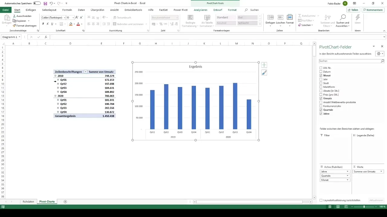
Step 7: Iterative Work with Data Visualizations
Continue the analysis by dragging different features into the Pivot Table. Use the filter options to extract specific information. If you want to test different chart types, you can easily copy and paste them into the worksheet.
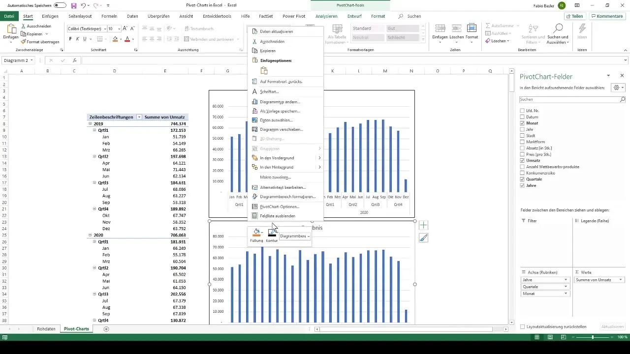
Step 8: Introduction of Slicers
To enhance the interactivity of your reports, you can use Slicers. These allow you to filter data based on specific criteria. Add Slicers for the desired data categories through the "Analyze" menu and place them in a visible location on the chart.
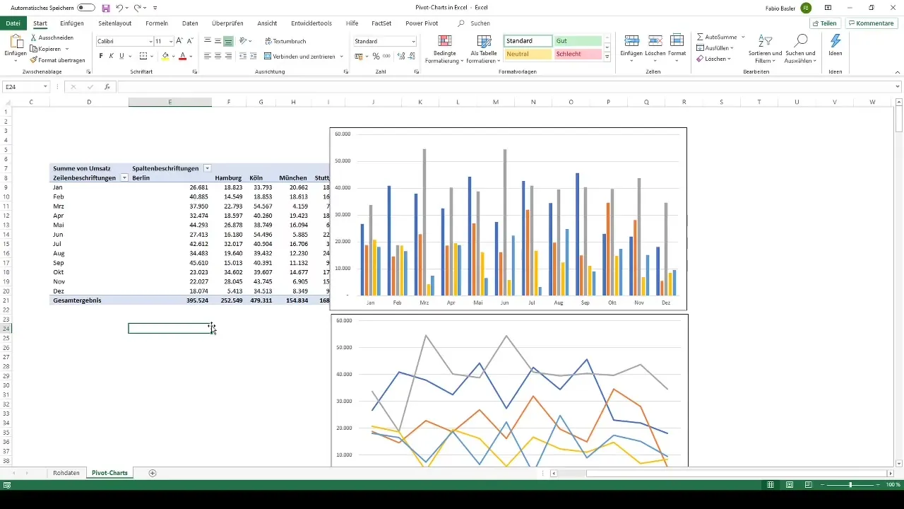
Step 9: Working with Multiple Pivot Tables and Slicers
It is also possible to create multiple pivot tables to be used in different reports. Make sure that the slicers for these tables are correctly connected so that the filter requests are uniformly applied across all pivot tables. Properly managing report connections makes your results consistent and clear.
Step 10: Customizing Slicer Designs
You can customize the slicers visually to harmoniously integrate them into your overview. At this opportunity, you could choose colors and fonts that correspond to your company's corporate design.
Summary
Creating pivot charts in Excel not only allows you to visualize data efficiently, but also to work dynamically and make reports interactive. By making targeted adjustments and using slicers, you create concise and relevant analyses that give your presentations more impact.
Frequently Asked Questions
How do I create a pivot table?Go to "Insert," select "PivotTable," and specify the output range.
What happens if I change raw data?You can simply refresh the pivot table to incorporate changes.
How can I add slicers?Add slicers through the "Analyze" menu and select the slicers for the desired field.
Can I have multiple pivot tables in one worksheet?Yes, you can create multiple pivot tables in the same worksheet and assign slicers to them.
Can I customize the design of my pivot charts?Yes, you can customize colors, fonts, and layouts in the chart options.


