Tornado diagrams are an effective way to visually present and compare data. They provide a clear and intuitive visualization that is particularly relevant in the areas of data analysis and reporting. In this guide, you will learn step by step how to create a tornado diagram in Excel. We will use a sample data set that will help you easily follow the steps.
Key Insights
- Tornado diagrams visualize information through successive bars.
- You need to use negative values on one side for correct representation.
- Axis labels must be clear and comprehensible.
Preparing the Raw Data
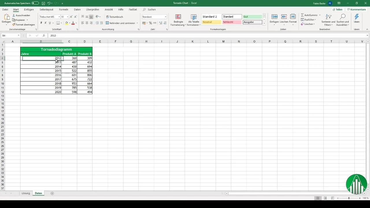
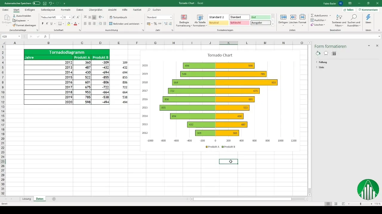
To create a tornado diagram, you first need your raw data. I have prepared the years 2012 to 2020 along with corresponding numbers for two products. These data form the basis for your diagram.
Converting the Data
Since a tornado diagram typically requires negative numbers on the left side, you need to adjust your data. In our case, as we only have positive numbers, you need to multiply the numbers of Product B by -1. This is done to represent them as if they were negative.
Creating the Tornado Diagram
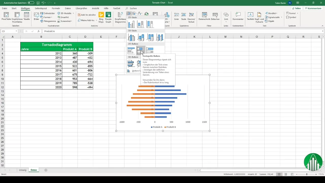
Once the data has been converted accordingly, you can create the diagram in Excel. Go to the menu bar and select "Insert". Among the chart options, look for the stacked bar chart suitable for a tornado diagram.
Formatting the Diagram
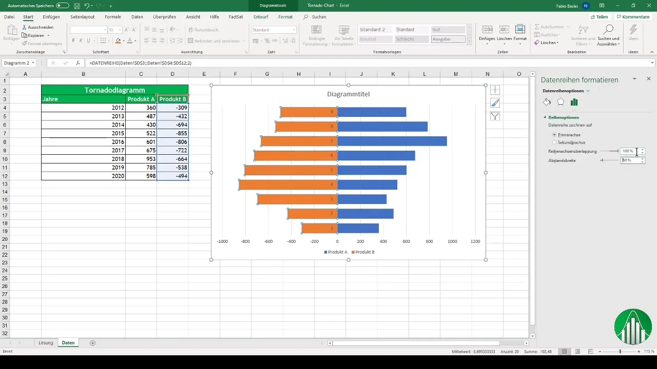
After inserting the diagram, you will notice that the representation is not optimal yet. You need to adjust the bars and change the width to make the visualization more appealing. It is advisable to reduce the width of the bars from the default setting to about 50%.
Adding Data Labels
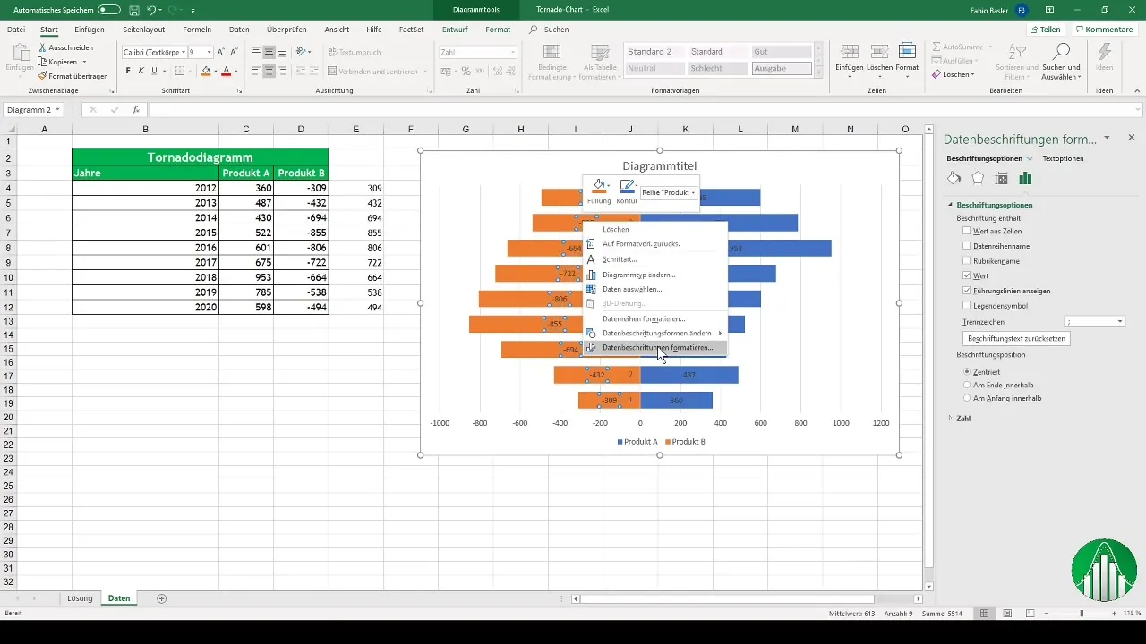
To increase the readability of the diagram, you should also add data labels. Right-click on the corresponding bars and select the option "Add Data Labels". This will give you a solid overview of the displayed values.
Positioning the Values
Having redesigned the diagram for better visual representation, we must ensure that the positive and negative values of Product B are correctly displayed. To do this, link the positive numbers again and format them accordingly.
Adjusting the Axes
An important component of an effective tornado diagram is the axis formatting. Change the horizontal axis so that instead of numbers, the corresponding years are displayed. This will make your diagram clear and professional.
Summary
You have now learned how to create and customize a tornado diagram in Excel. This includes data preparation, diagram creation, adding data labels, and formatting the axes. With this knowledge, you will be able to present complex data in an engaging way.
Frequently Asked Questions
What are Tornado diagrams?Tornado diagrams are specific bar graphs that visually compare data and enable a clear visual representation.
How do I create a tornado diagram in Excel?You need to prepare your data, create negative values for one side, and then insert and customize a stacked bar chart.
Why do I need negative numbers for the left side?Negative numbers are necessary to achieve the visualization in the classic tornado diagram format and ensure the comparability of values.
How do I add labels to my diagram?By right-clicking on the diagram, you can select the option to "Add Data Labels" and insert the desired information.
How can I adjust my diagram after creating it?You can easily adjust the bar width, color scheme, and label positions to obtain an appealing and understandable diagram.


