If you are looking for clear visual data presentations, the thermometer chart is an excellent choice. This type of chart is not only illustrative, but also provides a quick overview of key performance indicators. With Microsoft Excel, you can easily and effectively create such charts. Here, I will show you a step-by-step guide on how to create your own thermometer chart in Excel.
Key Insights
- Thermometer charts visualize progress against goals.
- Dropdown lists can help make the charts dynamic.
- Colored segments in the chart quickly convey information about the status.
Step-by-Step Guide
Collecting Impressions
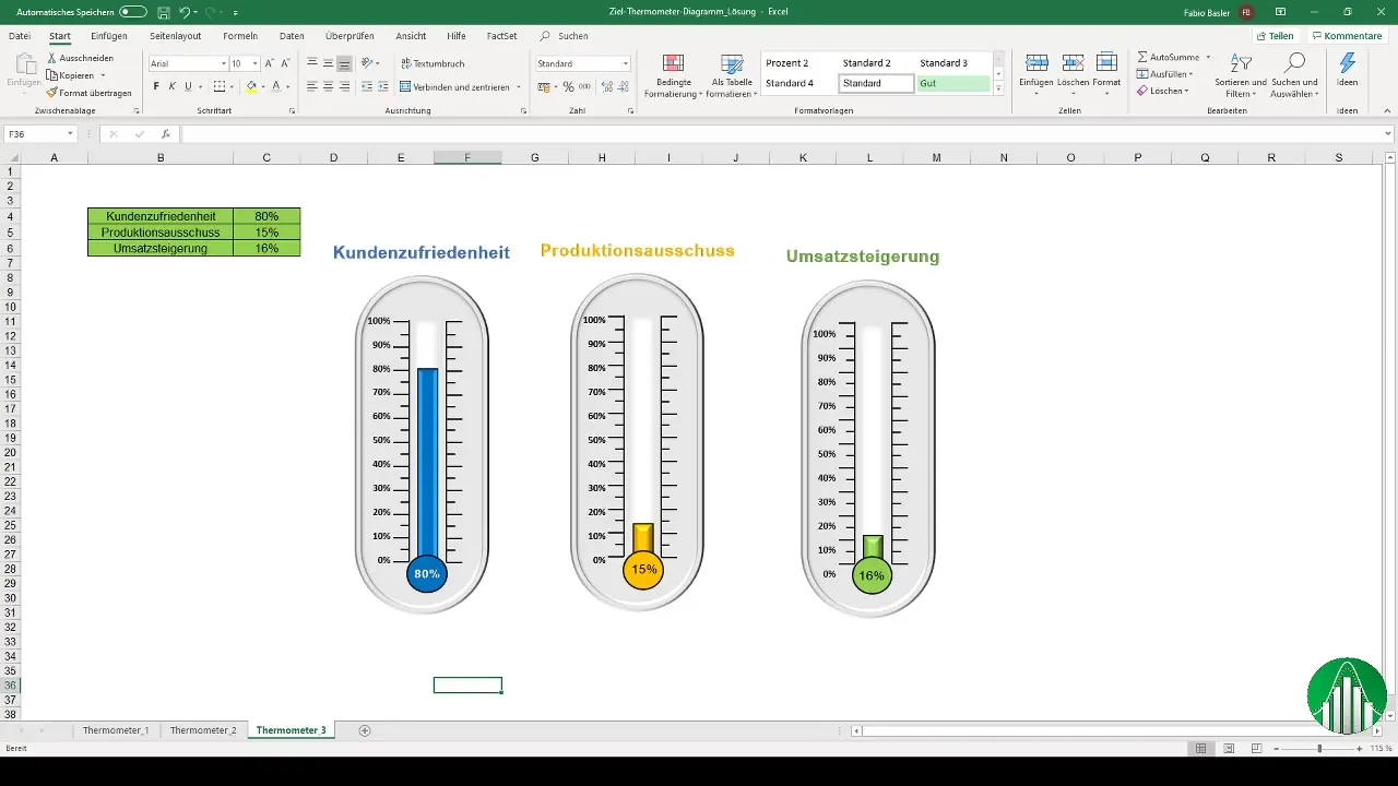
First, it is important that you understand what makes up a thermometer chart. Such charts are often used in controlling dashboards. They help quickly gain an overview of important key figures. The special appeal lies in the visual representation that allows you to present progress in an appealing way.
Preparing the Data
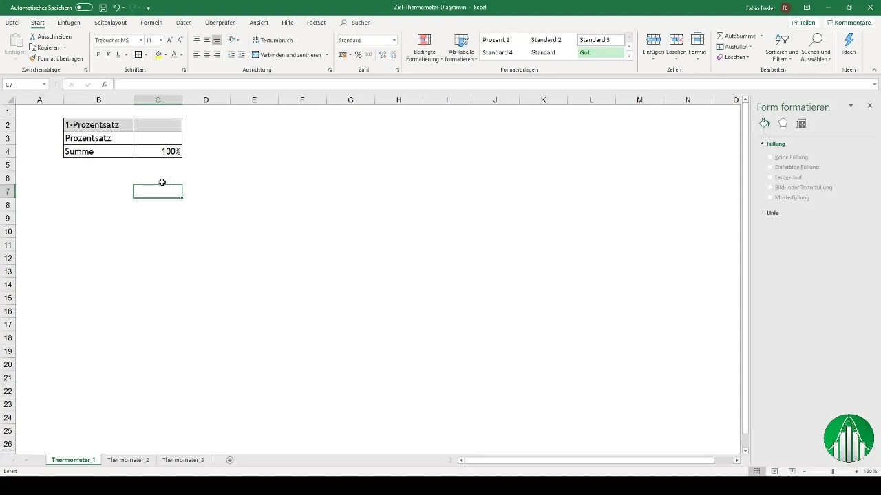
Start by creating a list for your dropdown menu. This list should contain percentages from 0 to 100 in tens increments. Simply write the values into the cells of your Excel sheet. This creates an important basis for your chart.
Creating a Dynamic Dropdown List
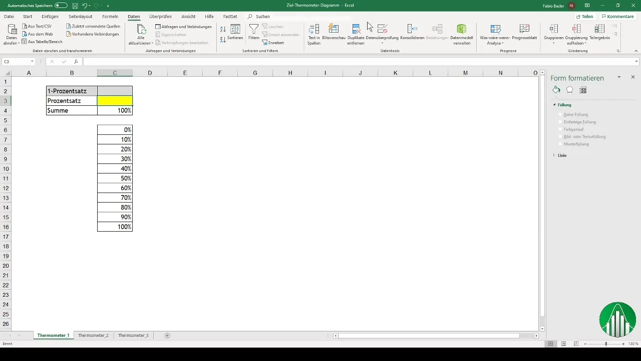
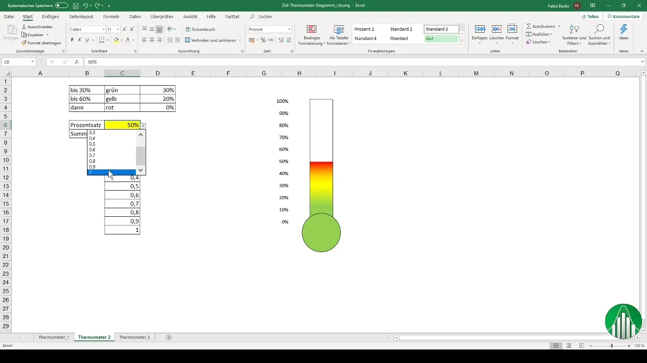
Once you have created the percentages, you want to insert a dynamic dropdown list into cell C3. Go to the "Data" tab and select "Data Validation". There you can specify the source for your list (C6 to C16) and easily select values between 0 and 100%.
Calculating the Complementary Percentage
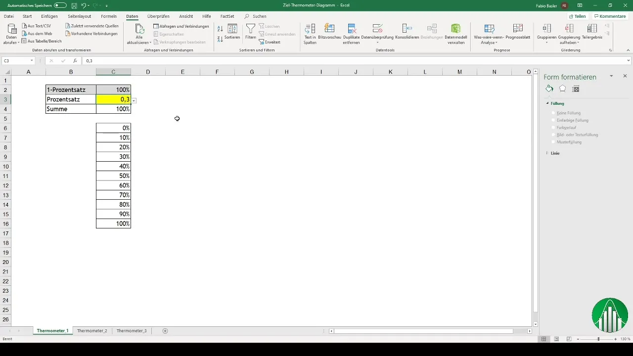
Now it's time to calculate the complementary percentage by taking 1 minus the percentage. Format the numbers correctly for display. For example, if the value 30% is chosen from the dropdown, the complementary value of 70% will automatically be obtained.
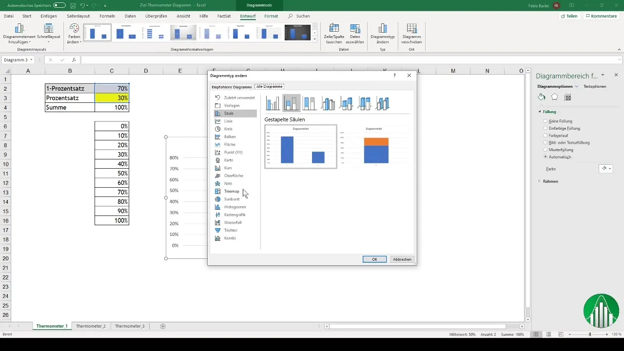
Creating a Stacked Column Chart
For the thermometer chart, choose a stacked column chart. Go to "Insert" and select the chart type accordingly. You can customize the chart by choosing a black outline for the columns and coloring 30% red - leaving the rest empty.
Reversing the Data Series
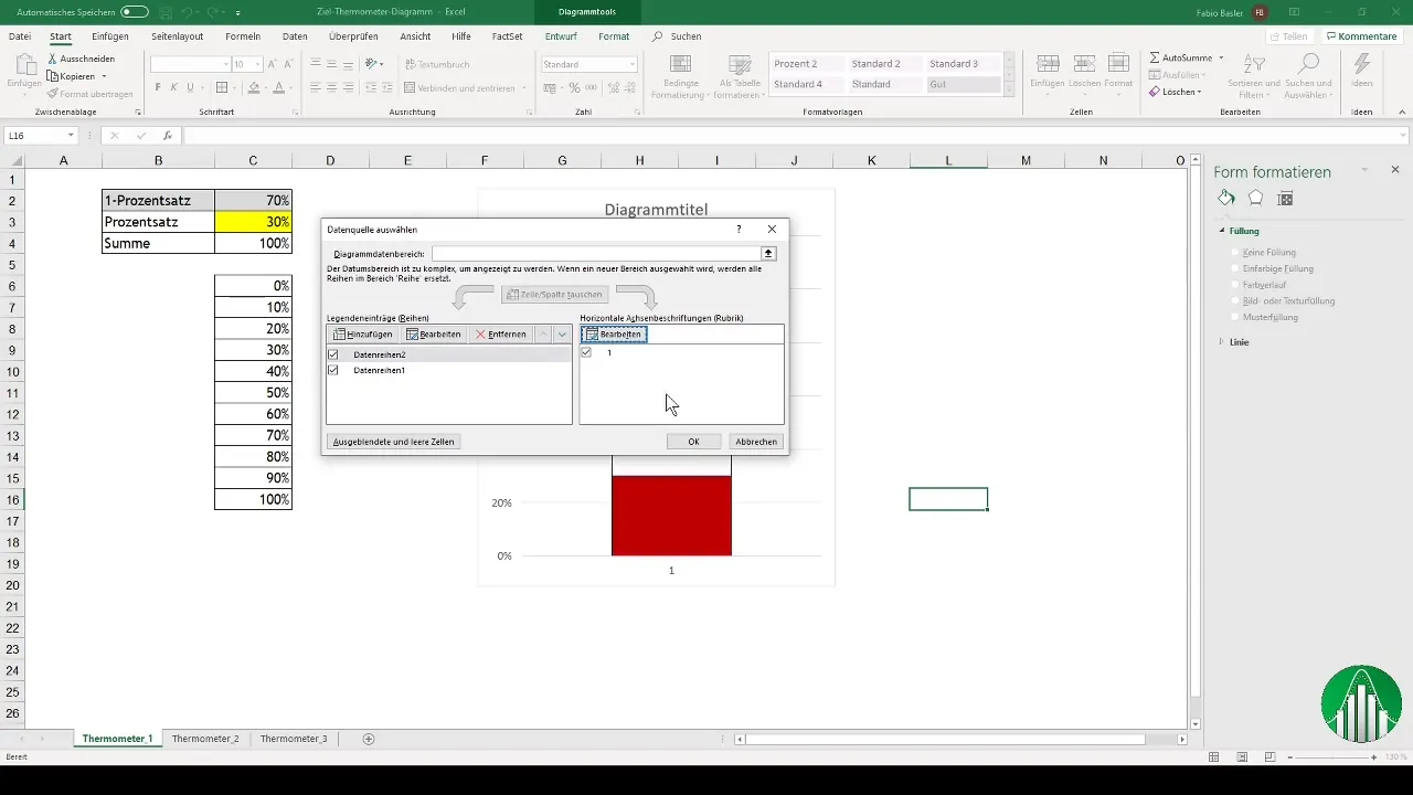
In this step, it may be necessary to reverse the data series. Go to the data selection and move the second data series to the top position so that the chart is displayed correctly.
Fine-Tuning the Chart Settings
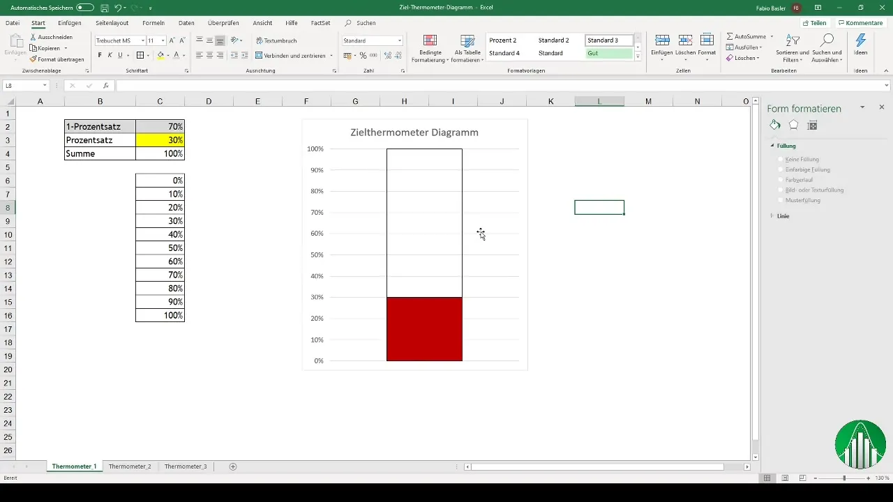
You can further customize the chart by deleting the horizontal axis or correctly formatting the values from 0 to 100%. Gridlines can also be removed to make the chart more organized.
Adding the Temperature Symbol
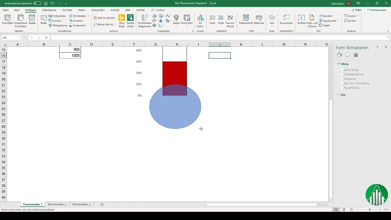
To further customize the chart, you can add a shape, such as a circle or ellipse. This will create a more appealing look and better visual differentiation in your chart.
Creating a Colorful Thermometer Chart
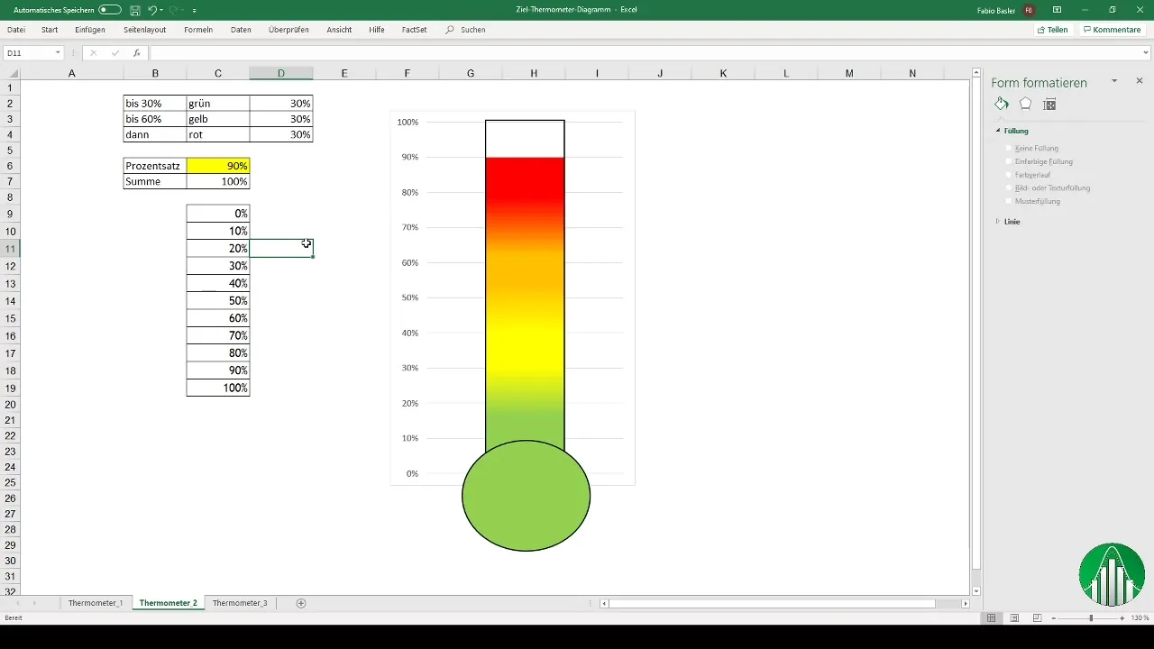
If you want to visually emphasize your chart, you can use a color gradient for the thermometer chart. Add colors attributed to different critical areas: green for positive values, yellow for mixed results, and red for critical areas.
Inserting Conditional Formatting
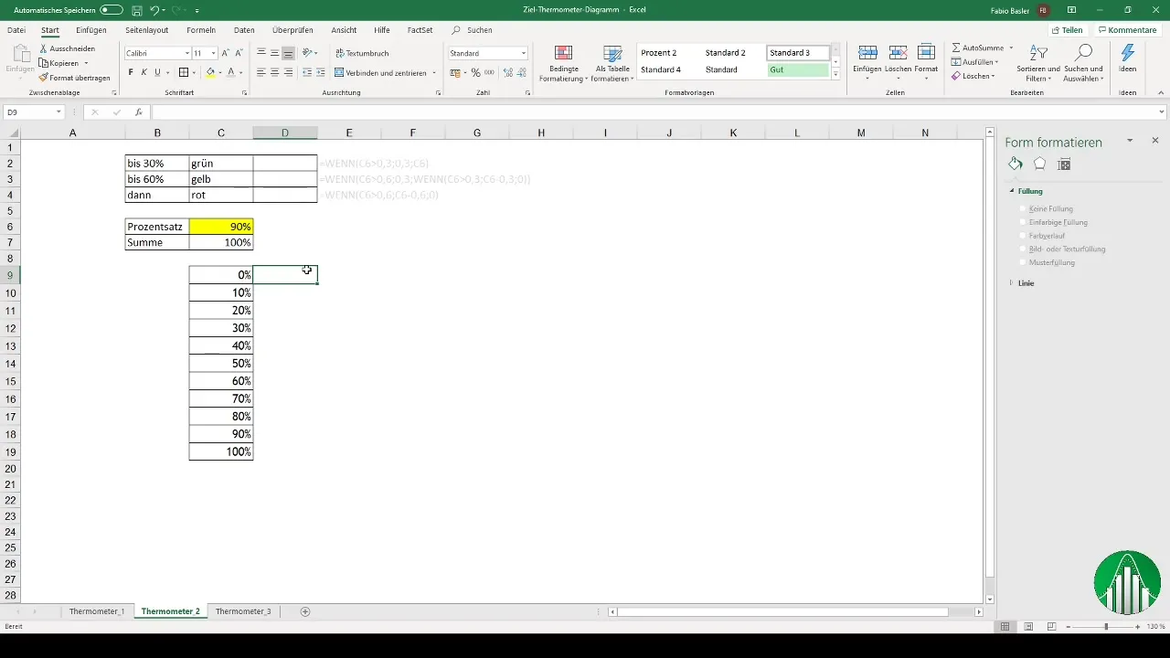
Define the percentages for the colors using the IF formula in Excel. Readable colors (Green, Yellow, and Red) allow you to recognize the performance evaluation at a glance. Let's say you define that 0-30% should be green, 30-60% yellow, and above 60% red.
Finalizing the Dynamics
Now, when you select a percentage from the dropdown menu, the colors and values in the thermometer chart should dynamically change. With this functionality, you achieve an interactive presentation of your data.
Professional Templates
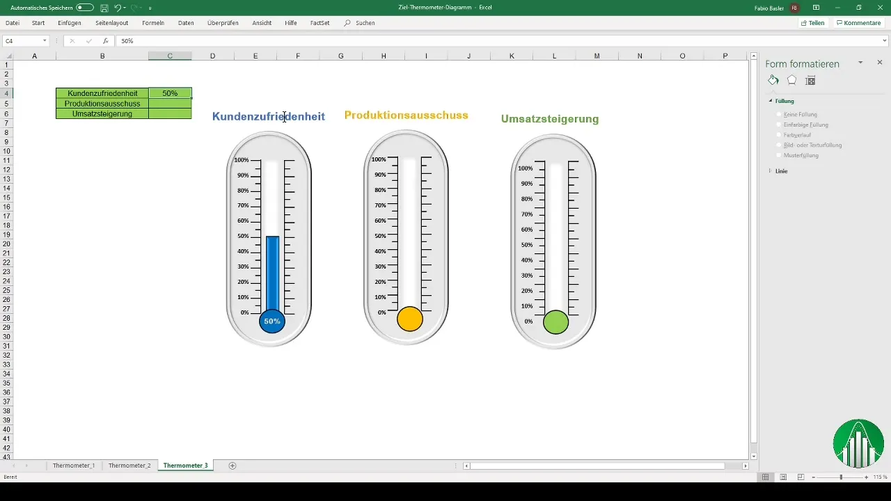
If you want a particularly professional version of your thermometer chart, you can use pre-prepared templates to help you achieve even more appealing results. These templates can be customized as needed.
Summary
With this guide, you can easily create a thermometer chart in Excel in simple steps. From preparing the data, creating dynamic dropdown lists to adding colors and effects, your data presentation will be quick and effective for everyone to understand.
Frequently Asked Questions
How do I create a dropdown list in Excel?Go to "Data" > "Data Validation" and select "List", then specify the cell range for the values.
How can I customize the colors in the thermometer chart?Use the formatting options and assign specific colors to different percentage ranges.
Can I make the chart dynamic?Yes, by using dropdown lists and conditional formulas, you can dynamically adjust the chart.


