If you are already familiar with Excel and want to try creating dynamic charts, simply scroll down a bit. This step-by-step guide will help you create an interactive chart based on dynamic planning steps. With the right functions, you can not only present your data, but also adjust and display it flexibly.
Key Insights
- You can dynamically display and select Excel data.
- The use of the "Move Range" formula is essential for creating flexible charts.
- Dropdown lists enhance the user-friendliness and interactive elements of your Excel files.
Step-by-Step Guide
Start by defining the planning months. First, go to data validation and choose a list to create the respective months. This list will be used as a source for dynamically selecting the months.
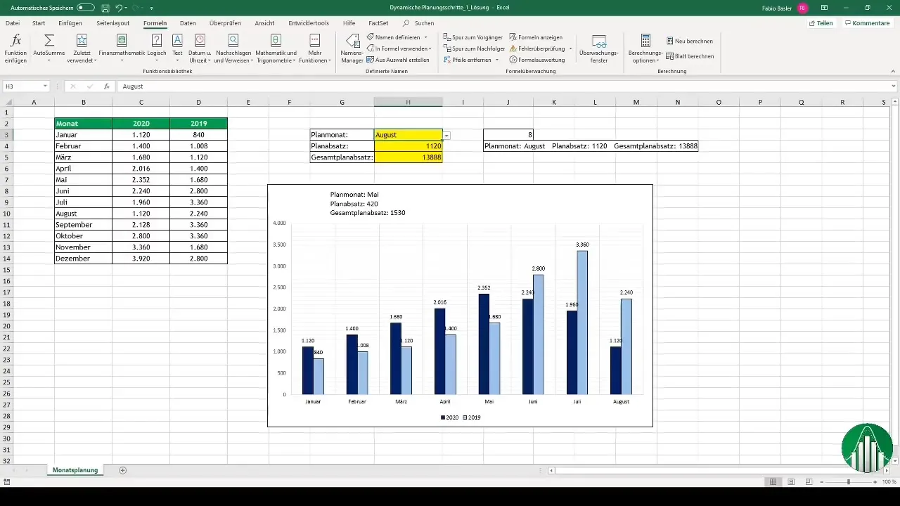
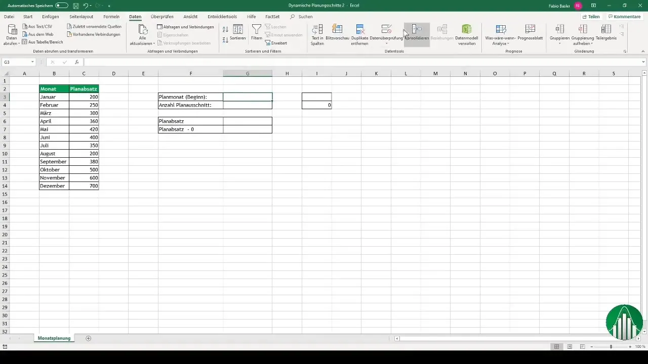
Once you have defined the months, select the corresponding planning steps. These steps should be available in dropdown form, for example, as values from 1 to 11, to increase flexibility and choices.
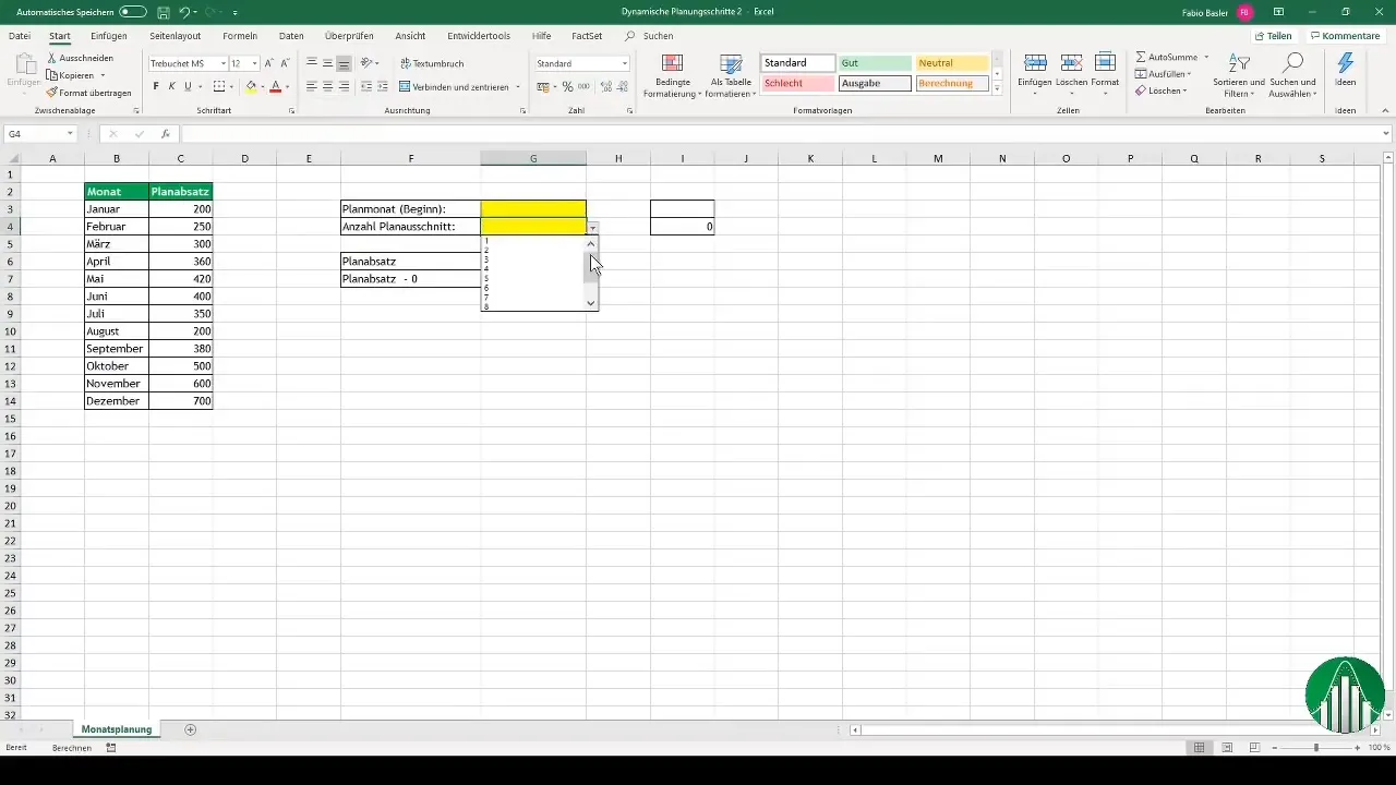
Now that you have selected the months and planning steps, you can establish a specific month. For example, if you select the month of March and indicate that you want to go three months ahead, this will determine that the time period extends from March to May.
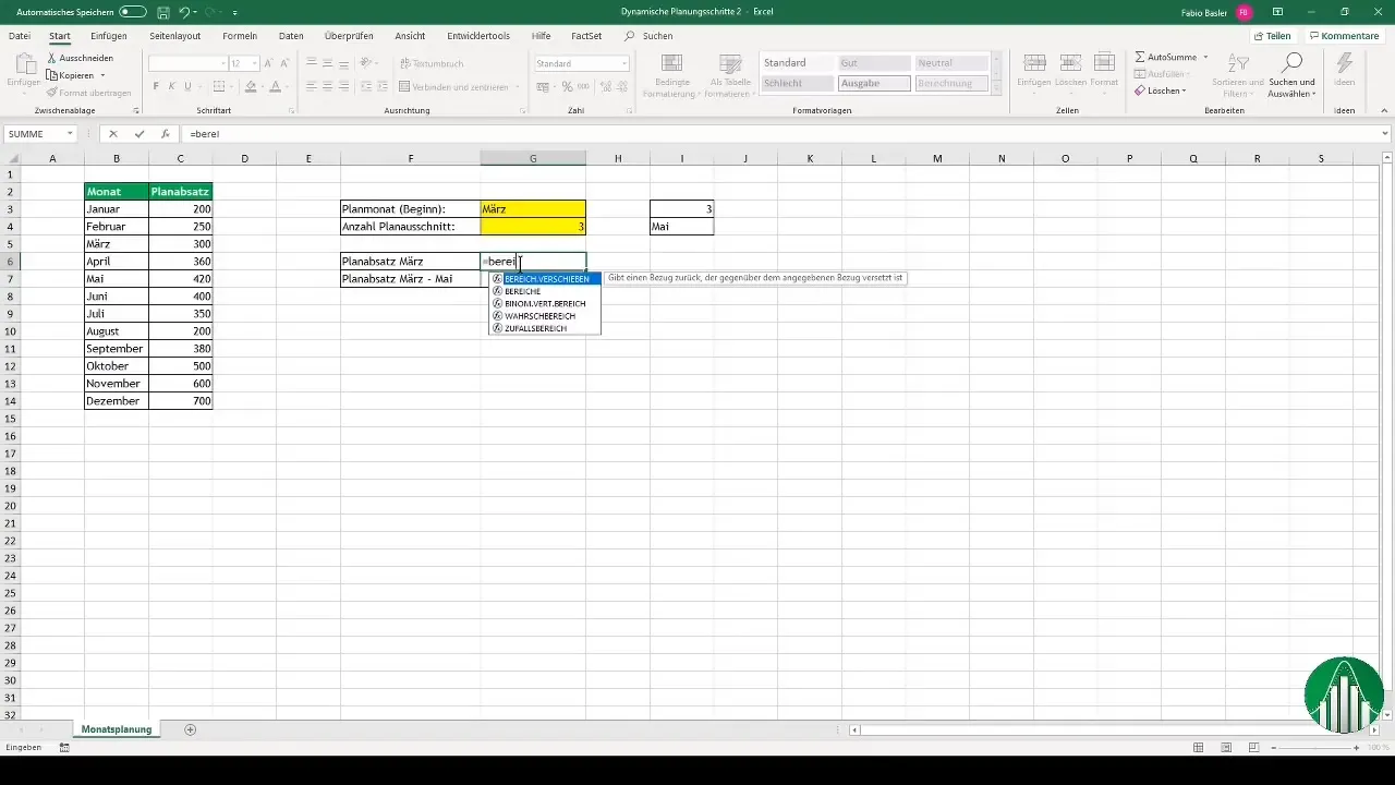
With the "Move Range" formula, you can now extract data from the selected range. You enter this formula for the corresponding planning section in March, indicating that the amount is 300. When you switch to April, you see the value of 360, indicating that the formula is working correctly.
To quantify the period from April to June, you use the SUM function together with the "Move Range" formula. This allows you to accurately add up the corresponding amounts and obtain the sum of values for the three-month period.
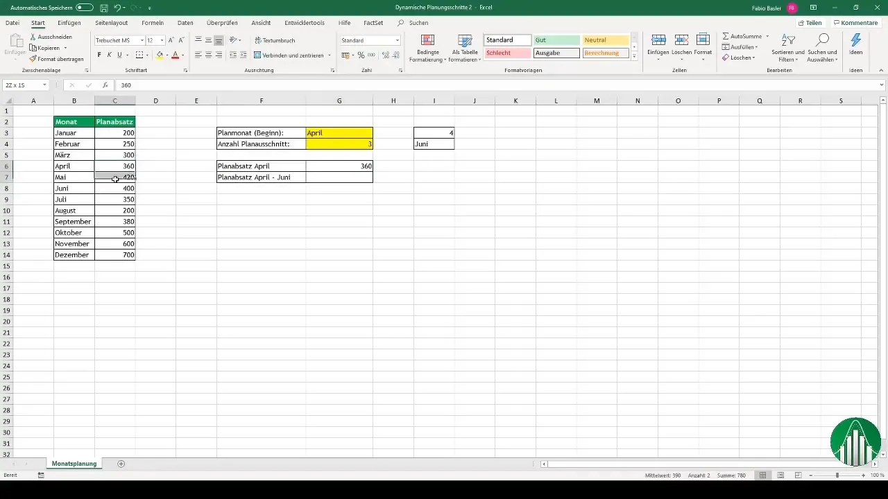
After quantifying all values, it's time to address the diagrammatic representation of the data. Go to the Name Manager and add a new formula that allows you to dynamically set the start of the chart.
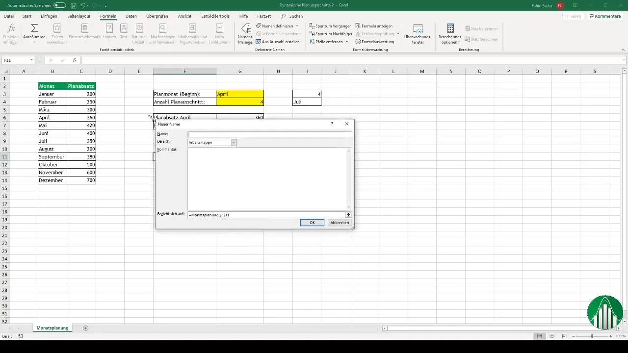
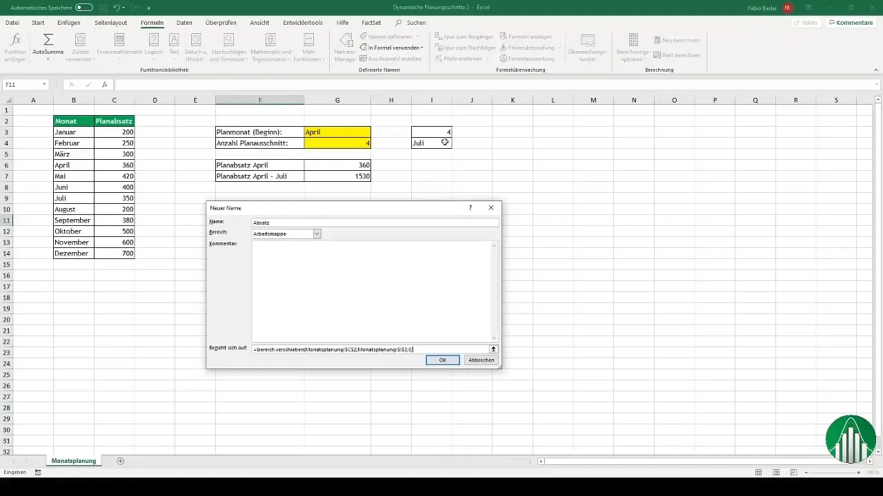
Here, you select the "Move Range" formula again so that the chart is fed with the desired data. This way, Excel can recognize the data from month to month and automatically derive the relevant values.
To ensure that the month and number values are correctly represented, make sure the data in your chart is properly assigned. This is done by repeatedly using the "Move Range" formula, this time for the numbers.
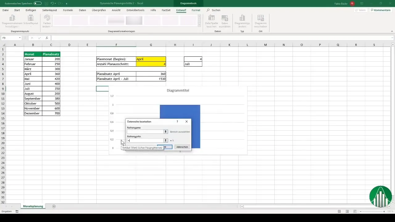
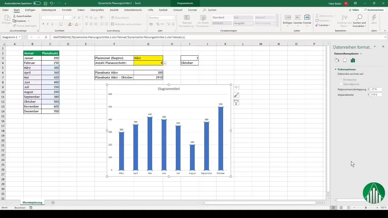
Once all settings have been correctly configured, you can set the chart as a 2D column chart and select the relevant data. It is important to name the chart accordingly so that Excel knows exactly where to find the information.
After creating the chart, you have the option to customize the design and presentation. For example, you can adjust the spacing width and change the colors to improve readability.
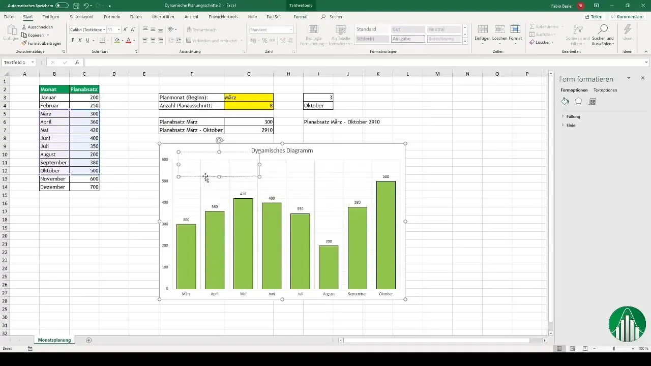
Another useful trick is to add text boxes that are dynamically linked to the values in the chart. This way, you can ensure that all changes are automatically displayed in the dialogue.
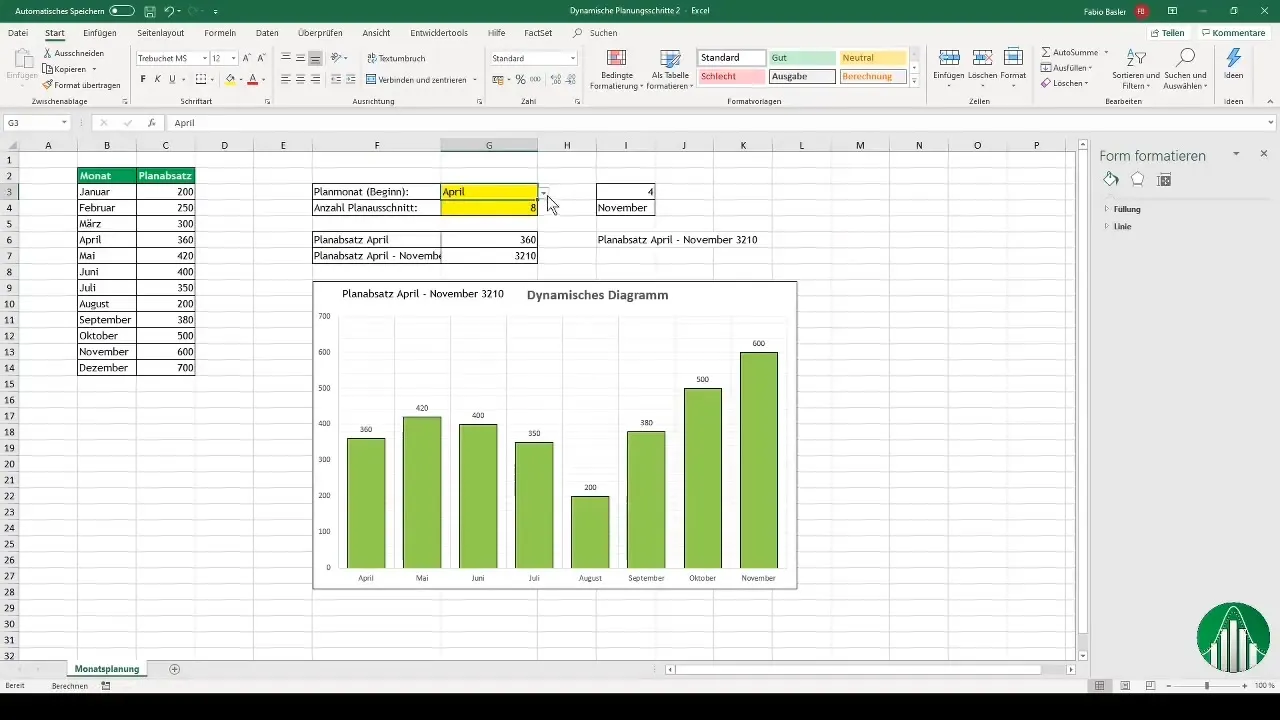
When you change the options or time periods, you will see that the diagram and the associated values update automatically, increasing the interactivity of your presentation.
Summary
In this guide, you have learned how to create interactive, dynamic diagrams with Excel. Using the "offset" formula and integrating dropdown lists provide you with excellent ways to effectively visualize and analyze your data.
Frequently Asked Questions
How do you define the planning months in Excel?You go to data validation and create a list with the corresponding months.
How does the "offset" formula work?This formula allows you to dynamically select and display a specific data range.
How can I customize the appearance of the diagram in Excel?You can change the colors, margins, and chart title according to your preferences.
What steps should I take to add interactive elements to my diagram?Add dropdown lists and link text fields automatically to the corresponding diagram data.


