Creating Gantt charts in Excel is a valuable skill in project management. These charts provide a visual representation of project schedules and help you keep track of various activities and their chronological sequence. Whether in the planning phase or monitoring progress, a well-designed Gantt chart can make a difference.
Key Takeaways
- Gantt charts offer a simple visual representation of project workflows.
- They indicate the duration of activities based on the length of bars.
- There are two common methods for creating Gantt charts in Excel: using a stacked bar chart or through conditional formatting.
Step-by-Step Guide
Step 1: Prepare Raw Data
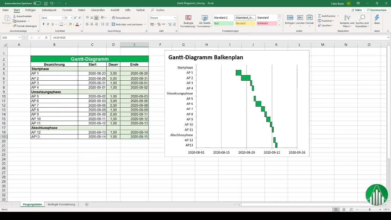
Before you start creating our Gantt chart, it is important to prepare the raw data accordingly. You should enter the time information of your project in Excel. The environmental project includes a start phase, an implementation phase, and a completion phase. The dates could run, for example, from August to September 2020.
Step 2: Select Chart Type
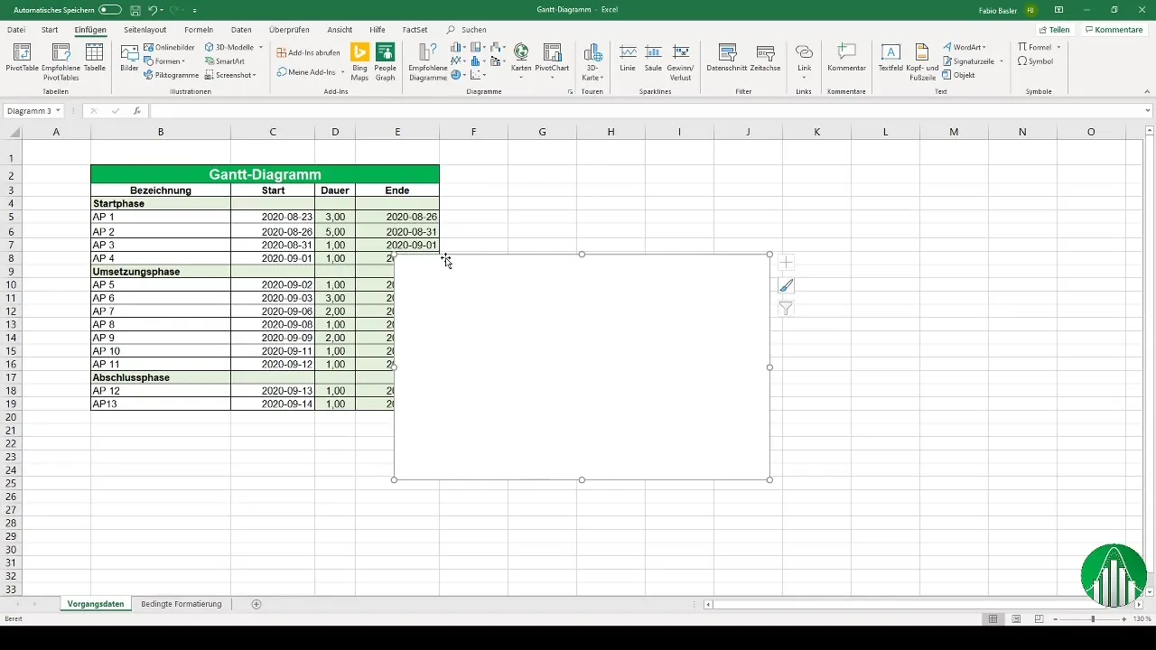
Now it's time to select the appropriate chart for your Gantt chart. Open the chart options in Excel and choose the 2D bar chart. This forms the basis of your Gantt chart.
Step 3: Add Data Series
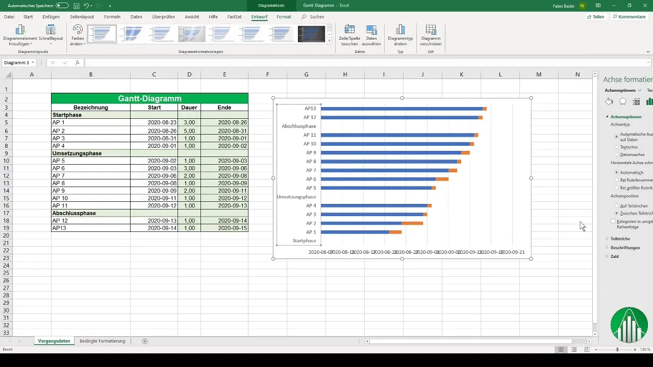
Next, we add the data series necessary for the Gantt chart. Select the relevant data for the start phases and add a second row for the duration of activities. Make sure to correctly select the vertical axis for the labels.
Step 4: Format Axis
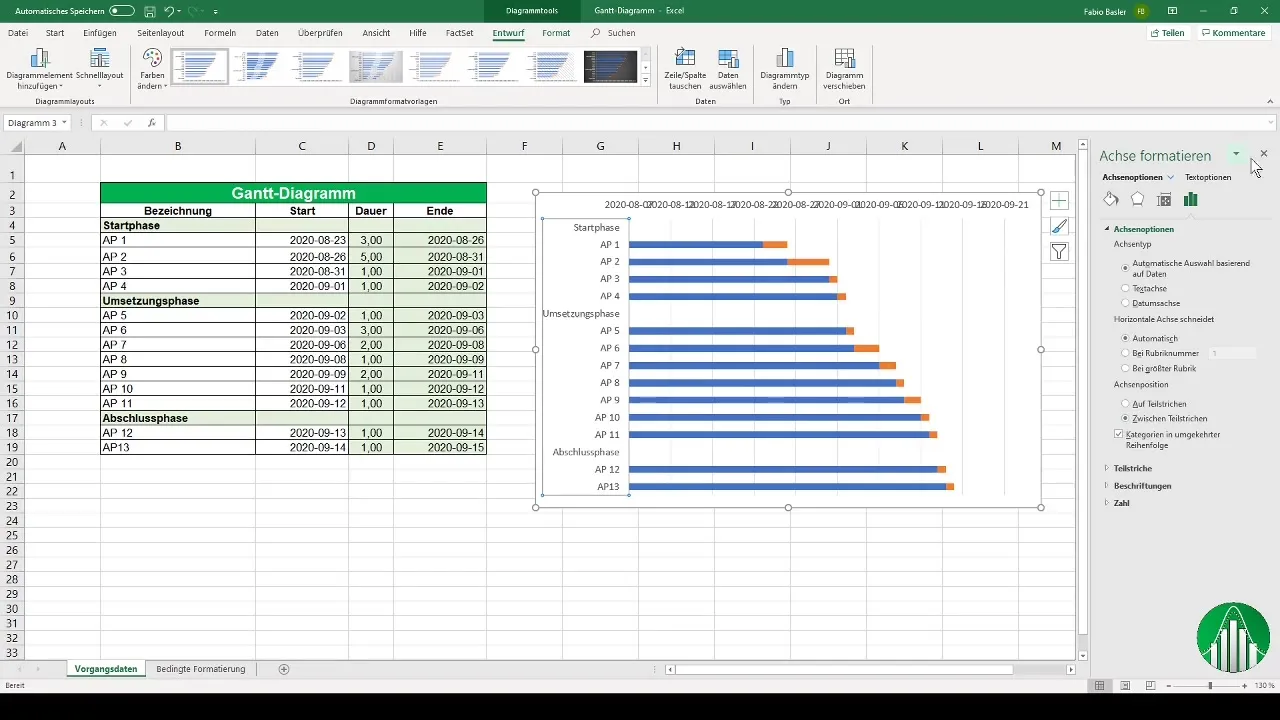
To further customize the chart, swap the order of the axes. Go to axis formatting and choose the option to display the vertical axis in reverse order. This display format enhances the clarity of your Gantt chart.
Step 5: Make Axis Adjustments
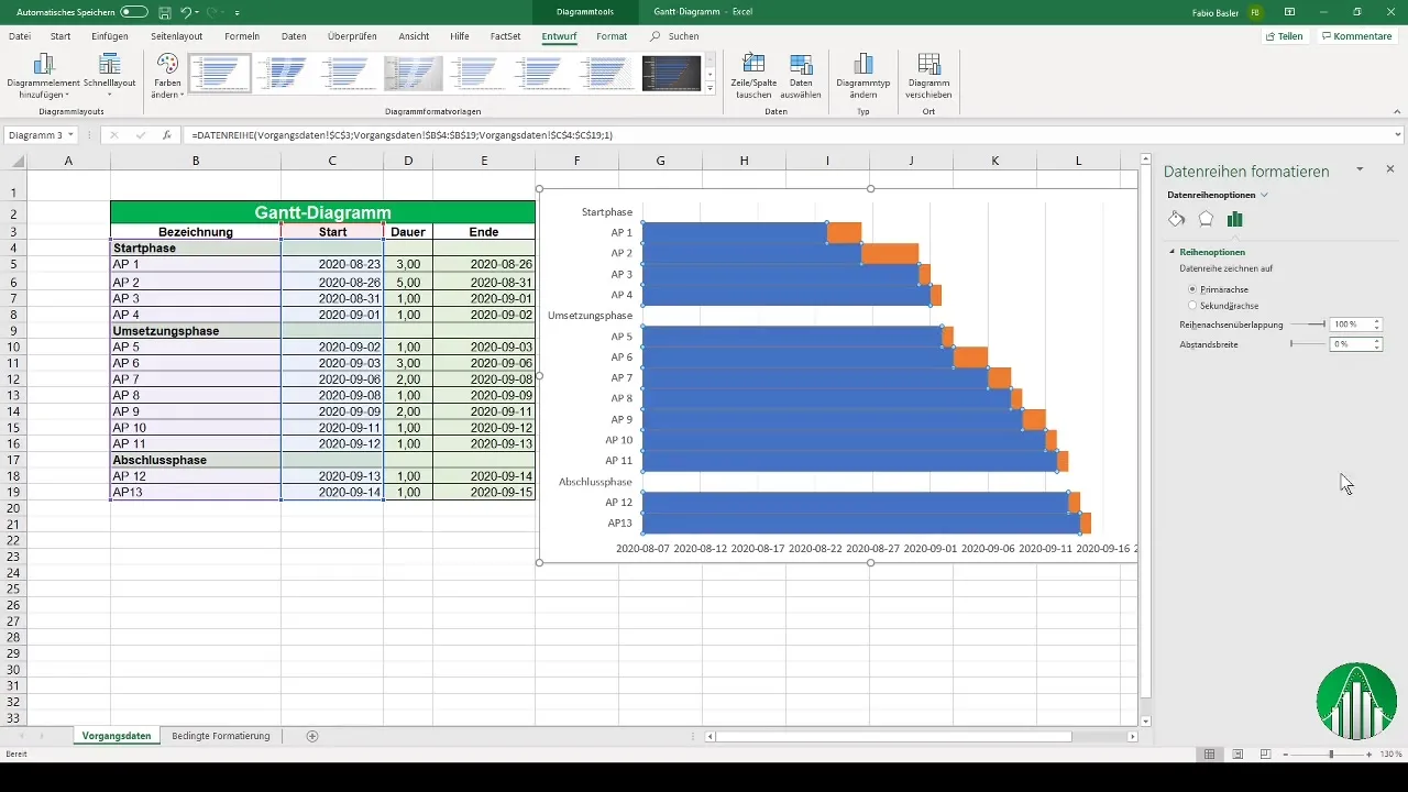
Adjust the horizontal axis by setting the axis close to High. Additionally, you can change the distance between bars to 0%, improving the readability of the chart and creating a more airy design.
Step 6: Customize Bar Colors
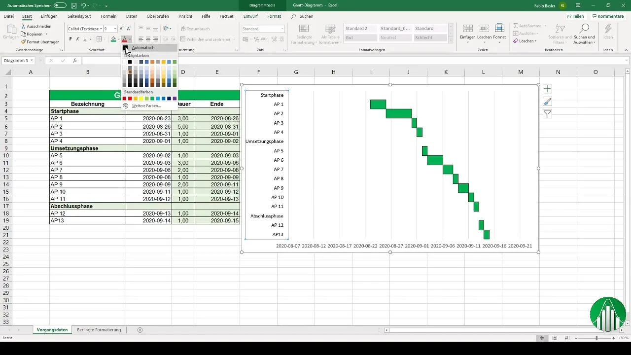
Another adjustment: Remove the fill of the first data series, so only the duration of activities is graphically displayed. This leaves the representation of the green bars that actively display the project's individual phases.
Step 7: Add Chart Title
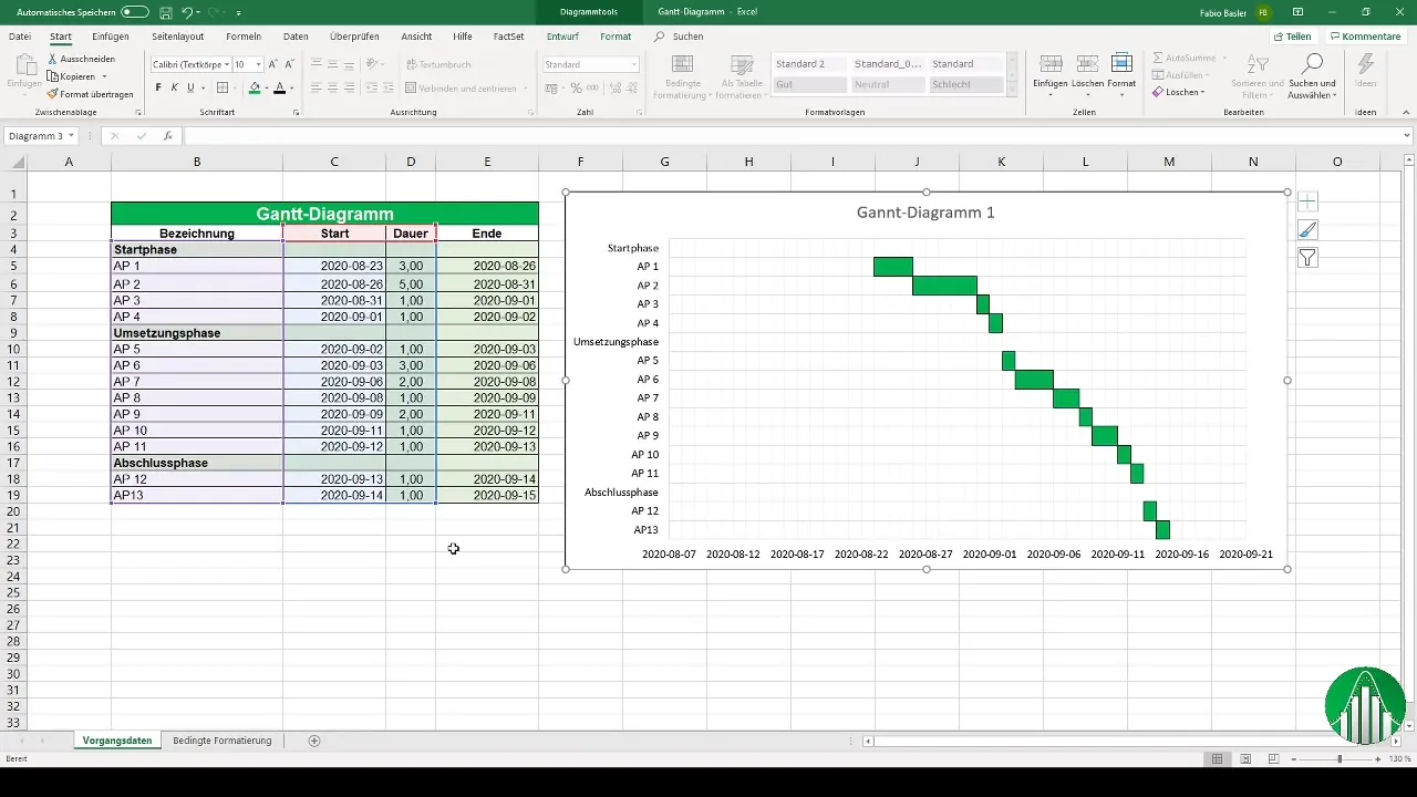
Now it's time to give the chart a title. Add a chart title like "Gantt Chart 1" to allow for better identification.
Step 8: Use Conditional Formatting
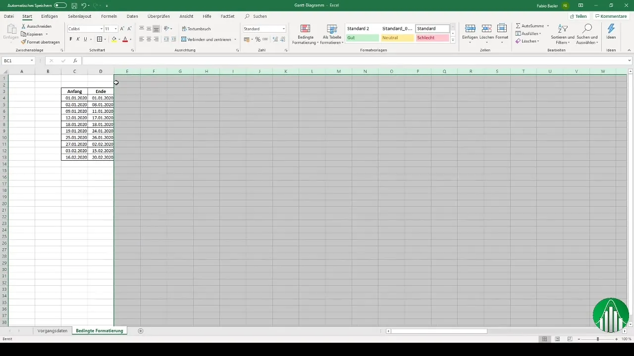
For the second method of creating a Gantt chart in Excel, we will use conditional formatting. We start with the raw data, which spans from January 1 to February 20, 2020. Format the columns uniformly and ensure that the text is easily readable.
Step 9: Create New Rule for Conditional Formatting
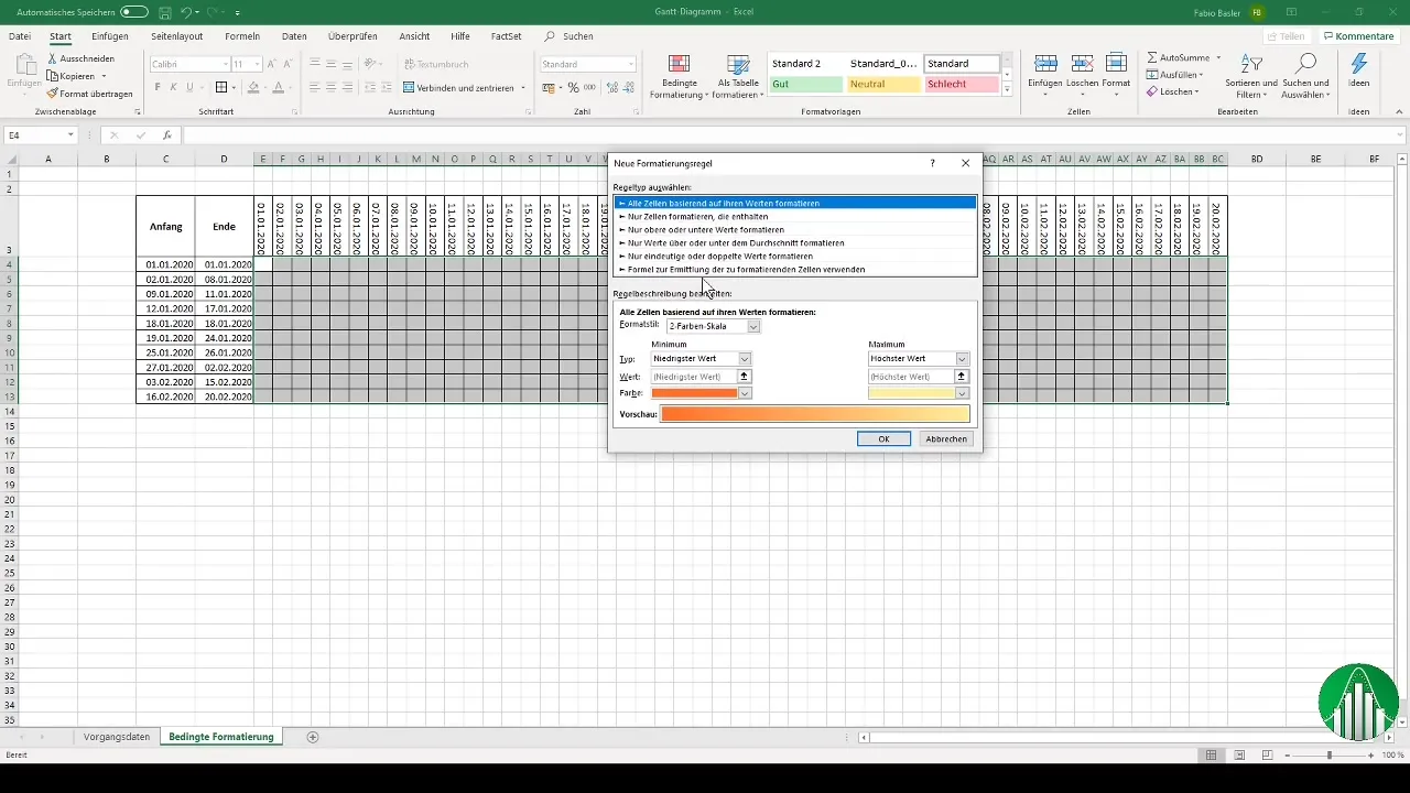
To create the Gantt chart using conditional formatting, go to the conditional formatting options and add a new rule. Here, you define a formula to determine which cells to format.
Step 10: Enter and confirm formula
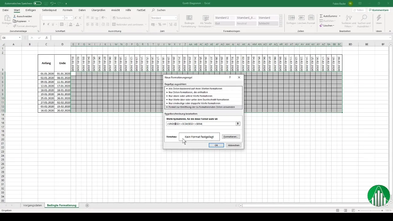
Now enter the formula that formats the cells according to the start and end dates. It is important to pay attention to absolute referencing so that the formatting is correctly applied. Choose an appealing fill color to display the duration of the activities.
Step 11: Check the final result
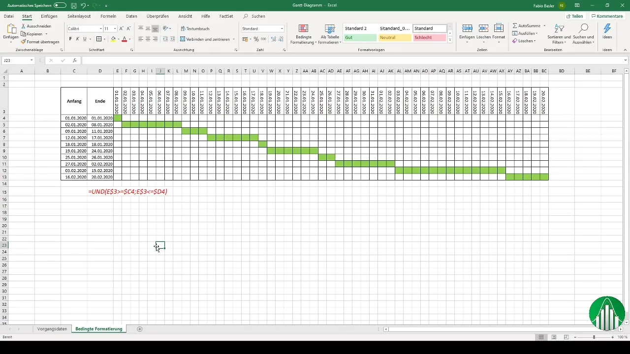
After setting the formatting rules, check your Gantt chart. Make sure that the timelines are clearly visible and that the representation remains clear and concise.
Summary
In this tutorial, you have learned how to create a Gantt chart in Excel. Whether through a stacked bar chart or conditional formatting, both methods offer you the ability to effectively visualize project schedules.
Frequently Asked Questions
How do I create a Gantt chart in Excel?You can create a Gantt chart in Excel by using a stacked bar chart or conditional formatting.
What are the advantages of a Gantt chart?Gantt charts provide a visual representation of the project progress and help you keep track of activities and schedules.
Can I use a Gantt chart for complex projects?Yes, Gantt charts are also suitable for complex projects and help you effectively manage different phases.


