Excel offers excellent opportunities for data visualization. Especially scatter plots and radar charts are useful tools for presenting data in a structured and visual way. In this guide, you will learn how to effectively use these types of charts to analyze and present your data.
Main insights
- Scatter plots are ideal for representing the relationship between two metric scaled values.
- Radar charts are useful for visualizing multiple features and considering data relative to a center point.
- The customization options in Excel allow you to adjust charts to your requirements.
Step-by-Step Guide
Create a Radar Chart
To create a radar chart, follow these steps.
First, you need a table containing the features and their expressed values. Make sure to select features suitable for displaying in a radar chart.
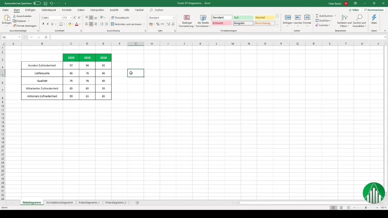
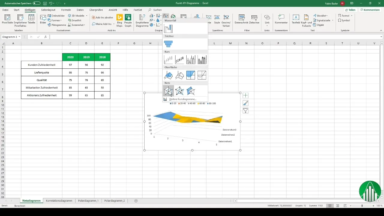
Once you have entered the data, select the range with these numbers. Then go to the “Insert” tab and choose the visualization option. Look for the radar chart here.
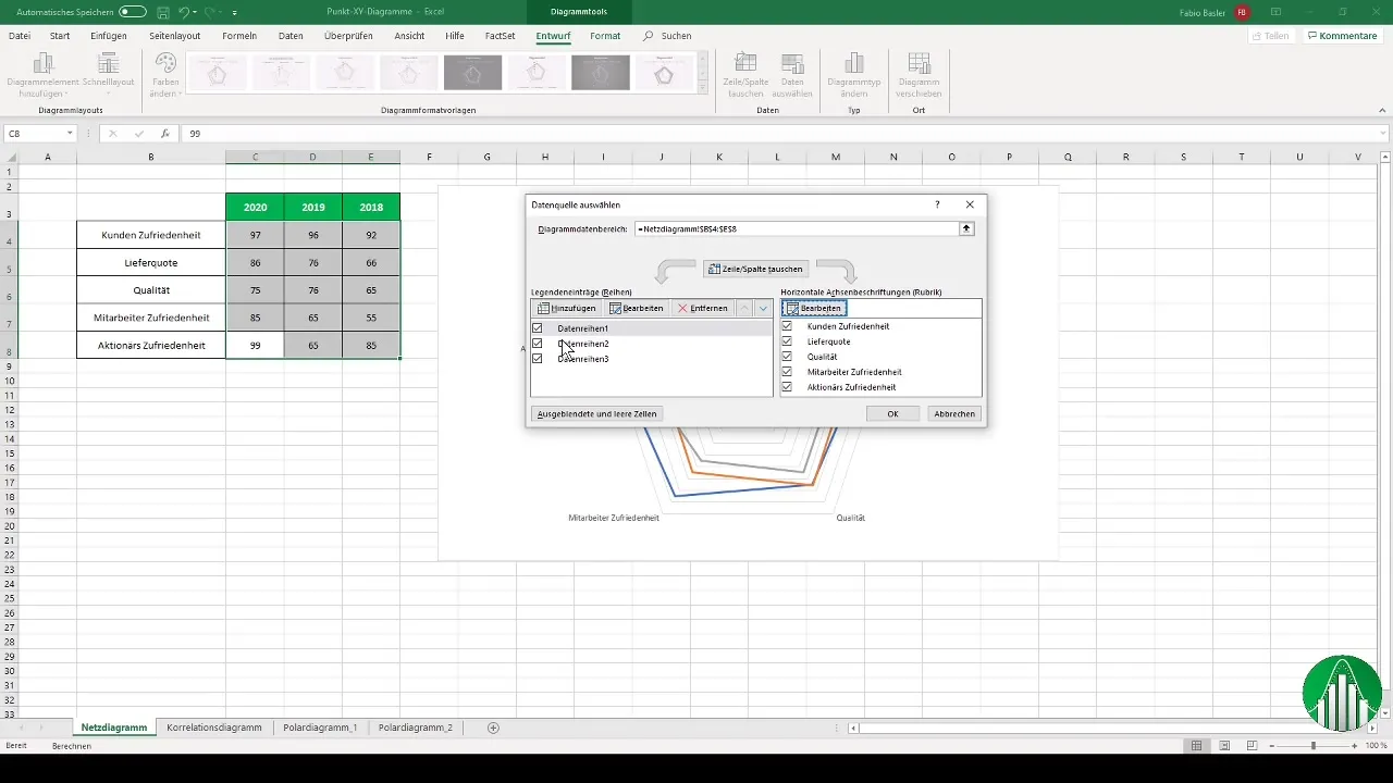
The next step is to label the axes. Go to the data selection and choose the horizontal axis labels to customize. Add the corresponding features (e.g. customer satisfaction, delivery rate, etc.) to make the chart clear and structured.
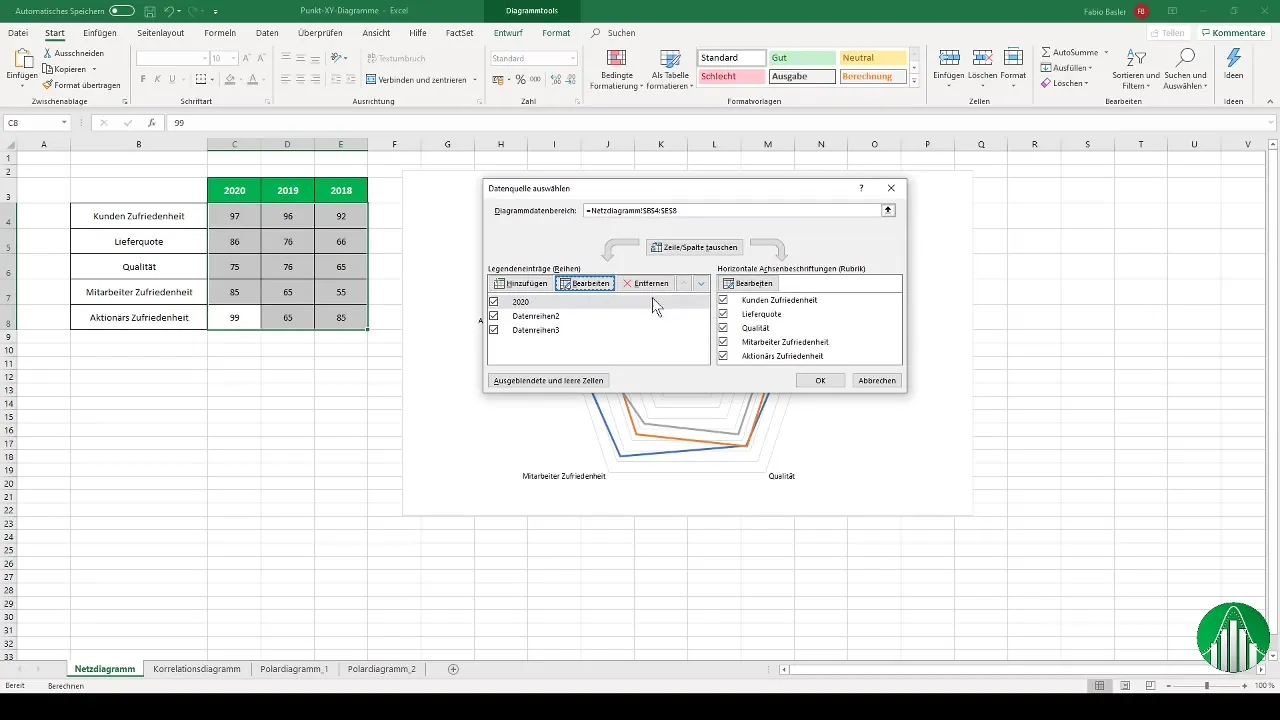
To create the legend representing the different yearly data, name the data series accordingly. For example, you can use the year 2020 for the first series and previous years for the subsequent data.
The colors of your chart can also be customized. For example, you can represent the year 2020 in green and 2019 in light green. This helps differentiate the different data easily.
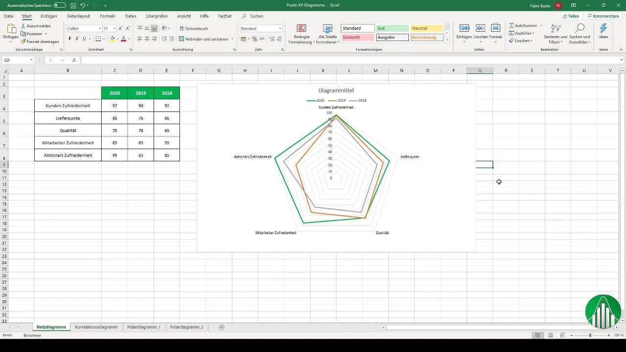
With these customizations, you now have a fully visualized radar chart where you can identify the different features relative to the center.

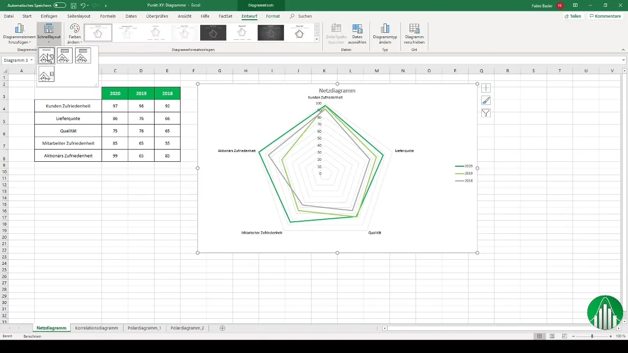
If desired, you can adjust the axis formatting to further optimize the display. Using the design options in Excel, you make further adjustments to make the chart more appealing.
Create a Scatter Plot
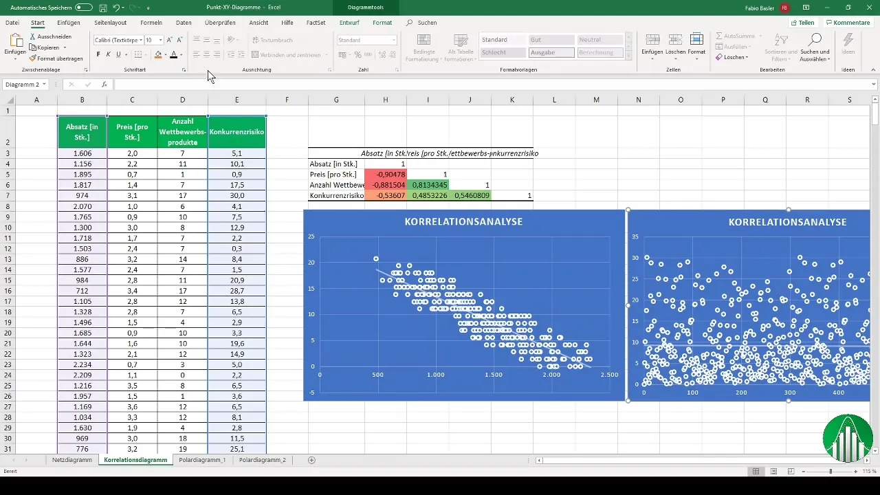
A scatter plot is particularly effective when it comes to representing relationships between two metric variables.
To create a scatter plot, as the first step, select the corresponding data. Then call up the option for an empty scatter plot.
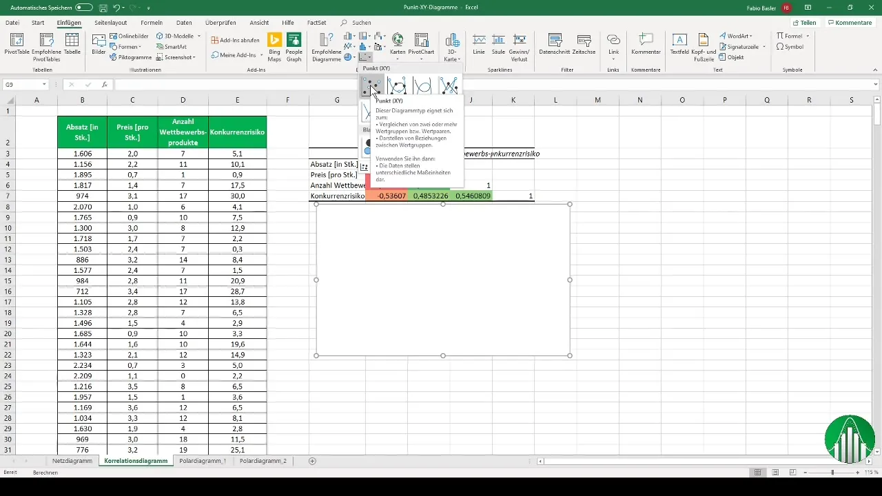
Now look for the data you want to visualize. For the X-axis, select, for example, the paragraph, and for the Y-axis, the number of competitive products. Confirm with "OK," and the chart will be created.

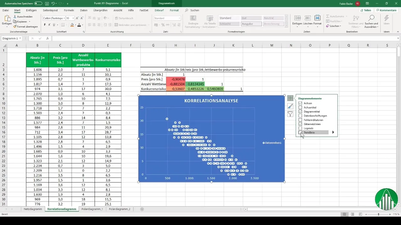
In the visualized scatter plot, you can see the distribution of points and analyze trends and correlations between variables.
Additionally, you can overlay a trendline on the points to better highlight the relationship between the data.
With a practical copy function, you can use the chart for another data series by simply moving it.
Create a radar chart
The radar chart, originally from natural science, is also useful for business analysis.
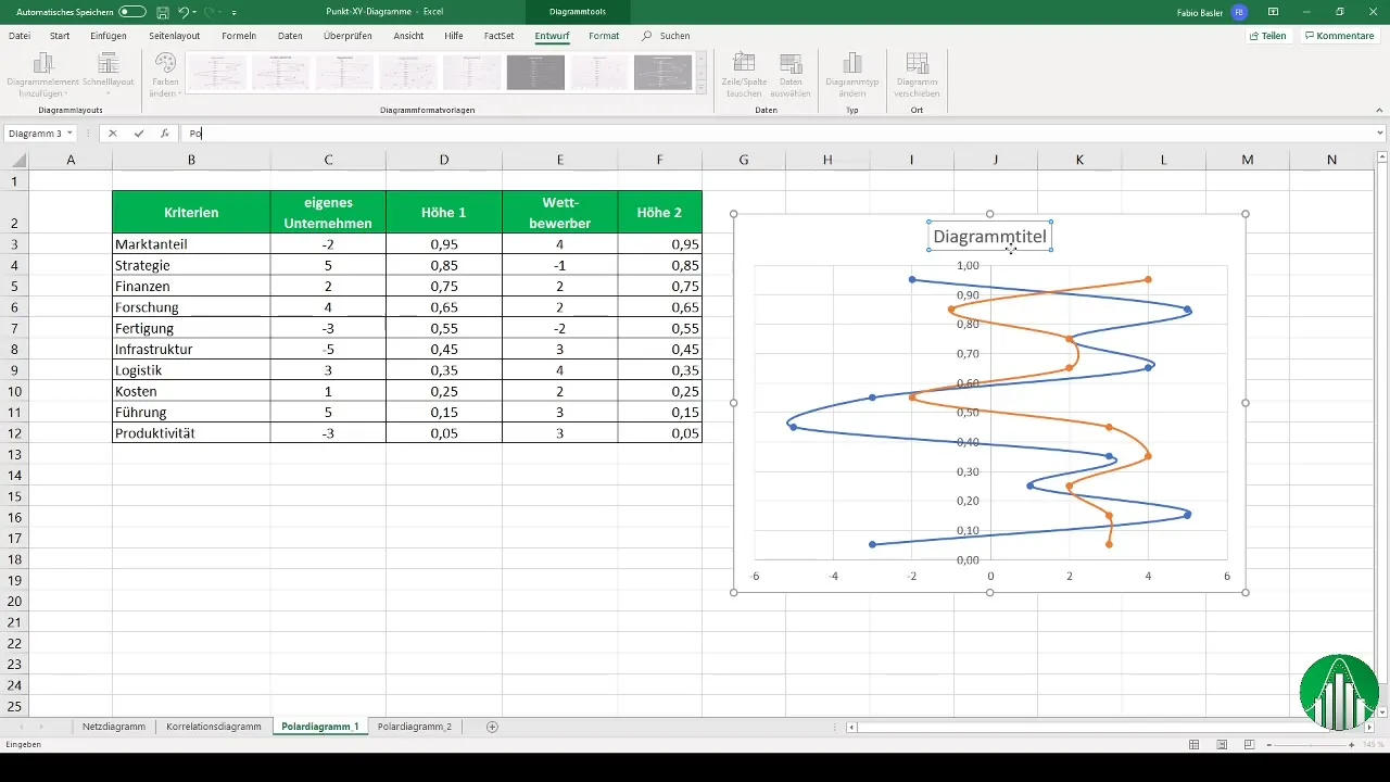
To create a radar chart, you select a scatter chart again and add the data variables you want to analyze - both for your company and for the competitors.
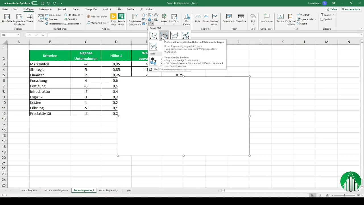
After entering the X and Y values for your company, you add the corresponding values for the competitors. This way, you get a comparative graphical representation.
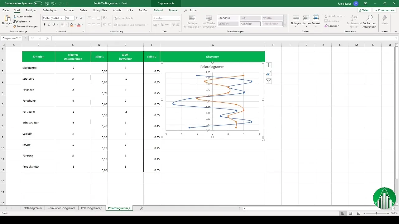
To visualize the vertical axis, you can copy the chart and paste it into a new worksheet to clearly represent the different features.
With these step-by-step instructions, you now have the opportunity to efficiently use scatter charts and radar charts in Excel.
Summary
With this guide, you have learned the basics of creating scatter charts and radar charts in Excel. Use these tools to effectively visualize and analyze your data.
Frequently Asked Questions
How do I create a radar chart in Excel?You can create a radar chart by entering your features in a table, selecting the corresponding data, and choosing the visualization option for the radar chart.
What is the difference between a scatter chart and a radar chart?Scatter charts show the relationship between two metric variables, while radar charts represent multiple features relative to a central point.
Can I change the colors in my chart?Yes, in Excel you can customize the colors of your data series to achieve better differentiation.
Which chart is suitable for correlations?The scatter chart is excellent for visualizing correlations between two or more sets of values.
How can I customize the legend in my chart?The legend can be customized in the chart settings by renaming the corresponding data series.


