Statistical analyses are crucial for making data-driven decisions. In this guide, you will focus on the Boxplot analysis, which is particularly helpful for visually displaying the distribution of data and identifying outliers. We will apply these techniques using an example of revenue from a survey that considers various customer types. You will learn how to calculate key figures in Microsoft Excel, create Boxplots, and conduct outlier analysis.
Main Insights
- You will receive a clear Boxplot representation to analyze revenue data by customer types.
- You will learn how outliers can be identified and interpreted to improve data quality.
- You will become familiar with Excel key figures such as median, quartiles, and range to comprehensively understand your data.
Step-by-Step Guide
Step 1: Data Preparation
First, import the revenue data into Excel. Ensure that you have separated the data for regular customers and premium customers. You can copy the relevant columns, such as revenues, into a new worksheet.

Next, differentiate the revenue data by the two customer types by simply copying the corresponding data. This way, you will have a better overview and can calculate key figures for each group separately.
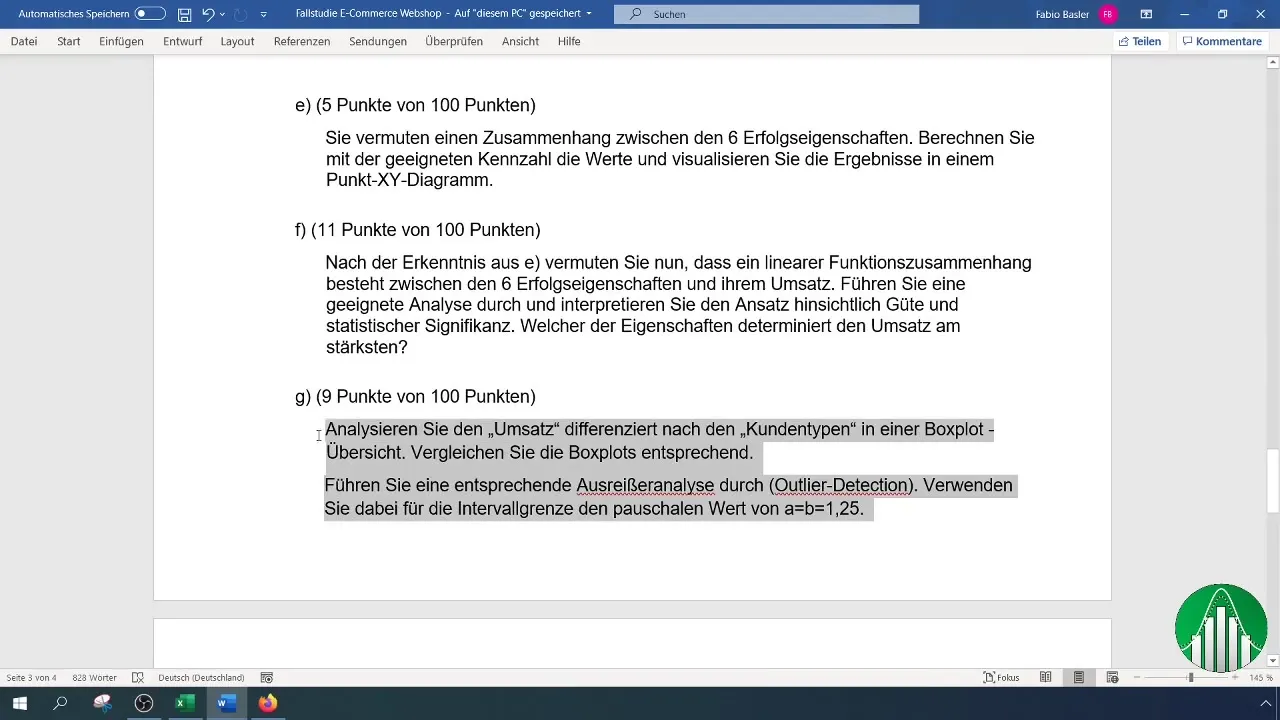
Step 2: Calculation of Key Figures
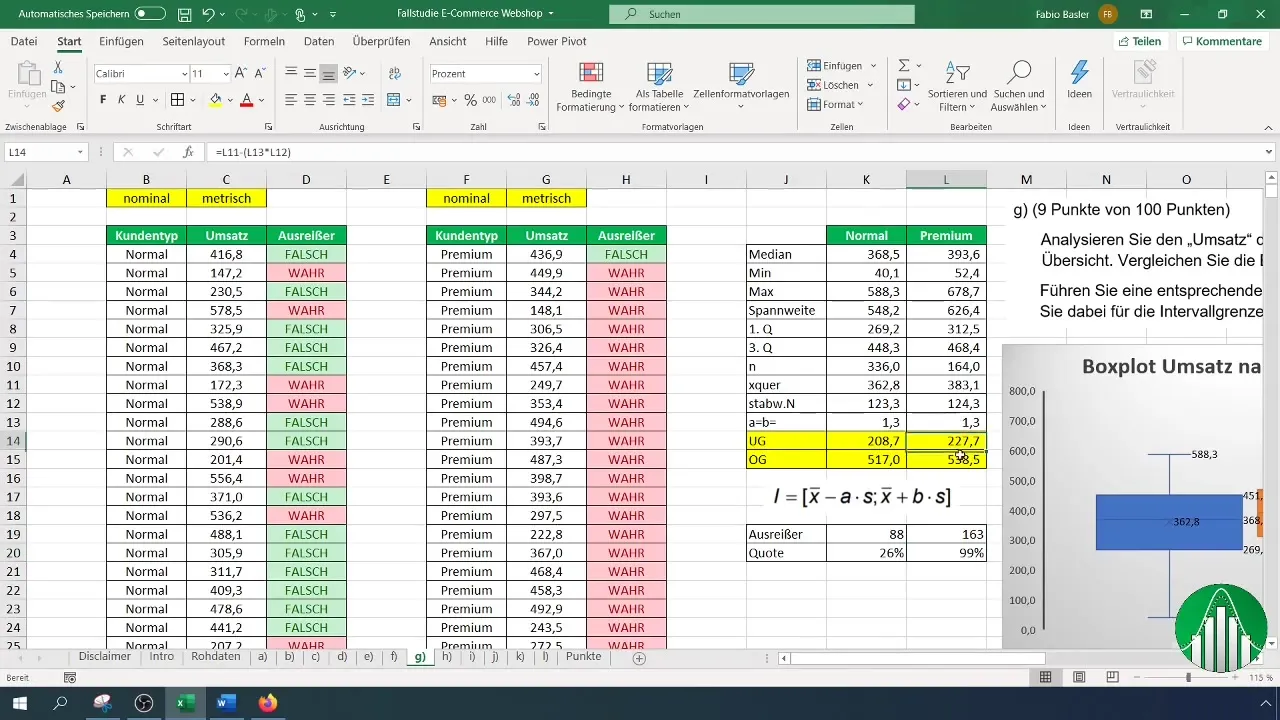
Now, start calculating important key figures necessary for the Boxplot representation. The first value you calculate is the median. You use the function =MEDIAN() to determine this value for both regular customers and premium customers.
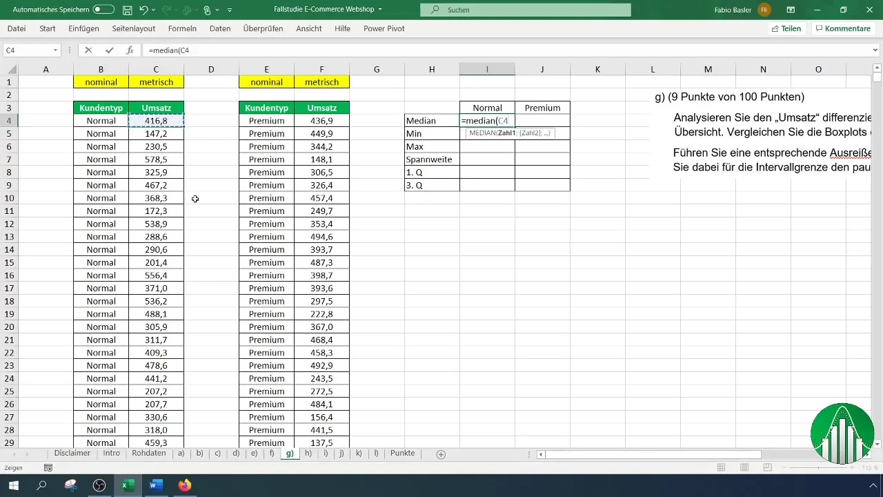
Next, calculate the minimum and maximum using the functions =MIN() and =MAX(). These values help understand the range of revenue data.
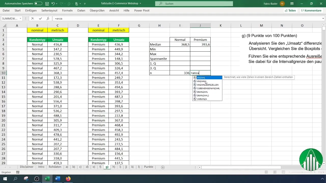
You obtain the range by subtracting the minimum from the maximum. The formula is simple: Range = Maximum - Minimum.

In addition, calculate the first and third quartiles using the =QUARTILE() function. These values are crucial for the Boxplot.
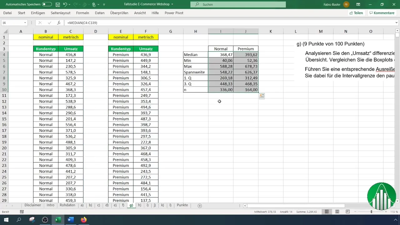
Step 3: Creating the Boxplots
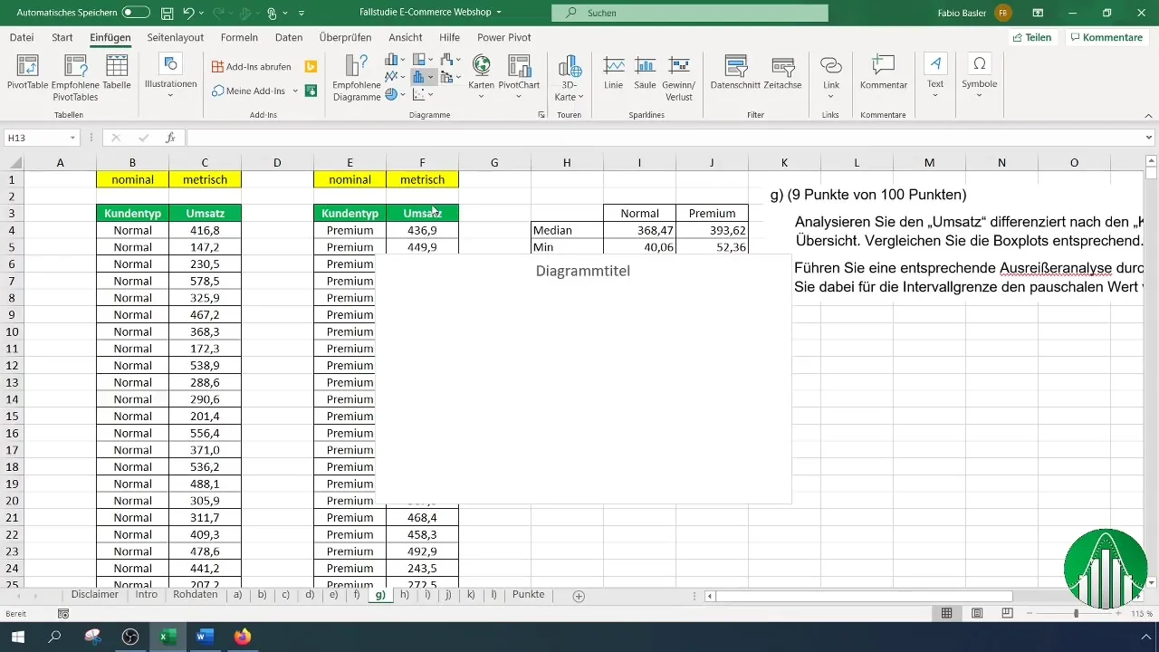
To create the Boxplot, select the "Insert" menu option and choose "Boxplot". First, add the data for regular customers.
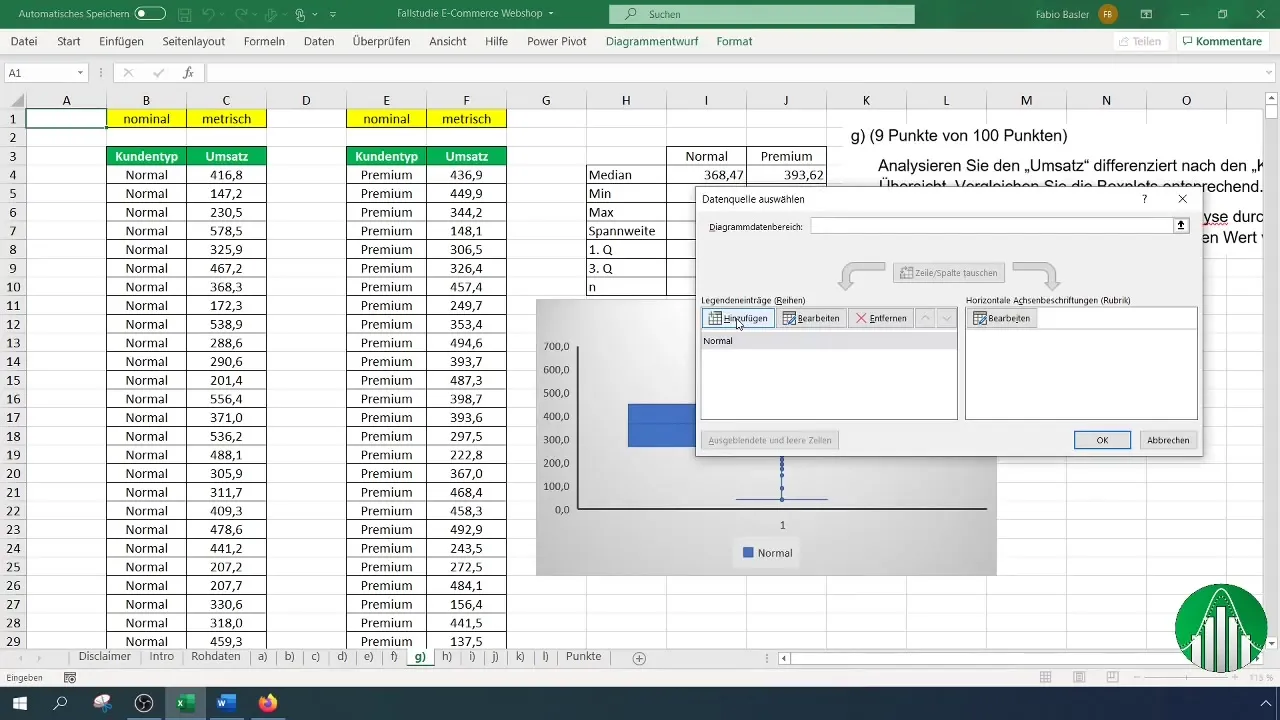
Right-click on the Boxplot to select the data. Now, add the data sets for premium customers.
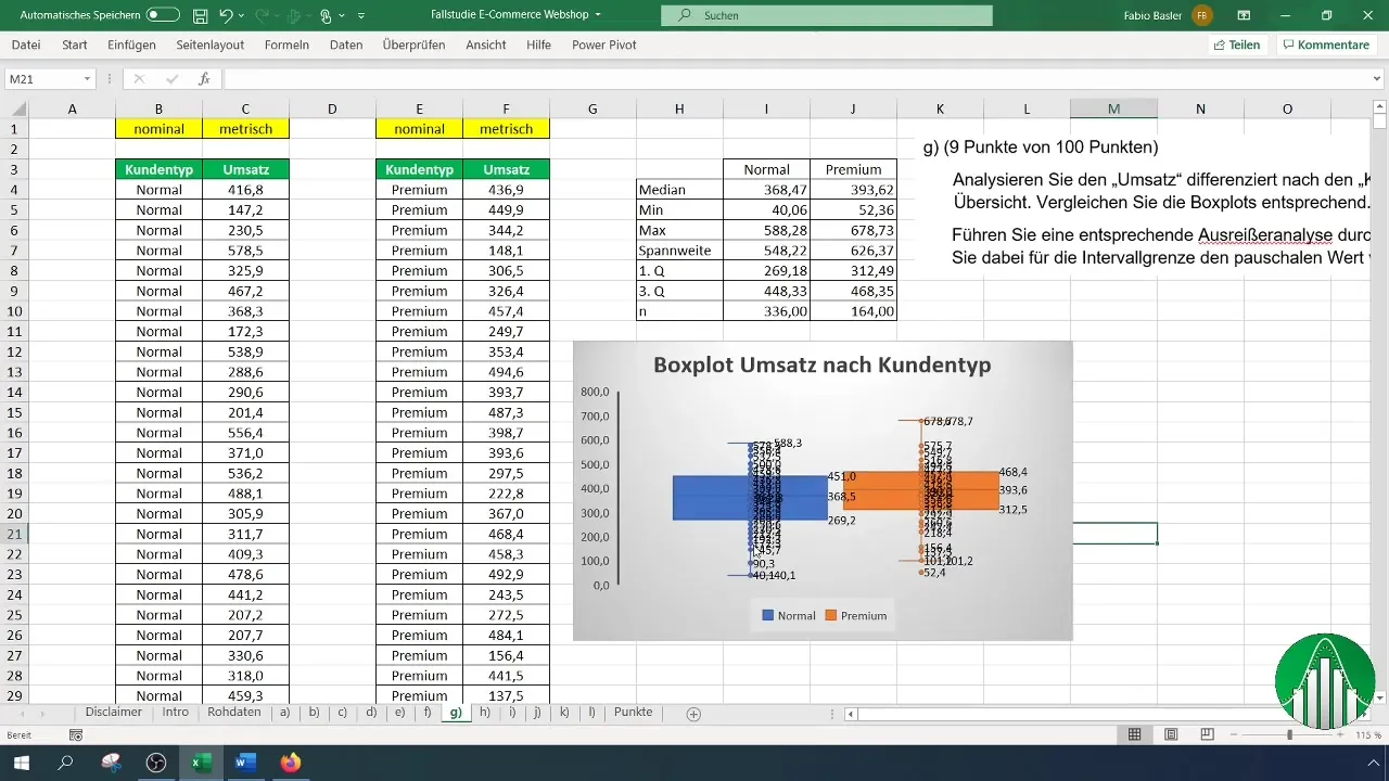
Ensure the Boxplot accurately represents by removing any unnecessary data labels to improve clarity.
Step 4: Interpreting the Boxplots
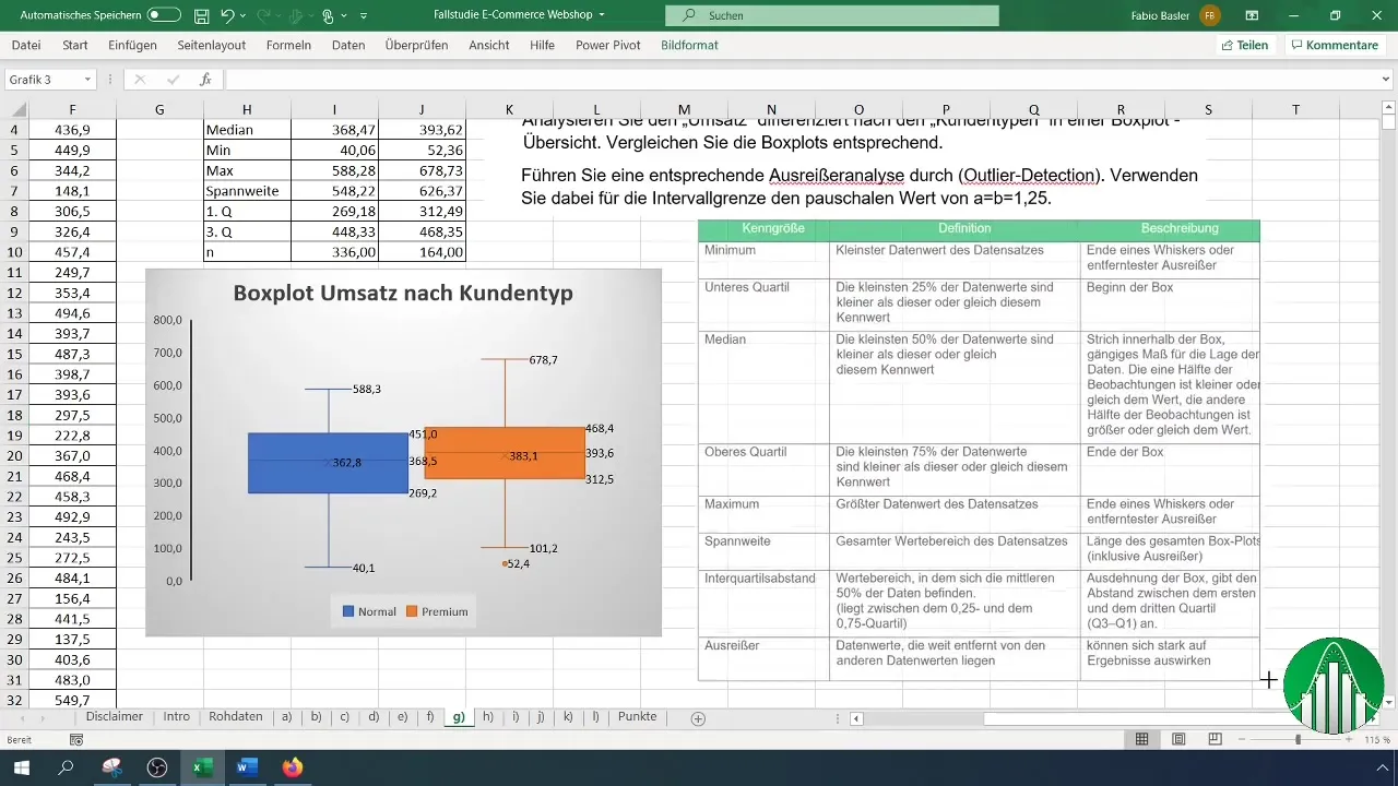
Now that the Boxplot is created, you can analyze the results. The median, quartiles, and range are visually presented to you. Note where the outliers are and how they affect the overall picture of the data compared to other values.
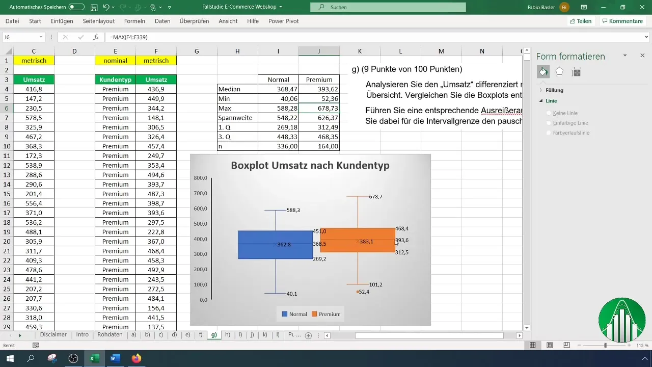
Make appropriate comparisons between regular customers and premium customers. Consider the significance of the different median values and ranges.
Step 5: Performing Outlier Analysis
To identify outliers, you apply the method of "Outlier Detection." First, you calculate the mean and standard deviation for the two customer groups.
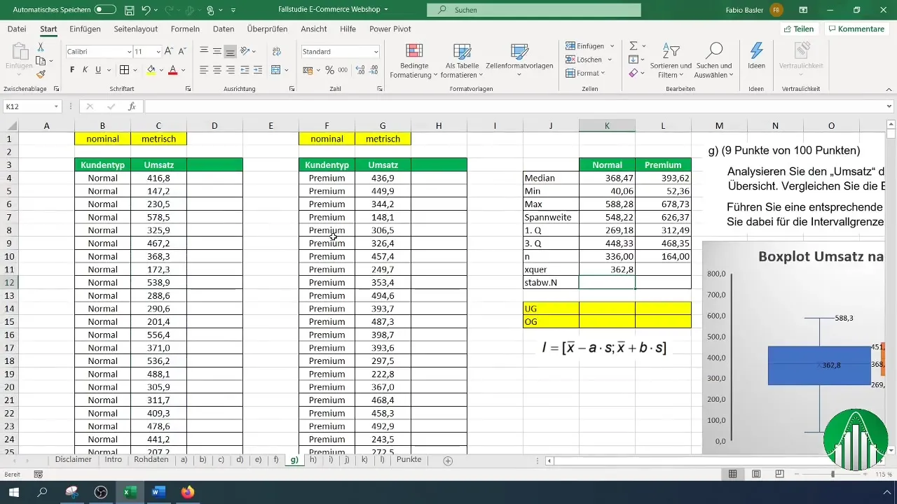
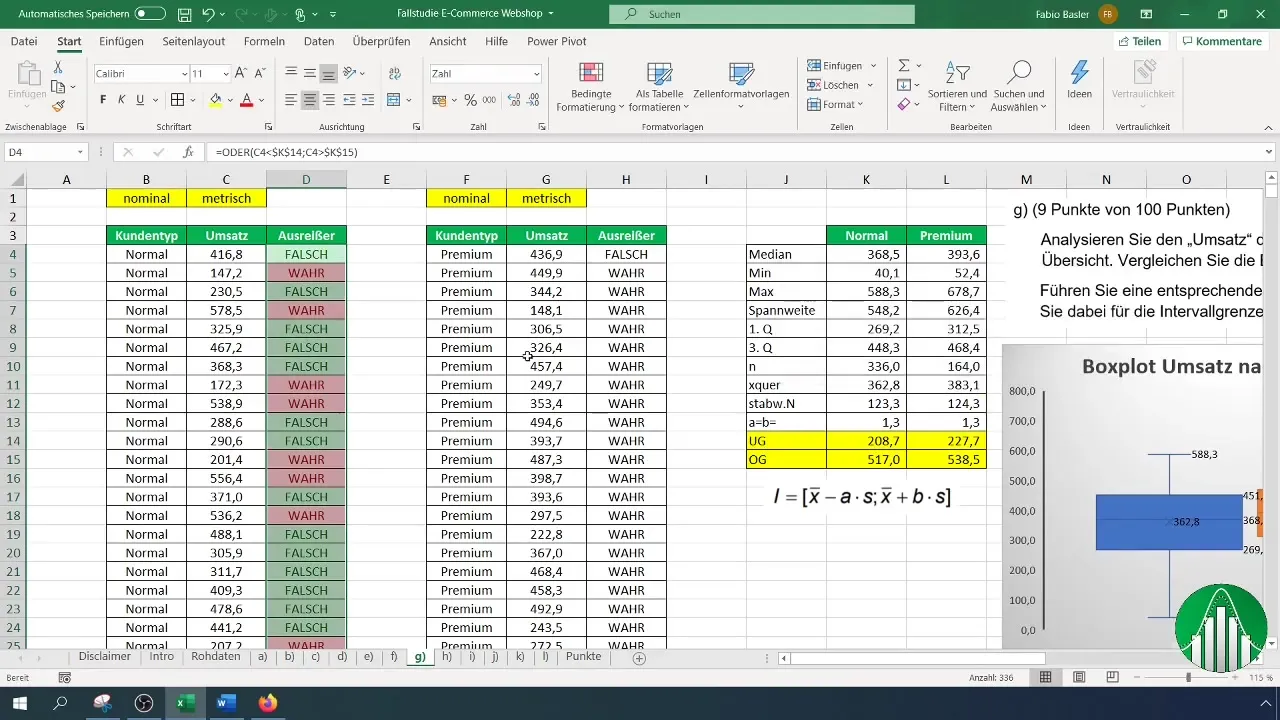
Now you apply the formula to determine the lower and upper bounds, using the value 1.25 for both a and b. These bounds help you to directly identify the outliers.
You can then visually represent the results with conditional formatting to better identify the outliers.
Step 6: Additional Evaluations
Finally, you conduct an analysis to determine the number of identified outliers. This not only gives you information on how many values are outside the set boundaries but also their impact on your overall analysis.
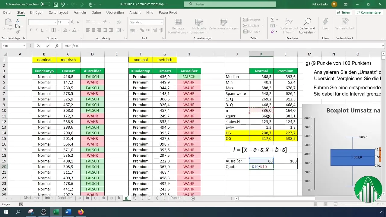
Normally, you should examine the percentage of outliers relative to the total number of data points more closely to better assess whether these values actually play a significant role.
Summary
In this guide, you have learned how to conduct a detailed box plot analysis in Excel and identify outliers at the same time. You now know that metrics such as median, quartiles, and range are essential tools for effectively analyzing and interpreting data. This will help you better understand revenue by customer type and derive targeted actions.
Frequently Asked Questions
What is a Boxplot?A box plot is a graphical representation of data distribution that visualizes median, quartiles, and outliers.
How do I calculate the median in Excel?Use the function =MEDIAN() and select the range of your data.
What are outliers and how do I identify them?Outliers are values that deviate significantly from the other data points. They are identified by checking threshold values.
How can I create a Boxplot chart in Excel?Select the data, go to "Insert," and then choose "Boxplot."
How important are outliers in data analysis?Outliers can provide important information about unusual or critical data points and should therefore be analyzed.


