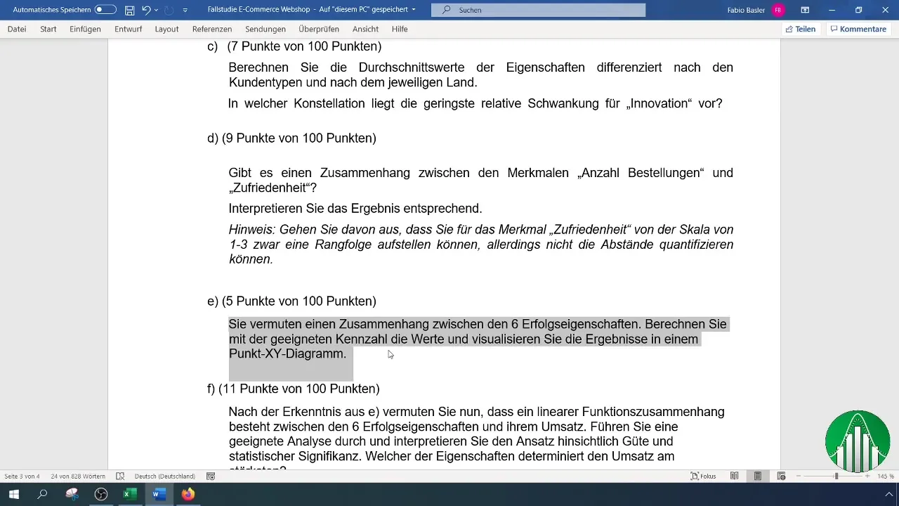
Analyzing relationships between different variables is of central importance in statistics. One of the most effective methods for this is correlation analysis, which allows you to discover relationships between multiple characteristics. In this tutorial, you will learn how to create a correlation matrix from a survey using Excel, consisting of six relevant success attributes. You will learn how to analyze data, present the results graphically, and interpret them meaningfully.
Main Insights
- Correlation measures the strength and direction of a relationship between variables.
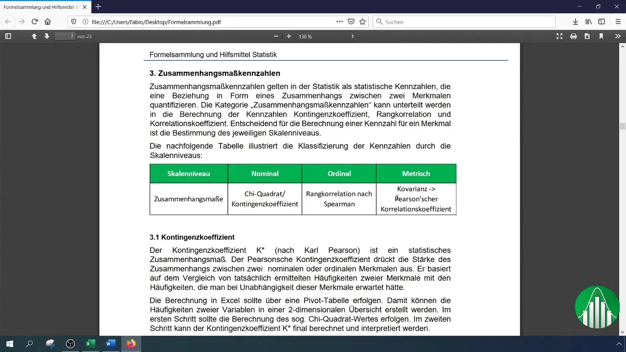
- The Pearson correlation coefficient is a commonly used method for calculating the correlation of metric data.
- Excel offers a data analysis function that simplifies the creation of a correlation matrix.
- Conditional formatting helps in the visual representation of correlations.
Step-by-Step Guide
Data Preparation and Transfer
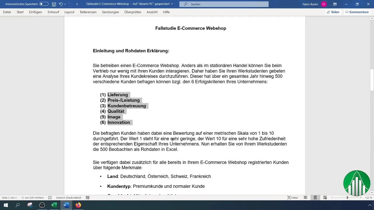
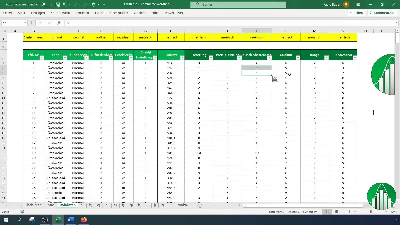
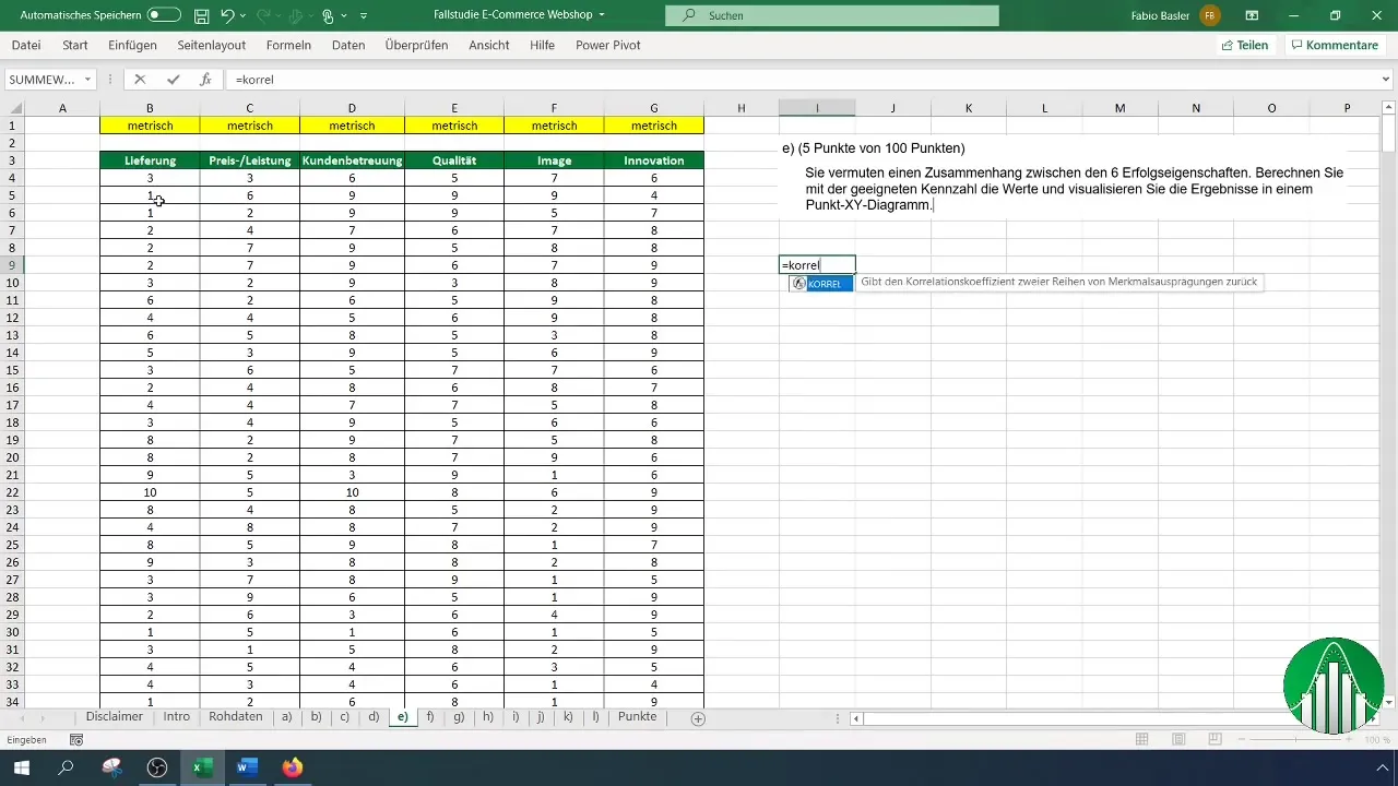
You have already conducted a survey from which you have collected values for six success attributes: Delivery, Value for Money, Customer Service, Quality, Image, and Innovation. These values are available in an Excel document. To perform the correlation analysis, you need to transfer the relevant data to the worksheet first.

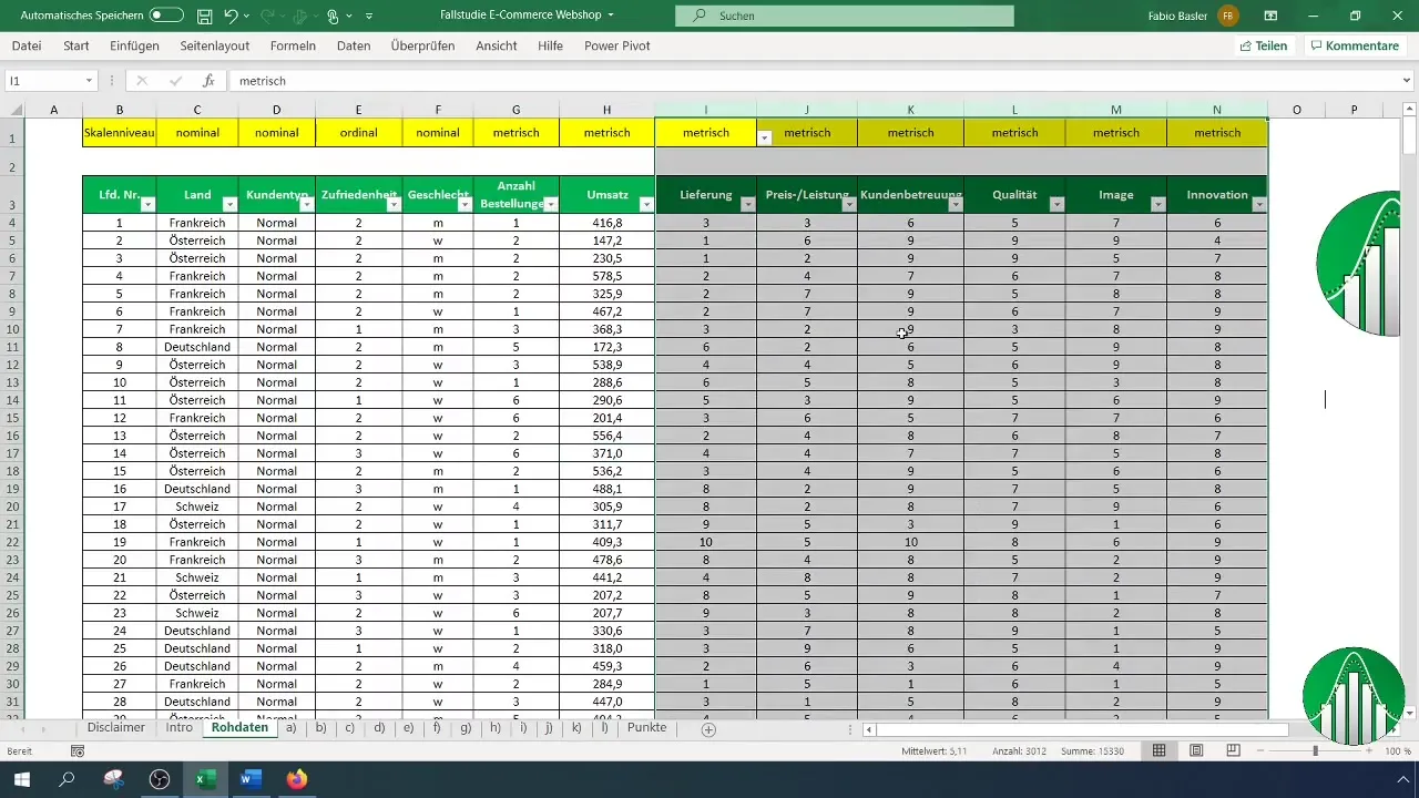
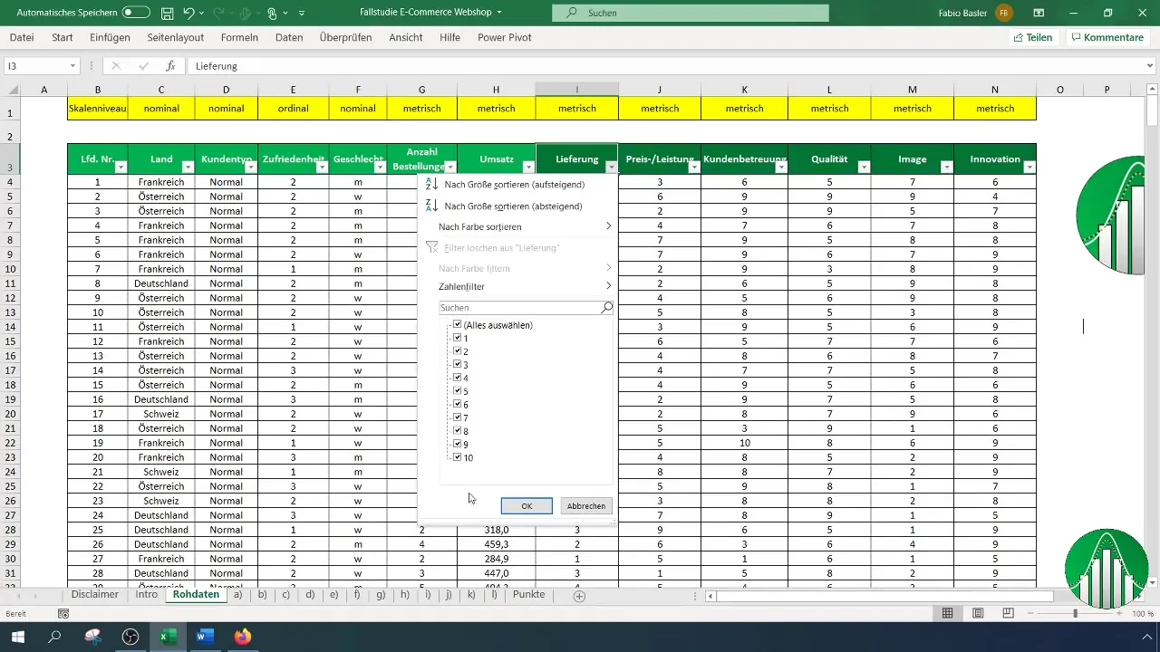
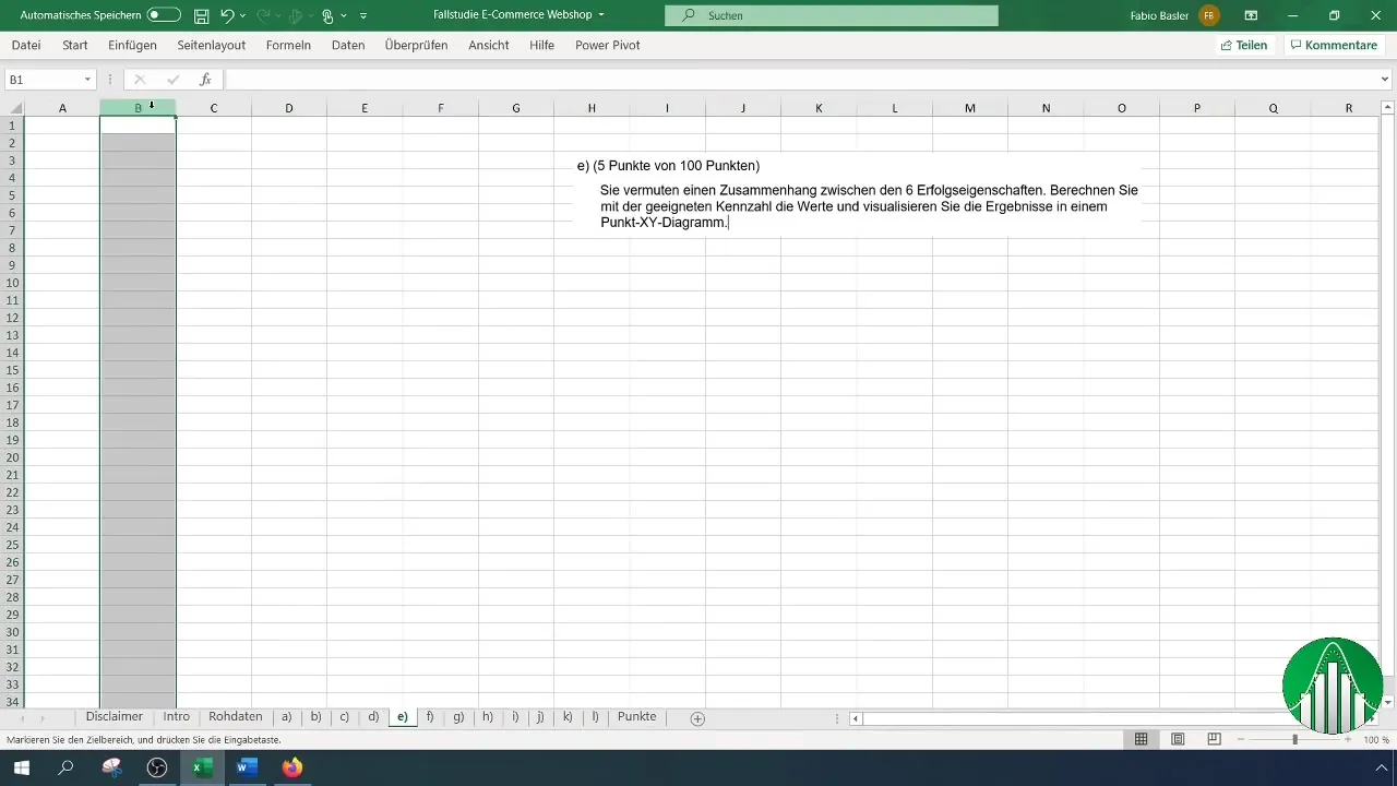
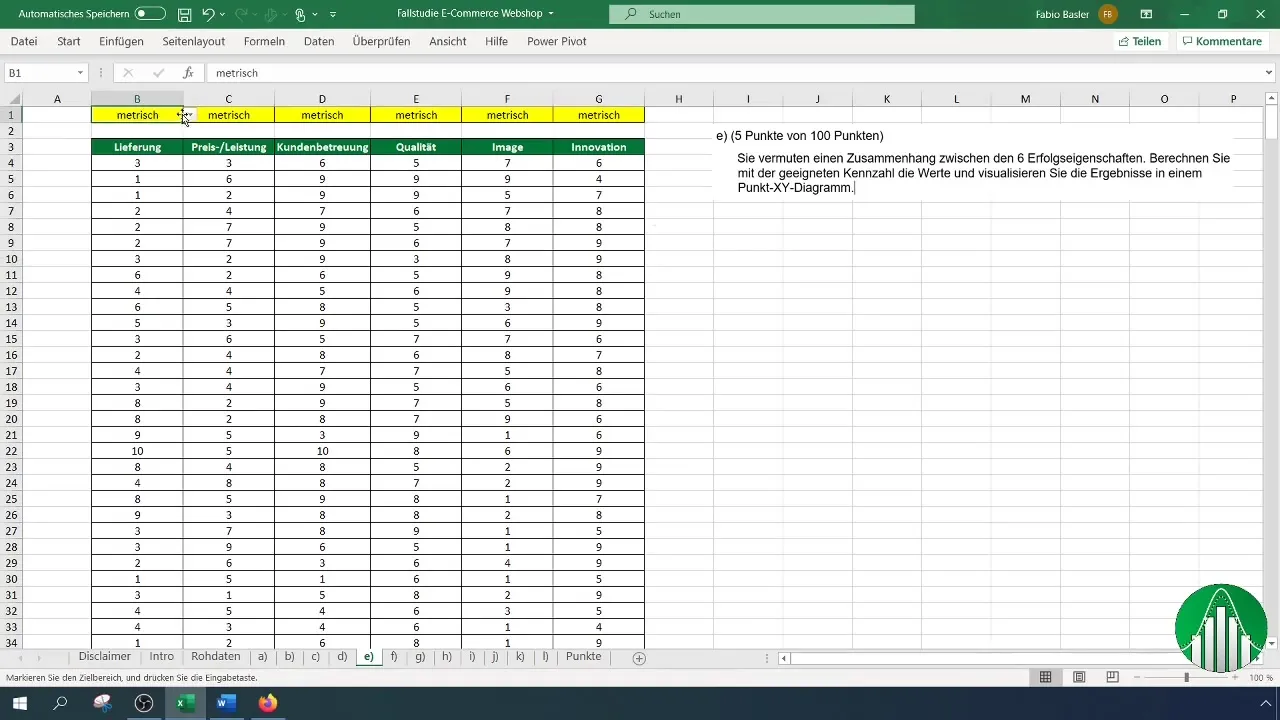
Select the columns containing your attributes from column I to N. Copy this data and paste it elsewhere to prepare it for analysis.

Checking the Scale Level
Before you can calculate the correlation, it is important to check the scale level of your data. In this case, the data is metric since it is based on a point scale of 1 to 10. This information is crucial as the Pearson correlation coefficient can only be used for metric scales.
Conducting the Correlation Analysis with the Data Analysis Function
To create the correlation matrix, you need to activate the data analysis function in Excel if it is not already activated. Go to "File," then "Options." Select the "Add-Ins" category and make sure the data analysis function is chosen. Enable it with a checkmark and click "OK."
Now you can access the data analysis. Click on "Data" in the menu bar and then on "Data Analysis." Select "Correlation" from the list and click "OK" again.

Defining Input Range and Output Range
Now define the input range for your analysis, making sure to include the first row with the headers. Select the complete range from B to G to ensure that all relevant data and their headings are captured.
Next, set the output range, for example, in cell I9, and click "OK" to start the calculation. Excel will now create a correlation matrix showing the relationships between your success attributes.
Applying Conditional Formatting
While the correlation matrix is already informative, you can enhance clarity through conditional formatting. Select the cells in the matrix and go to "Conditional Formatting." Choose the color scale to highlight the strength of correlations. A positive correlation can be colored green, while negative correlations can be highlighted in red.
This visual representation allows you to identify the strongest connections at a glance. You will notice that there is a moderate correlation of around 50% between Customer Service and Quality.
Interpretation of the Results
You can now interpret the individual correlations step by step. It is advisable to use a separate table to evaluate the different correlation values. Copy the corresponding value table below your correlation results to better compare the features.
Graphical Representation of the Correlations
To visually represent the relationships, a scatter plot is recommended. Insert an empty chart and choose the data for the first correlation, e.g., between Delivery and Price-Performance. Click on "Select Data" and add a new data series.
Select X and Y values to display the data in the chart. Add a trendline if needed to clarify the relationship.
Repeat this process for the other variables to visualize all 15 possible combinations. You will be able to visually represent both positive and negative relationships.
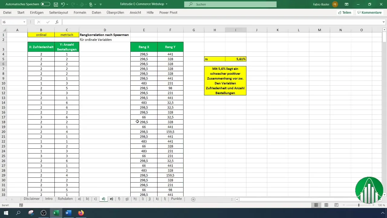
Additional Visualizations
In addition, you can customize the visualization by choosing additional options, such as adding metrics or the coefficient of determination R². This will give you more insight into the strength of your correlations.
Summary
In this guide, you have learned how to create a correlation matrix in Excel, analyze the correlations between different performance characteristics, and visually represent them. The combination of data analysis and graphical representation allows you to gain valuable insights from your survey to support strategic decisions.
Frequently Asked Questions
How do I activate the data analysis function in Excel?Go to "File" > "Options" > "Add-Ins" and activate the data analysis function.
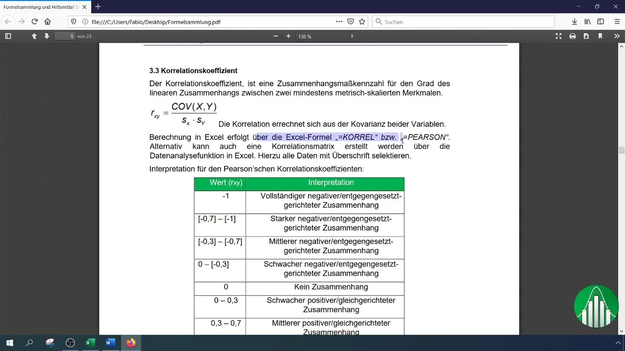
How do I find the Pearson correlation coefficient?Use the function "=CORREL(array1; array2)" in Excel to calculate the correlation coefficient between two variables.
Can I use other types of charts as well?Yes, you can choose other types of charts to display the data, but the scatter plot is particularly suitable for correlations.


